The State of UK Competition Report April 2022
Published 29 April 2022

© Crown copyright 2022
This publication is licensed under the terms of the Open Government Licence v3.0 except where otherwise stated. To view this licence, visit nationalarchives.gov.uk/doc/open-government-licence/version/3 or write to the Information Policy Team, The National Archives, Kew, London TW9 4DU, or email: psi@nationalarchives.gov.uk.
Where we have identified any third party copyright information you will need to obtain permission from the copyright holders concerned.
This publication is available at https://www.gov.uk/government/publications/state-of-uk-competition-report-2022/the-state-of-uk-competition-report-april-2022
Executive Summary
Context
Recognising the importance of competition to economic performance, in March 2021 the Chancellor and the Business Secretary jointly commissioned the CMA to carry out an assessment of the state of competition in the UK.[footnote 1] This followed an earlier assessment published by the CMA in November 2020.[footnote 2] Others have also noted the value of such assessments: for example, John Penrose MP’s report on competition policy – Power to the people [footnote 3] – called for a ‘State of Competition and Consumer Detriment’ report.[footnote 4]
This second State of Competition report responds to the Chancellor’s and Business Secretary’s request. Its central aim is to provide information and analysis to help inform public debate and policy. It builds on the CMA’s first assessment, presenting new, improved and updated indicators of the state of competition. In particular, the latest report presents:
-
Updated indicators of the state of competition, including concentration, profitability and markups, and entry and exit.
-
Improved estimates of concentration that adjust for the effects of international trade and the effects of competing firms having the same owners (so-called “common ownership”).[footnote 5]
-
An assessment of whether consumers on lower incomes face less competitive markets.
-
Analysis of the latest surveys examining businesses’ and consumers’ experience of markets.
-
Specific analysis of competition in digital markets, which are poorly captured by existing economic statistics.
The importance of competition
The COVID-19 pandemic, the UK’s changing trade relationship with the EU, disruption to supply chains and shipping, and rising energy costs have all brought significant change and upheaval to the UK economy over the past few years. In such circumstances it is more important than ever that competitive intensity across the economy is monitored and supported.
Effective competition happens when businesses compete to win customers by offering them a better deal. When firms compete effectively with each other, they cannot raise prices, or cut quality and service, without losing business.
If competition is weak or ineffective, firms do not face the same pressures to keep prices down; to keep quality up; to operate efficiently; or to innovate. This comes at a cost to consumers, other businesses and the wider economy.
-
Weak competition harms consumers: the cost of weak competition is borne by consumers in the form of higher prices, lower quality and less innovation. This raises the cost of living,[footnote 6] and it can hit the poorest households hardest.[footnote 7] With fewer suppliers to choose from, and less innovation, consumers also suffer from reduced choice.
-
Weak competition can harm businesses: just as consumers pay more when competition is weak, businesses pay more than they should to their suppliers. And when markets are dominated by a small number of powerful firms, they can use their position to prevent other businesses from entering and growing. Both of these factors lead to higher prices for customers of those businesses.
-
Weak competition harms the economy as a whole: because firms do not face pressures to operate as efficiently as possible, the people employed by them are not as productive as they could be. Nor do they face the same pressures to innovate, in order to get ahead of their rivals. This inefficiency and lack of innovation comes at a cost to the economy as a whole, in the form of reduced job creation, weaker productivity and slower wage growth. In countries where competition is stronger, productivity and hence wage growth tends to be higher. [footnote 8]
Findings
Overview
The strength of competition is not generally directly observable, but must instead be inferred by analysing relevant indicators. Taken together these indicators can shine a light on the state of competition.
“Static” indicators of competition include concentration (the extent to which industries are dominated by a small number of large firms) and business profitability. These measures can help to tell us about the state of competition at a particular point in time: high concentration or high profitability in an industry may be signals that competition is weak. Tracking how such static measures change through time can shed light on how well the competitive process is working in the UK economy. Figure 1 shows the average market share of the 5 largest firms in each industry (the so-called C5 measure) over the last 20 years. It shows that there was a marked increase in concentration in the years after the 2008 financial crisis. Since then, concentration has fallen, but it still remains above levels seen prior to 2008.
Figure 1: Average C5 (average market share of the 5 largest firms in each industry) [footnote 9]
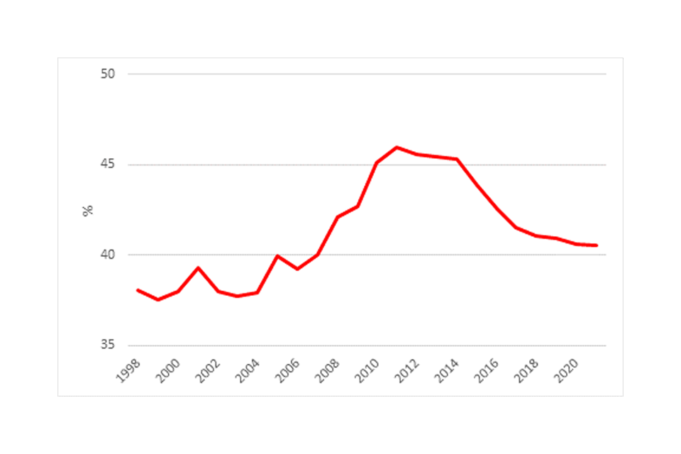
Image description: A line graph showing the average market share of the largest 5 firms in each industry between 1998 to 2021.
There is also some evidence that on some measures profitability is higher than before the 2008 crisis. Figure 2 shows data on the markup of prices over marginal costs. It shows that average markups have increased since 2008 from just over 20% to about 35%. It also shows that the increase in markup has been higher for the 10% most profitable firms.
Figure 2: Price-cost markups since 2000[footnote 10]
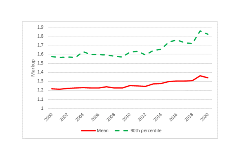
Image description: A line graph showing the mean (red line) markup of price over marginal cost and the equivalent graph for firms in the 90th percentile (dotted green line) between 2000 to 2020.
Further analysis of static measures can be found in concentration, industry structure, and distributional impacts and markups and profitability.
“Dynamic” indicators of competition include rates of firm entry and exit, and the extent to which high-performing firms sustain or get dislodged from their position. These measures help us assess the extent of change and churn in an industry over time. In an open competitive market we expect to see firms entering and leaving markets, and jostling for market share, as this is an important part of the competitive process. Looking at these measures, there is evidence that the largest and most profitable firms are able to sustain their strong position for longer than they used to. Figure 3 shows the rank persistence of the top 10 firms in each industry over time. The rank persistence measures how many of the top 10 firms in an industry were also in the top 10 3 years ago. Figure 3 shows that over the last 20 years, the likelihood of the largest firms in an industry remaining the largest firms has increased. The chart shows that whilst the rank persistence was around 5 before 2008, it has been between 7 and 8 since.
Figure 3: Rank persistence (averaged across industries) [footnote 11]
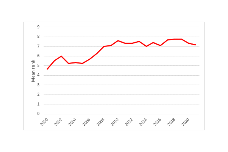
Image description: 3 line graphs illustrating trends between 2003 to 2020. The line in red illustrates the average markups across industries and is trending upwards. The dotted green line represents the average EBIT margin across all industries and is gently sloping downwards and the dotted blue line represents average ROCE and is also trending upwards.
We have also looked at profit persistence. This shows the proportion of the top 10 most profitable firms in each industry which were also in the top 10 3 years ago. This provides a more mixed picture than the rank persistence measure, as shown in Figure 4. Profit persistence has increased as measured by markups over marginal costs and the Return on Capital Employed (ROCE), but has fallen back to pre-2008 levels for Earnings Before Interest and Taxes (EBIT).
Figure 4: Profit persistence (averaged across industries)[footnote 12]
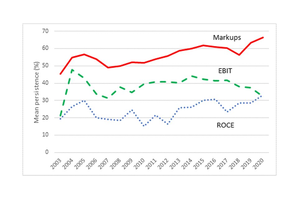
Image description: A line graph showing the median HHI across the UK economy from 1998 to 2021.
Further analysis of dynamic measures can be found in other indicators of competition.
When companies in the same market are controlled (or part-controlled) by the same owners, the commercial incentives for them to compete will be weaker or even absent. For the first time, this report presents preliminary data on the effects of this common ownership by combining 2 extremely large datasets of UK businesses. Our assessment, which considers common ownership at 25% and 50% thresholds,[footnote 13] shows that:
-
The effect of common ownership on the overall number of independent businesses is modest: only 160,000 businesses out of the 2.6m analysed are part of a common ownership group.
-
However, common ownership is more prevalent among larger businesses and in certain sectors: for example, in mining and quarrying, almost 30% of businesses are part of a common ownership group. Because of this, accounting for common ownership materially increases measured concentration in some sectors. Figure 5 shows this using 2 different measures of concentration. One is the combined market share of the 10 largest firms in each industry (C10); the other is the Herfindahl-Hirschman Index (HHI). [footnote 14] This chart shows that common ownership can have a significant effect on the HHI.
-
It should be reiterated, however, that this is very preliminary analysis that we will seek to refine in future.
Figure 5: Impact of accounting for common ownership on the C10 and HHI [footnote 15]
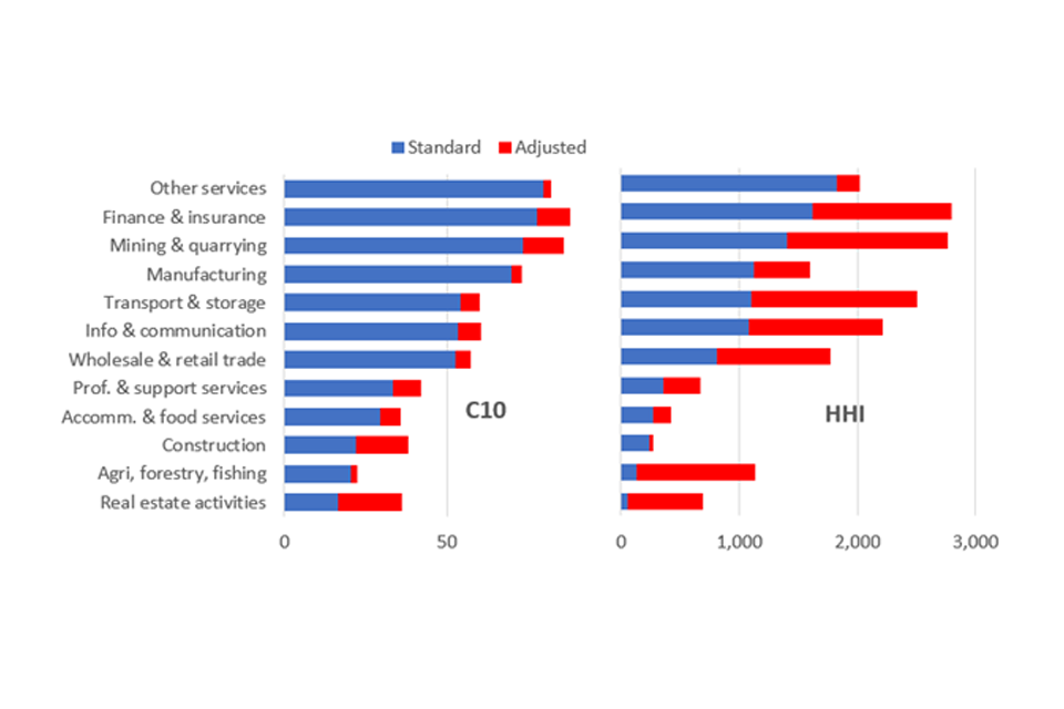
Image description: Two stacked bar charts. The chart on the left represents the share of the top 10 firms by industry using standard measures (blue bars) and how these shares change once common ownership is factored to produce adjusted measures (red bars). The chart on the right represents the HHI of firms by industry (blue bars) and how these change once common ownership is considered (red bars).
Further analysis of common ownership can be found in adjusted concentration.
Adjusted concentration also considers how concentration is affected when international trade is accounted for. The standard data that is used for measuring concentration in the UK excludes imports into the UK and exports out of the UK. We have attempted to correct for this using the available trade data. This analysis, which relates to a sample of manufacturing industries only, is illustrated in Figure 6. The red line shows our standard measure of overall concentration, whilst the blue and green lines show the upper and lower bounds of our estimates of concentration once we take trade into account. The chart shows that overall concentration is lower when we account for international trade. This highlights the important role that international trade plays in contributing to keeping UK markets competitive. Whilst the effect seems significant at the aggregate level, it should be noted that the result will vary across specific industries. For instance, in industries where large volumes of imports come from a small number of overseas suppliers, accounting for international trade will tend to increase measured concentration.
Figure 6: The effect of trade on measured concentration [footnote 16]
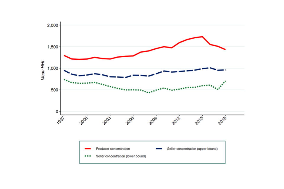
Image description: 3 line graphs illustrating various measures of concentration between 1998 to 2019. The red line represents traditional measures of concentration, “producer concentration”. The dashed blue line and dotted green line represent concentration when measured from the seller’s perspective and illustrate upper and lower bound measures respectively.
Effective competition is driven by customer choice. It is the act of choice that sends signals to firms about what customers want and makes them compete to deliver it. If consumers are not able to identify or access the best value deals, or if firms do not deliver on their offers, then competition will not deliver lower prices and better quality. In the worst case, firms may instead compete to mislead or exploit customers. For example, if some firms in a market operate by presenting up front prices which do not include “hidden extras” this can undermine firms with a more straightforward presentation of prices to consumers. This ‘drip pricing’ has the capacity to significantly distort competition and harm consumers. Understanding consumers’ experience of markets is therefore critical to any rounded assessment of the state of competition.
In the consumer survey evidence section, it analyses a number of surveys, including the results of the recently-published BEIS Consumer Protection Study 2022 (CPS), which asks consumers about problems they have experienced with goods and services they have purchased.[footnote 17]
-
In the period covered by the CPS (the year to April 2021), most consumers (around 7 in 10) experienced some sort of “detriment” or “harm”. This is caused by a problem with something they had bought or used. Problems were more frequently encountered with services than with goods. In addition, the average cost to consumers of these problems is higher with services (£41) than with goods (£14).
-
The study estimates that the total net value [footnote 18] of consumer detriment was £54.2bn, two-fifths of which comes from just 4 sectors: renting services, vehicle maintenance and repair, second-hand vehicles, and internet provision.
-
Detriment is more widespread and more costly among younger people, and among those in more difficult financial situations.
-
A separate survey[footnote 19] on UK customer satisfaction shows that over the same period, the level of problems consumers have encountered had risen compared to earlier periods. However, satisfaction with complaint handling has also risen over this period.
In the concentration, industry structure, and distributional impacts section, it considers another aspect of the consumer experience: the extent to which those on low incomes are more likely to buy in markets in which there are fewer supplier and less choice. Overall, we find that households on lower incomes are significantly more likely to consume goods and services produced in more concentrated industries. This is because markets for essential goods and services (which, for those on low incomes, account for a higher proportion of expenditure) tend to be more concentrated. This is illustrated in Figure 7. It shows that whilst the average concentration faced by the 10% least well off consumers is about 1,100, this drops to less than 900 for the 10% most well off consumers.
Figure 7: Expenditure on products and services by households[footnote 20]

Image description: Line graph illustrating the relationship between the average concentration or weighted HHI each household by income faces. The line is downward sloping, illustrating that households in the highest income decile experience a lower weighted HHI than households in the lowest income decile.
Spotlight on the COVID-19 pandemic
Analysis of the impact of the Covid-19 pandemic is hindered by a lack of available data.[footnote 21] The available data suggests very little change in concentration since 2019, while measures of profitability and markups show a slight decline. Given the lack of data, it is too early to draw any firm conclusions about any long term impact of the Covid-19 pandemic on concentration or profitability.
Other dynamic indicators show that, while there was an immediate fall in new businesses being created after March 2020, there was also a reduction in business closures. This was subsequently followed by a rapid increase in business creation (and closures). This pattern is not usually observed during economic slowdowns, and may be due to the extraordinary levels of financial support provided by government, and to regulatory forbearance in respect of insolvencies and HMRC debt collection. More recently, there is tentative early evidence of a rise in business closures as the major elements of government support are withdrawn.
Evidence from surveys of business owners (discussed in business survey evidence) unsurprisingly indicates that the pandemic was a significant barrier to growth, with over a third of businesses with expansion plans saying that these were postponed, cancelled or scaled back as a result.[footnote 22] Businesses also report that innovation levels have been affected by the pandemic, with a fall in the proportion of businesses reporting either product or service innovation in 2020 compared to 2019 (though levels remained higher than in 2018).[footnote 23]
From the consumer perspective, the pandemic is likely to have affected the level and pattern of detriment in markets. The CMA received tens of thousands of complaints about difficulties consumers had experienced in obtaining refunds for travel and holidays that were cancelled because of lockdown restrictions.[footnote 24] This is borne out by evidence from the BEIS Consumer Protection Study 2022 (Consumer survey evidence), which found ‘airlines’ and ‘package holidays and tours’ to be the sectors in which consumers were most likely to have experienced detriment. In over 90% of cases, consumers reported that the problems they had experienced in these sectors had been caused or made worse by the pandemic.
Overall, consumers reported that £7.7bn of the detriment they experienced (14% of the total) had been caused by the pandemic. A further £18.8bn (just over a third of the total) was linked to detriment that consumers said had been made worse by the pandemic.
Unsurprisingly, the pandemic accelerated the trend toward online shopping. Whilst all retail categories saw increases in online spending, online grocery saw one of the largest increases (after DIY), with spending up an estimated 75.2% between 2019 and 2020 and grocery sales accounting for a fifth of all online spending, the highest proportion on record.
Spotlight on digital markets
The digital revolution has brought huge benefits to consumers. And it has enabled small firms to reach out beyond their local market and access customers around the world. In the process, it has disrupted business models, from broadcasting and music, to taxis and food delivery. Digital markets have huge potential to continue to improve our lives and living standards and to play an important role in the post-pandemic recovery. But to deliver those benefits, they need to stay competitive.
The data that we have used in this report does not capture indicators of competition in these digital markets. We have therefore relied on our published analysis of some of these markets. Competition in the digital economy summarises some of the key findings on competition in digital markets made by the CMA’s market studies into digital advertising and mobile ecosystems.
Google, Meta and Apple are highly profitable and have a very high market share in the markets in which they operate, a situation that has endured for many years. On both static and dynamic measures of competition, these markets therefore appear to perform poorly.
Weak competition in search and social media markets risks leading to reduced innovation and choice, as well as to consumers giving up more data than they would like. Google and Meta’s (Facebook’s)[footnote 25] strong position also means that businesses are more likely to pay more for digital advertising than they would in a more competitive market, a cost that we would expect ultimately be reflected in higher prices for consumers.
When consumers buy a smartphone, they effectively enter into one of 2 mobile ‘ecosystems’ – controlled by Apple or Google – that determine how a range of online content is delivered to them. The result is that the provision of a range of smartphone services, including operating systems, app stores and mobile browsers, is highly concentrated. Competition is further weakened by the difficulties users encounter in switching between Apple (iOS) and Google (Android) devices. All this may limit innovation and choice, and lead to consumers paying more for app purchases and subscriptions than in a more competitive market.
Implications
Competition has a key role to play in supporting UK productivity and growth. Given evidence that competitive pressure may have been stronger in the past than it is today, it is natural to ask what might be done to further strengthen competition. The objective of this report is to inform debate and public policy, rather than to propose specific interventions. However, the evidence in this report, combined with other recent work and analysis undertaken by the CMA, point towards a number of important areas of focus.
Competition policy and enforcement: the CMA has a key role to play, particularly post-Brexit, in creating the conditions where the best businesses can thrive, and where consumers can shop with trust and confidence. The CMA’s annual plan sets out its priorities for the year ahead.
Reform of the framework: as the CMA has set out, and as government has recognised, there is a need to update the legislative framework – including the CMA’s tools and powers – to make it fit for the modern economy. The CMA supports the plans by the government to reform competition and consumer protection law to make it swifter and more effective, and to introduce a new pro-competition regime for the most powerful digital platforms.
Pro-competitive regulatory policy: well-designed regulation can support consumer choice and competition, especially in markets where data is important.[footnote 26] And it can support consumer trust, confidence and engagement, particularly in complex markets. The CMA welcomes the government’s plans to reform the framework for regulation,[footnote 27] and to hard-wire competition principles into regulatory decision making.[footnote 28]
Close monitoring of the impact of Covid-19 business support: as the exceptional support provided by government to business during the pandemic is withdrawn, it will be important to monitor the effects on markets and consumers. Firms leaving markets are an important part of the competitive process; but to the extent it leaves certain markets with a small number of powerful firms, there could also be a cause for concern.
Developing the analysis further
In addition to updating the existing analysis, we intend to include additional analysis in the next iteration of this report. As with this version of the report, much of this will be carried out in conjunction with academic advisors. This will potentially include the following areas:
Concentration metrics:
-
Estimating concentration measures at a more granular level in order to better approximate economic markets. Our analysis in this report is based on 4-digit SIC industries. As explained in concentration, industry structure, and distributional impacts, this is likely to represent a more aggregated level than what the CMA would normally define as an economic ‘market’. This could include refining our use of the existing data sets (for instance, through the use of data science techniques to match industries with how companies describe their own business in statutory directors’ reports and other filings) in order to more closely match SIC industrial categorisations to economic markets.
-
The data we use for estimating concentration metrics is recorded at a national level. We investigated the possibility of estimating concentration at a more local level, but the necessary data was not available. We intend to do further analysis on this issue in order to better understand how concentration varies regionally.
-
Our analysis shows how accounting for imports and exports significantly affects estimated concentration. However, our estimates remain imprecise, as shown by the gap between our upper and lower bound estimates in Figure 6 above. More granular data on firms’ levels of trade would allow for more precise estimates of the impact of trade flows (and changes in trade flows) on estimated concentration measures.
-
Further work to understand what factors drive the greater concentration faced by lower income households in essential goods and services markets. We consider this to be a particularly high priority piece of work.
Profitability:
-
The best methodology for estimating markups and profitability at a sector level is a highly debated topic in the economic literature. As the debate evolves, new or enhanced methodologies might become available. If one of the key drivers for competition policy is a belief that excessive concentration in markets can lead to excessive monopoly profits, then understanding trends in mark-ups, profitability and returns on capital in different sectors and industries is very important.
-
A focus on the most profitable firms, the markets they operate in, and their features could shed some light on the competitive conditions these highly profitable firms face. This is not to say that the CMA regards profitability as a problem per se, but rather that persistent profitability that does not attract new competitors may be an important signal of problem areas in the economy.
Common ownership:
-
The economic literature on common ownership is still developing. Our analysis of common ownership in adjusted concentration is still preliminary and there are various ways in which it could be extended and improved upon. For instance, our results are sensitive to the control thresholds used. Further sensitivities could be built in to explore how our results are driven by our definition of common ownership groups (including allowing for common ownership across industries and differentiating between horizontal and vertical ownership chains) and person of significant control.
-
In addition, further iterations of the data used in our analysis would allow for a study of changes in common ownership and adjusted concentration measures over time.
Effect of COVID-19:
-
The long run effect of the pandemic on competitive outcomes is clearly an important topic for further research. The next iteration of this report should look at this issue.
-
The BEIS Consumer Protection Study 2022 provides valuable evidence on the experience consumers are having in markets and the problems they encounter. The reference period for the 2021 survey is April 2020 to March 2021 - the peak of the Covid-19 pandemic - and the findings were heavily influenced by this. A further wave of the survey is recommended to understand the level of consumer detriment now that the UK is emerging from the worst economic impact of the pandemic. It will also be particularly important to understand consumer detriment levels considering recent increases in the cost of living for UK consumers meaning that the impact of any detriment experienced may be greater than in previous years.
Introduction
The competitive process provides incentives for firms to keep prices down and to keep quality and service standards up: in short, to win business by making the best offer to consumers that they can. In turn, this contributes to economic growth and productivity. The firms that serve their customers most effectively and are most efficient in terms of how they run their business, can be rewarded through winning market share from their competitors.
Free and fair competition, by incentivising firms to innovate, to improve productivity and to keep prices lower, is therefore essential in providing consumers with better deals and new goods and services while also contributing to higher real wages across the economy.
Following the CMA’s first publication on the state of competition within the UK economy[footnote 29], the Chancellor of the Exchequer and the Secretary of State for Business, Energy, and Industrial Strategy asked the Competition and Markets Authority (CMA) to deliver assessments on competition across the UK economy on a regular basis.[footnote 30]
This commission from government asks that the report should be an authoritative, accessible and transparent source of public information on how competition is evolving across the UK economy. The ambition is that this will also provide both the CMA and government with information to better target their respective resources and tools towards improving competition in the UK.
Competition and the pandemic
As the UK begins to return to normality after the coronavirus (COVID-19) pandemic (the pandemic), an assessment of the state of competition is now more important than ever. The economic environment may discourage business entry and expansion and lead to an increase in business closures thus placing competition under strain. We look in detail at some of the dynamic indicators of competition in other indicators of competition and the extent to which any effects of the pandemic can be seen in the most recent evidence.
The pandemic has also brought the reliance of the UK economy on international supply chains into focus. We discuss the effects international trade can have on competition as importers can provide competition to domestic producers,. This is discussed in further detail in adjusted concentration.
Competition drives productivity
The UK’s weak productivity growth is well known, so much so that the 0.3% average annual increase in UK labour productivity (measured as output per hour) since the financial crisis was named Statistic of the Decade by the Royal Statistical Society in December 2019.[footnote 31] It had averaged 2.3% in the decade prior.
By comparison, the UK’s level of productivity has been lower than that of other advanced economies since the 1960s. The UK’s level of productivity is more than 20% lower than other major advanced economies such as the US, France and Germany. Productivity growth across the G7 [footnote 32] averaged 0.8% since 2008 (compared to the 0.3% in the UK). There is also wide variation in productivity within the UK. As measured by output per hour, the only 2 areas with average levels of productivity above the UK average in 2018 were London and the South East.[footnote 33]Recent publications by the ONS offers a more nuanced picture.[footnote 34]
The causes of this weak productivity are numerous and often complex but improving it is a major government and public priority. In the long term, productivity growth remains the only path to sustainable economic growth and rising living standards.
One mechanism to help tackle the UK’s weak productivity is boosting competition. There is strong evidence that competition drives productivity growth.[footnote 35] It does this in 3 main ways:
-
acting as a disciplining device, placing pressure on the managers of firms to become more efficient;
-
via reallocation, ensuring more productive firms increase their market share; and
-
driving firms to innovate, coming up with new products and processes which can lead to step-changes in efficiency.
While research is still ongoing as to which of these mechanisms is more important in different contexts, increasing our understanding of the state of competition in the economy and trends in it over the last 2 decades could help understand where it might be possible to support productivity growth by promoting competition.
Widespread concern that competition is weakening
In recent years competition concerns have been brought into sharp focus in international academic and policy debates with a number of studies suggesting that competitive pressure across advanced economies could be weakening. The most high-profile of these have been focused on the US, with some extending the analysis to Europe, including the UK. In our first assessment of the state of competition[footnote 36] within the UK, we found evidence to support some of these concerns, with a rise in concentration across UK industries and an increase in markups amongst already profitable firms. The rationale for undertaking our assessment is to build a better understanding of what has happened in the UK.
The debate over whether market power is broadly increasing over time most notably gained prominence in 2016 when the White House Council of Economic Advisors (CEA) published research based on US data which tracked the share of revenue accounted for by the 50 largest firms in 13 broad industrial sectors and noted it had increased in 10 of them since 1997. This research also pointed to a sharp increase in the return on capital achieved by the top 10% of US firms and an apparent drop in the rate of firm entry.
Several recent books, by economists and by political commentators, have discussed broad changes in competition in economies and the effect of competition policy on this. In the US, Baker (2019)[footnote 37] has argued that competition policy has become unusually weak in recent decades, allowing for a long-term decrease in competition in markets which has had large macroeconomic effects. Philippon (2019)[footnote 38] contrasts this with Europe, which he argues has been successful in pursuing a stricter competition policy, particularly with regard to mergers, and so has markets which are becoming more competitive. He points to differences in the amount of lobbying and political spending by incumbent firms between the US and Europe as being one of the key explanations for this difference.
In terms of the picture in Europe, De Loecker and Eeckhout (2018)[footnote 39] use Thomson Reuters data on a wide set of countries, including large European and North American countries and a set of developing countries, to estimate the changes in firms’ average mark-ups[footnote 40] in these countries between 1980 and 2016. They find that estimated mark-ups have risen across almost all developed countries, with stable or falling mark-ups observed in many developing countries. According to the authors, the UK has seen an increase in estimated gross mark-ups from just below 1 to 1.68 (meaning prices rose from being roughly equal to marginal cost to being 68% higher than marginal cost), putting the UK in the top third of increases among European countries.
From a UK-specific perspective, the Resolution Foundation found that concentration in the UK economy as a whole increased between 2003 and 2011 – particularly during the financial crisis in 2008 – before starting to fall back again.[footnote 41] This appeared to be the case regardless of the measure of concentration used.
Digital markets present different challenges
As set out in the Digital Competition Expert Panel review,[footnote 42] digital technology provides substantial benefits to consumers and the economy. These gains however have arisen without strong competition both in and for the market. This means that consumers are missing out on the full benefits and innovations that competition can bring. Increasing digitalisation makes examining the overall state of competition in the UK particularly important.
Internationally, the consensus on the need for action to address the challenges posed by digital markets has also grown stronger. Work to address these challenges is now underway around the world. In particular, the European Commission published its Digital Markets Act[footnote 43] proposals in December 2020 which include ex ante rules covering large online platforms acting as gatekeepers. In addition, Germany has amended its competition act[footnote 44] to enable it to better address the conduct of large digital companies. There have been regulatory proposals and developments in both Australia and Japan. And in the US, the House Judiciary Antitrust Subcommittee made a range of recommendations[footnote 45] to restore competition in digital markets, and there has been a recent increase in antitrust enforcement activity.
How public authorities are responding
Many competition authorities have recognised the need to change how they operate to respond to these challenges. At the CMA, we have set out proposals for reform of our duties and powers[footnote 46] and set up a dedicated Digital Markets Unit to begin to operationalise key parts of a new regime to promote competition in digital markets.[footnote 47] Internationally, some cross-economy assessments of competition have been undertaken in Germany,[footnote 48] Norway, and New Zealand.[footnote 49]
Purpose of the project and what it can tell us
Purpose
Our central purpose is to better measure and understand the state of competition in the UK, and to help inform policy and academic and public debate on competition. For example, this work may indicate where government efforts to promote competition might be best directed and suggest where further analysis would be helpful.
What this project can tell us
There are many ways of measuring the state of competition. We look at a range of metrics, each aiming to shed light on a different aspect of how markets are functioning in the UK:
-
concentration – the structure of industries and the extent to which industry turnover is divided among the largest firms;
-
adjusted concentration – the structure of industries incorporating broader measures than turnover such as significant shareholdings or imports and exports;
-
profitability and mark-ups – the levels of UK businesses’ profits, the markups of prices over costs charged by businesses and the distribution of profits among businesses;
-
other indicators of competition – how likely the most profitable businesses are to remain the most profitable businesses, the stability of the positions of the largest firms in the economy, and the rates of firm entry and exit;
-
consumer surveys – measures of consumer detriment across markets and channels of purchase;
-
business surveys – firm’s perceptions on competition, barriers to expansion and innovation.
These metrics may be estimated at the level of individual industries, of sectors of the economy and of the whole economy. Individually, each of these measures provides only a limited amount of information, but together they can paint a better picture of the trends in competition over recent years.
This work is not a substitute for the CMA’s work in market studies and market investigations (or the similar work carried out by the sector regulators) and the findings are not intended to be informative of the approach taken (or conclusions that may be drawn) in that context, nor is it our intention (nor would it be feasible) to conduct a ‘market study’ of the whole UK economy. Furthermore, it remains the case that competition can most effectively be assessed at the level of individual product markets – measures based on industries and sectors can only indicate what the underlying trends may be. Our intention is to provide a view of how the structure and performance of markets has evolved over time.
We would like to thank the following people who provided the team with challenge and advice on the project: Dr Anthony Savagar (Senior Lecturer in Economics, University of Kent); Professor Steve Davies (Professor of Economics, University of East Anglia); Joseph Carr (PhD student, University of East Anglia ); Sabria Behilil (PhD student, University of East Anglia).
Concentration, industry structure, and distributional impacts[footnote 50]
Summary
We use concentration as a simple indicator of competition in a market. Higher concentration means a smaller number of firms control a larger share of the market which may lead to weaker competitive pressures and greater market power.
We have used data from the Office of National Statistics to build several measures of concentration from 1998 to 2021 – the longest time period for which data is available. We find that average industrial concentration – aggregated to the level of the whole economy – has increased during the financial crisis and the following recession. Since 2011, we have seen a stabilisation and gradual reduction in concentration, though not to the pre-crisis level. The increase in concentration is driven by the very largest firms in each sector.
We divided industries according to their HHI levels and found that, even at the relatively aggregated 4-digit industry level, 2 in 5 industries are classified as medium or highly concentrated, a proportion which has not changed significantly over time.
Sector-level trends show differences in concentration trends across sectors. Among the high-turnover sectors, Finance and insurance, Manufacturing, and Information and communication show high and/or increasing concentration levels.
Looking at the relationship between concentration and inequality, it is illustrated that poorer households spend a greater proportion of their income on essential goods or services. These households on average face markets that are approximately 30% more concentrated than markets faced by the richest households. Therefore, this would suggest that poorer households are more vulnerable to the effects of concentration.
Concentration and industry structure
Introduction
In this chapter, we consider measures of competition based on industry structure, such as concentration. We first explain what aggregate measures of concentration can and cannot tell us about competition. We then give an overview of the existing studies of concentration across the UK economy and compare the results to work done in other countries.
We then set out our own concentration analysis of the UK economy. In doing this, we consider how the average concentration of UK industries has changed since 1998 and examine the trends at the sector level. The time period considered is driven uniquely by the availability of reliable data. Our more detailed analysis of concentration and industry structure across the UK economy is set out in Appendix A.
We also seek to establish an empirical understanding of the relationship between market concentration and income inequality, effectively looking at the extent to which poorer households lose out because their consumption is disproportionately high in markets where firms are more concentrated and therefore more likely to exert market power.
Concentration as a measure of competition
Estimating concentration in individual markets is an intuitively simple way to assess the level of competition across an economy. Economic theory tells us that the more concentrated a market is, the less competitive pressure firms may face, potentially resulting in increased market power.[footnote 51] This could result in higher prices and lower quality for consumers, either directly, or indirectly if the increase in market power manifests itself in fewer incentives to invest and innovate.
The 2 most common measures of concentration are the Herfindahl-Hirschman Index (HHI) and Concentration Ratios.
Concentration-based metrics have the advantage of simplicity; all we need to calculate them are firm-level revenue figures within reasonably defined industries.
However, we must be cautious in interpreting them as direct evidence of market power. Concentration metrics do not measure market power directly. Rather, they are one step removed as they are a ‘market outcome’ – that is, they arise as a result of the competitive interactions of firms rather than determining the competitive interaction.
This means we need to be careful when interpreting concentration metrics, as the underlying causes of any observed changes in industry concentration may be unclear. For example, an increase in concentration can be either the result of fierce competition (where more efficient firms gain market share at the expense of less efficient ones) or the result of anti-competitive behaviour where one firm uses its market power to exclude other firms. Similarly, an increase in concentration might not always lead to weaker competition, and the effect of changes in concentration is likely to depend on the initial level of concentration (see CMA analysis). In addition, the level and trends in globalisation and digitalisation are likely to influence the concentration in a market.
HHI, Concentration Ratios, and their limitations
As mentioned in concentration as a measure of competition, the 2 most common measures of concentration are the Herfindahl-Hirschman Index (HHI) and Concentration Ratios.
The HHI is calculated as the sum of the squares of each firm’s shares at a given level of aggregated activity. It ranges between 0 to 10,000, where a value of 0 represents perfect competition and 10,000 represents a monopolist. Product markets with HHIs of more than 1,000 are generally considered to be concentrated, and those with HHIs of more than 2,000 to be highly concentrated.[footnote 52],[footnote 53]
Concentration Ratios are the combined market share of the largest firms.[footnote 54] This is the sum of the market shares of the top 5, 10, or 20 firms at a given level of aggregated activity. The number is often expressed as Cn (for example C5, C10 or C20).
Both indices have their advantages and disadvantages. For example:
-
The HHI accounts for the market shares of all companies in an industry, regardless of their size. Therefore, the HHI will capture information from across the entire industry. Concentration Ratios, instead, disregard any information beyond the top n largest firms. For example, the C10 will not account for the market shares of companies smaller than that top 10 in the industry. This can represent an advantage for Concentration Ratio where market shares information is only available for the largest firms, or where we are interested only in the ‘dominance’ of the largest group of firms. It can also represent a disadvantage as it might disregard important dynamics among medium and small sized firms. Moreover, when only a small number of firms belongs to a narrowly-defined industry, Concentration Ratios might not be very informative.
-
Concentration Ratios are measured in market shares, while HHI has no intuitive unit of measure. This enhances the interpretability of Concentration Ratios. However, the HHI can be interpreted as follows: from the value of the HHI, it can be computed the correspondent number of equally sized firms required to obtain the same HHI. For example, an HHI of 2,000 indicates that the market is as concentrated as a market with 5 equally sized firms.[footnote 55]
-
Both indices are relatively easy to compute. However, they are both aggregate measures which may hide interesting complexities in the underlying distribution of market shares.[footnote 56] One should therefore take this into account when interpreting the results.
Moreover, there are also caveats around the methodology and data we (and others) use to look at concentration across an economy.[footnote 57] In particular:
-
In the UK, we must rely on data gathered based on the Standard Industrial Classification (SIC) system, and even the most granular SIC codes are likely to be far broader than any ‘product market’[footnote 58] that the CMA would define in any inquiry or casework.[footnote 59] This makes it hard to draw direct conclusions about competition in a particular market.[footnote 60] Moreover, in this data each firm is allocated one single SIC industry even if it in reality it operates across several. This makes the study of multiproduct/multiservice companies difficult. Additionally, SIC codes do not easily take account of newer markets, such as digital markets, as they are based on traditional industrial classifications.[footnote 61]
-
In the UK, data on business turnover is only available at the national level, but geographic markets are not necessarily national and can instead be either local or international. For example, a leading retail chain setting up new stores in multiple local areas may lead to an increase in the measured national concentration, as it is likely that the retail chain would make more sales nationally. However, retailers often compete in local markets[footnote 62] and there may be no increase (and possibly a decrease) in the concentration of any local markets it enters as existing retail stores in those local areas face an additional competitor.[footnote 63]
-
In an industry of international scope, where imports make up a material part of domestic consumption, concentration statistics, which only show the production of domestic firms, will provide a misleading view of the actual structure of the market.[footnote 64] This poses a particular problem when charting changes in the estimated level of concentration over time – as many markets in developed countries, particularly those for manufactured goods, have seen increasing levels of imports and the closing of domestic manufacturers.[footnote 65] We address this particular issue in adjusted concentration.
Existing concentration studies
Compared to the body of literature focussing on concentration in the US, the number of papers published focussing specifically on the UK is fairly small. Nevertheless, there has been a recent increase in the number of UK-focussed studies. We discuss the main studies which look at changes in concentration in the UK in the following paragraphs. We discuss their findings below, highlighting points of consensus and areas of disagreement.[footnote 66]
Findings
Common, though not universal, themes from these studies are that, over the last 2 decades and at an economy wide level:
-
concentration levels are higher now than they were in 1998 – the oldest data available
-
concentration in the UK peaked just after the financial crisis, but was generally stable or fell after the financial crisis back towards pre-financial crisis levels
One study (Aguda, Hwang, and Savagar (2019)) found evidence that aggregate measures of concentration in the UK are sensitive to the inclusion in the sample of certain industries.
In addition, all of these studies show that the economy-wide results mask the fact that different industries followed different trends with some experiencing increases in concentration while for others concentration remained constant or decreased.
The Resolution Foundation found that concentration in the UK economy increased between 2003 to 2004 and 2010 to 2011, before starting to fall back again. This appeared to be the case regardless of the cross-economy measure used.
-
Between 2003 to 2004 and 2010 to 2011, the share of the largest 100 firms across the entire economy increased by over a third in the UK, from 18.5% to over 25%, and then began to fall, reaching roughly 23% in 2015 to 2016.
-
With respect to economy-wide average Concentration Ratios,[footnote 67] the Resolution Foundation found that concentration similarly increased between 2003 to 2004 and 2010 to 2011, albeit to a smaller degree than seen using the CR100 measure. After this spike, the aggregated subsector concentration measures levelled off and then started to fall, not returning to their pre-crisis levels.
-
Finally, economy-wide average HHIs showed concentration rising from below 900 in 2003 to 2004 to above 1,100 in 2010 to 2011, and then falling to around 940 in 2015 to 2016.
Additionally, when looking at changes in concentration in each sector, the Resolution Foundation found that concentration increased in two thirds of all industries over the same timeframe. The sector with the largest observed increase was ‘Manufacturing’ (over 10% increase) – ‘Other’ also experienced a 25% increase, driven primarily by the gambling subsector.[footnote 68] Three sectors decreased in concentration, with ‘Construction’ experiencing the largest decrease (roughly 2.5%).
The Resolution Foundation considered what was driving the changes in its economy-wide averages. It found that the rise was caused by both an increase in the share of the economy accounted for by highly concentrated subsectors and a general increase in concentration within the subsectors. However, while it found a general increase in concentration at the subsector level, this masks the fact that actual trends differ substantially between individual subsectors. For example, based on CR5 concentration figures, 55% of the subsectors analysed saw an increase in concentration from 2003 to 2004.[footnote 69] Similarly, while the share of subsectors with high concentration[footnote 70] grew from 18% to 21%, the number of subsectors with low concentration[footnote 71] increased from 40% to 41% over the same timeframe.
BEIS (2020) found concentration increased across all its Concentration Ratios between 2006 and 2010.[footnote 72] While the absolute levels of concentration found by BEIS are lower than those found by the Resolution Foundation, the percentage increases across CR5 and CR10 are larger in BEIS’ results. After this spike, concentration levelled off and slowly decreased, while remaining above pre-financial crisis levels. BEIS found similar results when analysing a weighted average HHI, although this measure found a larger observed fall after the financial crisis than its estimated Concentration Ratios, with HHI decreasing to pre-financial crisis levels in 2017 before increasing again in 2018.
Again however, the economy-wide averages are not representative of the levels as well as trends in concentration that many sectors of the economy experienced.[footnote 73] Generally, around half of the sectors examined by BEIS experienced an increase in concentration between 2006 and 2018 across all concentration measures, with concentration in the remaining sectors remaining constant or decreasing.
Alongside this, BEIS also published data on churn as well as firm entry and exit, finding that firm entry rates fell during the financial crisis and have been stable since.[footnote 74]
The UK specifically had a large proportion of industries with strong increases in concentration – in 29% of British industries the share of the 4 largest firms grew more than 20%. Underlying all of these results, the authors suggest that the changes in concentration suggest a tendency towards ‘oligopolistic structure’.
Bajgar, Criscuolo and Timmis (2021) took a similar approach and examined the share of sales of the largest 8 business groups in 13 countries including the UK.[footnote 75] The authors then compared these against the shares of both the 4 largest firms and 20 largest firms. The authors used the Orbis database to calculate the sales of the largest firms and the OECD STAN database at the 2-digit level to calculate total sales in each country industry. Overall, the authors found that from 2002 to 2014 there was a broad increase in industry concentration across the majority of sectors and countries, including the UK.
Davies (2021) found that concentration at the 4-digit level increased rapidly (by 30%) between 1998 and 2011 before levelling off at a high level from 2011 to 2018. Within industries, this increasing concentration was usually fuelled by soaring market shares for the largest 5 firms at the expense of the smallest.[footnote 76]
Aguda, Hwang, and Savagar (2019) investigated the sensitivity of aggregate market concentration measures to the sectors that are included and found, when using their full sample, broadly decreasing concentration in the UK between 1998 and 2018 based on whole economy CR5, CR10, CR20, and CR50. However, their results are consistent with the other papers when assessing these concentration trends for a sub-sample which excludes firms from subsectors known to be poorly measured or where using turnover to indicate output might be problematic. They found increasing concentration up until 2010, followed by a period of fluctuating concentration until 2016, after which a decrease in concentration can be seen.
When assessing entry and exit in the UK – something we discuss in markups and profitability – the authors found that in most years entry was greater than exit with the difference being greater after the financial crisis.[footnote 77] The exceptions are during and just after the financial crisis (2008 to 2011) and in 2018 where more firms exited the economy than entered it.
Valletti, Koltay, Lorincz, and Zenger (2017) examined concentration in the UK, alongside France, Germany, Italy and Spain, using both the weighted average CR4 and HHI4. The authors found that concentration was constant in 2010 and 2011, before falling afterwards to plateau around 2014 to 2015. A later report by Koltay, Lorincz & Valletti (2021) documented 2 more results.[footnote 78] First there was a moderately increasing average industry concentration over the last 2 decades. Second, there was a considerably increasing proportion of high concentration industries. Low and mid concentration industries became more concentrated on average, while industries with existing levels of concentration higher than 60% became less concentrated.
The Social Market Foundation (2017) report found that 8 out of the 10 analysed markets exhibited HHI levels exceeding 1,000 in 2016, of which 3 showed HHI levels of 2,000 and above. Eight out of 9[footnote 79] markets exhibited CR4 market shares of over 50%, indicating a considerable amount of concentration. Consistent with other studies that identified different trends amongst subsectors over time, the researchers found that markets moved in different directions, with some markets falling in concentration while a number of other markets became more concentrated over the observed timeframe.
UK-specific findings in the international context
In Europe the evidence is mixed, with some papers suggesting increasing concentration, others finding stability, while others suggest concentration has been falling. In contrast, the majority of the literature on the US suggests an increase in concentration, with Gutiérrez and Philippon (2020)[footnote 80] representing an exception to this.
The trend of increasing concentration in the US was most notably put forward when the Council of Economic Advisers (CEA) published a note based on US data which tracked the share of revenue accounted for by the 50 largest firms in the 13 industrial sectors defined by the North American Industry Classification System,[footnote 81] and noted it had increased in 10 of them between 1997 and 2012.[footnote 82]
Findings of increasing concentration in the US are also reported in Autor et al (2020), [footnote 83] who generally found increasing concentration across the OECD[footnote 84]. Grullon, Larkin, and Michaely (2018) [footnote 85] also report increasing concentration in the US; using HHIs, they suggested that concentration increased in more than three-quarters of US industries over the last 2 decades, with the average increase reaching 90%. They also found a significant increase in the CR4, including public and private firms, in most industries. Additionally, they reported that the average and median size of public firms has tripled in real terms.
Bajgar et al (2019) [footnote 86] calculated SIC-code level concentration in Europe and North America using both OECD MultiProd data and Orbis-Worldscope-Zephyr data. In line with the CEA results for the US, the datasets show a rise in industry concentration between 2000 and 2014, with roughly 75% of industries in both continents becoming more concentrated over this period.
On the other hand, Gutiérrez and Philippon (2018) [footnote 87] found stable to decreasing concentration in Europe, which they mainly attribute to a combination of stronger enforcement of pro-competitive policies in Europe, falling product market regulations, more stringent competition laws and lower levels of lobbying compared to the US. While the researchers found concentration increased in Europe during the financial crisis and immediately afterwards, the levels of concentration have been fairly stable since the early 2000s and have fallen since the late 1990s. The US on the other hand witnessed an increase in concentration over the same timeframe.[footnote 88]
Separately, Gutiérrez and Philippon (2020) also looked at the evolution of concentration globally as well as in the US by focussing directly on the largest global and US firms in terms of sales in a given year. They compared domestic sales of the largest US companies with domestic US GDP[footnote 89] and consolidated global sales of the largest global companies with global GDP. Contrary to the other works, they concluded that over the past 2 decades, the largest firms have not outgrown the global economy and that their domestic share of domestic GDP has been more or less stable over the previous 4 decades. Additionally, Gutiérrez and Philippon found that the largest firms have witnessed a decline in their share of global GDP.
CMA analysis
This section summarises the analysis we have undertaken for this report, with the detailed findings set out in Appendix A. As outlined in the concentration as a measure of competition section, there are several caveats when using trends in concentration to measure changes in the level of competition. We have considered the extent to which it is possible to address these caveats in our own analysis.[footnote 90]
Economy wide concentration trends
C5 and C10
To begin with, we look at the results when aggregating all the individual 4-digit SIC codes to look at the concentration picture cross-economy from 1998 to 2018, as measured by C5 and C10, aggregated by turnover.[footnote 91] In doing so, we exclude non-market sectors, such as government-related services and education, because of the different role that competition plays in these industries. We are also wary of the potential impact that large (in terms of relative turnover) sectors like finance and extraction of oil might have on our aggregate figures. Therefore, we construct 2 measures:
-
turnover-weighted mean C5 and C10, excluding Finance and insurance and Fuel wholesale[footnote 92]
-
the median of sectors’ C5 and C10[footnote 93]
Figure 2.1 shows concentration measured by the mean C5 while Figure 2.2 shows concentration as measured by the median C5. For consistency with our State of Competition report from 2020, we also report the C10.
Figure 2.1: Turnover-weighted mean C5 and C10, across whole UK economy
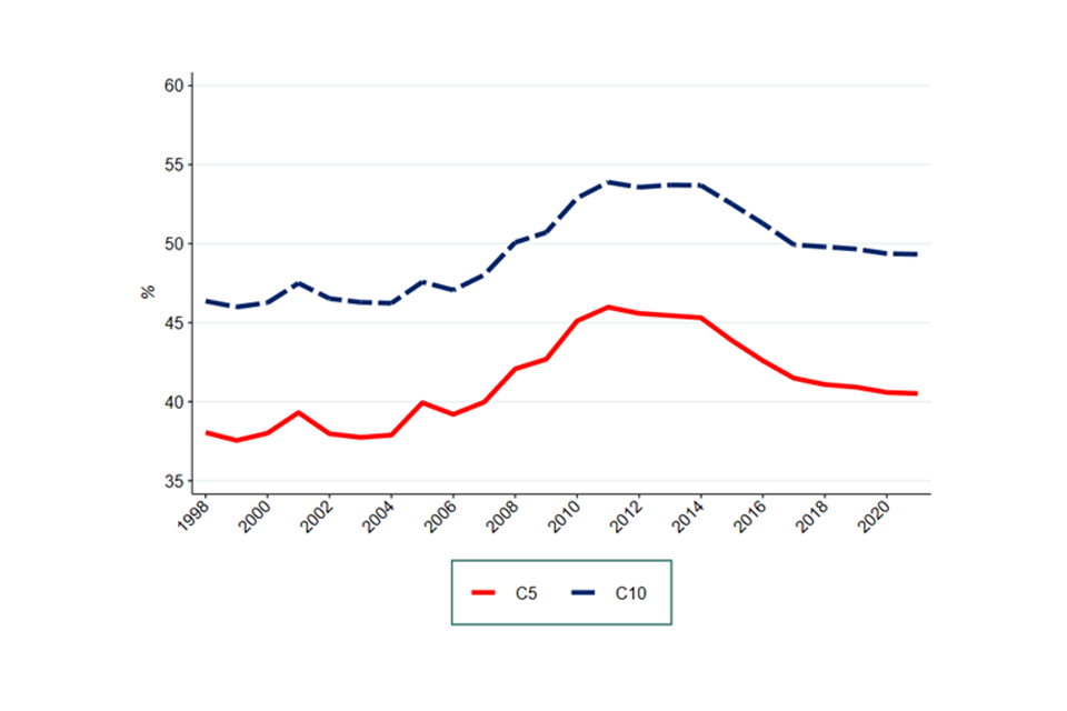
Image description: A line graph showing the turnover weighted mean C5 and C10 from 1998 to 2021. There are separate lines for C5 and C10 and the figure is depicted in percentages.
Source: CMA analysis of ONS BSD data
Note: Excludes some non-market sectors such as government services – including fully government-run sectors such as central banking, and those dominated by the public sector, such as education; and the 4-digit industry Wholesale of solid; liquid and gaseous fuels and related products and industries in the Finance and Insurance sector as their runover disproportionately affects our results.
Figure 2.2: Median C5 and C10, across whole UK economy
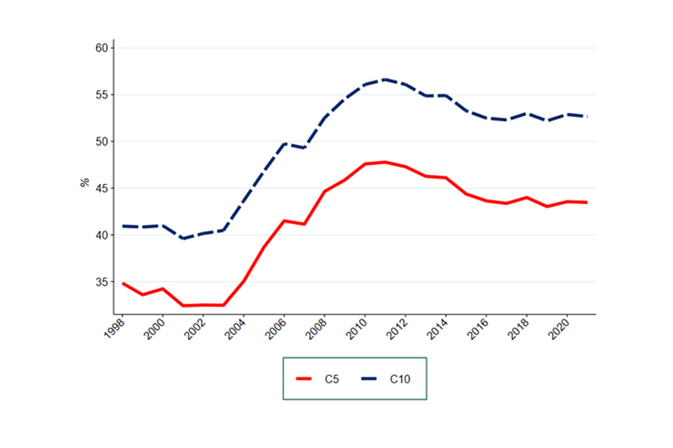
Image description: A line graph showing the median C5 and C10 from 1998 to 2021. There are separate lines for C5 and C10 and the figure is depicted in percentages.
Source: CMA analysis of ONS BSD data
Note: Excludes some non-market sectors such as government services – including fully government-run sectors such as central banking, and those dominated by the public sector, such as education. Median is calculated as the median of turnover-weighted sector-level means.
Both graphs show a similar trend. Looking at the period 2008 to 2021, we can see that concentration increased between 2009 and 2011, then declined from 2014 onwards. This increase coincides with the financial crisis and the recession in its aftermath (Q2 2008 to Q2 2009). While concentration has declined from its peak in 2011, it is still at a higher level than seen from 1998 to 2008.
A comparison between the C5 and C10 suggests that the change in concentration is almost entirely driven by the 5 largest firms in each industry. Indeed, the 2 lines in Figure 2.1 and Figure 2.2 are nearly identical with only a difference in the level. Moreover, the median (both here and for the HHI below) shows a sharper rise in concentration after the financial crisis and slower decline after that than the mean. In the limited time available, we were not able to pinpoint exactly to the source of this difference.
HHI
Figure 2.3 shows the economy wide HHI. Similar to what we did with the C5 and C10, we present both turnover-weighted average and median HHI.
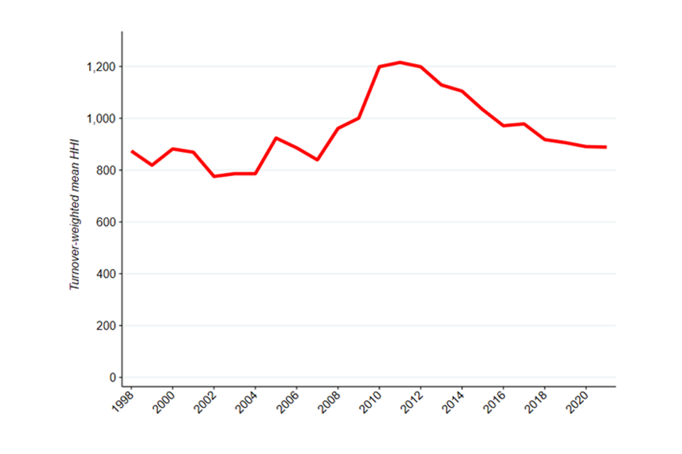
Image description: A line graph showing the turnover weighted mean HHI across the UK economy from 1998 to 2021.
Source: CMA analysis of ONS BSD data
Note: Excludes some non-market sectors such as government services – including fully government-run sectors such as central banking, and those dominated by the public sector, such as education; and the 4-digit industry Wholesale of solid; liquid and gaseous fuels and related products and industries in the Finance and Insurance sector as their runover disproportionately affects our results.
Figure 2.4: Median HHI, across whole UK economy
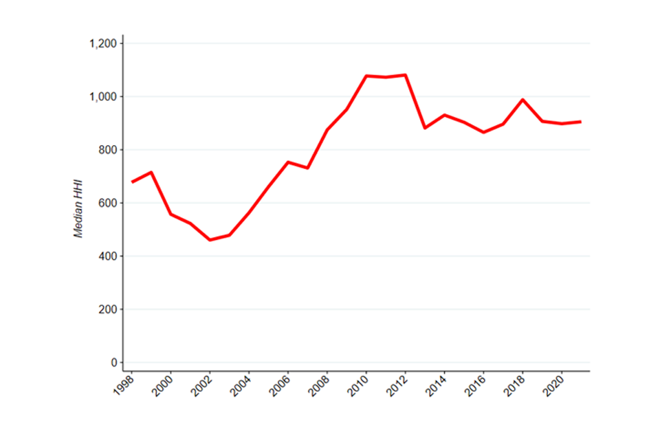
Image description: A line graph showing the median HHI across the UK economy from 1998 to 2021.
Source: CMA analysis of ONS BSD data
Note: Excludes some non-market sectors such as government services – including fully government-run sectors such as central banking, and those dominated by the public sector, such as education. Median is calculated as the median of turnover-weighted sector-level means.
The pattern is similar to the one seen in C5 and C10: concentration has materially increased after the financial crisis.
In interpreting C10 ratios and HHI (or other concentration metrics) over a 23-year period, we should bear in mind that several factors might affect their change over time.[footnote 94] However, overall, this evidence suggests that the peak in concentration that coincided with the financial crisis has taken some time to fall away and, especially in the case of median concentration, remained at levels higher than pre-financial crisis. The trends we have found are consistent with the findings of the Resolution Foundation and BEIS reports (see the findings section).
Distribution of C5
Another way to visualise changes in concentration is to look at the distribution of concentration indices over time. We start by looking at the C5.
In particular, we look at the way 4-digit SIC industries are distributed according to their concentration and how this distribution has changed in the past 11 years. This analysis may shed light on the level of competition in the economy. A competitive economy is expected to show an asymmetric distribution with most industries showing a relatively low concentration. This means that one would expect most industries to have a relatively low value of C5.
Figure 2.5 shows that this is the case for the UK. The bars represent the proportion of industries with a given level of concentration.[footnote 95] Concentration, in this case, is measured as the total market shares of the top 5 firms. We present this information for both 2010 and 2021.
Figure 2.5: Distribution of industries according to the market share of the 5 largest firms in 2010 and 2021
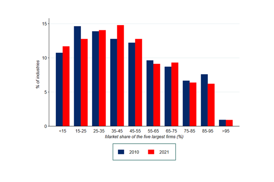
Image description: A bar graph showing the distribution of industries according to the market share of the 5 larges firms in 2010 and 2021. The y axis depicts the market share the 5 largest firms have and starts at <15%, then 15 to 25% and so on until it reaches >95%. Each section has 2 bars which represent the total percentage of industries in 2010 and 2021 for which the 5 largest firms that had that specific market share.
Source: CMA analysis of BSD data.
Note: graph based on 4-digit SIC industries. Excludes industries in some non-market sectors such as government services – including fully government-run sectors such as central banking, and those dominated by the public sector, such as education.
The distribution in Figure 2.5 presents the expected positive skewness. In 2021, more than 53% of the industries are characterised by the largest 5 firms holding 45% or less of the market. Less than 14% of industries have a C5 greater than 75%.
The distribution is broadly similar in 2010 and 2021. The most substantial changes are a reduction in the proportion of industries with a C5 of 15-25% and an increase in the proportion of industries with a C5 of 35 to 45%. Moreover, the proportion of industries with a C5 greater than 75% has not increased.
Concentration trends in the proportion of industries by HHI levels
We now turn to the distribution of the HHI. Competition authorities around the world have often used specific levels in the HHI to determine whether a market is highly concentrated. For example, the merger assessment guidelines of the US Department of Justice (DOJ) state that a market is highly concentrated if it presents n HHI above 2,500; medium concentrated between 2,500 and 1,500; and not concentrated if below 1,500.[footnote 96] The European Commission uses thresholds of 2,000 and 1,000.[footnote 97]
We use the European Commission thresholds to create Figure 2.6. This shows the proportion of UK industries, weighted by their turnover, that fall within each category since 2008.[footnote 98] Using the DOJ thresholds only changes the level, not the trend.
Figure 2.6: Proportion of turnover-weighted industries according to different HHI thresholds
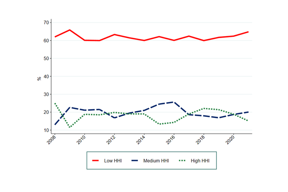
Image description: A line graph showing the proportion of turnover-weighted industries according to different HHI thresholds from 2008 to 2021. There are 3 lines – one for a low threshold, one for a medium threshold and one for a high threshold.
Source: CMA analysis of BSD data
Note: graph based on 4-digit SIC industries. Each industry has been weighted by its total turnover. Excludes some non-market sectors such as government services – including fully government-run sectors such as central banking, and those dominated by the public sector, such as education; and the 4-digit industry Wholesale of solid; liquid and gaseous fuels and related products and industries in the Finance and Insurance sector as their runover disproportionately affects our results.
More than 3 in 5 industries have an HHI level that can be considered low. This result is probably not surprising given we are measuring the HHI at the level of 4-digit SIC industries, a broader level than what the CMA or other antitrust authorities would typically define as a market. As such, the HHI thresholds set out by competition authorities’ guidelines might not be very indicative. However, it is notable that even at this broader level, about 2 in 5 industries have either a medium or high HHI level. In this context, it is important to remind that under some circumstances, high concentration can reflect high competitive pressure, with all but the most efficient firms being driven from the market (see concentration as a measure of competition section).
The proportion of industries within each category is relatively stable over time. In other words, there has not been any material change in the number of industries becoming more or less concentrated.
High-turnover sectors-level concentration trends
In this section, we focus on a subset of the economy and explore sector-level trends. We look only at what we defined as high-turnover sectors as they are the most likely to drive our economy wide measures. These are the 6 sectors in the UK economy with the highest total business turnover[footnote 99] for the period 1998 to 2021. These sectors account for an annual average of 82% of the combined turnover of firms in the BSD. In Appendix A, we provide similar results for the lower-turnover sectors.
There are individual trends apparent at a sector-level (hence when we aggregate all the individual 4-digit SIC codes in a specific sector) that differ somewhat from the whole economy picture. It should also be reiterated that ‘natural’ levels of concentration in different sectors will vary due to differing cost structures and other parameters. Therefore, we focus on trends in the concentration of particular industries over time, and differences in these trends between sectors.
Moreover, in interpreting these sector level trends, the importance of imports in many sectors should be borne in mind. The data on businesses we use to calculate concentration in this chapter is based on UK businesses alone. We address the impact of trade data on concentration measures in adjusted concentration.
C10
Figure 2.7 shows the mean C10, weighted by turnover, within each sector from 1998 to 2021.
Figure 2.7: Turnover-weighted mean C10 within each high turnover sector
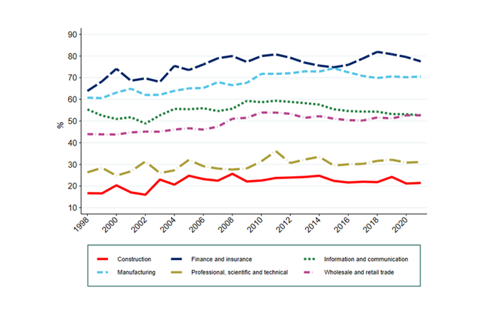
Image description: A line graph showing the turnover-weighted mean C10 within 6 high turnover sectors from 1998 to 2021. There are 6 lines for 6 different industries – Construction, Finance and insurance, Information and communication, Manufacturing, Professional and scientific activities and Wholesale and retail trade.
Source: CMA analysis of ONS BSD data
Note: Data issues mean that figures for 1997 have been dropped. C10 is calculated at 4-digit sic code level and then aggregated to sector level using a weighted average by total firm turnover. Professional and support services includes both Professional, scientific and technical activities, and Administrative and support service activities. Excludes some non-market sectors such as government services – including fully government-run sectors such as central banking, and those dominated by the public sector, such as education; and the 4-digit industry Wholesale of solid; liquid and gaseous fuels and related products and industries in the Finance and Insurance sector as their runover disproportionately affects our results.
Figure 2.7 shows that concentration has increased over the period for most of these high turnover sectors. The sectors differ in the degree to which they become more concentrated prior to the financial crisis, with concentration stabilising across most sectors following that point. It is unsurprising these trends mirror the overall picture given these sectors account for an annual average of 82% of the combined turnover of firms in the BSD. Finance and insurance[footnote 100] stands out as a sector where concentration increased the most in the run-up to the financial crisis from less than 64% in 1998 to more than 80% in 2011, as does Manufacturing whose C10 increased from approximately 61% in 1998 to 74% in 2015.
In Appendix A, we provide similar results for the lower-turnover sectors. Some of these sectors exhibit similar patterns to that described above as they show a relative peak around 2010 (for example Mining and quarrying, and Utilities).[footnote 101] In contrast, in some sectors concentration increases significantly throughout the period (Transport and storage, Other services,[footnote 102] and Agriculture, forestry and fishing) while others become less concentrated over the period (Accommodation and food services, and Real estate activities).
HHI
Figure 2.8 shows the mean HHI, weighted by turnover, within each of high-turnover sectors. Again, we focus on the long-term trends rather than the short-term fluctuations.
Figure 2.8: Turnover-weighted mean HHI within each high turnover sector
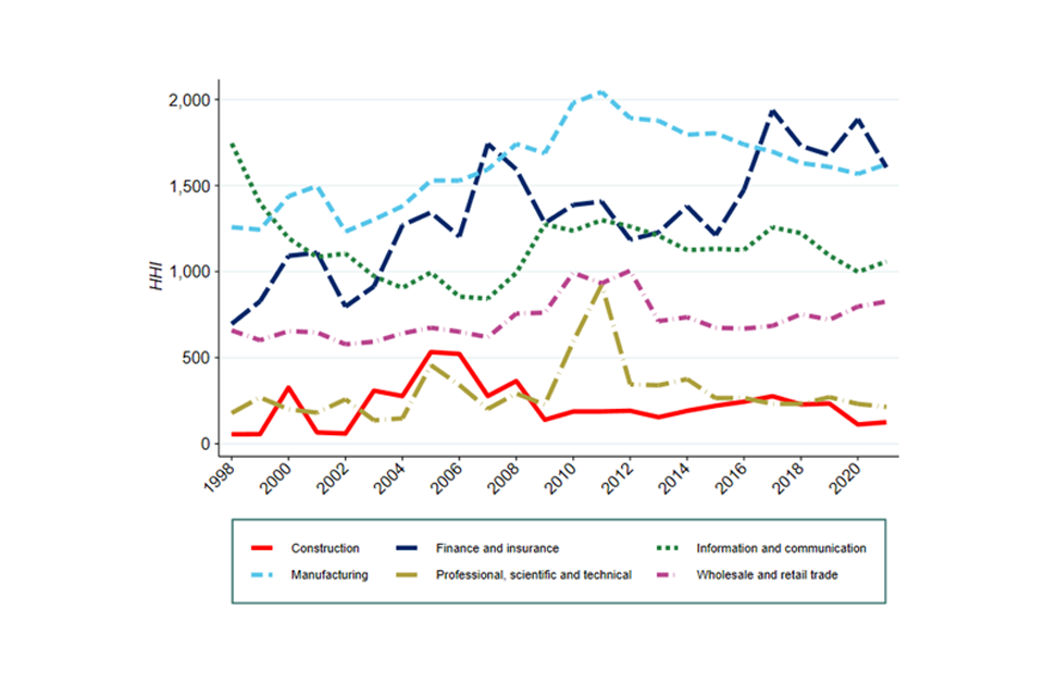
Image description: A line graph showing the turnover-weighted mean HHI within 6 high turnover sectors from 1998 to 2021. There are 6 lines for 6 different industries – Construction, Finance and insurance, Information and communication, Manufacturing, Professional and scientific activities and Wholesale and retail trade.
Source: CMA analysis of ONS BSD data
Note: Data issues mean that figures for 1997 have been dropped. C10 is calculated at 4-digit sic code level and then aggregated to sector level using a weighted average by total firm turnover. Professional and support services includes both Professional, scientific and technical activities, and Administrative and support service activities. Excludes some non-market sectors such as government services – including fully government-run sectors such as central banking, and those dominated by the public sector, such as education; and the 4-digit industry Wholesale of solid; liquid and gaseous fuels and related products and industries in the Finance and Insurance sector as their runover disproportionately affects our results.
Figure 2.8 shows consistent results with the C10 for some sectors, but not for all. Similar to Figure 2.7, most sectors display a relative peak in the early 2010s, after the financial crisis (for example, Manufacturing, Wholesale and retail trade, and Professional, scientific and technical activities). However, the HHI shows a different pattern for Finance and insurance whose concentration more than doubled since 1998.
In Appendix A, we provide similar results for the lower-turnover sectors. Transport and storage display a declining HHI, whereas Other services increase significantly over the considered period. Accommodation and food services, Real estate activities, and Agriculture, forestry and fishing have low and relatively stable levels of HHI.
Concentration and distributional impacts
Introduction
The analysis in this Chapter draws exclusively from the forthcoming paper by Davies and Mariuzzo[footnote 103] on inequality and concentration. We are extremely grateful to them for their generosity in allowing us to refer to this work ahead of publication and for all their help in producing this chapter.
This chapter seeks to establish an empirical understanding of the relationship between market concentration and income inequality and has been stimulated by the growing concern that the harmful effects of market power may fall disproportionately on the less well off.
Selected literature review
Though there are several studies on the effects of competition on inequality[footnote 104], the analysis presented in this Chapter has predominantly been inspired by 3 academic papers:
-
Baker and Salop (2015) note that given the marginal propensity to consume is less than unity, the lower-income who allocate proportionately more of their income to consumption than higher-income households, should benefit more from lower prices. In contrast, the rich may lose more from any reduction in share prices as a result of lower monopoly profits. In this light, inequality has been framed in terms of consumer surplus and how this is distributed among consumers (by income)
-
Comanor and Smiley (1975) demonstrate that the share of the wealthiest in Gross National Product would decline in the absence of monopoly to the benefit of all those below the median. This effect was driven by the fact that up to 50% of wealth holdings by the richest 2.4% was entirely due to monopolised capital gains. However, the paper also noted that poorer households consume relatively more of their income
-
Creedy and Dixon (1998) use Australian data to measure the effects of monopoly power on different household income levels for 14 commodity groups. This analysis differs to the others in that it uses estimates of price elasticities to estimate the exposure of households to these industries.
Two questions are posed by this literature. Do the poor lose out because:
-
across markets, their consumption is disproportionately high in markets where firms have more market power?
-
within markets, they are likely to pay higher prices and face price discrimination?
This analysis looks to test the first. It does so by looking at concentration as a proxy (although not synonym) for market power.
Analysis
Methodology
We assess the spending pattern of households in order to better understand their exposure to different industries. This will provide an insight into the extent their exposure varies by income.
The UK’s annual Living Costs and Food Survey (LCF) (formerly known as the Household Expenditure Survey) shows household expenditures across various product categories. The survey offers the mean expenditure across 136 sectors (defined at 3-digit SIC level) split by household income decile. In the most recent version (year ending 2018), the sample size is over 27,000[footnote 105]. The ONS is confident that this provides a representative population sample, except for 11 smaller products (such as Alcopops) for which reliable estimates are not recoverable for all deciles.
The data on concentration, in the form of the HHI, is taken from the Department for Business, Energy and Industrial Strategy (BEIS), which provides annual estimates for 609 disaggregated industries covering the period 2006 to 2018[footnote 106].
As both the LCF and HHI data use different nomenclature, we match the data from the LCF to that from BEIS. Given the aggregation levels are different, this matching process is not perfect.[footnote 107] Analysis has been presented for 110 expenditure categories.
Key are the assumptions regarding the extent to which expenditure should be linked to the industries producing the product (“manufacturers”) or the industries selling the final product (“retailers”).[footnote 108]
Given a focus exclusively on manufacturers fails to account for the extent of imports and exports, our approach predominantly focuses on retailers (information on manufacturer concentration has also been presented where relevant). Our conclusions remain the same with either approach.
Within retailers, further thought must be given to the type of businesses selling goods and the relative weight of large grocery supermarket chains compared to specialist retailers (for example, artisan bakers). With no available evidence on the exact nature of this split, the analysis assumes both a 50:50 and an 80:20 split (supermarket/specialist), though both assumptions yield the same conclusions.
Table 2.1: Frequency distribution of HHI for matched sample
| HHI Range | Number of manufacturing and services | Number of retailing and services | Number of retailing and services (80:20 weighting) |
|---|---|---|---|
| ≥5000 | 3 | 2 | 2 |
| 2500 to 4999 | 6 | 5 | 2 |
| 2000 to 2499 | 15 | 5 | 1 |
| 1000 to 1999 | 30 | 19 | 54 |
| 500 to 999 | 19 | 56 | 20 |
| 0 to 499 | 27 | 19 | 27 |
| N observed HHI | 100 | 106 | 106 |
| N missing HHI | 10 | 4 | 4 |
| N observations | 110 | 110 | 110 |
Source: Davies and Mariuzzo (2022).
As can be seen in the table above, concentration varies across manufacturers and retailers. 22% of manufacturing markets are ‘very concentrated’ (defined as having an HHI over 2000). This is equivalent to having 5 equally sized firms in the market. A further 27% are ‘moderately concentrated’ (defined as having an HHI over 1000).
By contrast retailing markets are relatively less concentrated, with 11% defined as very concentrated and 17% as ‘moderately concentrated’. However, when the split between specialist and large grocery supermarkets is considered,[footnote 109] using an assumption that the majority of consumers shop in supermarkets, would suggest that over 54% of retail markets have an HHI greater than 1000 or are moderately concentrated.
A closer look at spending patterns by income deciles begins to reveal how these levels of concentration are expected to affect different households.
Figure 2.9: Expenditure on products and services by households
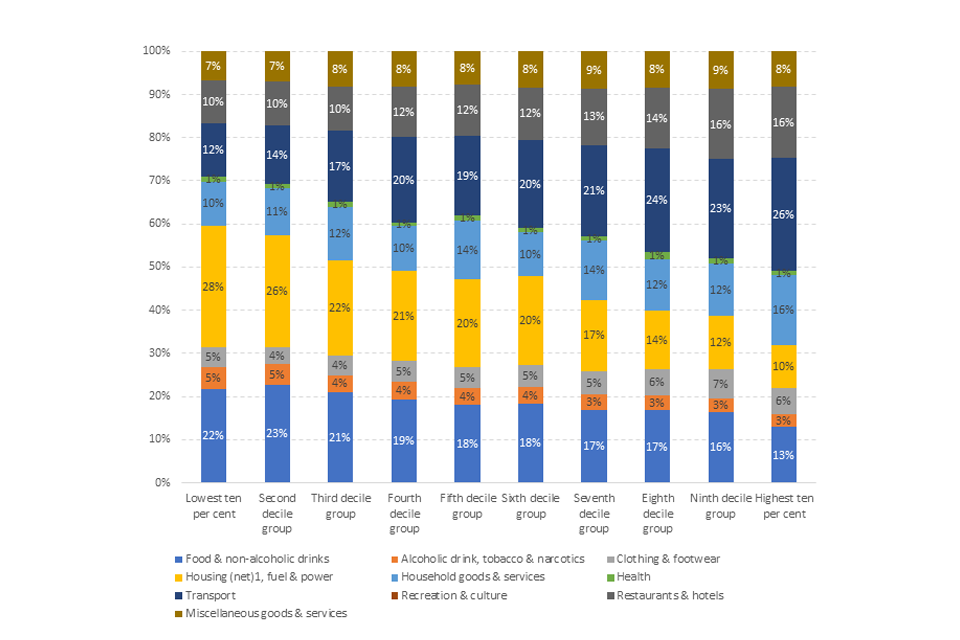
Image description: A 100% stacked bar graph that shows the expenditure on products and services by households in the 10 different decile groups. Each bar is comprised of 10 segments, such as Transport, and each segment shows the percentage of total expenditure it is responsible for in that decile group.
Source: ONS Living costs and food survey (2018).
As demonstrated in Figure 2.9, the proportion of expenditure on food, housing, fuel and power declines as household income increases. Conversely, there is a positive relationship between the rise in income and expenditure on hotels and restaurants.
For each household decile, we computed an HHI for each of the 110 product or service categories and averaged them using the share of income (wdj) as weight. The result is as per the following formula:
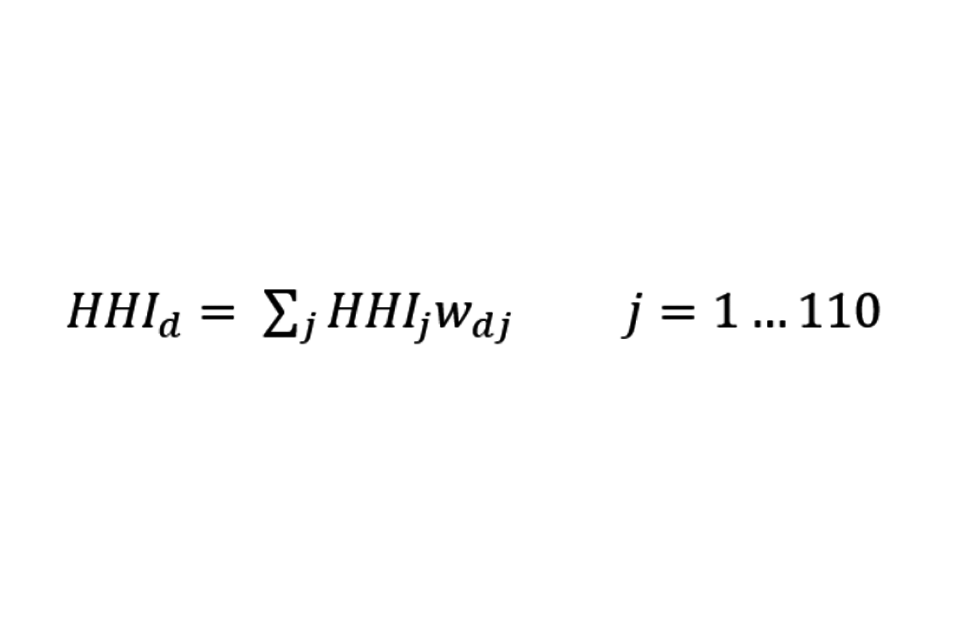
Formula description: HHI d is equal to the sum across j of HHI j times w d j, for j that goes from 1 to 110.
Note that the weighting can be based on either a household’s expenditure (the sum of which will add to unity) or as a proportion of a household’s income (the sum of which will be less than unity as savings are not part of the product or services categories). This is a non-trivial difference as savings are expected to be a larger proportion of a higher-income household’s income. In practice, this highlights that the effects of concentrated markets on poorer households is likely to be greater as they will have a bigger proportion of their income spent on consumption as opposed to savings.
Findings
As shown in Figure 2.10, in all 3 indices, there is a decline across the deciles. As can be seen in Figure 2.10, there is clearly an inverse relationship between weighted HHI and a household’s income, with lower-income households having on average a higher weighted HHI relative to higher-income households.
The magnitude of the declines is substantial. For example, the poorest households on average face markets that are approximately 30% more concentrated than markets faced by the richest households.
The rate of decrease is greatest for retailers when supermarkets are weighted more. Under this index the richest 10% of the population have an average HHI that is only 70% of the poorest 10%.
The levels of concentration are greater for manufacturing than for retailing. The manufacturer index notes that the poorest 10% of the population buy products and services in markets with an average HHI of 1088 (equivalent to a market with around 10 equally sized firms) or ‘moderately concentrated’. By contrast, the richest 10% of the population face an average HHI of 832 (equivalent to a market with 12 equally sized firms) and below a typical threshold for a defining a market as concentrated.
Figure 2.10: Expenditure on products and services by households
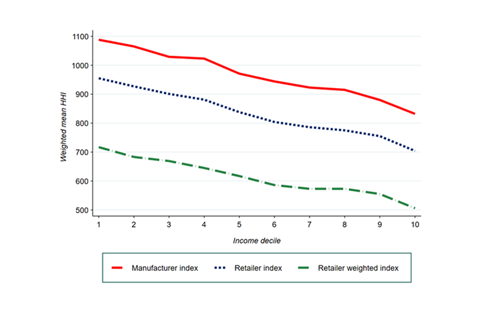
Image description: A line graph showing the expenditure on products and services by households. The graph depicts income decile with weighted mean HHI for 3 measures – Manufacturer index, Retailer index and Retailer weighted index.
Source: Davies and Mariuzzo (2022).
Income elasticity and concentration
In addition to establishing a weighted HHI for households across the income spectrum, Davies and Mariuzzo estimate the income elasticity for each of the 110 product categories. The methodology for this is detailed in their paper[footnote 110].
As can be seen in Table 2.2, 22% of the examined products and services are estimated to be ‘inferior’, i.e. their demand or the proportion of income spent on them falls as households’ income rises. This is evidenced by a negative income elasticity of demand.
Approximately 30% of goods were estimated to be luxury goods, characterised by an income elasticity greater than 1. For these products and services, demand or the proportion of income spent rises at a greater rate than any corresponding increase in income.
Table 2.2: Frequency distribution of income elasticities for the matched sample
| Income elasticity of demand range | Description | No. of categories | Proportion of products |
|---|---|---|---|
| η1 < 0 | Inferior goods | 24 | 22% |
| 0 < η1 < 1 | Normal goods | 53 | 48% |
| η1 ≥ 1 | Luxury goods | 33 | 30% |
| Total Observations | 110 |
Source: Davies and Mariuzzo (2022).
When these income elasticities are plotted on a graph against the HHI of the supplying industry a clear pattern emerges.[footnote 111] When sellers are defined as manufacturers, there is an inverse relationship between income elasticity and the concentration of sellers for inferior and normal goods. Goods which are proportionately more important in the budgets of poorer households tend to be more concentrated. This would suggest that poorer households are likely to be at greater risk of the effects of concentrated markets, as they are more reliant on goods and services that are characterised by such an industry structure.
However, as the income elasticity for goods and services crosses the threshold from normal to luxury goods and services, if anything the trend reverses, with luxuries characterised by slightly greater levels of concentration amongst sellers.
Figure 2.11: Weighted HHI by income elasticity - Retailing
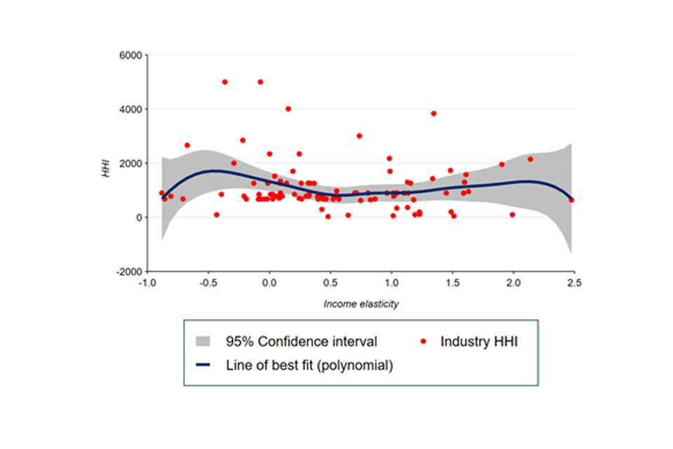
Image descriptions: A scatter graph showing the weighted HHI by income elasticity, from -1 to 2.5, for the retailing sector. There is a line of best fit on the graph alongside a 95% confidence interval.
Source: Davies and Mariuzzo (2022).
Note: Confidence intervals are purely descriptive. HHI cannot be negative.
Figure 2.12: Weighted HHI by income elasticity - Manufacturing
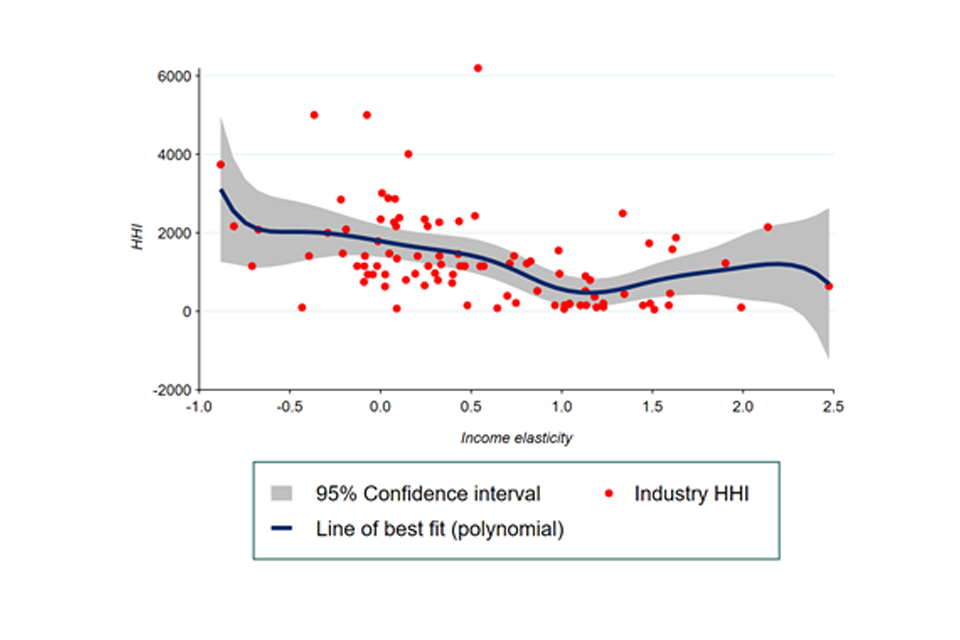
Image description: A scatter graph showing the weighted HHI by income elasticity, from -1 to 2.5, for the manufacturing sector. There is a line of best fit on the graph alongside a 95% confidence interval.
Source: Davies and Mariuzzo (2022).
Note: Confidence intervals are purely descriptive. HHI cannot be negative.
The relationship is similar but less pronounced when sellers are defined as retailers.
Conclusions
This analysis sought to improve our understand of the relationship between market concentration and the relative income of households.
Our work illustrates evidence that poorer households spend a greater proportion of their income on essential goods or services. It also demonstrated that there is a negative correlation between consumption of essential or income-inelastic goods and services, and market concentration. This analysis would therefore suggest that it is lower-income households that are more vulnerable to the effects of concentration. This is likely to be driven by the fact consumption occupies a greater proportion of their incomes and that the goods and services they consume are from industries that are relatively more concentrated than the goods and services consumed by better off households.
At this stage the analysis does not put forward any reason for why industries supplying essentials are likely to be more concentrated. It does, however, present evidence for why the CMA should continue to consider particularly vulnerable consumers and the extent to which they are harmed by competition concerns.
Adjusted concentration[footnote 112]
Summary
-
common ownership arises when one shareholder owns shares (or has control) in multiple companies. When this is the case, these companies might compete less with one another to ensure they all maintain high profits. In this sense, the companies are not independent. However, the concentration analysis in concentration, industry structure, and distributional impacts assumes that they are
-
we construct a novel dataset on substantial common ownership among UK companies and find that roughly 160,000 businesses in the UK are linked to at least one other business through their common controllers. Amounting to less than 4% of all businesses, this is most likely a substantial underestimate: our dataset only contains information on large ownership stakes, meaning we do not capture institutional investors who are more likely to have smaller holdings in many companies. Despite this, we find accounting for common ownership can lead to substantial increases in concentration. However, the magnitude of these increases depends heavily on how common ownership is defined
-
given the experimental nature of our analysis, we therefore view our results as providing evidence on the extent of common ownership in the UK; and as adding to the evidence that not accounting for common ownership means materially understating concentration
-
new analysis incorporating international trade on concentration demonstrates that there is evidence that the UK manufacturing sector is becoming more exposed to foreign firms with a growing share of imports within these industries
-
omitting international trade from concentration metrics can lead to an over-estimate of concentration in the UK at a 4-digit SIC level. In that respect increased trade exposure has a deconcentrating effect on average
-
however, in some industries imports can have a concentrating effect and under-estimate levels of concentration in UK 4-digit SIC sectors if there are large foreign firms present
Adjusting concentration for common ownership
Introduction
In this chapter we consider measures concentration that are in some way ‘adjusted’ for factors that traditional metrics do not account for.
-
the first of these factors is common ownership – the setting in which shareholders have ownership or control stakes in multiple companies within the same industry. We review the existing studies in this area and describe the analysis we performed to capture common ownership in our concentration measures
-
the second factor is international trade, as the existence of any imports or exports in a market clearly implies: a) that not everything produced within a given country is sold within that country, and b) that some of the sales within that country are a result of production by foreign entities
Further details on the methodology and findings in this chapter are provided in Appendix B.
Common ownership, competition, and concentration
Common ownership is usually defined as the ‘simultaneous ownership of shares in many firms active in the same market.’[footnote 113] Traditional economic thinking assumes that firms will act independently and compete with each other in order to maximise their own profits. Common ownership, however, challenges this assumption.
Some studies propose instead that firms maximise the profits of their shareholders’ portfolio.[footnote 114] In the presence of common owners, this means firms account for the implications of their actions on their rivals’ profits. Therefore, under this scenario competition is dampened. Consider a simple example:
-
suppose there are 2 firms, A and B, in the market. Traditional economic theory assumes each firm will maximise their own profits
-
however, suppose now, an investor has equal shares in both A and B. The common ownership hypothesis postulates that, when making business decisions, the management of firm A will not seek to maximise the profit of firm A only, but it will account for firm B’s profits too. That is, the management places some weight on the consequences of its actions on the profits of other firms
-
suppose further the 2 firms are direct competitors, and that the management of firm A is contemplating a price reduction that would be profitable for firm A. If this price reduction causes a loss for firm B, for example because some customers would switch to firm A in response to the price change, firm A might abandon the price reduction if joint profits of the 2 firms would now be lower
One of the implications of common ownership is that traditional measures underestimate concentration, and therefore overstate the competitiveness of an industry. It is thus necessary to consider different metrics which account for this potential interdependence of firm behaviour.
In the concentration, industry structure, and distributional impacts section, we have described how different measures can be used to calculate concentration in an industry. One of them is the Herfindahl-Hirschman Index (HHI).[footnote 115] When addressing common ownership, the most common tool used in the academic literature is the so-called Modified Herfindahl-Hirschman Index (MHHI).[footnote 116]
The MHHI is a modification to the HHI which is derived under the assumption that firms maximise the weighted average of shareholders portfolio profits. The MHHI allows the calculation of an industry concentration as the sum of 2 parts: a ‘standard’ HHI and another component which captures the additional concentration arising due to common ownership. We provide a formal definition and critique of MHHI in Appendix B.
It should be noted that the practical estimation of the MHHI will always depend on the richness and structure of the data at hand. From common ownership, competition, and concentration section, we describe our approach to deriving a modification to the HHI on the basis of the dataset available to us.
In the remainder of this section, we summarise some of the main studies on the impact of common ownership on competition.[footnote 117]
Existing studies
The Joint Centre of Research conducted an extensive review of common ownership in the EU.[footnote 118] It studied common ownership levels and trends for the period between 2007 and 2016 using data from Orbis. Findings from this report included:
-
the number of listed firms which were cross held by shareholders with at least 5% ownership in more than one firm formed around 67% of the companies in the sample in 2016[footnote 119]
-
the top shareholders held shares in as many as 25% of firms, and there was a trend for these firms to be the largest firms in an industry. This preference of the top shareholders for the largest companies increased over time and, as a result, firms included in the largest portfolios represented over 90% of market capitalisation in all years between 2010 and 2016[footnote 120]
-
JRC looked at the impact of the Blackrock-BGI merger on the market power (proxied by the Lerner index) of firms in the EU beverage sector. The premise of this analysis was that the merger represented an exogenous increase in common ownership. Results showed a positive relationship between common ownership and market power of firms, suggesting that common ownership might be anticompetitive[footnote 121]
The JRC report shows that common ownership has become more prevalent in recent years. However, common ownership has been studied since the early 1980s. The focus of these early studies was on how common ownership might be able to facilitate explicit or implicit coordination among competitors. Over time, the literature has moved toward the potential anticompetitive effects of common ownership on firms’ unilateral incentives.
Several studies provide theoretical models and examples that show that common ownership leads to anti-competitive incentives and outcomes. Studies in this area have usually built on standard economic models to account for (direct and / or indirect) common ownership links.
More recent empirical work has provided some evidence to support the proposition that common ownership can be anticompetitive. However, these results have been contested and a clear consensus has yet to arise in the empirical literature.
For example:
-
the work by Azar, Schmalz and Tecu (2018) provides evidence that common ownership causes higher prices in the US airline industry.[footnote 122] The paper studies the relationship between the MHHI and price using pricing data from the Department of Transportation and ownership data from Thomson-Reuters dataset[footnote 123]
-
both Azar et al (2016) and Gramlich and Grundl (2017) studied the impact of common ownership in the US banking industry.[footnote 124] Using slightly different methodologies for how to account for common ownership,[footnote 125] the 2 studies found inconsistent results: the former concluded that common ownership has an anti-competitive influence on the price of banking products; the latter found no evidence of this effect
As part of the OECD roundtable in 2017, the CMA submitted a study of common ownership in retail banking. It found that the same few investors occupy the top shareholding positions across the industry over a 5-year period from 2012 to 2017. The report also found a degree of common ownership in the insurance market. It was recognised that the extent of common ownership in retail banking and insurance markets in the UK appeared to be lower than in the US.[footnote 126]
CMA analysis
This section summarises our own research on common ownership in the UK economy and how it might affect measures of concentration. Using data that is close to exhaustive in its coverage of the UK economy, we were able to analyse the extent to which businesses are connected by common ownership or control (more detail on our data and the ownership/control it measures follows). We were also able to calculate simple adjustments to concentration metrics used in the [Concentration, industry structure, and distributional impacts] – the C10 and HHI – that seek to illustrate the potential impact of these connections.
Much of the research on common ownership has focused on a subset of large, listed firms. We have sought to build a novel dataset on substantial common ownership across all companies registered in the UK by linking administrative data from Companies House and the Inter-Departmental Business Register (IDBR), a register of the turnover and employment of all PAYE or VAT registered businesses in the UK.[footnote 127] This new dataset was built as part of a wider HMT funded project. We then used it to carry out some initial analysis of the information it contained on common ownership.
A major advantage of this data is that it allows us to analyse almost the entire population of businesses active in the UK. However, an important limitation is that it only records broad information on ‘large’ ownership and control stakes (more on this below). For example, our data is unlikely to capture the effect of institutional investors with smaller stakes in multiple businesses – the type of common ownership that is the focus of many of the studies discussed in the existing studies) section. As a result, it will understate the extent of common ownership in the UK economy.
Therefore, the research in this chapter should be interpreted as an exploratory analysis of common ownership among businesses with very concentrated ownership and control structures, rather than common ownership in general. As such, it provides an additional perspective on the debate regarding how common ownership might affect concentration.
Here we describe our data sources, the methodology we used to adjust measures of concentration based on the information they contain and our results. We also discuss the limitations of our analysis and how they affect the interpretation of those results. Appendix B provides comprehensive detail on all of these aspects of our research.
Data
To evaluate the extent of common ownership in the UK economy and how it might affect concentration metrics, we combined 2 datasets:
-
the Inter-Departmental Business Register (IDBR)
-
companies House (CH) data on all companies registered in the UK and the entities (individuals or companies) that own or control them
The IDBR is the same administrative record used to construct the Business Structures Database (BSD), the data used for our main concentration analysis in concentration, industry structure, and distributional impacts. It serves as the basis for many UK studies of concentration and contains information on, among other things, the turnover, employment, and industry of all businesses in the UK that are PAYE or VAT registered.[footnote 128] [footnote 129] However, it does not contain details on the shareholders or controllers of the businesses it covers.[footnote 130] We obtained the IDBR database with information on the roughly 2.6 million businesses active in September 2021.
CH maintains information on, among other things, the ownership and accounts of all UK companies. Each registered company is also required to submit to CH the details of their Persons with Significant Control (PSC), which are defined as:
persons, both legal and natural who, directly or indirectly: (a) own more than 25% of the shares in a company: (b) control more than 25% of the voting rights in a company; (c) hold the right to appoint or remove the majority of the board of directors of the company; or (d) otherwise have the right to exercise, or actually exercise, significant influence or control.
We obtained a version of this data that was current on December 9th, 2021. It contained information on all the roughly 5 million active companies registered at CH and their approximately 6.1 million records of PSC: roughly 390,000 companies have multiple PSC records.
The IDBR and CH differ in size because, although they overlap significantly, they cover different types of businesses. The IDBR includes all business that are VAT or PAYE registered, whereas CH covers all limited companies or limited liability partnerships irrespective of their tax status.[footnote 131]
Because it includes data on businesses’ turnover and industry, the IDBR is our ‘main’ source of information. As a result, when we link it to the CH data, we create a dataset containing information on all PAYE and VAT registered UK companies, that also includes details of PSC for the limited companies of liability partnerships.[footnote 132] Appendix B provides more detail on the 2 data sources and how differences in their coverage affects our analysis.
Identifying common ownership and common ownership groups
For each company registered with CH, the PSC data contains one record for each of their PSC. However, PSCs are not associated with unique identifiers which means they cannot be easily identified as having control across different registered companies. For example, there is no direct way to know whether a Jane Doe recorded as a PSC for company A is the same Jane Doe who is recorded as a PSC for company B.
To overcome this issue, we undertook a record linkage exercise. We used information including names, addresses, and dates of birth to estimate the probability that 2 PSC records refer to the same individual or company. When the probability was sufficiently high, we considered 2 records as relating to the same PSCs, giving them a unique identifier.[footnote 133]
As suggested in the data section, we then combined this data with the IDBR, creating a novel dataset with information on both the PSC of businesses (from CH), and their turnover, employment, and industry (from IDBR).[footnote 134] This matching allowed us to see which IDBR businesses had large owners in common.
Using our new PSC identifiers, we then identified groups of businesses linked through chains of ownership or control, what we refer to as ‘common ownership groups’.[footnote 135] In this analysis, businesses are deemed as belonging to the same common ownership group if they were part of a business chain involving any significant control, as defined by CH in the data.
Figure 3.1 provides an example of sorting 8 hypothetical businesses into 2 common ownership groups. Ownership group A (left-hand-side) is made up of 5 businesses associated with 2 main PSC, Frank Smith and Anne White. Our methodology accounts for indirect links between businesses like White PLC and Smith Retail PLC by searching for connections that go beyond direct common ownership.
In our methodology, we treat the 5 businesses in ownership group A as if they were a single business. Likewise, we would combine the 3 businesses in ownership group B as one entity. Although not shown in, if a business is part of no common ownership group, then we treat it as its own business.[footnote 136] We can then use these newly defined businesses as the basis for calculating adjusted measures of concentration.[footnote 137]
It is important to note that our definition of common ownership groups is sensitive to the 25% threshold we use for shareholding, voting rights, or rights to share assets (identifying common ownership and common ownership groups). The CH data only contains information on these controls at over 25%, and in 3 bands: 25 to 50%, 50 to 75%, and 75 to 100%.
We first used 25% as the threshold for defining common ownership groups to account for the smallest degree of control available in our data. Increasing this threshold would decrease the number or size of common ownership groups we find – we show results in this case in the results section of this Chapter. At the same time, the common ownership groups will not capture any owners with shareholdings, voting rights, or rights to share assets below the 25% threshold.
Figure 3.1: Illustrative example of how we identified persons of significant control and common ownership groups
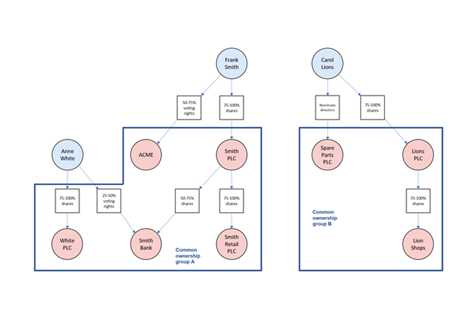
Image description: A graphic showing an example of how our methodology groups together businesses into common ownership groups. There are circles representing business and individual PSC. Circles are connected by arrows that show hypothetical links between them. There are also small squares that show the control that links them, for example ’50 to 75% shares’. In the graphic, circles representing businesses are allocated to 2 ownership groups based on how our methodology would treat their connections. These groups are represented by a thick solid line.
Source: CMA.
Adjusting concentration based on common ownership groups
In the concentration, industry structure, and distributional impacts section, we presented concentration measures and explained how they can be used to proxy competition. In the introduction and the common ownership, competition, and concentration section sections, discussed in detail the shortcomings of these traditional proxies of competition in the presence of common ownership. Here, we calculate modified measures of concentration to account for the type of common ownership captured in our data.
To do this, we first calculated industry-level concentration measures (C10 and HHI) in a standard way, using businesses as identified in the IDBR to calculate market shares. This is the same way we calculate these measures in the concentration, industry structure, and distributional impacts section.[footnote 138]
Second, we recalculated market shares using common ownership groups identified as in identifying common ownership and common ownership groups, meaning combining the turnover of all businesses in an ownership group into a single business if they operated in the same industry. This is a simplification that has implications for our results. We discuss these in the next subsection.
Nevertheless, grouping businesses in this way allowed us to construct C10s and HHIs that are adjusted for the fact that multiple businesses might be part of the same common ownership group. Finally, we compare the 2 measures to assess the scale of the adjustment.
Concentration calculated on the basis of common ownership groups will always be equal or higher than that based on single businesses. This is because, according to our definition in identifying common ownership and common ownership groups, there will always be at least as many common ownership groups as businesses.
If some of the companies grouped are among the largest in the industry, then the adjusted C10 will be higher than its unadjusted counterpart. The HHI will increase regardless of where in the distribution the grouping takes place because it accounts for all market shares in the industry. However, it will increase most when larger businesses in are grouped into common ownership groups.
In concentration, industry structure, and distributional impacts we described how concentration can be connected to the intensity of competition. Moreover, the studies summarised in existing studies suggest that common ownership might reduce competition. Here, we aim to connect these facts by analysing how the adjustment we have described affects the C10 and HHI. Large changes in either would suggest that there are links between companies that might have competition-reducing effects.
Some important features of our data and methodology
The dataset we have created is novel and contributes to the evidence base for research on common ownership in several ways:
-
Our data contains ownership and control information for companies that are not publicly listed. These are companies that are not often analysed in studies of common ownership.[footnote 139]
-
As far as we are aware, it is also the first dataset that links the IDBR – an administrative record of businesses in the UK often used for research on concentration – to CH records of common ownership and control.
-
Because of the detail in the CH data, we are able to capture a range of controls beyond mere ownership; for example, we have data on the right to share assets, the ability to appoint and remove directors, people, or board members, and significant voting shares.
However, there are several features of our data that affect how we can interpret the results of our analysis of common ownership:
-
Data from CH only contains information on ownership and voting rights above 25%. This is its main limitation and means it will not contain records on common ownership patterns associated with smaller stakes. In particular, the holdings of institutional investors (which are usually below 5%[footnote 140]) are likely not recorded.
-
As discussed in identifying common ownership and common ownership groups, the data on the extent of ownership and voting rights is also only available in 3 bands: 25 to 50%, 50 to 75%, and 75 to 100%. This makes it difficult to account for the extent (as opposed to just the presence) of ownership in businesses when adjusting concentration metrics.
-
Finally, there is a degree of uncertainty around the way we identify common PSC across companies. As explained in identifying common ownership and common ownership groups, we link PSC records on the basis of information such as name, address, and date of birth. While we have strived to minimise mismatches, the process will yield inaccurate results in a small proportion of cases.
Finally, and due to the exploratory nature of our analysis, there are 2 important simplifications we make in our use of this data that also affect the interpretation of our results:
-
First, we simplify the notion of common ownership by grouping all companies, regardless their (vertical or horizontal) relationship, that are part of a common ownership group into a single entity. This is equivalent to assuming that a PSC holding significant control in 2 companies makes them entirely the same business. We make this simplification in order to use all the information we have in our data on significant control. Alternative methods can be used to calculate modified concentration metrics, however we leave this for potential future work using this data.[footnote 141]
-
Second, we define common ownership groups based on the minimum level of control measured in our data. As a result, we identify the minimum possible number of ownership groups. When we present our results below, we also provide a discussion of how they are affected by this simplification affects.
Together, these assumptions mean we will calculate the largest possible adjustments to the C10 and HHI given the information we have in our data. Given these limitations, we do not draw any conclusions regarding how common ownership might affect competition. This would require a more nuanced approach. Appendix B provides more detail on the PSC register, IDBR, and how their structure and coverage affect our analysis, as well as the methodology we used for identifying PSC and common ownership groups.
Results
Common ownership groups across the UK economy
Overall, our final data contained records on roughly 2.65 million businesses and 2.55 million common ownership groups we estimate they belong to.[footnote 142]
Figure 3.2 below shows that across all SIC sectors there are fewer common ownership groups than businesses, and that no sector has a disproportionate number of ownership groups relative to its overall size.
Figure 3.2: Number of businesses and common ownership groups across UK SIC sectors
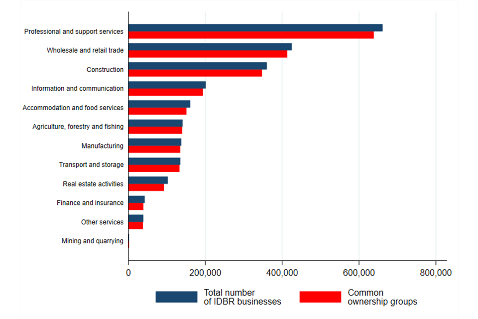
Image description: A bar chart showing the difference in the number of business entities in across UK SIC sectors when we consider common ownership groups. There are 2 bars for each industry representing the number of businesses and number of common ownership groups. The difference in the height of the 2 bars represents the difference in the number of business entities.
Source: CMA analysis of CH and IDBR data.
Note: Professional and support services includes both Professional, scientific and technical activities, and Administrative and support service activities. Excludes some non-market sectors such as government services – including fully government-run sectors such as central banking, and those dominated by the public sector, such as education; and the 4-digit industry Wholesale of solid; liquid and gaseous fuels and related products and industries in the Finance and Insurance sector as their turnover disproportionately affects our results.
To assess how prevalent common ownership is in our data, we counted the number of businesses that are part of a common ownership group with at least one other business (this is different to the change in the number of businesses shown in Figure 3.2). Out of roughly 2.6 million businesses in the IDBR, around 160,000 businesses are connected in this way.[footnote 143] This means that approximately 6% of businesses in our data have connections through common ownership that would not be captured in the IDBR.
To show how the prevalence of common ownership differs across industries, Figure 3.3 shows the proportion businesses in each SIC sector that are part of a common ownership group with at least one other business. The higher this proportion, the more frequent is common ownership in the sense defined here.
Mining, quarrying and utilities has by far the largest prevalence of common ownership by this measure, and Agriculture, forestry, and fishing has by far the lowest. This is also by far the smallest industry in terms of number of businesses (Figure 3.2).[footnote 144] For all other sectors, the proportion of businesses in common ownership groups with other businesses ranges from 6 to 14%. Figures B.6 and B.7 in Appendix B also show that this measure of the prevalence of common ownership is not related to industry size in the underlying 4-digit SIC industries. This is despite the high prevalence in Mining, quarrying and utilities at the sector level.
Figure 3.3: Proportion of businesses in a common ownership group with at least one other business across UK SIC sectors
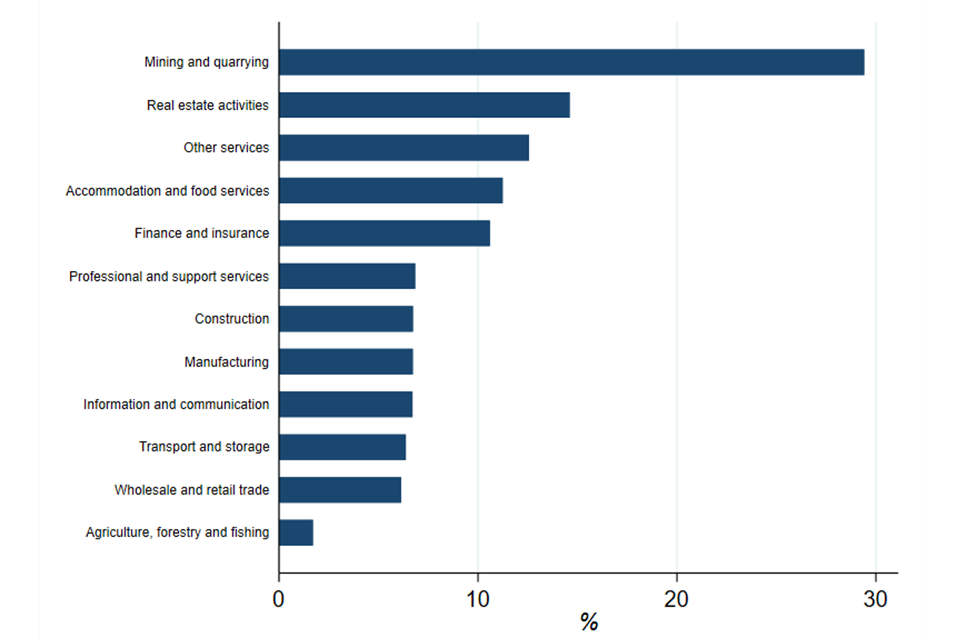
Image description: A bar chart showing how common it is for businesses to be part of a common ownership groups across UK SIC sectors. There is one bar for each UK SIC sector, its height representing the percent of businesses in the sector that are part of a common ownership group with at least one other business.
Source: CMA analysis of CH and IDBR data.
Note: proportions are calculated for 4-digit SIC industries, and then averaged at sector level using industries’ share of sector turnover as weights. Professional and support services includes both Professional, scientific and technical activities, and Administrative and support service activities. Excludes some non-market sectors such as government services – including fully government-run sectors such as central banking, and those dominated by the public sector, such as education; and the 4-digit industry Wholesale of solid; liquid and gaseous fuels and related products and industries in the Finance and Insurance sector as their turnover disproportionately affects our results
Adjusted concentration that incorporates common ownership groups
Figure 3.4 and Figure 3.5 below show how the adjusted C10 and HHI change relative to their standard counterparts when we combined IDBR businesses into common ownership groups as described in adjusting concentration based on common ownership groups. Both were calculated as weighted (by turnover) averages of the C10s and HHIs in the underlying 4-digit SIC industries within each sector. Sectors are ordered by their standard measure in both graphs. For the reasons discussed in adjusting concentration based on common ownership groups, both the C10 and HHI change positively across all sectors in Figure 3.4 and Figure 3.5.
Focusing first on the C10, the largest absolute adjustment occurs in the Construction and Real Estate sectors, both of which have among the lowest standard C10s. However, we observe a material increase in concentration for Finance and insurance and Mining and quarrying, whose C10 is already the highest among all sectors. Across the remaining industries, the changes in the C10 are broadly similar.
Figure 3.4: Standard and adjusted C10 across UK SIC sectors
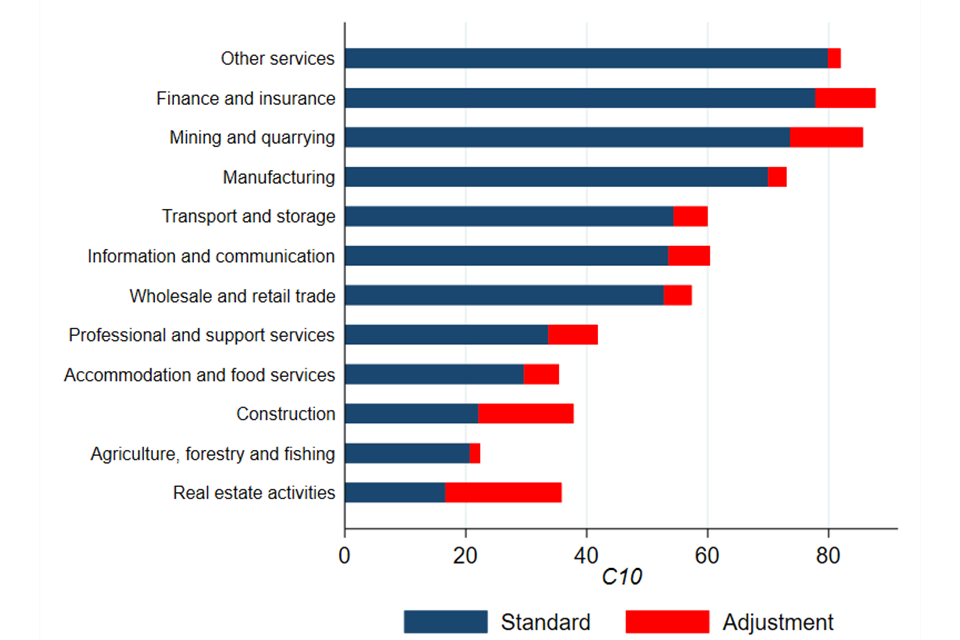
Image description: A bar chart showing how the C10 changes in UK SIC sectors once we account for common ownership groups. There is one bar for each sector, and they have 2 portions: the first portion of each bar shows the C10 as calculated without accounting for common ownership; and the second portion the increase to the C10 after common ownership is incorporated.
Source: CMA analysis of CH and IDBR data.
Note: C10s are calculated for 4-digit SIC industries, and then averaged at sector level using industries’ share of sector turnover as weights. Professional and support services includes both Professional, scientific and technical activities, and Administrative and support service activities. Excludes some non-market sectors such as government services – including fully government-run sectors such as central banking, and those dominated by the public sector, such as education; and the 4-digit industry Wholesale of solid; liquid and gaseous fuels and related products and industries in the Finance and Insurance sector as their turnover disproportionately affects our results.
Turning to the HHI, Figure 3.5 shows that adjusting for common ownership groups generally induces much larger changes in this measure of concentration.
There are large changes in HHI in already highly concentrated sectors such as Manufacturing and Finance and Insurance. However, we find large changes in HHI also in sectors with a lower standard HHI, for example Mining and quarrying moves from the fourth highest HHI sector to the second, while Information and communication from seventh to fourth.
Figure 3.5: Standard and adjusted HHI across UK SIC sectors
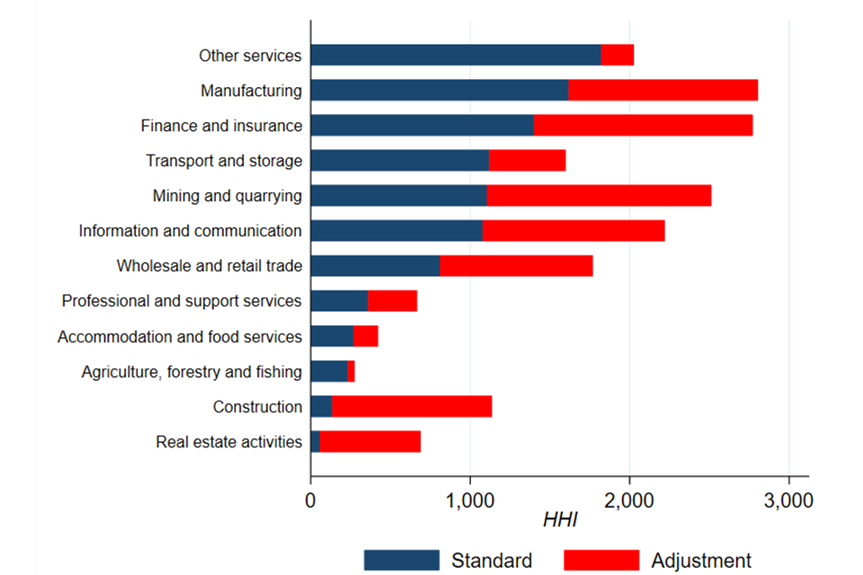
Image description: A bar chart showing how the HHI changes in UK SIC sectors once we account for common ownership groups. There is one bar for each sector, and they have 2 portions: the first portion of each bar shows the HHI as calculated without accounting for common ownership; and the second portion the increase to the HHI after common ownership is incorporated.
Source: CMA analysis of CH and IDBR data.
Note: HHI s are calculated for 4-digit SIC industries, and then averaged at sector level using industries’ share of sector turnover as weights. This graph was created using a 25% threshold to define common ownership groups. Professional and support services includes both Professional, scientific and technical activities, and Administrative and support service activities. Excludes some non-market sectors such as government services – including fully government-run sectors such as central banking, and those dominated by the public sector, such as education; and the 4-digit industry Wholesale of solid; liquid and gaseous fuels and related products and industries in the Finance and Insurance sector as their turnover disproportionately affects our results.
The large changes in the HHI relative to the C10 reflect the fact the HHI is significantly affected by the grouping of already large businesses.
In particular, we identify 2 large common ownership groups that drive these results. These groups decrease substantially in size once we increase our threshold for defining common ownership groups to 50% shareholdings, voting rights, or rights to share assets. There are many other ways in which these thresholds can be set to define the groups. Appendix B provides more details on how changing the threshold affects the adjustments we calculate.
Figure 3.6 below shows that increasing the threshold to 50% results in far less pronounced adjustments to the HHI are across all but the Finance and insurance sector. While we did not have the time and resources to explore this result in detail, we believe that the results for Finance and insurance are driven by one particular common ownership group which contains several businesses.
Figure 3.6: Standard and adjusted HHI across UK SIC sectors using a 50% threshold to define common ownership groups
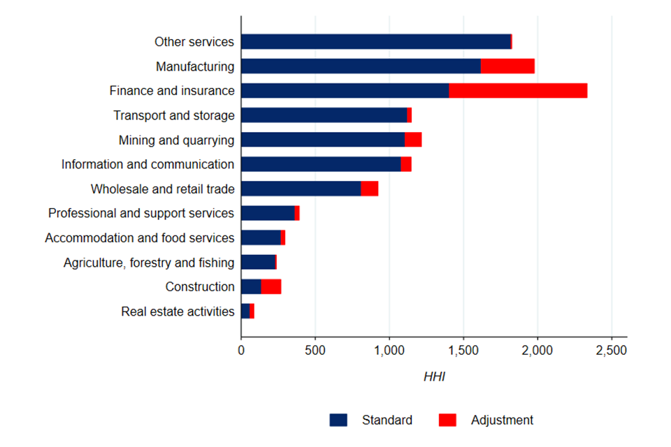
Image description: A bar chart again showing how the HHI changes in UK SIC sectors once we account for common ownership groups. There is one bar for each sector, and they have 2 portions. The first portion of each bar shows the HHI as calculated without accounting for common ownership. In this graph, the second portion of the bar presents the increase to the HHI after common ownership is incorporated having defined common ownership groups using a 50% threshold on shareholdings, voting rights, and rights to share assets.
Source: CMA analysis of CH and IDBR data.
Note: C10 s are calculated for 4-digit SIC industries, and then averaged at sector level using industries’ share of sector turnover as weights. Professional and support services includes both Professional, scientific and technical activities, and Administrative and support service activities. Excludes some non-market sectors such as government services – including fully government-run sectors such as central banking, and those dominated by the public sector, such as education; and the 4-digit industry Wholesale of solid; liquid and gaseous fuels and related products and industries in the Finance and Insurance sector as their turnover disproportionately affects our results.
Conclusions on common ownership
This chapter analysed the presence of common ownership in the UK economy and its potential impact on concentration metrics. We created a new dataset which combines 2 registers with extremely large coverage of UK businesses – the IDBR and CH company records.
To adjust concentration for the common ownership captured in our new dataset, we combined businesses into a single entity if they were linked through a chain of ownership or significant control. Although this is a simplification that assumes common ownership makes businesses entirely the same entity, it allowed us to utilise all the information on significant control in our data.
This adjustment reduced the number of independent businesses across all SIC sectors, increasing both their C10 and HHI. We saw larger changes in the HHI because it is affected to a greater extent by the fact we find common ownership groups made up of large businesses. These changes materially reduced once we increased the threshold for control to 50% because fewer of these businesses were combined.
On one hand, our analysis is likely to have understated the extent of common ownership in the UK economy. This is because our data only allowed us to analyse a very specific notion of common ownership that likely does not encompass institutional investors. On the other hand, combining businesses into a single entity based on a threshold of 25% control (of shares, voting rights, or rights to share assets) also means we have likely overstated the common ownership we do have information on. This, coupled with sensitivity of our adjustments to the definition of common ownership groups, means we cannot draw definitive conclusions about the extent to which the common ownership we capture affects concentration or competition.
Given the experimental nature of our analysis, we therefore view our results as:
-
providing evidence on the extent of common ownership in the UK
-
adding to the evidence that not accounting for common ownership - even in a constrained exercise like this – means materially understating concentration
Adjusting concentration for international trade
Introduction
In this section, we consider measures of concentration adjusted for international trade. The analysis draws heavily on Carr and Davies (2022) forthcoming analysis on international trade and concentration.[footnote 145] We are extremely grateful to them for their generosity in allowing us to refer to this work ahead of publication and for all their help in producing this chapter
An accurate accounting of importing and exporting activities is essential to understanding the competitiveness of any market, but especially in the UK where overseas trade is so prevalent.[footnote 146]
We begin by defining some of the key concepts, as outlined in the Carr and Davies (2022) paper and discuss some issues in the standard approach. We then detail some significant findings in relevant literature that highlight the severity of these issues. Finally, we proceed to provide an overview of the Carr and Davies approach and present some preliminary findings on seller concentration within UK industries and compare it to more traditional indicators. Further details on the methodology and findings are provided in Appendix B. We then conclude by setting out the areas which would benefit from further work.
Key Concepts
An important distinction here is the difference between what we define as Seller Concentration as opposed to Producer Concentration. The existence of any imports or exports in a market clearly implies:
-
that not everything produced within a given country is sold within that country
-
that some of the sales within that country are a result of production by foreign entities. Figure 3.7 demonstrate this distinction between the activities of domestic firms and sales in the domestic market
Figure 3.7 illustrates the domestic market, which is comprised of sales by foreign firms in the form of imports and domestic firms in the form of home market sales, the sum of the 2 is then Domestic Market Absorption. At the same time, firms may also produce some level of output to export overseas, which, when combined with their output for the home market, gives us Domestic Production.
Figure 3.7: Illustration of domestic market
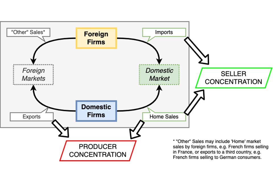
Image description: Illustration of the domestic market, showing the interaction between foreign firms (yellow box), domestic market (green box), domestic firms (blue box) and foreign markets (grey box). The graphic demonstrates that the domestic market encapsulates all these entities and that producer concentration which is the typical measure of concentration only captures domestic firms, whereas seller concentration represents domestic and foreign sales on the domestic market.
Source: Carr and Davies (2022)
Consumers in the domestic market therefore face a level of Seller Concentration that includes imports and domestic production exclusive of exports. For example, British consumers are much less likely to be affected by the share of a British firm in a French market than they are by the share of a French firm in the British market.
However, many studies, including concentration, industry structure, and distributional impacts of this this report, focus on Producer Concentration, which simply captures domestic output. This is due to data limitations,[footnote 147] and while some attempts have been made to overcome this,[footnote 148] full assessments of Seller Concentration are still rare[footnote 149] and none exist for the UK.
Measuring concentration using total turnover data for domestic firms ignores both the fact that some of the firms’ output may be consumed overseas and the fact that consumers may also be engaging with (potentially large) foreign firms.
Box 1: Illustration of impacts of trade on UK car industry concentration (Davies, 2021)
Over 80% of the production of the UK’s 5 largest car producers (Jaguar Land Rover, Nissan, Peugeot S.A, BMW and Honda) is exported. These companies are all subsidiaries of foreign owned multinationals.
Only 3 out of the top 10 car models sold within the UK are actually produced in the UK, demonstrating the heavy reliance on imports to UK consumption.
The top 5 selling firms (VW, Ford, BMW, PSA and Mercedes) account for 62% of the market and the HHI of sellers is 967. (Calculated using data from SMMT (2022) and Statista).
However, the Business Structure Database (BSD) records this industry’s HHI=1837 (because it only records UK domestic output) and C5=78.8%. So, in this case, the BSD concentration statistic would significantly over-estimate the concentration of sellers.
There are 2 factors at play:
-
the presence of importers serves to decrease the shares of UK producers in domestic markets
-
the presence of such a large volume of UK exports suggests UK producers have relatively smaller shares in the UK market
Even when imports are considered, the default position is to assume that they will have a deconcentrating effect. In an age of “Global” and “Superstar” firms and extensive globalisation, it would seem this assumption is perhaps becoming more questionable.
Consider for example a 4-digit UK SIC sector, such as the market for outdoor sports clothing. For illustrative purposes let us assuming the market is moderately concentrated with 10 equally sized firms (the equivalent of an HHI of 1000). Let us also assume however that 70% of the goods sold in the domestic market are imported from a single dominant firm (with an HHI of 10000). It is entirely conceivable in this instance that the importer generates greater levels of concentration in the domestic market.
In addition to documenting the role of imports on domestic competition, it is not possible to correctly evaluate competition in a market without correctly accounting for exports. In terms of concentration, if we do not exclude exports we will overstate the market shares of domestic producers in the domestic market, for example, British firms will appear to have a larger share of total UK sales because we are not excluding their output that is sold overseas. This is particularly important given that exporters are typically concentrated.[footnote 150]
Relevant Literature
While we noted above that there is a relative lack of literature that assesses the role of trade on concentration, there is one interesting exception to this, by Amiti and Heise (2021) that does attempt to measure Seller Concentration.
Amiti and Heise (2021) refute concerns of rising concentration in the US by detailing how previous studies which suggested concentration may have increased, were in fact documenting a purely domestic phenomenon. US producers have become more concentrated, but this has been counteracted by the growth of foreign firms, mostly at the bottom of the sales distribution, meaning the level of Seller Concentration in these markets has remained relatively stable. Their work represents one of the first studies to use data on the universe of firms, both foreign and domestic, to measure concentration.
Further literature on the relationship between imports and competition more broadly, outside measures of concentration, are discussed in Appendix B.
Analysis
In the absence of data on the universe of firms, when we do not know the value of imports, exports, and home sales at the individual firm level, Carr and Davies (2022) outline how to use data that is often more readily available to establish a range of values within which the true level of Seller Concentration will plausibly lie.
In order to convert an HHI of producer concentration into an HHI of seller concentration, data are required for:
-
the aggregate share of imports in domestic market absorption
-
the concentration of importers
-
the share of exports in domestic production
-
the concentration of exporters relative to the concentration of domestic production
One can then calculate Seller HHI as:
Seller HHI ≡ (1-m)2 • HHID + m2 • HHIM
Formula description: Seller HHI is equal to the sum of 2 elements: 1) the product between HHI D and the square of one minus m; 2) HHI M and the square of m.
Where m is import share, HHIM is the HHI among importers only, and HHI¬D is the HHI of domestic producers exclusive of exports. Effectively, the concentration in the domestic market or Seller HHI is equivalent to the sum of the concentration in both the import and domestic group with a weighting based on their respective share in Domestic Market Absorption.[footnote 151] The result can be interpreted in the same way as a standard HHI value, but it now covers the domestic market sales of both domestic and foreign firms.
It highlights why the level of Seller Concentration is not only determined by the levels of HHID or HHIM but also their respective shares in the domestic market. A market with an HHID of 5000 (domestic duopoly) will be far less important if 90% of the domestic market absorption comprises imports from competitive suppliers.
Carr and Davies (2022) consider a sample of 122 manufacturing industries, and their work represents a first attempt at calculating Seller Concentration within the UK economy. The paper uses domestic data from the UK’s Business Structure Database (BSD) and import-export data from the HMRC and covers the years 1997 to 2018.
-
On the trade side, data is published online by the HMRC from their own records.[footnote 152] This source gives us the total value of trade flows of goods to and from individuals countries at the 4-digit level, thus providing information on the geographical dispersion and half of the information required to calculated import share.
-
The remaining variables, measuring domestic concentration and domestic production, were secured for at the 4-digit level from extracts of the BSD.[footnote 153]
Assumptions
Export concentration: all firms export the same proportion of their production – most empirical evidence shows that in most industries the largest firms do most of the exporting, so this is not an implausible assumption. With that said, it may underestimate the extent to which the largest firms dominate exporting, which could inflate HHID.
Import concentration: there are 2 extreme alternatives:
-
Lower bound: imports are totally fragmented with no single firm having a non-trivial market share. Often likened to imports having the role of a competitive fringe
-
Upper bound:[footnote 154] country level monopolies. Each import origin country contains a single firm responsible for all of that country’s exports to the UK. For example, all imported Swedish wood is produced by “Sweden Ltd”.[footnote 155]
The assumptions made by Carr & Davies (2022) are extreme but are offsetting in that (a) leads to a downward bias while (b) leads to an upward bias.
Results
Figures 3.8, 3.9 and 3.10 are taken from the paper by Carr and Davies (2022).
Figure 3.8: Producer and upper and lower bound seller concentration
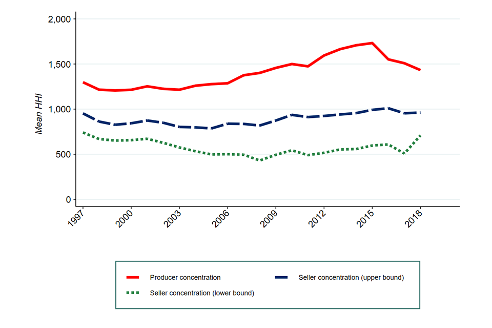
Image description: Line graph, with 3 lines illustrating concentration between 1998 to 2019. Producer concentration (red line) rises from 1998, peaking in 2015 before gradually declining. The dashed blue line and dotted green line represent an upper and lower bound estimate of seller concentration. These lines are considerably flatter than the producer concentration and demonstrate how concentration estimates change once imports are considered.
Source: Carr and Davies (2022)
Figure 3.8 presents a time series of the 3 concentration measures discussed above. From this figure a few conclusions may be drawn:
-
By conventional measures, producer concentration grew up to 2016 before recently declining, but the remaining within the region of moderately concentrated (defined as having an HHI above 1000).
-
Adjusting for trade has a deconcentrating force on average, regardless of the assumptions made. Even assuming one firm per exporting country Seller Concentration is on average always lower than producer concentration.
-
Adjusting for trade can change or even reverse trends seen in concentration over time. In the work of Carr and Davies, Producer Concentration has trended upwards, Seller Concentration under the Upper Bound has remained relatively stable, but under the Lower Bound concentration in UK manufacturing appears to have fallen.[footnote 156] With that said there was a sharp uptick in the Lower Bound towards the end of the period. This was the result of a sharp fall in imports in 2018.
-
finally, under the Upper Bound average concentration in UK manufacturing has approached the threshold of being considered “concentrated”. It is also worth re-stating that given findings in the literature referenced above, namely that exporting is extremely concentrated, the Upper Bound may be a more accurate representation than the Lower Bound.
In other words, assessments of concentration that do not consider imports, importer concentration and exports may only reveal part of the story.
Both the Upper & Lower Bounds suggest that conclusions of rising concentration in UK manufacturing are incorrect; in reality we cannot rule out the possibility that the degree of concentration in this sector may have remained relatively stable over the past 20 years, or even have decreased.
Figure 3.9: Scatter plot of seller and producer concentration
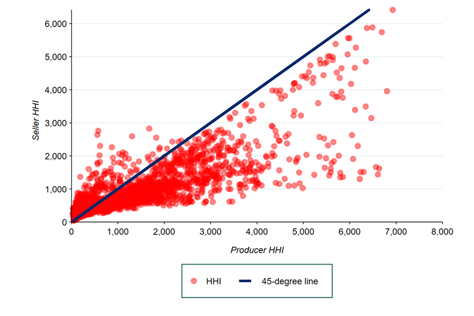
Image description: Scatter plot of seller and producer concentration, with each red dot a representation of a SIC 4 digit industry’s HHI. The majority of the dots fall below the blue 45 degree line, illustrating that seller concentration is typically lower than producer concentration.
Source: Carr and Davies (2022)
Figure 3.9 plots Seller Concentration against Producer Concentration for each industry-year in the sample. The solid dark-blue line lies at 45°. All points above this line therefore represent individual industries each year where the trade adjustment leads to an increase in the level of concentration in the market.
It shows that under a reasonable set of assumptions importers can be a concentrating force within markets. While this is under the Upper Bound assumption of country level monopolies, as noted in the literature above, exporting within countries is often dominated by a handful of firms if not a single exporter. Therefore, it is likely that in some industries concentration is under-estimated as the market is dominated by large foreign importers.
To illustrate how severe an issue this underestimation may be consider the 2 UK SIC industries 26520 and 32130, ‘Manufacture of watches and clocks’ and ‘Manufacture of imitation jewellery and related articles’ respectively. Between 1997 and 2018 the average levels of Seller Concentration and Producer Concentration were as follows (Carr & Davies (2022)):
Table 3.1: Comparison of producer and seller HHI estimates for selected SIC industries
| SIC Code | Mean seller H | Mean Producer H | Mean import share | |
|---|---|---|---|---|
| 26520 | Manufacture of watches and clocks | 2087 | 1371 89.6% | |
| 32130 | Manufacture of imitation jewellery and related articles | 1196 | 628 | 75.3% |
Source: Carr and Davies (2022)
It is worth stressing again these are industry-sample arithmetic means. For 32130, this means that use of producer concentration would on average consistently label the market as unconcentrated while it was in fact concentrated.
From Table 3.1, we can see that in some cases omitting international trade leads to an underestimation of concentration in the UK at 4-digit SIC level. With that said Figure 3.9 would suggest that in most cases the opposite is true. In either case what is most important here is the disconnect between Seller Concentration and Producer Concentration. Without knowing what is happening on the import side of the market, we cannot say with certainty what the level of concentration in the market will be.
Finally, Figure 3.10 examines what has happened to the 2 key import side variables over time. Both import share and geographical dispersion have increased since 2003.
This suggests UK consumers are buying more manufactured products from abroad and from a smaller number of countries. This could be an early indicator that UK imports are becoming more concentrated, and that this rise in concentration will play more of a role in determining UK market concentration.
Figure 3.10 UK Import share and geographical dispersion over time
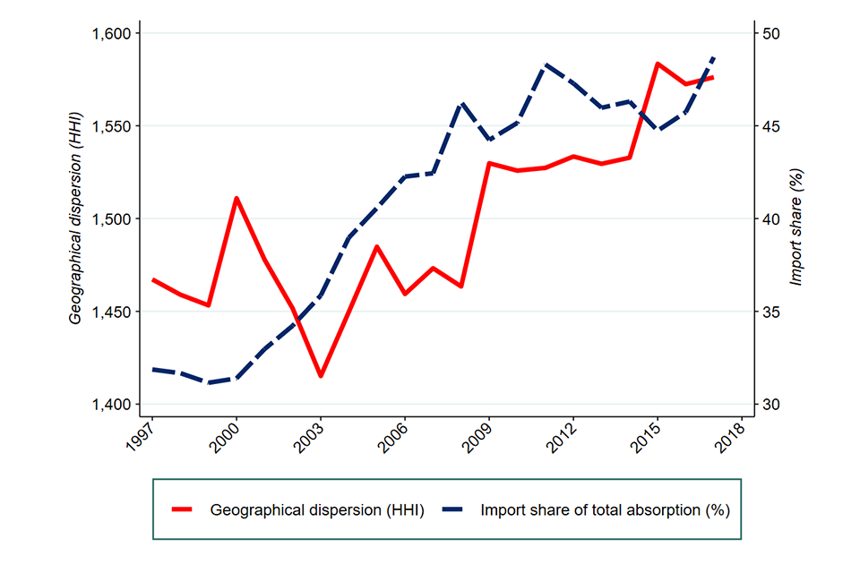
Image description: Line graph representing import share and geographical dispersion between 1998 to 2018. The red line represents geographical dispersion and has risen over the period, the blue dashed line illustrates import share which has also risen over the period.
Source: Carr and Davies (2022)
Markups and profitability
Summary
-
A firm’s markup (the ratio of the price charged for a good/service to the incremental cost to produce/provide it)[footnote 157] is a measure of its product market power.[footnote 158] Using a large dataset of all UK firms with more than 250 employees, we find that the mean markup has risen from 1.22 to 1.34 over the last 2 decades.
-
Consistent with other studies on markups in the UK, we find that most of that increase occurs in the last 10 years and is most pronounced among the firms that already had high markups: from 1.58 to 1.82 at the 90th percentile.
-
An increase in mark ups may not imply an increase in economic profits if firms also incur larger fixed costs to produce goods and services. For this reason, we also consider various metrics that seek to capture some of the fixed costs which might offset economic profits, namely the EBIT margin and the ROCE.[footnote 159] In this report, these measures are calculated at a high level, using several assumptions, and should not be used in comparison to more detailed CMA work carried out in pursuit of its statutory functions.
-
Our analysis shows that across the economy mean EBIT margins have remained broadly stable in the past 20 years.
-
The average ROCE (which also accounts for capitalised expenditures) has declined gradually over time. However, the decline in the average ROCE has been slower than the decline in the cost of capital, as proxied by the yield on investment-grade debt. This may indicate that some of the increase in markups has resulted in higher net returns to capital holders.
-
Overall, we consider that the increase in markups and the slower decline of ROCE relative to cost of capital provide tentative evidence that economic profits have increased since the financial crisis.
Introduction
In this chapter we consider markups and profitability as indicators of competition. We first explain what markups and profitability can and cannot tells us about competition. We then provide an overview of the existing studies of markups and profitability across the UK economy, and compare the results to work done in other countries.
We then set out our own analysis of markups and profitability. In doing this, we consider how measures of markups and profitability have changed across the UK economy since 2000.
In Appendix C, we provide more details on the methodology used in past studies and in this chapter.
Markups, profitability and competition
Measures of both markups and profitability have been used in the economics literature as indicators of the state of competition at both the global level and at the country level. This section outlines the theoretical justifications for the use of these metrics and discusses some of their limitations.
Markups, market power and competition
Market power is usually defined by economists as the ability of a firm to charge a price for a product that is above the additional cost of producing one more unit of that product (the ‘incremental cost’ or ‘marginal cost’). The bigger the gap between the price of a product and its marginal cost the greater the firm’s market power.
Therefore, one measure of a firm’s market power is the ratio of the prices it charges to its marginal costs. This ratio is called a ‘markup’. If a firm’s markup is 1 then the firm’s prices are the same as its marginal costs – this means the firm does not have market power and that the market it operates in is highly competitive. If, for example, a firm’s markup is 1.2 then the firm’s prices are 20% higher than its marginal costs.
Markups have the advantage of being a relatively direct measure of market power with strong theoretical underpinnings and therefore can provide valuable information on how competition may have changed over time. This is particularly the case where results are consistent across the different methods used to estimate markups and with other metrics such as profitability.
However, there are several issues that need to be considered when using markups and we explore them in Appendix C – they relate both to how to interpret trends, and the methodology and data used to estimate markups.
It is important to understand that firms that are charging markups above 1 are not necessarily making ‘excess profits’. Firms that charge high markups might also face high fixed costs, such that their owners are only recovering their cost of capital. Nevertheless, markups are a relevant indicator of market power to monitor for a competition authority. A firm can only charge high markups if some features of its market somehow limit the intensity of competition between suppliers. For example, the firm’s competitors may be offering differentiated products and may be unable to expand into the firm’s market segment; or consumers may face significant search costs such that they are not aware of all alternatives. Such features often imply that mergers or anti-competitive practices are either more likely or more damaging for customer welfare. Hence, merger control and antitrust enforcement become more important in contexts where markups are increasing, even if, in and of themselves, they do not imply that firms are making excess profits.
Profitability and competition
The CMA often evaluates the economic profits of individual firms in the context of market investigations. The CMA’s guidelines for market investigations set out that in a competitive market, firms would generally not make more than a ‘normal’ level of profit.[footnote 160] This is the level of profit needed in order to justify keeping the capital employed by a firm within it.[footnote 161] Therefore, profits persistently above the normal level among a significant number of firms in a market might indicate problems with competition. This typically requires a detailed assessment of asset values and the cost of capital.
When considering profitability at the economy-wide level, it can be difficult to establish what the normal level of profit should be. Nevertheless, it can be informative to consider changes over time. Unless the cost of capital is changing markedly, rising profits throughout a sector or even across the economy are consistent with the proposition that competition is becoming less effective.[footnote 162]
Assessing trends in profitability is therefore one way in which we can assess changes in competition over time. This is particularly the case where results are consistent across different measures of profitability and other metrics such as markups.
Existing evidence
The recent literature on trends in economy-wide markups and profitability has generally found evidence of an increase in both metrics in developed economies, including the UK, in recent decades. Whether the results prove that there has been a generalised increase in market power is still debated.
This section summarises the existing evidence on recent trends in markups and profitability for the UK economy and more generally at a global level, and briefly discusses how this evidence has been interpreted.
Trends in markups in the UK
Several papers have looked at recent trends in markups and in the distribution of markups across firms to understand the dynamics of competition at a global level or at the level of a national economy.
The literature has generally found an increase in markups in advanced economies in recent decades. This has been interpreted by some as evidence of a decrease in the level of competition around the world.
2 studies have used a methodology developed by De Loecker and Warzynski (2012)[footnote 163] to estimate the trends in markups among listed companies in the UK.[footnote 164] [footnote 165] First, as part of a global study of markups, De Loecker and Eeckhout (2018)[footnote 166] estimated that mean markups among listed firms in the UK increased from 0.94 in 1980 to 1.68 in 2016.
Second, using a similar dataset, Aquilante et al. (2019)[footnote 167] broadly replicate the same results, finding that the mean markup increased from 1.2 to around 1.6 between 1987 and 2017. Most of the increase took place after 2000 – from around 1.3 to around 1.6. Markup increases were similar across economic sectors but, within each sector, they tended to be concentrated among those firms at the top of the markup distribution.
The same study also finds that the rise in markups was far larger among firms selling predominantly into foreign markets rather than in the domestic market. In fact, the increasing trend in mean markup is much more pronounced when firms are weighted by international sales (from around 1.2 to around 1.8 during the period) than when they are weighted by domestic sales (from around 1.1 to around 1.3). Aquilante et al. (2019) argue that these results are consistent with the view that rising markups were concentrated among internationally operating ‘superstar’ firms, possibly reflecting their greater ability to benefit from global network economies of scale and scope.
These 2 studies only include data on listed firms in the UK. However, listed companies are different to the overall population of UK businesses and some of these differences may accentuate the issues with using accounting data.
-
Listed companies have a different industry mix to the overall population of UK companies.
-
Listed firms are disproportionately likely to have significant overseas operations. For example, the largest UK-listed company by turnover in 2017,[footnote 168] Royal Dutch Shell, employs around 6,000 people in the UK,[footnote 169] or only about 7% of its global headcount of 82,000.[footnote 170] The international scale of many listed companies may require additional analysis of the approach to attribution of profits to UK activity for accounting purposes.
A recent report by the Institute for Fiscal Studies (IFS) observes that in the last 4 decades firm heterogeneity – in terms of productivity, wages, markups and size – has increased.[footnote 171] Specifically, there is a minority of firms that are high-performing – the so-called “superstar firms” –, whereas most firms are characterised by lower levels of overall performance, similar to those observed in the 1990s. Due to the increased importance of superstar firms, the economy-wide trend in markups and the industries-level trends in concentration are increasing, whereas the share of national income going to wages in the UK has decreased. The authors thus observe that even where high-performing firms have acquired their position through beneficial innovations and superior technology, the market power that this confers still risks harming consumers and workers.
This is the only study we are aware of which is based on data for both listed and privately held firms. We adopt a similar approach. Diez et al. (2019) used a similar dataset for a global-level analysis which, compared to similar studies based on listed firms, finds significantly lower increases in markup.
Global trends in markups and profitability
The UK evidence is broadly consistent with the global evidence on increasing markups. In particular, several studies have found:
-
a trend of increasing markups either globally,[footnote 172] in advanced economies[footnote 173] or specifically in the US[footnote 174]
-
that the increase in markups was concentrated among firms in the upper part of the markup distribution[footnote 175]
Two studies have also considered the extent to which the change in the mean markup was due to an increase in the markup itself or due to an increase in the size of high markup firms relative to the size of low markup firms. The 2 studies utilised different countries and methodologies and the results of these studies point in different directions.
-
Diez et al. (2019) using a global dataset for the period 2000 to 2015 found that most of the increase in the mean markup was due to an increase in the markup itself.[footnote 176]
-
De Loecker, Eeckhout and Unger (2020), using a US dataset for the period 1980 to 2016, found that most of the increase in the mean markup was due to an increase in the size of high markup firms relative to low markup firms.
In terms of sector level results, 2 studies have found evidence that the increase in markups differs between sectors based on how Information, Communication and Technology (ICT) focused they are. Specifically, Diez et al. (2019) found that, while increases have been seen in a broad range of economic sectors, markup growth has been twice as large in ICT-intensive sectors.[footnote 177] This result is consistent with what was found by Calligaris, Criscuolo and Marcolin (2018),[footnote 178] who consider a sample of 26 countries for the period 2001 to 2014.
The existing empirical evidence on profitability is more limited and largely based on US studies. The data in these studies generally shows trends towards increasing mean profitability and increasing dispersion of profitability among US firms, consistent with the evidence on markups.[footnote 179]
How the trends have been interpreted
While there is some evidence that mean markups, and probably other measures of profitability, have increased in recent decades, the underlying causes of these trends are debated. The main factors suggested are of 3 types: technological change, globalisation and the rise of ‘superstar’ firms, and increased rent seeking.
Technological change can explain at least part of the trend in markups. As discussed at markups, market power and competition section , a general trend in increasing fixed and sunk costs due to changes in technology would be expected to lead to rising markups. However, the results in De Loecker, Eeckhout and Unger (2020) suggest that while overheads as a share of total expenditure have increased, such increase was not large enough to fully account for the trend in markups.
Globalisation can also be part of the explanation for rising markups (see Berry et al. 2019).[footnote 180] Firms with access to a global supply chain can get lower-cost inputs and achieve greater economies of scale. In the presence of competing firms unable to globalise, globalised firms will be able to sustain higher markups. If, within an industry, globalised firms gain market share, the mean industry markup will rise. This theory is linked to the argument, developed by Autor et al. (2020), that the recent trend in increasing markups can be explained by the rise of ‘superstar’ firms.[footnote 181]
Some of the evidence discussed at trends in markups in the UK section is compatible with this theory. For example, Aquilante et al. (2019) find that the rise in markup was far larger among UK firms selling predominantly into foreign markets than in the domestic market. The theory, however, relies to a large extent on the more productive firms with higher markups growing relative to other firms. The evidence on the extent to which higher markup firms have grown relative to other firms is mixed and thus whether this theory holds is still an open question which requires further research.
Finally, increasing markups and profitability may reflect an increased ability of firms to exploit their market power. This could be due both to increased managerial ability to take advantage of inelastic demand (see Berry et al. 2019) and/or to a decline in antitrust enforcement. Gutiérrez and Philippon (2017) have argued that laxer antitrust enforcement has been one of the main factors contributing to weakening competition in the US. On the other hand, Gutiérrez and Philippon (2018)[footnote 182] have also praised the stronger antitrust enforcement in the EU in recent years. However, as seen at trends in markups in the UK section, evidence on markups shows increasing trends both in the US and in Europe.
CMA analysis
When assessing competition, we are interested in economic profits because they typically serve as an indicator of a lack of competition. However, economic profits can differ from profits contained in available accounting data. For this reason, we look at a variety of profit measures. In particular, our analysis includes an assessment of markups as well as an assessment of profitability using both Earnings Before Interest and Taxes (EBIT) margins and Return on Capital Employed (ROCE).
This analysis, alongside the State of Competition 2020 report, extends previous research on markups in the UK in several ways.
-
First, our sample includes both listed and private companies as it is based on data on large companies (those with more than 250 employees) sourced from the FAME database.[footnote 183] It is therefore more representative of the population of UK businesses than previous UK studies.
-
Second, as well as considering markups we have also considered 2 measures of profitability – EBIT margins and ROCE – which has not been done previously in UK studies.
Details on the dataset used and the methodology adopted in our analysis are presented in Appendix C. As set out at in markups, market power and competition, an increase in markups may be associated with an increase in fixed costs and one way of testing for this possibility is to assess measures of profitability which take into account fixed costs. Therefore, it is important that we use the same sample for both metrics to ensure comparability. This means that we exclude some firms where the relevant information for EBIT margins is available, but we cannot estimate markups. We discuss the implications of this in Appendix C.
Finally, our results do not include the Finance and Insurance sector.[footnote 184] This is because a large number of firms in that sector do not report turnover data which we use to estimate markups and to weight out results.
Markups
In this section we present our findings on the evolution of the mean markup across large firms[footnote 185] in the UK economy. Firms’ markups are rarely observed directly so they need to be estimated. As we explain in detail in Appendix C, there are 3 main methodologies in the academic literature to estimate markups: the production function approach, the demand approach and the cost share approach. Each of these methodologies rely on different assumptions and there is no consensus on which is the best alternative to use.
Our approach to estimating markups broadly follows De Loecker, Eeckhout and Unger (2020). The starting point for this analysis is that, if firms minimise their cost of production, the markup is simply the product of 2 terms: the ‘input cost revenue share’ (the cost of an input as a share of a firm’s revenue), and the ‘output elasticity’ (the extent to which the firm’s output varies with changes in the quantity of the chosen input). The first term is directly observable in companies’ accounts, but the second term must be estimated.
The authors of the paper, and the literature on markups more generally, use 2 different approaches to estimate the output elasticity: the production function approach works by setting out a parametric specification of the production function, and then using some instruments to estimate the relevant parameters; in contrast the cost share approach simply estimates the output elasticity as the expenditure on a variable input divided by total expenditure on all inputs. The cost share approach does not rely on a parametric specification of the production function, but it requires 2 significant assumptions: that the technology has constant returns to scale, and that the optimisation conditions hold for all inputs in all years, including for inputs with adjustment costs (for example, capital).
The validity of these above 2 approaches is still being debated in the literature. We have opted for the cost share approach because it is more straightforward to use with accounting data, which reports revenues and expenditure rather than output and input quantities.
To begin with, we look at the annual turnover-weighted mean markup across the entire sample for the period 2000 to 2020 alongside the trends in markups at the 50th percentile (the median) and the 90th percentile.[footnote 186]
Figure 4.1: Turnover-weighted mean markups
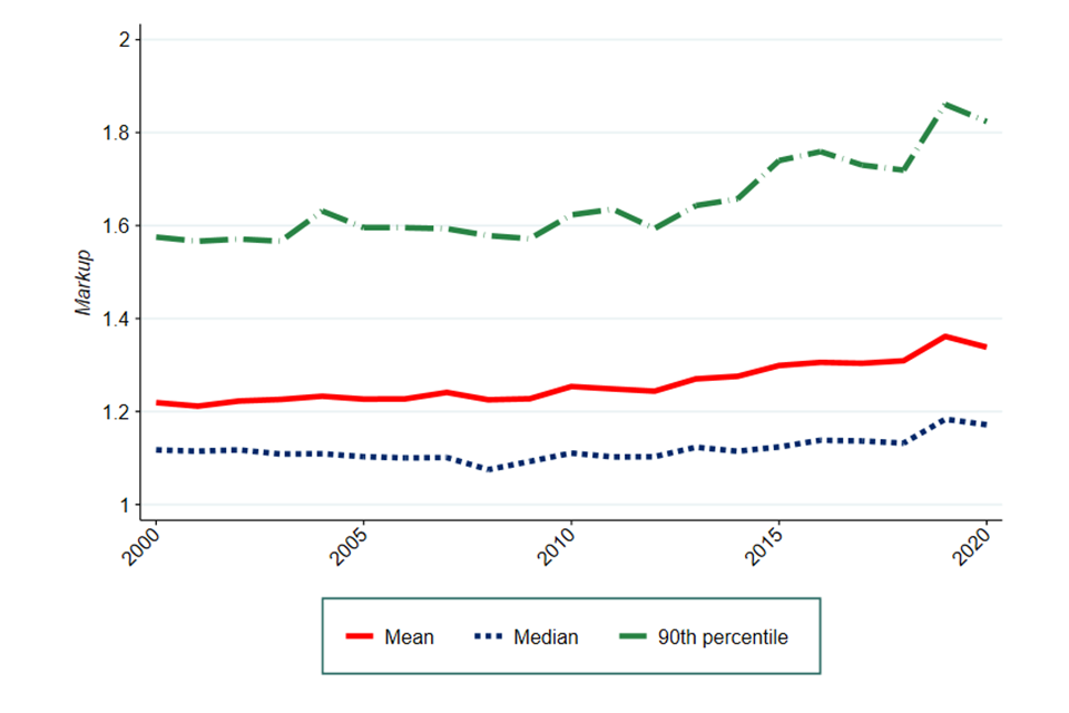
Image description: This chart shows the evolution of the turnover-weighted markups from 2000 to 2020 at different levels of the distribution as captured by the various lines. Specifically, the levels we considered are the mean, the median and the 90th percentile.
Source: CMA analysis of FAME data.
Figure 4.1 shows an upward trend in mean markups, with an increase from 1.22 to 1.34 since 2000.[footnote 187]
However, we also note that, while overall there has been an increase in mean markups, trends vary when considering markups at different levels of the distribution. As shown in Figure 4.1, the increase in mean markup comes mainly from an increase in the markups of firms 90th percentile which saw an increase from 1.58 to 1.82. Therefore, our finding suggests that the increase in mean markups likely comes from an increase in markups in the upper end of the distribution.
This pattern is broadly consistent with both the UK and international evidence on markups outlined in trends in markups in the UK to global trends in markups and profitability. However, the magnitude of the changes is smaller than that found by De Loecker, Eeckhout and Unger (2020) and Aquilante et al. (2019), whose economy wide results focus on listed companies in the US and UK respectively.[footnote 188]
This could be explained by the differences in the samples used: our data includes non-listed companies.[footnote 189] Consistent with this, Diez, et al. (2019) is the only other study we are aware of that included both listed and non-listed companies and they found increases in mean markups that were smaller than those estimated by De Loecker, Eeckhout and Unger (2020).
Finally, we also carried out some sensitivity checks in terms of the weighting measure we use for the mean markup based on De Loecker, Eeckhout and Unger (2020). Specifically, in addition to weights based on turnover, we also considered the cost of goods sold (COGS) and employment in terms of number of employees as alternative weights to turnover.[footnote 190] The result is shown in Figure 4.2.
Figure 4.2: Mean markups using different weights
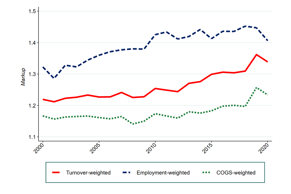
Image description: This chart shows the evolution of the mean markup from 2000 to 2020 by using different weights. Specifically, the weights we used are firms’ turnover, employment (as captured by the number of employees) and the cost of goods sold.
Source: CMA analysis of FAME data
As shown in Figure 4.2, the level of markups is materially different according to the weight used. However, the trend of the mean markup over time is generally the same regardless of the weighting measure we use, and this seems to suggest that the evolution of markups over time is not driven by the choice of the weight. Overall, we find that the mean markup has increased over the last 2 decades in the UK, although there has been a short decline in 2020 likely due to the COVID-19 pandemic. This increase mainly comes from an increase in the upper end of the distribution. This is consistent with Aquilante et al. (2019), who find a similar result for listed firms in the UK.
Profitability
While an increase in mark-ups may indicate an increase in market power among firms, it may also be due to an increase in fixed costs as a proportion of all costs. Therefore, we have also considered EBIT margins and ROCE as additional measures of profitability. While reflecting pure accounting profits and not economic profits (and hence not market power), both these measures account, to some extent, for the presence of fixed costs.
Normally, if the CMA was conducting profitability analysis in relation to a specific market, it would undertake a detail analysis of the appropriate profitability metric and the appropriate adjustments to make to the relevant accounting data such that economic profits can be calculated. However, it is not practical to conduct such a detailed analysis as part of this report or more generally in an assessment of competition across an entire economy. Regardless, the trend in the EBIT margin and ROCE will still be informative about the state of competition.
Earnings before Interest and Taxes (EBIT) margin
EBIT is a standard measure of operating accounting profits and thus the EBIT margin (meaning EBIT divided by turnover) is a useful indicator of how profitability might have changed across a large group of companies over time.[footnote 191] [footnote 192]
As with markups, we looked at the annual turnover-weighted mean EBIT margin for large companies for the period 2000 to 2020. We also examined EBIT margins at the 50th (median) and 90th percentile for the same period.[footnote 193] [footnote 194] These results are shown in Figure 4.3.
Figure 4.3: Turnover-weighted mean EBIT margin
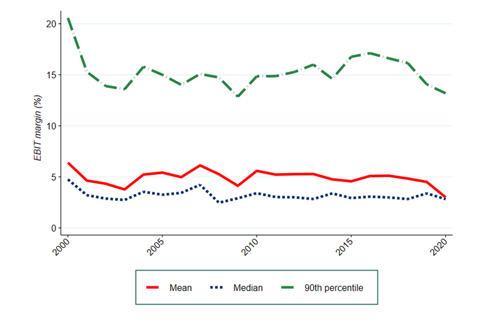
Image description: This chart shows the evolution of the turnover-weighted Earnings Before Interest and Tax (EBIT) margin from 2000 to 2020 at different levels of the distribution as captured by the various lines. Specifically, the levels we considered are the mean, the median and the 90th percentile.
Source: CMA analysis of FAME data
Figure 4.3 suggests that the turnover-weighted mean EBIT margin, represented by the solid line, has remained broadly constant around 5% although there has been a slight drop to 3% in 2020. In comparison the EBIT margin for those in the 90th percentile experienced a steep drop in 2001 but overall tended to remain 10 to 12 percentage points higher than the turnover-weighted mean EBIT margin.[footnote 195] There has been a decline in 2020 for all 3 measures, possibly due to the COVID-19 pandemic.
As outlined in CMA analysis under markups and profitability, we conducted our EBIT analysis on firms who had information that allowed us to estimate both the markup and the EBIT. We were also able to conduct our analysis of EBIT margins using all firms for whom information on EBIT was available. When looking at the trends among this larger sample we see the same pattern (see Appendix C).
Therefore, taking everything into account, our analysis shows that across the economy mean EBIT margins have remained broadly stable in the past 20 years.
Return on Capital Employed (ROCE)
The second measure of profitability we use is ROCE, which the CMA has used in past Market Investigations [footnote 196]. While EBIT margin is EBIT divided by turnover, ROCE is estimated by dividing EBIT by Capital Employed (measured as total assets minus current (short-term) liabilities, or equivalently, equity plus long-term liabilities).
Theoretically, ROCE has advantages over EBIT margin as a profitability measure as it takes into account the capital intensity of a firm. This means that comparisons between firms’ ROCE are likely to better account for differing levels of capital intensity than EBIT margins[footnote 197].
As with EBIT margin, the results may still need to be treated with caution as the trend in accounting profits may not follow the trend in economic profits. For example, this would be the case if the proportion of true capital investment that is under-recorded within ROCE changes over time. Regardless, ROCE can still serve as a useful measure of trends in profitability over time.
We have considered trends in ROCE at different levels of the distribution, with Figure 4.4 showing the weighted mean ROCE alongside the ROCE at the 50th percentile (median) and the 90th percentile. In doing this we have considered the turnover-weighted distribution over time[footnote 198].
Figure 4.4: Turnover-weighted mean ROCE
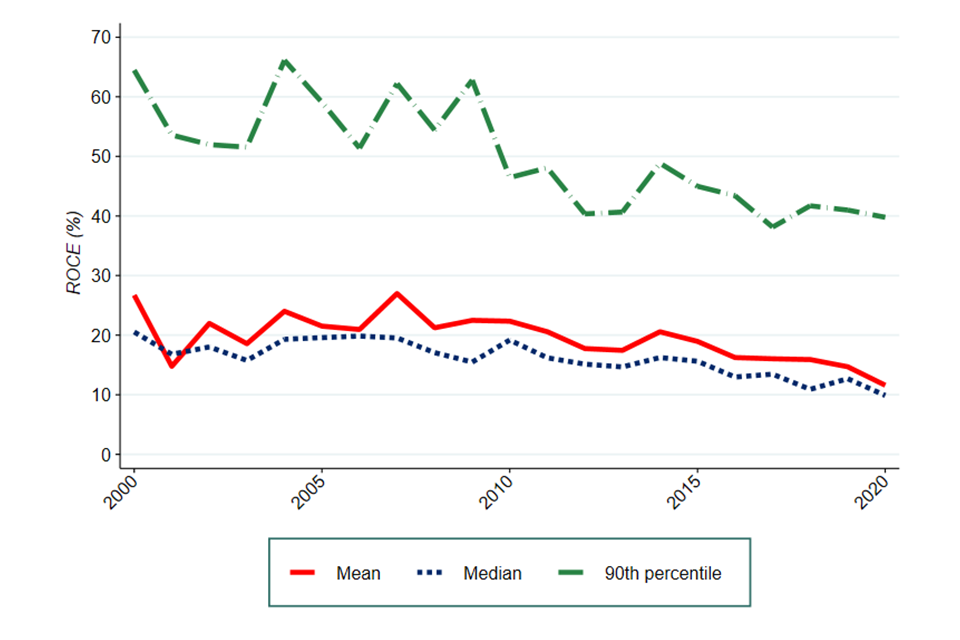
Image description: This chart shows the evolution of the turnover-weighted Return On Capital Employed (ROCE) from 2000 to 2020 at different levels of the distribution as captured by the various lines. Specifically, the levels we considered are the mean, the median and the 90th percentile.
Source: CMA analysis of FAME data
In interpreting Figure 4.4, we recognise that several factors and simplified assumptions may distort the estimated level of ROCE for example the presence of intangible assets, or the way the capital base is measures in accounting data. Nonetheless, we believe this analysis is still informative about the trends of ROCE over time. In cases run by the CMA in pursuit of its statutory functions, a more detailed analysis would be carried out to estimate the appropriate level of ROCE. Figure 4.4 shows that leading up until the financial crisis the turnover-weighted mean ROCE oscillated between 15% and 25% before smoothing out. We then observe a gradual fall in the turnover-weighted mean at the time of the financial crisis (which is to be expected as ROCE is sensitive to macro-economic events). The turnover-weighted mean remained close to the median ROCE (50th percentile) throughout 2000 to 2020. ROCE for those in the 90th percentile demonstrated similar behaviour and remained 25 to 30 percentage points higher than the turnover-weighted mean between 2000 and 2020.
However, when considering ROCE, it is necessary to take account of the cost of the capital that is employed. A fall in ROCE might simply reflect the fact that the capital employed has become cheaper. In fact, if a fall in ROCE coincides with a similar fall in the cost of capital, then economic profits might not have fallen after all. The cost of capital has not been constant over time – particularly over the course of the 20 years we have considered.
As explained in Appendix C, for the purposes of this analysis we have used a measure of the cost of debt as a proxy for the cost of capital (which is conceptually made up of the cost of debt and the cost of equity)[footnote 199]. This is because the cost of debt is directly observable while the cost of equity is unobservable (for our assumptions on the cost of equity see Appendix C), and we are interested in aggregate trends over a 20-year period; over the long-term returns to debt and equity can reasonably be expected to trend in the same direction.
Our measure of cost of debt is the IHS Markit iBoxx GBP Non-Financials BBB 5 to 7 index. This is a low investment-grade rating, which we believe reflects the credit worthiness of the large (mostly private) companies in our dataset. The ‘cost of debt’ line on Figure 4.5 and Figure 4.6 is therefore one step removed from the cost of capital in the economy – it is a measure only of debt and not of equity capital.[footnote 200]
Figure 4.5 shows the absolute trend in the turnover-weighted mean ROCE and cost of debt while Figure 4.6 shows the relative trend for these, with the values for both indexed at 100 in 2000.
Figure 4.5: Absolute turnover-weighted mean ROCE and the cost of debt
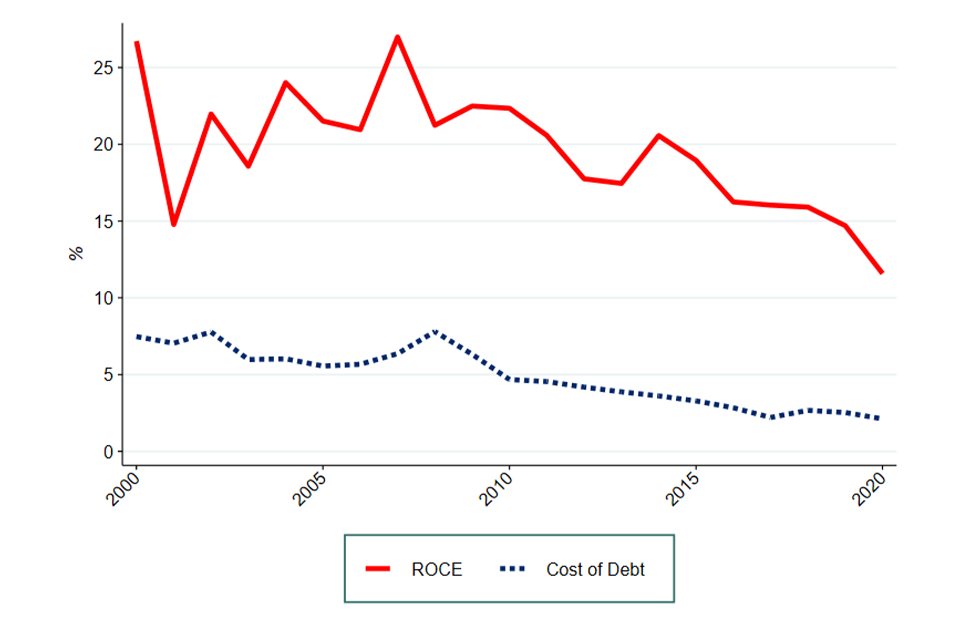
Image description: This chart compares the absolute trend in the turnover-weighted Return On Capital Employed (ROCE) to the cost of debt as captured by the yield on indices of BBB-rated UK non-financial debt from 2000 to 2020.
Source: CMA analysis of FAME data and IHS Markit data
Figure 4.6: Relative turnover-weighted mean ROCE and the cost of debt, indexed at 100 for their value in 2000
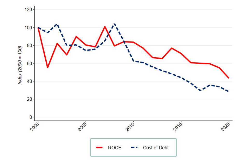
Image description: This chart compares the trend in the turnover-weighted Return On Capital Employed (ROCE) to the cost of debt as captured by the yield on indices of BBB-rated UK non-financial debt from 2000 to 2020. What distinguishes this figure from Figure 4.5 is that in this chart both the ROCE and the cost of debt have been indexed, i.e. the value of the ROCE and the cost of debt in 2000 has been set equal to 100 and their values in the following years have been adjusted accordingly.
Source: CMA analysis of FAME data and IHS Markit data
From both figures it can be seen that for the period 2000 to 2008 there was high variability in the turnover-weighted mean ROCE and the cost of debt. In some years the turnover-weighted mean ROCE grew more while in other years the cost of debt did. However, we find that since the financial crisis the cost of debt fell relatively more than the turnover-weighted mean ROCE. This is true regardless of which year we begin with when measuring. This could indicate that economic profits have been rising over time.
Conclusion
In this chapter, we consolidated evidence on the literature on markups and provided some up-to-date indications on trends in markups and profitability to evaluate the general state of competition in the UK economy.
Overall, our analysis of markups is consistent with previous studies from the UK and other countries such as the US. We have found that since 2008 there has been an increase in weighted mean markups which mainly comes from an increase in the upper end of the distribution.
We find that EBIT was relatively stable over the past 20 years. The 90th percentile shows more variability, but the overall trend remains stable.
We have also accounted for capital intensity by looking at ROCE. Our analysis shows that, while ROCE has fallen over the past 20 years, the cost of debt has fallen relatively more.
Overall, we consider that the increase in markups and the slower decline of ROCE relative to cost of capital provide tentative evidence that economic profits have increased since the financial crisis.
Other indicators of competition[footnote 201]
Summary
-
to offer a better understanding of changes to industry composition, we have built dynamic measures of competition. These complement our analysis of industry structure which static measures of competition such as concentration provide
-
we built dynamic measures of competition in order to capture aspects that concentration or other static measures of competition overlook. In particular, we looked at measures of persistence, the evolution of market shares and firms entry and exit rates
-
rank persistence (ie the likelihood of the largest firms in an industry to remain the largest firms) has increased over the past 20 years, albeit this increase largely occurred prior to 2010. This suggests that the largest firms have cemented their position. Some sectors show particularly high or increasing levels of rank persistence
-
profit persistence (the extent to which the same firms are persistently in the top 10% for that metric) provides a mixed picture. We found material levels of persistence in markups and EBIT margins, but less in ROCE. Persistence in markups increased over the past 20 years, whereas ROCE increased only from 2017 and EBIT was relatively stable
-
looking at the evolution of market shares for the largest 5 companies and those outside the top 20 shows a wide range of dynamics across sectors. While in some sectors the largest companies have been increasing their market shares at the expenses of smaller firms, in other sectors the largest companies only represent a small share of the market
-
finally, we find 2 periods over the past 20 years during which entry decreased and exit increased materially following the business cycle: after the financial crisis and from 2016. Data from 2020 showed that after a fall in entry rates at the outbreak of the COVID-19 pandemic, entry sharply increased, differently from other recessions
Introduction
In concentration, industry structure, and distributional impacts and Markups and profitability, we have assessed aggregate measures of concentration, mark-ups and profitability as proxies for competition. As explained in the respective chapters, these measures have their limitations, and we must be careful in interpreting them as direct evidence of the competitive conditions of actual markets.[footnote 202]
Concentration in a given year only gives part of the picture of how well competition is working in a particular industry. A highly concentrated industry may in fact be competitive if it is dynamic, with firms jostling for the top position, and with the most efficient firms increasing their shares of industry turnover, before, in turn, being displaced by other, more efficient, firms. Therefore, findings based on aggregate concentration measures may conceal other changes in industry structure. Metrics which specifically capture dynamic competition are needed to address this.
For this reason, we computed some metrics that look at different aspects of competition and its evolution over time. In particular, we used the BSD and FAME data to compute the following measures:[footnote 203]
-
The rank persistence of the largest firms in each sector
-
The persistence of the most profitable firms in the UK economy
-
The evolution of market shares for different segments of the market
-
The rates of firm entry and exit
Rank persistence
Another measure that we have used is the likelihood of the very top firms in an industry (in terms of turnover) remaining the top firms. This metric focuses on a much smaller group of the most economically significant firms in the economy.
In practice, we examined the top 10 firms in each sector by turnover and checked, for each year, how many of them were also in the top 10 3 years previously. We called this metric ‘rank persistence’. Figure 5.1 shows the simple average of rank persistence across all sectors.
Figure 5.1: Simple mean rank persistence
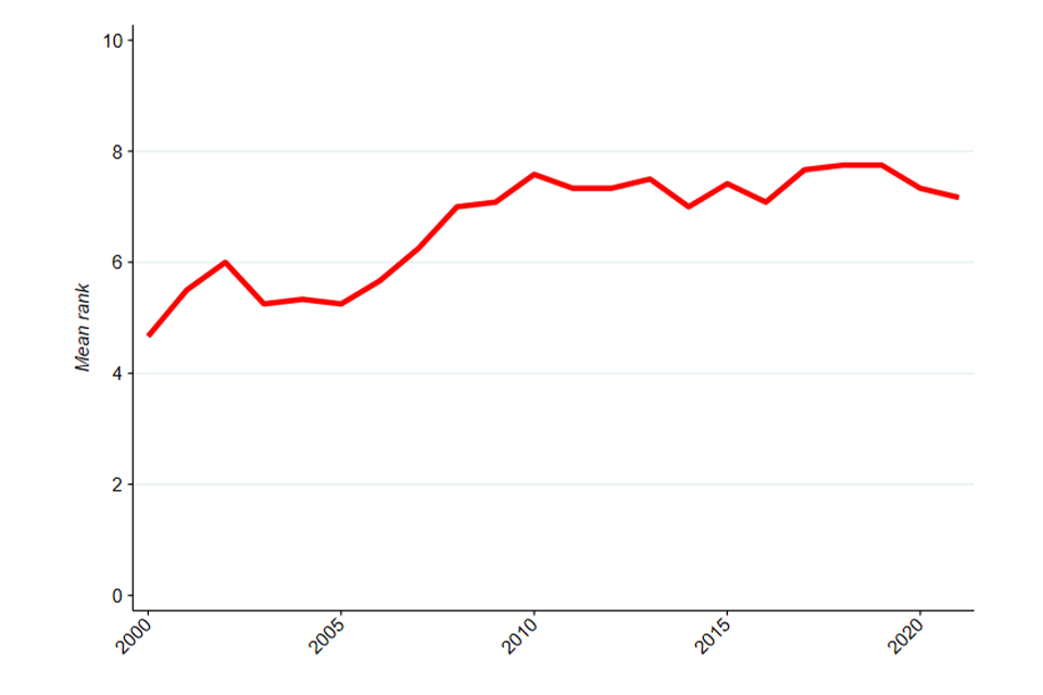
Image description: A line chart showing the annual mean rank persistence across all UK sectors, from 2000 to 2021. The line starts above 4 and ends at above 7.
Source: CMA analysis of ONS BSD data
Note: rank persistence if first calculated at sector level and then averaged across sectors without the use of any weight. Excludes some non-market sectors such as government services – including fully government-run sectors such as central banking, and those dominated by the public sector, such as education.
An overall increase in rank persistence over time is visible. Among the top 10 firms in 2000, there were only about 5 who were also among the top 10 in 1998. This number increased to over 7 in 2021. The increase in rank persistence occurred mainly in the second half of the 2000s. In 2000, half of firms in the top 10 changed over 3 years, but 2010 this had fallen to a quarter.
This means that over twenty years churn (on average across different industries) among the top 10 firms has declined significantly. This indicates that large firms have cemented their positions at the top. This high and increasing rank persistence is a sign that competition might not be very dynamic.
Aggregate measures often hide different dynamics at sectoral level. We report detailed charts for rank persistence for each sector in Appendix D, but worth highlighting here:
-
professional and scientific services and Finance and insurance sectors presented particularly large increases. These sectors saw rank persistence as low as one in the early years of the time series, but consistently above 5 and sometimes as high as 8 or 9 in later years
-
several prominent sectors observed high rank persistence over the most recent 10 years, including Wholesale and retail trade, Transport and storage, and Information and communication, all of which had rank persistence of 9 in several years, indicating a great deal of stability in the identities of the top businesses in the sector
These sectoral results strengthen the finding that the largest firms have been cementing their positions over the course of the past 20 years.
Profits persistence
We presented our main analysis of mark-ups and profitability in Markups and profitability. This analysis was based on the FAME dataset and restricted to companies with more than 250 employees. While our analysis demonstrated how the mark-ups, EBIT margins, and ROCE have changed for the top 10% most profitable firms since 2000, it did not explore whether the top 10% is made up of the same large firms over time.
If the composition of this top 10% does not change over time, then 2 possible interpretations are possible: (i) it may indicate that there are a group of large firms who are consistently outperforming other firms because they are more efficient, or (ii) it may indicate a lack of competition (or a mix of both).
Therefore, separately for mark-ups, EBIT margins, and ROCE, we have estimated the extent to which the same firms are persistently in the top 10% for that metric.[footnote 204] To do this we have considered the proportion of companies in the top 10% in a given year that were also in the top 10% 3 years before.[footnote 205] We do this at an economy level.
Figure 5.2 shows the persistence of companies in the top 10% for mark-ups, EBIT margins and ROCE when looking across the whole economy for the period 2003 to 2020.
Figure 5.2: Profit persistence at whole UK economy level
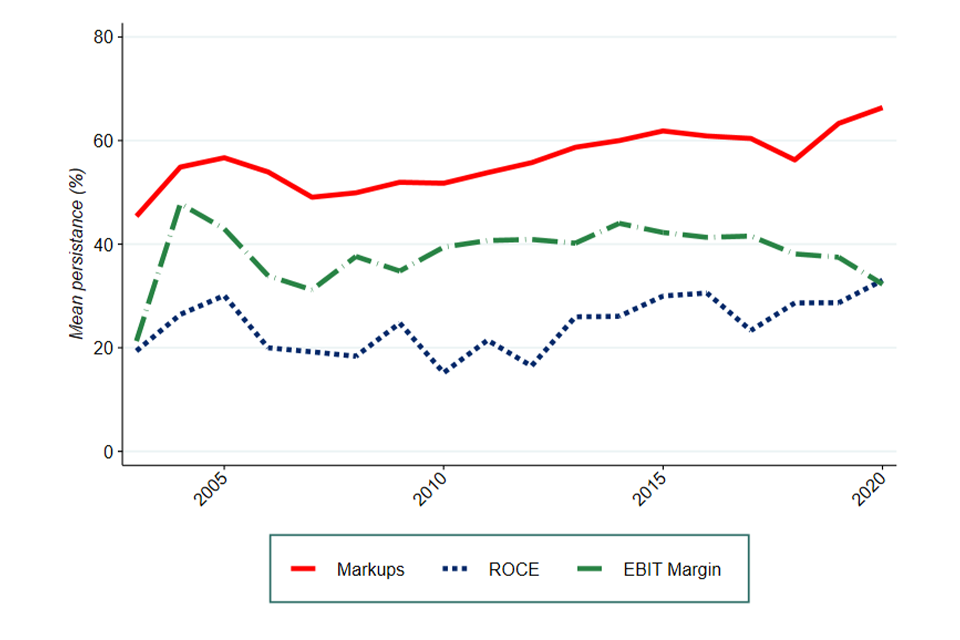
Image description: A line chart showing the annual profit persistence (in %) at UK economy level, from 2003 to 2020. The markups line is above all other lines, and starts above 40% and ends above 60%. The ROCE line is below all other lines for the majority of the period; it starts at approximately 20% and ends above 30%. The EBIT margin line starts slightly above 20% and ends at above 30%.
Source: CMA analysis of FAME data
Figure 5.2 shows the following:
-
markups: there is a material level of persistence in the top 10%. For example, 62% of the firms in the top 10% in 2020 were also in the top 10% in 2018. This persistence in the identity of companies making the highest markups increased after the financial crisis from approximately 50%
-
EBIT margins: there is a non-trivial level of persistence in the top 10%. Although persistence increased after the financial crisis, from 2014 it has been slowly decreasing
-
ROCE: persistence in the top 10% is lower than in other metrics. However, since 2017 it has been growing steadily
Overall, the evidence tentatively suggests that profit persistence is becoming material. For example, looking at markups, in 2020 nearly two thirds of the 10% most profitable companies were also within the 10% most profitable firms 3 years previously. Markups persistence increased over the past 20 years, while ROCE persistence increased only since 2017, and EBIT margin persistence did not increase.
The evolution of market shares
Aggregated levels of concentration may hide dynamics at sectoral level. In Figure 5.3, 5.4, and 5.5, we present the evolution of average market shares for the 5 largest companies in each industry and those outside the largest 20 since 1998, for 3 different sectors.[footnote 206]
In Appendix D, we report the same figures for all other sectors, too.
Figure 5.3: Market share of 5 largest firms and those outside the top 20 in the Finance and insurance sector
Image description: A line chart showing the market share (in %) of the 5 largest firms and the firms outside the top 20 largest firms, in the finance and insurance sector, from 1998 to 2021. The line representing the market share of the top 5 firms is highest, and starts at above 45% and ends at 60%. The line representing the market share of the firms outside the top 20 starts slightly below 20% and ends slightly above 10%.
Source: CMA analysis of ONS BSD data
Note: Market shares are calculated at 4-digit SIC industry level and averaged across the sector using turnover as weights.
Figure 5.4: Market share of 5 largest firms and those outside the top 20 in the Information and communication sector
Image description: A line chart showing the market share (in %) of the 5 largest firms and the firms outside the top 20 largest firms, in the information and communication sector, from 1998 to 2021. The line representing the market share of the top 5 firms is highest for the majority of the period; it starts at above 45% and ends at below 45%. The line representing the market share of the firms outside the top 20 starts slightly below 40% and ends above 40%.
Source: CMA analysis of ONS BSD data
Note: Market shares are calculated at 4-digit SIC industry level and averaged across the sector using turnover as weights.
Figure 5.5: Market share of 5 largest firms and those outside the top 20 in the Accommodation and food services sector
Image description: A line chart showing the market share (in %) of the 5 largest firms and the firms outside the top 20 largest firms, in the accommodation and food services sector, from 1998 to 2021. The line representing the market share of the top 5 firms is highest; it starts at above approximately 60% and ends at almost mid-way between 60% and 70%. The line representing the market share of the firms outside the top 20 starts slightly below 30% and ends above 20%.
Source: CMA analysis of ONS BSD data
Note: Market shares are calculated at 4-digit SIC industry level and averaged across the sector using turnover as weights.
The 3 sectors above show different dynamics:
-
in Finance and insurance, the average market share of the 5 largest companies started from 45% in 1998, and it increased over time. The largest 5 firms had, on average, a market share of 60% in 2021. Gains from the largest 5 firms occurred partly at the expenses of the smallest firms, whose market shares declined to slightly more than 10% in 2021 from approximately 20% in 1998, but partly to medium-sized firms as well
-
the Information and communication sector shows 3 distinct phases. In the early 2000s, market shares for the smaller companies increased at the expense of larger companies up to 2002. Since then and up to 2011, however, the largest 5 firms have increased their market shares mainly at the expenses of the smallest firms. From 2012, the smallest firms have steadily eroded market shares from the largest 5 firms, ending up with more than 42% of the market in 2021
-
the Accommodation and food services sector shows that the largest 5 firms have a relatively small market share of about 22% in 2021. The share has been stable or declining since the early 2000s. The market share of firms outside the top 20 made up more than 65% of the market in 2021. This would suggest that competition is strong in this sector
In interpreting these results, one should bear in mind that they are based on industry classifications rather than market definitions. Therefore, it is difficult to draw policy conclusions on their basis. Nonetheless, comparing these results to the overall increasing trends shown in concentration, industry structure, and distributional impacts shows how aggregate measures at economy wide level may hide different, and sometimes diverging, trends at sectoral level.
Firm entry and exit
The final indicator we have estimated are the rates of firm entry and exit. When a market is well-functioning, we would expect it to be possible for new more efficient firms to enter the market and displace older less efficient firms, which exit the market. This is an important dynamic for the entire economy.
However, we must be careful in how we interpret this evidence. High entry and exit rates do not necessarily indicate dynamism. Indeed, it could be that new firms are failing to challenge the incumbent firms, and the firms which exit represent recent (effectively failed) entrants rather than older, less efficient firms. In addition, entry and exit rates may not tell us much about dynamism in parts of markets occupied by large firms, at least in the short term, as the entry and exit of larger firms will be overwhelmed in the statistics by small firms.
We have several sources of data on entry and exit. To explore long term trends in entry and exit rates, we have analysed BSD data since 1997. We have also explored more recent and high-frequency data to focus on recent developments. Short-term data sources include the Business Demography experimental data, Companies House, and Insolvency Service.
Long-term entry and exit rates
We use BSD, the same data used for our analysis of concentration in concentration, industry structure, and distributional impacts, to measure entry and exit rates over the past 20 years. We compute these rates for each year based on how many companies are recorded as created or closed in the BSD relative to the total number of companies in the economy in a given year.
Figure 5.6: Entry and exit rates
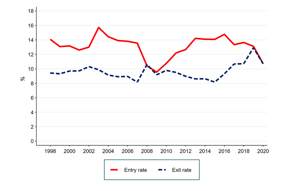
Image description: A line chart showing entry and exit rates, from 1998 to 2020. The line representing the entry rate is highest for the majority of the period; it starts at approximately 14% and ends between 10% and 12%. The line representing the exit rate starts slightly below 10% and between 10% and 12%.
Source: CMA analysis of ONS BSD data
Entry and exit rates have been relatively stable over the period 1998 to 2020 with 2 exceptions. First, the financial crisis in 2007/08 coincided with a sudden spike in the exit rate and a decrease in the entry rate, which took until 2013 to recover. Second, since 2015 exit rates have been increasing, with the exception of 2020 (more on this below) and from 2016 entry rates have been declining.
Short-term entry and exit rates: Business Demography and Companies House
The main limitation of BSD is its lack of real-time data. Indeed, data from BSD on entry and exit stops in 2020. However, business creation and closure is an important indicator to monitor especially in the face of large shocks such as COVID-19. For this reason, we looked at other sources of data.
The ONS provides experimental quarterly statistics on business creations (or births) and closures (or deaths) from the IDBR. It is important to note that there might be discrepancies between the time a business is actually created or closed, and the respective recording in the data. For example, the ONS notes that:
-
‘The date a business is added to the IDBR is generally on the same day, or within a few days, of the legal creation of the business as a company with Companies House. However, this can be several weeks after the effective birth of the business.’
-
‘For business closures, the registration process can take longer, as the death of a business may be long and complex. The “effective” death of a business may occur several months before its actual death from a legal perspective. A business is removed from the IDBR if information from HM Revenue and Customs (HMRC), Office for National Statistics (ONS) business surveys or Companies House indicates it is no longer active. The ONS proves deaths by contacting companies if necessary.’[footnote 207]
These 2 issues should not affect our quarterly data too significantly. We explore this data first by looking at the overall number of companies created and closed since 2017. Then, we focus on the period from 2019 and describe the any change during the COVID-19 pandemic.
Figure 5.7 shows the total number of companies that have been created and closed from 2017. From the graph, it is clear that our data records business openings and closures in a seasonal way, with more openings and deaths being recorded in the first quarter of the year.
Figure 5.7: Companies openings and closures
Image description: A line chart showing company openings and closures, from 2017 to Q3 2021. The line representing company openings is slightly higher than the company closures line for the majority of the period between Q3 2017 and Q1 2021; it starts at above 80,000 and ends at approximately the same level. The line representing company closures starts slightly below 100,000 and ends slightly above 100,000.
Below, we focus on the last 3 years available: Q1 2019 to Q3 2021. To clean the seasonal cycles present in the data, we look at year-on-year change. Figure 5.8 shows the year-on-year percentage change in company births for Q1 2019 to Q3 2021. A positive bar indicates that there has been an increase in the number of company creations relative to the same quarter one year before.
Figure 5.8: Year-on-year percentage change in total business openings by quarter across the UK between Q1 2019 to Q3 2021
Image description: A bar chart showing the year-on-year percentage change in total business openings by quarter across the UK between Q1 2019 to Q3 2021. Each bar represents the percentage change in total business openings in the respective quarter of each year. A positive bar indicates an increase in the number or company openings relative to the same quarter one year before.
Source: CMA analysis of Business Demography experimental data
Figure 5.9 shows the year-on-year percentage change in total business closures across the UK by quarter between Q1 2019 and Q3 2021. A positive bar indicates that there has been an increase in the number of companies closures relative to the same quarter one year before.
Figure 5.9: Year-on-year percentage change in total business closures by quarter across the UK between Q1 2019 to Q3 2021
Image description: A bar chart showing the year-on-year percentage change in total business closures by quarter across the UK between Q1 2019 to Q3 2021. Each bar represents the percentage change in total business closures in the respective quarter of each year. A positive bar indicates an increase in the number or company closures relative to the same quarter one year before.
Source: CMA analysis of ONS data
Previous recessions (like the financial crash in 2008) have usually been followed by a rise in business closures and decline in business creations. However, business demographics data show a different pattern during the 2020 recession.
Company creations declined during the first lockdown in Q2 2020 – a typical characteristic of recessions. However, there was a material increase in company creations during the second and third lockdowns. On the other hand, company closures have declined during the first lockdown in Q2 2020. Company closures rate materially increased from Q4 2020 – this coincided with the increase in business creation we presented in Figure 5.8.
This atypical pattern is possibly due to the exceptional level of government support seen during this crisis compared to previous recessions which may have helped failing businesses delay closure. Government support measures included: the coronavirus job retention scheme, VAT deferral, business rates relief for some sectors, recovery loan schemes, the Emergency Coronavirus Act 2020 and temporary restrictions on using winding up processes.[footnote 208]
This atypical change in entry and exit rates is also visible in data from Companies House. Duncan et al (2021) as well as Savagar and Galanakis (2021) use this data to find consistent results with those described above for entry.[footnote 209] Following a sharp drop during the initial national lockdown, business registration has strengthened in most sectors even during the second and third lockdown periods.
In particular, Wholesale and retail trade was the sectors which saw the largest increase in company births relative to 2019, Accommodation and food services, and Transportation and storage, were the sectors that saw the lowest number of company births during the pandemic. The authors also suggest that firm creation was higher in more productive sectors. This is consistent with a suggested positive reallocation impact of the pandemic. However, they warn that firms might have been set up artificially due to increased government support and that they might not lead to long-term benefits for productivity.
Short-term exit rates: Insolvencies
Typically, in a competitive economy we would expect less productive businesses to go out of business and to be replaced by new ones. Therefore, an interesting data source is the number of companies being declared insolvent. This is why we look at data from the Insolvencies Service.[footnote 210] This data includes the total monthly insolvencies in England and Wales. These are plotted in Figure 5.10 from January 2019 to October 2021.
Insolvencies are a subset of business closures. Specifically, insolvencies refer to a business exiting the market due to an inability to pay its debts, whereas business closure refers to a firm exiting the market for any reason (including insolvency).
Figure 5.10: Monthly total insolvencies in England and Wales
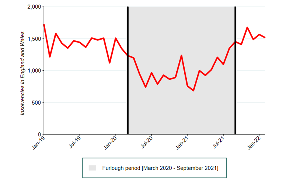
Image description: A line chart showing monthly insolvencies from 2017 to 2021. The line begins above 1500, close to 1700, and ends below 1500. The fourlough period is shaded on graph between, March 2020 and September 2021.
Source: CMA analysis of data from the Insolvency Service
This data is consistent with findings based on Business Demography and Companies House. The shaded area of Figure 5.10 indicates the months in which furlough was available. This also proxies the period over which other business support schemes were available for businesses.
Evidence appears consistent with suggesting that this scheme was successful in reducing the potential increase in insolvencies that would be typically expected during a crisis.[footnote 211]
Conclusions on dynamic indicators
The dynamic metrics that we have estimated complement the concentration figures presented in concentration, industry structure, and distributional impacts. They provide useful information and insight into certain competitive dynamics that cannot be captured by aggregated concentration indices. For example, high concentration might be driven by high fixed costs and, conversely, low concentration might hide little dynamic competition. In this Chapter, we have explored measures of persistence, the evolution of market shares and firms entry and exit rates. These metrics look beyond some of the limitations of static concentration measures and assist in building a more nuanced picture.
Metrics of persistence present some evidence that there has been a slight increase in the tendency of the largest or most profitable firms to remain top performers, although this is not true across all measures. This might suggest that competition may be becoming less dynamic for the largest and most profitable firms.
The evolution of sector-level market shares shows a wide variety of dynamics. Some sectors present an increasing concentration among the top 5 firms at the expenses of the smaller firms, while others show a large and stable market share made predominantly by smaller firms.
The evidence on entry and exit showed that, over the past 20 years, the 2 periods during which entry decreased and exit increased materially were after the financial crisis and after 2016. More real time data showed that the COVID-19-related recession followed a different pattern from ‘standard’ recessions, with a typical decrease in business creation accompanied by a contemporaneous decrease in business closures and insolvencies during the first lockdown. Both business openings and closures grew significantly from the end of 2020.
Consumer survey evidence
Summary
-
the BEIS Consumer Protection Study 2022 estimates that 69% of consumers, or 36 million adults in the UK, had experienced at least one problem with something they had bought between April 2020 and April 2021 (or bought at any time and used between those dates) which caused them stress, cost them money or took up their time[footnote 212]
-
the incidence of detriment experienced was higher for services markets than goods markets; services also accounted for just over three-quarters of the estimated total net monetised detriment
-
the choice of detriment measure materially affects conclusions drawn between markets. Using incidence – or the rate of consumer problems – airline and package holidays were the sectors with the greatest problems, followed by internet provision. However, when measuring the net monetised detriment – or total cost – renting services and vehicle maintenance and repair were the worst-performing sectors
-
findings suggest that some groups of consumers had a greater risk of experiencing detriment, for example consumers who reported finding it more difficult to manage financially were more likely to have experienced detriment than those living comfortably (86% of those finding it very difficult to manage financially and 78% of those finding it quite difficult compared with 66% of those living comfortably). Consumers from black and minority ethnic groups were also more likely to have experienced detriment than white consumers (76% compared to 68%)
-
amongst those who experienced detriment, consumers finding things more difficult financially were more likely to have suffered a net monetised detriment of at least £1,500 across all their experiences of detriment in the study year
-
overall, 43% of detriment experiences were felt by consumers to have been caused by or made worse by the COVID-19 pandemic. However, this was felt to have been the case for the vast majority of detriment experiences in the airline and package holiday sectors (96% and 95%, respectively)
-
the UK Customer Satisfaction Index (UKCSI) found that whilst the level of problems consumers encountered had risen, there had been improvements in how firms handle complaints, with all 4 complaint handling measures in the UKCSI recording their highest-ever score
-
the pandemic had a significant impact on UK consumer shopping behaviour with the online retail channel growing by 44.9% to £111.1 billion in 2020, accounting for 27.6% of all retail sales. This is expected to lead to a longer-term change in consumption habits, emphasising the importance of promoting competition and measuring outcomes across these platforms
Introduction
Relevance of consumer survey data
The cost of weak competition is borne by consumers in the form of higher prices and lower quality. This raises the cost of living, and it can hit the lowest-income households hardest. With fewer suppliers to choose from, and less innovation, consumers also suffer from reduced choice. We are therefore ultimately interested in assessing the level of competition because strong competition can deliver good consumer outcomes.
Other chapters in this report provide evidence of industry structure, such as concentration, to infer the level of competition across the economy. This chapter uses survey evidence to look directly at the experiences consumers are having in markets and assess how existing levels of competition are shaping these outcomes.
Survey data also tends to be more up to date than some of the economic indicators. This enables us to build up a picture of how more recent events may have impacted on markets which might not be possible from economic indicators alone. For instance, the on-going impact of COVID-19 on consumer behaviour and consumers’ experiences in markets.
We expect competitive markets to deliver good outcomes for consumers (and uncompetitive markets to deliver sub-optimal outcomes). As such, we can use reported outcomes as an indicator of effective competition.
There is relevant survey evidence that looks over time, and in some instances across countries, to assess performance across a broad range of markets. Combining multiple sources allows us to paint a broad picture of how consumers experience markets, the outcomes those markets provide, and what this might imply (although not determinatively conclude) about how competition in the UK has developed.
Methodology
In this chapter we are interested in assessing the outcomes consumers believe markets are delivering for them. In reviewing the existing literature, we have identified a wide array of potential sources and structured our search for evidence against the following metrics:
-
consumer problems/detriment in markets
-
satisfaction in markets
-
experience of comparing products/services and switching
-
changes to shopping behaviour since the COVID-19 pandemic
Limitations
Consumers cannot and should not be expected to judge whether the outcomes they experience in markets are the optimal result of effectively competitive markets or the restricted sub-optimal outcomes of uncompetitive markets.[footnote 213] Furthermore, some types of detriment are more visible to consumers than others and this may vary across markets. Differences in reported outcomes across industries, and trends over time, may reflect competition or may reflect other unrelated factors.
In using existing consumer survey evidence to inform a comprehensive assessment of competition across the economy, the approach we take is necessarily different to that the CMA would normally take to survey evidence, for example when carrying out an in-depth review of a market. It would not be practical nor realistic to commission in-depth surveys of every product market across the economy, and no single existing survey covers all the topics we are interested in.
As with all the metrics in our report, those we consider here are subject to certain caveats. In particular, they do not typically give a direct indication of the level of competition in the economy or a given market, but they are valuable indirect evidence.
For instance, in a market with effective competition, we would expect that consumers would opt to make purchases from firms which they trusted based on their satisfaction with previous performance, and with which they had experienced fewer problems.
In terms of firm behaviour, we might expect that, in a competitive market, firms would want to ensure that consumer expectations were met, that problems were dealt with, and that they provided a good choice of products.
Some of these metrics might tell us about the process of competition itself. Consumers’ ability to compare providers and products, and to exercise choice are key to effective competition; poor scores here might indicate that the process of competition is not working well. Nevertheless, it is important to note that interpretation is not always straightforward – for example, the reporting and resolution of consumer problems can be influenced by regulatory activity.
Therefore, the survey evidence analysed in this chapter may appear on the surface to contrast with evidence elsewhere in this report or indeed to other surveys. This reflects the fact that the various pieces of analysis carried out for this report are approaching the question of assessing the overall state of competition in the UK economy in different ways[footnote 214]. To attempt to make such an assessment, we must utilise these different approaches to piece together a more complete picture.
It should be noted when reading this chapter, that the fieldwork for much of the survey evidence drawn upon was conducted during the COVID-19 pandemic which significantly impacted both consumer behaviour and the way in which businesses were able to operate. The pandemic might also have impacted consumers’ expectations of businesses.
Furthermore, since the surveys included in this chapter were conducted, the UK has experienced inflation at a rate that has outstripped average wage increases, increasing the cost of living for consumers. Future survey and other data will provide a clearer understanding of the impact of this on consumer detriment.
As with most sample surveys that report quantitatively, the findings are estimates for a wider target population of interest – such as UK adults 18+. As such, they are not exact measures of the population parameters in question but are subject to imprecision stemming from sampling error[footnote 215]. Some of the survey evidence we present in this chapter includes confidence intervals – typically, 95% CIs – to provide a measure of the uncertainty associated with the population estimates that is attributable to sampling error. [footnote 216]
This summary of the available survey evidence is not intended as a deep-dive analysis of individual sectors. The CMA through its Enterprise Act 2002 markets work has done this in some areas and many of the sector regulators carry out significant research on performance in their specific markets. We use the term ‘markets’ to reflect the findings as reported in the surveys we refer to; it should not be interpreted to mean ‘relevant markets’ in the competition law sense (not least because relevant markets are likely to be narrower).
Survey sources
The consumer survey evidence that best meets the requirements of this report comes from the BEIS Consumer Protection Study 2022 which looks at consumer detriment across 44 UK markets. We review the results from this survey in the first instance, supplementing it with evidence from other surveys.
Summary of consumer survey findings
Problems and detriment
We expect competitive markets to deliver good outcomes for consumers and, as such, problems may be indicative of uncompetitive markets. Consumer problems, detriment experienced, and the degree of satisfaction in markets are closely linked. In this section we consider the metrics available on these areas from existing survey evidence and what this tells us about which markets are performing less well from a consumer perspective.
The COVID-19 pandemic has undoubtedly impacted on the experience consumers have had in different markets over the past 2 years and particularly in certain markets. We seek to understand the impact of the pandemic and readers should bear in mind this important context.
The BEIS Consumer Protection Study 2022 (CPS) [footnote 217] is a particularly useful source of evidence in assessing these issues. The survey examines the incidence of consumer detriment[footnote 218] in the UK, estimates its cost and analyses its distribution. Two main measures of consumer detriment were estimated in the survey:
-
the proportion of consumers who had experienced a problem in a given market in which they had purchased/used goods/services in the 12 months to April 2021, referred to as the incidence of detriment
-
the cost of the detriment, for example, the overall net monetised financial detriment experienced by consumers (see Figure 6.2 for more detail)
As shown in Figure 6.1, an estimated 69% of consumers, or 36.0 million adults in the UK, have experienced at least one problem with something they had bought between April 2020 and April 2021 (or bought at any time and used between those dates) which caused them stress, cost them money or took up their time.[footnote 219] The median number of instances of detriment reported was 4 per person, and there were an estimated total of 229.8 million experiences of detriment for the UK as a whole.[footnote 220] The incidence of detriment in the services market is higher, at 55%, compared with that for goods[footnote 221], at 48%.
Figure 6.1 – Summary of consumer detriment – April 2020 – April 2021
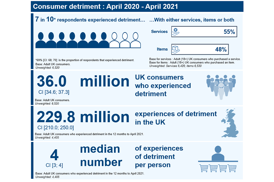
Image description: Graphic illustrating consumer detriment between April 2020 to April 2021. An illustration with 7 shaded silhouettes and 3 white silhouettes highlighting that 7 in 10 respondents experiencing detriment, alongside two horizontal bars, akin to a bar graph, that show that 55% was services related and 48% was item related. Three more graphics demonstrate that 36 million UK consumers faced at least one incident of detriment, 229.8 million experiences of detriment in totality in the UK with a median number of 4 incidences of detriment per person.
Source: CPS, Image 2, p23.
Further evidence seems to support the finding that consumers experienced relatively high levels of problems in 2020 and 2021. For example, the UK Customer Satisfaction Index (UKCSI)[footnote 222] surveys consumers about their experiences with specific organisations in 13 sectors and reported that 16.4% of customers had experienced a problem in the 3 months preceding the survey, the highest rate ever recorded in the UKCSI.[footnote 223] The COVID-19 pandemic was likely a factor that caused or contributed to a significant proportion of these problems which is discussed in more detail in the most negative consequences of detriment section.
Consumers took some form of action[footnote 224] in 82% of detriment experiences seen in the UK over the 12 months to April 2021. Consumers were asked about their satisfaction with the outcome of detriment experiences considered to have been concluded. In just over half (55%) of these concluded experiences of detriment consumers reported being completely or somewhat satisfied with the outcome, while they were dissatisfied with the outcome – completely or somewhat – in a quarter (25%) of them.[footnote 225]
Data from the UKCSI indicates that whilst the level of problems consumers have encountered had risen, there appear to have been some improvements in how firms handle complaints with all 4 complaint handling measures in the UKCSI recording their highest ever score.[footnote 226]
Net Monetised detriment
The CPS also estimates the monetised value of detriment to UK consumers across 7 different components as set out in Figure 6.2.
Figure 6.2 – Net monetised detriment formula and its components[footnote 227]

Image description: Costs components (original cost + cost of replacing of fixing the product + additional cost + time cost) – Mitigation components (use value + value of refund or replacement received + other compensation) = Net monetised detriment
Source: CPS, Figure 7, p29.
Between April 2020 and April 2021 UK consumers are estimated to have experienced a total net monetised detriment of £54.2 billion (95% confidence interval: £40.9 billion - £67.6 billion)[footnote 228][footnote 229], with a median value of £28 for a detriment experience[footnote 230]. Figure 6.3 shows the breakdown of the £54.2 billion across the various components of costs and mitigations.
Figure 6.3 - Value of the net monetised detriment components (billion £)
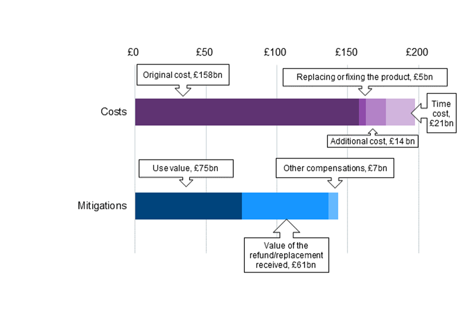
Image description: Chart to show breakdown of the £54.2 billion across the various components of costs and mitigations. Bar chart. First bar shows costs. Categories are: Original cost, £158bn; Replacing or fixing the product, £5bn; Additional cost, £14 bn; time cost £21bn. Second bar shows mitigations. Categories are: Use value £75bn; Value of the refund/replacement received £61bn; other compensations £7bn.
Source: CPS, Figure 9, p32.
Base: All detriment experiences in UK in the 12 months to April 2021.
Unweighted: 9,416.
To help put the estimated £54.2 billion of total net monetised detriment in the 12 months to April 2021 into context, the CPS refers to the £1,293 billion of household consumption expenditure in the period from Q3 2020 to Q2 2021 estimated from the ONS’s Consumer Trends publication.[footnote 231]
The incidence of detriment is higher in services markets (55% compared with 48% for goods) and a higher proportion is also seen for monetised detriment where just over three-quarters (76%) of estimated net monetised detriment is in services markets compared with that in goods markets (24%). The median detriment for services is £41, compared with £14 for goods (see Table 6.1).
Table 6.1 Incidence of detriment and net monetised detriment by services and goods markets
| Product type | Incidence of detriment | Estimated total UK detriment (billion £) | Median detriment (£) | Share of UK total net monetised detriment |
|---|---|---|---|---|
| Services | 55% | £41.2bn | £41 | 76% |
| Goods | 48% | £13.1bn | £14 | 24% |
Source: CPS, extracts from Image 2 (p23) and Table 2 (p33) (not including confidence intervals around the point estimates)
Base for incidence: 6,426 (services), 6,530 (goods)
Base for net monetised detriment: 5,708 (services), 3,708 (goods)
The poorer performance of services markets relative to goods markets was observed in our 2020 State of UK Competition report which noted that this trend was observed in all EU countries included in the 2018 Consumer Markets Scoreboard and that this was particularly marked in the UK.[footnote 232] In 2019 to 2020, The European Commission launched the Market Monitoring Survey (EC MMS) to replace the Markets Scoreboard. The EC MMS report covers a narrower set of markets and does not report on goods and services markets as a whole, therefore the assessment of goods and services markets’ performance, in aggregate, in the UK relative to that of the EU cannot be updated at this stage.
Findings by market sector
Consumer survey evidence can be used to highlight how specific market sectors are performing in terms of customer satisfaction and incidence of problems. As highlighted earlier, given the reference period for the CPS was April 2020 to April 2021, the COVID-19 pandemic undoubtedly impacted on customer experiences in a range of sectors which is explored later on in the chapter.
Whilst not all consumer problems in markets are driven by competition issues, we might expect that, in a competitive market, firms would want to ensure that consumer expectations were met and that problems were dealt with.
There was significant variation in both the incidence of detriment and net monetised detriment levels between different market sectors in the CPS (the consumer survey that currently covers the greatest number of market sectors). Table E.1 in Appendix E shows the incidence and estimated net monetised detriment (as well as median net monetised detriment and the estimated number of UK consumers affected by problems in each sector) for all 44 market sectors asked about in the survey.
The sectors with the highest incidence of detriment (Figure 6.4) were ‘Airlines’, where 36% of consumers who had bought/used that service in the past year had experienced a problem, followed by ‘Package holidays and tours’ (35%), ‘Second-hand vehicles’ (30%) and ‘Internet Provision’ (29%). The high incidence of detriment in certain sectors – such as ‘Airlines’ and ‘Package holidays & tours’, both associated with travel – is likely to be related to a large extent to the significant disruption experienced among these sectors as a result of the measures implemented in response to the COVID-19 pandemic. The impact of the pandemic as perceived by consumers who experienced detriment is discussed – including across market sectors – in the impact of COVID-19 on consumer detriment section.
Figure 6.4 – The 10 sectors with the highest incidence of detriment
| The 10 sectors with the highest incidence of detriment | UK consumers aged 18+ who made a purchase in the sector or market cluster |
|---|---|
| Airlines | 36% |
| Package holidays and tours | 35% |
| Second-hand vehicles | 30% |
| Internet provision | 29% |
| Electronic devices and software | 26% |
| Real estate services | 26% |
| Clothing, footwear and accessories | 24% |
| Furniture and appliances | 21% |
| Adult care | 21% |
| New vehicles | 19% |
Source: CPS, Figure 1, Executive Summary, page 7
Base: UK consumers aged 18+ who made a purchase in the sector or market cluster. Unweighted: Airline 463, Package holidays and tours 429, Second-hand vehicles 1,011, Internet provision 5,035, Electronic devices and software 3,655, Real estate services 364, Clothing, footwear and accessories 5,321, Furniture and appliances 3,709, Adult care 140, New vehicles 440.
A different picture emerges when looking at estimates of net monetised detriment by sector. As may be seen in Figure 6.5 below, the highest total net monetised detriment was recorded in ‘Renting services’ (the £7.4bn accounts for 14% of the total), ‘Vehicle maintenance and repair’ (£7bn, or 13%), ‘Second-hand vehicles’ (£4.1bn, or 7%) and ‘Internet provision’ (£3.4bn, or 6%) – in total, these 4 sectors account for 40% of total monetised detriment. See Appendix E for median net monetised detriment by sector.
Figure 6.5 – Two-fifths of the total UK net monetised detriment imputable to 4 sectors
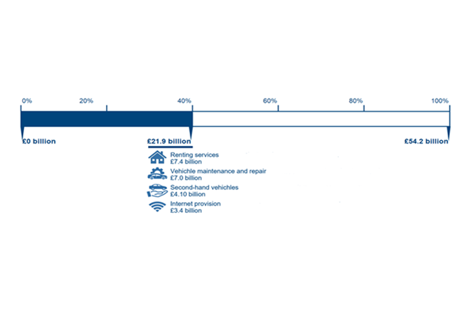
Image description: A bar graph with 0 to 100% across the top and a shaded area below that covers 0 to 40%, illustrating that 40% or two-fifths of net monetised detriment can be attributed to 4 sectors, renting services, vehicle maintenance and repair, second hand vehicles and internet provision.
Source: CPS, Image 3, page 34
The preceding paragraphs highlight that the lens through which we view detriment, be that incidence or net monetised value, highlight different market sectors as more or less problematic from a consumer perspective.
For some sectors with a high incidence of detriment, the total net monetised detriment is nonetheless relatively low – as is the case in ‘Airlines’ and ‘Package holidays and tours’ (where total net monetised detriment is estimated at £0.4billion and £0.2billion, respectively). This is because they have relatively low median net monetised detriment of £28 and £42, respectively (in part because high proportions of the costs involved were recouped) and were also lower usage categories (survey estimates suggest 3.7million and 3.5 million UK consumers, respectively, had used/bought these services in the past 12 months – or, about 7% of UK consumers for both).
Conversely, for other sectors, the difference in ranking is primarily due to the average monetised detriment within that sector being high, meaning a relatively low incidence of detriment nonetheless yields high total net monetised detriment (as is the case for ‘Renting services’, for example, where the incidence of detriment is only 13% but the median monetised detriment is £442 because not only was the initial cost high, but the amount recouped was relatively low compared to many other sectors).
In other cases, the difference is driven by the usage of that market sector being particularly high so that, even if the incidence and/or average monetised detriment is relatively low, due to the fact that so many UK consumers are using that sector the net monetised detriment is relatively high (as is the case for ‘Electricity and gas services’ where survey estimates suggest 42.3 million UK consumers (or 81%) had bought or used the service in the past 12 months so a relatively low median monetised detriment of £28 and incidence of detriment of 15% nonetheless means the sector overall has a high total net monetised detriment of £2.2bn).
‘Internet provision’[footnote 233] is notable because it is a sector estimated to be used by a large proportion of consumers (70% of survey respondents said that they had bought from or used the sector in the last 12 months, equating to an estimated 36.5 million UK consumers). It was also the sector with the 4th highest incidence of detriment at 29%, meaning that, while the median net monetised detriment was not among the highest at £55, total net monetised detriment was estimated at £3.4 billion for the sector in the UK (fourth highest). This suggests that internet services is a sector which has proved particularly problematic for UK consumers in the 12 months to April 2021. Whilst the CPS indicates that consumers did not generally perceive their problems with internet provision as being caused by the COVID-19 pandemic,[footnote 234] it did result in increased pressure on the infrastructure stemming from increased consumption and high consumer expectations.
‘Second-hand vehicles’ is the other sector with a top 5 ranking for both incidence of and total net monetised detriment (30% and £4.1 billon respectively). However, usage of this sector is lower with an estimated 8.1 million UK consumers having bought from or used this sector in the 12 months to April 2021. The CPS draws attention to the fact that the second-hand vehicles market represents a classic case of asymmetric information with a high-value good, as dealers may have better information on important characteristics of vehicles for sale than they choose to provide to consumers buying them.[footnote 235]
A relatively similar picture emerges on the market sectors with higher levels of customer problems in other surveys. For example, the European Commission Consumer Market Monitoring Survey (EC MMS)[footnote 236] asked consumers in 2019 and 2020 whether they had experienced problems with products or services in 22 markets and Figure 6.6 shows how problems within UK markets compare to those across the EU. The markets where UK consumers experienced the highest level of problems were: airline services (23%); electronic products (20%) and internet provision (17%) each with a higher incidence of problems than the EU27 average (13%, 12% and 14%, respectively).
Figure 6.6 – Incidence of problems with products or services UK vs EU27
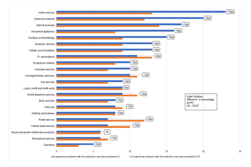
Image description: Clustered barchart. Category are products or services (“Airline services”, “Electronic products” etc) and the bars are the incidence of problems with these products or services in the UK and the EU27. The differences in incidence between the EU27 and the UK are shown.
Source: EC MMS 2019 and 2020. CMA analysis of data from the EC MMS microsite, including 2021 data tables.
Question: ‘Have you experienced problems with the products or services you purchased?’
Bases: Not available on microsite
Note: Results are only included on the microsite where a country’s sample size for a given question is at least 50.
The problems that consumers encounter in markets would be expected to impact on their satisfaction with them. The UK Customer Satisfaction Index has been measuring customer satisfaction in 13 market sectors since 2008[footnote 237] which enables us to look at broad trends in customer satisfaction over time. When looking at satisfaction with markets overall, Figure 6.7 shows that the Satisfaction Index saw a continuous improvement from 72 in January 2008 rising to 72.2 by January 2013. The Institute of Customer Service attribute this to improvements in transactional service, especially for complaint handling and speed of service and employee competence.[footnote 238] Since 2013, whilst there have been some relatively small fluctuations in the Satisfaction Index, levels have remained broadly stable with the latest reported figure in January 2022 at 78.4.
Figure 6.7 – UK Customer Satisfaction Index – 2008 to 2022
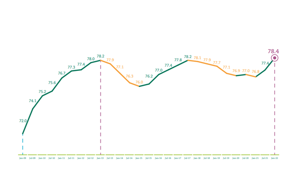
Image description: Line graph showing the UK Customer Satisfaction index from Jan 2009 to Jan 2022. When the line is yellow this shows a decline in the index compared to the previous wave and when it is green is shows an increase compared to the previous wave. The line is green since Jan 2021 as it has risen from 76.8 to 77.4 in July 2021 to the latest figure of 78.4 from January 2022.
Source: UK Customer Satisfaction Index, Jan 2022, p7
Base: The January 2022 UKCSI comprises 45,000 responses from 10,000 UK consumers
As a smaller number of markets are included in the UKCSI and some of the markets covered in it are not covered in the CPS or EC MMS, direct comparisons cannot be made. Nonetheless, it is notable that the worst-performing sectors in the latest Satisfaction Index – and which have also been among the worst-performing sectors over time – are ‘Utilities’ (74.5), ‘Transport’ (75.1) and ‘Telecommunications and media’ (76.3) (also ‘Public services, local’ which is not included in the other referenced surveys).[footnote 239]
Consumer experience by channel of purchase
The CPS asked about the channel through which a purchase that led to detriment was originally made. The greatest number of experiences of detriment occurred where the purchase was made online from a seller’s website (36%), followed by ‘in-person from a shop or other outlet’ (27%) and ‘over a phone call’ (15%). This can be seen in Figure 6.8, where we note that, while presented as a bar chart, each bar here represents a ‘percentage part of the whole’. It is important to note, however, that the study does not hold information about the overall number of purchases in the different channels and cannot explain whether the incidence or the amount of net monetised detriment was broadly proportionate, or not, to the activity of consumers across channels.
Figure 6.8 – Channel of purchase in detrimental experiences
| Channel of purchase | Percentage of detriment experiences |
|---|---|
| Online (seller website) | 36 |
| In-person from a shop | 27 |
| Over a phone call | 15 |
| Online (third-party marketplace) | 9 |
| Auto-renewal | 5 |
| Online (private seller, for example eBay or AirBnB) | 3 |
| In-person from a visiting salesperson | 2 |
| Online (social media platform) | 1 |
| Other | 3 |
Source: CPS, Figure 4, p27
Base: All detriment experiences in the UK in the 12 months to April 2021. Unweighted: 9,388.
The levels of estimated total and median net monetised detriment were also associated with channel of purchase, but – as was the case when looking at market sector – the patterns are different to that for incidence of detriment, especially for the median detriment values.
For median net monetised detriment, the highest value was seen for purchases made ‘In-person from a salesperson’ (at £87), followed by ‘Auto-renewal’ and ‘Online (social media platform)’ (both £55). See Figure 6.9. The highest total net monetised detriment was associated with purchases made ‘In-person from a shop’ (£19.9 billion) and from purchasing ‘Online from the provider’s website’ (£11.5 billion), followed by ‘Over a phone call’ (£6.6 billion). See Figure 6.10.
Figure 6.9 - Median net monetised detriment by channel of purchase (£)
| Channel of purchase | Median net monetised detriment (£) |
|---|---|
| In-person from salesperson | 87 |
| Auto-renewal | 55 |
| Online (social media platform) | 55 |
| Over a phone call | 32 |
| Online (private individuals) | 31 |
| In-person from a shop | 28 |
| Online (provider’s website) | 17 |
| Online (third-party marketplace) | 14 |
| Other | 28 |
Source: CPS, Figure 14, p41.
Base: All detriment experiences in the UK in the 12 months to April 2021.
Unweighted: 9,388 (In-person from a shop: 2,268; In-person from salesperson: 188; Over a phone call: 1,625; Online (provider’s website): 3,314; Online (third-party marketplace): 755; Online (private individuals): 214; Online (social media platform): 84; Auto-renewal: 529).
Figure 6.10 – Total net monetised detriment by channel of purchase (Billion £)
| Channel of purchase | Median net monetised detriment (Billion £) |
|---|---|
| In-person from a shop | 19.9 |
| Online (provider’s website) | 11.5 |
| Over a phone call | 6.6 |
| Online (private individuals) | 2.5 |
| In-person from salesperson | 2.5 |
| Online (third-party marketplace) | 1.8 |
| Auto-renewal | 1.6 |
| Online (social media platform) | 0.6 |
| Other | 6.7 |
Source: CPS, Figure 13, p40.
Base: All detriment experiences in the UK in the 12 months to April 2021. Unweighted: 9,388 (In-person from a shop: 2,268; In-person from salesperson: 188; Over a phone call: 1,625; Online (provider’s website): 3,314; Online (third-party marketplace): 755; Online (private individuals): 214; Online (social media platform): 84; Auto-renewal: 529).
Choice, shopping around and switching
Levels of shopping around and switching can also be indicative of the health of markets. However, there is no specific level of switching that we would expect to see in a competitive market. Relatively little new cross-market survey evidence has been published on the levels of and attitudes towards switching since the publication of the 2020 State of UK Competition report.[footnote 240]
Industry data indicates however that the COVID-19 pandemic and other external factors such as the turbulence in the energy market may have reduced levels of switching in some regulated markets. For example:
-
Current Account Switch Service (CASS) data shows that the number of current account switches fell significantly after March 2020 and was much lower in 2020 than in the previous year with 1,017,354 [footnote 241] switches between April 2019 – March 2020 falling to 562,016[footnote 242] between April 2020 and March 2021.
-
Energy UK electricity switching figures reported 139,070 customers changed supplier in November 2021. This is the lowest monthly figure since Energy UK started publishing these in October 2013 and represents a more than 70% fall compared to November 2020. From January 2021 to November 2021, almost 4.9 million customers had changed supplier, an 11% decrease compared to the equivalent period in 2020. This had been expected given the current turbulence in the energy retail market. The cheapest deals on the market at the time of reporting were those covered by the price cap – removing any financial incentive to switch as customers are advised to stay on these default tariffs in the absence of better deals elsewhere.[footnote 243]
We will explore this further in future State of UK Competition reports when more data on switching is available across a fuller range of markets.
Whether or not a consumer goes on to switch provider for a product or service is, typically, linked to how easy they find it to compare the offerings of different providers.
The EC MMS asked consumers how easy of difficult they found it to compare products or services of different providers/retailers/operators in the 22 markets covered by the survey in 2019 and 2020. Across most markets, a similar or lower proportion of UK consumers said they found it difficult to compare products/services compared with the EU27 average. The markets where the highest proportions of UK consumers said they found it very difficult or fairly difficult to compare between providers were ’Electricity services’ (10%), ’Furniture and furnishings’, ‘Products for children’, ‘Cosmetics’ (each at 9%), and ’Insurance services’ (8%).[footnote 244]
The experience of vulnerable consumers in markets
The most vulnerable in our society, such as those on low incomes; people without access to online services or those who struggle to use them; or people with poor mental health who may avoid or fear change, can face greater challenges engaging in markets. These consumers may be particularly vulnerable in markets that are not delivering a good experience for consumers.
The CPS analysis looked at which demographic and socio-economic characteristics are associated with higher vulnerability to detriment across a number of measures. Findings suggest that some groups of consumers had a greater risk of experiencing detriment in the first place and of suffering the most negative consequences of detriment.
It is worth noting, however, that the likelihood of experiencing detriment is likely to be heavily influenced by the type and extent of consumer activity (quality and quantity of products consumed, as well as the amount of money consumers have to spend on purchases). The higher incidence of detriment observed in some subgroups might therefore be the consequence of their consumer activity, in turn related to their socio-economic or demographic characteristics. The CPS report includes more detailed analysis exploring how the probability of experiencing detriment changes by key characteristics while controlling for other factors.[footnote 245] For example, while the finding that younger and more educated people are more likely to have experienced detriment may seem counter-intuitive, the association was weakened when consumer activity was added to the model, suggesting that differences by age and education on the probability of having faced detriment is partly associated with, but not fully explained by, differences in consumer activity.[footnote 246]
When looked at in isolation, consumers on lower incomes were no more likely to experience detriment than average (66% of those on an equivalised monthly household income of £1,000 or less compared to 69% on average). In fact, consumers with higher incomes were more likely to have experienced detriment (72% of those with an equivalised monthly income of £1,501 to £2,500 and 73% where this was more than £2,500); this in part may be explained by consumers with higher incomes engaging across a wider range of market sectors and spending more in the first place.[footnote 247]
Income, however, is only one measure of an individual’s financial situation and does not necessarily paint a full picture. The CPS found that consumers who reported finding it more difficult to manage financially were more likely to have experienced detriment (86% of those finding it very difficult to manage financially and 78% of those finding it quite difficult compared with 66% of those living comfortably) (Figure 6.11).
Figure 6.11 – Percentage of consumers who have experienced detriment by how people say they are managing financially
| How people say they are managing financially | Percentage of consumers who have experienced detriment |
|---|---|
| Living comfortably | 66 |
| Doing alright | 67 |
| Just about getting by | 69 |
| Finding it quite difficult | 78 |
| Finding it very difficult | 86 |
Source: CPS, Figure 32, p67.
Base: UK consumers aged 18+. Unweighted: 6,520 (Living comfortably: 1,841; Doing alright: 2,756; Just about getting by: 1,398; Finding it quite difficult: 336; Finding it very difficult: 178).
There was significant variation in the likelihood of having experienced detriment by ethnic group, with consumers from minority ethnic groups as a whole more likely to have experienced detriment than white consumers (76% compared with 68%). However, the proportion of consumers experiencing detriment differed amongst white ethnicity sub-groups, with 67% of white British consumers reporting experiencing detriment in the 12 months covered by the study compared with 80% of consumers from any other white background.[footnote 248]
The most negative consequences of detriment
The CPS also looked at the demographics of those who experienced the most negative outcomes, including value of net monetised detriment, impact on household finances and physical and mental health, and the likelihood of having experienced negative emotional consequences.
Overall, 14 per cent of consumers in the UK who experienced detriment in the 12 months to April 2021 suffered a net monetised detriment value of £1,500 or more.[footnote 249]
This varied between age groups, with younger people more likely to have suffered a net monetised detriment of £1,500 or more (Figure 6.12).
Figure 6.12 – Percentage[footnote 250] who suffered a net monetised detriment of £1,500 or more by age group
| Age group | Percentage who suffered a net monetised detriment of £1,500 or more |
|---|---|
| 18 to 29 | 19 |
| 30 to 39 | 15 |
| 40 to 49 | 15 |
| 50 to 59 | 14 |
| 60 to 69 | 12 |
| 70+ | 8 |
| Overall | 14 |
Source: CPS, Figure 37, p78.
Base: UK consumers aged 18+ who have experienced detriment in the 12 months to April 2021.
Unweighted: 4,405 (18- to 29: 335; 30 to 39: 689; 40 to 49: 832; 50 to 59: 882; 60 to 69: 852; 70+: 810).
There was also variation by economic activity status. Amongst those who experienced detriment, only 8% of retired consumers suffered a net monetised detriment of £1,500 or more, compared with 20% of unemployed people, 18% in full-time education, 18% in other activities, and 14% of those in paid work.[footnote 251] Unemployed consumers may have been more likely to state that they were finding it very or quite difficult to get by financially which is also associated with a greater risk of having experienced monetised detriment of £1,500 or more, as seen below.
Amongst those who experienced detriment, consumers finding things more difficult financially were more likely to have suffered a net monetised detriment of £1,500 or more (Figure 6.13).
Figure 6.13 – Percentage [footnote 252] who suffered a net monetised detriment of £1,500 or more by financial situation
| Financial situation | Percentage who suffered a net monetised detriment of £1,500 or more |
|---|---|
| Living comfortably | 12 |
| Doing alright | 14 |
| Just about getting by | 12 |
| Finding it quite difficult | 23 |
| Finding it very difficult | 22 |
| Overall | 14 |
Source: CPS, Figure 38, p79.
Base: UK consumers aged 18+ who have experienced detriment in the 12 months to April 2021.
Unweighted: 4,405 (Living comfortably: 1,185; Doing alright: 1,851; Just about getting by: 957; Finding it quite difficult: 261; Finding it very difficult: 144).
The CPS discusses potential reasons for higher proportions of younger consumers and consumers finding things difficult financially experiencing net monetised detriment of £1,500 or more. It suggests that this may be partly explained by these groups, where they experienced detriment, being more likely to face more instances of detriment during the study period and/or being more likely not to take any actions to address the detriment. Over a period of 12 months, these can lead to the accumulation of a large sum of net monetised detriment.[footnote 253]
The problems consumers face in markets can impact on their lives beyond the financial cost. Respondents in the CPS who experienced detriment were asked whether these experiences had a negative effect on their physical health, mental health and/or household finances, and how severe this effect was. Ten percent of these respondents reported a very negative effect on their mental health in at least one of their reported experiences of detriment, 5% a very negative effect on physical health and 9% a very negative effect on their household finances. Certain more vulnerable groups including those finding it difficult financially were more likely to report at least one of their experiences of detriment had a very negative impact on their physical health, their mental health and/or their household finances compared with those in a more comfortable financial situation (Figure 6.14).
Figure 6.14 Percentage[footnote 254] who reported a very negative effect on their wellbeing at least once by financial situation

Image description: Graph showing the percentage of people who reported a very negative effect on their wellbeing. A grouped bar-chart with 3 groups and 5 categories. The groups are the type of effect (“mental health”, “physical health” and “household finances”); the categories are the financial situation of the respondent (“Living comfortably”, “Doing alright”, “Just about getting by”, “Finding it quite difficult” and “Finding it very difficult”)
Source: CPS, Figure 39, p80.
Base: UK consumers aged 18+ who have experienced detriment in the 12 months to April 2021.
Unweighted: 4,401 (Living comfortably: 1,184; Doing alright: 1,851; Just about getting by: 955; Finding it quite difficult: 261; Finding it very difficult: 144).
The impact of COVID-19 on consumer detriment
The CPS was carried out in April and early May 2021 with consumers asked about problems they had encountered between April 2020 and April 2021. It is important to keep in mind that the COVID-19 pandemic influenced consumers’ options, behaviours, habits and experiences as well as businesses’ capacity to adapt and respond.
Consumer detriment appears to have been impacted by the COVID-19 pandemic. The CPS asked respondents to what extent they felt that the instances of consumer detriment they experienced between April 2020 and April 2021 were caused or made worse by the pandemic. While the outbreak of the COVID-19 pandemic was considered irrelevant by consumers in almost half of the experiences of detriment (47%), over 2 in 5 (43%) of the detriment experiences were felt by consumers to be either mostly or fully caused by or made worse by the COVID-19 pandemic (Figure 6.15).
Figure 6.15 – Experiences of detriment, by the extent to which consumers considered they were caused or made worse by the COVID-19 pandemic
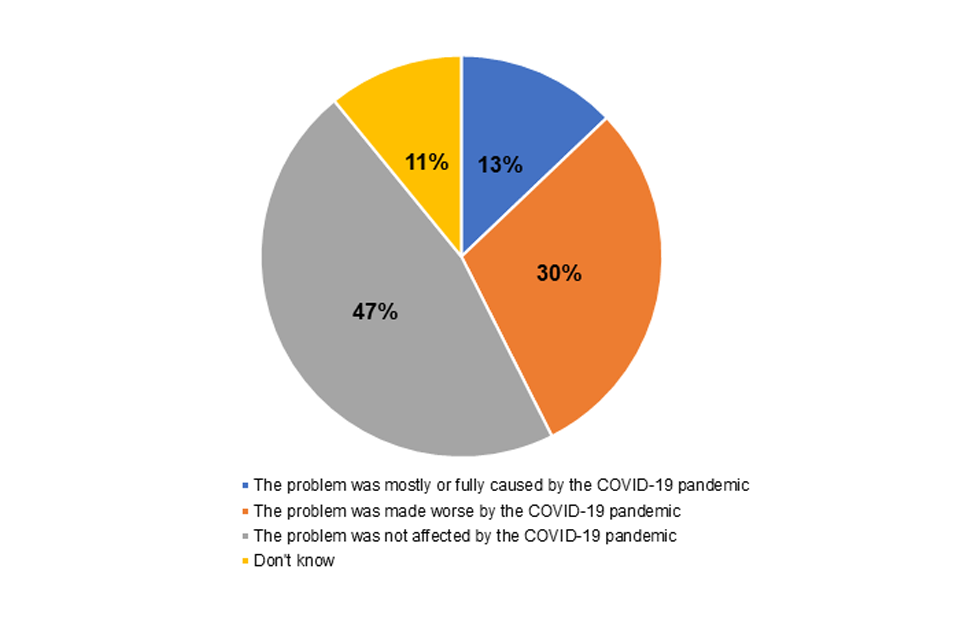
Image description: Pie chart. There are 4 categories: whether the detriment was “Mostly or fully caused”, “Made worse”, or “Not affected” by the pandemic; and one category fro “Don’t know”
Source: CMA chart based on CPS, Figure 48, p93.
Base: All detriment experiences in the UK in the 12 months to April 2021 (up to 3 per respondent). Unweighted: 9,407.
Note: Displayed percentages don’t add exactly to 100% due to rounding.
There was significant variation by market sector in the extent to which consumers felt the problems they had faced had been affected to at least some extent by the COVID-19 pandemic. Compared with the 43% overall of experiences of detriment considered to have been caused by (at least in part) or made worse by the COVID-19 pandemic, the highest, corresponding figures were 96% for problems associated with airlines, 95% for package holidays and tours, 85% for sport, cultural and entertainment activities, 80% for hotels and holiday accommodation, and 73% for private medical and dental services[footnote 255] – all sectors known to have been heavily impacted by the pandemic.
When looking only at the 8 sectors with the highest incidence of detriment (see Figure 6.4 for the sectors where incidence of detriment was highest) as noted above, the vast majority of those who had experienced a problem with ‘Airlines’ and ‘Package holidays and tours’ felt it was caused or made worse by the pandemic. However, this was not the case for the other sectors with the highest incidence of detriment where, in particular, much lower proportions of consumers felt their problem was mostly or fully caused by the pandemic (see Figure 6.16).
Figure 6.16 – Percentage (of experiences of detriment) where the detriment was perceived to be fully or mostly caused or made worse by the COVID-19 pandemic by market sector
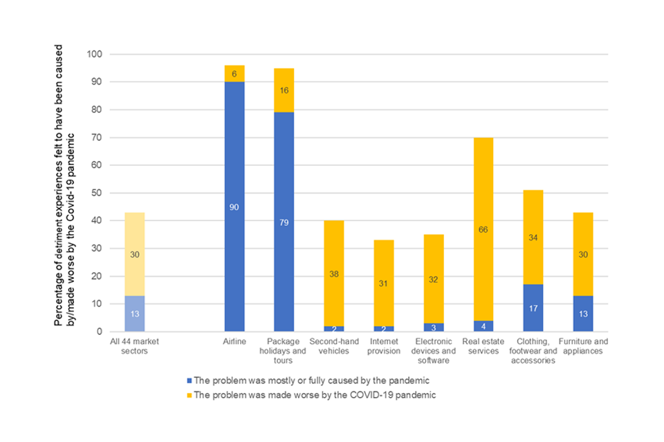
Image description: Bar chart. Categories are the type of detriment (“Airline”, “Package holidays and tours” etc, and “All”). Bars show the percentage of detriment experiences. Each bar is broken into two (problem was mostly or fully caused by the pandemic, and problem was made worse by the pandemic)
Source: CMA analysis of CPS data
Base: All detriment experiences in the UK in the 12 months to April 2021.
Unweighted: All 44 market sectors: 9,407; Airline: 125; Package holidays and tours: 116; Second-hand vehicles: 183; Internet provision: 1,025; Electronic devices and software: 592; Real estate services: 68; Clothing, footwear and accessories: 822 ; Furniture and appliances: 569
Note: The chart includes bars for all market sectors combined and for the 8 market sectors with the highest incidence of detriment (in decreasing order of incidence of detriment from left to right).
Unsurprisingly, it appears the COVID-19 pandemic also had an impact on the total net monetised detriment in the UK in the 12 months covered by the study. Overall, detriment considered by consumers to have been affected, at least to some extent, by the pandemic is estimated to have cost £26.5 billion to UK consumers (of which, detriment mostly or fully caused by the pandemic cost £7.7 billion, while £18.8 billion was linked to detriment made worse by the pandemic). In the same period, detriment considered unrelated to the pandemic had an estimated net monetised value of £23.0 billion and detriment for which consumers were unsure of the pandemic’s role had a net monetised value of £4.5 billion.[footnote 256]
Other survey evidence also points to certain sectors being particularly impacted by the pandemic and that this appears to have been on a relatively short-term basis. For instance, the July 2021 UKCSI report compared customer satisfaction across 13 market clusters in September and October 2020 and again in March to April 2021. This found that the sectors where satisfaction had improved the most were transport and tourism increasing by 5.5 and 3 percentage points respectively compared with an average of 1.6 percentage points across all sectors indicating that issues initially experienced in these sectors early on in the pandemic had improved.[footnote 257]
Impact of COVID-19 on consumer shopping habits
The COVID-19 pandemic, unsurprisingly, had a significant impact on UK consumer shopping behaviour, which is evidenced in a range of survey and retail data.
As shown in Figure 6.17, record growth during the pandemic saw the online retail channel grow by 44.9% to £111.1 billion in 2020. This accounted for 27.6% of all retail sales.[footnote 258] Following a strong start to 2021, Mintel expect a rebalancing of the sector as consumers return to store-based shopping which they forecast is likely to last for 2 years before seeing a period of growth again from 2023.
Figure 6.17 – Market forecast online sales (including VAT) – 2016 - 2026
Image description: Line chart showing the growth of online sales. The period covered is 2016 to 2026. The data are: the amount of online sales (2016 to 2020), an estimate of the 2021 value (£111bn), and a projection for 2022 to 2026. The projection is a central projection together with prediction intervals. The central projection is for the value of online sales to drop slightly in 2022 and then to rise steadily to £151bn in 2026.
Source: Mintel (2021) Online Retailing: Delivery, Collection and Returns (UK 2021) full report PDF, p25
Whilst all retail categories saw increases in online spending due to the pandemic, online grocery saw one of the largest increases (after DIY), with spending up an estimated 75.2% between 2019 and 2020 and grocery sales accounting for a record fifth of all online spending.[footnote 259]
Looking at where consumers are buying from online, Figure 6.18 shows that in 2020, Amazon was the UK’s largest online retailer accounting for an estimated 28% of all online retail spend, followed by eBay (11%) and Tesco (7%). Amazon reported that the UK was the fastest growing market of its core regions in 2020, with Mintel estimating that GTV sales,[footnote 260] including marketplace sellers, advanced 55.5% to reach £26.7 billion. The leading grocers all saw rapid growth due to the demand for online groceries during the pandemic. For example, Tesco’s online market share advanced from 5.6% to 6.7% while Sainsbury’s advanced from 5.5% to 6.5%.
Figure 6.18 – Top 10 online retailers within the UK by estimated market share (excluding VAT), 2020
| Top 10 online retailers within the UK by estimated market share (excluding VAT), 2020 | Percentage |
|---|---|
| All others | 29 |
| Amazon | 28 |
| eBay | 11 |
| Tesco | 7 |
| Sainsbury’s Group | 7 |
| John Lewis Partnership | 4 |
| ASDA | 4 |
| Dixons Carphone | 4 |
| Next | 2 |
| The Very Group | 2 |
| Ocado | 2 |
Source: Mintel (2021) Online Retailing UK, 2021 p15 (using data from Office for National statistics/company reports and accounts/Mintel)
The Department for Business, Energy and Industrial Strategy (BEIS) reports[footnote 261] that in Autumn 2021, 9 in 10 people (91%) said they had made an online retail purchase in the last 12 months, with more making a purchase from a multiple seller platform like Amazon (87%) than a single retailer website (70%) (Figure 6.19). This suggests that the vast majority of UK consumers now purchase online, at least to some extent.
Figure 6.19 Online retail purchases and services used in last 12 months (based on all people), Autumn 2021
| Online retail purchase or service | Percentage |
|---|---|
| ANY online retail purchases | 91 |
| A website with multiple sellers (for example Amazon, eBay, Gumtree, Etsy) | 87 |
| A single retailer website (for example a high street retailer website) | 70 |
| ANY online services | 88 |
| Social media (for example Facebook, Twitter, Instagram) | 75 |
| Streaming services (for example Netflix, Spotify) | 72 |
| Renting a service from an individual (for example AirBnB, Uber, JustPark) | 34 |
Source: BEIS Public Attitudes Tracker - Consumer Issues, Autumn 2021, p2
Base: all wave respondents – Autumn 2021: A website with multiple sellers (5,531), a single retailer website (5,513), social media (5,529), streaming services (5,501), renting a service from an individual (5,502)
Questions: In the last 12 months, have you bought anything online from the following types of website? Please select all that apply / Which, if any, of the following online services have you used in the last 12 months? Please select all that apply.
The true extent to which the shift to online endures remains to be seen. Retail and survey data in 2022 and beyond should provide a clearer picture of behaviours in the longer-term.
Business survey evidence
Summary
-
The latest BEIS survey of small businesses reported that the biggest obstacle to growth for SME employers was the pandemic. ‘Competition’ was the second most reported obstacle to business success though it is worth noting that in a competitive market we would expect competition to be an obstacle to a firm’s success unless this competition was unfair.
-
Early indications from survey evidence show the pandemic may have impacted business innovation, with a fall in the proportion of firms reporting either product or service innovation in 2020 compared to 2019. Reported innovation levels however remain higher than in 2018 and forthcoming survey evidence in 2022 should provide a clearer picture on the impact of the pandemic on business innovation.
-
Business expansion plans also appear to have been impacted by the COVID-19 pandemic with 35% of businesses that previously had expansion plans reporting that their expansion plans were either postponed, cancelled or were less ambitious as a result of the pandemic.
-
Micro and small businesses were more likely to feel it was difficult to enter new areas of business compared to medium and larger companies.
-
The use of third-party digital platforms as a sales channel was relatively limited with around four-fifths of businesses having not used third-party digital platforms to sell to customers.
-
For those who did use third-party platforms, eBay was the most commonly used platform, followed by Amazon and Facebook.
Introduction
Relevance of business survey data
The previous chapter used consumer survey evidence to assess consumer experiences in markets.[footnote 262] This chapter uses evidence from surveys of businesses to look directly at the experience businesses are having in markets.
There is a range of business survey evidence that looks at the experience of businesses and their views on the competitive landscape within the markets in which they operate. Looking across these sources allows us to paint a broad picture of how businesses are experiencing markets and what this might imply (although not determinatively conclude) about how competition in the UK has developed.
Much of the business survey evidence that we draw on in this chapter has been collected during the COVID-19 pandemic which helps us to understand what the impact of the pandemic might have been on business experiences of competition.
Methodology
In this chapter we explore the attitudes and experience of businesses towards a range of competition-related areas on which survey evidence is available:
-
Experiences of and perceptions of competition – the number of suppliers available to a business and the number of competitors to their business as well as any changes to these can indicate the level of competition or changes to the competitive landscape within a particular market. We therefore included questions on the high-frequency business survey commissioned by the ONS – The Business Insights and Conditions Survey (BICS) – to explore changes to the competitive landscape (number of suppliers and competitors) in which the businesses operate since the COVID-19 pandemic to help provide an understanding (alongside other evidence) of the impact of the pandemic on competition. We also include evidence from other surveys which ask businesses directly about their views of competition within their own sector.
-
Barriers to expansion –it is not just the concentration of an industry sector that might matter in terms of competition but the persistence of significant market share among businesses in the sector (in other words are the same businesses holding similar industry share year after year). In order to gain market share and disrupt the established order, expansion is key – thus any barriers to that are particularly useful to investigate in survey evidence (noting that the opportunities for expansion will differ by sector).
-
Innovation is a key driver of productivity growth, and competition is a driver of innovation.[footnote 263] Differences between industries in innovation levels may indicate an absence of competitive pressure or high barriers to entry (although it is worth noting that there will be other factors that determine differences in innovation levels). Thus, we examine the available business survey evidence exploring innovation levels and any changes to this over time.
-
Experiences using digital retail platforms – Competition in the digital economy highlights the highly innovative nature of digital platforms, the fact that consumers value their products very highly and their significant contribution to the UK economy. Given the increasing use of these platforms by businesses and the increase in online shopping during the pandemic, here we explore the available survey evidence to help understand what the business experience is of using these platforms.
Limitations
Differences in reported outcomes across industries, and trends over time, may reflect competition or may reflect other unrelated factors.
As with all the metrics in our report, those we consider here are subject to certain caveats. In particular, they do not typically give a direct indication of the level of competition in the economy or a given market, but they are valuable indirect evidence.[footnote 264]
It should be noted when reading this chapter, that the fieldwork for much of the survey evidence drawn upon was conducted during the COVID-19 pandemic which significantly impacted the way in which businesses were able to operate.
Survey sources
In this chapter we draw mainly on evidence from the CMA’s Competition Law Business Tracker; questions the CMA included on the ONS BICS survey; the BEIS survey of Retailers Experiences of using Digital Platforms and the BEIS Longitudinal Small Business Survey.
Summary of business survey findings
Experiences and perceptions of competition within business sector
In general, we would expect competition to be an obstacle to a firm’s success and would consider this an indication of competition. In the 2020 State of UK Competition Report, we reported from the BEIS’ Longitudinal Small Business Survey (LSBS) of UK SMEs that competition in the market was consistently seen, between 2016 and 2019 inclusive, as the greatest obstacle to business success amongst SMEs.[footnote 265] As also observed in our 2020 report, the LSBS does not go into further detail about the nature of the competition that is seen as a barrier to business success and whether businesses perceive this competition to be fair or otherwise. However, this finding would be concerning if the suggestion is that competition is unfair in some sense.
The 2020 LSBS[footnote 266] was conducted between September 2020 and April 2021 during the coronavirus (COVID-19) pandemic and BEIS highlight that the impact of the pandemic can be seen clearly throughout the survey’s most recent findings.[footnote 267]
The main reported obstacle to growth for SME employers was the coronavirus (COVID-19) pandemic (71%) in the 2020 survey. ‘Competition’ continued to be noted as relatively significant (in second place), mentioned by 37% of SME employers. Other major obstacles included regulations and red tape (35%), taxation (27%), staff recruitment and skills (26%) and late payment (25%).[footnote 268] Figure 7.1 indicates how the pandemic and its introduction as an additional response option has impacted the frequency with which other obstacles, including competition, were cited by SME employers in 2020.
Figure 7.1 – Percentage of SME employers citing each major obstacle to the success of the business
Image description: Bar-chart. Categories are year (2016 to 2020) and employers’ views of what have been major obstacles to the success of the business. Bars are percentages citing each category as a major obstacle to the success of the business. Largest categories are “Coronavirus” (2020 only), then “Competition”, “Regulations/red tape”, “Taxation, VAT, PAYE etc”
Source: BEIS, Longitudinal Small Business Survey 2020 SME Employers, p31
Base: All SME employers
Question: Which of the following would you say are major obstacles to the success of your business in general?
Survey evidence suggests that SMEs are finding it harder to compete with large businesses than they did in the past. The CMA Competition Law Business Tracking Research[footnote 269] asked businesses with under 250 employees to provide a view on competing with larger companies providing the same products and services. Over half of such businesses (57%) felt it was harder to compete with larger companies than it was 5 years ago (Figure 7.2).
Figure 7.2 – Extent of agreement whether it has become harder to compete with larger firms providing the same products or services than it was 5 years ago
Image description: Stacked bar-chart. 5 categories (“Strongly agree” to “Strongly disagree”) plus a category for “Don’t know / N/A”
Source: CMA (2021) Competition Law Business Tracking Research, p34
Base: All businesses with less than 250 employees in 2021 (1,126)
Question: Agree or Disagree: It is harder to compete with larger companies providing the same products or services, than it was 5 years ago.
There were some differences observed by business characteristics in terms of their perception of how hard it was to compete with larger companies compared to 5 years ago:
-
micro businesses were more likely to agree it was harder (58%), whereas small businesses (50%) and medium businesses (45%) were less likely to agree that is the case.
-
Businesses in the Wholesale, Retail and Transportation sector (67%) and Accommodation and Food sector (68%) were more likely agree that it is harder to compete with larger companies, while those in Information, Communication, Financial and Real Estate sectors (48%) and the Professional Services sector (45%) were less likely.
-
Businesses trading locally (61%) and those situated in Northern Ireland (73%) were also more likely to agree that it is harder to compete with larger companies.
The CMA survey asked businesses whether competition has become fairer or more unfair in their sector over the last 5 years.[footnote 270] As shown in Figure 7.3 6 in 10 businesses (61%) said it has not changed; a quarter (25%) felt it had become more unfair (12% a little and 13% a lot); whilst one in 10 (11%) felt it has become fairer (8% a little and 2% a lot).
Figure 7.3 – Perceived change to fairness in competition in their sector over the last 5 years
Image description: Stacked bar-chart. 5 categories (“A lot fairer” to “A lot more unfair”) plus a category for “Don’t know”
Source: CMA (2021) Competition Law Business Tracking Research, p36
Base: All businesses (1,200)
Question: Fair competition means businesses can compete with each other on a level playing field. Over the last 5 years, would you say that competition in your sector has become…?
Analysis of business sub-groups within the CMA survey indicated that the COVID-19 pandemic may have had some impact on business responses on their views of competition within their sector. Those that said COVID-19 has had a negative impact on their financial performance were more likely to feel that competition in their sector has become more unfair (28%). Businesses in the Wholesale, Retail and Transportation sector were also more likely to consider competition to be more unfair (33%), sectors which will have been significantly affected by the COVID-19 pandemic.
The quarter of businesses who felt that competition in their sector had become more unfair over the last 5 years were asked why they felt that was the case. This was an open-ended questions and responses given by businesses were then coded into the categories shown in Figure 7.4.
Figure 7.4 - Business views over why competition has become more unfair in their sector over the last 5 years (among those who thought competition had become more unfair)
| Business view | Percentage |
|---|---|
| Hard to compete with the larger companies | 32 |
| Poor regulation / too many unregistered/unprofessional people | 15 |
| The market is saturated / too many people competing for the same customers | 14 |
| Other businesses selling at lower prices / selling at a loss to undercut | 13 |
| Increase in online retailers make it harder to compete | 11 |
| Larger companies are better supported / looked after | 7 |
| Corruption / bribery / disregard of competition law | 6 |
| Competition from overseas | 4 |
| Regulation hinders competition | 3 |
| Effects of Brexit | 2 |
| Lack of government funding/support | 1 |
Source: CMA (2021) Competition Law Business Tracking Research, p37
Base: Those who think competition in their sector has become more unfair in 2021 (285).
Question: Why do you think competition in your sector has become more unfair? (unprompted).
As shown above in Figure 7.4, the most common response given related to the feeling that it is harder to compete with larger companies, cited by a third (32%). Responses here include a feeling that larger companies are able to bend the rules, larger companies have more money/ buying power, are able to market themselves better, and can benefit from economies of scale. Businesses in Wholesale, Retail and Transportation (46%) were more likely to report this.
It is not necessarily the case however that SMEs finding it harder to compete with larger businesses is concerning from a competition perspective. For instance, as highlighted above, increased competition either from sellers online or abroad and the ability of large businesses to exploit their economies of scale and become more efficient, should yield lower prices and better outcomes for consumers. Competition concerns would arise however if large firms were exploiting any market power they possessed, through acts such as predatory behaviour or the erection of trade barriers.
Around one in 7 businesses that believe competition in their sector has become more unfair felt that this was due to poor regulation and too many unregistered or unprofessional people (15%) and a similar proportion (14%) felt it was because the market was saturated or there were too many people competing for the same customers.
Whilst businesses competing on price is what we would expect to see in a healthy market, around one in 8 businesses (13%) felt that other businesses selling at lower prices or selling at a loss to undercut others has made competition more unfair.
People are desperate to get work. They will waive their fees and not make any money just so they are able to sell their products and services. This makes it harder for us as we cannot match their prices, therefore we cannot make any profit.
Micro business, Professional Services
An increase in online retailers would also not in itself give rise to competition concerns and indeed could be a sign of a healthy market. From a business perspective however, one in 10 (11%) felt that the increase in online retailers made it harder to compete. Businesses in the Wholesale, Retail and Transportation sector were more likely to say this (22%).
Internet players do not have same regulation as physical suppliers.
Micro business, Education and Health
People tend to compare prices online and some online providers offer a huge discount because they don’t have overheads. My overheads crucify me with all my bills to pay for staff and rates for my shop etc.
Micro business, Professional Services
The CMA included questions on the ONS Business Insights and Conditions Survey (BICS)[footnote 271] to explore the impact of COVID-19 on a range of business performance areas. Respondents were asked whether the following had changed since the start of the pandemic:
-
the number of suppliers sourcing the respondent; and
-
the number of businesses selling similar goods or services as the respondent.
A reduction in the number of suppliers can be an indicator of competition concerns. As shown in Figure 7.5, most businesses saw no change in the number of suppliers, but considerably more stated their choice of suppliers decreased than stated there was an increase.
Figure 7.5 – Change in choice of supplier since the start of the pandemic
| Change in choice of supplier since the start of the pandemic | Percentage |
|---|---|
| No change | 62 |
| Decrease | 13 |
| Not sure | 22 |
| Increase | 2 |
Source: BICS, Wave 43: 1 November 2021 to 14 November 2021
Question: Has the overall choice of suppliers for sourcing your business’s materials, goods or services changed since the start of the coronavirus (COVID-19) pandemic?
Base: Businesses not permanently stopped trading
Most businesses either perceived there to be no change in the number of businesses selling similar goods (39%) or were unable (48%) to say when asked if the number of businesses selling similar goods had changed since the start of the pandemic. Of those businesses that were able to answer this question, most stated there had not been a change. Nevertheless, in some sectors (for example Accommodation and Food; Arts Entertainment and Recreation; and Transportation and Storage) many more businesses saw a decrease than saw an increase. These figures need to be interpreted with caution as they refer to respondents’ perceptions, and because of the large proportion who answered ‘Not Sure’. But they could be early indicators of sectors particularly badly affected by the pandemic.
Figure 7.6 – Change, since the start of the pandemic, in the number of businesses selling similar goods
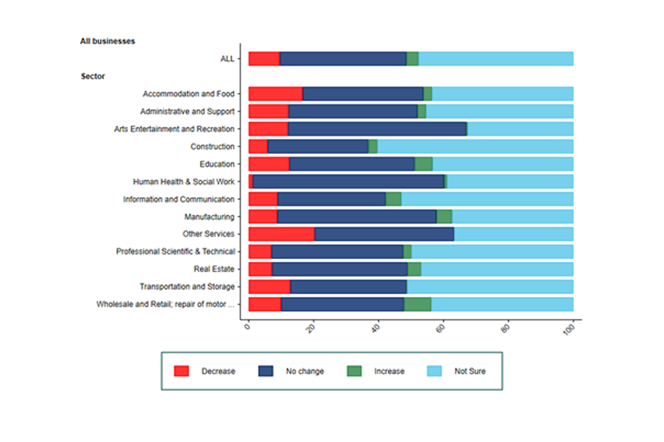
Image description: Stacked bar chart, broken down by sector, showing how businesses think the number of businesses selling similar goods has changed since the start of the pandemic. Bars are broken down into 4 categories: “Decrease”, “No change”, “Increase”, “Not sure”
Source: BICS, Wave 43: 1 November 2021 to 14 November 2021
Question: Has the number of businesses, selling similar goods or services as your business, changed since the start of the coronavirus (COVID-19) pandemic?
Base: Businesses not permanently stopped trading, UK
Innovation
There are early indications from survey evidence that the COVID-19 pandemic has impacted on business innovation levels. The 2020 BEIS LSBS, reported the proportion of firms reporting either product or service innovation rose from 24.1% in 2018 to 31.6% in 2019 before falling to 28.4% in 2020.[footnote 272] The report notes, more generally, that the changes in business behaviours (including whether or not they undertook innovation) observed between 2019 and 2020 may reflect the effects of the changes in the context within which UK SMEs operated following the pandemic and EU exit[footnote 273] though it should be noted that reported innovation levels remained higher in 2020 compared to 2018. The forthcoming 2021 BEIS’ Innovation Survey will provide further detail on innovation levels among UK Businesses and provide a clearer picture on the impact of the pandemic and EU exit on innovation levels.
Business expansion plans
The balance of opinion among surveyed businesses in the CMA Competition Law Business Tracking Research[footnote 274] was that it has become more difficult to enter new areas of business and to expand within their existing area of business in recent years (Figure 7.7):
-
41% disagreed that it was easier for companies like theirs to enter new areas of business than it was 5 years ago (compared to 32% agreeing).
-
Over two fifths (44%) disagreed that it is easier for companies like theirs to expand in their existing area of business than it was 5 years ago (33% agreed).
Figure 7.7 - Extent of agreement that it is easier to enter new areas of business and expand in their existing area of business than 5 years ago
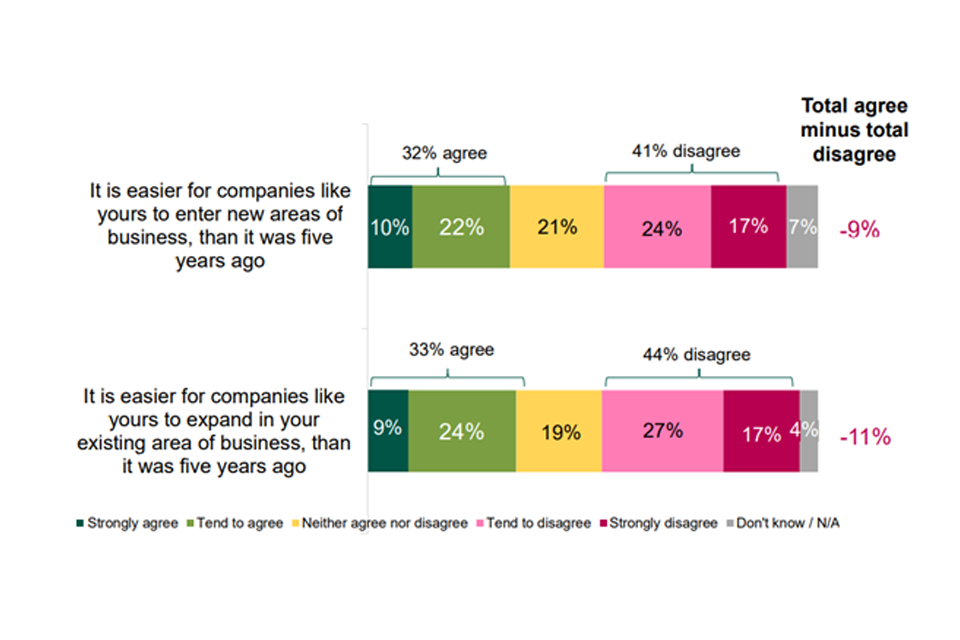
Source: Competition Law Business Tracking Research, p32 to 33
Base: All businesses in 2021 (1,200) Agree or Disagree: It is easier for companies like yours to enter new areas of business, than it was 5 years ago.
Question: Agree or Disagree: It is easier for companies like yours to expand in your existing area of business, than it was 5 years ago.
The survey found a linear correlation by size of business in terms of the perception of ease of expansion into new or existing areas. Micro and small businesses were more likely to feel it was difficult to enter new areas of business with 42% of micro and 37% of small businesses disagreeing that it is easier to enter new areas of business than it was 5 years ago whereas, medium and large businesses were less likely to disagree (30% and 26% respectively).
The same survey suggests that COVID-19 may have impacted on businesses’ perception of the ease of expanding with those who reported that COVID-19 had had a negative impact on the financial performance of their business more likely to disagree that it is easier for companies like theirs to expand in their existing area of business than it was 5 years ago (48% disagree compared to 31% among those who said COVID-19 has had a positive impact).
Business expansion plans appear to have been impacted by the COVID-19 pandemic. The CMA included questions on the ONS BICS survey to explore the impact of the pandemic on business expansion plans. The survey found (Figure 7.8) that 35% of businesses, that previously had expansion plans, said their expansion plans were either postponed or cancelled or were less ambitious as a result of the pandemic (15% less ambitious, 20% postponed/cancelled); only 5% said they were more ambitious. The sectors particularly badly affected were Arts, Entertainment and Recreation (with 48% saying their plans were either postponed or cancelled or were less ambitious); Education (45%) and Administrative and Support (43%).[footnote 275]
Figure 7.8 – Effect of COVID-19 on businesses’ expansion plans
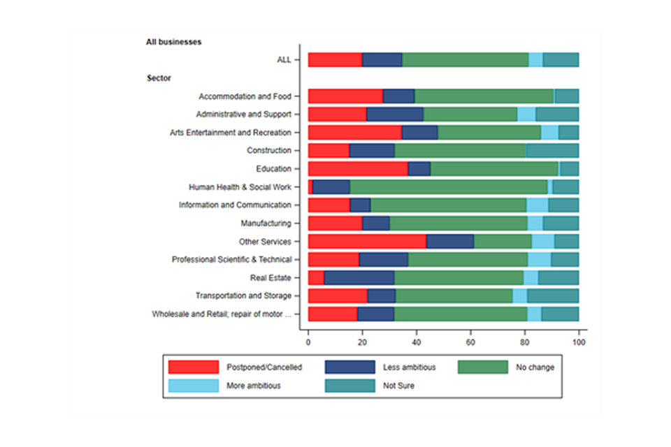
Image description: Stacked bar chart. Categories are sector. Bars are broken into 5 categories: “Postponed/Cancelled”, “Less ambitious”, “No change” “More ambitious”, “Not sure”
Source: BICS, Wave 43: 1 November 2021 to 14 November 2021
Question: Has the coronavirus (COVID-19) pandemic affected your business’s plans to expand the business?
Base: Businesses not permanently stopped trading, UK. ‘Not applicable’ answers excluded.
Business use of online marketplaces
As noted, the UK lockdown periods of the COVID-19 pandemic led to huge shifts among UK consumers to shopping online. This online reliance during these periods appears to have been habit forming with consumers now shopping online in significantly greater numbers than pre-pandemic. Online marketplaces[footnote 276] are also increasing in prevalence as a way for businesses to sell their products. It has been estimated that sales using this channel will grow by around 50% to almost £40bn by 2024.[footnote 277]
The experience of businesses’ use of online marketplaces was explored in both the BEIS Retailers Experience of using Digital Platforms survey[footnote 278] and the CMA Competition Law Business Tracking Research.[footnote 279] Both of these surveys were carried out during the COVID-19 pandemic (BEIS survey Aug-Sept 2020, CMA survey Jan – March 2021) and both found that around four-fifths of businesses had not used third-party digital platforms to sell to customers (Figure 7.9 for CMA survey results).
Figure 7.9 - Business use of third-party online platforms to sell products or services to customers
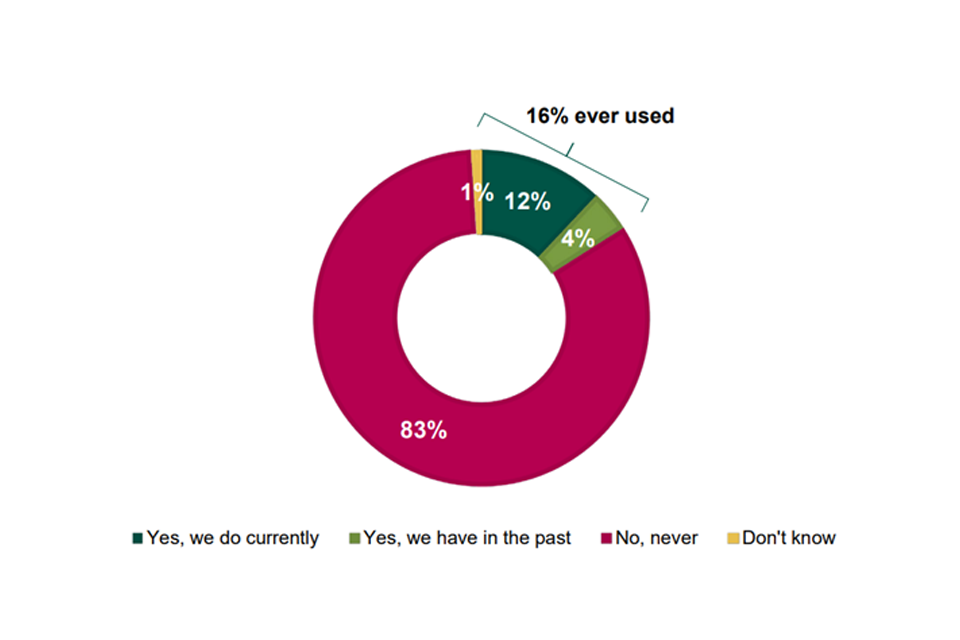
Image description: Donut chart (4 categories) showing that 12% of businesses currently use third-party online platforms to sell products or services, 4% have used them in the past; 83% have never used, and 1% don’t know
Source: CMA (2021) Competition Law Business Tracking Research, p39
Base: All businesses (1,200)
Question: Has your business sold products or services on third-party online platforms, either currently or in the past? The term ‘online platform’ refers to third-party websites and apps which allow you, alongside other businesses, to sell products to customers. Examples include sites such as Amazon and eBay Base: All businesses (1,200)
There was some variation in likelihood to use digital platforms by business characteristics:
-
larger businesses were significantly more likely than others to report having ever used third-party online platforms to sell to customers: 35% of medium and 31% of large businesses.
-
businesses trading nationally or internationally were significantly more likely to use these platforms (22% and 27% respectively) than those trading regionally or locally (8% and 13% respectively).
-
businesses operating in the Accommodation and Food sector (28%) and Wholesale, Retail and Transportation sector (22%) were significantly more likely to have used online platforms to sell to customers.
Whilst the majority of businesses had not used retail platforms, as highlighted in impact of COVID-19 on consumer shopping habits section, around 40% of all online retail sales in the UK in 2020 were through either Amazon (28%) or eBay (11%).
The CMA survey asked the 12% of all businesses who currently use third-party online platforms how dependent they were on these platforms to sell their products or services. Over half (55%) said they were dependent on them (33% very and 22% quite dependent).
The BEIS Retailers’ Experience of Using Digital Platforms survey focused on those businesses who had used digital platforms in the past 2 years. This found that whilst all of these businesses used/had used digital platforms and despite the move to online purchases during the COVID-19 pandemic, offline channels remained the most commonly used for the surveyed businesses. For more than half of retail businesses using online platforms, sales through them accounted for less than 25% of their annual turnover, both in the last financial year and in the last month (54% and 57% respectively).
As shown in Figure 7.10, the proportion of sales from businesses’ own websites is similar to third-party digital platforms.
Figure 7.10 - Proportion of sales from business’ turnover that came from each sales channel (among businesses who have used digital platforms in the past 2 years)
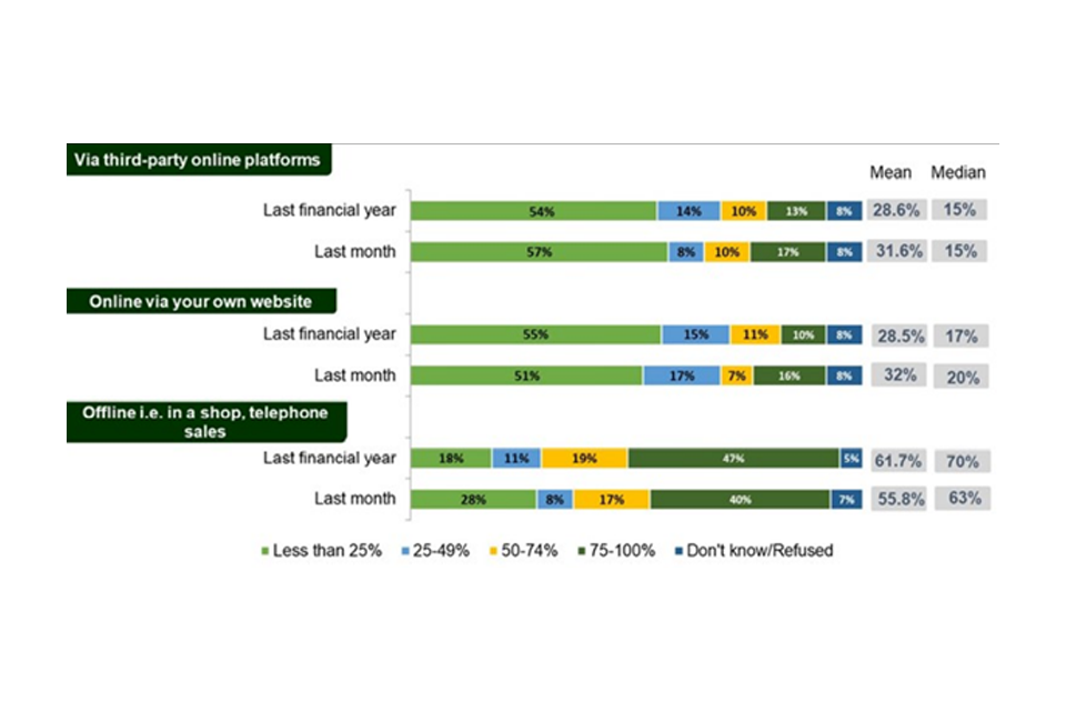
Image description: Stacked bar-charts showing where sales came from. Two category variables: the channel of sale (third-party online platform, online via own website, and offline) and the time period (last financial year, and last month). Within each of these groups, the proportion of sales is shown (“Less than 25%”, “25% to 49%”, “50% to 74%”, “75% to 100%”). The mean and median are also shown.
Source: BEIS (2021) [Retailers experience of using digital platforms] (https://assets.publishing.service.gov.uk/government/uploads/system/uploads/attachment_data/file/1003984/retailers-experience-using-digital-platforms__1_.pdf)
Base: Offline (231), online via their own website (195), online via thirdparty online platforms (286). A3. Now thinking about the last month, what proportion of your sales came from… Base: Offline (231), online via their own website (195), online via third-party online platforms (286)
Question: Thinking about your business’s turnover for the last financial year, what proportion of your sales came from.
Some differences emerged in the extent of use of different channels by business characteristics among the surveyed businesses:
-
Medium/large businesses were more likely to get 75 to 100% of their sales through offline channels both in the last financial year (64%) and in the last month (58%).
-
Sole traders were more likely to be reliant on third party digital platforms with 19% saying they had accounted for 75 to 100% of sales in the last financial year (26% stated this was the case in the last month).
Views of businesses were mixed on the extent to which they felt they got a fair deal when selling products or services via digital platforms:
-
The CMA survey found that among the 16% of businesses who had ever used them, 37% agreed they got a fair deal and 39% disagreed (21% were neutral on the issue).
-
Businesses who disagreed that they get a fair deal from digital platforms were more likely to think competition in their sector has become more unfair in the last 5 years (45% vs. 23% think they get a fair deal), which suggests that their experience of online platforms could be a contributing factor to their overall perceptions about the state of competition in their sector.[footnote 280]
The BEIS survey explored use of different digital platforms. Around half of the retail businesses surveyed who used digital platforms used multiple online platforms to sell their products and services (48%).[footnote 281] As shown in Figure 7.11, eBay was the most commonly currently used platform (54%) followed by Amazon (28%) and Facebook (13%). Use of Amazon was significantly higher among medium and large businesses (55%) and retailers using multiple online platforms are more likely to use eBay (70%) and Amazon (48%) to sell their products and services.
Figure 7.11 – use of digital platforms (among those who use them)
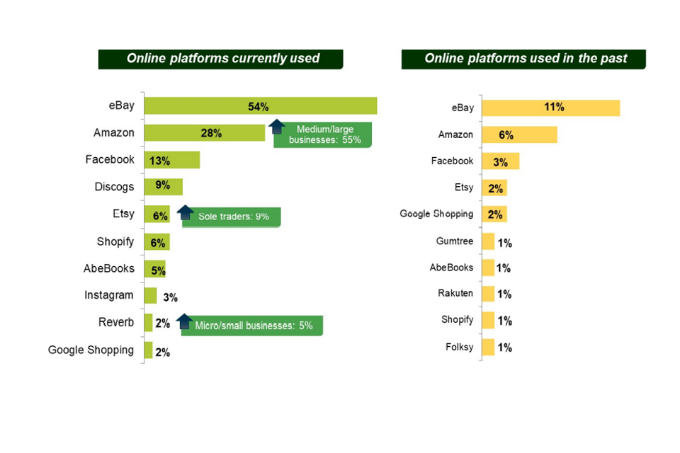
Image description: Two bar charts (platforms currently used and platforms used in the past). Categories are the platform (eBay, Amazon, Facebook etc)
Source: BEIS (2021) Retailers experience of using digital platforms
Base: Base: All businesses (286) who have used digital platforms in past 2 years. Base: All businesses that currently use online platforms (254)
Question: Which platforms does/did your business use to sell your products or services?
Platforms used by 2% or more are shown. A5. Are there any other platforms your business has used in the past?
The BEIS survey explored the main platform retailers used and for over a third of businesses (35%), eBay was their main platform (either the only third-party online platform they use, or the platform used the most where they use multiple platforms) followed by Amazon (19%), Discogs (8%) and Facebook (7%). Amazon was more likely to be the main platform for medium and large businesses (33%), with Etsy more likely to be the main platform for sole traders (6% compared to 3% overall). Retailers using only one platform to sell their products and services were more likely to use eBay than other platforms (40%), whereas retailers using multiple platforms are more likely to use Amazon (29%) as their main platform.
The most common benefit businesses saw from using a digital platform was being able to access a larger market (66%). As shown in Figure 7.12, this was significantly higher among businesses with a turnover of less than £100,000 (77%). Around a quarter of businesses felt it was an additional channel to sell their products on (24%), one in 5 (20%) felt it was popular with customers and around one in 7 retailers felt the benefit of using the online platform is that it provides new opportunities for overseas sales (14%). Again, this was significantly higher among businesses with a turnover of less than £100,000 (20%).
Figure 7.12 – Perceived benefits of using digital platforms among platform users
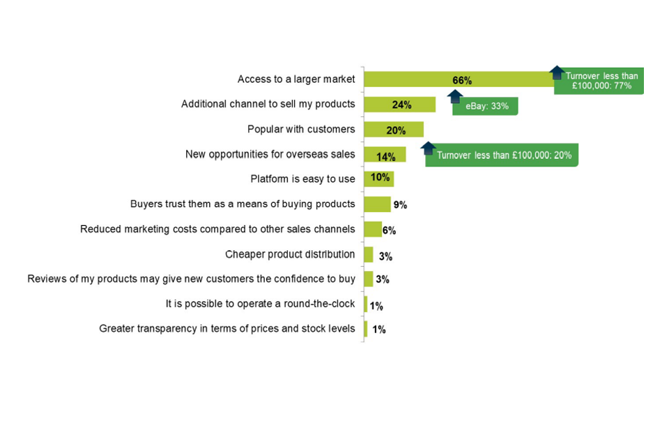
Image description: Bar chart. Categories show possible benefits for businesses in using a digital platform to access a larger market; bars showing percentages of respondents who chose each category.
Source: BEIS (2021) Retailers experience of using digital platforms, p12
Base: All businesses using/used online platforms (286)
Question: What does/did your business see as the benefits of using the platform?
Businesses using digital platforms were asked which online platform they would consider to be the next best alternative to their main platform. 45% of surveyed platform users were unable to specify an alternative. Of those who were able to identify an alternative, less than a third (29%), felt it was a ‘good alternative’.[footnote 282]
Competition in the digital economy
Why are we having a standalone chapter on competition in UK digital platform markets?
Nature of markets
There are 2 main reasons why we have included a standalone chapter on competition in digital platform markets. The first is that these markets are not well captured either by the metrics that we are using in much of the rest of this report or by standard statistical measures. The UK Economics Statistics Review (2016) noted ‘the nature of digital products [and] … the great challenge for economic measurement stems from the fact that the consumption of digital products often does not involve a monetary transaction [and] that … [d]igital products delivered at a zero price, for instance, are entirely excluded from GDP’.
Building on this theme, existing Standard Industrial Classification codes have rather opaque descriptions for several digital companies. This is unsurprising given they were originally introduced into the UK in 1948 and last updated in 2007. Thus, for instance, the most common[footnote 283] SIC code for Google, Amazon, Facebook (Meta[footnote 284]) and Apple is 82990, which is “other business support service activities not elsewhere classified”.
The second reason is that there is a great deal of competition policy activity around these markets.[footnote 285] They are large, important, markets in which there is considerable published evidence of competition concerns.[footnote 286] Much of this evidence has been produced by the CMA. We note that the European Parliament has required that the European Commission publish an annual State of Digital Competition report (as part of the new Digital Markets Act) and that:
this report shall provide an analysis of the market position, influence and business models of the gatekeepers in the common market.” (Amendment: Article 30a to the DMA)
The digital platforms are clearly highly innovative and consumers value their products very highly. This is shown by the popularity of their core products and is reflected in their high market capitalisations. They also make a significant contribution to the UK economy. DCMS estimated that digital technologies contributed £151bn in UK output and accounted for 1.6 million UK jobs in 2019.[footnote 287] However, there are also widespread competition policy (and other) concerns about the digital platforms. The nature of these markets is such that we should expect competition concerns. There are large economies of scale and scope; there are substantial network effects (both direct and indirect); and there are high barriers to entry at the platform level as a result of the platforms expanding outside of their core products into a wide range of neighbouring markets. As such, there is no inconsistency with the observation that the platforms are innovative and popular and the observation that there are considerable concerns about aspects of their behaviour in the UK.
These concerns are significant enough that the government has set up a bespoke digital platforms regulator (i.e. Digital Markets Unit) within the CMA. The problems however are not confined to the UK. There has been considerable competition policy and regulatory action against the digital platforms in many countries. For instance:
-
The European Commission has proposed a new Digital Markets Act. The expectation is that this will be adopted in the near future.
-
Germany has adopted a new law allowing the German competition authority to regulate platforms with “paramount significance for competition across markets” (and designated Google as such in January 2022).
-
There are a number of legislative initiatives with respect to the digital platforms in the US (for example the American Innovation and Choice Online Act, often referred to as the Self-preferencing Act).
-
Australia and France have taken action against Google and Facebook over their compensation of news publishers for use of their material.
This chapter is not a complete survey of those concerns. We focus primarily on those areas where the CMA has already undertaken work. This ensures that our analysis is firmly rooted in evidence.
The rest of this chapter is organised as follows.
-
A brief discussion of the Furman Review and DMU, since this is important context to the various competition concerns.
-
Evidence on GAFA profitability in the UK.
-
Summary of the results of our Online Platforms and Digital Advertising market study.
-
Summary of the interim results of our Mobile Ecosystems market study.
-
A brief discussion of cloud computing infrastructure.
-
A brief discussion of ecosystem competition.
The Furman Review
Much of the impetus for the CMA’s work on digital markets came from the Furman Review (“Unlocking digital competition”, March 2019). This review was set up by HMT and BEIS in September 2018. It was asked to “consider the potential opportunities and challenges the emerging digital economy may pose for competition and pro-competition policy, and to make recommendations on any changes that may be needed”.
The Furman Review concluded that there are particular reasons to be concerned about competition in digital platform markets. It argued that:
digital markets are still not living up to their potential. A set of powerful economic factors have acted both to limit competition in the market at any point in time and also to limit sequential competition for the market in which new companies would overthrow the currently dominant ones. This means that consumers are missing out on the full benefits and innovations competition can bring.” (para 1.1)
It further argued that whilst some of the concerns are not unique to digital markets, others are:
Some of these economic factors are common to many markets, digital and otherwise. Some are natural, unchangeable and even desirable – like consumers benefiting from economies of scale. But some are the result of deliberate choices by the major platforms, including choices about acquisitions, standards, access to data and other practices, that could be remedied by effective policies that would unlock more of the potential for competition.” (para 1.2)
The Furman Review noted that competition concerns within digital platform markets have a scale and pervasiveness that is far beyond that of most markets. In 2018, 95% of the UK adult internet population visited Facebook on at least a monthly basis. The equivalent figure for Google was 99%.
The Review’s conclusions were guided by a number of propositions. First, that the digital economy is creating substantial benefits. Second, that in many cases digital markets are subject to tipping in which the winner takes most of the market as a result of a combination of economies of scale and scope, network externalities, bundling of products, behaviour limitations on the part of consumers and the use of defaults. Third, that whilst concentration in digital markets may have benefits in terms of consumer convenience and firms with the best products growing, it can also give rise to substantial costs. The Review highlighted in particular the danger to innovation. Fourth, competition “for” the market, rather than “in” the market, cannot be relied upon to solve the problems associated with market tipping.
The Review also made a number of recommendations. The most substantial one was a proposal to set up a new digital regulator, the Digital Markets Unit (DMU), that would be tasked with securing competition, innovation and beneficial outcomes for consumers and businesses in digital platform markets. This regulator would designate those digital platforms with enduring market power over a strategic bottleneck market as having strategic market status (SMS). They would be subject to ex ante regulation. The Review also recommended a substantial change to merger control. Noting that between 2008 and 2018 GAFAM had made over 400 acquisitions but none had been blocked, it recommended that SMS firms would have to notify all acquisitions (even if very small; even if no apparent overlaps) and the CMA would apply a “balance of harms” test to these mergers.
The government accepted much of what the Furman Review recommended and the DMU has now been established within the CMA. The government has agreed that the regime should be focused on SMS firms (i.e. firms with substantial and entrenched market power in a digital market); that it should create firm-specific codes of conduct for the SMS firms; that it should focus on pro-competitive interventions to ensure long term competition to the SMS firms; and that SMS firms should notify all mergers.[footnote 288] This action indicates the strength of competition concerns around the digital platform markets in the UK.
Case studies and existing CMA analysis
Evidence of high profitability for digital platforms[footnote 289]
It is clear that the largest digital platforms are highly profitable. Whilst we do not have UK figures, we have calculated estimates of Alphabet’s (Google’s) and Facebook’s EBIT and ROCE for our Digital Advertising market study, as illustrated in 8.1 and 8.2. Alphabet has been profitable for at least the last 15 years, since its IPO in 2004, and its revenues have grown significantly in every year since. Its percentage profit margins, measured as EBIT have remained consistently high and although on a declining trajectory the profit margin before the effect of European Commission fines has not fallen below 20%.
Figure 8.1 Alphabet Group Revenue and Profit between 2011 and 2019
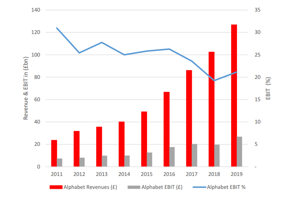
Image description: A bar and line graph showing revenue and profit for the Alphabet group between 2011 to 2019. The red bars illustrate revenues, starting at over £20bn in 2011 and reaching over £120bn in 2019. The grey bars illustrate EBIT, starting at below £20bn in 2011 and rising to over £20bn in 2019. The blue line represents EBIT% and was over 30% in 2011 and over 20% in 2019.
Source: Figure D.1 of “Online platforms and digital advertising” CMA, July 2020
Facebook has been consistently profitable since 2009 whilst growing its business in terms of revenue and had an EBIT margin in 2019 of around 34%.
For context, as we saw in Markups and profitability, the mean turnover-weighted EBIT margin for the UK economy has remained broadly constant at around 5% although there has been a slight drop to 3% in 2020. The EBIT margin for companies in the 90th percentile tended to remain 10 to 12 percentage points higher and as of 2020 was around 13%. Whilst these are UK specific figures, and those in Figures 8.1 and 8.2 represent global estimates, it is clear that these digital platforms have a considerably higher profit margin.
Figure 8.2 Facebook’s revenue and profit from 2009 to 2019
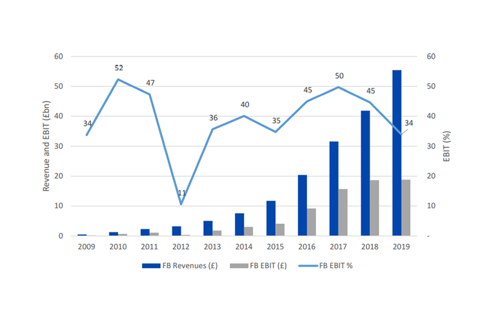
Image description: A bar and line graph showing revenue and profit for Facebook between 2009 to 2019. The blue bars illustrate revenues, starting at less than £1bn in 2009 and reaching over £50bn in 2019. The grey bars illustrate EBIT, starting at around £0 in 2009 and rising to almost £20bn in 2019. The blue line represents EBIT% and was 34% in 2009 and 34% in 2019.
Source: Figure D.8 of “Online platforms and digital advertising” CMA, July 2020
Both companies earn ROCE well above their cost of capital. The ROCE figure for Google is specific to search, which is where Alphabet makes the majority of its revenue.
Figure 8.3 Google search and Facebook ROCE vs WACC estimates (2018)
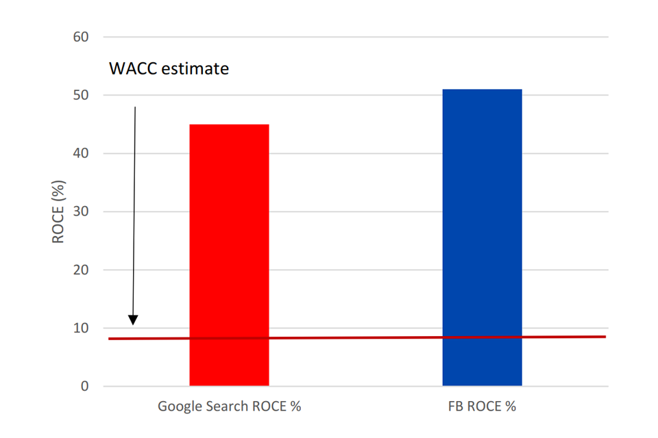
Image description: A bar graph comparing the ROCE% of Google Search and Facebook against an estimated WACC in 2018. The red bar illustrates Google Search’s ROCE%, which was over 40% in 2018, the blue bar illustrates Facebook’s ROCE % was just over 50%. The red line illustrates that the estimated WACC was below 10%.
Source: Figure 2.11 of “Online platforms and digital advertising” CMA, July 2020
Our interim report on Mobile Ecosystems includes estimates of Apple’s profitability. On a global basis, Apple made $67.1 billion in profit in 2020, and recent disclosures indicate that this grew to $109.2 billion in 2021. We have estimated that in recent years, Apple’s return on capital employed has been over 100% – a high figure in any sector.
As illustrated in Markups and profitability, the UK specific mean ROCE estimates were around 12% in 2020, with the 90th percentile estimates closer to 40%. Again, though the estimates we have for digital platforms represent global figures, it would appear that these firms are considerably more profitable.
Figure 8.4 Apple return on capital employed 2011 to 2021
Image description: A line chart showing Apple’s return on capital employed between 2011 to 2021. The blue line illustrates Apple’s ROCE was 493% in 2011 and 312% in 2021, with a peak of 1,728% in 2015.
Source: Figure D.6 of “Online platforms and digital advertising” CMA, July 2020
We have not carried out published work into Amazon.
Digital Advertising Market
The UK digital advertising market is an important market for consumers. There are 2 main types of digital advertising: search advertising and display advertising. Search advertising refers to the adverts that often appear at the top of search results.[footnote 290] Display advertising refers to adverts that appear alongside webpages or social media (for example Facebook). Firms bid to win one of these slots and then pay if a consumer clicks on the return (search) or views the webpage (display).
The UK digital advertising market was worth about £14bn in 2019, of which £7.3bn was search and £5.5bn was display. This translates into about £500 per household. This is a relevant metric because we would expect consumers to pay for digital advertising. Digital adverts are largely a marginal cost for firms (pay per click or view), so we would expect the costs to get passed onto consumer prices.[footnote 291] So a lack of competition in digital advertising is likely to harm consumers.
Digital advertising is where Google and Facebook monetise the audiences that they acquire via their free products (for example Google search, YouTube, Facebook). They have very strong positions in the market, with the result that 80% of the revenues flow to them. In 2020, over a third of UK internet users’ time was spent on sites owned by either Google or Facebook.
Figure 8.5 UK consumer time spent on top 1000 online properties
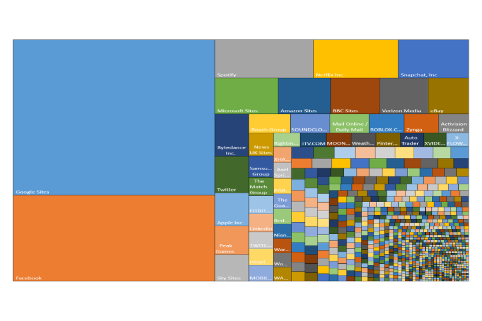
Image description: A treemap illustrating time spent by consumers on the top 1000 online websites. The largest light blue square represents the time consumers spend on Google sites. The second largest rectangle, coloured orange, represents time consumers spent on Facebook. The 2 biggest squares represent over one-third of the overall treemap.
Source: Figure 2.2 of “Online platforms and digital advertising” CMA, July 2020
Search advertising
Figure 8.6 Shares of supply by page referrals from January 2009 to April 2010
Image description: A line chart showing the shares of supply by page referrals from January 2009 to April 2010. The red line shows Google’s share of supply has been at or above 90% between this period. The other lines represent shares of supply for Bing (turquoise), Yahoo (purple), DuckDuckGo (black), Ecosia (green) and other (grey) advertisers. All of these search advertisers have page referrals that account for less than 10% of page referral shares.
Source: Figure 3.3 of “Online platforms and digital advertising” CMA, July 2020
Google has a greater than 90% share in online search. Evidence from our market study is that this high share, as shown in Figure 8.6 allows Google to charge higher prices to advertisers. As noted above, we would expect these higher prices to be passed through to consumers.
Figure 8.7 Average cost-per-click for top ad cost per click on Google and Bing
Image description: A bar graph showing the average cost-per-click for top ads on Google and Bing. The red bars illustrate that Google is 30% to 40% more expensive than Bing (green bars) across desktop and mobile platforms.
Source: Figure 5.7 of “Online platforms and digital advertising” CMA, July 2020
Display advertising
Whilst Google alone is very strong in search advertising, Facebook and Google are strong in display advertising, as illustrated in Figure 8.8. Facebook has more than 50% of this market (through Facebook and Instagram), whilst Google has very high shares in open display segment.
Figure 8.8 Shares of expenditure in UK display advertising (2019)
Image description: A pie chart showing the shares of expenditure in UK display advertising. Facebook (blue) has a 35% to 40% share, Instagram (purple) has 10% to 15%, Youtube (red) 5% to 10%, other platforms (black) 5% to 10% and open display (grey) has a 30% to 35% share.
Source: Figure 5.9 of “Online platforms and digital advertising” CMA, July 2020
Display advertising is where Facebook primarily monetises its very strong position in social media in the UK. Facebook Group (i.e. Facebook, Messenger, Instagram and Whatsapp) account for more than 70% of time spent by UK consumers on social media, illustrated in Figure 8.9.
Figure 8.9 Shares of supply by user time spent on social media from July 2015 to February 2020
Image description: A line graph showing share of time spent on social media between July 2015 and February 2020. There are 11 lines, representing the Facebook group, Facebook, Snapchat, Whatsapp, Instagram, Twitter, TikTok, LinkedIn, Pinterest, Reddit and Tumblr.
Source: Figure 3.9 of “Online platforms and digital advertising” CMA, July 2020
The CMA found that this high share translated into higher monetisation (revenue per user) than for other platforms as shown in Figure 8.10.
Figure 8.10 Average annual revenue per user for selected platforms (2011 to 2019)
Image description: A line chart showing annual revenue per user between 2011 to 2019. There are 7 lines representing, Facebook, Instagram, LinkedIn, Pinterest, Snapchat, TikTok and Twitter.
Source: Figure 5.12 of “Online platforms and digital advertising” CMA, July 2020
As noted above, Google has a very high share of the open display segment of the display advertising market. The open display segment relates to those adverts put on third party websites, as opposed to on advertiser owned platforms (i.e. Facebook and Instagram for Facebook and YouTube for Google). The open display market encapsulates the supply chain between an advertiser who wants to advertise on a website and a website owner who wants to accept adverts. This supply chain, often referred to as the adtech stack, is illustrated in Figure 8.11. It involves firms bidding to buy advertising space on websites (the “buy side”) and publishers (owners of websites) accepting the highest bids (the “sell side”).
Figure 8.11 Google’s roles in the adtech stack
Image description: A process map of Google’s role in the adtech stack. The boxes with blue outlines represent Googles market share and those shaded in blue represent stages in the supply chain from sell side to buy side.
Source: Figure 2 of “Online platforms and digital advertising” CMA, July 2020
Further information on the adtech stack is provided in Consumer survey evidence of the CMA’s market study of online platforms[footnote 292] but as illustrated above Google has a high market share across the supply chain. The CMA’s Digital Advertising market study raised 2 concerns about Google’s position in the adtech stack. First, that these high shares corresponded to low levels of competitive pressure and hence higher costs to users (publishers and advertisers) than in a more competitive market. Second, that Google faced conflicts of interest from being on both sides of the market (i.e. representing both buyers and sellers in the same auctions). The evidence found by the CMA suggested that these concerns were real: publishers receive on average only 65% of what advertisers spend on open display. An analysis by ISBA/PWC suggested that the figure might be even lower.[footnote 293]
What does this evidence imply for the state of competition in digital advertising?
Platforms funded by digital advertising provide highly valuable services, allowing people to find information in an instant and connect with family and friends from around the world – all at no direct cost to the consumer. Google and Facebook are the largest such platforms by far. Both have grown by offering better products than their rivals. However, they are now protected by such strong incumbency advantages – including network effects, economies of scale and unmatchable access to user data – that potential rivals can no longer compete on equal terms.
These issues matter to consumers. The evidence in our market study, and summarised above, indicates that weak competition in search and social media leads to higher prices and reduced innovation and choice compared to more competitive markets. Weak competition in digital advertising increases the prices of goods and services across the economy. By reducing the amount of money going to publishers in the open display market, it also undermines the ability of newspapers and others to produce valuable content, to the detriment of broader society.
Mobile ecosystems
Another area where we have carried out substantial work is in the area of mobile ecosystems.[footnote 294] This relates to the products offered by Apple and Google on smartphones. Mobile ecosystems include the mobile device, the operating system (iOS or Android), the app stores (Apples’ App Store and Google’s Playstore) and important apps (for example Apple’s Safari browser or Google’s Chrome browser). We are currently undertaking a market study into mobile ecosystems and published an interim report in December 2021. The following discussion of the state of competition in mobile ecosystems in the UK is based on that interim report.
Mobile ecosystems are very important to consumers. As well as accounting for the majority of internet usage in the UK – with internet users spending almost 3 hours a day on average online using a smartphone or tablet – mobile devices are also the channel through which an increasing range and volume of other products and services are accessed and consumed. Mobile devices are a platform through which millions of apps from hundreds of thousands of app developers are made available to users and also an important platform for innovation.
It is important to recognise that the existing mobile ecosystems give rise to substantial consumer benefits. Having an operating system, app store, and a core set of apps (as well as, for Apple, mobile devices) developed by a single provider helps guarantee that products work seamlessly together, and are easy and convenient for users. Apple and Google (and others) have engaged in innovation that has improved the features, functionality and performance of their mobile devices and operating systems as well as the tools they provide to support app developers. This innovation will have benefitted users as it has made devices quicker, more powerful and increased the number of things consumers can do on their mobile devices.
However, as noted above, ecosystems of this type create barriers to entry for new firms into the various products. These barriers to entry can mean that the incumbents’ positions become entrenched and this can lead to reduced competitive pressure on the incumbents, with consequent reductions in innovation.
We have found 4 areas of competition concerns in our interim report.
Competition in the supply of mobile operating systems and devices
The UK market for the supply of mobile operating systems is very concentrated. Figure 8.12 illustrates that Apple has 50% to 60% share of smartphones in the UK and hence iOS has a 50% to 60% share of mobile operating systems on smartphones. Android accounts for almost all the rest of mobile operating systems and hence has a share of 40% to 50%.[footnote 295] This duopoly is a relative recent situation. Ten years ago there were 4 significant mobile operating systems, but BlackBerry and Symbian have both exited, whilst Android has grown dramatically.
Figure 8.12 Operating system shares of supply in active smartphones in the UK (2009 to 2021)
Image description: A line graph illustration the market shares in the smartphone operation system market between 2009 to 2021. There are 5 lines representing market shares for iOS, Android, Blackberry OS, Windows and Symbian OS.
Source: Figure 3.9 of “Mobile ecosystems: interim report” CMA, December 2021
In principle, competition between duopolists can be strong. However, it is often not and that appears to be the case with mobile operating systems and associated devices. There appears to be relatively little direct competition between iOS devices and Android devices. This is because most purchasers of a smartphone already have one and consumers tend to stick to their current ecosystem when making a new purchase due to switching costs between ecosystems (for example challenges around transferring data, apps and subscriptions when switching ecosystems). The result is that at the device level, the market is significantly differentiated with relatively little competition at each price point, as shown in figure 8.13. We would generally expect more price competition to lead to better consumer outcomes.
Figure 8.13 Proportion of smartphones shipped into the UK by £100 price bracket (2020)
Image description: A bar graph illustrating the proportion of smartphones sold in the UK by £100 price bracket. The grey bars that point left represent phones sold by Android. The light blue bars that point to the right represent phones sold by Apple.
Source: Figure 3.2 of “Mobile ecosystems: interim report” CMA, December 2021
This observation is also apparent when looking at average prices, illustrated in Figure 8.13.
Figure 8.14 Average price, excluding VAT, of iOS devices and Android devices (not adjusted for inflation)
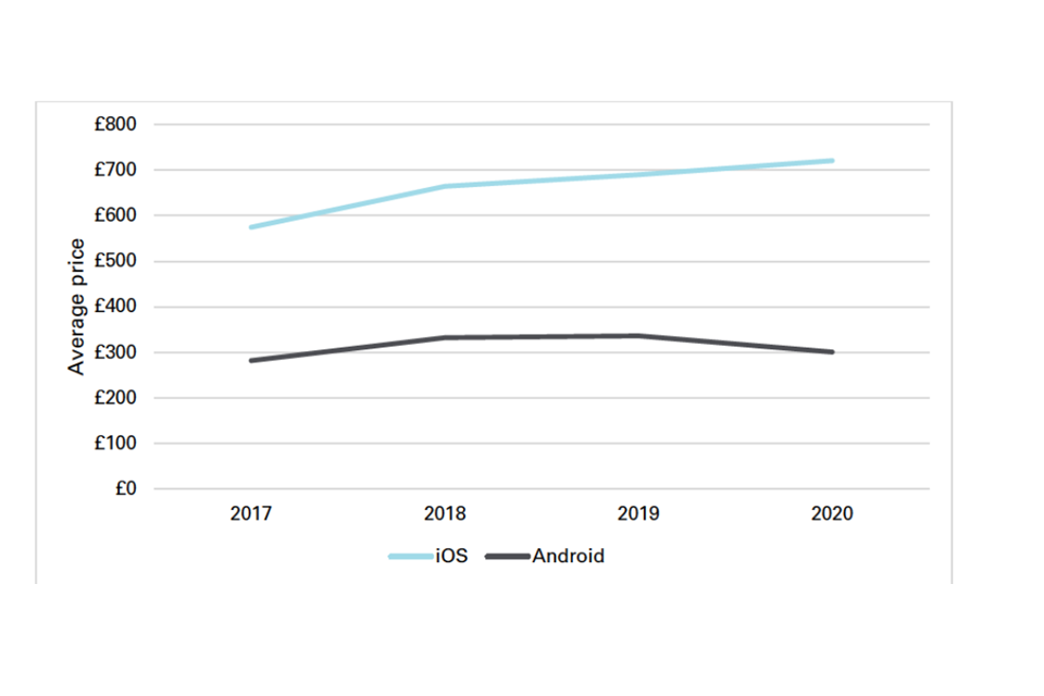
Image description: A line graph, with 2 lines illustrating the average price of iOS (light blue) and Android (dark grey) devices between 2017 to 2020. The Android line remains broadly flat over the period, whereas the iOS line increases from around £600 to £700 over the period.
Source: Figure 3.3 of “Mobile ecosystems: interim report” CMA, December 2021
Competition in digital mobile apps
Apps are one of the 2 key gateways to online content from a mobile device. Both Apple and Android have market power in the distribution of native apps. There is little competition between the iOS and Android app stores because consumers are captive to the relevant app stores once they have made their device choice. Thus Apple has a 100% share of native app distribution on iOS, whilst Android has a 90% to 100% share on Android phones. App developers see the app stores as complements, not substitutes, and so want to be on both the App Store and the Play Store. The result is a lack of competition between the 2 app stores, whose download shares are shown in Figure 8.14.
Figure 8.15 The proportion of downloads by app stores across iOS device, Android devices and others (UK, 2020)
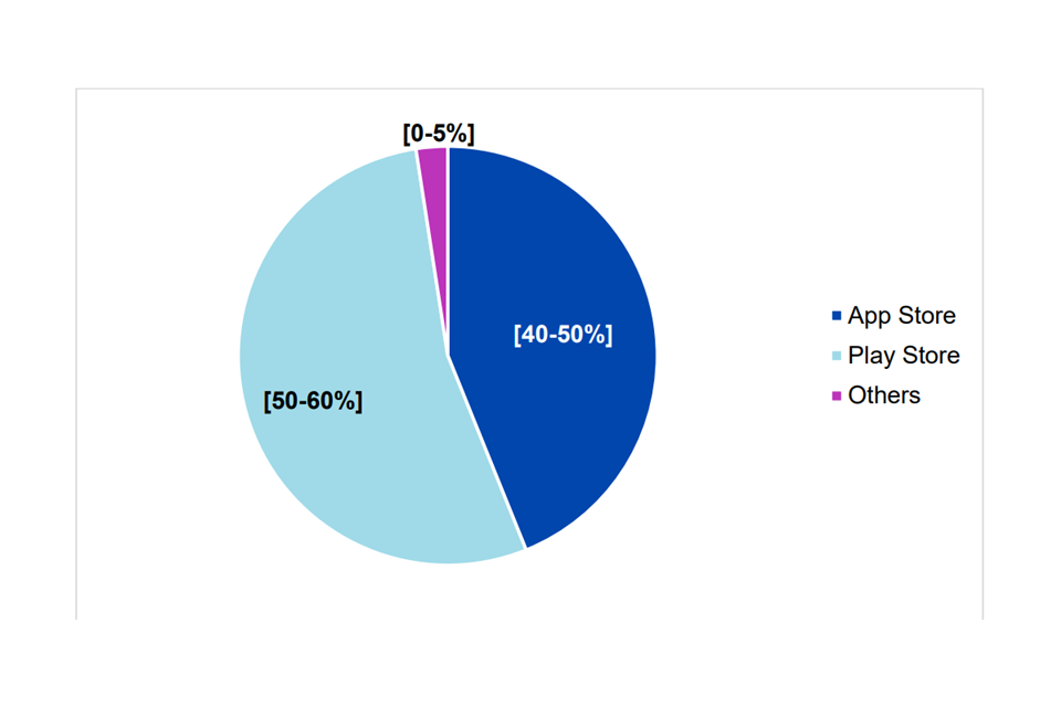
Image description: A pie chart illustrating the proportion of downloades by app stores across iOS, Android and other devices. The navy blue pie demonstrates that the app store accounts for 40 to 50% of downloads, the light blue illustrates that the Play store accounts for 50 to 60% of downloads with the purple segment representing other app stores which account for 0 to 5% of downloads.
Source: Figure 4.1 of “Mobile ecosystems: interim report” CMA, December 2021
Competition in supply of mobile browsers and browser engines
Browsers are the other key gateway to accessing online content on mobile devices. Apple and Android operate a near duopoly here as well. Apple’s Safari browser has a 90% share on iOS whilst Google’s Chrome browser has a 75% share on Android. Their shares are higher when looking at the underlying software on which browsers are built (i.e. browser engines). Apple’s browser engine (Webkit) has a 100% share on iOS as Apple does not allow browsers on iOS unless they are based on Webkit. Google’s browser (Blink) has a similarly high share. The only other browser engine (Gecko by Mozilla) has a share on Android of about 4%. The CMA estimates that in 2020 97% of mobile browsing took place using either Webkit or Blink.
This matters for 2 reasons. First, we would expect to see more innovation if there was more, and more direct, competition in web browsers and engines. Second, the CMA found that web apps (i.e. web-based versions of native apps) do not currently provide the same features and functionalities as native apps. The evidence indicates that this is largely due to restrictions on the features and functionalities of web apps that result from the fact that browsers on iOS devices must use Apple’s own WebKit browser engine. The lower functionality for web apps on iOS means that developers typically have to develop a native app for iOS. This means that rather than develop one web app, they have to produce separate native apps for iOS and Android. This is both inefficient and serves to protect the position of the app stores (see next sub-section).
Role of Apple and Google in competition between app developers
The lack of competition between iOS and Android app stores means that app developers must write for both app stores. This raises 2 significant concerns. First, it means that the app developers have little bargaining power and cannot play the 2 app stores off against each other. This lack of bargaining power has led to concerns over the 30% commission fees that both Apple and Google charge to digital apps. Second, it has allowed Apple to hinder the development of cloud-based apps and, in particular, cloud gaming apps. This would allow developers to write only one game code that could be used on either iOS or Android devices.[footnote 296]
A further concern is both Apple and Google using default installation of key apps, such as browsers, thus harming the developers of rivals apps. Whilst Apple can use defaults as a result of the direct link between device sales and iOS, Google does it through revenue share agreements between itself and the device manufacturers.
Cloud computing
Cloud computing refers to remote IT infrastructure, that is computing power and storage, that can be purchased on-demand, i.e. rented, through a self-service component over the Internet. This market is often referred to as ‘Infrastructure as a Service’ (IaaS). Products and services that are built on top of this infrastructure are often included under the term “cloud”. These include platform environments where applications can be built and developed using pre-built tools, ‘Platform as a Service’ (PaaS), and similarly software provided on top of cloud infrastructure, and possibly a platform, ‘Software as a Service’ (SaaS). The number of players in the market increases as you move from IaaS to PaaS and SaaS.
We have not carried out public work on cloud computing infrastructure.[footnote 297] We have looked at some cloud computing issues as part of some merger analysis that we have undertaken, but not at the IaaS level. We are aware, however, that cloud computing infrastructure is a key input for many firms and that competition concerns have been raised about this market, which is relatively concentrated. We do not have UK-specific market shares, but worldwide market shares, illustrated in Figure 8.15, show that the top 3 firms (Amazon AWS, Microsoft Azure and Google Cloud) account for more than 50% of the market. We are also aware that there are barriers to entry into IaaS due to the level of resource required (sunk costs), technical know-how and economies of scale and scope.
Figure 8.16 Cloud infrastructure services vendor market shares worldwide
Image description: Stacked bar charts illustrating the cloud infrastructure services market shares worldwide between Q4 2017 to Q3 2021. Each bar is coloured according to the could vendor market share for that quarter representing Amazon AWS (blue), Microsoft Azure (navy), Google Cloud (grey), Alibaba Cloud (red), IBM Cloud (green) and Other infrastructure providers (yellow).
Source: Statista 2021
Competition between ecosystems
It is significant that the most successful digital companies in recent years have increasingly been building large ecosystems of complementary products and services around their core service.
Network effects and substantial economies of scale and scope across markets facilitate the development of ecosystems on the supply side. Demand side synergies for consumers (for example convenience) create value for consumers from ecosystems. However, as noted by the OECD,
digital ecosystems can leverage their market power into adjacent markets and may also represent a barrier to entry for new innovative firms.”[footnote 298]
This strategy has been particularly evident for both Google and Facebook, enabling them to cement the position and strength of their core service, and to leverage this strength into other markets. The expansion of these digital ecosystems is resulting in an increasing proportion of our online activity being channelled through a small number of companies. Integration of a wide range of products and services can deliver efficiency savings, potentially reducing prices, and can also potentially improve the consumer experience overall, by increasing the ease with which a range of different services are accessed. However, this expansion can also give rise to competition concerns. For instance, platforms with market power can leverage their position into downstream or adjacent markets, thus giving themselves an advantage over potential competitors and undermining competition in those markets. The platforms can protect their most profitable products by surrounding their core products with a large number of complementary products. They are also able to gather large amounts of data from across markets and this can further strengthen their competitive positions.
Figures 8.16 and 8.17 below illustrate in simplified form the extent of the ecosystems that Google and Facebook have been able to create around their core consumer-facing services of search and social media.
Figure 8.17 Illustration of Google’s online consumer-facing ecosystem
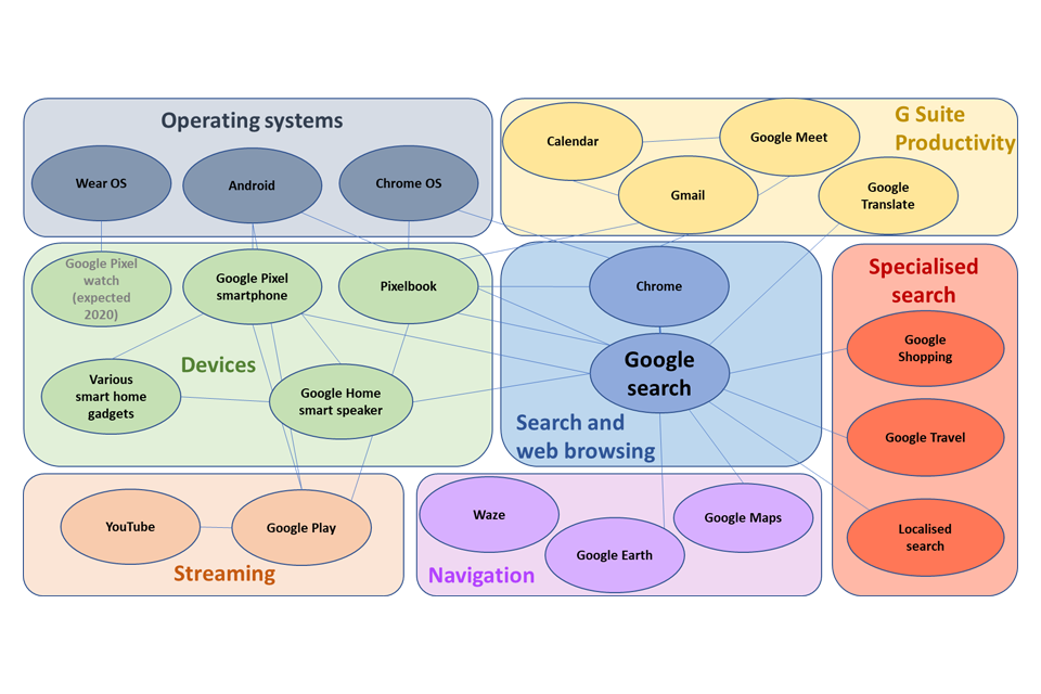
Image description: Tree map illustrating the google ecosystem and associated platforms. The illustration is broken up into 7 colours, illustrating its operating system (grey), G-suite productivity (yellow), devices (green), Search and web browsing (blue), specialised search (red), streaming (peach) and navigation (purple).
Source: Figure 2.4 of “Online platforms and digital advertising” CMA, July 2020
Figure 8.18 Illustration of Facebook’s online consumer-facing ecosystem
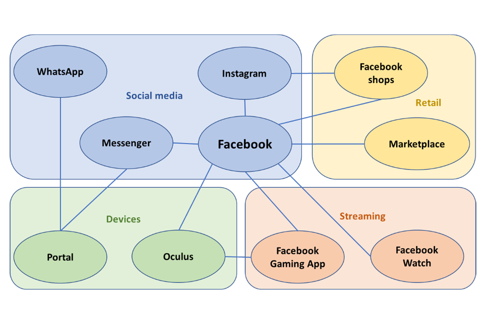
Image description: Tree map illustrating the Facebook ecosystem and associated platforms. The illustration is broken up into 4 colours, illustrating its social media (blue), retail (yellow), devices (green) and streaming (peach).
Our digital ecosystems market study illustrates the importance of ecosystems in this area as well. As shown in Figure 8.18 the level of control exerted by Apple and Google in relation to operating systems, app stores and browsers means that it is very difficult for another ecosystem to emerge. Further, because Apple and Google control the way that browsers perform on their devices; and also set the terms for access to their app stores for native apps, they are able to limit competition from third parties. Weak competition can reduce innovation, increase prices and restrict consumer choice (for example over default apps and privacy choices).
Figure 8.19 The choice between Apple’s and Google’s mobile ecosystems
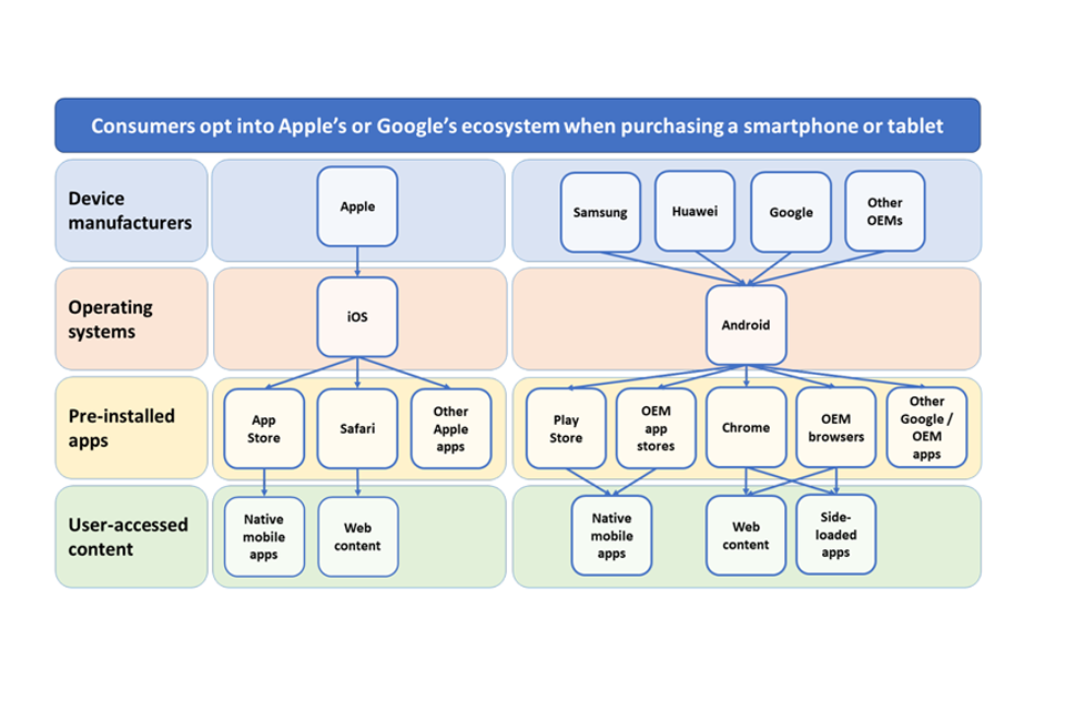
Image description: Two tree diagrams illustrating the choice between Apple and Google’s mobile ecosystems. The 2 trees are characterised by 4 distinct levels, illustrating device manufacturers (blue), operating systems (red), pre-installed apps (yellow) and used-accessed content (green). The tree on the left illustrates Apple’s ecosystem, with the tree on the right illustrating Google’s.
Source: Figure 1 of “Mobile ecosystems: interim report” CMA, December 2021
We have not carried out published work on Amazon and so cannot make any comments on the competition implications of its ecosystem. However, we note that it has expanded significantly beyond its original core products of online retail services [footnote 299]
Conclusion
This chapter has demonstrated the importance of digital markets to consumers and the wider economy. While digital platforms have created very large benefits for consumers, there are also legitimate concerns around the impacts of platforms’ market power, both directly in relation to their impacts on consumers, and for other businesses that rely on platforms to access customers.
The DMU has been established in shadow form within the CMA in order to address these issues. The Government has consulted on a new framework for digital regulation which would give the DMU powers to impose codes of conduct and make other pro-competition interventions in cases where platforms have ‘Strategic Market Status’ – i.e. entrenched market power giving them a strategic position in relation to particular digital activities.
This chapter also demonstrates the challenges of building an overall picture of competition in digital markets. General industry statistics give only limited insight into the state of digital markets. The CMA has been able to shed further light on specific markets and activities by gathering detailed evidence through market studies, notably in relation to online platforms and digital advertising, and more recently mobile ecosystems.
Going forward, we intend that the DMU should build a more systematic evidence base across a wider range of digital markets using a range of tools, including horizon scanning and data gathering outside of formal market investigations. This will be important in providing a robust evidence base for the DMU’s ongoing activities and responsibilities for overseeing competition in digital markets.
Further work
Concentration, industry structure, and distributional impacts to competition in the digital economy have looked at a series of measures and indicators aimed at capturing the strength of competition in UK industries. However, as outlined throughout this report, the strength of competition is not directly observable, but must instead be inferred by the indicators analysed. In producing this report, we have identified ways in which that analysis may be improved in future as well as potential areas of related further work.
Refining and developing the existing analysis
We have identified some areas of existing analysis that we intend to refine to improve our understanding of the state of competition and increase the robustness of our findings. There are also areas of further analysis that future iterations of the State of Competition report might explore. These include, for example:
-
The extent to which our results are driven by the definition of SIC codes. As explained in concentration, industry structure, and distributional impacts, this is likely to represent a more aggregated level than what the CMA would normally define as a ‘market’. Further work could be done to estimate the extent of this difference and its impact on the interpretation of our results.
-
In the first State of Competition report, we used estimates for Gross Value Added (GVA) to weight concentration measures instead of turnover.[footnote 300] This has some advantages; however, since updated data for GVA was not available in time for the publication of this report, we did not use it here. Future iterations of this report should consider weighting concentration measures by GVA.
-
Concentration, industry structure, and distributional impacts provides evidence on trends in different concentration measures. While the overall trend is consistent across all measures, there are some minor differences across HHI and Concentration Ratios. Further analysis into the drivers of these discrepancies might highlight interesting insights.
-
We have shown trends of concentration measures not only at an economy wide level, but also at a sector level. We are unable with the available data to look at concentration at a more granular level. However, further work could be done to identify market features where firms have persistently high profits and/or market shares.
-
More work could be done to explore network metrics in relation to common ownership. If the data allows it, measures like density, connectedness, and centrality might provide interesting insights on not only the extent of common ownership but also its form.
-
Moreover, our results on common ownership are sensitive to the control thresholds used. Further sensitivities could be built in to explore how our results are driven by our definition of common ownership groups (including allowing for common ownership across industries and differentiating between horizontal and vertical ownership chains) and person of significant control.
-
Another highly debated topic is the estimation of the cost of capital. Markups and profitability uses cost of debt as an imperfect proxy, but this could be improved upon with more data and time. For example, the CMA could also look at freely available estimates of the equity risk premium to estimate a weighted average cost of capital for the economy.
-
The Business Survey chapter looks at the experiences of business using digital retail platforms. The use of these by both businesses and consumers is increasing and it will be important to continue to monitor the use of and experience of both customers and businesses using these platforms.
-
The Consumer Protection Study provides valuable evidence on the experience consumers are having in markets and the problems they encounter. The reference period for the 2021 survey is April 2020 to March 2021 - the peak of the COVID-19 pandemic - and the findings were heavily influenced by this. A further wave of the survey is recommended to understand the level of consumer detriment now that the UK is coming out of the pandemic. It will be particularly important to understand consumer detriment levels considering recent increases in the cost of living for UK consumers meaning that the impact of any detriment experienced may be greater than in previous years.
Other areas of potential research
Finally, we believe there are areas where current economic research offers some gaps for further study that others may be well placed to advance outside of the State of Competition report. Examples include:
-
Refine our understanding and use (maybe through the use of data science techniques to match, for example, the industries with how companies describe their own business in statutory directors’ reports and other filings) of the BSD, IDBR, and FAME data to more closely match SIC industries to antitrust markets.
-
The economic literature on common ownership is still developing. Our analysis of common ownership in Adjusted concentration is experimental. Therefore, there are several ways in which it could be extended and improved upon. For example, further iterations of the data used in our analysis would allow for a study of changes in common ownership and adjusted concentration measures over time.
-
The data we used in concentration, industry structure, and distributional impacts is recorded at a national level. For example, information is available on the registration address of companies; however, this rarely reflects the market presence of a business. We explored the availability of readily accessible and reliable data at a local level, but we could not identify any data relevant for this report. An interesting area to explore is the extent to which economy-wide results differ at a regional level.
-
Adjusted concentration shows how accounting for imports and exports might greatly affect our findings on concentration measures. More granular data on firms’ levels of trade would allow for more precise estimates of concentration measures.
-
Markups and profitability estimates a variety of profitability measures. The best methodology to estimate markups is a highly debated topic in the economic literature. As the debate evolves, new or enhanced methodologies might become available.
-
Further work to understand what factors drive the greater concentration faced by lower income households in essential goods and services markets.
-
A focus on the most profitable firms, the markets they operate in, and their features could shed some light on the competitive conditions these highly profitable firms face.
-
Further analysis on the long-run impact of the COVID-19 pandemic and the increase in e-commerce on the competitive dynamics across sectors and regions of the UK.
See: ‘Cost pass-through: theory, measurement and potential policy implications, a report prepared for the Office of Fair Trading’, RBB Economics, February 2014.
-
BEIS/HM Treasury (HMT) (2021), State of UK competition report: commission to the CMA ↩
-
Penrose, J (2021), Power to the people: independent report on competition policy ↩
-
Consumer survey evidence of this report considers the nature and extent of consumer detriment in the UK. ↩
-
More formally, common ownership is the presence of significant shareholding or influence over multiple companies by a single owner. ↩
-
European Central Bank (2005), Does product market competition reduce inflation ↩
-
See for example, Ennis, S. et al. (2019), Inequality: A hidden cost of market power; Gans et al. (2019) Inequality and market concentration. Concentration, industry structure, and distributional impacts of this report also considers the relationship between incomes and competition. ↩
-
Bravo-Biosca, A. and Criscuolo, C., (2010), ‘Evidence on business growth dynamics’, presentation and paper for the OECD Working Party on Industry Analysis, 8-9 November 2010; CMA (2015), Productivity and competition – a summary of the evidence. ↩
-
Source: CMA analysis of ONS BSD data. Note: Excludes some non-market sectors such as government services - including fully government-run sectors such as central banking, and those dominated by the public sector, such as education; and the 4-digit industry Wholesale of solid; liquid and gaseous fuels and related products, and industries in the Finance and Insurance sector as their runover disproportionately affects our results. Average is calculated as the turnover-weighted mean across 4-digit industries. ↩
-
Source: CMA analysis of FAME data ↩
-
Source: CMA analysis of ONS BSD data. Note: rank persistence if first calculated at sector level and then averaged across sectors without the use of any weight. Excludes some non-market sectors such as government services – including fully government-run sectors such as central banking, and those dominated by the public sector, such as education. ↩
-
Source: CMA analysis of FAME data ↩
-
That is, grouping businesses together as a single entity where they have a common owner with more than 25% control (and 50% control), whether via shareholdings or voting rights. ↩
-
The Herfindahl-Hirschman Index (HHI) is a measure of concentration that reflects the sum of the squares of each firm’s shares at a given level of aggregated activity. It ranges between 0 to 10,000, where a value of 0 represents perfect competition and 10,000 represents a monopolist. Product markets with HHIs of more than 1,000 are generally considered to be concentrated, and those with HHIs of more than 2,000 to be highly concentrated. ↩
-
Source: CMA analysis of CH and IDBR data.Note: C10s and HHIs are calculated for 4-digit SIC industries, and then averaged at sector level using industries’ share of sector turnover as weights. Professional and support services includes both Professional, scientific and technical activities, and Administrative and support service activities. Excludes some non-market sectors such as government services – including fully government-run sectors such as central banking, and those dominated by the public sector, such as education; and the 4-digit industry Wholesale of solid; liquid and gaseous fuels and related products and industries in the Finance and Insurance sector as their turnover disproportionately affects our results. ↩
-
Producer concentration metrics do not factor in imports or exports whereas seller concentration measures do. As can be seen once international trade is factored in, measures of concentration are ostensibly lower. Further information is provided in Adjusted concentration. Source: Carr, J and Davies, S.W (2022) ↩
-
BEIS (2022) Consumer Protection Study 2022 ↩
-
Figure 6.2 sets out how net monetised detriment is calculated. ↩
-
Institute of Customer Service (January 2022) [UK Customer Satisfaction Index (January 2022) p58 ↩
-
The graph illustrates the average HHI faced by households across income deciles. Income decile 1 represents those with the lowest incomes whereas income decile 10 represents those with the greatest incomes. As can be seen, on average those in lower income households consume from industries that are on average 30% more concentrated. This conclusion remains the same whether concentration is based on the producers (manufacturers) of goods and services or sellers (retailers). Source: Davies and Mariuzzo (2022) ↩
-
Profitability indicators are available up to 2020. Concentration indicators are available for 2021, and reflect the position of businesses in April 2021. ↩
-
ONS (2021) ONS Business Insights and Conditions Survey (BICS) Wave 43: 1 November 2021 to 14 November 2021 ↩
-
BEIS Longitudinal Small Business Survey 2020 SME Employers, p8 ↩
-
Complaints related to holidays and airlines accounted for around two-thirds of the total complaints received about cancellations and refunds. See, for example, CMA (2021) Protecting consumers during the coronavirus pandemic: 15 March 2021 update. ↩
-
In October 2021, Facebook changed its name to Meta. References to CMA analysis conducted on the company prior to 2021 makes reference to Facebook. ↩
-
See, for instance, Reforming the framework for better regulation: CMA response, October 2021, and CMA, Regulation and competition – a review of the evidence, January 2020 ↩
-
BEIS, Reforming the framework for better regulation: a consultation, July 2021; HMG, The Benefits of Brexit, January 2022, p.20 et seq. ↩
-
HMG, Build back better: our plan for growth, March 2021 ↩
-
BEIS/HM Treasury (HMT) (2021), State of UK competition report: commission to the CMA ↩
-
Royal Statistical Society (2019), Statistic of the decade ↩
-
The G7 comprises Canada, France, Germany, Italy, Japan, the UK and the United States of America. ↩
-
HMT (2020), Budget 2020, section 1.7 Productivity ↩
-
ONS (2020), International comparisons of UK productivity (ICP), final estimates: 2020 ↩
-
CMA (2015), Productivity and Competition, paragraphs 3.17 to 3.34 ↩
-
Baker, J. B. (2019), The Antitrust Paradigm: Restoring a Competitive Economy, Harvard University Press ↩
-
Philippon, T. (2019), The Great Reversal: How America Gave Up on Free Markets, Harvard University Press ↩
-
De Loecker, J. & Eeckhout J. (2018), Global Market Power, NBER Working Paper 24768 ↩
-
The difference between the price charged for a good/service and the cost to produce/provide it. ↩
-
Resolution Foundation (2018), Is everybody concentrating? Recent trends in product and labour market concentration in the UK ↩
-
Independent report for HMT (2019), Unlocking Digital Competition ↩
-
European Commission (2020) Digital Markets Act ↩
-
Amendment of the German Act against Restraints of Competition ↩
-
House Judiciary Committee (2020) Investigation of competition in digital markets ↩
-
CMA (2019), Reforms proposed to put consumers at the heart of UK competition regime ↩
-
CMA (2021) Digital Markets Unit. ↩
-
Monopolkommission (2018), Trends in indicators of market power ↩
-
New Zealand Productivity Commission (2019), Competition in New Zealand: highlights from the latest data ↩
-
This work was produced using statistical data from ONS. The use of the ONS statistical data does not imply the endorsement of the ONS in relation to the interpretation or analysis of the statistical data. The work uses research datasets which may not exactly reproduce National Statistics aggregates. ↩
-
It is important to note that under some circumstances, high concentration can reflect high competitive pressure, with all but the most efficient firms being driven from the market. See concentration as a measure of competition on how concentration does not directly measure market power. ↩
-
See, for example, paragraph 5.3.5 of OFT (2010), Merger Assessment Guidelines, used by the CMA. ↩
-
HHIs are more relevant to homogenous product markets than to differentiated product markets. ↩
-
Syverson, C. (2019), Macroeconomics and Market Power: Facts, Potential Explanations and Open Questions, Economic Studies at Brookings, provides a helpful overview. ↩
-
This is computed by dividing 10,000 (the highest value HHI can possibly have) by the value of HHI (2,000 in this case). ↩
-
For example: (i) a C5 of 50% could be made of one firm with 42% market share and 4 firms with 2% market share each; or it could be made of 5 firms all with 10% market share each; (ii) equally, an HHI of 3,500 could be made of one firm with 58% market share and 4 with 5%; or it could be made of 5 firms with 20% market share each. ↩
-
The points noted in 2.13(a) to (c) mean that the results of this analysis would not be informative for any analysis of competition required in exercise of the CMA’s enforcement functions. ↩
-
Following the OFT (2004) Market Definition guidance, the CMA attempts to define product markets as the narrowest possible market, or group of products, over which a hypothetical monopolist could profitable sustain supra competitive prices – also called a hypothetical monopolist test. It should be noted that ‘product’ can refer to either a good, service or property right. ↩
-
Werden, G. J., & Froeb, L. M. (2018), Don’t Panic: A Guide to Claims of Increasing Concentration, Antitrust Magazine compare the size of the industries defined by SIC codes with the more detailed antitrust market definitions from Department of Justice merger investigations defined using the hypothetical monopolist test. They go on to estimate a ‘Commerce Quotient’ which is the annual volume of a market’s commerce divided by the size of the industry code which it is within. 17 of the 47 markets that were identified in the 1980s accounted for less than 1% of the industry code commerce. Only 14 markets accounted for more than 10% of an industry code’s commerce. ↩
-
For example, an increase in the concentration observed at the level of a SIC code may be due to increases in concentration among individual product markets within that SIC code or because more concentrated markets within that SIC code increase in size relative to other product markets within that SIC code. For example, the SIC code ‘01051 – Operation of dairies and cheese making’ conceals a large increase in the concentration of liquid milk production by aggregating it with the production of butter, cheese and other dairy products. ↩
-
BEIS/HMT (2020), State of UK competition report: Commission to the CMA, Annex 2. ↩
-
Retailers may often compete both at the local level and the national level. As set out in CMA (2017), Retail mergers commentary, the CMA assesses at what geographic scope competition is taking place. In certain markets, the lines between local and national competition are blurred, with certain aspects being decided centrally, while others are set locally. For example, in Ladbrokes/Coral the CMA found that betting odds were decided nationally, while prices were based on local competition. ↩
-
Rossi-Hansberg, E., Sarte, P. D., & Trachter, N. (2018), Diverging trends in national and local concentration (No. w25066), National Bureau of Economic Research, use a rich dataset from a market research firm which allows them to estimate concentration in local areas in the US (at the county, metro area and ZIP code level). They find that local markets actually tend to become less concentrated over time, through the mechanism of chains expanding into many local markets described above. Note that this paper still uses SIC codes to define product markets, and that it treats all markets as being local though many are, in fact, national or international in scope. ↩
-
A similar caveat applies in industries where a large proportion of UK output is exported. ↩
-
For example, the share of domestic production in ‘Textiles, wearing apparel, leather and related products’ decreased from 52% in 1997 to 20% in 2017. ↩
-
See Appendix A for a description of the methodologies used in the studies. ↩
-
Weighted CR5, CR10 and CR20 averages across 608 5-digit SIC code subsectors. ↩
-
‘Other’ includes all subsectors that do not fit into the 8 defined industries. This includes, for example, the gambling subsector. Given the Resolution Foundation does not discuss the composition of ‘Other’, it is difficult to deduct any meaningful insight from this grouping. Nevertheless, the Resolution Foundation points out that the strong increase in concentration in ‘Other’ is driven by the gambling subsector, which makes up 55% of the revenue within ‘Other’ in 2015 to 2016. ↩
-
It is not clear from the report how the remaining 45% of subsectors were split between sectors where concentration remained the same and where it decreased. ↩
-
CR5 exceeding 66%. ↩
-
CR5 below 33%. ↩
-
BEIS/HMT (2020), State of UK competition report: Commission to the CMA, Annex 2, Paragraph 11. ↩
-
One specific example that illustrates this is the difference in concentration experiences in regulated versus unregulated markets, with the former experiencing concentration levels over twice as large as the latter (using HHI). ↩
-
BEIS (2020), Business sectors: Indicators of concentration and churn ↩
-
M. Bajgar, C. Criscuolo, & J. Timmis (2021). Intangibles and industry concentration: supersize me ↩
-
However, the author also argues that the level of industry definition for which data are published is much too general. For example, the BSD’s most granular level of industry aggregation is the 4-digit. While this identifies over 600 different industries, it is still far more generalised than the anti-trust market – the level at which the market is defined in most anti-trust and merger investigations. The author believes that because of this, their results from using BSD’s 4-digit level understate the prevalence of high or very high concentration at the anti-trust market level. Davies (2021), Competition and Concentration: Charting the Faultlines ↩
-
The ONS points towards increases in PAYE registered firms as part of the reason for increasing entry rates post-2013. ↩
-
G. Koltay, S. Lorincz, & T.M. Valletti (2021). Concentration and Competition: Evidence from Europe and Implications for Policy ↩
-
CR4 data for the credit card market unavailable. ↩
-
Gutiérrez, G., & Philippon, T. (2020), Some Facts About Dominating Firms (No. w27985), National Bureau of Economic Research ↩
-
These include sectors such as ‘Transportation and Warehousing’ and ‘Retail Trade’. ↩
-
CEA (2016), Benefits of Competition and Indicators of Market Power ↩
-
Autor, D., Dorn, D., Katz, L.F., Patterson, C., & Van Reenen, J. (2020), The Fall of the Labor Share and the Rise of Superstar Firms, Quarterly Journal of Economics ↩
-
Ie across the member countries of the Organisation for Economic Cooperation and Development. ↩
-
Grullon, G., Larkin, Y., & Michaely, R. (2018), Are U.S. Industries Becoming More Concentrated ↩
-
Bajgar, M., Berlingieri, G., Calligaris, S., Criscuolo, C., & Timmis, J. (2019), Industry Concentration in Europe and North America (No. 18). ↩
-
Gutiérrez, G., & Philippon, T. (2018), How EU Markets Became Free: A Study of Institutional Drift (No. w24700), National Bureau of Economic Research ↩
-
Similar results have previously been discussed in Gutiérrez, G., & Philippon, T. (2017), Declining Competition and Investment in the US (No. w23583), National Bureau of Economic Research, as well as Dottling, R., Gutierrez, G., & Philippon, T. (2017), Is there an investment gap in advanced economies? If so, why?. However, as mentioned in Autor et al (2020), Bajgar et al. (2019) argue that Dottling, Gutierrez, and Philippon are mistaken about concentration decreasing in Europe, pointing to the incomplete coverage of Orbis data as a reason why their finding is spurious. ↩
-
Gross Domestic Product. ↩
-
As noted at footnote 21, this is not intended to reflect the approach taken in exercise of the CMA’s competition enforcement functions. ↩
-
4-digit sic codes are aggregated into sector-wide and economy-wide measures using a weighted average, by the total revenue of each 4-digit sic code. ↩
-
We excluded Sector K (Finance and insurance) and industry 4671 (Wholesale of solid; liquid and gasseous fuels and related products). ↩
-
We compute first the turnover-weighted mean of C5 and C10 within each sector. Then, we take the median across sectors. ↩
-
For example, there is an inevitable drift of the actual activities of businesses away from the categorisation that the SIC classification system places them in. Similarly, the natural level of concentration in industries will change over the longer term as technology and the firms’ cost structures evolve over time. For example, if technological advancements means that firms need to make large initial investments to compete efficiently then concentration will increase, without necessarily harming consumers. ↩
-
These are 4-digit SIC industries. ↩
-
DOJ, Horizontal Merger Guidelines(8.19.10), section 5.3. ↩
-
And a change in the HHI of 500. EC, Guidelines on the assessment of horizontal mergers under the Council Regulation on the control of concentrations between undertakings, paragraph 20. ↩
-
These are 4-digit SIC industries. Not weighting by turnover does not change the results. ↩
-
Details and charts on the other 7 sectors may be found in Appendix A. ↩
-
Care should be taken in interpreting the Finance and insurance figure as the recorded turnovers of financial firms will depend heavily on the exact type of business the firm is doing (for example, hedge fund, private equity, trading, etc) and will represent a different concept to the turnover of a manufacturing or retail firm. ↩
-
See Figure A.3 Appendix A. ↩
-
‘Other services’ principally includes Arts, entertainment and recreation, and personal services. ↩
-
Davies, S.W and Mariuzzo, F. Inequality and concentration: Are the poor more exposed to concentrated markets? (January 20, 2022). ↩
-
See for example, Ennis, S. et al. (2017) Inequality: A hidden cost of market power; Furman and Orszag (2018) Slower productivity and higher inequality: are they related. ↩
-
Office for National Statistics Detailed household expenditure by disposable income decile group: Table 3.1. ↩
-
BEIS Business sectors: indicators of concentration and churn. ↩
-
There are 15 categories for which there are no corresponding SIC codes and expenditure categories. HHI values for a further 11 SIC industries were suppressed due to small sample sizes, which meant 26 expenditure categories or 10.4% of the average household expenditure was excluded from the analysis ↩
-
This issue is largely confined to goods, as services are typically purchased directly from the provider. ↩
-
43 of the 110 retail industries involve a combination of specialist retailers and large grocery supermarket chains. ↩
-
Mariuzzo, F and Davies, S.W. Inequality and concentration: Are the poor more exposed to concentrated markets? (January 20, 2022). ↩
-
The authors have opted for a polynomial line of best fit. This differs from conventional estimates, based on least squares regressions, in that in principle the line can have as many turning points as possible as opposed to offering a single linear relationship. In doing so it presents a more nuanced interpretation of the relationship between income elasticity and HHI. ↩
-
The CMA would like to thank Joseph Carr (University of East Anglia) and Sabria Behilil (University of East Anglia) for major contributions to this chapter. ↩
-
JRC Report (2020), Common Shareholding in Europe, European Commission, p. 12. ↩
-
See for example: Backus, M., Conlan, C., and Sinkinson, M (2019) The common ownership hypothesis: Theory and evidence Economic Studies at BROOKINGS, Hansen, R. & Lott, J. (1996), Externalities and corporate objectives in a world with diversified shareholders/consumers, Journal of Financial and Quantitative Analysis. ↩
-
See the concentration as a measure of competition section. ↩
-
Introduced by Bresnahan, T. & Salop, S. (1986) Quantifying the competitive effects of production joint ventures, International Journal of Industrial Organisation, and generalised by O’Brien, D. & Salop, S. (2000) Competitive effects of partial ownership: financial interest and corporate control, Social Science Research Network. ↩
-
The review in this report and in the related Appendix is highly inspired by the ongoing work of Sabria Behill (PhD student at University of East Anglia). ↩
-
JRC Report (2020), Common Shareholding in Europe, European Commission. ↩
-
JRC Report (2020), Common Shareholding in Europe, European Commission, p.5. ↩
-
JRC Report (2020), Common Shareholding in Europe, European Commission, p.6. ↩
-
JRC Report (2020), Common Shareholding in Europe, European Commission, p.208. ↩
-
Azar, J. Schmalz, M. & Tecu, I. (2018) Anticompetitive effects of common ownership, The Journal of Finance. ↩
-
However, several studies – some of which funded by institutional investors – have raised concerns with the methodology used by the authors and the robustness of the findings, see Appendix B for a detailed discussion of these critiques. ↩
-
Azar, J., Raina, S., & Schmalz, M. 2016. Ultimate ownership and bank competition, Gramlich, J., & Grundl, S. 2016. Estimating the competitive effects of common ownership. FEDS Working Paper No.2017 to 29. ↩
-
Azar et al (2016) used the GHHI – a variation of the MHHI which accounts for cross as well as common ownership – whilst Gramlich and Grundl (2017) use the ownership weightings (the component from MHHI’s derivation which isolates the extent of common ownership). The latter is a more theoretically grounded approach according to O’Brien (2017) - See Appendix B for a more detailed discussion of this. ↩
-
UK submission to OECD (2017): Common ownership by institutional investors and its impact on competition. ↩
-
There are some exceptions like sole traders. ↩
-
See concentration, industry structure, and distributional impacts for a review of the studies on concentration, including those that use the BSD. ↩
-
We use the term “business” generically here. Both the IDBR and CH have a specific notion of what constitutes a “business” for their recording purposes. Appendix B provides more detail on the 2 data sources and how their recording of business entities compares. ↩
-
The IDBR includes some limited information on whether a business belongs to a larger business group; however, this is based on legal ownership. Appendix B discusses the structure of the IDBR in more detail. ↩
-
See the Business Structures Database user guide. ↩
-
Sole traders can register for VAT or PAYE (and therefore are in IDBR) but are not required to register as a company (and therefore are not in CH). However, sole traders do not have shareholders or directors and so, other than the owner, they would have no PSC. The owner (sole proprietor) could be a PSC in another company. However, sole traders are generally small businesses – only 13% of the roughly 3.2 million are registered to pay VAT, which requires a turnover of greater than £85,000, or PAYE. As a result, we do not believe this omission would significantly skew or drive any of our results. See: Business population estimates for the UK and regions 2021: statistical release. ↩
-
We used a likelihood of 85% as the threshold above which we considered 2 records to be referring to the same PSC. We believe this is high enough to limit incorrect matches, but sufficiently low to allow for small differences in recording of details. ↩
-
IDBR businesses can be linked to more than one company. This was the case for around 17,000 businesses, 0.06% of the sample. Of these, only around 9,000 were linked to multiple PSC groups. ↩
-
PSCs and common ownership groups will have links to companies that do not involve direct ownership. For example, many PSCs have the ability to appoint and remove directors. We use “common ownership groups” broadly here to refer all of these notions of control concisely. ↩
-
Because businesses in the IDBR can be linked to more than one company in the CH data, they can also be linked to more than one common ownership group. This occurs for 9,286 or 0.3%, of businesses in the IDBR – a very small proportion. Where this happens, we: (a) randomly choose one ownership group when the is associated with 2 common ownership groups; and (b) select the most common ownership group when there are more than 2. In the case of ties in (b), a common ownership group is again randomly chosen. Although these links might be informative of common ownership, we make this choice to avoid grouping many businesses together into one entity that might only be joined by a very loose link. Appendix B provides more detail on the link between the CH data and the IDBR. ↩
-
In practice, we only combine the turnover of businesses in common ownership groups that operate in the same 4-digit SIC industry. As a result, we do not account for diversification that arises through cross-industry links among businesses in the same ownership group. This is in line with our approach for calculating the standard versions of the C10 and HHI here and in the Concentration, industry structure, and distributional impacts section. ↩
-
The results might differ across the 2 chapters due to the different time frame covered and the different sampling restrictions applied. ↩
-
See section Common ownership, competition, and concentration of this chapter. ↩
-
See for example JRC report, discussed in paragraph 3.8. ↩
-
Calculating a traditional MHHI (as described in paragraphs 3.4 to 3.6) would require us to use only a subset of the information on ownership of shares. We would also be required to make simplifications with regards to the extent of shareholdings in businesses. ↩
-
The 2.5 million includes: (a) those estimated to be in a common ownership group by themselves; and (b) those not matched to a common ownership group from the IDBR. For (b), we use the standard classicisation of businesses in the IDBR. It also calculates ownership groups at the 4-digit SIC industry level to account for the fact a common ownership group might contain multiple businesses that operate different markets. As in concentration, industry structure, and distributional impacts, we approximate markets using businesses within 4-digit SIC industries. Across the whole economy, there are roughly 2.6 million businesses and 2.3 common ownership groups. Appendix B provides more detail. ↩
-
The 160,000 is not equal to the sum of the differences in the bars in Figure 3.2. These differences represent the change in the effective number of businesses. The 160,000 refers to the number of businesses that are in common ownership groups with multiple businesses. This will always be higher than the change ineffective businesses. Again, this number is based on connections between businesses within 4-digit SIC sectors. If we consider businesses across the whole economy, they increase considerably. However, our concentration analysis, both in this Chapter and in concentration, industry structure, and distributional impacts, uses 4-digit SIC industries as proxies for markets. As a result, we focus on this case here. See Appendix B for more details. ↩
-
Alongside ‘Other Service Activities’ is also the smallest sector in terms of other measures of industry size such as employment, turnover, and Gross Value Added (GVA). See, for example, Non-financial business economy, UK and Regional (Annual Business Survey): 2019 results. ↩
-
Carr, J. and Davies, S.W. (2022), Seller vs. producer concentration ↩
-
Concentration is merely one indicator of the state of competition in a market. High levels of concentration may indicate uncompetitive conditions or be a result of large efficient firms. ↩
-
Concentration is typically calculated using data from business registers which can fail to account for the impact of imports or exports. This is because firm size is typically measured by turnover from production or employment within the country concerned. Therefore, any concentration index computed from such data will measure producer concentration rather than seller concentration. ↩
-
See for example Gutierrez and Philippon (2017), Autor et al (2017) and Feenstra and Weinstein (2017). ↩
-
At time of writing the only known example of a paper with data on the universe of firms is the work of Amiti & Heisse (2021), discussed below. ↩
-
Freund and Pierola (2015) Export superstars note that find that in many cases a single firm can shape the export patterns of an entire country. This is detailed further in Appendix B. ↩
-
See Carr, J. and Davies, S.W. (2022) for derivation and additional explanation ↩
-
See UK Trade Info: Help with using our data for more details. ↩
-
Note the work is therefore limited in scope to manufacturing alone. Additionally, a concordance procedure was generated to match industries across 2 classifications systems. The domestic data is classified under the UK SIC 2007 system while the trade data is classified under SITC rev.4. Matching was made based on the final good or goods produced, but the lack of any standard matching procedure may also be considered a limitation here (see Carr, J & Davies, S.W. 2022, for further details). ↩
-
This analysis does not consider the presence of multinationals or companies with locations in multiple countries. In theory imports from multinationals would serve to increase the upper bound estimate above the country level monopolies discussed in this chapter. ↩
-
The upper bound assumption of country level monopolies is equivalent to the geographical dispersion of imports (at the country level), If there is only one importer from each country (and no firm sources its imports from more than one country), then the concentration of imports by geographical origin is also the concentration of importing firms, ie it is equivalent to the concentration across countries with one firm per country. ↩
-
Notice the line of the Lower Bound is a near mirror image of the Producer Concentration trend. This is because in the absence of any Importer Concentration, Seller HHI collapses to (1-m)2 • HHID. Concentration is then only determined by import share and the home sales concentration measure. ↩
-
The incremental costs are generally referred to as marginal costs and relate to the cost to produce/provide one more unit of that product. ↩
-
Please note that in our analysis we focus on product market power and not factor market power. The latter refers to a firm’s ability to determine the prices it pays for inputs. ↩
-
EBIT stands for Earnings Before Interests and Tax. ROCE stands for Return On Capital Employed. ↩
-
CMA (2013), Guidelines for market investigations: Their role, procedures, assessment and remedies (Revised), paragraph 116. ↩
-
Where the firm’s profit level is the rate of return on the capital in the firm (adjusted to take account of risk). ↩
-
See, for example, De Loecker, Eeckhout and Unger (2020); and Jason Furman and Peter Orszag (2015), A Firm-Level Perspective on the Role of Rents in the Rise in Inequality, Presentation at ‘A Just Society’ Centennial Event in Honor of Joseph Stiglitz, Columbia University. ↩
-
De Loecker, J. and Warzynski, F. (2012), Markups and Firm-level Export Status, American Economic Review, Vol. 102, No. 6, October 2012, pp2437-71. ↩
-
The methodology developed by De Loecker and Warzynski (2012) – explained in more detail in Appendix C – is referred to as the production function approach. This approach starts from the assumption that firms decide which inputs to use to minimise costs, given the costs of these inputs and their production function. The markup can then be estimated using information on the cost of an input as a share of a firm’s revenue (the ‘input cost revenue share’) and the extent to which the firm’s output varies based on changes in the quantity of that input used (the ‘output elasticity’). ↩
-
A recent working paper that also uses the production function estimation to estimate firm-level and aggregate mark-ups both at the sector- and economy-level in the UK is Hwang, K. I., Savagar, A. (2020), Markups and Productivity in the UK, Working Paper. ↩
-
De Loecker, J., Eeckhout, J. (2018) Global Market Power, NBER Working Paper no. 24768. ↩
-
Aquilante, T et al. (2019), Market Power and Monetary Policy, Bank of England Staff Working Paper No. 798. ↩
-
The most recent year of the analysis in Aquilante et al. (2019). ↩
-
Shell UK website, Who we are, accessed 24/08/2020. ↩
-
Shell global website, Who we are, accessed 24/08/2020. ↩
-
Source: De Loecker, J., Obermeier, T., Van Reenen, J. (2022), Firms and Inequality, IFS Deaton Review of Inequalities. ↩
-
De Loecker and Eeckhout (2018) find an increasing trend for the period 1980 to 2016 based on global dataset of over 70,000 listed firms across 134 countries. They found the trend was broadly comparable in Europe, North America, Asia and Oceania, but that markups were largely flat among the emerging economies of South America, while there was no clear trend in Africa. Diez et al. (2019) find an increasing global trend for the period 2000 to 2015, concentrated in advanced economies. While most studies only look at listed firms, Diez et al. (2019) also includes some private firms and in doing so finds significantly lower markup increases. ↩
-
Diez et al. (2018) find an increasing trend for the period 1980 to 2016 for advanced economies, but they find less evidence of this happening in emerging markets and developing economies. ↩
-
De Loecker, Eeckhout and Unger (2020) find that the mean markup in the US increased from 1.21 in 1980 to 1.61 in 2016. ↩
-
De Loecker and Eeckhout (2018) find the increase is concentrated among firms in the upper part of the markup distribution. Diez et al. (2019) find that the increase has been concentrated in the top decile of the markup distribution, both listed and unlisted. De Loecker, Eeckhout and Unger (2020) find that the increase in the mean markup comes entirely from the firms with markups in the top half of the markup distribution. ↩
-
Diez et al. (2019) use a dataset covering 20 countries including the US, however, it is unclear what proportion of the dataset is made up by US firms and the extent to which differences in results are due to the different samples used or not. ↩
-
Diez et al. (2019) use a categorisation of economic sectors developed by the OECD based on software investment, ICT tangible investment, intermediate ICT goods, intermediate ICT services and robot use. A sector is classified as ICT intensive if it is above the median in at least 4 of these categories. ↩
-
Calligaris, S., Criscuolo, C., Marcolin, L. (2018), Markups in the digital era, OECD Science, Technology and Industry Working Papers, 2018/10. ↩
-
For example, Bessen (2016) presents evidence of increasing operating margins in the US, showing an increasing trend beginning around 1990. Similarly, De Loecker, Eeckhout and Unger (2020) show evidence of increasing profitability for US-listed firms between 1980 and 2016 that broadly mirrors the increase in markup during the same period. Furman and Orszag (2015) show data on the evolution and distribution of ROIC (excluding goodwill) among US publicly traded non-financial firms between 1965 and 2014. The data shows an increase in ROIC (Return on Invested Capital) especially since the early 2000s, concentrated on the firms at the top of the ROIC distribution. Bessen, J. (2016), Accounting for Rising Corporate Profits: Intangibles or Regulatory Rents?, Boston University School of Law, Law & Economics Working Paper No.16-18. ↩
-
Berry, S., Gaynor, M., Scott Morton, F. (2019), Do Increasing Markups Matter? Lessons from Empirical Industrial Organization, Journal of Economics Perspectives, 33(3), pp44 to 68 ↩
-
Autor, D., Dorn, D., Katz, L.F., Patterson, C., & Van Reenen, J. (2020), The Fall of the Labor Share and the Rise of Superstar Firms, Quarterly Journal of Economics, pp645 to 709. ↩
-
Gutiérrez, G. and Philippon, T. (2018), How European Markets Became Free: A Study of Institutional Drift, NBER Working Paper 24700 ↩
-
The FAME (Forecasting Analysis and Modelling Environment) database is a time series database from SunGard. This database contains firm-level information on their financial statement submitted to Companies House in the UK. See Appendix C for further information on the database. ↩
-
We also excluded the following 2-digit SIC codes: 91 (Libraries; archives; museums and other cultural activities), 93 (Sports activities and amusement and recreation activities), 96 (Other personal service activities), 85 (Education), 37 (Sewerage), 36 (Water collection; treatment and supply), 12 (Manufacture of tobacco products) and 7 (Mining of metal ores). ↩
-
Our sample consists of around 4,000 UK companies having more than 250 employees. ↩
-
Following De Loecker, Eeckhout and Unger (2020), we order firms by markup and then compute the percentiles based on turnover. We do this to be consistent with the turnover-weighted mean markup. Please note that the weights are a firm’s turnover in a given year relative to the total turnover of all firms in that year. ↩
-
We have checked whether the pattern from 2008 onwards is caused by variation in the elasticities by assuming a constant elasticity. While patterns around the financial crisis look different, the broad pattern of an increase in mark ups is unchanged. ↩
-
De Loecker, Eeckhout and Unger (2020) use data from the US Census to look at markups in 3 sectors of the US economy and in doing so include both listed and non-listed firms. ↩
-
In addition, this could be due to our sample dropping some large firms, for which we do not have information on cost of sales, as discussed in more detail in Appendix C. ↩
-
A detailed explanation of the weighting measures we use is provided in Appendix C. ↩
-
Capital intensity refers to the amount of fixed or real capital present in relation to other factors of production, such as labour. ↩
-
As the EBIT margin does not take into account capital intensity, it may not be an appropriate measure to consider when comparing the absolute level of profits across different industries with different capital intensities. However, that is not the purpose of the exercise here, where we are considering general trends over time rather than the absolute level of profits. ↩
-
Following De Loecker, Eeckhout and Unger (2020), we order firms by EBIT margin and then compute the percentiles based on turnover. We do this to be consistent with the turnover-weighted mean EBIT margin. ↩
-
As with markups the weights are a firm’s turnover in a given year relative to the total turnover of all firms in that year. ↩
-
In 2008 the EBIT-margin of the top decile firms was 15%, which decreased to 13% in 2020. ↩
-
For example see Appendix 9.10 of the Final Report of the CMA’s Energy Market Investigation. ↩
-
In general, to stay in business in the long run a firm with a higher capital intensity will require a higher EBIT margin to cover its cost of capital than a firm with a lower capital intensity. ↩
-
Following De Loecker, Eeckhout and Unger (2020), we order firms by ROCE and then compute the percentiles based on turnover. We do this to be consistent with the turnover-weighted mean ROCE. ↩
-
The examination and discussion of cost of capital concepts within this report, and the use of specific cost of debt proxies, are intended only to provide broad context and aid debate. None of the concepts or measuring approaches discussed, nor the individual metrics used, are intended to reflect the CMA’s view of best practice in the estimation of a cost of capital. Nothing in this report should be considered as relevant to any current or future CMA interpretation of a suitable level of, or measuring approach for, the cost of capital of any business or industry. ↩
-
While the BBB 5-7 Index is based on the cost of debt faced by a small portion of all UK companies, as seen in Figure C.3 in Appendix C, all of the different proxies for the cost of debt consider follow very similar trends from 2000 to 2020. Therefore, regardless of the proxy chosen for cost of debt we would still expect to see similar trends in ROCE. ↩
-
This work was produced using statistical data from ONS. The use of the ONS statistical data does not imply the endorsement of the ONS in relation to the interpretation or analysis of the statistical data. The work uses research datasets which may not exactly reproduce National Statistics aggregates. ↩
-
See for example concentration as a measure of competition. ↩
-
A more detailed account of these metrics may be found in Annex A. ↩
-
As with our trends analysis, we ordered firms by mark-up/EBIT margin/ROCE and then computed the percentiles based on turnover shares. We do this to be consistent across our analysis. ↩
-
We have also considered this metric based on 5 years and, while the absolute levels of persistence change, the overall trends do not substantively differ. ↩
-
Market shares are calculated at 4-digit SIC industry level and averaged across the sector using turnover as weights. ↩
-
See for example, Corporate Insolvency and Governance Act 2020 - CBP-8971.pdf (parliament.uk), VAT deferred due to coronavirus (COVID-19), and Financial support for businesses during coronavirus (COVID-19) ↩
-
Duncan, Galanakis, León-Ledesma, and Savagar (2021), Trough to Boom: UK firm creation during the COVID-19 pandemic. Savagar and Galanakis (2021), What has been happening to firm creation by UK region and sector? - Economics Observatory. ↩
-
We note that the fall in insolvencies might also have been the result of delays in the insolvencies procedures during the first lockdown. However, any potential impact of such delays seems to have had been limited since the number of insolvencies has not increased over the pre-pandemic level. ↩
-
The results of the most recent survey looking at consumer detriment and carried out by BEIS are heavily influenced by the pandemic, which significantly affected consumer behaviour and the way businesses are likely to have operated. Caution is therefore advised when drawing any conclusions given the unique nature of this event. ↩
-
To take the standard monopolist example, consumers cannot be expected to know if a producer is restricting supply (or limiting quality) and charging higher prices than would be reached at equilibrium. ↩
-
As well as reinforcing the point that this work is not a substitute for a detailed competition assessment of individual markets, such as would be carried out in a market study. ↩
-
Which is one component of total survey error; others include non-sampling errors, such as coverage error, measurement error and various forms of potential bias. ↩
-
However, where a CI is not presented – possibly because it is not readily available in the survey source quoted – the findings are still estimates that are subject to a degree of uncertainty. ↩
-
BEIS (2022) Consumer Protection Study 2022 (CPS) - this is a mixed-mode survey of, in total, 6,582 UK adults which asks about problems experienced with goods or services purchased between April 2020 and April 2021 (or purchased at any time and used within that period) and which enabled estimates to be calculated for the UK adult population as a whole. It should be noted that, where population estimates are presented, these are subject to sampling error; this is the case whether or not a confidence interval is explicitly provided alongside the point estimate in the charts and text. ↩
-
In the CPS, consumer detriment was defined as problems with the products consumers had purchased or used that caused them stress, cost them money, or took up their time. ↩
-
The 95% confidence intervals (CIs) are: [68% to 70%] around the estimated 69% who experienced detriment and [34.6 million to 37.3 million] around the estimated 36.0 million consumers affected in the UK. ↩
-
95% CI: [210.0 million to 250.0 million]. ↩
-
While we use the term ‘goods’ in this report, the CPS refers to ‘items’. Figures or tables that have been reproduced from the CPS without change will refer to ‘items’. As explained in its technical appendix (CPS, Appendix E), the CPS’ classification of sectors primarily followed the methodology used in the EU monitor of consumer markets but was also influenced by classifications in use elsewhere, where relevant. Of the 44 sectors in the CPS’ study classification, 12 are goods sectors and 32 service sectors. ↩
-
Institute of Customer Service (January 2022) UK Customer Satisfaction Index (January 2022) p7 ↩
-
Each UK Customer Service Index incorporates 2 sets of data (March to April and September to October each year) to create a rolling measure of customer satisfaction. It is representative of the UK adult population by region, age and gender. Customers are asked to rate their experience of dealing with a specific organisation in the previous 3 months. Customers can only choose one organisation per sector but can complete the survey for up to 5 different sectors. The UKCSI currently comprises of 45,000 total responses. ↩
-
In the CPS an incident of detriment was considered actioned by the consumer if they have taken any initiative to address the problem (including, amongst others, contacting the seller or a consumer rights organisation, claiming under a guarantee, writing online reviews, withholding payments, taking legal actions, using a dispute resolution system, asking family members or friends for help). ↩
-
BEIS (2022) Consumer Protection Study 2022 pp 52 to 53 and 62 to 63. ↩
-
Institute of Customer Service (January 2022) UK Customer Satisfaction Index (January 2022) p58 ↩
-
For ‘Time cost’, each hour spent dealing with detriment was estimated to have a monetised value of £13.87. ‘Use value’ is the value that was retained by the product. It is a combination of assumed use value and self-reported subjective value, depending on the detriment type and those components which mitigate the overall cost faced when subtracted from the initial costs. For further detail on the methodology, see Appendix E of the CPS report, pp129 to 133. ↩
-
This net monetised detriment figure has been calculated for all the detriment experiences asked about in the study (up to 3 per respondent), however 19% of these were unresolved at the time of the survey which means some of the questions used to quantify the 7 components covered in the detriment calculation were not applicable to those whose complaints were still ongoing. For full details see CPS, p30 and Appendix E. ↩
-
We note that the width of the confidence interval around the total net monetised detriment reflects the relatively high degree of uncertainty associated with this estimate (for example, it is much wider than that for the incidence of detriment, where the 95% CI was 68% to 70% around a point estimate of 69%). There are a number of aspects that contribute to this uncertainty, including sample design, the presence of heavy outliers in the components of net monetised detriment and the complexity of the weighting strategies, including scaling up to the UK population. The report of the CPS, Appendices B and E, covers this in more detail. ↩
-
While a small proportion of extreme values are present, 95% of detriment experiences fall within a range of -£500 and £1000 (net monetised detriment can be negative meaning that, overall, the consumer gained financially from the experience). The distribution is positively skewed and with the most extreme values being positive; by comparison, the mean net monetised detriment was £242. The median has been used in this chapter as it represents a more robust and less biased measure of centrality given the skewedness of the distribution. ↩
-
BEIS (2022) Consumer Protection Study 2022 p30. ↩
-
CMA (2020), The State of UK Competition - November 2020, pp 69 to 71. ↩
-
Defined in the CPS questionnaire as ‘Internet provision services (excluding mobile phone data plans) Also excluding smartphone data plans. Including home broadband, dial-up and mobile internet plans (using dongles)’. ↩
-
BEIS (2022) Consumer Protection Study 2022, pp 64 and 96. ↩
-
BEIS (2022) Consumer Protection Study 2022, p24. ↩
-
European Commission (2019, 2020) Consumer Market Monitoring Survey. ↩
-
The UK Customer Satisfaction Index is based on 26 measures which are categorised in 5 dimensions of customer satisfaction: Experience; Complaint Handling: Customer Ethos: Emotional Connection and Ethics. 273 organisations received a UKCSI rating, these include 260 named organisations and 13 generic providers including “your local Council”, “your local restaurant/takeaway” etc. These 273 organisations are then categorised into the 13 sectors in the UKCSI. See: UK Customer Satisfaction Index - January 2022. ↩
-
Institute of Customer Service (Jan 2020) UK Customer Satisfaction Index (January 2020, p58. ↩
-
Institute of Customer Service (January 2022) UK Customer Satisfaction Index (January 2022) p25. ↩
-
CMA (2020), The State of UK Competition - November 2020 p74. ↩
-
Pay.uk (2020) Current Account Switch Service Dashboard Issue 26 ↩
-
Pay.uk (2021) Current Account Switch Service Dashboard Issue 30. ↩
-
Energy UK (Nov 2021) Electricity Switching - November 2021. ↩
-
EC MMS 2019 and 2020. CMA analysis from the EC MMS microsite, Choosing goods and services section. ↩
-
BEIS (2022) Consumer Protection Study 2022 pp 70 to 77. ↩
-
BEIS (2022) Consumer Protection Study 2022 pp 69 and 74. ↩
-
CMA analysis from the detailed tables underlying the published CPS report. The CPS analysis also included regression models predicting the likelihood of detriment based on various combinations of socio-economic and demographic characteristics and variables representing levels of consumer activity across all 44 markets. For further details see CPS pp 70 to 77. ↩
-
BEIS (2022) Consumer Protection Study 2022, pp 69 to 70. ↩
-
This is the sum of the net monetised detriment in all the experiences of detriment they had in the 12-month period. ↩
-
This is a percentage based on only those consumers experiencing detriment in the 12 months to April 2021. ↩
-
BEIS (2022) Consumer Protection Study 2022, p78. ↩
-
This is a percentage based on only those consumers experiencing detriment in the 12 months to April 2021. ↩
-
BEIS (2022) Consumer Protection Study 2022, p79. ↩
-
This is a percentage based on only those consumers experiencing detriment in the 12 months to April 2021. ↩
-
BEIS (2022) Consumer Protection Study 2022 Figure 53, p97. ↩
-
BEIS (2022) Consumer Protection Study 2022 p93. ↩
-
Institute of Customer Service (July 2021) UK Customer Satisfaction Index (July 2021) p51 to 53 (registration required to access). ↩
-
Mintel (2021) Online Retailing: Delivery, collection and returns (UK 2021) full report PDF, p25 to 27 (registration and payment required to access). ↩
-
Source: Mintel (2021) Online Retailing UK, 2021, Full report (PDF) p50 (registration and payment required to access). ↩
-
Gross transaction value, or GTV, is a measure used by e-commerce companies with a “market-place” where multiple sellers transact. GTV is equal to the number of items sold multiplied by the price collected. ↩
-
BEIS Public Attitudes Tracker - Consumer Issues, Autumn 2021, p2. ↩
-
This summary of the available survey evidence is not intended as a deep-dive analysis of individual sectors. The CMA through its Enterprise Act 2002 markets work has done this in some areas and many of the sector regulators carry out significant research on performance in their specific markets. We use the term ‘markets’ to reflect the findings as reported in the surveys we refer to; it should not be interpreted to mean ‘relevant markets’ in the competition law sense (not least because relevant markets are likely to be narrower). ↩
-
CMA (2015), Productivity and Competition, paragraphs 3.27 to 3.34. ↩
-
As with all sample surveys that report quantitatively, the findings are estimates for a wider target population of interest – such as businesses in Great Britain with 10 or more employees. As such, they are not precise measures of the population parameters in question but are subject to uncertainty stemming from sampling error. Some of the survey evidence we present in this chapter includes confidence intervals – typically, 95% CIs – to provide a measure of the precision and uncertainty associated with the population estimates that are attributable to sampling error. However, where a CI is not presented – possibly because it is not readily available in the survey source quoted – the findings are still estimates that are subject to a degree of uncertainty. ↩
-
CMA (2020), The State of UK Competition, p76. ↩
-
BEIS (2020) Longitudinal Small Business Survey Small Business Survey 2020: businesses with employees. ↩
-
There are separate reports for businesses with 1 to 249 employees and those with no employees. Unless otherwise stated, results quoted here are for businesses that are employers and similar patterns and trends (if not absolute numbers) are seen amongst those with no employees. ↩
-
However, for the 2020 survey amongst businesses with no employees, late payment and UK Exit from the EU were more frequently cited than obstacles associated with taxation. ↩
-
CMA (2021) Competition Law Business Tracking Research p34. ↩
-
CMA (2021) Competition Law Business Tracking Research, p36. ↩
-
BICS is a fortnightly survey of businesses covering issues about financial performance, workforce, prices, trade, and business resilience. The survey is sent to around 38,000 UK businesses and obtains about 8,000 responses each fortnight. It is random probability survey with a high response rate and as such is a useful source of evidence about UK businesses. It also reports frequently – every 2 weeks – so we are reporting on views expressed recently. ↩
-
BEIS (2020) LSBS 2020 Panel report, p8. ↩
-
BEIS (2020) LSBS 2020 Panel report, p20. ↩
-
CMA (2021) Competition Law Business Tracking Research, p32 to 33. ↩
-
ONS (2021) ONS Business Insights and Conditions Survey(BICS) Wave 43: 1 November 2021 to 14 November 2021. ↩
-
Defined as “an e-commerce site where third-party companies can sell their products or services to consumers whereby the transactions are processed by the website owner”. ↩
-
Online marketplace spend to reach £39bn in next 5 years - Retail Gazette. ↩
-
BEIS (2021) Retailers experience of using digital platforms. ↩
-
CMA (2021) Competition Law Business Tracking Research. ↩
-
CMA (2021) Competition Law Business Tracking Research p40 to 41 ↩
-
BEIS (2021) Retailers experience of using digital platforms, p15. ↩
-
BEIS (2021) Retailers experience of using digital platforms p14 to 15. ↩
-
Companies are free to declare an SIC code on the activity they feel best suits their trading practice. Companies can choose multiple SIC codes if they have a diverse set of goods or services. ↩
-
In October 2021, Facebook changed its name to Meta. For analysis conducted prior to 2021, we have continued to refer to the company as Facebook. ↩
-
We are currently carrying out a market study on mobile ecosystems, have recently agreed commitments with Google following a CA98 investigation of the Privacy Sandbox, and have open investigations against Apple and Meta. At the time of publication the CMA had 3 live CA98 investigations involving digital platforms. 1) Investigation into Google’s ‘Privacy Sandbox’ browser changes; 2) Investigation into Facebook’s use of ad data; 3) Investigation into Apple AppStore. ↩
-
CMA Online platforms and digital advertising; CMA Digital Market Strategy; “Unlocking digital competition” Report of the Digital Competition Expert Panel (March 2019). ↩
-
DCMS Economic Estimates 2019: Gross Value Added; DCMS Sectors Economic Estimates 2019: Employment. ↩
-
At present many tech mergers in the UK fall below the thresholds the CMA has set for investigation therefore it does not have the jurisdiction to scrutinise this activity. ↩
-
Details of the analysis underlying the evidence in this subsection can be found in Appendix D of Online platforms and digital advertising (CMA, July 2020) and Appendix D of Mobile ecosystems: interim report (CMA, December 2021). ↩
-
For instance, the first 4 returns to “flight to Paris” were paid adverts for BA, Air France, Lastminute.com and easyjet. The first non-paid for return was for skyscanner. (as at 2pm on 21 January 2022). ↩
-
It is reasonable to assume that 100% of this cost passes through to consumer as: 1) digital advertising is a variable cost for advertisers, and; 2) empirical research suggests pass through is generally 100% in markets with many competitors, which describes many markets reliant on digital advertising. ↩
-
CMA (2020) Online platforms and digital advertising. ↩
-
Programmatic Supply Chain Transparency Study” ISBA/PwC (May 2020). ISBA is the Incorporated Society of British Advertisers. ↩
-
Analysis regarding mobile ecosystems have been taken from the CMAs interim report. Apple and Google argue that our views in this interim report are incomplete. We are considering their views as part of the analysis that will be published in our final report. ↩
-
Apple also has a 50% to 60% share of tablet operating systems. Android has a lower share than on smartphones (20% to 30%). Amazon’s Fire OS has a share of 20% to 30%. ↩
-
It would also potentially harm Apple’s sales of high end devices as cloud gaming apps do not need such high specification devices. ↩
-
Ofcom’s proposed work for 2022 to 23 includes a series of discussion papers on the impact of ‘cloudification’ and a better understanding of the technologies used to deliver online services. ↩
-
Executive summary of the hearing on competition economics of digital ecosystems” OECD (3 December 2020). Available here. ↩
-
The European Commission Digital Market Act provides further information on Amazon’s increased scope of activity in its Impact Assessment Support Study (p. 211). ↩
-
CMA (2020), State of Competition, paragraph 2.43. ↩