Most Similar Forces: Technical report
Published 16 July 2026
Applies to England and Wales

© Crown copyright 2026
This publication is licensed under the terms of the Open Government Licence v3.0 except where otherwise stated. To view this licence, visit nationalarchives.gov.uk/doc/open-government-licence/version/3 or write to the Information Policy Team, The National Archives, Kew, London TW9 4DU, or email: psi@nationalarchives.gov.uk.
Where we have identified any third party copyright information you will need to obtain permission from the copyright holders concerned.
This publication is available at https://www.gov.uk/government/publications/most-similar-forces/most-similar-forces-technical-report
Authors
Ross William Smith and Jakob Reinholdsson.
Executive summary
This report presents an update to Most Similar Forces (MSF), a tool that enables comparisons of police force areas (PFA) across England and Wales. We have incorporated new data sources, revised statistical techniques, and input from the policing sector to enhance the accuracy and relevance of the groupings.
The MSF approach identifies for each police force a set of other PFAs which are similar with respect to socio-economic and demographic characteristics relevant for crime rates. These groupings are primarily intended to benchmark overall crime and anti-social behaviour rates weighted by the cost to policing, but it could also be used to benchmark other crime and policing metrics which are closely related.
This report details the data and methodology used and provides guidance on assessing the suitability of MSF comparisons. The groups used to benchmark weighted crime rates can be found in Annex B of the accompanying ‘Most Similar Forces: Annexes’, while a measure of similarity between police force areas can be found in Annex C.
1. Introduction
Most Similar Forces (MSF) is a tool enabling fair and meaningful comparisons of overall weighted crime rates between police force areas (PFAs) across England and Wales. This technical report outlines the methodology underpinning the creation of the groups. The accompanying user guide provides a non-technical description of the product and guidance for how and when it should be used.
MSF provides for each PFA a measure of similarity to all other PFAs in England and Wales (excluding City of London). The similarity measure can be used to gauge how similar PFAs are with respect to a set of socio-economic indicators correlated with crime and anti-social behaviour (ASB) rates weighted by the cost to police of responding to these incidents. (For brevity, we will in this report refer to this as “crime rates” or “weighted crime rates”.) From this similarity measure, we have created for each PFA a group of most similar force areas that can be used to benchmark weighted crime rates. The MSF tool may also be used to compare police forces on other crime and policing metrics which are closely related to weighted crime rates, although it is up to the user to validate their application.
To form the basis of the data we used, we conducted a rapid evidence review which resulted in a wide set of socio-economic and demographic indicators that are shown to be correlated to any type of crime or public welfare and safety incident type in academic literature. We also consulted police forces and the offices for police and crime commissioners who suggested additional relevant indicators. Based on this we collected data from a variety of mainly government sources and selected 7 of these indicators based on their correlation with weighted crime rates. We then applied principal component analysis (PCA) and calculated similarity between PFAs with respect to the principal components using the Euclidian distance. We defined each forces’ group using k-nearest neighbour, as the 7 force areas with the highest similarity scores.
MSF was first created in 2003 and was last updated in 2013. In this update we have reviewed the data, methodology and use cases to improve the accuracy and statistical robustness of the groupings and resulting analysis. We have retained the core structure of the previous MSF methodology to have continuity with the previous product and provided further clarification on appropriate use-cases.
All forces have the same group size in this analysis. We have not trimmed any groups, because this did not significantly improve the benchmarking performance of the groups (See section “Group formation”). Therefore, we decided to simplify the methodology and give all force areas 7 group members. However, for other use cases it may be appropriate to use a different subset of force areas to compare a force with. In such cases a user can refer to the similarity scores in Annex B of the Most Similar Forces: Annexes, and select a subset as appropriate.
As can be seen in the section “Application and validation”, some crime types may not be appropriate to benchmark with these groups. While it would be possible to create different sets of groups for each crime type, we chose for simplicity to have only one set of groups. We chose weighted crime rates as the dependent variable because it is a close proxy of overall police demand, which means it should be the most broadly applicable measure to base these groups on.
The groups created from the similarity scores and used to benchmark crime rates can be found in Annex B of the Most Similar Forces: Annexes, and the similarity scores between PFAs can be found in Annex C. For further questions on the use of MSFs, please contact ninePEPFATeam@homeoffice.gov.uk.
2. Data selection
In this analysis, 45 indicators are used. They are based primarily on the rapid evidence review and were identified based on their empirical association with crime and public safety and welfare incident types in academic studies. We also included indicators suggested by police forces and the offices for police and crime commissioners following consultation. Together, the indicators are a broad set of socio-economic, demographic, and geographic factors and include measures of deprivation, housing, local amenities and road and traffic variables. The correlation with different types of crime and incident types is important because we want to base the analysis on indicators of police demand, rather than aiming to capture a general picture of the socio-economic and demographic characteristics in areas. A full list of indicators and definitions can be found in Annex A of the Most Similar Forces: Annexes.
The main source of indicators is the 2021 ONS census. To ensure that all other indicators, as well as the dependent variable, are comparable we collected data for that year or as close in time as possible. We collected indicators for years within 2018 to 2021 and used a yearly average for all variables where we have multiple years of data available. The indicators were available at different geographic granularities, so we aggregated the data to the PFA level and calculated relevant rates such as “percentage of deprived households” or “number of retail outlets per hectare”. This means that we treat each PFA as one data point and will not account for the variation of any variable within a PFA.
We accounted for potential impacts of the COVID-19 pandemic[footnote 1] on the underlying data and the relationships between data where possible by using multi-year averages.
We excluded City of London from this analysis because they are a clear outlier across most indicators in Annex A of the Most Similar Forces: Annexes. They are in the first or 99th percentile in 58% of the variables, and in the fifth or 95th percentile for 82% of variables. This is compared to the second largest outlier, the Metropolitan Police, which are an outlier in 20% and 26% of variables respectively. This means that City of London would likely not be comparable with any other forces using Most Similar Forces, and would skew any relationships between indicators and dependent variable. They therefore have no MSF group or similarity measurements.
As a dependent variable we use the average number of recorded crimes and anti-social behaviour (ASB) incidents per head of population between 2018 and 2021. The different crime types and ASB incidents were weighted by the unit cost from the Police Activity Survey[footnote 2] (Home Office, 2025). This weighting ensures that the dependent variable is reflective of the total demand faced by each police force. We included all crime types and ASB incidents in this metric as we wanted a metric that proxies as close as possible overall police demand.
3. Feature selection
From the 45 indicators we collated, we aimed to select indicators that are the strongest predictors of weighted crime rates. Some indicators may be less relevant due to having a weak association with weighted crime rates, while other indicators may be redundant if they are strongly correlated with each other and contain overlapping information. Therefore, we want to base the analysis on a subset of indicators that are the most relevant to weighted crime rates and the least redundant. Using a more refined subset also provides results that may be easier to interpret and use.
We considered including all 45 indicators in the analysis without any prior feature selection, allowing the subsequent PCA alone to address redundancy. While methodologically valid, this approach resulted in groups with lower explanatory power for benchmarking weighted crime rates than a refined subset. We also considered an expert-led variable selection approach but did not consider this sufficiently robust. Given that MSFs are intended to benchmark weighted crime rates rather than provide a general socio-economic clustering; we considered it more appropriate to use a subset of indicators strongly associated with weighted crime rates, which also resulted in better crime rate benchmarking than other approaches that were considered.
To select a set of indicators to use, we used a Correlation Based Feature Selection algorithm (Hall, 1999) which evaluates different subsets of indicators using a Merit value in equation (1) where r̄cf is the number of indicators in the subset, r̄ff is the average correlation between those indicators in the subset with the demand weighted crime data and is the average correlation between indicators within the subset.
Equation (1)

This merit score balances the aim of maximising relevance to the weighted crime rate with limiting redundancy arising from inter-correlation between indicators. The selection therefore prioritises retaining variables that are strongly correlated with the weighted crime rate, even where some inter-correlation exists, while excluding variables that are primarily redundant due to being highly correlated with one another. The final subset of indicators is chosen to maximise the overall merit value.
To find the best subset we use greedy backward elimination. We begin with the full set of 45 variables and iteratively remove one variable at a time, removing the variable that results in the smallest reduction or largest improvement in the merit score. This search continues until we fail to improve upon the best score for 5 consecutive iterations, a standard “patience” parameter to avoid excessive computation after reaching a likely optimum.
Through this method we reduce the initial 45 variables down to the 7 variables shown below:
- proportion of residents with low educational qualifications
- unemployment claimant rate
- proportion of rented households
- proportion of households without a car
- employment deprivation score
- proportion of the population aged 10 to 15
- urban road length per hectare
These indicators represent a balanced subset from the initial list that have the highest correlation with the dependent variable of weighted crime rate, while having lower correlation with each other. They represent in effect the most relevant and the least redundant features of the dataset that maximise explainability of weighted crime rates. They do not necessarily represent any direct causal relationships with crime rates but may be proxies for other underlying factors that drive crime and anti-social behaviour.
4. Dimensionality reduction
While the feature selection method prioritises relevance to the weighted crime rate, it does not fully eliminate inter-variable correlation (as shown in Figure 1 and Table 1). If we measure similarity using the indicators in their original form, distance-based comparisons would be distorted due to the inter-variable correlations. Instead, we use PCA to manage correlations and simplify the structure of the dataset to a set of principal components before calculating similarity between PFAs. PCA is a linear transformation that compresses the selected indicators into orthogonal principal components, which are uncorrelated features that aims to capture the maximum possible variation in a dataset into a few dimensions.
Figure 1: Pairwise correlation matrix of selected indicators
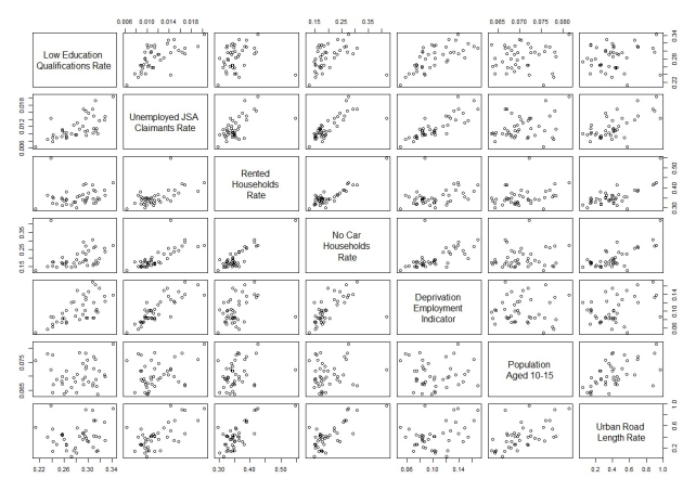
Table 1: Correlation with weighted crime rate for each indicator
| Indicator | Correlation |
|---|---|
| Proportion of residents with low educational qualifications | 0.54 |
| Unemployment claimant rate | 0.84 |
| Employment deprivation score | 0.67 |
| Proportion of rented households | 0.67 |
| Urban road length per hectare | 0.73 |
| Proportion of households with no access to a car | 0.80 |
| Proportion of the population aged 10 to 15 | 0.39 |
PCA produces as many principal components as there are variables in the dataset, but only a few of them explain most of the variation in the dataset. We use an elbow test on the scree plot of the principal components using a distance-to-line method (Satopää et al., 2011)[footnote 3] to select the number of principal components to use, as shown in Figure 2. This approach identifies the point at which additional components yield diminishing marginal gains in explained variance. While a secondary inflection is observable at 4 components, the distance-to-line criterion indicates the primary elbow is at 2 components, which together retain 79% of the variation in the selected indicators. This means that we will be using principal components 1 and 2 (PC1 and PC2) to measure similarity.
Figure 2: Scree plot showing variation explained by each principal component
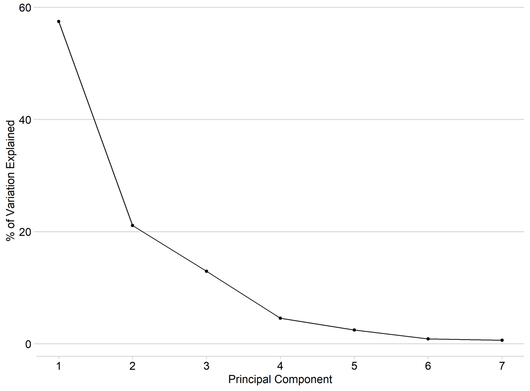
Figure 3 plots each force in the principal component space and illustrates how similar they are to each other in regard to the selected variables. To interpret these PC scores, one can look at the rotation scores in Table 2. These rotation scores show what percentage of each principal component are driven by each indicator. PC1 is primarily driven by the unemployment claimants rate, proportion of rented households, proportion of households with no cars, employment deprivation score and urban road length. PC2 is primarily driven by the low education rate, employment deprivation, proportion of 10 to 15-year-olds and urban road length.
Figure 3: Scatter plot of each force on principal component 1 and 2
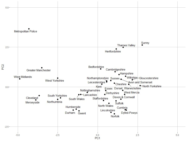
Table 2: Variable importance; principal component rotation scores
| Indicator | PC1 | PC2 |
|---|---|---|
| Proportion of residents with low educational qualifications | 8% | 27% |
| Unemployment claimant rate | 22% | 3% |
| Proportion of rented households | 16% | 9% |
| Proportion of households with no access to a car | 20% | 1% |
| Employment deprivation score | 14% | 22% |
| Proportion of the population aged 10 to 15 | 4% | 23% |
| Urban road length per hectare | 16% | 15% |
| Total | 100% | 100% |
The sequential application of CFS and PCA, reducing 45 indicators to 7 and then to 2 orthogonal principal components, results in a substantial reduction in dimensionality and limits the interpretability of the original dataset. The approach however limits the influence of redundant information and maintains a strong relevance to the weighted crime rate. The resulting principal components capture the dominant demand-related structure in the data, providing a robust basis for downstream similarity analyses.
5. Measuring similarity
With principal component 1 and 2 as the feature space, we define the similarity score between 2 force areas as the normalised and inverse Euclidian distance between them. The Euclidean distance is a straightforward and commonly used measure that captures the straight-line distance between 2 points in multi-dimensional space. As the PC scores are uncorrelated and standardised, Euclidean distance provides a meaningful measure of similarity between forces with regard to the selected indicators.
The formula for calculating the Euclidian distance between 2 police force areas A and B, each represented by their principal component scores, is shown in the equation (2) where: PC1(A) is the principal component 1 score of PFA A; PC1(B) is the principal component 1 score of PFA B, PC2(A) is the principal component 2 score of PFA A and PC2(B) is the principal component 2 score of PFA B.
Equation (2)

The Euclidian distance by itself provides limited ability for interpretation, so we create a similarity score by dividing every distance by the maximum distance between 2 forces. This normalises the distances and gives us a relative score of disparity. We then inverse this to get the similarity score which we use to create the groups, shown in equation (3), where DAB is the Euclidian distance between forces A and B and DMAX is the maximum Euclidian distance between any 2 forces. This gives each pair of forces a similarity score between 0 and 100, where the higher the number, the more similar the 2 forces are.
Equation (3)

We include in Annex C of the Most Similar Forces: Annexes, the similarity scores between all force combinations. This table can be used to identify how similar all other forces are to each force with respect to the chosen indicators.
6. Group formation
The similarity scores set out how similar each of the other forces are to each force with respect to the selected indicators. For the purposes of this product, we also aimed to create consistent groups of forces which can be used to benchmark weighted crime rates for each force area. We create the groups using k-nearest neighbour, a common and simple supervised machine learning technique that predicts the value of the data point by taking the average of the closest data points around it. Importantly though, this grouping does not alter the underlying data structure or similarity scores; it only determines how that fixed similarity space is partitioned into groups.
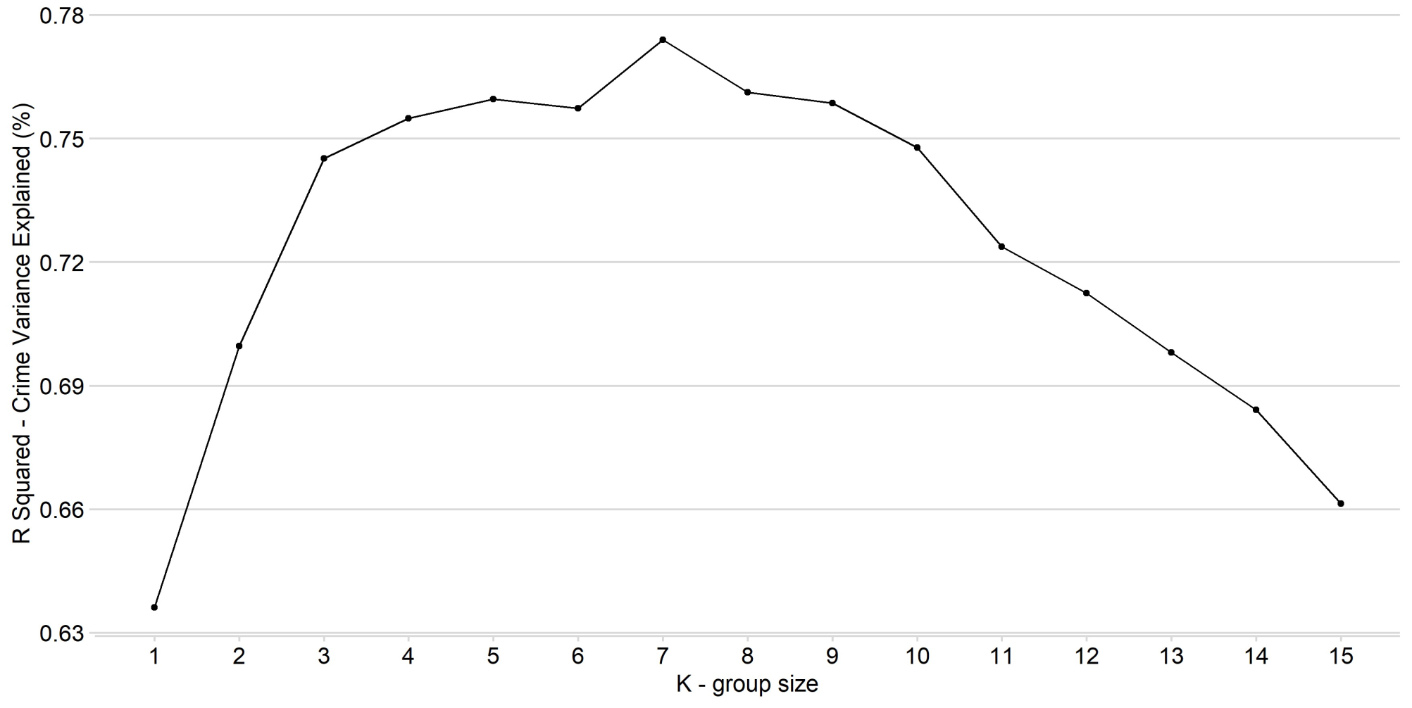
We define the groups to be, for each PFA, the 7 force areas with the highest similarity score. We chose 7 by looking at which value of K (group size) maximises the R2 metric (equation 4), where WCRi is the weighted crime rate for PFA i, WCRg is the group average and WCR bar is the average across all forces. The R2 value measures how much variation of weighted crime rates are explained by the group averages. This results in a set of groups where, on average, the group average for the weighted crime rate is as close as possible to the target force. This suggests that the 7 most similar forces are on average the best set of comparisons for benchmarking weighted crime rates. Figure 4 visualises the R2 value for each group size.
Equation (4)

Figure 4: Variation in weighted crime rate explained for each group size
7. Application and validation
A user of MSFs can choose to either use the groups set out in Annex B of the Most Similar Forces: Annexes, or they can use the similarity scores in Annex C to make comparisons. We intend that these groups and the similarity scores will be primarily used as a tool to compare weighted crime rates. They may also be used for metrics that are closely related to weighted crime, or in situations where the chosen indicators in this analysis are expected to be correlated to the dependent variable. Users should validate the application of this tool for their specific situation.
This section provides an outline of how the groups can be used by comparing a force metric against the group average to serve as a benchmark. There may however be other analytically valid ways of using these groups or the underlying data to assess performance.
The similarity scores represent similarity with respect to the most impactful indicators on weighted crime. The group average can therefore be seen as a predicted value for a force area given those indicators, everything else being equal. This means that the residual (the difference between the actual value and group average) is the unexplained variation in weighted crime rate that would represent a possible performance gap. For this interpretation to be valid and useful in performance management, we must assume that the residual can at least in part be explained by the operational practices of that police force.
While all groups contain seven force areas, the similarity between group members varies. Some forces have more closely matched group members than others, so users should also consider the similarity scores in Annexes B and C of the Most Similar Forces: Annexes when interpreting comparisons.
MSF may in some circumstances also be used to benchmark other metrics that are closely related to weighted crime rates, or in circumstances where the metric in question is expected to be influenced by the same underlying socio-economic indicators. A way to quantify that validation is to use the R2 value (equation 4), where the weighted crime rate is replaced with the chosen metric. The R2 is an important indicator of how applicable MSF is as a benchmark because it explains how much of the variation in the metric can be predicted by the groups, compared with using the national average as a benchmark.
The higher the R2 value (closer to 100%), the more of the variation in the metric can be predicted by the groups, and therefore the stronger the indication that MSF is a good tool to use to compare forces. If the R2 is low (closer to, or below, 0%) that means the underlying socio-economic factors used to create the MSFs are less correlated to the metric. A low R2 implies that the group average is a limited benchmark and may be no better than using the national average for that metric, although there is no exact R2 value which is considered “good”, or high enough to use. As long as the R2 is above 0, the force levels are closer to their group averages than average across all forces.
To illustrate the differences in R2 values, we apply MSFs to different crime types. While some crime types are closely related to weighted crime rates, others follow different patterns. This is shown in Table 3 where the R2 indicates how well the group averages correlate to the target force crime rate for that crime type. In this example, looking at crime rates averaged across 2018 to 2021, the groups are more appropriate to use for unweighted crime rates, robbery and residential burglary which are at the top of the table. They should however likely not be used, or cautiously used, to benchmark ASB or drug offences which are towards the bottom of the table. We encourage the user to do a similar validation exercise before applying MSFs to their own metrics.
Table 3: R2 for crime rate by crime type
| Crime Type | R2 |
|---|---|
| Weighted crime rate | 77% |
| Unweighted crime rate | 64% |
| Robbery | 63% |
| Residential burglary | 60% |
| Vehicle offences | 56% |
| Theft from the person | 54% |
| Other theft offences | 54% |
| Stalking and harassment | 45% |
| Criminal damage and arson | 42% |
| Violence with injury | 40% |
| Miscellaneous crimes | 32% |
| Non-residential burglary | 29% |
| Shoplifting | 22% |
| Possession of weapons offences | 21% |
| Homicide | 19% |
| Public order offences | 4% |
| Sexual offences | 4% |
| Bicycle theft | 2% |
| Violence without injury | -4% |
| Drug offences | -12% |
| Anti-social behaviour | -12% |
| Death or serious injury unlawful driving | -27% |
References
Home Office (2025) Police Activity Survey. (Accessed: 3 December 2025).
Office for National Statistics (ONS). (2025). Census 2021: General report for England and Wales. [PDF] London: Office for National Statistics. [Accessed 14 October 2025].
Wharfe, H., Furlong, S., Feist, A. and Dunnett, A. (2024). The impact of COVID-19 lockdowns on crime demand and charge volumes in England and Wales, Home Office. [Accessed 14 October 2025].
Hall, M. A. (1999) Correlation‑Based Feature Selection for Machine Learning, PhD thesis, Department of Computer Science, University of Waikato.
Satopää, V., Albrecht, J., Irwin, D. & Raghavan, B., 2011. Finding a “Kneedle” in a haystack: Detecting knee points in system behaviour. In: 2011 IEEE 31st International Conference on Distributed Computing Systems Workshops, 2011, pp. 166–171. [Accessed 3 February 2026].
-
As discussed in the ONS report on the 2021 Census (ONS, 2025), which concludes that the extent of the impact is not yet known, and the Home Office report on the impact of COVID-19 lockdowns on crime patterns, which found several impacts during lockdown but no clear evidence to support excluding the 2021 crime data from this analysis. (Home Office, 2024). ↩
-
The Police Activity Survey (PAS) publication does not provide a unit cost for anti-social behaviour (ASB). A unit cost of £138 per incident was therefore estimated using the same approach to total costs as the PAS. Unlike the crime unit costs, which are calculated using police recorded crime data, the ASB unit cost was calculated using police force reported numbers of ASB incidents in the PAS supplementary data. ↩
-
The distance to line method refers to a technique which measures the greatest perpendicular distance from points on a scree plot to a line which connects the first and last data points. ↩