Chapter 5: inequality in health
Published 13 July 2017

© Crown copyright 2017
This publication is licensed under the terms of the Open Government Licence v3.0 except where otherwise stated. To view this licence, visit nationalarchives.gov.uk/doc/open-government-licence/version/3 or write to the Information Policy Team, The National Archives, Kew, London TW9 4DU, or email: psi@nationalarchives.gov.uk.
Where we have identified any third party copyright information you will need to obtain permission from the copyright holders concerned.
This publication is available at https://www.gov.uk/government/publications/health-profile-for-england/chapter-5-inequality-in-health
1. Main messages
Health inequalities are differences in health between people or groups of people that may be considered unfair. There is a social gradient in lifespan; people living in the most deprived areas in England have on average the lowest life expectancy and conversely, life expectancy is higher on average for those living in areas with lower deprivation. Males living in the most deprived tenth of areas can expect to live 9 fewer years compared with the least deprived tenth, and females can expect to live 7 fewer years.
Males and females living in the most deprived areas can also expect to spend nearly 20 fewer years in good health compared with those in the least deprived areas: they spend nearly a third of their lives in poor health, compared with only about a sixth for those in the least deprived areas. For males living in the 5 most deprived tenth of areas, and females living in the 4 most deprived, average healthy life expectancy falls below the age of 65 years (current state pension age for men).
Although deprived areas can be found in all regions of England, there is a higher concentration of more deprived authorities in the north. In addition, life expectancy in local authorities within the same deprivation group is generally lower among authorities in the north than those in the south.
As a consequence, there is a persistent ‘north-south’ divide in life expectancy and healthy life expectancy. Those in southern regions can on average expect to live longer and with fewer years in poor health than those further north.
Almost half of the gap in life expectancy between the most and least deprived areas in England is due to excess deaths from heart disease, stroke, and cancer in the most deprived areas. These are also the causes that make up a large proportion of the burden of premature death in England overall.
As well as lower life expectancy, there is a higher prevalence of many behavioural risk factors among the more deprived areas compared with the less deprived areas. These health inequalities are underpinned by inequalities in the broad social and economic circumstances which influence health.
2. Introduction
As described in previous chapters, there are differences in health outcomes for men and women, for different age groups and for different countries. As described in this chapter, there are also differences in outcomes relating to socioeconomic status, ethnicity, geographical region and other social factors. These health inequalities, differences in health between people or groups of people that may be considered unfair, reflect historic and present-day social inequalities in our population. Reducing inequalities should allow everyone to have the same opportunities to lead a healthy life.
This chapter provides an overview of inequality in health in England, concentrating primarily on deprivation. Inequalities by other socioeconomic characteristics are explored in more depth in the report Public Health Outcomes Framework: health equity report, focus on ethnicity which presents analysis and commentary on inequalities for 18 indicators from the Public Health Outcomes Framework (PHOF).
3. Patterns in health inequality
Life expectancy at birth in England has generally increased in recent decades and provisional data for 2016 show that it has reached 79.5 for males and 83.1 for females (chapter 1). However, life expectancy is not uniform across England and inequalities exist. On average, individuals living in more deprived areas live the fewest years, while those in the least deprived areas have the longest lives (figure 1, 2).
If England’s population is ranked from most to least deprived and then divided into 10 groups (deprivation decile groups), life expectancy increases in each decile group as the level of deprivation decreases (figure 1, 2). In other words, there is a ‘social gradient’ in health [footnote 1]. Between the most and least deprived tenths of England, the absolute difference in life expectancy is 9 years for males and 7 years for females (figure 1, 2).
3.1 Figure 1: male life expectancy and healthy life expectancy at birth by deprivation decile, England, 2013 to 2015
For males, both life expectancy and healthy life expectancy were highest in the least deprived areas and lowest in the most deprived areas
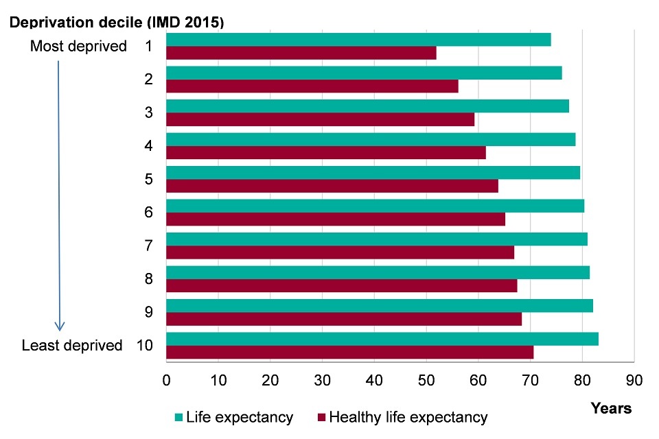
Figure 1. Male life expectancy and healthy life expectancy at birth by Index of Multiple Deprivation (IMD) 2015 deprivation deciles at lower super output area (LSOA) level, England, 2013-2015 [Source: Public Health Outcomes Framework]
Note: Index of Multiple Deprivation (IMD) 2015 deprivation deciles at lower super output area (LSOA).
This shows:
- the least deprived areas had the highest male life expectancy (83.1 years) while the most deprived areas had the lowest life expectancy (74.0 years)
- healthy life expectancy (years in good health) was highest in the least deprived areas (70.6 years) and lowest in the most deprived areas (51.9 years)
- while there was a sizeable difference in outcome between the most and least deprived, there was also a gradient whereby there were incremental decreases in life expectancy and healthy life expectancy between each decile group as deprivation increased. The level of inequality or ‘gap’ is 9 years for life expectancy and 19 years for healthy life expectancy[footnote 2]
- from the most deprived tenth of areas (decile group 1), up to and including decile group 5, the average healthy life expectancy was lower than the current male state pension age of 65 years
3.2 Figure 2: female life expectancy and healthy life expectancy at birth by deprivation decile, England, 2013 to 2015
For females, both life expectancy and healthy life expectancy were highest in the least deprived areas and lowest in the most deprived areas
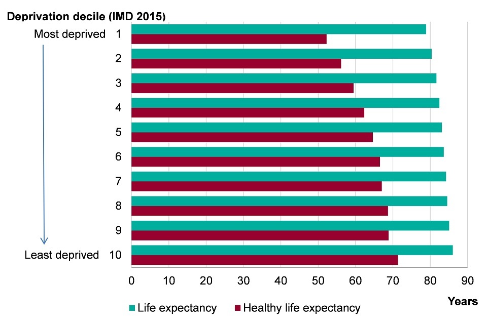
Figure 2. Female life expectancy and healthy life expectancy at birth by Index of Multiple Deprivation (IMD) 2015 deprivation deciles at lower super output area (LSOA) level, England, 2013-2015 [Source: Public Health Outcomes Framework]
Note: Index of Multiple Deprivation (IMD) 2015 deprivation deciles at lower super output area (LSOA).
This shows:
- the least deprived areas had the highest female life expectancy (86.1 years) while the most deprived areas had the lowest life expectancy (78.9) years
- healthy life expectancy was highest in the least deprived areas (71.3 years) and lowest in the most deprived areas (52.2 years)
- while there was a sizeable difference in outcome between the most and least deprived, there was also a gradient whereby there were incremental decreases in life expectancy and healthy life expectancy between each decile group as deprivation increased. The level of inequality or ‘gap’ is 7 years for life expectancy and 20 years for healthy life expectancy [footnote 2]
- from the most deprived tenth of areas (decile group 1), up to and including decile group 4, healthy life expectancy was lower than 65 years
This difference in outcomes between the most deprived and least deprived begins early in life. Of all live births at full term, a higher percentage are born at a low birth weight in the 3 most deprived decile groups than on average in England (figure 3). Furthermore, the infant mortality rate is highest in the most deprived areas and lowest in the least deprived areas (figure 4).
If the most deprived decile group had the same infant mortality rate as the least deprived, there would have been 780 fewer infant deaths in 2013 to 2015. And if all decile groups had the same infant mortality rate as the least deprived, there would have been 2,051 fewer infant deaths in England as a whole.
3.3 Figure 3: the proportion of live births at term with low birth weight (<2500g) by deprivation decile, England, 2012 to 2014
A higher percentage of babies are born at term with a low birth weight in the 3 most deprived decile groups
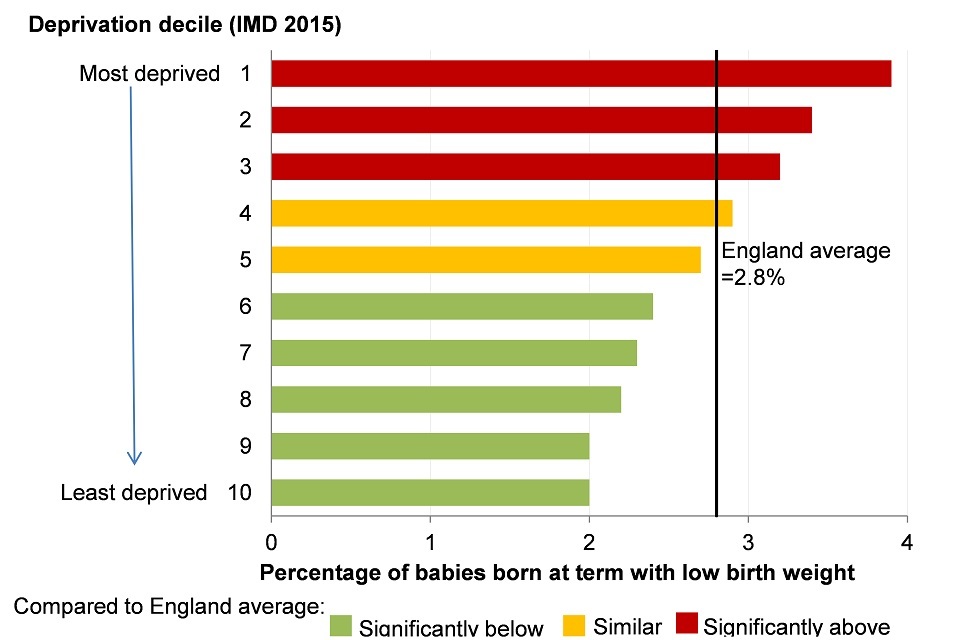
Figure 4. Infant mortality rate per 1,000 live births for persons by Index of Multiple Deprivation (IMD) 2015 deprivation deciles at lower super output area (LSOA) level, England, 2013-15 [Source: Public Health Outcomes Framework: Health Equity Report. Focus on Ethnicity (2017)]
Note: Index of Multiple Deprivation (IMD) 2015 deprivation deciles at lower super output area (LSOA).
This shows:
- in the 3 most deprived decile groups, significantly more babies born at term had a low birthweight than the England average (2.8%)
3.4 Figure 4: infant mortality rate by deprivation decile, England, 2013 to 2015
The infant mortality rate is highest in the most deprived decile group and lowest in the least deprived
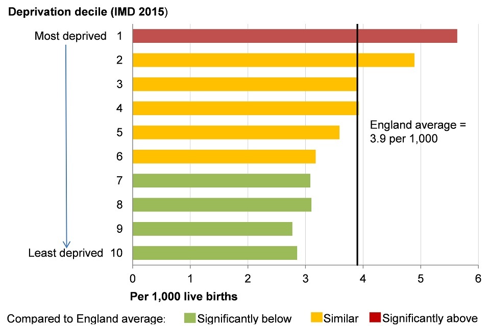
Figure 3. Proportion of live births at term with low birth weight (<2500g) for persons by Index of Multiple Deprivation (IMD) 2015 deprivation deciles at lower super output area (LSOA) level, England, 2012-14 [Source: Public Health Outcomes Framework]
Note: Index of Multiple Deprivation (IMD) 2015 deprivation deciles at lower super output area (LSOA).
This shows:
- in the most deprived decile group there was a significantly higher infant mortality rate than the England average
- in the 4 least deprived decile groups there was a significantly lower infant mortality rate than the England average
Figure 5 shows the geographical distribution of England’s local authorities according to their level of deprivation. More of the authorities in the most deprived group are in the north of England than in the south, but there are deprived authorities in all regions (figure 5).
In addition to this, as shown in the PHOF, life expectancy in local authorities within the same deprivation group is generally lower among authorities in the north than those in the south. As a consequence, there is a persistent north-south divide in life expectancy. Those in southern regions can expect to live longer than those further north (figure 6, 7).
3.5 Figure 5: lower tier local authorities (districts and unitary authorities) by Index of Multiple Deprivation (IMD) 2015
Districts and unitary authorities in the most deprived quintile in England are concentrated in the North, Midlands and London
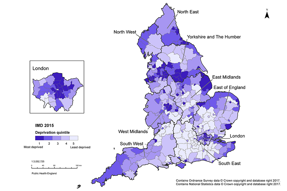
Figure 5. Map of lower tier local authorities (districts and unitary authorities) shaded to indicate the Index of Multiple Deprivation (IMD) 2015 deprivation quintile of the area, England, 2015 [Source: Department for Communities and Local Government, 2015]
This shows:
- by mapping the level of deprivation for local authorities using IMD 2015, it can be seen that levels of deprivation vary around the country and pockets of deprivation are found in all regions
- the local authorities that fall within the most deprived quintile are concentrated in the north of England, the Midlands and London
- the local authority districts in the least deprived quintile are concentrated in the south of England
Healthy life expectancy also varies between areas, reflecting both the level of deprivation and geographical location. The most deprived areas have the lowest healthy life expectancy while the least deprived areas have the highest (figure 1, 2).
For both males and females in the most deprived areas, there is almost a 20-year difference in healthy life expectancy compared with those living in the least deprived areas. Healthy life expectancy across England is also characterised by the same north-south divide that exists for life expectancy: it is highest in the southern regions and lowest in the north (figure 6, 7).
In addition, for males living in the lowest 5 deprivation decile groups, and females living in the lowest 4 groups (more deprived), their healthy life expectancy falls below the age of 65 years, the current state pension age for men (figure 1, 2). In the most deprived decile group, healthy life expectancy falls short of the current state pension age for men by more than 10 years for both males and females (figure 1, 2).
3.6 Figure 6: male life expectancy and healthy life expectancy at birth by region, England, 2013 to 2015
For males, there is a north-south divide in life expectancy and healthy life expectancy where the highest life expectancy is found in the southern regions and the lowest in the north
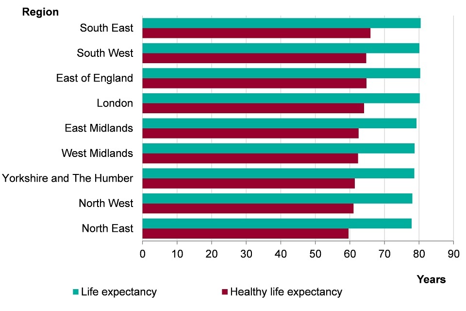
Figure 6. Male life expectancy and healthy life expectancy at birth by region, England, 2013-2015 [Source: Public Health Outcomes Framework]
This shows:
- male life expectancy was highest in the southern regions of England and lowest in the northern regions
- the South East had the highest life expectancy (80.5 years) while the North East had the lowest life expectancy (77.9 years)
- there was a similar north-south divide in male healthy life expectancy with the lowest healthy life expectancies being in the north of England and the highest in the south
- the highest healthy life expectancy was in the South East (66.0 years) and the lowest was in the North East (59.6 years)
3.7 Figure 7: female life expectancy and healthy life expectancy at birth by region, England, 2013 to 2015
For females, there is a north-south divide in life expectancy and healthy life expectancy; the highest life expectancy is in the southern regions and the lowest in the north
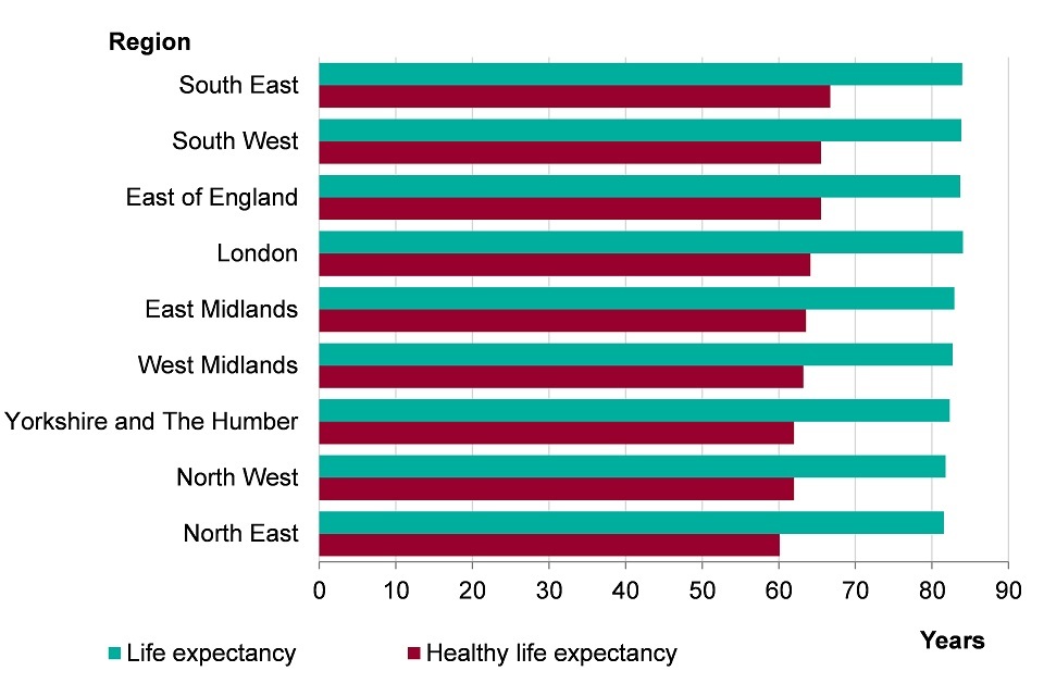
Figure 7. Female life expectancy and healthy life expectancy at birth by region, England, 2013-2015 [Source: Public Health Outcomes Framework]
This shows:
- female life expectancy was highest in the southern regions of England and lowest in the northern regions
- London had the highest life expectancy (84.1 years) while the North East had the lowest life expectancy (81.6 years)
- there was a similar north-south divide in female healthy life expectancy with the lowest healthy life expectancies being in the north of England and the highest in the south
- the highest healthy life expectancy was in the South East (66.7 years) and the lowest was in the North East (60.1 years)
The gap in life expectancy between the most and least deprived areas in England can be broken down by the broad causes of death that contribute to the years of difference (figure 8). Almost half of the gap in life expectancy between the most and least deprived areas in England is due to excess deaths from circulatory disease (heart disease and stroke) and cancer in the most deprived areas. This means that if people in the most deprived fifth of areas in England had the same mortality rate for these causes as the least deprived fifth, the gap in life expectancy between the most and least deprived fifths would reduce by almost a half.
3.8 Figure 8: the breakdown of the life expectancy gap between the most deprived and least deprived quintiles, by broad cause of death for males and females, England, 2012 to 2014
Deaths caused by heart disease, stroke and cancers made up half of the gap in life expectancy between the most and least deprived quintiles in England
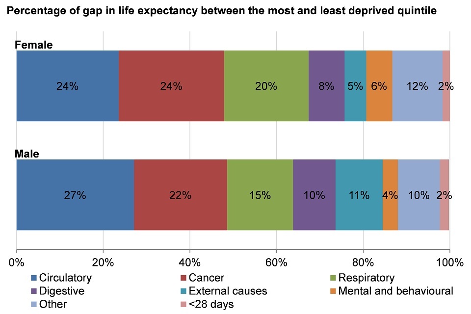
Figure 8. The breakdown of the life expectancy gap between the most deprived and least deprived quintiles, by broad cause of death for males and females, England, 2012-2014 [Source: PHE Segment tool: England PDF]
Note: Due to rounding, numbers may not add to 100%. England was divided into quintiles based on Lower Super Output Area (LSOA) level IMD 2015 scores.
This shows:
- in both males and females, circulatory (heart disease and stroke), cancer and respiratory causes of death are the top 3 contributors to the difference in life expectancy between the most and least deprived quintiles
- circulatory disease deaths account for 24% of the difference in life expectancy in females and 27% in males between the most and least deprived quintiles
- cancer deaths contribute to 24% of this gap in females and 22% in males
- respiratory causes of death contribute 20% to the gap in females and 15% to the gap in males
- digestive, external, mental and behavioural, deaths in those under 28 days, and deaths due to other causes also contribute to the gap in life expectancy
As well as lower life expectancy, there is a higher prevalence of many behavioural risk factors in the more deprived areas compared with the less deprived areas. For example, in more deprived areas, the prevalence of inactivity and the prevalence of smoking are both highest, while the proportion of people eating the recommended 5-a-day of fruits and vegetables is lowest (figure 9). These are among the key behavioural risk factors for cardiovascular, cancer and respiratory disease deaths (chapter 2).
Those in the most deprived areas are also more likely to suffer the harms associated with alcohol consumption, one of the risk factors associated with the highest proportion of deaths in the 15 to 49 age group [footnote 5], (chapter 2).
3.9 Figure 9: the prevalence of selected risk factors in adults by deprivation decile, England
The prevalence of risk factors varies across upper tier local authorities grouped into deprivation deciles, whereby the least deprived areas had the lowest prevalence of risk factors
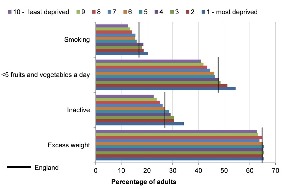
Figure 9. Prevalence of excess weight (2013-15), inactivity (2015), eating fewer than 5 portions of fruits and vegetables (2015) aged 16+, and smoking (2015) aged 18+ by IMD 2015 deprivation deciles of grouped upper tier local authorities, England [Source: Public Health Outcomes Framework]
Note:
- excess weight in adults (aged 16 or over), 2013 to 2015
- physically inactive adults (aged 16 or over), 2015
- eating fewer than 5 portions of fruits and vegetables a day (aged 16 and over), 2015
- smoking prevalence in adults (aged 18 or over), 2015
The indicator presented as ‘eating fewer than 5 portions of fruit and vegetables a day’ is an inversion of the indicator ‘proportion of the adult population meeting the recommended ‘5-a-day’ available on the PHOF.
Only statistically significant differences are described as ‘higher’, ‘lower’, ‘more’, ‘less’ or ‘fewer’. If not statistically significant they are described as ‘similar’.
Index of Multiple Deprivation (IMD) 2015 deprivation deciles at upper tier local authority level.
This shows:
- for all 4 risk factors, the lowest prevalence was in the least deprived decile group and, with the exception of excess weight, the highest prevalence was in the most deprived
- smoking prevalence was higher than the England average (16.9%) for the most deprived 40% of areas and lower than the England average in all other decile groups
- the prevalence of eating less than the recommended intake of fruits and vegetables was higher than the England average (47.7%) and the prevalence of inactivity was higher than the England average (28.7%) in the most deprived 30% of areas, and similar or lower for all other decile groups
- the prevalence of excess weight by deprivation across all deciles was similar to the England average (64.8%), with no clear relationship to deprivation, however, the lowest prevalence was in the least deprived 10% of areas
Health outcomes and the prevalence of behavioural risk factors not only differ by level of deprivation but also by personal characteristics such as sex, ethnicity and socio-economic group. Compared with women, men have a higher prevalence of excess weight, poor diet and smoking, but a lower prevalence of inactivity (figure 10).
The prevalence of these risk factors also varies between ethnic groups. Compared with the average in England, a higher proportion of those in Asian and Black ethnic groups do not eat the recommended amount of fruit and vegetables and have a higher rate of inactivity. Smoking is more common among White and Mixed ethnic groups and being overweight is higher in White and Black ethnicities (figure 11).
3.10 Figure 10: the prevalence of selected risk factors in adult males and females, England
The prevalence of behavioural risk factors is higher in men than women, except for inactivity
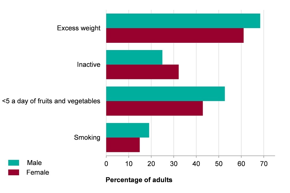
Figure 10. The prevalence of excess weight (2013-15), inactivity (2015), eating fewer than 5 portions of fruits and vegetables (2015) in males and females aged 16+, and smoking (2015) in men and women aged 18+ in England [Source: Public Health Outcomes Framework]
Note:
- excess weight in adults (aged 16 or over), 2013 to 2015
- physically inactive adults (aged 16 or over), 2015
- eating fewer than 5 portions of fruits and vegetables a day (aged 16 or over), 2015
- smoking prevalence in adults (aged 18 or over), 2015
The indicator presented as ‘eating fewer than 5 portions of fruit and vegetables a day’ is an inversion of the indicator ‘proportion of the adult population meeting the recommended ‘5-a-day’ available on the Public Health Outcomes Framework.
Only statistically significant differences are described as ‘higher’, ‘lower’, ‘more’, ‘less’ or ‘fewer’. If not statistically significant they are described as ‘similar’.
This shows:
- more men carried excess weight (68.4%) compared to women (61.1%)
- more women were inactive (32.2%) than men (25.0%)
- more men (52.7%) did not eat the recommended number of fruit and vegetables (5-a-day) than women (42.9%)
- more men were current smokers (19.1%) than women (14.9%)
3.11 Figure 11: the prevalence of selected risk factors in adults by ethnic group, England
The prevalence of risk factors varies by ethnic group in England
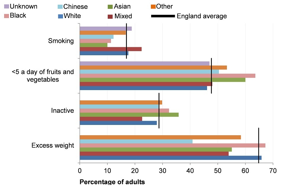
Figure 11. The prevalence of excess weight (2013-15), inactivity (2015), eating fewer than 5 portions of fruits and vegetables (2015) in persons aged 16+, and smoking (2015) in persons aged 18+ by ethnic group, England [Source: Public Health Outcomes Framework]
Note:
- excess weight in adults (aged 16 or over), 2013 to 2015
- physically inactive adults (aged 16 or over), 2015
- eating fewer than 5 portions of fruits and vegetables a day (aged 16 and over), 2015
- smoking prevalence in adults (aged 18 or over), 2015
The indicator presented as ‘eating fewer than 5 portions of fruit and vegetables a day’ is an inversion of the indicator ‘proportion of the adult population meeting the recommended ‘5-a-day’ available on the Public Health Outcomes Framework.
Only statistically significant differences are described as ‘higher’, ‘lower’, ‘more’, ‘less’ or ‘fewer’. If not statistically significant they are described as ‘similar’.
This shows:
- mixed ethnic groups had the highest prevalence of smoking, a lower prevalence of inactivity and excess weight, and a similar prevalence of eating less than recommended intake of fruits and vegetables
- Asian ethnic groups had a higher prevalence of inactivity and of eating less than recommended intake of fruits and vegetables, but a lower prevalence of excess weight and smoking
- Black ethnic groups had a higher prevalence of inactivity, excess weight and of eating less than recommended intake of fruits and vegetables, but a lower prevalence of smoking
- White ethnic groups had a higher prevalence of smoking and excess weight, but a lower prevalence of inactivity and of consuming less than the recommended intake of fruits and vegetables
- Chinese ethnic groups had a similar prevalence of inactivity and of eating less than recommended intake of fruits and vegetables, and a lower prevalence of excess weight and smoking
Health inequalities are underpinned by ‘the conditions in which people are born, grow, live, work and age’. The broad social and economic circumstances which together influence the quality of the health of the population are known as the ‘social determinants of health’ [footnote 1]. The social determinants of health underpin the inequalities in behavioural risk factors and health outcomes and are explored in chapter 6.
More detail on inequalities in health outcomes by these area and individual characteristics, and the inequalities in the social determinants of health that underpin them can be found in the report Public Health Outcomes Framework: Health Equity Report. Focus on Ethnicity.
4. Trends in health inequality
To help monitor the fulfilment of PHE’s statutory duties to have due regard to the need to reduce health inequalities and to promote equality under both the Health and Social Care Act 2012 [footnote 3] and the Equality Act 2010 [footnote 4], 18 key indicators of health and the wider determinants of health have been selected by PHE’s Health Equity Board to form part of the PHE Health Equity Dashboard and are reported in the report Public Health Outcomes Framework: health equity report, focus on ethnicity.
The indicators are all drawn from the Public Health Outcomes Framework and are divided into 3 groups:
- core, overarching health outcomes
- PHE priority areas
- social determinants of health
The trends reported shows that despite the long-term trend of improvements in life expectancy, infant mortality, and rates of premature deaths from cancer and cardiovascular disease in England since 2001 to 2003, stark inequalities remain.
There has been little change in inequalities in male life expectancy, male and female healthy life expectancy and premature cancer mortality. For female life expectancy, there has been a small widening of the gap between the most and least deprived areas.
For premature cardiovascular disease mortality, considerable inequality by deprivation remains, with mortality rates in the most deprived areas almost 3.5 times higher than those in the least deprived in 2012 to 2014 (figure 12).
4.1 Figure 12: cardiovascular disease mortality under 75 years for persons, by deprivation decile, England, 2013 to 2015
Premature mortality from heart disease and stroke was highest in the most deprived decile group and lowest in the least deprived
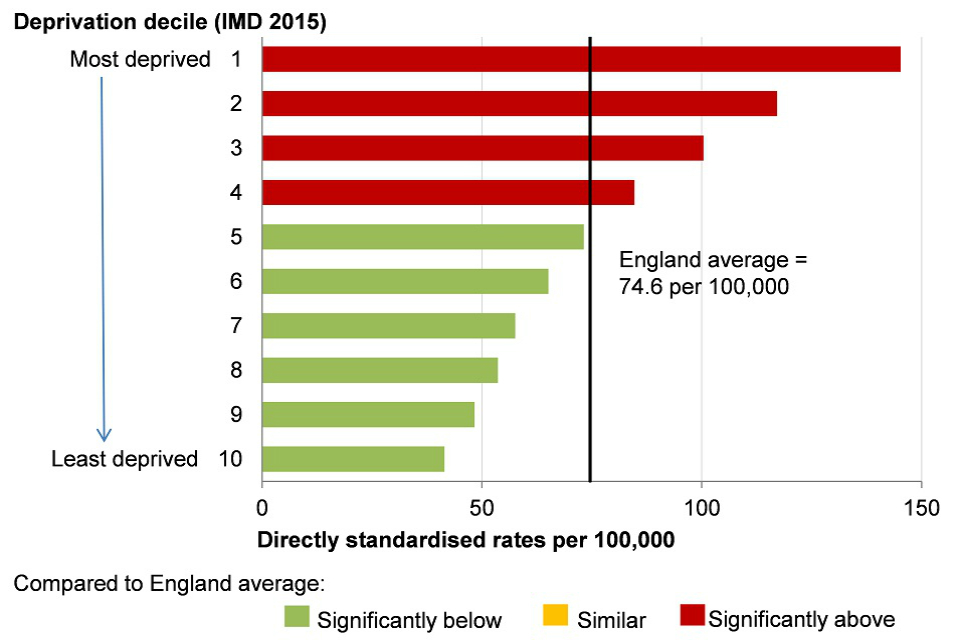
Figure 12. Cardiovascular (heart disease and stroke) disease mortality under 75 years for persons, by Index of Multiple Deprivation (IMD) 2015 deprivation deciles at lower super output area (LSOA) level, England, 2013-15
Note: Index of Multiple Deprivation (IMD) 2015 deprivation deciles at lower super output area (LSOA)
This shows:
- mortality rates under age 75 from heart disease and stroke were highest in the most deprived decile group of England and lowest in the least deprived decile group
- in the 4 most deprived decile groups, mortality rates under age 75 from heart disease and stroke were higher than the England average
The report also shows wide inequalities in health by ethnicity and by country of birth across a range of indicators. However, this picture is complex and difficult to summarise with some groups doing well on some measures of health and less well in others.
For most indicators, it was not possible to analyse trends in inequality by ethnic group. Where this was possible, the picture was mixed. For example, inequality in low birth weight by ethnic group has narrowed, but there has been little change in inequality between ethnic groups in infant mortality.
In 2014, the ethnic group with the highest infant mortality rate (Pakistani) was more than 3 times that of the ethnic group with the lowest infant mortality rate (White Other) (figure 13).
4.2 Figure 13: infant mortality rate by ethnic group, England, 2014
The infant mortality rate varies by ethnic group
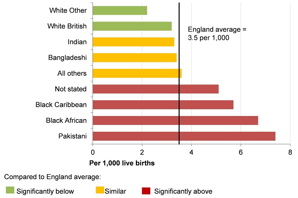
Figure 13. Infant mortality rate per 1,000 live births for persons by ethnic group, England, 2014 [Source: Public Health England. Public Health Outcomes Framework: Health Equity Report. Focus on Ethnicity (2017)]
This shows:
- infant mortality rates were highest in people from the Pakistani group and lowest among people from the White Other group
- for people from the Pakistani, Black African, Black Caribbean and ‘Not stated’ groups the infant mortality rate was higher than the England average
- for people from the Pakistani group, infant mortality was twice as high as the England average
- for people from the White Other and White British groups the infant mortality rate was lower than average
- for people from Indian, Bangladeshi, and ‘All others’ groups, the infant mortality rate was similar to the average
5. Further information
Further information on trends in inequalities in health outcomes by area and individual characteristics, and the social determinants of health can be found in Public Health Outcomes Framework: health equity report, focus on ethnicity.
6. References
-
The Marmot Review: Fair Society, Healthy Lives. The Marmot Review Team (2010). ↩ ↩2
-
Inequality is measured by the Slope Index of Inequality. It is a measure of the social gradient in an indicator and shows how much the indicator varies with deprivation. It takes account of inequalities across the whole range of deprivation within England and summarises this into a single number. The measure assumes a linear relationship between the indicator and deprivation. ↩ ↩2
-
Smith K, Foster J. (2014) Alcohol, Health Inequalities and the Harm Paradox. Accessed: 5 July 2017. ↩
-
Health and Social Care Act (2012) Legislation.gov.uk Accessed: 8 January 2017. ↩
-
Equality Act 2010 (2015). Legislation.gov.uk. Accessed: 8 January 2017. ↩