Performance framework
Published 24 July 2012

© Crown copyright 2012
This publication is licensed under the terms of the Open Government Licence v3.0 except where otherwise stated. To view this licence, visit nationalarchives.gov.uk/doc/open-government-licence/version/3 or write to the Information Policy Team, The National Archives, Kew, London TW9 4DU, or email: psi@nationalarchives.gov.uk.
Where we have identified any third party copyright information you will need to obtain permission from the copyright holders concerned.
This publication is available at https://www.gov.uk/government/publications/gds-performance-framework/performance-framework
Introduction
How do we know if a public service is working for users? How do we know how well it’s working? How can we tell if the changes we make are improving the service?
Harnessing the power of digital tools is vital for improving the performance of public services, but it can be difficult to know where to start. This guide aims to empower service owners to design and improve transactional public services. It is based around seven principles, with easy-to-follow checklists to help you get started. We have also included a worked example for how we have approached performance management for the new GOV.UK single government domain.
Who is this framework written for?
Every government transactional service should have a single service owner accountable for its performance. The service owner will know how well the service is working for users. They will have the information at their fingertips. An empowered service owner will have more than just information. They will be iterating the design of the service frequently to learn what works and what doesn’t. They will do this on a weekly, or even daily, basis.
The service owner who knows how well a service is working for users, and who is empowered to iterate the design of the service on a daily basis, will need the the right data and the right tools. Digital tools provide us with a precise and automated way to measure service performance and to generate user insight. We can use APIs (application programming interfaces) to access and combine data from multiple sources, including digital, phone and face to face channels. We can use software to do advanced analysis and powerful data visualisations. And we can test new designs, monitoring how well they work with optimisation tools. All this means organisations can harness information to improve their ability to deliver.
What does this framework apply to?
This performance framework focuses on transactional services. In this context, a transactional service is where the user does something such as apply for a licence, register a birth, pay tax or claim benefits. This is in contrast to a publishing service where the user wants to find out information about something. It also excludes ‘back office’ functions like payroll, procurement or human resources systems. A complete list of government transactional services is available on GOV.UK.
The Government has set out a clear objective on the use of performance management to help departments drive improvements in transactional service delivery. By the end of this year, we want to establish a consistent set of cross-government metrics for digital service delivery, and publish the cost per transaction of high value services. This will enable the government to monitor and continually improve its services.
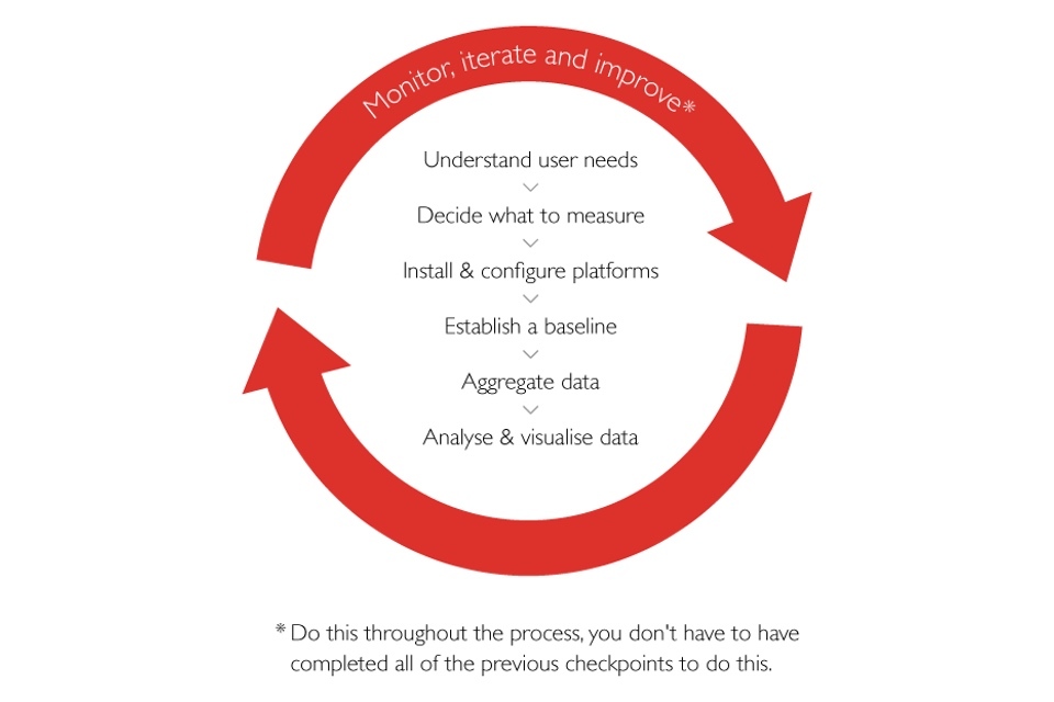
GDS has developed this framework as a first step in helping teams to achieve this goal. The framework is made up of 7 steps:
- understand user needs
- decide what to measure
- install and configure platforms
- establish a baseline
- aggregate data
- analyse and visualise data
- monitor, iterate and improve
The final step can be repeated throughout the process.
1. Understand user needs
In order to improve the performance of a service, you have to analyse and identify the information different audiences will need to assess that performance.
Checklist
- Have you identified who your users are?
- Have you articulated your users’ needs?
- Have you prioritised services (eg by number of users or cost)?
There is typically a hierarchy of interested users, all of whom will have different metrics for success. Technical staff might have operational and optimisation concerns, while senior management and ministers will have more strategic and comparative concerns. These needs will be reflected in the organisation’s business objectives.
Worked example: GOV.UK user needs and personas
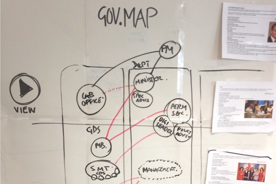
When we thought about who would need information on the performance of GOV.UK, we considered a range of audiences from ministers and senior management through to GDS product managers and developers.
We interviewed the different types of staff who would need to use the dashboards and then we mapped them showing their level of seniority, whether they were in the department or outside it and key relationships.
For key customers, we made personas to better communicate their needs and goals.
Example
This table might be useful as a template when thinking about user needs.
| User | Objectives | Questions |
|---|---|---|
| Senior officials: Ministers, Departmental Boards | Risk management; maximise digital uptake; ensure value for money; control or reduce overall spend; public celebration of success. | How does this compare with other services on cost per transaction? What do users think of our services? How can we increase the number of people using the service digitally? |
| Management: Senior Responsible Officers, Middle management, product managers | Minimise failed transactions; control queues; hit budget target; optimise staffing levels; accurate financial and performance forecasting. | What are we likely to spend by the year-end? How can we drive down channel costs? |
| Operational: developers, frontline staff | Maximise service availability; minimise errors; minimise broken links; ensure search results are relevant; ensure domain is secure and handles customer data properly. | Is the service operating normally? Why are bounce rates so high on the homepage? Who are our users and what do they need? |
| Public | To know how public money is being spent; to know well public services are being run; to know the government is responsive to public feedback on improving services. | How much money is the government spending on public services? What is the cheapest way to deliver public services? How satisfied are people with public services? |
2. Decide what to measure
Develop simple, actionable and collectable metrics based on your understanding of user needs. Identify where that information will come from and how frequently it will be needed.
Checklist
- Have you developed metrics and key performance indicators (KPIs)?
- Are your metrics simple, actionable and collectable?
- Have you mapped your metrics to the relevant audience?
- Have you identified where your metrics will be sourced from?
- Do you know how frequently performance information is required by your users?
KPIs will be few in number - typically around five - and are top-line indicators of how well a service is performing. For almost all transactional services, these are likely to include the volume of transactions, the cost per transaction and success (or conversion) rate - the proportion of users attempting to use a transactional service that successfully complete the task.
There will be many other, more granular metrics that will be useful for different audiences.
It’s good practice to record every event generated by the system even if it’s not currently of interest. Don’t obsess over what to measure: measure everything (where it is cost-effective to do so). This maximises the flexibility to come back later and revise the chosen metrics and tailor data visualisations to different audiences. This information could come from a variety of sources, for example Oracle and Excel for CRM and finance databases, Google Analytics for web testing and optimisation tools, or Nagios and Pingdom for system monitoring.
Worked example: GOV.UK
An approach that worked well for us was to run a brainstorming session to generate a long list of metrics which we then narrowed down by asking senior managers, If you had to choose one KPI, what would it be? We settled on four KPIs: user trust, task completion, reach and cost per successful visit.
Example
| Question | KPI | How measured | Source |
|---|---|---|---|
| Do people trust the content? | User trust | How much do you trust this information? (1 not at all, 5 trust completely) | Online survey |
| How many people are using it? | Reach | Number of visits per week, number of unique users per week | Web analytics |
| What proportion of visits are successful? | Task completion | Remote usability testing. Were you able to get everything you needed today? (none/some/most/everything) | Usability testing results. Online survey |
| How much did it cost per successful visit? | Cost per successful visit | Cost / (Task Completion x Reach). This factors a measure of user success into a simple cost per visit metric, dividing it by task completion rate. | Finance system, online survey, web analytics |
Extended example
This is an extended example to demonstrate some typical metrics and KPIs.
| User | User story | Action | Metric or KPI | Format | Data source |
|---|---|---|---|---|---|
| Senior officials: Ministers, Departmental Boards | I want to know the cost per transaction of key government services so that I have an overview and can compare the financial performance of services | Grant or withhold funding | Cost per transaction | Quarterly report | Finance, Operations |
| I want to know the proportion of transactions delivered digitally for key government services so that I have an overall view on delivering ‘Digital by Default’ and can compare between services. | Start a ‘channel shift’ initiative | Number of transactions by channel (%) | Quarterly report | Operations | |
| I want to know what the public think of key government services so that I have an overall view of customer satisfaction and can compare between services | Celebrate success publicly | Customer satisfaction | Quarterly report | Survey | |
| Management: Senior Responsible Officers, Middle management, product managers | I want to know how much it is costing to deliver a specific service by channel so that I can drive costs down | Implement a channel shift initiative | Costs by channel | Monthly report | Finance, Operations |
| I want to know how much of my budget I have spent by resource so that I can forecast end-of-year spend and see whether I’m on track to hit target | Request additional budget or re-allocate budget if necessary | Costs by resource | Monthly report | Finance, Project software | |
| I want to know how many attempted transactions resulted in failure for a specific service so that I can quickly act to improve the service | Work with developers to test an alternative page design to see if it reduces the failure rate | Success rate, Failure rate | Daily dashboard | Web analytics | |
| Operational: developers, frontline staff | I want to know if the service becomes unavailable so that I can take immediate action to restore it | Investigate cause and resolve problem | Uptime or Mean time between failures (MTBF) | Realtime alert | System monitoring |
| I want to know how specific pages are performing so that I can take steps to optimise if necessary | Investigate cause and resolve problem | Page response time | Daily dashboard | System monitoring | |
| I want to minimise the number of broken links so that the user experience is error free | Investigate cause and resolve problem | Number of broken links | Daily dashboard | Logs | |
| I want to know if the service is being compromised so that I can take immediate action to avert an outage | Investigate cause and resolve problem | Number of attacks by type | Realtime alert | System monitoring | |
| Public | I want to know how public money is being spent to that I can hold the Government to account | Write to MP, tweet or blog about experience | Costs, cost per transaction | Quarterly report | Finance, Operations |
| I want to know how well public services are performing to make sure my voice is being heard | Give feedback on a service | Satisfaction | Quarterly report | Survey, Service desk |
3. Install and configure platforms
Install and configure reporting platforms that meet your needs. Where possible, use platforms that enable the data to be piped automatically into other systems. Using APIs will stop you having to input data manually and allows for aggregation across multiple platforms.
Checklist
- Have you installed web analytics software?
- Have you configured your web analytics software with the appropriate conversion funnels?
- Do you have the capability to run user satisfaction surveys?
- Do you have the capability to do A/B testing and multivariate testing?
- Do you have software installed for monitoring service uptime and performance?
- Can you generate custom performance data based on system-generated events?
There are a number of open source products available as well as paid alternatives. If you are using a third party supplier, ensure that you have access to the raw data behind the measures specified in the contract and make sure data is not thrown away after a short period of time.
Worked example: How far down the page users read
We use Google Analytics to measure how users interact with GOV.UK pages. We want to know how far down the page they are reading so that we can tweak the content, if necessary.
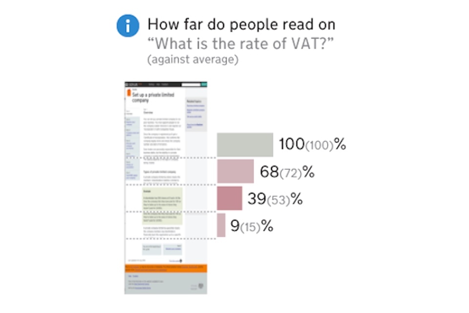
This involved triggering events that can be picked up by Google Analytics at various points down the page: 25%, 50%, 75% and 100%.
For example, on the page ‘What is the rate of VAT?’:
- 100% of visitors read a quarter of the page
- 68% of visitors read to the half-way point
- 39% of visitors read three quarters of the page
- 9% of visitors read all the way to the bottom
A funnel visualisation shows the proportion of users who move on to the next page and the number who exit the site (ie the drop out rate).
Example: ‘Register to vote’ conversion funnel
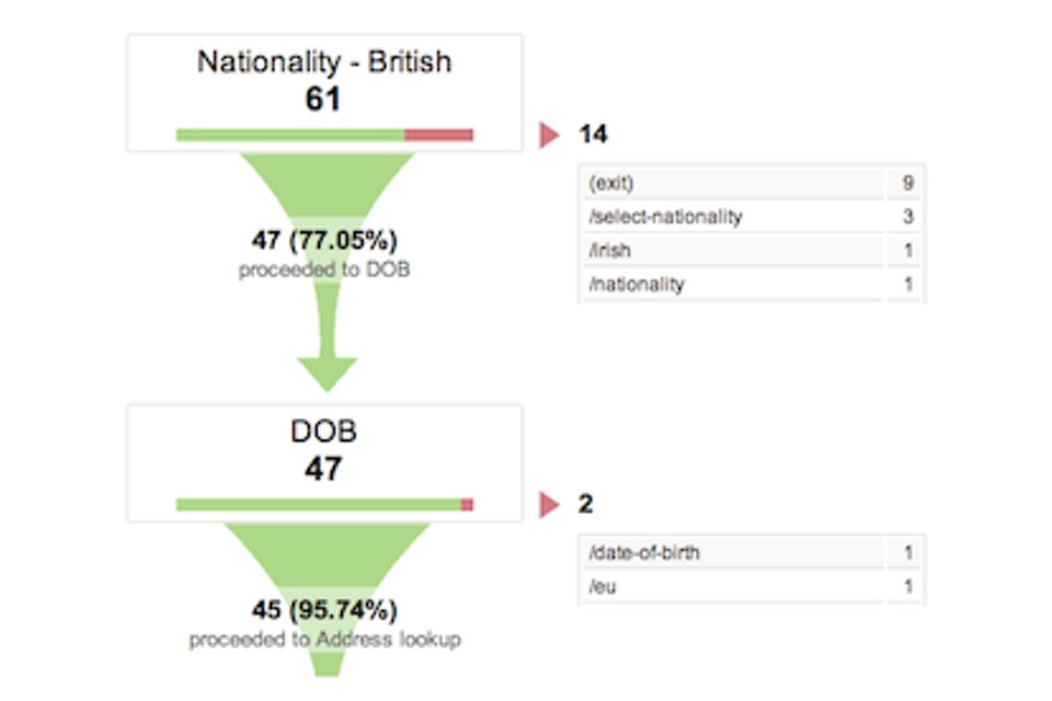
We are developing a new service to allow people to join the electoral register online. The product is in alpha at the time of writing but we have already installed Google Analytics and configured it to measure how users flow through the transaction.
For example, in response to a question about nationality:
- 14 people exited the service without answering
- 47 answered and continued to the next question about date of birth
The funnel visualisations show at each stage the proportion of users proceeding through and the number who exit the process. This enables us to quickly spot where users are experiencing problems and where we might need to test alternative page designs.
4. Establish a baseline
Establish a ‘baseline’ based on current performance trends by channel, against which changes to the service will be judged. This will help you pinpoint the effect of your initiatives, and identify what worked.
Checklist
- Have you measured your current performance?
- Have you compared your performance with similar types of service (eg by transaction category)?
- Do you know who your users are in terms of age, disability, socio-economic group and internet usage?
It is good practice to look at performance trends over time, rather than take a snapshot at a particular point in time. Peaks and dips in performance are then measured relative to this base (or trend) line which helps to identify the effect of communications or design initiatives. It also reveals seasonal variations in performance.
Benchmarking against other services can also provide a useful context for judging performance. By comparing to other similar services (eg requesting a licence or reporting information) you know whether the service is significantly better or worse than expected. A complete list of the government’s transactional services is available on GOV.UK.
You need to know who your users are to be able to determine whether they are likely to need assisted digital to help them use the digital service. The proportion of users needing assisted digital will vary based on the users of the particular service. For example, a higher proportion of people applying for incapacity benefits are more likely to need assistance with digital services than those needing to pay their road tax.
Worked example: GOV.UK remote usability testing
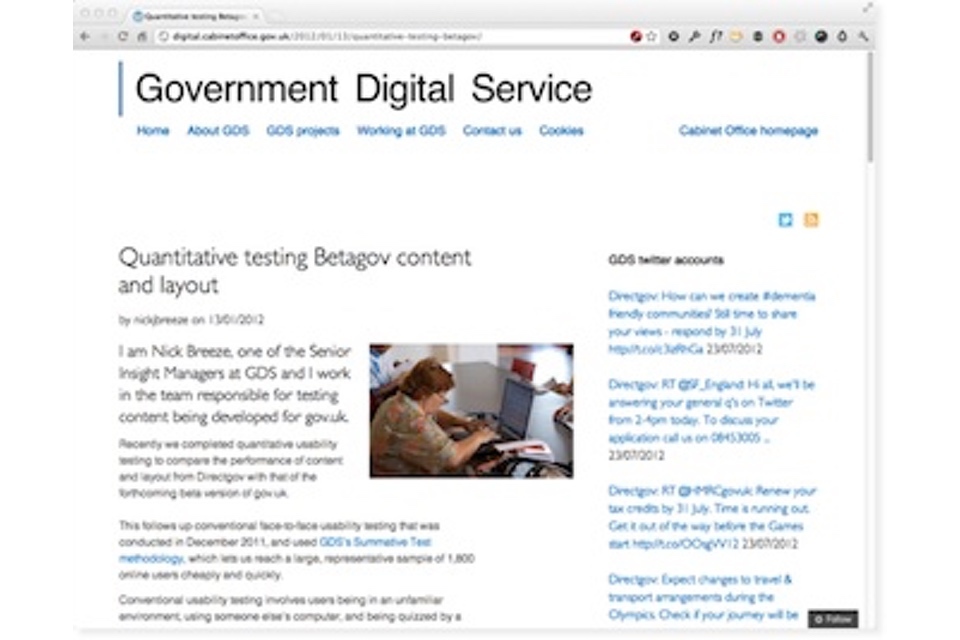
We use remote usability testing to measure task completion rates and times. It involves users completing tasks on the website using their own computers and then answering questions about their experience.
Read this blog article for more information and some initial results.
Example: HMRC active demand management
HMRC runs 16 contact centres, with around 6000 staff handling 60 million telephone calls a year.
They identified that they could remove more than 37% of call demand. Using active demand management and utilising frontline staff as the ‘voice of the customer’ they identified demand that could be moved to digital channels such as interactive voice response (IVR) or could be removed by improving processes.
The results were:
- 2009/10: 4.5m calls handled by IVR; 4.2m calls eliminated
- 2010/11: 8.4m handled by IVR; 7m calls eliminated
For more information, see this National Audit Office (NAO) report on how HMRC handles telephone enquiries.
Example: cost per transaction measurement at the Department for Transport
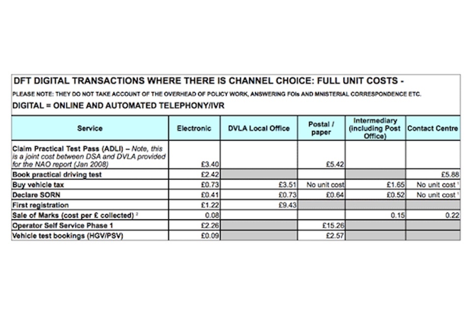
The Department for Transport (DfT) and its agencies the DVLA , the Driving Standards Agency (DSA) and the Vehicle and Operator Services Agency (VOSA) have made progress in channel shift to digital delivery. The department measures the cost per transaction across a selection of services that they provide.
This allows comparison of transaction costs between channels and provides insight about where cost saving opportunities exist for moving to digital delivery.
5. Aggregate data
Collect and aggregate performance information from multiple sources and across multiple channels. Make sure you understand what this will mean in terms of system requirements.
Checklist
- Have you collected data on costs, usage and performance?
- Have you collected performance data from digital and non-digital channels?
- Do you know how many people use the service, by channel?
- Have you aggregated performance data to enable it to be easily combined?
Combining data often reveals useful insights, for example into service efficiency (such as cost per transaction and total cost to serve or proportional usage by channel (like the percentage of digital uptake versus post or phone).
Be aware though that combining data from different data sources can lead to huge storage requirements: large, data-driven organisations now talk about storage in terms of petabytes, the equivalent of one million gigabytes. However, there are cost-effective solutions to this problem already in place. For example, the Hadoop software framework was developed to enable collection, aggregation and querying of such huge data stores, and is based on work done by Google and Yahoo to develop search engines.
Worked example: GOV.UK data insight platform
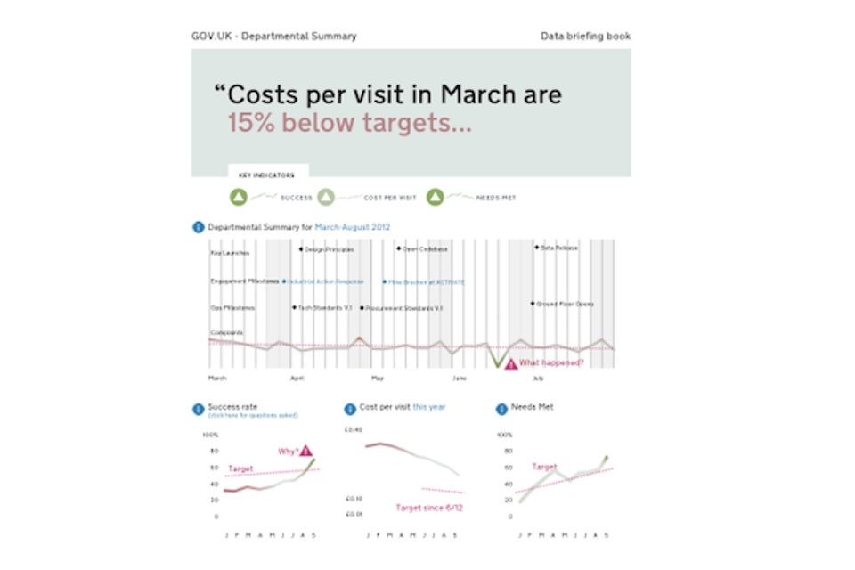
See a large image of the GOV.UK departmental webpage performance insight platform.
We’re developing a platform that will aggregate data from a range of sources within GDS, including web analytics, survey and finance data. This will be used by senior managers to monitor KPIs but also by product managers and developers to monitor operational measures such as drop out rates or error rates.
This approach shows the potential for displaying performance information from disparate sources side by side, and for combining data to provide insight (such as cost per visit).
Example: Time series metrics
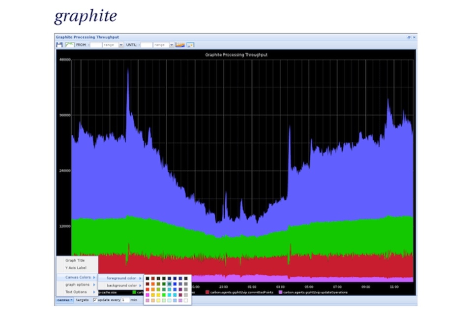
Graphite is a real-time graphing system which is optimised for time series data. Being able to easily store time series data and comparing different datasets on the fly can be particularly powerful for identifying problems and potential improvements.
For example, graphing page load time and task completion rates together can show where a performance problem has a direct impact on users of a service.
6. Analyse and visualise data
Communicate performance information to your users through the appropriate dashboards, reports and alerts. Highlight specific segments that you know users are interested in, and make sure that your visualisations are simple, actionable and contain minimal amounts of chart junk.
Checklist
- Have you done any segmentation (ie analysed performance data by segment)?
- Have you designed the appropriate dashboards, reports and alerts?
- Are your data visualisations visible to their intended audience?
- Have you followed best practice design principles for data visualisation?
Typical segments include:
- channel used to access service: through which channel(s) did the user find out about and attempt to use the service?
- new vs. repeat visitors: are first time users behaving differently to those who have used the service before?
- geographical region: how popular is the digital service by region and how does that compare with online penetration in general?
- product type: does the user experience vary depending on the type of product or service?
- value: is performance dependent on the monetary value of the product or service being sought?
Dashboards are objective-focused and will help inform decisions, often with the help of real-time data.
Reports provide regular, scheduled snapshots of data and tend to require extra context and time to digest.
Alerts are used to inform the users about a change or an event, often using attention-grabbing delivery mechanisms.
By making your visualisations clearly visible you maximise the likelihood that the information will be acted upon - and services thereby improved.
Best practices include:
- keeping charts plain: don’t use shading, 3D or other distracting effects
- removing clutter: don’t use trend lines, grid lines, unnecessary labelling
- not using pie charts: they require more space and are harder to read than bar charts
- using text where a chart adds nothing
Worked example: GOV.UK developer dashboards
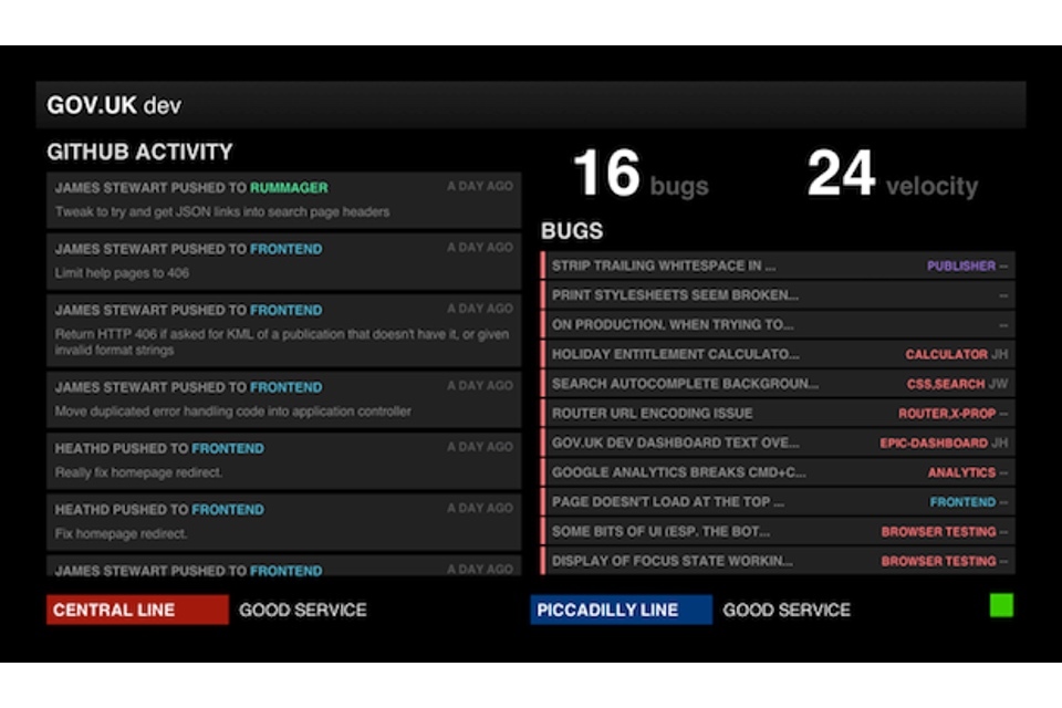
Dashboards keep our developers and editors up to date with the latest status reports and highlight any critical problems. They are displayed on large screens close to developers’ desks so that they can be easily monitored. This means that bugs can be spotted quickly and fixed.
Read this blog article to find out how these dashboards were developed.
Example: Yahoo! News
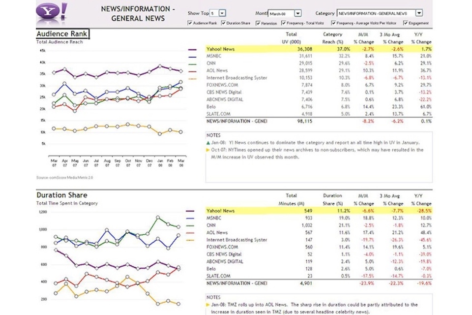
A dashboard was designed for senior staff at Yahoo! News. It consolidates data from multiple internal and external data sources providing a single view in an accessible, interactive and attractive format.
The information is presented clearly, with a good balance of charts, tabular data and text. It shows how key metrics have changed over time which helps users to easily spot when performance has dipped.
Example: US government IT dashboard
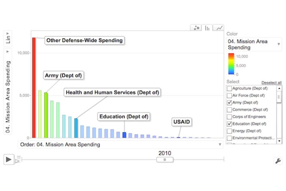
In 2009, the US government introduced an IT dashboard, designed to provide CIOs, the public and agency leaders with key data on the performance of federal IT investments.
Users can track spending by department and see how good each organisation is at staying within project deadlines and budgets. The dashboard is interactive, allowing users to focus on specific departments and look at different types of spending.
The dashboard is now used by the Administration and Congress to make budget and policy decisions.
7. Monitor, iterate, and improve
Test a range of performance improvement initiatives and monitor to see which work well. These can be piloted on a subset of your users to minimise risk. Implement the best performing solutions widely and then repeat this process relentlessly: what you measure will change over the course of a product or project’s lifetime.
Checklist
- Are you monitoring and acting upon user feedback?
- Have you done any A/B testing or multivariate testing?
- Have you evaluated the effectiveness of your performance reports?
- Have you taken an iterative approach to developing your service?
Any service that meets user needs will include an element of user feedback. This should be monitored and acted upon so as to continually improve the service for users.
A range of options are available for improving the overall performance of a service. The following examples are based on the 4 Ps of marketing:
- Price: can the price be changed, for example to attract people to the digital channel?
- Product: can the user experience be improved (for example, from user feedback, user testing, A/B testing, multivariate testing)?
- Placement: can the digital service URL be placed on printed materials and voice recordings?
- Promotion: can greater use of email and social media be used to promote repeated use of the digital service?
Taking an iterative approach to service development increases the pace of improvement and minimises the risk of failure. Don’t wait until the end to do this, it should happen continuously throughout the process.
Worked example: GOV.UK A/B testing
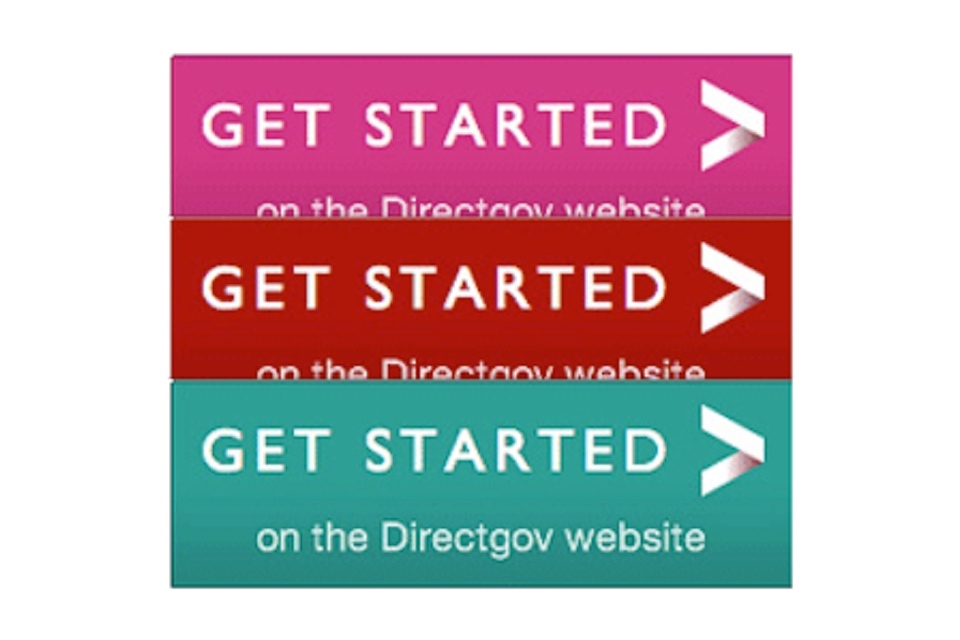
We’re using A/B testing to see how colour changes can affect user behaviour. This is an example of how we are designing services based on user data.
To read more about this and our approach to design in general, please read the GDS Design Principles.
Multivariate testing on Lovefilm
Multivariate testing (MVT) is similar to A/B testing but allows many variables to be tested simultaneously with the best performing combination emerging over time. Lovefilm did multivariate testing on 192 different page elements and found two major changes that increased conversion by 10%.
Aside from the financial benefits, and the measurable improvements for users, the company found itself with more time to develop tests and hypotheses rather than having long meetings to come up with a single solution.
The approach also reduced the risk of introducing new designs, which had been proven in a live environment prior to full implementation.
Further reading
1. Understand user needs
The National Audit Office report Digital Britain One: Shared infrastructure and services for government online identified that there was a lack of information on the costs and associated benefits of digital services.
2. Decide what to measure
The Occam’s Razor blog by Avinash Kaushik has loads of useful advice on metrics, KPIs and analytics. See, for example, this article on how to set good performance indicators.
3. Install and configure platforms
The Google Analytics Help Centre is a useful resource if you use that particular platform.
And this blog article by Morgan Brown has a good discussion about user flows and conversion funnels.
4. Establish a baseline
This article in The Guardian shows online customer satisfaction scores for retailers. These scores are based on the Customer Satisfaction Index.
5. Aggregate data
There’s a great article by Mike Loukides on the role of the data scientist.
Total Cost to Serve is a method for calculating the cost of a transaction for both the service provider and the user. HMRC has developed a method for calculating the cost of users time when interacting with government. This is important because some channels may be quicker to use than others.
6. Analyse and visualise data
Designing with Data is an excellent book by Brian Suda that can help you design beautiful and powerful data visualisations.
Juice Analytics has loads of useful resources on how to design and develop useful data visualisations and dashboards.
Edward Tufte’s The Visual Display of Quantitative Information is a seminal work on data visualisation and introduces the concept of chartjunk.
The Flowing Data blog by Nathan Yau is a useful source of data visualisation news.
The D3 Gallery is a stunning collection of data visualisations.
And here’s an overview of some data visualisation tools on datavisualization.ch.
7. Monitor, iterate and improve
This article in Wired shows how A/B testing was used to good effect in Obama’s election campaign.
This shows how multivariate testing was used to improve conversion rates at Lovefilm.