Adult social care charging reform: analysis
Updated 12 September 2024

© Crown copyright 2024
This publication is licensed under the terms of the Open Government Licence v3.0 except where otherwise stated. To view this licence, visit nationalarchives.gov.uk/doc/open-government-licence/version/3 or write to the Information Policy Team, The National Archives, Kew, London TW9 4DU, or email: psi@nationalarchives.gov.uk.
Where we have identified any third party copyright information you will need to obtain permission from the copyright holders concerned.
This publication is available at https://www.gov.uk/government/publications/build-back-better-our-plan-for-health-and-social-care/adult-social-care-charging-reform-analysis
Following an announcement by the Chancellor of the Exchequer on 29 July 2024, the planned adult social care charging reforms, which were inherited from the previous government, will not be taken forward in October 2025.
Introduction
The recently announced reform to social care charging is currently estimated by the Department of Health and Social Care (DHSC) to cost £3.7 billion in 2027 to 2028 including illustrative Barnett Consequentials. The financial year 2027 to 2028 is when the additional cost to the state from reform has stabilised, after users begin hitting the cap. The first users begin hitting the cap roughly 2 years after implementation. This figure makes a number of assumptions about future demand pressures on adult social care under the reform system, which we will keep under review with monitoring and trailblazers, and figures will be updated in due course. Around half of all older adults in care receive some state support for their care costs under the current system. This rises to roughly two-thirds under the reforms announced. No one will be worse off, and some will be better off, as a result of these reforms.
The announced reform includes the following elements:
- for the first time ever, the amount an individual will have to pay towards their social care will be capped. From October 2023, both new entrants and existing social care users will have their contribution towards their assessed care needs count towards the cap
- the increase in the Upper Capital Limit of £100,000 will apply universally, irrespective of an individual’s care setting or circumstances
- between the Upper and Lower Capital limits, if individuals are not able to pay for their care from their income, they will be expected to contribute up to £1 in every £250 from their chargeable assets towards the cost of their care
- the notional level of ‘daily living costs’ (DLCs), being the amount an individual needs to pay when in residential care that does not contribute to their capped care costs, will be set at the equivalent of £200 per week in 2021 to 2022 prices
- for individuals who receive financial support for their care costs from their local authority, it is the amount that the individual contributes towards these costs that will count towards the cap on care costs
Nobody will be worse off under the government’s plans than under the current system, and many people will be better off.
Some commentators have compared the government’s plans with what was proposed, but not implemented, in 2015.
The charts below compare the proposal announced in September 2021, with the detailed parameters announced on 17 November 2021, to the version consulted on in 2015. In terms of the main differences, under 2015 proposals:
- the upper capital limit (UCL) of the means test would have been set at 2 different levels: £118,000 UCL for people in residential care (£141,000 in 2023 prices) or £27,000 UCL (£32,000 in 2023 prices) for those in domiciliary care or those in care homes benefiting from housing disregard
- individuals would have made a more substantial contribution towards their daily living costs. Under 2015 proposals, these were set at £230 per week (£258 per week in today’s prices) rather than the equivalent of £200 per week in today’s prices under our current proposals
- individuals would have metered towards the cap at the rate set by their local authority for their care costs (excluding DLCs)
The more generous means-testing regime for those in domiciliary care or those in care homes benefiting from housing disregard in the 2021 proposals results in around £200 million per year in additional spend for older adults. Capping DLCs at a lower level, so they are affordable from income for more people results in around £600 million per year in additional spend for older adults. This is offset by the changes to the approach to how people meter towards the cap, with the government amendment reducing the amount of additional state spend by £900 million per year. These figures are in cash terms in financial year 2027 to 2028 including illustrative Barnett Consequentials.
The government is also making significant investment in the current system which was not included as part of the 2015 proposals, including investment in the workforce, housing and a new assurance framework.
Asset depletion
Asset depletion charts show the percentage by which people with different levels of total chargeable wealth at the outset of their care journey will have depleted their starting wealth at a given point in time of their care journey.
A limitation of this asset depletion chart is that it can only demonstrate specific scenarios:
- the examples assume the individual has a weekly chargeable income of £239 – DHSC’s estimate of the median chargeable income of over 65s in England
- the examples also assume that the individual pays the average weekly fee rate for older adult users in residential care of £683. In reality the incomes and fee rates for care users vary widely
- asset depletion charts do not show the likelihood of the different care journey lengths that people face
- asset depletion charts do not show the variation in contributions from users from their wealth
- these charts do not demonstrate any interaction with the housing disregard – that is, the chart assumes that all of a user’s housing wealth is chargeable. For anyone who still lives in their own house, or whose spouse or dependent lives in their house, their house is not included in their chargeable assets
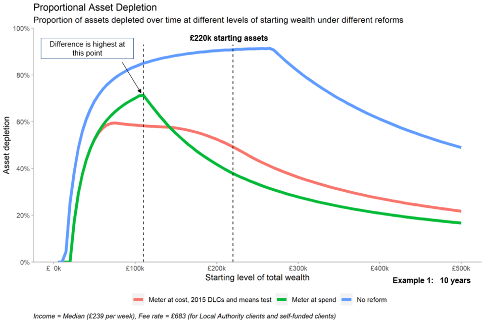
Example 1
Take the example of a person at the end of a 10-year residential care journey, who started with wealth of £220,000 – DHSC’s estimate of median wealth of over 65s in England:
- under the current system this person would have depleted 91% of their starting wealth in order to pay for their care, leaving them with around £20,000 at the end of their care journey
- under the 2015 proposal this person would have depleted 49% of their starting wealth in order to pay for their care, leaving them with around £112,000 at the end of their care journey
- under the 2021 announced reform this person would have depleted 38% of their starting wealth in order to pay for their care, leaving them with around £137,000 at the end of their care journey
- they are better off under the 2021 announced reform due to the difference in the DLCs. First, the lower DLCs mean more of their spend contributes to their metering, so they hit the cap earlier. Secondly, after hitting a cap, the DLCs are set at a level where they’re able to cover them completely out of income, whereas under the 2015 reform proposal they would still make a small contribution out of their wealth to cover DLCs even after hitting the cap
- however, people with different levels of starting wealth have different financial outcomes under the 3 different systems
Example: chart at 10-year care journey
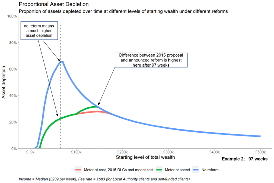
Example 2
Looking instead at 97 weeks (roughly the median residential care journey length in England), we can see that the 2 reforms perform similarly:
- under the current system, proportional asset depletion peaks for a user who started with £65,000, depleting 65% of their assets in this time, leaving them with around £23,000 at the end of their care journey
- under both the 2015 proposal and 2021 reform proposals, this same user would only deplete 22% of their assets in this time, as they are protected by the more generous means test, leaving them with around £51,000 at the end of their care journey
- a user starting with £100,000 is equally well off from both reforms following a 97-week care journey. Though not hitting the cap in either reform, the more generous means test means they deplete 26% of their assets as opposed to 45% under the current system, leaving them with around £74,000 and £55,000 respectively at the end of their care journey
- the 2015 proposal performs slightly better here for those with starting wealth around £140,000 due to the higher means test in residential care. A user starting with £140,000 would deplete 31% of their assets under the 2021 announced reform and 28% under the 2015 proposal, leaving them with around £97,000 and £102,000 respectively at the end of their care journey. They are both better than the current system where they would be left with £95,000 at the end of their care journey
Example: chart at 97-week care journey
This interactive chart allows you to move the slider to a set number of weeks and view asset depletion for different levels of wealth and different care journey lengths.
The link above will download an html file. You can save the file and open it in your web browser to view.
Number of people who benefit
In the financial year 2020 to 2021, we provided support to 616,000 clients with long term care needs, of which around 360,000 (aged 65 or over) are older adults and around 256,000 are younger adults (aged 18 to 64).
Nobody is worse off under the 2021 reform proposals compared to the current system, and many are better off.
We estimate that the number of older adults we provide support to will increase as a result of reform by around 90,000 in a steady state snapshot of users currently in care. This is based on an additional 30,000 benefitting from the changes to the means test only, and 60,000 benefitting from the cap (or cap and means test). At present, we do not have detailed information on the income and wealth of the younger care population, however, we estimate that the vast majority are already state funded. If the remainder have lower income and assets, then they will benefit from the means test. The number of people who benefit will vary over time and users can benefit from both the means test and the cap within their care journey.
Length of stay in care homes
The table below shows the length of stay of users in care homes based on research carried out by Personal Social Services Research Unit (now the Care Policy Evaluation Centre) on BUPA care homes in 2011. You can view the original research. 13% of older adults who enter a care home have a care journey 5 years or more, and 2% have care journeys of 10 years or more.
Percentage of users entering residential care homes who survive X years
| Years | Percentage of users |
|---|---|
| 1 | 55% |
| 2 | 39% |
| 3 | 27% |
| 4 | 19% |
| 5 | 13% |
| 6 | 9% |
| 7 | 6% |
| 8 | 4% |
| 9 | 3% |
| 10 | 2% |