Transport connectivity metric
Published 29 September 2025

© Crown copyright 2025
This publication is licensed under the terms of the Open Government Licence v3.0 except where otherwise stated. To view this licence, visit nationalarchives.gov.uk/doc/open-government-licence/version/3 or write to the Information Policy Team, The National Archives, Kew, London TW9 4DU, or email: psi@nationalarchives.gov.uk.
Where we have identified any third party copyright information you will need to obtain permission from the copyright holders concerned.
This publication is available at https://www.gov.uk/government/publications/transport-connectivity-metric/transport-connectivity-metric
Overview of connectivity metrics
The Department for Transport has developed the connectivity metric, which measures an individual’s ability to reach employment, services and social engagements.
Connectivity evaluates the value of destinations and the opportunity to reach said destinations using various modes of transport, including walking, cycling, driving and public transport. It considers different purposes of travel, like employment, education, shopping, leisure and healthcare.
We have produced connectivity estimates for the 2021 classifications for output areas (OA) and lower super output areas using data on travel infrastructure and destinations in England and Wales, which we will make publicly available.
We have also produced connectivity estimates for each of approximately 15 million 100-metre square areas covering England and Wales. These will form the basis for the Connectivity Tool, which is only accessible by local authorities and government departments.
Using this new method, we conclude that 1-hour connectivity metrics provide a good visual and numeric summary of the total value one can reach.
The method captures that most value is located near urban centres, with origin points able to reach these centres benefiting from higher connectivity.
The model shows that while active travel and public transport connectivity have clear ‘hot spots’ located near the centres, travel using private vehicle can be seen as the ‘equaliser’, bringing connectivity to rural areas.
These are our first estimates of connectivity and we welcome feedback to inform our future developments and refinements.
This guidance sets out the methodology for the connectivity metric. The metric defines connectivity as someone’s ability to get where they want to go. It measures opportunity to travel to various destinations, weighted by people’s overall proclivity to take those options. It aims to capture:
- the most common modes of travel and destination types
- the time required to reach these destinations
- the value presented by the destinations and people’s travel preferences
It doesn’t show how many people take different routes: purely their opportunity to do so. Nor is it a transport model: there is no trip assignment or convergence processes.
Connectivity metric data is available to download in ODS format from the GOV.UK landing page for this guidance. This contains a variety of connectivity metrics presented at output area, lower super output area, local authority district and regional level for England and Wales. Further details are available in the metadata included within the file.
Data sources
To calculate connectivity, we combine:
- data for origin locations with data on destinations - data on shops, services, places of leisure, employment, student numbers and population
- network infrastructure between these locations - for driving, public transport and active travel
- willingness to travel - travel behaviour
Origins
To determine origin locations, we have calculated population-weighted centroids at the output area (OA) level. We did this using data from Ordnance Survey (OS) AddressBase for the location of residential buildings and their postcodes, combined with data from the Office for National Statistics (ONS) to map postcodes to output areas. To calculate the centroids, the easting-northing location for all buildings flagged as residential was calculated in Python.
For the 100 metre-square areas we have divided England and Wales in a grid of approximately 15 million square areas. The centroids of the squares form the origins for the Connectivity Tool, which is only accessible by local authorities and government departments.
Destinations
We have determined the locations of destinations that people may want to travel to. The connectivity model includes destination types that fall within the higher-level purposes of education, leisure and community, employment, healthcare, shopping and social visits. Data for all destination categories uses the best source of data based on quality assurance and exploratory analysis, which means that within the same destination category, a mix of different data sources may be reflected. The data has been procured at the address level, with the exception of data on workplaces, which is available at the postcode level. The following sources were used for each destination category:
- education: Department for Education official records
- leisure and community: Ordnance Survey AddressBase, Ordnance Survey Greenspaces and OpenStreetMap data repositories
- healthcare: NHS England
- shopping: Ordnance Survey AddressBase supplemented by OpenStreetMap data
- residential properties: Ordnance Survey AddressBase
- workplaces: Business Register and Employment Survey (BRES) dataset provided by the Office for National Statistics
Data sources for destinations is summarised in Table 1. All referenced datasets represent the most current available information (as a mix of Q4 2024 or Q1 2025 data), except for the BRES dataset, which utilises 2023 provisional figures. This is due to the BRES dataset being released periodically, and the 2024 data not yet being available at the time of development, though this will be included in the next update.
Education
Education covers primary and secondary schools, further education (ages 16-18), special needs schools and private education. Universities are excluded due to the complexity in pinpointing single access points, as they typically consist of numerous buildings, including administrative and non-educational facilities.
Leisure and community
Destination data for leisure and community locations were obtained from a combination of OpenStreetMap (OSM) and Ordnance Survey (OS), where for each location type, the best source was chosen based on exploratory analyses. This destination category includes pub/bar/nightclubs, sports facilities, culture, recycling centres, post offices and post boxes (OSM), Cinemas/theatres, halls/social clubs, job centres, places of worship, libraries and banks/financial services (OS AddressBase) and green spaces (OS Green Spaces).
Healthcare
Healthcare destinations include pharmacies, general practices, opticians, dentists, hospitals, private healthcare and emergency departments.
Shopping
Shopping destinations include petrol stations, restaurants/takeaways, general retail shops, supermarkets and convenience stores. All destinations are sourced from AddressBase, while convenience stores are obtained from OpenStreetMap.
Employment
For places of employment, the number of jobs at the postcode level was obtained from the Business Register and Employment Survey (BRES) dataset from the Office from National Statistics. Each individual job then counts towards the employment value at the centroid of the postcode it is registered at.
Social visits
For social visits, the number of people to visit in their private homes is estimated by taking the number of people living in an output area and dividing it by the total dwellings in that OA. We then assume each dwelling in that OA has that many people living there. Each residential building is then taken as a separate destination.
Transport networks
To determine which destinations are within reach of each origin, we need a graphical representation of the transport networks around Great Britain. These are made up of millions of nodes and links (small sections of roads or pathways, which connect 2 or more nodes together). Figure 1 illustrates the structure of such a network.
Figure 1: An example network of links (the lines) and nodes (labelled with letters)

The diagram above shows 25 nodes labelled A through Y. Each node is connected to selection of other nodes via a number of edges.
We construct a separate network for each mode of travel. Networks vary in size, for example, the Great Britain cycling network has 8.5 million nodes. As these graphs will be different for each of the modes of transport, we have determined the best data source for each based on exploratory analysis and quality assurance. We obtain the graphs from Ordnance Survey MasterMap, OpenStreetMap and Basemap.
Each link contains information on how long it takes to traverse it. The traversal times for each link are determined firstly by their network provider data, though we adjust these for driving and active travel using congestion and topology information. This is discussed in more details in the methodology section.
Driving
We use Ordnance Survey (OS) MasterMap network data for driving. Road and link datasets are combined, accounting for directionality. OS hereditament data identifies the type of each link (for example, motorway, footpath), allowing us to exclude non-drivable routes such as footpaths, cycleways, bridleways and private roads. This means that if a journey starts near a private road, it begins at the nearest public road, with walking time to that point added. Since 20% of links lack hereditament info, road links with missing classifications are treated as drivable by car.
Active travel
For cycling and walking, our graphs are constructed using OpenStreetMap data. Here, tags provided with the data are used to determine which links can be walked/cycled on. Motorways and dual carriageways without footpaths are excluded, as well as links tagged as having no access or being inaccessible by foot or bike. In practice, this means that private roads and access restrictions are excluded from walking and cycling networks. For cycling, links that are tagged as steps or footways are removed from the network, unless they have bicycle ramps or specified bicycle access, respectively.
Public transport
For public transport, we take the combined infrastructure of all buses, trains, trams, light rail, ferries and underground services. We then combine this with the walking network. In this way, we assume that a public transport trip may include walking to, from and between the aforementioned services, but does not include any cycling or driving by private vehicle. We use timetables data by Basemap. The transport stops are mapped to nodes on the walking network. The locations of stops are compared to the NaPTAN dataset as a form of quality assurance.
Willingness to travel
To determine willingness to travel, we use data from the National Travel Survey (NTS), years 2011 to 2020. This results in approximately 2.5 million unique trips. Data from all years are aggregated to obtain the total number of trips across all years for each combination of mode, purpose, hour of the day and length in minutes. As the NTS has more granular definitions of travel modes and purposes, we aggregate these to the categories at which we calculate connectivity.
The NTS modes of travel were aggregated as follows:
- car - private car, taxi, van/lorry, minicab and other private transport, motorcycle/scooter/moped (as driver)
- public transport - surface rail, bus, London Underground, light rail, London stage bus, coach / express bus and other public transport, motorcycle/scooter/moped (as passenger)
Walking and cycling were kept as their own modes.
The travel purposes were aggregated as follows:
- education – education and escort education
- healthcare – shopping / personal business and escort shopping / personal business
- leisure – personal business other, escort shopping / personal business, entertain / public activity, sport: participate and other social
- shopping – personal business other, escort shopping / personal business, non food shopping, eat / drink with friends, personal business eat/drink, food shopping
- employment – commuting, escort commuting, other work
- social visits – visit friends at a private home
In all cases, trips made by mode or by purpose contribute to their main mode or purpose in amounts determined by the number of trips in the data. When combining purposes, typically uniform weights are used, with two exceptions. For education and healthcare, the NTS purposes contribute in non-uniform amounts to their main purpose. This was done because the purpose subtypes in the NTS were deemed to not be uniformly relevant, warranting a weighted combination.
The weights are determined by student numbers (for education), stakeholder engagement research sessions (healthcare).
These weights used can be found in tables 2 to 7.
For example, in Table 3 the weight for ‘Personal business medical’ towards pharmacy is 0.200. This means that 20% of the trips reported in the NTS data that were made for the purpose of ‘Personal business medical’ count towards visiting pharmacies. Meanwhile, opticians are weighted as 0.070, corresponding to 7%. This reflects the findings of stakeholder engagement sessions that pharmacies should weigh more heavily towards the purpose of healthcare than opticians.
It is worth noting that because aggregated NTS data from 2011 to 2020 is used, the data that feeds into the connectivity model doesn’t capture post-COVID changes in travel patterns.
Assumptions about data sources
This version of the connectivity metric uses data sources that were available at the time of initial design. As such, some assumptions and limitations to the data on which the connectivity model is made had to be made. Some of these may be refined over time in future releases of the metric. Some of the assumptions relate to data quality. For example, the assumption is that there are no delays or cancellation in public transport services. This will make areas with unreliable services appear more connected than they are.
Methodology
The metric is calculated for each of approximately 188,000 output areas (OAs), where each OA represents roughly 100 households. It does so by calculating which destinations are accessible within a time limit of 60 minutes from each origin point and determining the value they add to said origin. Trips that start in England and Wales and end in Scotland are included, meaning that destinations in Scotland can contribute to connectivity in locations outside of Scotland.
The model calculates a connectivity score for each combination of mode of travel, purpose and time of day. The modes considered are walking, cycling, driving and public transport.
The public transport mode is defined as trips that involve combinations of 2 or more of the following: walking, bus, rail, light rail, underground and ferry. All forms are considered as one joint network.
The purposes of travel considered are education, entertainment, healthcare, shopping, leisure and social visits. The times of day considered depend on the mode of travel.
For walking and cycling, a single time of day of 8am is taken as representative for the whole day.
For driving, we calculate connectivity at morning rush hour (7am to 10am), midday (10am to 4pm), evening rush hour (4pm to 7pm) and night (7pm to 7am).
For public transport, we calculate connectivity at 10-minute intervals between 6am and 10pm.
From here, the scores can be aggregated to overall connectivity scores at the purpose, mode and mode-purpose level. This is done using weighted averages, with weights determined by number of trips as reported in the National Travel Survey (NTS) for each combination of purpose, mode and time of day. Finally, a true overall score is calculated across all modes, purposes and times of day, excluding driving, to represent sustainable modes of transportation. These final overall scores comprise of approximately:
- 52% public transport
- 40% walking
- 8% cycling
In this document, ‘score’ is used as shorthand for connectivity score, or the connectivity for one or more modes. ‘Starting location’ refers to an OA centroid.
Aggregating upwards to obtain connectivity scores at levels such as lower super output area (LSOA) or local authority (LA) is straightforward using population-weighted averages. In this report, where scores are presented at the LSOA/LA level, these consist of population-weighted averages across all OAs within the LSOA/LA.
Pathfinding algorithm
We compute the set of accessible destinations for each origin location using a custom implementation of Dijkstra’s shortest path algorithm, which we apply to the network of each mode. Unlike traditional point-to-point shortest path algorithms, our implementation explores all nodes in the network, systematically tracking their associated destinations and travel times. The algorithm is developed in Rust, a programming language selected for its superior computational performance compared to Python.
To determine the location of origins and destinations on the network, we identify the network node for each mode of transport which is closest to each location. The nodes associated with the origins are ‘origin nodes’ and the nodes associated with destinations are ‘destination nodes’.
To assign origins and destinations to nodes on the network, we employed a KD-tree for efficient nearest-neighbour search. For each transport mode (walking, cycling, car), node coordinates were projected from geographic (longitude, latitude) to national grid (easting, northing) coordinates. We constructed a KD-tree from these node positions, enabling rapid lookup of the closest network node to each origin the population-weighted centroid of each output area) and all destinations (for example, residences, jobs and services).
The model operates iteratively. For each combination of mode, start time and origin location:
-
Initial expansion: Compute travel times from the origin to all directly connected destination nodes within the selected mode’s network. Add these to a ‘backlog’ of nodes whose contributions need to be calculated.
-
Scoring new destinations: Starting with the node that can be reached in the shortest time, if it has not yet been visited before and it could be reached in less than the travel time limit from the origin node, its contribution to the origin’s connectivity score is calculated. This involves assessing the value of all destinations associated with the node and applying an impedance function (willingness to travel) to the travel time, producing a penalty for longer journeys. The destination value is then multiplied by the impedance multiplier to represent the contribution to connectivity. The node is marked as visited and excluded from future iterations.
-
Further expansion: Repeat steps 1 and 2 for previously unseen nodes connected to the origin and any previously visited node. The process continues until no more new nodes can be reached, or the travel time limit is reached.
To account for variability in travel time due to traffic congestion and variations in public transport timetables, we calculate the connectivity scores at multiple times of day for the modes of driving and public transport. These connectivity scores are then used to calculate the weighted average across all times of day, with the weights being the volume of mode-purpose specific journeys as apparent from the NTS. For walking and cycling, we assume that there is no variability in travel time, so only one set of scores is calculated.
A cut-off point has been set for a maximum travel time of 60 minutes. This is done to limit the number of calculations, as well as to match the empirical observation of most trips in the NTS taking less than an hour.
Travel times
Travel time between network nodes are determined by the time required to traverse the link between the nodes, waiting time at nodes (if any) and the time cost of turns that need to be made along the route (if any). The exact method used differs per mode of travel and are described in more detail below.
The time on the link itself is determined by its length and the speed of travel, which differs by mode. All links in the graph include coordinate information in the form of polylines that we used to obtain the angle of the turn as measured in degrees clockwise. In line with Open Trip Planner (OTP), turns between 45 and 135 degrees are classed as right turns, turns between 135 to 225 degrees as U-turns and turns between 225 to 315 degrees as left turns.
Walking
Travel times on walking links are calculated using Tobler’s hiking function, which is an exponential function determining the hiking speed, taking into account the slope angle. A flat walking speed is assumed to be 5km/h. There is no time penalty for turns when walking.
Cycling
Travel times on cycling links are calculated using speed estimates based on Valhalla’s open-source routing engine data (Valhalla Project). Penalties for taking left, right and U-turns are 5, 15 and 15 seconds, respectively.
Driving
Travel times on driving network links are estimated using GPS data from DfT road congestion and travel time statistics. This dataset records road speeds for combinations of vehicle type (of we only use cars), road classification, road hierarchy, form of way, location, direction and time of day. Time of day here refers to either morning rush hour (7am to 10am), midday (10am to 4pm), evening rush hour (4pm to 7pm) and night (7pm to 7am).
To avoid bias towards exceeding the speed limits in the pathfinding algorithm and therefore the metric, observed speeds that exceed the legal limit are reduced to match the limit.
The turn penalties for left, right and U-turns are 9, 15 and 17 seconds, respectively.
Imputation of driving speed
In line with methodology used in the DfT journey time statistics, we require a sample size of at least 10 for every month of the year, for the driving speed to be considered representative. This results in the vast majority (92%) of the road links having insufficient data, requiring imputation to estimate the time to cross each link.
Imputation of driving speed is done by taking the weighted average speed of all links that share the same combination of road classification, route category, form of way and location, using the following groupings:
- road classification: motorways, A roads, B roads, classified unnumbered and unclassified
- route hierarchy: local road, local access road, restricted local access road, minor road, restricted secondary access road, etc
- form of way: single carriageway, dual carriageway, roundabout, slip road, track, etc
- location: urban, rural
These groupings are determined by OS hereditament data and ONS classifications. The weights correspond to the sample size from the DfT road congestion and travel time data.
Public Transport
For public transport, time between stops as given by the BaseMap timetables are used as the traversal times between links. To account for variability in timetables, we calculate connectivity scores for this mode for each 10-minute interval between 6am and 10pm and then take the weighted average. The weights correspond to the number of trips in the NTS at each time of day and each purpose of travel.
Factors affecting node values
Each node in a network that is within reach of an origin provides connectivity value to that origin. It does so for each combination of destination type, mode of transport and time of travel. For example, a large employer at a node that is easily accessible by a train station means that node will have a high value for the purpose of employment and the public transport mode. Three things influence the connectivity value added by a node to the origin:
- The value of destinations at the node.
- Travel time to the node (i.e. willingness to travel).
- The number of destinations of each type that were already accessible in a shorter amount of time (i.e. diminishing returns).
These concepts will be explained in the following subsections.
Value of destinations
Each node has 31 value scores: one for each type of destination. Each type of destination is linked to a travel purpose, to which it contributes connectivity. Which destination maps to which purpose is described in the section of this guidance on destinations and summarised in Table 1.
In our model, the value of a node is determined by the number of destinations of each type which are closest to that node, as determined by the KD-tree method described in section of this guidance on the pathfinding algorithm. Each destination – a shop, a school, a pharmacy – adds a value of one to the node, for their respective destination type.
Willingness to travel
While two nodes may provide the same inherent value, in practice, they will not be equally desirable as a destination if one takes longer to reach than the other. We expect the closer location to contribute more to the connectivity score. In our model, we account for this by adjusting the value of nodes by how long it took to reach the node from the origin, which we call the impedance penalty. We base this penalty on how long the average transportation network user is willing to travel to each type of destination by each mode of transport at each time of day. To do this, we use National Travel Survey (NTS) data from the years 2011 to 2020 to inform the model about proclivity to travel.
Because we model connectivity at the ‘purpose’ level, from the data, it becomes clear that respondents are willing to use different modes of transport for different amounts of time to reach work at that time of day. In practice, these data patterns will vary depending on the purpose of travel.
To reflect the travel preferences of people as recorded in the NTS, we model the relationship between the value of locations at a particular node and the time it takes to reach that node using an impedance function. The function takes the time to get to a destination’s node and outputs a multiplier. It takes the form of a sigmoid curve. For example, a travel time of 300 seconds returns a multiplier of 0.9, whereas a travel time of 1,400 seconds returns a multiplier of 0.3, meaning that the same node would have triple the value if it were 300 seconds rather than 1,400 seconds away.
To reflect people’s travelling preferences more accurately, the function will be different for each mode, purpose and time of day. To account for variation in travel preferences at different times of day, we fit impedance functions separately for morning rush hour (7am to 10am), mid-day (10am to 4pm), evening rush hour (4pm to 7pm) and nighttime (7pm to 7am).
To make the function match how far people are willing to travel, we fit an impedance function to the NTS data. We found that a sigmoid function gives the best fit, which we estimate using the scipy package in Python.
In the connectivity model, an impedance function is fitted for each combination of time of day, purpose and mode of travel by having combination-specific sigmoid functions fitted to the data, for time of day mode of transport and purpose.
Each function covers all starting locations and destinations: these impedance functions are assumed to be the willingness to travel of the average person. We don’t account for regional variation in willingness to travel, as this would lead to feedback loops. For example, starting locations where many people are using public transport would have a connectivity score which is disproportionally sensitive to the impact of improvements of the public transport network, thus undervaluing improvements in cycling or driving infrastructure.
Diminishing returns
The third and final factor influencing a network node’s contribution to the connectivity score of an origin point is the diminishing returns effect. This parameter represents the decreasing incremental utility of accessing multiple destinations of the same type. We apply one method to jobs and residential visits and another to all other purposes.
For education, healthcare, shopping and leisure and community, the rate at which utility diminishes with each additional accessible destination is governed by a specified scaling factor. These scaling factors modify the rate of score reduction for each subsequent destination reached within a given sub-purpose category. The factors were determined through internal research and validated through consultative engagements with local authorities.
Table 1 presents the complete set of diminishing returns scaling factors implemented in the model. The underlying principle is that destination types associated with limited required access are assigned lower scaling factors (corresponding to steeply declining functions), whereas destination types where numerous options continue to provide value (for example, due to benefits derived from increased variety) are assigned higher scaling factors (corresponding to more gradually declining functions).
Based on empirical testing, we established an upper limit of n=280 in the formula. This means that while destinations beyond the 280th continue to contribute to connectivity, their marginal value remains constant at the level of the 280th destination. This threshold prevents computational underflow and ensures that connectivity scores in urban environments (where access to numerous destinations is common) maintain appropriate differentiation in the results.
Finally, a normalisation method was applied by dividing raw scores by their theoretical maximum values, allowing fair comparison between sub-purposes with different diminishing returns scales.
For jobs and residential opportunities, diminishing returns are applied using a threshold and logarithmic transformation. The model first scales the accessibility score to represent a minimum required level of access (corresponding to reaching at least 100 jobs or residences). Scores below this threshold are set to zero, reflecting negligible utility for very limited access. For scores above the threshold, a natural logarithm is applied to capture diminishing marginal benefits as access increases.
This approach results in a sharp initial threshold and then more gradual diminishing returns, contrasting with the smoother, continuously declining scaling factors used for service destinations.
This distinction recognises that access to jobs and housing requires meeting a baseline before additional options provide meaningful incremental value. We use this form because we assume that the expected maximum utility of employment and residential nodes in scales logarithmically with the number of nodes. There is a range of literature setting a precedent for and supporting this in the transport space.
For example:
- The logsum as an evaluation measure: Review of the literature and new results
- Using the Logsum as an Evaluation Measure
Calculation of the scores
In the previous sections, we described how candidate destinations are identified, their travel times are calculated, their values determined, taking into account destination value, willingness to travel and diminishing returns. The value added by each node that can be reached is determined and the value of all nodes are summed up to obtain the total (unscaled) connectivity score for each origin point.
The above process gives us the scores at the destination level. That is to say, scores for primary education, secondary education, private education, etc. To combine these into purpose level, we take the weighted averages of the destination-level scores. How much each destination type contributes to its purpose is determined using NTS trip-based weights, as described in Willingness to travel.
For each starting location, we calculate connectivity metrics for each combination of purpose and mode of transport. These consist of weighted sums of the scores by time of day. In addition, we calculate an overall score, which is the weighted sum of all connectivity scores for each purpose and mode of travel for that starting location. Weights are the proportion of total trips made by each of these as recorded in the National Travel Survey (NTS). Finally, to compare the scores across different starting locations, they are scaled such that the starting location with the best score receives a scaled score of 100 and all other areas receive a score which is relative to that. As such, a starting location with a score of 50 is considered to be half as ‘connected’ as the best location in England and Wales.
Limitations of the connectivity metric
It is important to be aware that this version of the connectivity metric has certain limitations. These are the result of either an absence of available data or time constraints during development. As with the assumptions that had to be made regarding data sources, some of the limitations in the methodology may be refined over time in future releases. The current connectivity metric does not account for the following.
- Quality of route. For instance, there is insufficient data on route quality across the whole of England and Wales for active travel. This could include the quality of pavements or available lighting, safety of cycling etc.
- Different people’s mobility needs. It assumes that people have a uniform ability/preference to walk certain distances, can access all available bus stops, etc.
- Demographic differences in area. For instance, when estimating education connectivity, it does not consider that in certain areas, more children may need access to schools than in others.
- Travel cost, including cost of parking.
- Opening times or quality of destinations.
- Multi-modal transport, other than walking and public transport.
- Journey planning behaviour or actual use of infrastructure or the network.
Furthermore, the model has the following assumptions.
- Travel times from the centroid of an OA are representative of the travel times from all the residences in area. Delays, cancellations and disruptions are not accounted for.
- The preferences of individuals and willingness to travel is not location-dependent: i.e., it is uniform across all of England and Wales. This is a deliberate choice to avoid feedback loops of poor public transport uptake in areas, resulting in reduced impact of transport improvements in propositional scenario testing.
- The preferences of individuals and willingness to travel various distances is assumed to not have been impacted by the COVID-19 pandemic.
- Destinations more than an hour away are assumed not representative of daily travel behaviour and do not contribute to connectivity.
- Diminishing returns are applied at the sub-purpose level. This means that within each destination type, all destinations are assumed equally important to connectivity.
Connectivity metric results
Key results
Figure 2 shows the overall connectivity for all of England and Wales. All results presented in this publication are provisional results for 2021 LSOA boundaries and 2021 data sources (see section 3. Data sources). Connectivity within a particular region, such as a local authorities, unitary authorities or ceremonial counties, can also be considered on the relative basis within the chosen region. Figure 3 shows this for the Greater London area at the LSOA level.
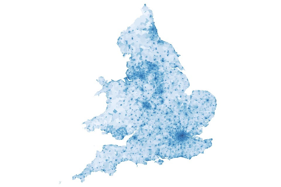
The figures offer few surprises: higher scores are strongly associated with areas with more destinations that people consider of value. In effect, at the high level, overall connectivity is higher in urban areas. This is because connectivity is about being able to get to valuable places quickly and as such the connectivity scores will inherently increase with the number of destinations.
However, this isn’t the whole story - more frequent public transport, less congested roads and more direct cycle routes will all increase the connectivity score. Areas closest to city centres aren’t always the highest scoring. This will be due to local nuances, including road networks, public transport options, cycling routes, where specific locations are distributed around the cities, among many other factors.
You can find the data behind these maps in the ODS spreadsheet on the GOV.UK landing page for this guidance.
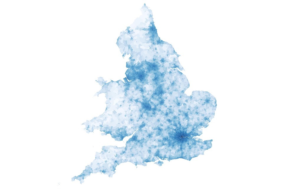
Figure 2: Overall connectivity in England and Wales, 2021 LSOA boundaries
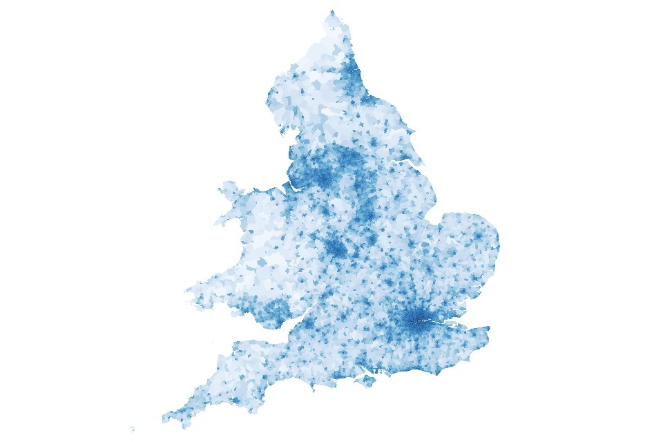
Heatmap showing overall connectivity to all destinations in England and Wales. Darker areas have better connectivity.
Figure 3: (Relative) overall connectivity in the Greater London area
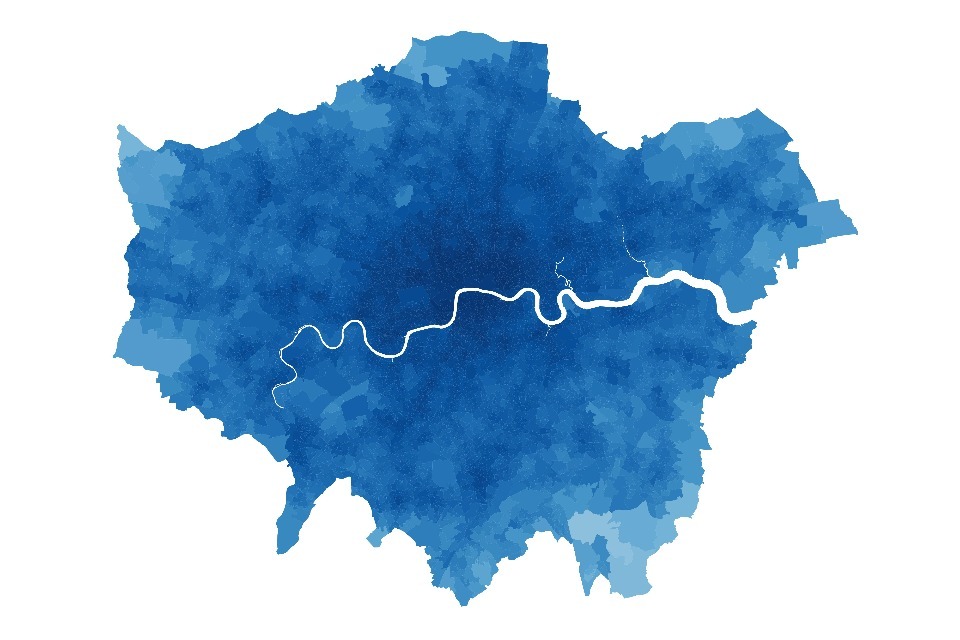
Darker areas have better connectivity.
Connectivity by region
Figure 4 shows the distribution of LSOA-level overall connectivity by region. We can observe several things from the figure. First, that connectivity is highest in London with a median score of more than 80 and lowest in Wales with a median below 60. Furthermore, we see that except for London, all regions show a wide distribution of scores, with all regions having areas of relatively low and high-scoring LSOAs. Finally, we can see there is a large overlap between the regions.
Figure 4: Distribution of overall connectivity scores at the LSOA level by region (ordered by median connectivity score).

Connectivity by mode
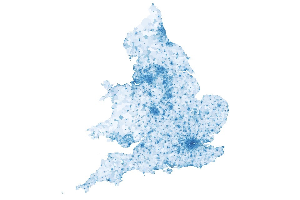
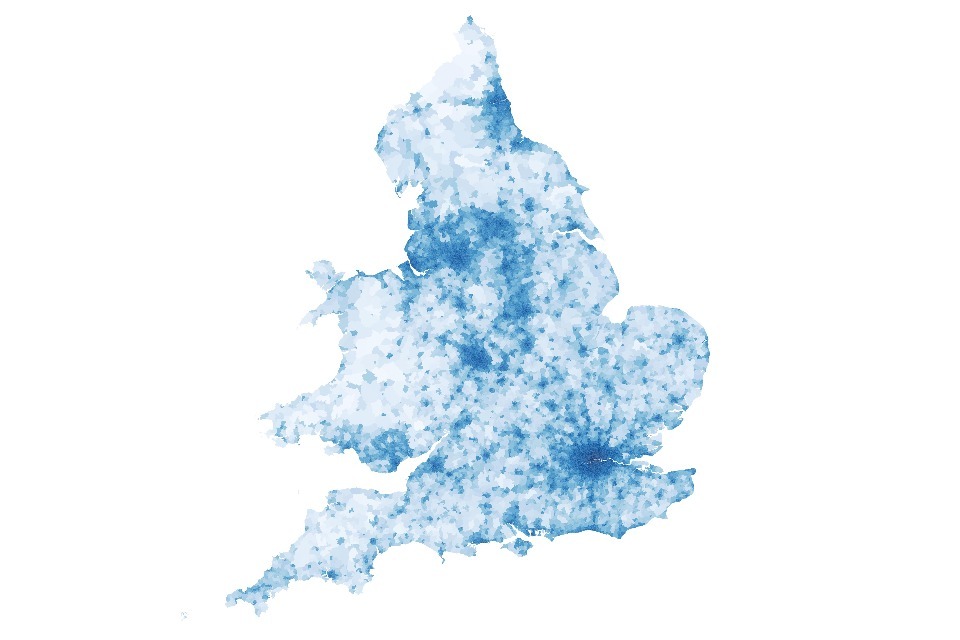
Figure 5, Figure 6, Figure 7 and Figure 8 show connectivity in England and Wales for each of the 4 modes of transport for 1-hour travel time radius.
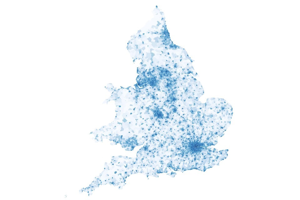
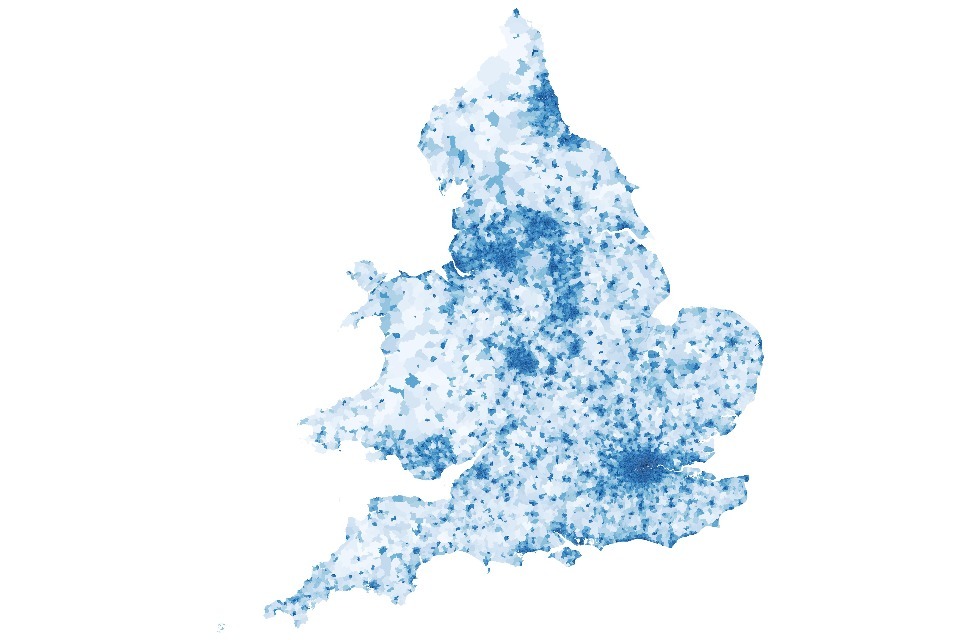
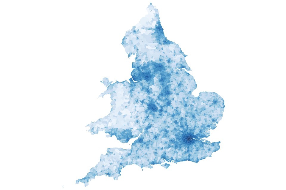
Because connectivity scores are scaled relative to the best area, the differences between the maps say something about the regional distribution of connectivity within each mode and not about the absolute difference in connectivity across modes. Also, consider that the metric applies a diminishing returns effect on the value of reaching more of the same type of destination. Therefore, we can conclude that the more ‘washed out’ a connectivity map is, the less variation there is in connectivity for that mode.
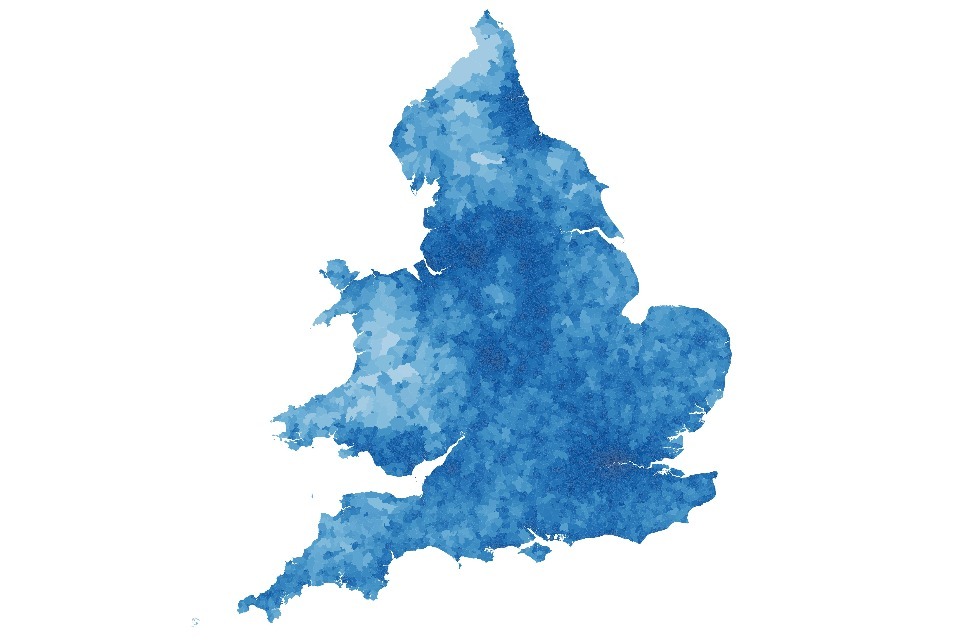
As we can see in Figure 7, driving by private car is the great equaliser for England and Wales: it is the mode that will result in highest connectivity in rural areas as compared to the best area (which is London), while for other modes, high connectivity is much more clearly clustered on ‘hot zones’ of urban areas.
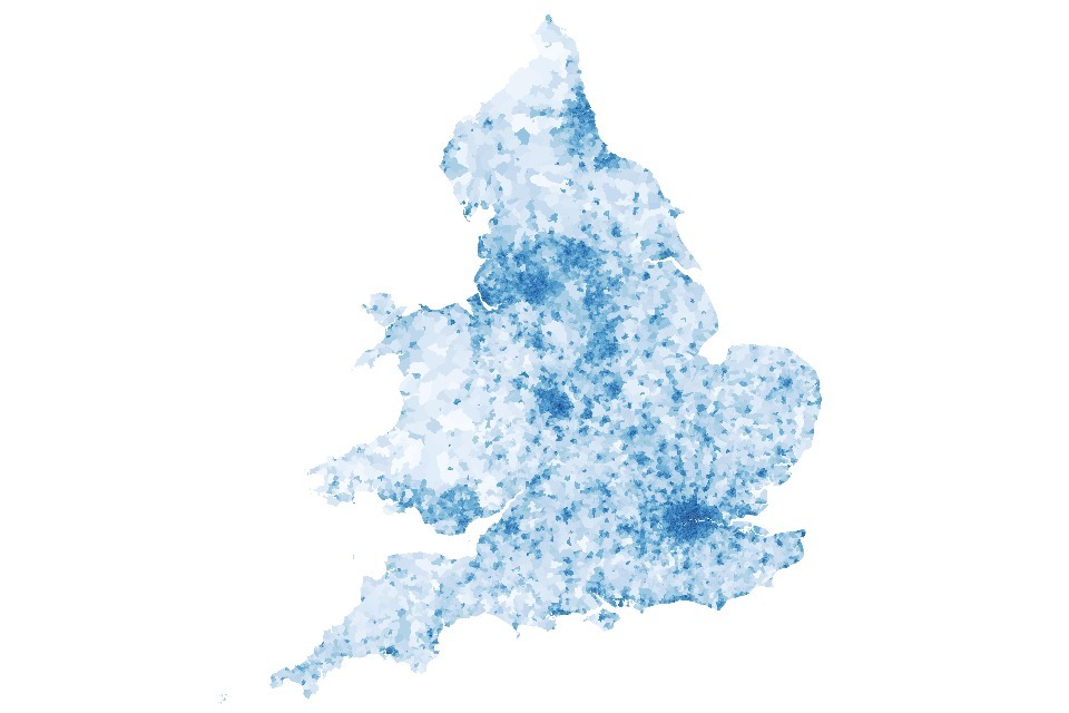
Figure 5: Heatmap of walking connectivity
Heatmap of walking connectivity to all destinations in England and Wales. Darker areas have better connectivity.
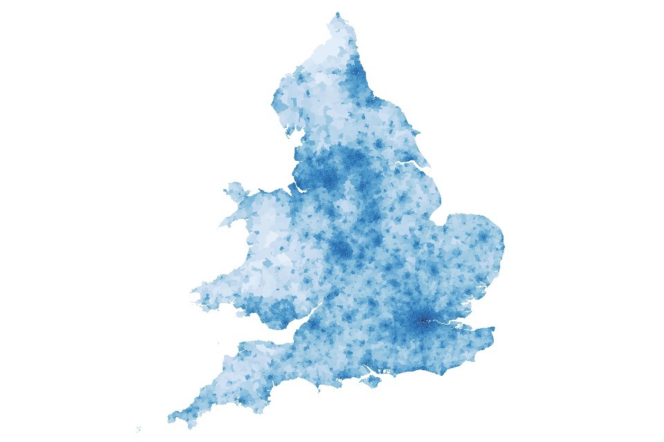
Figure 6: Heatmap of public transport connectivity
Heatmap of public transport connectivity to all destinations in England and Wales. Darker areas have better connectivity.
Figure 7: Heatmap of driving connectivity
Heatmap of driving connectivity to all destinations in England and Wales. Darker areas have better connectivity.
Figure 8: Heatmap of cycling connectivity
Heatmap of cycling connectivity to all destinations in England and Wales. Darker areas have better connectivity.
Connectivity by purpose
Figure 9, Figure 10, Figure 11, Figure 12, Figure 13 and Figure 14 show the connectivity scores by purpose of travel across England and Wales within a 1-hour travel radius. The interpretation follows the same logic as the scores for each mode of transport. The distribution of higher scores appears more centred around urban centres, with the effect being strongest for healthcare. For the purposes of employment and residential, the urbanisation effect is less pronounced - while urban areas are still best connected for these purposes, rural areas score comparatively better, making the effect less stark.
Figure 9: Heatmap of education connectivity
Heatmap of education connectivity using all modes of transport in England and Wales. Darker areas have better connectivity.
Figure 10: Heatmap of employment connectivity
Heatmap of employment connectivity using all modes of transport in England and Wales. Darker areas have better connectivity.
Figure 11: Heatmap of leisure and community connectivity
Heatmap of entertainment connectivity using all modes of transport in England and Wales. Darker areas have better connectivity.
Figure 12: Heatmap of healthcare connectivity
Heatmap of healthcare connectivity using all modes of transport in England and Wales. Darker areas have better connectivity.
Figure 13: Heatmap of shopping connectivity
Heatmap of shopping connectivity using all modes of transport in England and Wales. Darker areas have better connectivity.
Figure 14: Heatmap of residential connectivity
Heatmap of residential connectivity using all modes of transport in England and Wales. Darker areas have better connectivity.
How the connectivity metric model relates to other methods
Since 2014, the Department for Transport’s evidence base for understanding transport connectivity and access to key services has been derived from the journey time statistical series. Although innovative when they were first employed, the methodology and technologies used in the production of these statistics involves very lengthy processing times and a large amount of dedicated resource to generate. Over time, this has meant the statistics developed an increasingly large lag between the period they related to and their publication. Restrictions on access to relevant IT during the COVID-19 pandemic further disrupted production of the statistics beyond this.
Recognising these limitations of these statistics and methodology, the department has been working to produce an alternative evidence base and has since developed the connectivity metric. This new metric has been designed to be used for both monitoring and appraisal purposes to understand the impact of policy interventions. It aims to calculate a connectivity score for all of the geographic areas covered by the journey time statistical series, based on the purpose of travel and mode of travel (walking, cycling, driving and public transport).
The key differences can be summarised as follows.
- The journey time statistics presents estimates of travel times from where people live to key local services for England, while the connectivity metrics, defined as ‘someone’s ability to get to where they want to go’, provide a score in a range from 0 to 100 where 100 represents the most connected area.
- Journey time statistics are a series of outputs, published for the years 2014 to 2017 as well as for 2019, while the connectivity metrics are published for Q4, 2024 data.
- Journey time statistics have been discontinued, while the connectivity metric is planned to be updated annually (following feedback on this initial release), with a shorter time lag than the journey times statistical series.
- Journey time statistics included destinations to 8 key service types, including employment centres, primary schools, secondary schools, further education, GPs, hospitals, food stores and town centres, while the connectivity metric uses the number of jobs, residential, all education in aggregate, all shopping in aggregate and all leisure/recreation in aggregate. This latter method results in less clear distinctions between destinations of the same type, but a broader coverage of destinations, as the value provided by each sub-type is treated with its own diminishing returns function.
Both the historic journey times statistics series and the new connectivity metric have a similar objective – to provide data giving an indication of ease of access to critical services. Under our obligations arising from the Code of Practice for Statistics, we are expected to keep up to date with developments that can improve statistics. And, when introducing new methods, we are asked to consider the added value of potential improvements and consider their likely impact, including in relation to comparability and coherence. We are also asked to be transparent about longer-term development plans. With this in mind, the department is actively considering the impact that 2 concurrent series could have, particularly if competing narratives on transport connectivity emerge.
In particular, the department sought to establish whether there was a suitable business case for continuing to publish the journey time statistical series and planned to discontinue it if such a business case could not be established.
To do this, we invited users to provide their views on this subject and give us their feedback on this, via a survey which has now closed, having run from July 2023 to November 2024. Following the consultation, it was decided to discontinue the journey time statistical series and identify opportunities to extract estimates of travel times from the same algorithm that underpins the new connectivity metrics. These are planned to be released at a later date.
We welcome your feedback on the connectivity metric methodology, results and planned future improvements. If you would like to contact us, please email us at connectivity@dft.gov.uk.
Collaboration
The Department for Transport has been supported in this research by collaboration from individual analysts, data scientists, policy experts and academics from the Ministry of Housing, Communities and Local Government (MHGLC), Active Travel England (ATE), Institute for Travel Studies (ITS) at University of Leeds, the Alan Turing Institute (ATI) and SpaceTimeLab, University College London.
Tables
Table 1: Travel purposes, destination types, data sources and diminishing returns parameters
| Destination | Diminishing returns parameter | Purpose | Source |
|---|---|---|---|
| Primary education | 0.50 | Education | Department for Education |
| Secondary education | 0.50 | Education | Department for Education |
| Further (16-18) | 0.50 | Education | Department for Education |
| SEND | 0.50 | Education | Department for Education |
| Private education | 1.00 | Education | Department for Education |
| Pharmacy | 0.25 | Healthcare | National Health Service |
| GP | 0.50 | Healthcare | National Health Service |
| Opticians | 0.50 | Healthcare | National Health Service |
| Dentist | 0.50 | Healthcare | National Health Service |
| Hospitals | 5.00 | Healthcare | National Health Service |
| Private health | 0.50 | Healthcare | National Health Service |
| Emergency | 0.25 | Healthcare | National Health Service |
| Pub/bar/nightclub | 3.00 | Leisure & Community | Open Street Map |
| Sports facility | 3.00 | Leisure & Community | Open Street Map |
| Culture | 1.00 | Leisure & Community | Open Street Map |
| Recycling centre | 0.25 | Leisure & Community | Open Street Map |
| Post office | 0.25 | Leisure & Community | Open Street Map |
| Post box | 0.25 | Leisure & Community | Open Street Map |
| Library | 0.25 | Leisure & Community | Ordnance Survey AddressBase |
| Bank/financial service | 1.00 | Leisure & Community | Ordnance Survey AddressBase |
| Hall/social club | 1.00 | Leisure & Community | Ordnance Survey AddressBase |
| Cinema/theatre | 0.50 | Leisure & Community | Ordnance Survey AddressBase |
| Place of worship | 0.50 | Leisure & Community | Ordnance Survey AddressBase |
| Job centre | 0.25 | Leisure & Community | Ordnance Survey AddressBase |
| Green spaces | 0.50 | Leisure & Community | Ordnance Survey AddressBase |
| Restaurant/takeaway | 7.00 | Shopping | Ordnance Survey AddressBase |
| General retail shop | 7.00 | Shopping | Ordnance Survey AddressBase |
| Supermarket | 0.50 | Shopping | Ordnance Survey AddressBase |
| Convenience | 0.25 | Shopping | Open Street Map |
| Job | N/A | Employment | Office for National Statistics - BRES |
| Residence | N/A | Social visits | Ordnance Survey AddressBase |
Table 2: Education - mapping connectivity purposes to NTS travel purpose weightings
| Destination | Education | Escort education |
|---|---|---|
| Primary | 0.53 | 0.53 |
| Secondary | 0.31 | 0.31 |
| Further (16-18) | 0.08 | 0.08 |
| Send | 0.01 | 0.01 |
| Private education | 0.07 | 0.07 |
Table 3: Healthcare - mapping connectivity purposes to NTS travel purpose weightings
| Destination | Escort shopping / personal business | Personal business medical |
|---|---|---|
| Pharmacy | 0.082 | 0.200 |
| GP | 0.111 | 0.270 |
| Optician | 0.029 | 0.070 |
| Dentist | 0.054 | 0.130 |
| Hospital | 0.054 | 0.130 |
| Emergency | 0.070 | 0.170 |
| Private health | 0.012 | 0.030 |
Table 4: Leisure and community - mapping connectivity purposes to NTS travel purpose weightings
| Destination | Personal business other | Escort shopping / personal business | Entertain / public activity | Sport: participate | Other social |
|---|---|---|---|---|---|
| Pub / Bar / Nightclub | Not applicable | Not applicable | 0.2000 | Not applicable | 0.1430 |
| Sports facility | Not applicable | Not applicable | Not applicable | 1.0000 | 0.1430 |
| Green space | Not applicable | Not applicable | 0.2000 | Not applicable | 0.1430 |
| Entertainment venue | Not applicable | Not applicable | 0.2000 | Not applicable | 0.1430 |
| Culture | Not applicable | Not applicable | 0.2000 | Not applicable | 0.1430 |
| Hall / Social club | Not applicable | Not applicable | 0.2000 | Not applicable | 0.1430 |
| Job centre | 0.1250 | 0.0588 | Not applicable | Not applicable | Not applicable |
| Recycling centre | 0.1250 | 0.0588 | Not applicable | Not applicable | Not applicable |
| Place of worship | 0.1250 | 0.0588 | Not applicable | Not applicable | 0.1430 |
| Post office | 0.1250 | 0.0588 | Not applicable | Not applicable | Not applicable |
| Post box | 0.1250 | 0.0588 | Not applicable | Not applicable | Not applicable |
| Library | 0.1250 | 0.0588 | Not applicable | Not applicable | Not applicable |
| Bank | 0.1250 | 0.0588 | Not applicable | Not applicable | Not applicable |
Table 5: Shopping - mapping connectivity purposes to NTS travel purpose weightings
| Destination | Personal business other | Escort shopping / personal business | Non-food shopping | Eat / drink with friends | Personal business eat / drink | Food shopping |
|---|---|---|---|---|---|---|
| General retail | 0.1250 | 0.0588 | 1.000 | Not applicable | Not applicable | Not applicable |
| Restaurant takeaway | Not applicable | Not applicable | Not applicable | 1.000 | 1.000 | Not applicable |
| Supermarket | Not applicable | 0.0588 | Not applicable | Not applicable | Not applicable | 0.5000 |
| Convenience | Not applicable | 0.0588 | Not applicable | Not applicable | Not applicable | 0.5000 |
Table 6: Employment - mapping connectivity purposes to NTS travel purpose weightings
| Destination | Commuting | Escort commuting | Other work |
|---|---|---|---|
| Job | 1.00 | 1.00 | 1.00 |
Table 4: Social visits - mapping connectivity purposes to NTS travel purpose weightings
| Destination | Visit friends at private home |
|---|---|
| Residential | 1.00 |