Best Practice report for 2024 to 2025
Published 5 March 2026

© Crown copyright 2026
This publication is licensed under the terms of the Open Government Licence v3.0 except where otherwise stated. To view this licence, visit nationalarchives.gov.uk/doc/open-government-licence/version/3 or write to the Information Policy Team, The National Archives, Kew, London TW9 4DU, or email: psi@nationalarchives.gov.uk.
Where we have identified any third party copyright information you will need to obtain permission from the copyright holders concerned.
This publication is available at https://www.gov.uk/government/publications/best-practice-examples-from-2024-25/best-practice-report-for-2024-to-2025
HM Treasury has published examples of best practice in financial reporting annually since April 2019 and is committed to supporting the continuous improvement of financial and non-financial reporting.
This report contains examples of best practice from the 2024-25 PDF and HTML versions of annual reports and accounts (ARAs). These publications provide a bank of best practice examples that can be used by entities preparing ARAs across government to drive ongoing improvements.
This Best practice report gives prominence to four key principles, as discussed in Chapter 3 of the Government Financial Reporting Manual. The following are examples of the deliberate, effective and concise use of:

1. Context and Trends
Context and trend data are essential to communicating a complete, balanced picture of a department’s performance over the year. Clear contextual explanations and well‑presented trend information help users understand not just what happened, but why it happened and what it means.
Section 3.4 of the FReM notes that:
‘Context is key to understanding what any information in a financial report means. Sharing trend data can help build trust in the information presented.’
‘Clear and full explanations can help the user to make connections and understand conclusions. Adding context with both narrative and numbers gives a user the best possible support to understand the story set out in a report.’
1.1 Portraying Context and Trend Information
The following are effective ways to present context and trend data in financial reporting, illustrating how narrative, design, and metrics can work together to support clearer interpretation.
| Key Strengths | Why This Is Effective | Where This Can Be Used |
|---|---|---|
| Measurable metrics | Provides objective, quantifiable evidence rather than broad or subjective statements. | Can be woven throughout narrative sections, not just confined to the financial statements. |
| Summary pages | Distils key messages and highlights the most important takeaways for users. | “Milestones” or “Year at a Glance” pages create visual, engaging summaries without dense text. |
| Colour‑coding in tables and graphs | Helps readers quickly identify trends, patterns, and performance levels. | Consistent colour schemes and rating scales guide interpretation across the report. |
| Reporting on KPIs | Enables consistent tracking over time and meaningful comparison across reporting periods. | Present KPIs as progress narratives, supported by trend charts, rather than standalone measures. |
1.2 Examples
The following examples showcase effective ways to present context and trend data in financial reporting, illustrating how narrative, design, and metrics can work together to support clearer interpretation.
UK Export Finance
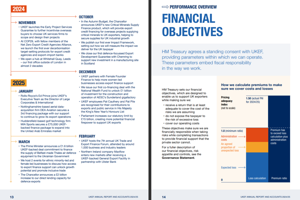
Pages 13 to 14 of the PDF version of UK Export Finance’s Annual Report and Accounts from 2024 to 2025.
| Key Strengths | Contains a ‘milestones page’ with a month-by-month overview of departmental priorities, providing an overview of the year. |
| Internal Links | Links to the Governance Statement, encouraging users to cross-reference through the report. |
| Accessibility | Uses plain English and graphics to explain how premiums are calculated, making complex financial decisions accessible to more users. |
UK Export Finance’s Annual Report and Accounts can be found here.
Cabinet Office
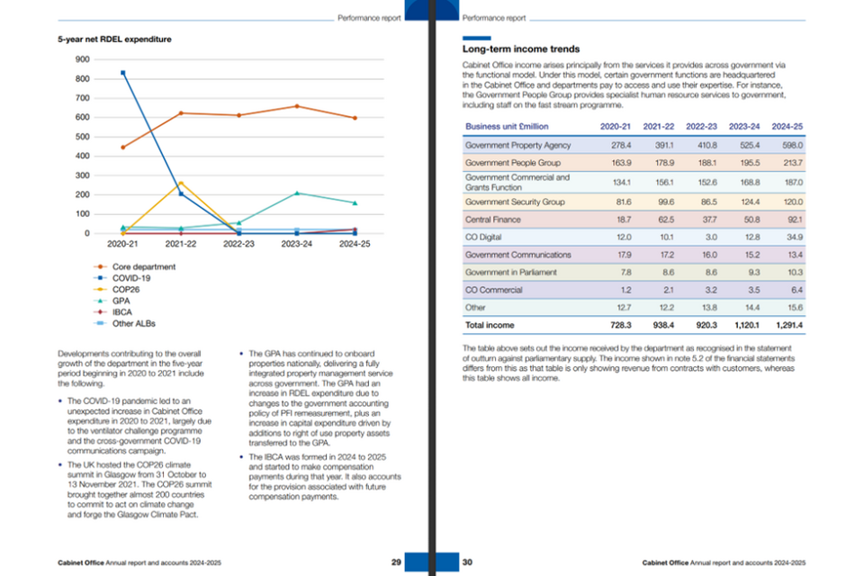
Pages 29 to 30 of the PDF version of Cabinet Office’s Annual Report and Accounts from 2024 to 2025.
| Key Strengths | Communicates information to users in a concise way, utilising colour coding in tables and graphs. |
| Internal Links | Contains streamlined contextual and trend data, comparing data from five years, to encourage comparisons between both areas and time. |
| Accessibility | Uses ‘plain English’ and bullet points to add further context around expenditure. |
Cabinet Office’s Annual Report and Accounts can be found here.
Office of Gas and Electricity Markets (Ofgem)
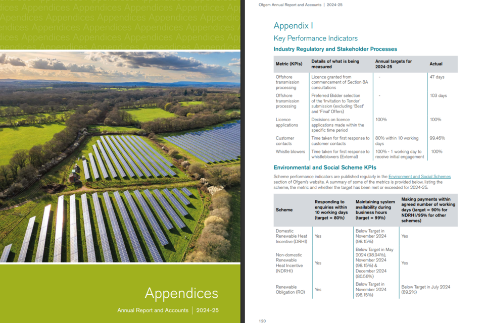
Pages 119 to 120 of the PDF version of the Office of Gas and Electricity Market’s (Ofgem) Annual Report and Accounts from 2024 to 2025.
| Key Strengths | Provides thorough and effective contextual information by reporting on Key Performance Indicators (KPIs). |
| Clarity | KPIs are clearly shown, comparing targets to what has been achieved by the department. |
| Internal Links | Links to further information on Ofwat’s website, encouraging users to go online for more in-depth information. |
Office of Gas and Electricity Market’s (Ofgem) Annual Report and Accounts can be found here.
2. Design Choices and Graphics
Design choices and graphics play a vital role in the usability and clarity of Annual Reports. Thoughtful visual design helps present complex information in a way that is accessible and meaningful to users with both finance and non‑finance backgrounds.
Section 3.5 of the FReM notes that:
‘Preparers can use design choices to direct a reader’s attention, to put information in context, or to make things easier to grasp.’
‘Graphics work best when they serve a clear purpose, show relationships difficult to describe in words, are properly labelled, and are supported by narrative.’
2.1 Using Design and Graphics Effectively
| Key Strengths | Why This Is Effective | Where This Can Be Used |
|---|---|---|
| Relationship overviews | Clearly illustrates connections, interdependencies, and how different parts of the organisation work together. | Visuals can map strategic priorities to KPIs, risks, governance structures, and outcomes. |
| Cross‑referencing graphics | Helps users navigate the report and understand how different sections relate, improving overall comprehension. | Effective for linking risk, mitigation strategies, performance reporting, and governance commentary. |
| SVG diagrams | Enhances accessibility and usability, especially in HTML versions of the report, due to scalability and screen‑reader compatibility. | Ideal for diagrams that explain financial controls, decision‑making pathways, or service delivery models. |
| Tables, graphics and narrative combined | Provides meaningful context, ensuring figures are interpreted correctly rather than viewed in isolation. | Particularly beneficial in financial performance analyses, where tables offer accuracy while narrative clarifies drivers, impacts, and insights. |
2.2 Examples
The following sections showcase examples of how design choices and graphics can be used effectively to enhance clarity, user navigation, and understanding within ARAs.
Department for Transport (DfT)
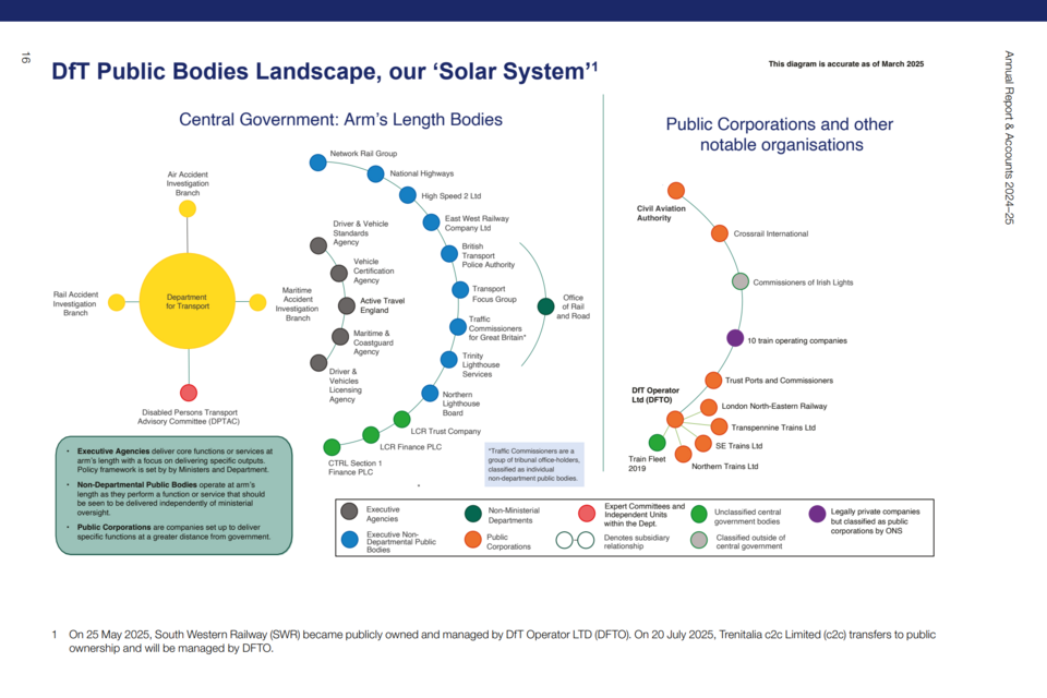
Page 16 of the PDF version of the Department for Transport (DfT) Annual Report and Accounts from 2024 to 2025.
| Key Strengths | ‘Solar system’ graphic visualises complex body classifications and relationships between entities. |
| Streamlined | Provides a useful overview and contextual understanding of DfT and all sponsored bodies on just one page. |
| Design Choices | Colour coding, with a key, shows how each entity is classified and related to other entities ‘at a glance’. |
The Department for Transport’s Annual Report and Accounts can be found here.
Department for Science, Innovation and Technology (DSIT)
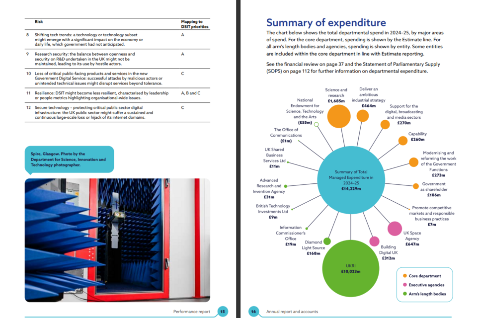
Pages 15 to 16 of the PDF version of the Department for Science, Innovation and Technology (DSIT) Annual Report and Accounts from 2024 to 2025.
| Key Strengths | Connects core spending to arm’s length bodies and executive agencies through colour coding and proportionate sizing. |
| Cross Referencing | Maps key risks onto departmental priorities to show how risks and priorities interact. |
| Internal Links | Links to both the financial review and Statement of Parliamentary Supply, encouraging users to cross-reference for more detailed information. |
The Department for Science, Innovation and Technology’s Annual Report and Accounts can be found here.
Department for Energy Security and Net Zero (DESNZ)
An extract from the HTML version of the Department for Energy Security and Net Zero (Desnz) Annual Report and Accounts from 2024 to 2025.
| Key Strengths | Succinctly and clearly shows departmental levels of governance. |
| Clear Categorisation | Uses colour-coding to show how areas of governance are categorised, alongside the main portfolios that the department prioritises. |
| Accessibility | Uses SVG graphics, which can adapt to different browsers and technologies. |
The Department for Energy Security and Net Zero’s Annual Report and Accounts can be found here.
Department of Culture, Media and Sport (DCMS)
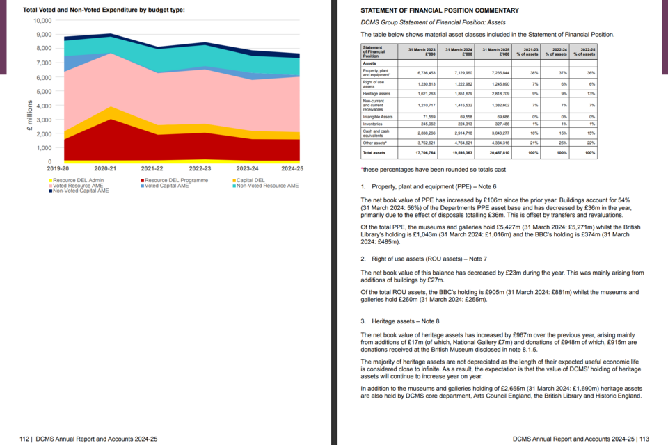
Pages 110 to 111 of the PDF version of the Department of Culture, Media and Sport (DCMS) Annual Report and Accounts from 2024 to 2025.
| Key Strengths | Uses a visualisation to communicate how different areas of expenditure relate to each other, succinctly showing complex information. |
| Design Choices | Illustrates how total expenditure is divided between voted and non-voted expenditure, using graphics and colours to portray the interactions between the Parliamentary control totals and HM Treasury control totals. |
| Clarity | Presents data in a table, as the complexity and level of detail mean the data is most usable as a table. |
The Department of Culture, Media and Sport’s Annual Report and Accounts can be found here.
3. Usability
Usability is a core principle emphasised in the FReM for the preparation and presentation of Annual Reports and Accounts. A report’s usability can be viewed from two complementary perspectives:
-
Ease of navigation – how straightforward it is for readers to locate and understand information.
-
Clarity of presentation – how effectively the information is structured, displayed, and explained.
More information about creating and sharing spreadsheets can be found here.
Point 3.6 of the FReM states that:
‘The format of the report also has implications for users. Search engines will pick up key words from web pages but will only read the title of a pdf report.’
‘Many users may be looking for specific information. The easier it is to navigate across a report, the less time they will have to spend searching.’
3.1 Enhancing Usability
| Key Strengths | Why This Is Effective | Where This Can Be Used |
|---|---|---|
| Sub‑headings and short paragraphs | Breaks complex content into manageable sections, making it easier for users to scan, navigate, and understand key messages. | Throughout narrative sections, including performance reporting, governance statements, and financial reviews. |
| Visualisations, data tables and graphs | Presents information in formats that support quick comprehension, highlight trends, and avoid reliance on long-form text alone. | Financial analysis, KPI reporting, risk updates, and summarised performance outcomes. |
| Interactive data presentation | Allows users to explore information at different levels of detail, improving engagement and tailoring the report to varying user needs. | HTML‑based ARAs, dashboards, or supplementary digital materials where users can expand, filter or drill down into data. |
| Separate summary reports | Provides a concise overview of key messages for users who want the headline information without the full detail. | “At a glance” summaries, executive summaries, or standalone summary documents published alongside the main ARA. |
3.2 Examples
The following examples showcase examples of how design choices and graphics can be used effectively to enhance clarity, user navigation, and understanding within ARAs.
Office of Qualifications and Examinations Regulation (Ofqual)
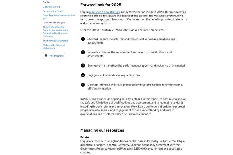
An extract from the HTML version of the Office of Qualifications and Examinations Regulation (Ofqual) Annual Report and Accounts from 2024 to 2025.
| Key Strengths | Uses sub-headings, numbered lists and short paragraphs to ensure text is easy to follow and understand. |
| Transparency | Links to a recent Ofqual strategy to provide further context, without having to include all information within the report. |
| Icons and Graphics | Each section of the numbered list has a key word, drawing focus to the key principles of the strategy. |
The Office of Qualifications and Examinations Regulation’s Annual Report can be found here.
Food Standards Agency (FSA)
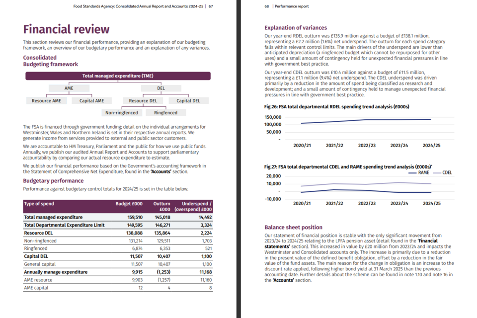
Pages 67 to 68 of the PDF version of the Food Standards Agency’s (FSA) Annual Report and Accounts from 2024 to 2025.
| Key Strengths | Uses visualisations, data tables and graphs to communicate different types of data, including trend data. |
| Design Choices | Uses different mediums to portray financial information, showing how design choices can effectively communicate different aspects of complex information. |
| Explanation | Clear English explanations utilise short paragraphs to ensure understanding and support the graphics and tables provided. |
The Food Standards Agency’s Annual Report can be found here.
Office of Rail and Road (ORR)
An extract from the HTML version of the Office of Rail and Road (ORR) Annual Report and Accounts from 2024 to 2025.
| Key Strengths | Applies filters to tables, making data interactive. Users can view different sections of data side by side, aiding comparison. |
| Concise Explanations | Short descriptions of segments allow for the table to be more effectively understood. |
| Accessibility | HTML reports can be interpreted by screen readers and are easier to read on mobile devices. |
The Office of Rail and Road’s Annual Report and Accounts can be found here.
Department for Work and Pensions (DWP)
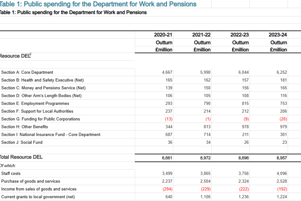
An extract from the ODS (OpenDocument Spreadsheet) of the Public Spending and Administration Budget for Department of Work and Pensions (DWP) Annual Report and Accounts from 2024 to 2025.
| Key Strengths | A separate spreadsheet allows figures to be downloaded and analysed in depth. |
| Design Choices | Red text indicates income, improving usability even to those unfamiliar with financial statements. |
| Accessibility | Uses an open file format which increases the usability of core tables, as standardised file types are not specific to software packages. |
The Department of Work and Pensions (DWP) Annual Report and Accounts can be found here.
4. Using Clear English
Using clear English is essential in ARAs because they are intended for a wide and diverse audience. Clear, concise language helps ensure that the information presented is easy to understand, avoids unnecessary technicality, and supports transparent accountability.
Point 3.7 of the FReM notes that:
‘Even when the subject of a report is complicated, using clear English makes the narrative easier to read. Some useful goals are:
(a) keep sentences short, with an average length of 15 to 20 words
(b) avoid acronyms
(c) where possible, use active verbs
(d) excessive use of jargon should be avoided
(e) where industry-specific terms are necessary for clear communication, they should be clearly defined and used consistently’
4.1 Using Clear English Effectively
| Key Strengths | Why This Is Effective | Where This Can Be Used |
|---|---|---|
| ‘At a glance’ section | Provides concise contextual information, giving readers an immediate understanding of the organisation’s purpose, activities, and performance. | At the start of each section of the report to help set the scene and orient the reader. |
| Colour‑coded tables | Enables large volumes of information to be grouped and interpreted quickly, reducing cognitive overload. | Throughout the report to present performance and financial data clearly and consistently. |
| Use of keys and icons | Highlights recurring themes and categories, helping readers identify connections between risks, strategic priorities, and outcomes. | When presenting risk information, strategic themes, or progress updates where symbols reinforce narrative messages. |
| RAG ratings | Offers a familiar, consistent visual system for illustrating severity, status, or progress, which can then be expanded on in narrative commentary. | Useful in risk reporting, KPI dashboards, mitigation assessments, and other performance metrics. |
Examples
The following examples illustrate how clear English and supporting visual tools enhance comprehension.
Serious Fraud Office (SFO)
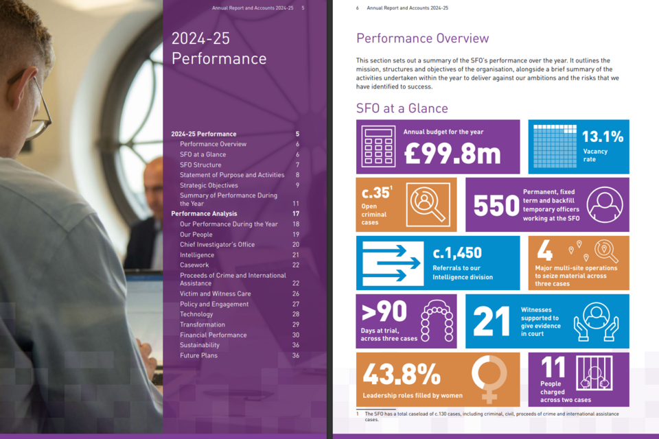
Pages 5 to 6 of the PDF version of the Serious Fraud Office’s (SFO) Annual Report and Accounts from 2024 to 2025.
| Key Strengths | The ‘at a glance’ section effectively shows an overview of SFO’s performance, giving immediate context to users as they first interact with the report. |
| Design Choices | Icons, short sentences and clear English ensure that all users will be able to understand and gain an overview of performance. |
| Usability | The Contents page divides the report into subsections on, making it easy for users to find the specific section of the report that is most relevant to them. |
The Serious Fraud Office’s (SFO) Annual Report and Accounts can be found here.
Ministry for Housing, Communities & Local Government (MHCLG)
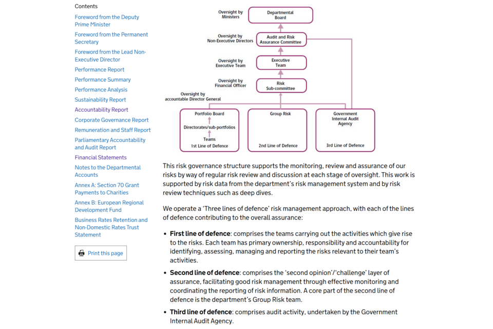
An extract from the HTML version of the Ministry for Housing, Communities & Local Government’s (MHCLG) Annual Report and Accounts from 2024 to 2025.
| Key Strengths | The graphics shows how each section of the system interacts with other ones, while the language in the graphic is concise and carefully chosen. |
| Clear English | Uses bullet points, which also feature on the graphic, to provide more information about each ‘line of defence’ within the governance system. |
| Accessibility | Graphic is scalable depending on the device used, increasing usability. |
The Ministry for Housing, Communities & Local Government’s (MHCLG) Annual Report and Accounts can be found here.
Government Actuary’s Department (GAD)
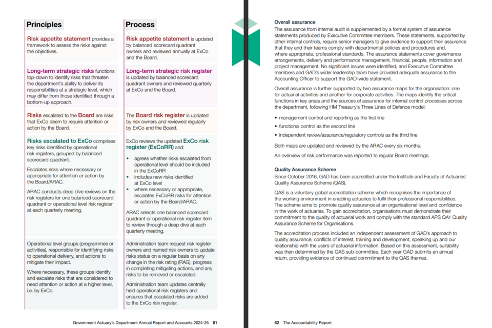
Pages 61 to 62 of the PDF version of the Government Actuary’s Department’s (GAD) Annual Report and Accounts from 2024 to 2025.
| Key Strengths | Divides each risk into ‘Principles’ and ‘Processes’, clearly describing each risk alongside what can be done to mitigate it. |
| Design Choices | Uses colour coding and bold text to allow users to easily find and understand the information that they require. |
| Clear English | Headings, short paragraphs and bullet points convey information in a digestible and understandable way. |
The Government Actuary’s Department’s Annual Report and Accounts can be found here.
HM Revenue and Customs (HMRC)
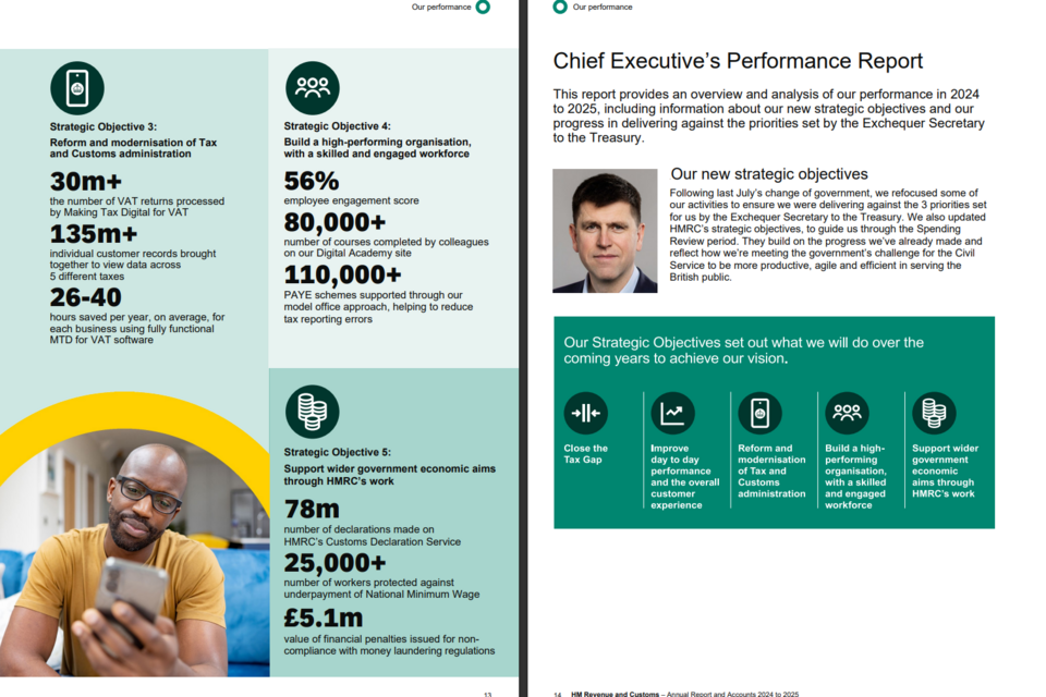
Pages 89 to 90 of the PDF version of the HM Revenue and Customs (HMRC) Annual Report and Accounts from 2024 to 2025.
| Key Strengths | Uses a ‘key’, relying on icons and colour, to reduce the need for repetition and allow for a large amount of information to be gained succinctly. |
| Design Choices | Consistent rating systems (such as the RAG rating and rating of risk trajectories as ‘improving’ or ‘stable’) increase comparability between risks concisely. |
| Clear English | Uses short paragraphs, centred around clear topics, to provide explanatory information in a clear and understandable way. |
HM Revenue and Customs’ Annual Report and Accounts can be found here.
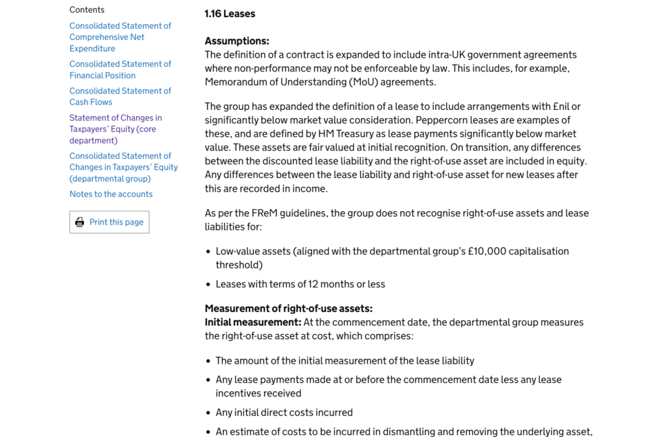
Department for Energy Security and Net Zero
An extract from the HTML version of the Department for Energy Security and Net Zero (Desnz) Annual Report and Accounts from 2024 to 2025.
| Key Strengths | Uses clear English to define complex terms, such as peppercorn leases. |
| Clear Formatting | Instead of presenting a difficult-to-understand block of text, the text is presented as paragraphs and bullet points. This makes the text more accessible. |
| Accessibility | The HTML report allows easy movement between sections of the report, allowing comparison between sections of the financial statements. |
The Department for Energy Security and Net Zero’s Annual Report and Accounts can be found here.
National Crime Agency
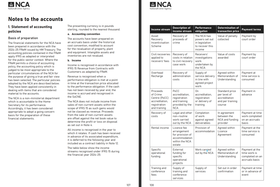
Pages 107 to 108 of the PDF version of the National Crime Agency’s (NCA) Annual Report and Accounts from 2024 to 2025.
| Key Strengths | Users gain a greater understanding of how income streams function, the rules that govern them, and the methodology behind decisions taken. |
| Comparability | By presenting each income stream in a table, users can compare different income streams and gain a wider understanding of how NCA generates income. |
| Clear English | Uses clear English, rather than financial jargon or complicated language, to allow for users to gain an understanding quickly and effectively. |
The National Crime Agency’s Annual Report and Accounts can be found here.
5. A Preparer’s Guide to HTML Reporting
5.1 Why HTML?
HTML reports offer three major advantages:
Accessibility
HTML supports screen readers and allows users to change font sizes or background colours through their browser settings.
Responsiveness
An HTML report scales to fit mobile phones, tablets, and wide monitors.
Interactivity
You can include filterable tables, “show/hide” features for technical detail, and interactive charts that reveal data when hovered over.
SVG Format
Use Scalable Vector Graphics (SVG) for diagrams and graphics. Unlike JPEGs, they retain their quality when zoomed in.
Alt-Text
Every image must have a descriptive “Alt-Text” tag so that users with visual impairments understand what the graphic represents.
5.2 Designing for the Web
| What | How | Why |
|---|---|---|
| ‘Accordians’ | Place in-depth technical notes or extra detail inside collapsible sections. | keep the main narrative streamlined. |
| Navigation | Ensure the Table of Contents is always visible (usually in a sidebar). | Users do not have to scroll back to the top. |
| Hyperlinking | Use internal links to elsewhere in the report and to external sources of information. | Users can easily find extra information and context. |
| Open Document Formats | Ensure data tables are prepared in a way that they can easily be converted to HTML or linked as an ODS (OpenDocument Spreadsheet). | ODSs will stay operable over a long time, as they are not linked to specific software that can be altered and updated. |
6. Summary
Effective ARAs combine clear English, strong usability, thoughtful design choices, and contextual trend information to support transparency and accountability. The following methods to ensure clear communication.
Context and Trends
- Multi-year trend charts
- KPI dashboards with colour-coded indicators
- Milestone timelines or ‘year at a glance’ visuals
Design Choices and Graphics
- Risk-mitigation linkage graphics
- Process flow illustrations using SVG diagrams
- Balanced scorecards combining numbers and narrative
Usability
- Clean, labelled data tables
- Executive summary panels
- SVG diagrams and interactive data
Clear English
- Icon sets for risks, themes or strategic priorities
- Colour-coded tables with simple, descriptive labels
- RAG-rated KPI or risk heatmaps
7. Further Guidance
Effective ARAs combine clear English, strong usability, thoughtful design, and contextual trend information to support transparency. For more information, please access the following: