Chapter 1: population change and trends in life expectancy
Published 11 September 2018

© Crown copyright 2018
This publication is licensed under the terms of the Open Government Licence v3.0 except where otherwise stated. To view this licence, visit nationalarchives.gov.uk/doc/open-government-licence/version/3 or write to the Information Policy Team, The National Archives, Kew, London TW9 4DU, or email: psi@nationalarchives.gov.uk.
Where we have identified any third party copyright information you will need to obtain permission from the copyright holders concerned.
This publication is available at https://www.gov.uk/government/publications/health-profile-for-england-2018/chapter-1-population-change-and-trends-in-life-expectancy
1. Main messages
The population of England has increased steadily over recent decades. At the same time the population has also been ageing and in 2017, the percentage of the population aged 85 years and over was 2.7 times greater than it was in 1971.
The number of people aged 85 years and over is expected to increase substantially in the future. In 2017 there were 1.35 million people aged 85 and over in England. By 2023 this is projected to reach 1.54 million (an increase of 14%) and in 2031 (when ‘baby boomers’ born after World War 2 move into this age group) it could reach 2.01 million.
The ageing population is reflected in the changing distribution of deaths by age. In England and Wales in 1971, deaths among those aged 85 and over made up 15% of all deaths. By 2016 they made up 39% of all deaths.
With England’s population both increasing and ageing, it was inevitable that the downward trend in number of deaths, seen since the late 1980s, could not continue indefinitely. Since 2011, when there were just over 450,000 deaths in England, the numbers have been generally increasing. By 2017 there were almost 500,000 deaths.
The number of deaths will increase considerably in the next few years if the population continues to experience recent rates of mortality. If this is the case, it is anticipated that in the year 2023 there will be around 550,000 deaths. That is just over 50,000 more deaths than in 2017, a 10% increase.
Provisional data for 2017 indicate that life expectancy at birth in England has now increased to 79.6 years for males and 83.2 years for females. People are living longer than at the start of the century, but since 2011 the rate of increase in life expectancy has slowed for both sexes. Based on life expectancy trends from 1981 to 2017, forecasts indicate that the future trend to 2023 is uncertain.
The latest data on healthy life expectancy at birth (the number of years lived in good health) show that it is now 63.3 years for males and 63.9 years for females (2014 to 2016) in England.
Since the period 2009 to 2011, life expectancy at birth has increased more than healthy life expectancy and therefore the number of years lived in poor health has increased slightly, as has the proportion of life spent in poor health. In the period 2014 to 2016, males lived 16.2 years in poor health, while females lived 19.3 years in poor health.
In 2016, UK life expectancy at birth was above the European Union (EU) average for males, but below the EU average for females. For both sexes, since 2011 it has improved more slowly in the UK than the EU average. However, with the exception of Italy, all of the 6 largest EU member states have seen a reduction in the rate of improvement in life expectancy since 2011.
2. Introduction
Average life expectancy has increased in England in recent decades, as presented in the Health Profile for England 2017.
Less than a century ago, deaths from infectious diseases were common and often death would follow a relatively short period of illness[footnote 1]. However, chronic non-communicable diseases are now the leading causes of death (see Chapter 2) and long periods of moderate and severe ill health often precede death.
We have an ageing population: in England in 2017, 1.35 million people were aged 85 and over, almost half a million of whom were in their 90s. The size of the population at older ages is important as the older a person is, the more likely they are to live with chronic conditions such as dementia, diabetes and some musculoskeletal conditions (see Chapter 3).
The size of the population aged 85 years and over is, therefore, an important determinant of demand for health and social care as older people have the highest usage[footnote 2],[footnote 3].
As well as looking at population changes, this chapter updates analysis in the Health Profile for England 2017 and looks at trends in the following measures:
- life expectancy (the average number of years that an individual is expected to live based on current mortality rates)
- healthy life expectancy (the average number of years that an individual is expected to live in a state of good or very good health, based on current mortality rates and prevalence of self-assessed good or very good health)
- average number of years lived in poor health (the difference between life expectancy and healthy life expectancy)
- proportion of life spent in poor health (number of years in poor health as a percentage of life expectancy)
Average life expectancy and healthy life expectancy are both important headline measures of the health status of the population. The healthy life expectancy measure adds a ‘quality of life’ dimension to estimates of life expectancy by dividing them into time spent in different states of health. The number of years of life in poor health is also important as it relates more closely to demand for health and social care, and associated costs.
When comparing outcomes for groups with very different life expectancies, the proportion of life spent in poor health is also useful. Two populations may both spend on average 15 years in poor health, which might be a quarter of life for a group with life expectancy of 60, but only a sixth of life for a group with life expectancy of 90.
3. Population change and trends in the number of deaths
The total population of England has increased steadily over recent decades (Figure 1). At the same time the population has also been ageing and the number of people aged 85 years and over has increased. In 2017 the proportion of the population aged 85 years and over was 2.7 times greater than it was in 1971.
Figure 1: trend in population size, all ages and ages 85+ years, England, 1971 to 2017
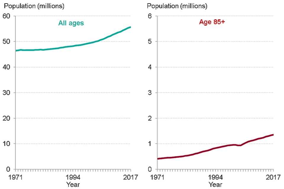
Source: PHE analysis of ONS population estimates
The distribution of deaths by age group has changed as the population has aged. In 1971, deaths among those aged 85 years and over made up just 15% of all deaths in England and Wales, but by 2016 they accounted for 39% of the total (Figure 2). In 1971, the number of deaths at ages 85 years and over was 6 times as great as the number of deaths under age one. In 2016, there were 76 times more deaths at age 85 years and over than under age one.
Figure 2: trend in percentage of deaths by age, England and Wales, 1971, 1980, 2000 and 2016
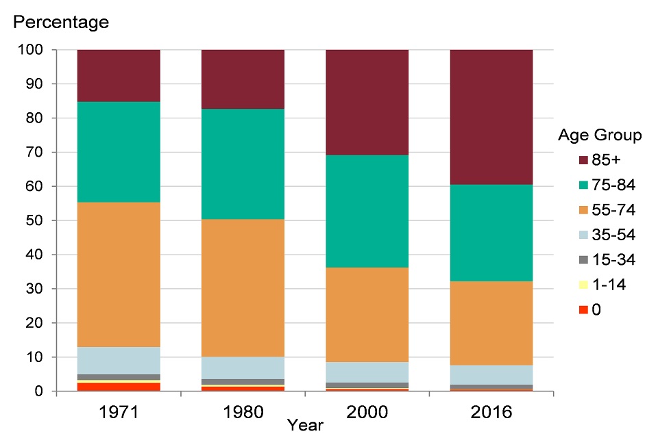
Source: PHE analysis of ONS mortality data
Despite an increasing and ageing population, a general decline in the annual number of deaths in England started in the late 1980s. In 1995, there were almost 530,000 deaths in England but by 2011 this had reduced to just over 450,000 (Figure 3).
With England’s population both growing and ageing, it was however inevitable that the downward trend in the number of deaths could not continue indefinitely. Since 2011 the numbers have been generally increasing and by 2017 there were almost 500,000 deaths in England (Figure 3).
Figure 3: trend in the number of deaths and population size, persons, England, 1995 to 2017, projected from 2018 to 2023
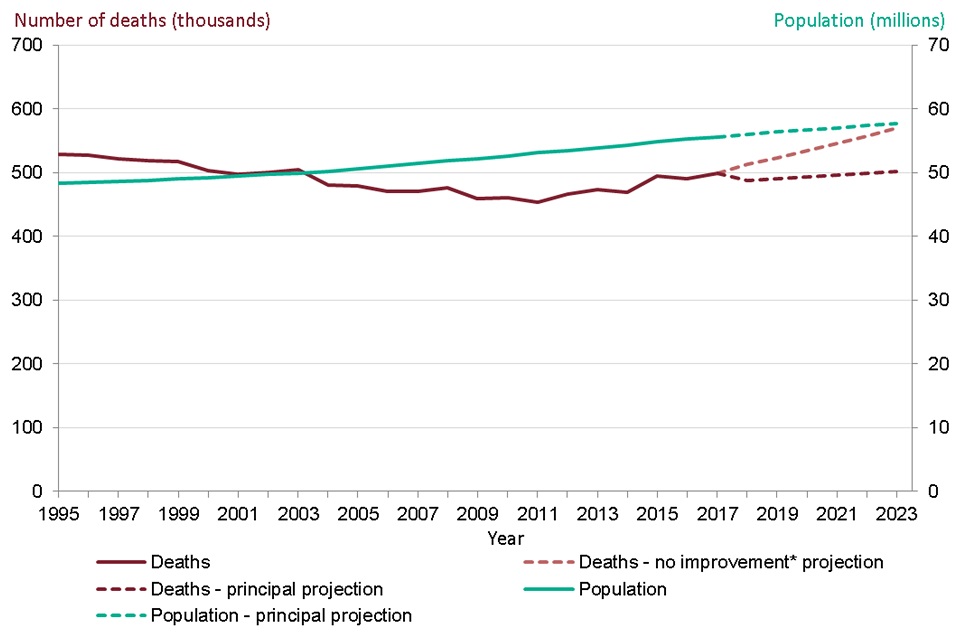
Source: PHE analysis of ONS population, population projection, and mortality data
*projected number of deaths assuming no improvement in mortality rates from those in 2016
See the full data source:
To provide an indication of the future size and age structure of the population, the Office for National Statistics (ONS) produces regular sets of population projections. These are based on assumptions of what will happen in the future with levels of births, deaths and migration.
The number of people aged 85 years and over is projected to increase substantially in the future. In 2017 there were 1.35 million people aged 85 and over in England. By 2023, this is projected to increase by 14% to 1.54 million. Between 2023 and 2031 (when those ‘baby boomers’ born immediately after World War 2 will reach 85) the population aged 85 and over is projected to increase by 31% to 2.01 million.
From their current principal projections, ONS estimate that there would be around 502,000 deaths in England by 2023 (Figure 3). This is based on an assumption that mortality rates will fall in the future. ONS also produce an alternative set of projections which assume that mortality rates in the future will not improve but will stay at the same level as in 2016. From these, ONS estimate that there will be around 550,000 deaths in 2023, just over 50,000 more than the number in 2017 (Figure 3).
Later sections of this chapter and Chapter 2 will show how there has been relatively little improvement in mortality rates in England since 2011. If mortality rates were to rise in the future, the number of deaths could be even higher than those in the ONS projections.
4. Trends in life expectancy at birth
Life expectancy at birth in England has increased in recent decades and provisional data for 2017 show that it has reached 79.6 years for males and 83.2 years for females (Figure 4). This is an increase of 0.1 years, since 2016, for both males and females. Male life expectancy has increased faster than that for females and the gap in life expectancy is now less than 4 years, whereas in 1981 it was 6 years.
Life expectancy at birth for males increased by an average of 13.9 weeks per year from 1981 to 2011, while for females the increase was 10.3 weeks per year (Figure 4). Between 2011 and 2017, the average increase in life expectancy slowed for both sexes, to 4.3 weeks per year for males and 1.7 weeks for females. There has thus been a reduction in the rate of improvement in life expectancy since 2011.
ONS produces regular projections of life expectancy which are derived by estimating long term trends in mortality improvement and projecting them forward for future decades. The latest principal projections from ONS (which assume that mortality rates will fall in the future) project that in 2023 life expectancy at birth will be 81.1 years for males and 84.3 years for females (Figure 4), an increase of 9.4 weeks and 7.3 weeks per year respectively, over the period of the projection (2018 to 2023).
Besides the principal projections of life expectancy illustrated in Figure 4, ONS also produce high and low life expectancy variants, which respectively assume more and less improvement in mortality rates. If it is assumed that mortality rates remain constant then life expectancy would also remain constant.
PHE have produced life expectancy forecasts based on fitting a model to the trends in life expectancy from 1981 to 2017 (Figure 4) (See Methods, data and definitions). These forecasts show that the more slowly rising trend since 2011 has not been observed for long enough to be clear whether it will continue. The upper and lower confidence limits shown around the forecasts indicate that the future trend is uncertain for both sexes.
See Methods, data and definitions for more information on the PHE forecasting methodology and ONS projections.
Figure 4: trend in life expectancy at birth, males and females, England, 1981 to 2017, projections and forecasts from 2018 to 2023
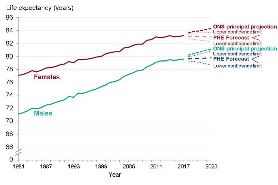
Source: PHE analysis of ONS data
5. Breakdown of trends in life expectancy at birth by age
The contribution of different age groups to the change in life expectancy between time points can be assessed using a method of ‘decomposition’.
Contributions that increased life expectancy (that is, where the mortality rate has reduced over time) have a positive value, while contributions that offset the life expectancy increase (where the mortality rate has increased over time) have a negative value (Figure 5).
All age groups made a positive contribution to improvements in life expectancy between 2001 and 2006, and between 2006 and 2011. The age groups which made the biggest contribution to improvements were the older ages, 60 to 89.
The contribution from almost all age groups was smaller between 2011 and 2016, indicating that the slowdown in mortality improvement occurred across most age groups. For both sexes, some age groups made a negative contribution to the change in life expectancy, as indicated by the red bars in the charts. The most noticeable negative contribution was for females aged 90 years and over.
Figure 5: breakdown of change in life expectancy at birth by age, males and females, England, 2001 to 2006, 2006 to 2011 and 2011 to 2016
Males
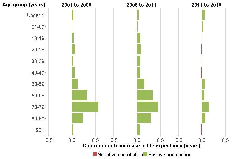
Source: PHE analysis of ONS data
Females
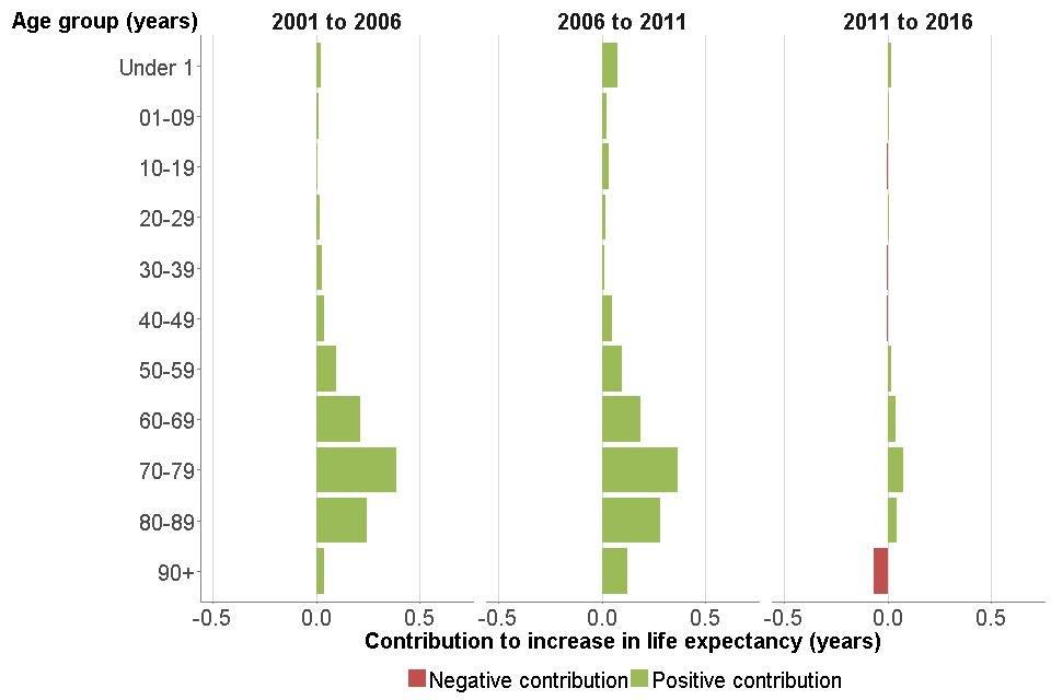
Source: PHE analysis of ONS data
See Methods, data and definitions for a more detailed explanation of the decomposition method.
6. Healthy life expectancy at birth
Data for healthy life expectancy are published by ONS as three-year averages (for example, 2014 to 2016). Since 2009 to 2011 there has been no significant change to healthy life expectancy in England and data for 2014 to 2016 indicate that it is now 63.3 years for males and 63.9 years for females (Table 1).
Table 1: life expectancy, healthy life expectancy, number of years in poor health and proportion of life spent in poor health, from birth and age 65 years, males and females, England, 2014 to 2016
| At birth | At birth | At age 65 | At age 65 | |
|---|---|---|---|---|
| Males | Females | Males | Females | |
| Life expectancy (years) | 79.5 | 83.1 | 18.8 | 21.1 |
| Healthy life expectancy (years) | 63.3 | 63.9 | 10.5 | 11.3 |
| Number of years in poor health | 16.2 | 19.3 | 8.2 | 9.8 |
| Proportion (%) of life in poor health | 20.4 | 23.2 | 44.0 | 46.6 |
Source: Office for National Statistics: health state life expectancies at birth and at age 65
See how your area compares:
Female life expectancy at birth
Male life expectancy at age 65
Female life expectancy at age 65
Male healthy life expectancy at birth
Although females live longer than males, in 2014 to 2016 there was little difference in healthy life expectancy between the sexes. Females, therefore, spent more years in poor health than males (19.3 years compared with 16.2 years for males) and a greater proportion of life in poor health (23.2% compared with 20.4%) (Table 1).
The majority of the extra years of life for females in 2014 to 2016 were spent in poor health: females lived 3.6 years longer than males but had only 0.6 years longer in good health. Therefore 3 of these extra years were spent in poor health.
In the Health Profile for England 2017, an increase in male healthy life expectancy of 2.8 years was reported between 2000 to 2002 and 2012 to 2014. The increase for females was 1.5 years. Due to a change in methodology, comparable data for recent years are now only available back to 2009 to 2011. This short time frame limits the conclusions that can be made about trends, as indicators giving a summary picture of population health tend to change slowly.
Male life expectancy at birth increased by 0.8 years between 2009 to 2011 and 2014 to 2016, and healthy life expectancy increased by 0.3 years (Figure 6). Years spent in poor health thus increased by 0.5 years. The proportion of life lived in poor health increased slightly: 20.0% in 2009 to 2011; 20.4% in 2014 to 2016.
For females between 2009 to 2011 and 2014 to 2016, life expectancy at birth increased by 0.4 years but healthy life expectancy fell by 0.2 years, so years lived in poor health increased by 0.7 years. The proportion of life lived in poor health increased from 22.5% in 2009 to 2011, to 23.2% in 2014 to 2016.
It is important to note that this measure of years spent in poor health is self-reported and does not adjust for the severity of ill health or the types of conditions that may be present. Trends in ill health (morbidity) adjusted for severity of disease are presented in Chapter 3.
Figure 6: trend in life expectancy, healthy life expectancy and years spent in poor health from birth, males and females, England, 2009 to 2011 up to 2014 to 2016
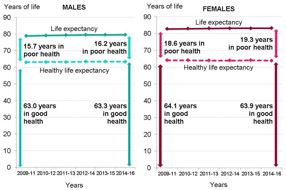
Source: PHE analysis of ONS estimates of life expectancy and healthy life expectancy
7. Life expectancy and healthy life expectancy at age 65
The trend in life expectancy at age 65 years has been upwards in recent decades. In 2014 to 2016, males aged 65 lived a further 18.8 years (up from 16.3 years in 2001 to 2003) and females an additional 21.1 years (up from 19.2 years in 2001 to 2003).
Since 2009 to 2011, increases in life expectancy have slowed for both sexes at age 65 and increases in healthy life expectancy have kept pace, so the number of years lived in poor health has remained about the same. Males lived 8.2 years in poor health from age 65 in both 2009 to 2011 and 2014 to 2016, while females lived 10.0 years in poor health in 2009 to 2011 and 9.8 years in 2014 to 2016.
The proportion of life from age 65 spent in poor health was 44.0% for males and 46.6% for females in 2014 to 2016.
8. UK comparisons
Of the four UK nations, England had the highest life expectancy for both males and females in 2016. This has consistently been the case in recent years (Figure 7). All four nations have experienced a slowing of life expectancy improvement since 2011, and all had a decrease in life expectancy for both sexes in 2015.
Figure 7: trend in life expectancy at birth, males and females, countries of the UK, 2006 to 2016
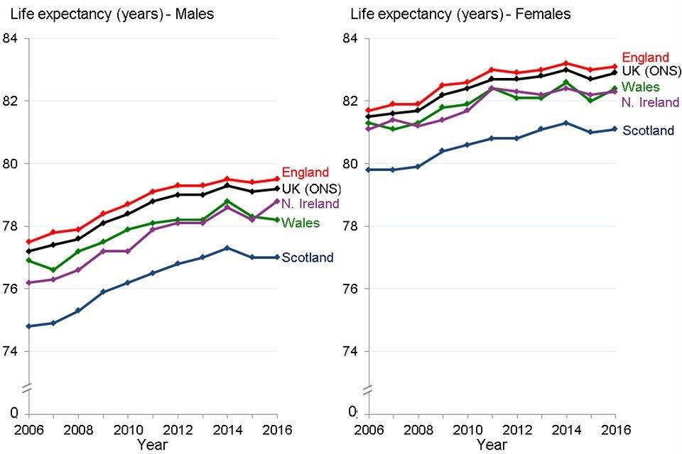
Source: PHE analysis of data from ONS
9. European comparisons
Female life expectancy is doing comparatively worse than male life expectancy when compared with the rest of the European Union (EU). Among the 28 EU member states in 2016, the UK was ranked 10th highest for male life expectancy but only 17th for female life expectancy (Figure 8). UK male life expectancy was above the EU average but was 1.6 years lower than the highest country (Italy). However, female life expectancy in the UK was lower than the EU average and 3.3 years lower than Spain, the country with the highest level in 2016.
These comparisons are made with the UK rather than England as it is the UK which is the EU member state. In addition, it is not possible to compare England with the EU as the EU data are calculated using a method which is not directly comparable to the method used by ONS to calculate life expectancy in England.
Figure 8: life expectancy at birth, males and females, EU member states, 2016
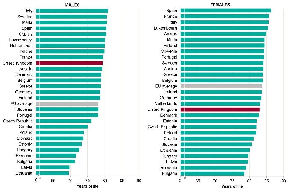
Source: PHE analysis of data from EUROSTAT
Between 2011 and 2016, the average annual increase in life expectancy in the EU as a whole was lower than the increase between 2006 and 2010, for males and females. With the exception of Italy, all of the 6 largest EU member states had a smaller annual improvement over the later period.
The average annual improvement in life expectancy in the UK between 2011 and 2016 was lower than in the other largest EU member states, and lower than the EU average, for both sexes. All of the largest EU member states had a fall in life expectancy in 2015 (Figure 9).
Figure 9: trend in life expectancy at birth, males and females, largest EU member states, 2006 to 2016
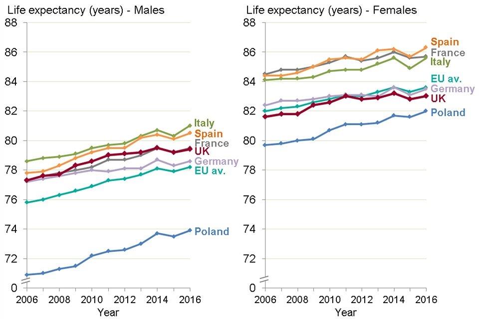
Source: PHE analysis of data from EUROSTAT
Data is also available on healthy life expectancy for all EU member states, based on responses to a survey question asking how respondents rate their health in general. In 2016, throughout the EU, although males lived shorter lives than females, they spent a smaller proportion of their lives in poor health. This suggests that the bulk of the extra years of life for females were spent in poor health (Table 2).
In 2016, the proportion of life spent in poor health was smaller in the UK than the EU average, except for males at birth. At age 65, both males and females in the UK spent a smaller proportion of life in poor health than the other large EU countries (Table 2).
Due to a different definition of poor health in the EU data, the figures for the proportion of life lived in poor health in the UK in Table 2 are very different to the figures quoted in Table 1 for the proportion of life lived in poor health in England. See Methods, data and definitions for further information.
Table 2: life expectancy and proportion of life in poor health*, from birth and age 65 years, males and females, largest EU countries, 2016
| 2016 | Males | Males | Males | Males | Females | Females | Females | Females |
|---|---|---|---|---|---|---|---|---|
| Country | Life expectancy at birth | Proportion (%) in poor health* | Life expectancy at age 65 | Proportion (%) in poor health* | Life expectancy at birth | Proportion (%) in poor health* | Life expectancy at age 65 | Proportion (%) in poor health* |
| France | 79.5 | 6.4 | 19.6 | 16.3 | 85.7 | 8.1 | 23.7 | 18.6 |
| Germany | 78.6 | 6.4 | 18.1 | 14.4 | 83.5 | 7.8 | 21.3 | 18.3 |
| Italy | 81.0 | 5.4 | 19.4 | 17.5 | 85.6 | 7.9 | 22.9 | 24.0 |
| Poland | 73.9 | 10.0 | 16.0 | 32.5 | 82.0 | 13.0 | 20.5 | 39.0 |
| Spain | 80.5 | 5.3 | 19.4 | 16.5 | 86.3 | 8.0 | 23.6 | 23.3 |
| United Kingdom | 79.4 | 6.9 | 18.8 | 13.8 | 83.0 | 8.0 | 21.1 | 13.7 |
| EU average | 78.2 | 6.5 | 18.2 | 17.6 | 83.6 | 8.7 | 21.6 | 23.1 |
Source: EUROSTAT Life expectancy and healthy life expectancy
*poor health = the difference between life expectancy and healthy life expectancy
10. Further information
The data presented in this chapter show a high-level picture of trends in life expectancy and healthy life expectancy in England. These trends are influenced by changes in patterns of mortality (Chapter 2) and changes in the prevalence of disease over time (Chapter 3).
In addition, these high-level trends conceal inequalities between different parts of the country and different population groups (Chapter 5).
Data from the Global Burden of Disease (GBD) model are an alternative source of trends in life expectancy and healthy life expectancy. It shows similar results to the data presented in this chapter, an increase in life expectancy with smaller absolute increases in healthy life expectancy since the earlier point of 1990. Health is determined by both risk and protective factors. The presence of these factors determines the level of health and wellbeing in the population and therefore the level of healthy life expectancy. Risk factors such as smoking, drinking and poor diet are discussed in Chapter 3.
Protective factors are not just the absence of risk and include the conditions and influences that create good health and wellbeing and/or buffer against disease. Examples include personal resilience, sense of control, social connectedness, physical activity, breastfeeding and school readiness. These are discussed throughout the Health Profile for England, but particularly in Chapters 4, 5 and 6. Social factors such as being in good work, having an adequate income, access to outdoor space and social capital are covered in Chapter 6.
11. References
-
Griffiths C and Brock A (2003) Twentieth century mortality trends in England and Wales. Health Statistics Quarterly 18:5-17. ↩
-
NHS Digital (2016) Hospital admissions hit record high as population ages: Accessed 29 June 2018. ↩
-
NHS Digital (2016) Community Care Statistics, Social Services Activity, England - 2015-16: Accessed 29 June 2018. ↩