Local Health commentary: August 2022
Published 2 August 2022
Applies to England

© Crown copyright 2022
This publication is licensed under the terms of the Open Government Licence v3.0 except where otherwise stated. To view this licence, visit nationalarchives.gov.uk/doc/open-government-licence/version/3 or write to the Information Policy Team, The National Archives, Kew, London TW9 4DU, or email: psi@nationalarchives.gov.uk.
Where we have identified any third party copyright information you will need to obtain permission from the copyright holders concerned.
This publication is available at https://www.gov.uk/government/statistics/local-health-august-2022-update/local-health-commentary-august-2022
In this release
This release includes 47 indicators updated with data for the latest available time period and the latest available boundaries. For a complete list of indicators that have been updated please see Local Health: indicator updates, August 2022.
The Office for Health Improvement and Disparities’ (OHID) Local Health mapping tool presents data at small geographic area level. It helps provide an understanding of the scale of, often hidden, inequalities within local areas. The data can be used to support targeted interventions to reduce health inequalities, with the aim for everyone to have the same opportunities to lead a healthy life, no matter where they live or who they are.
This summary provides examples of selected indicators: life expectancy, fuel poverty and unemployment.
Summary of selected indicators
Life expectancy
Period life expectancy is the average number of years a person would expect to live based on contemporary mortality rates. For a particular area and time period, it is an estimate of the average number of years a newborn baby would survive if they experienced the age-specific mortality rates for that area and time period throughout their life.
Figures reflect mortality among those living in an area in each time period, rather than mortality among those born in the area. The figures are not therefore the number of years a baby born in the area could actually expect to live, both because the mortality rates of the area are likely to change in the future and because many of those born in the area will live elsewhere for at least some part of their lives.
Life expectancy at birth is a useful summary measure of all-cause mortality as it quantifies the differences between areas in units (years of life) that are more readily understood and meaningful to the audience than those of other measures.
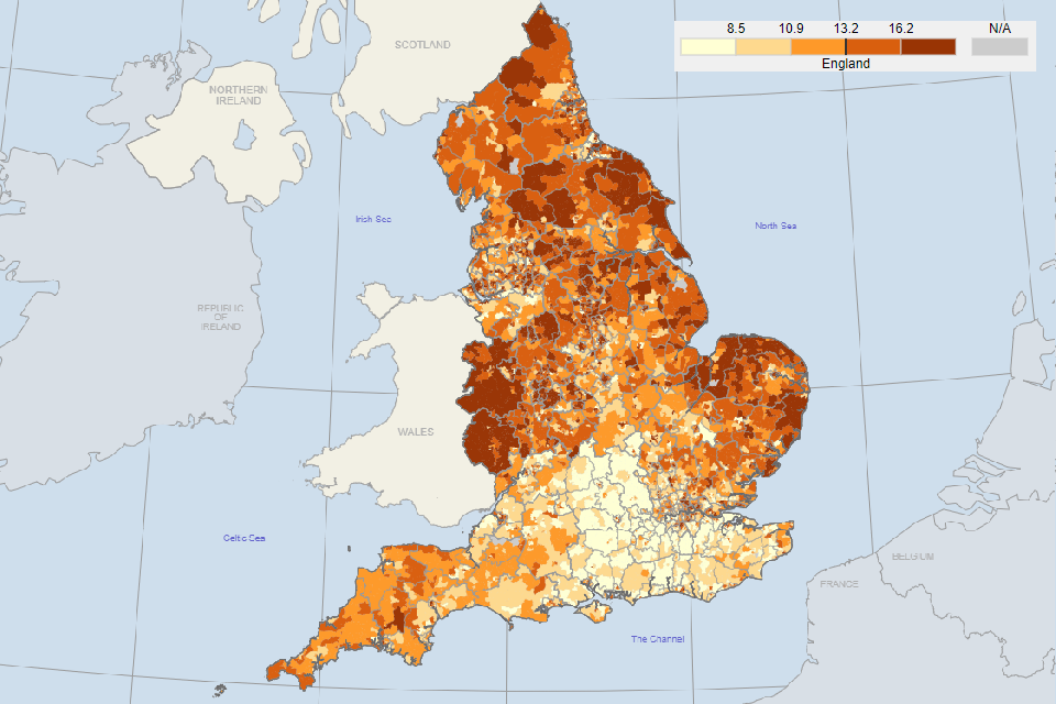
The life expectancy at birth indicators for males and females have been updated to the period 2016 to 2020. Figure 1 shows that at upper tier local authority level, life expectancy at birth for females is higher in the south of England compared to the north. However, at ward level the picture is much more complex with a large amount of variation across neighbouring areas.
Figure 1: life expectancy at birth for females in England, 2016 to 2020, for upper tier local authorities (top) and wards (bottom)
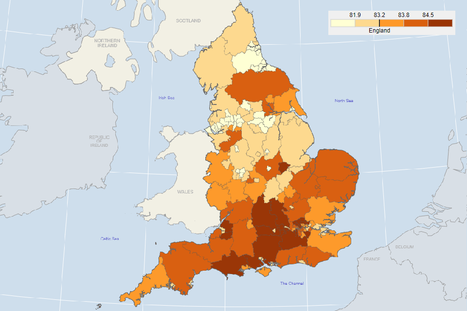
Source: The Office for Health Improvement and Disparities analysis of ONS death registration data and mid-year population estimates.
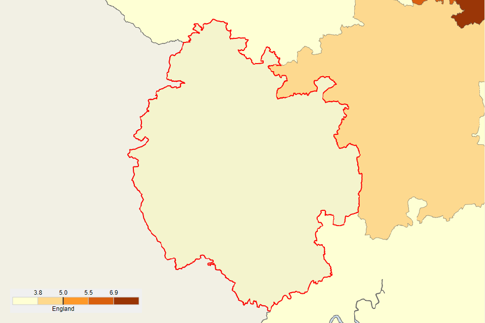
Although an upper tier local authority has a high life expectancy as a whole, there may be pockets of areas with low life expectancy, which can only be detected at a small area level. For example, the overall life expectancy for females in Hampshire is 84.5 years, however for wards within this area it ranges from 78.4 to 93.7 years (Figure 2).
Figure 2: life expectancy at birth for females in Hampshire, 2016 to 2020, for upper tier local authority (top) and wards (bottom)
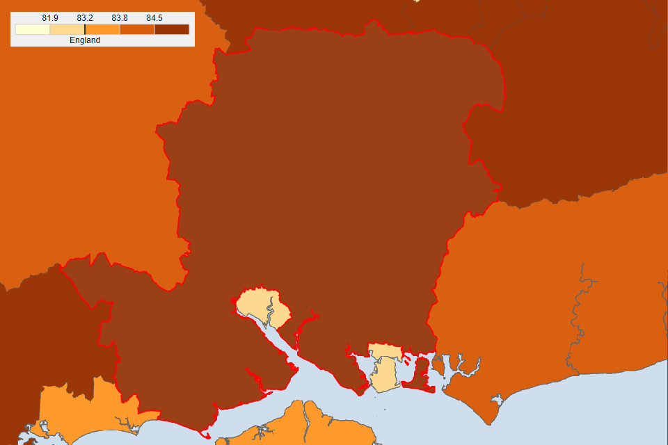
Source: The Office for Health Improvement and Disparities analysis of ONS death registration data and mid-year population estimates.
Fuel poverty
To align with a change in methodology and definition made by the Department for Business, Energy and Industrial Strategy, Local Health has an updated fuel poverty indicator. The indicator now measures fuel poverty through ‘Low Income Low Energy Efficiency’. Using this measure, a household is fuel poor if:
-
it is living in a property with an energy efficiency rating of band D, E, F or G as determined by the most up to date Fuel Poverty Energy Efficiency Rating (FPEER) methodology, and
-
its disposable income (after housing costs and energy needs) would be below the poverty line
A comparison between the old and new definitions can be found in the latest report from the Department for Business, Energy and Industrial Strategy.
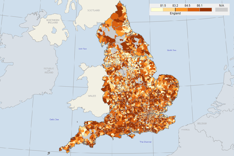
In 2020, 13.2% of households in England were classified as being in fuel poverty. At ward level, a higher percentage of households in the north of England were in fuel poverty compared to the south (Figure 3).
Figure 3: modelled estimates of the proportion of households in fuel poverty (%), 2020, wards in England
Source: Department for Business, Energy and Industrial Strategy (BEIS).
Unemployment
The unemployment indicator has been updated for the financial year 2021 to 2022. During the coronavirus pandemic, there was an increase in the unemployment rate as outlined in Employment in the UK: April 2022. It has decreased since then and has now returned to pre-pandemic levels.
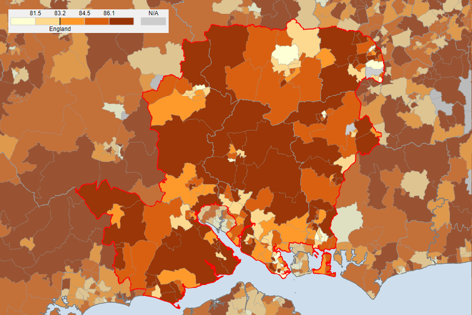
Looking at a small area level gives a more detailed picture of how unemployment varies across a county. For example, the county of Herefordshire as a whole has a low unemployment rate of 3.1%. However, the rates for wards within this area vary between 1.6% and 5.9%. Using Local Health to highlight within area inequalities (Figure 4) allows for targeted action in the areas that have most need.
Figure 4: unemployment, percentage of the working age population claiming out of work benefit in Herefordshire, 2021 to 2022, for upper tier local authority (top) and wards (bottom)
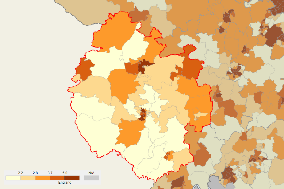
Source: NOMIS Labour Market Statistics.
Responsible statistician, product lead: Sonia Gill.
For queries relating to this publication contact pha-ohid@dhsc.gov.uk.