Using charts effectively in the COVID-19 Health Inequalities Monitoring for England (CHIME) tool
Updated 23 February 2026
Applies to England

© Crown copyright 2026
This publication is licensed under the terms of the Open Government Licence v3.0 except where otherwise stated. To view this licence, visit nationalarchives.gov.uk/doc/open-government-licence/version/3 or write to the Information Policy Team, The National Archives, Kew, London TW9 4DU, or email: psi@nationalarchives.gov.uk.
Where we have identified any third party copyright information you will need to obtain permission from the copyright holders concerned.
This publication is available at https://www.gov.uk/government/statistics/covid-19-health-inequalities-monitoring-in-england-tool-chime/using-charts-effectively-in-the-covid-19-health-inequalities-monitoring-for-england-chime-tool
This guide provides some tips for using chart functions within the CHIME tool.
View further information
Within each chart, the cursor can be hovered over to present further information.
In the chart below, the peak in January 2021 has been hovered over, presenting the geography, the time period and the age-standardised mortality rate:
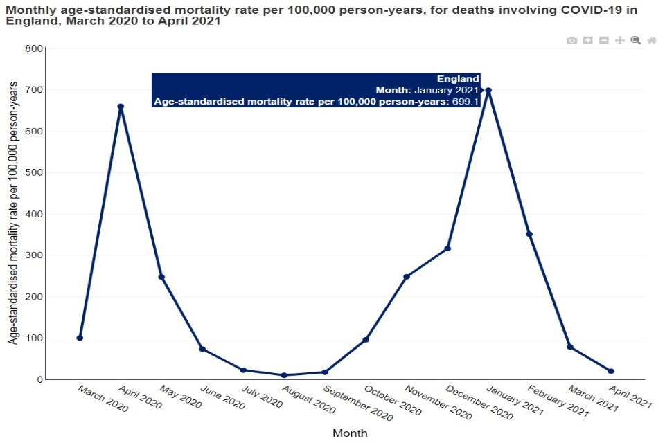
Chart showing how the cursor can be hovered over the data line to present further information
View just one line of data
In a chart with multiple lines, clicking on one option in the legend will display only that line.
In the chart below, persons has been selected, removing the male and female lines from the chart:
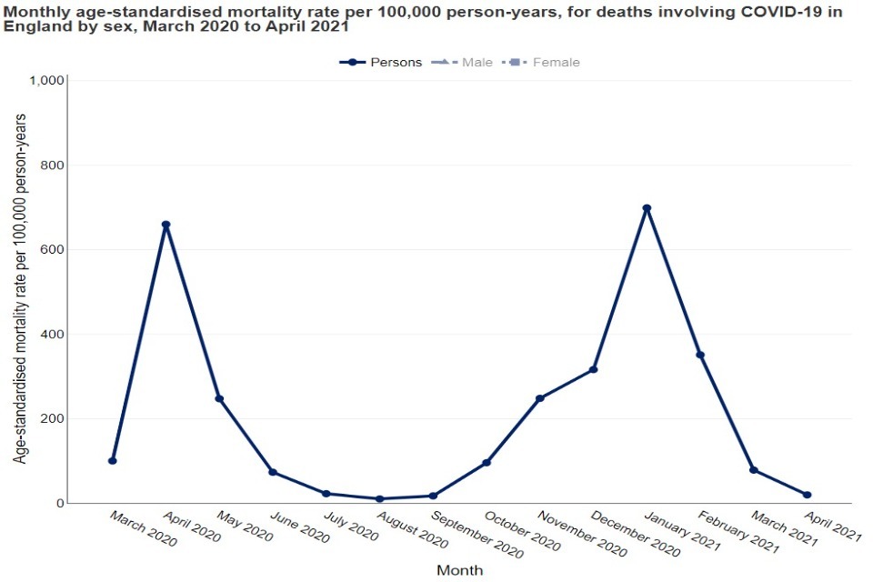
Chart showing how the display can be changed from multiple data lines by clicking on one option in the legend to display only the variable of choice.
Clicking on any option in the legend will restore all the lines.
View a particular subsection or area of interest
If lines are close together, the cursor can be used to zoom in. By clicking on the chart and dragging over the area of interest, the chart will zoom in to the specific subsection.
In the image below, the period covering the summer months of 2020 appears to have overlapping lines. The area of interest has been selected, shown in the following image:
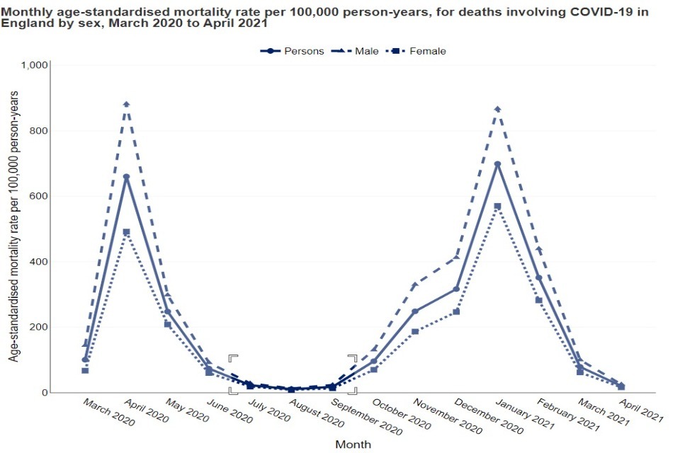
Chart with a timeframe of interest select ready to zoom in
When releasing the cursor, the chart will zoom in to the area of interest, as shown below:
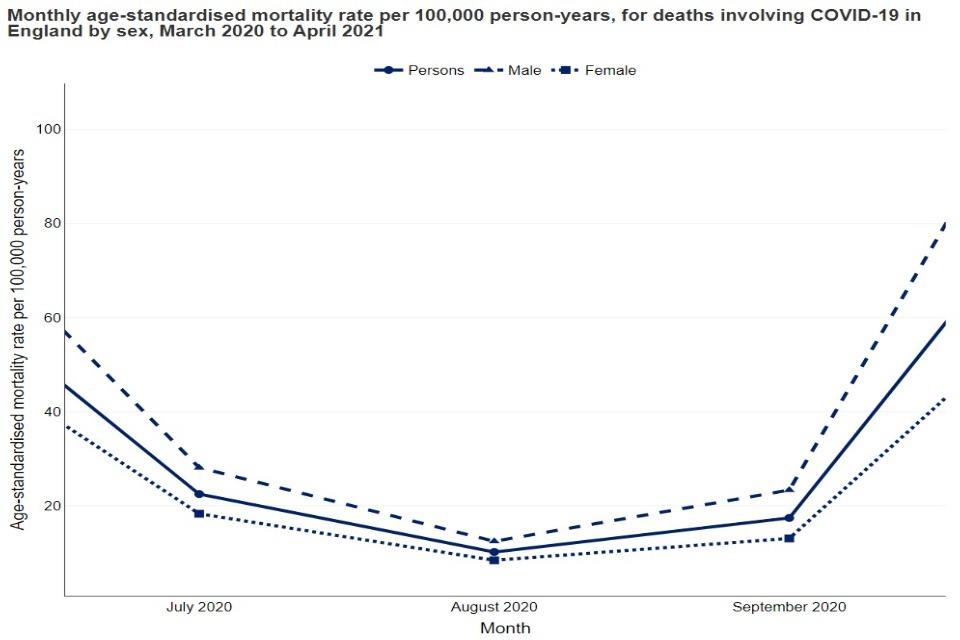
Chart with the selected timeframe zoomed in for the detail
Pan function
Another feature is the ‘Pan’ button. This allows for the chart to be moved, to focus on areas of interest. For example:
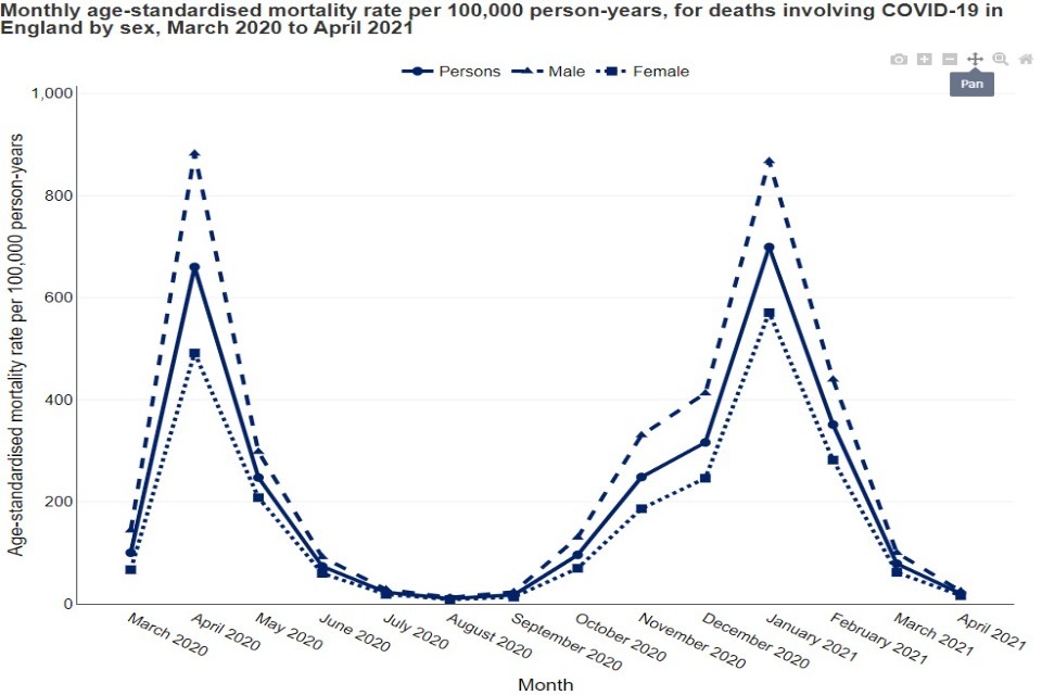
Chart highlighting the 'Pan' button.
This shows the ‘Pan’ function in use, with the chart pulled down to focus on the specific peaks in the chart:
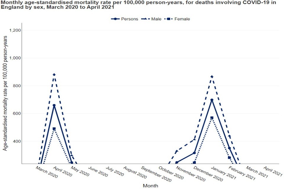
Chart showing what the 'Pan' button achieves
Zoom in and out
The charts also come with ‘Zoom in’ and ‘Zoom out’ buttons, in order to zoom in and out of the chart:
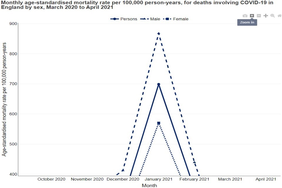
Chart showing the zoom in button
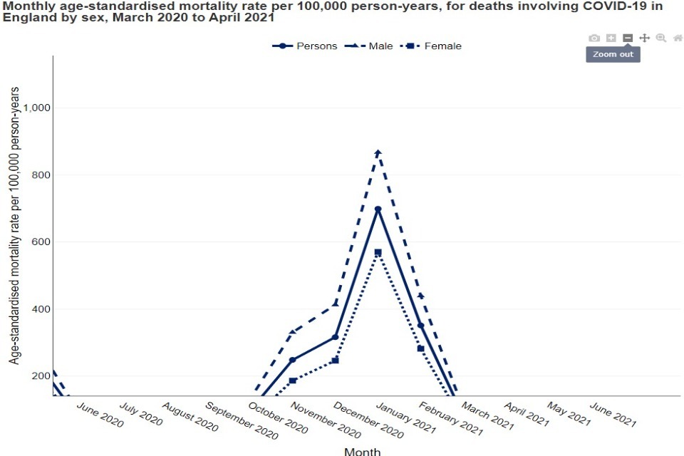
Chart showing the zoom out button
Reset
To return to the original chart, click the button ‘Reset axes’:
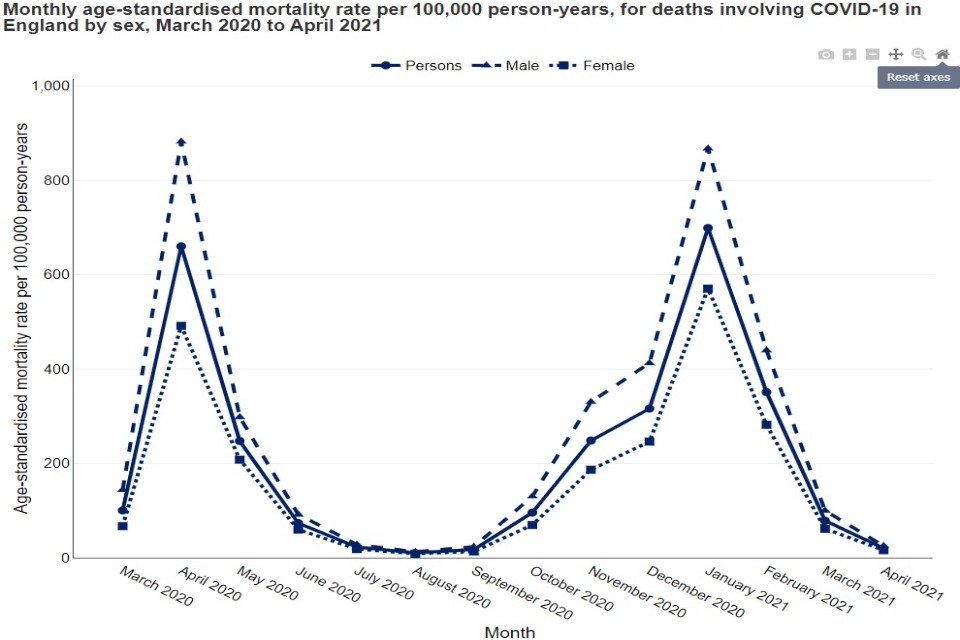
Chart showing the reset axes button
Download a chart as an image
Finally, the chart comes with a ‘Download plot as a png’ button, in order to export the chart as an image. By clicking on this, an image is generated and saved:
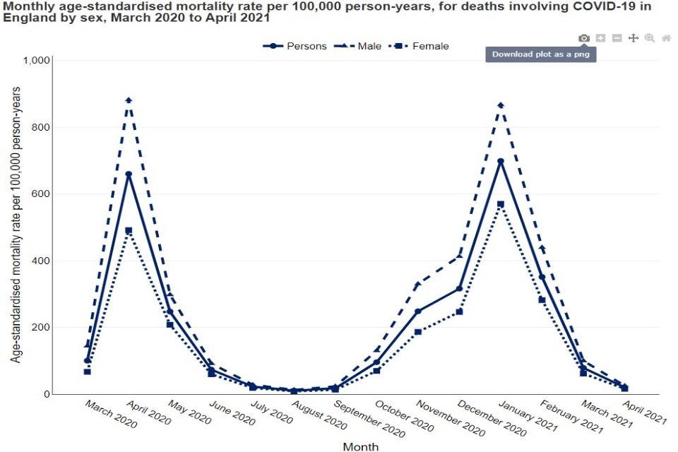
Shows the chart available with a 'download plot as a PNG' button
The image is saved as a .png file, with the file name describing what the chart is showing:
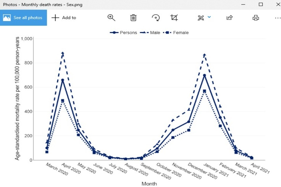
Chart showing image saved as a PNG file