Community and Engagement Survey 2025/26 - neighbourhood and community: report
Updated 16 September 2026
Applies to England

© Crown copyright 2026
This publication is licensed under the terms of the Open Government Licence v3.0 except where otherwise stated. To view this licence, visit nationalarchives.gov.uk/doc/open-government-licence/version/3 or write to the Information Policy Team, The National Archives, Kew, London TW9 4DU, or email: psi@nationalarchives.gov.uk.
Where we have identified any third party copyright information you will need to obtain permission from the copyright holders concerned.
This publication is available at https://www.gov.uk/government/statistics/community-and-engagement-survey-202526-neighbourhood/community-and-engagement-survey-202526-neighbourhood-and-community-report
This report summarises the key findings in the Community and Engagement Survey (CES) for neighbourhood and local community, including sense of belonging, interactions with neighbours, community cohesion and trust, and perceived attractiveness of the local area for 2025/26[footnote 1]. Reports for other sections within the CES are available on the annual web page.
The CES asks respondents how they interact with their neighbourhood, how often they chat with neighbours, and how attractive their neighbourhood is.
The CES is representative of people aged 16 and over in England. For simplicity, we will sometimes refer just to “people” in our reporting.
For information on how to use and interpret these statistics see the note available on the supplementary documents page[footnote 2].
1. Key findings:
1.1 Headline
61% of people aged 16+ felt they belonged “very strongly” or “fairly strongly” to their immediate neighbourhood, a 1 percentage point decrease from 2024/25 (62%).
By local authority, there was a 27 percentage point difference in the proportion of people who reported feeling a strong sense of belonging to their immediate neighbourhood, from 74% in Derbyshire Dale to 47% in Norwich.
69% of people aged 16+ reported they chatted to their neighbours, more than just to say hello, at least once a month, no significant difference from 2024/25 (69%).
By local authority, there was a 48 percentage point difference in the proportion of people who chat to their neighbours at least once a month, from 85% in Derbyshire Dales to 36% in the City of London. If the City of London is removed as an outlier, there is a 33 percentage point difference between Derbyshire Dales (85%) and Lambeth (52%).
61% of people aged 16+ reported that people pull together to improve their neighbourhood, a 5 percentage point increase from 2024/25 (56%).
By local authority, there was a 40 percentage point difference in the proportion of people who agreed that people in their neighbourhood would pull together to improve the neighbourhood from 82% in Derbyshire Dales to 43% in Norwich.
38% of people aged 16+ reported that many of the people in their neighbourhood can be trusted, a 3 percentage point decrease from 2024/25 (40%).
By local authority, there was a 50 percentage point difference in the proportion of people who reported that many people in their neighbourhood could be trusted from 65% in Derbyshire Dales to 15% in the City of London. If Derbyshire Dales is excluded, there is a 45 percentage point difference, from 60% in South Hams to 15% in the City of London.
79% of people aged 16+ agree that their local area is a place where people from other backgrounds get along, a 2 percentage point decrease from 2024/25 (81%).
By local authority, there was a 34 percentage point difference in the proportion of people who agree that their local area is a place where people from different backgrounds get along, from 92% in the City of London to 59% in Boston.
11% of people aged 16+ think that over the past two years, their local area has got better to live in, no significant difference from 2024/25 (11%). 31% reported that it had got worse, a 1 percentage point increase from 2024/25 (30%).
By local authority, there was a 31 percentage point difference in the proportion of people who reported that their local area had got better to live in over the last two years, from 34% in Hackney to 3% in Boston.
2. Sense of belonging to the neighbourhood
2.1 Timeseries
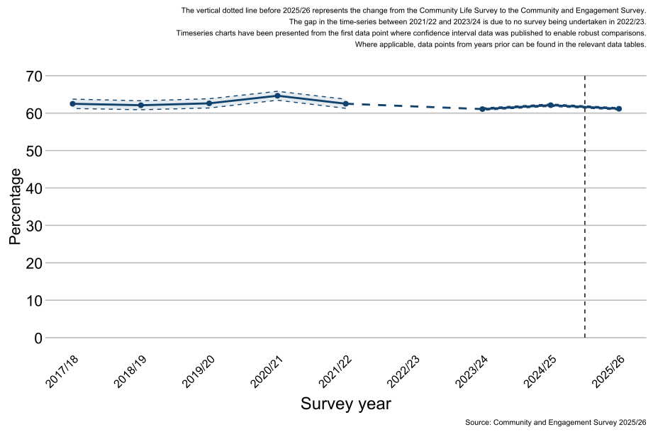
As shown in Figure 1.1, 61% of people felt a strong sense of belonging to their immediate neighbourhood in 2025/26 which was lower than the proportion of people in 2024/25 (62%) but similar to those in 2023/24 (61%).
Note: There are considerable changes in the confidence intervals between each year due to the sample size of the survey. Where the sample has been boosted, the confidence intervals will narrow to reflect higher confidence in the estimates.
Figure 1.1: Percentage of people who feel very or fairly strongly that they belong to their immediate neighbourhood, England: 2017/18 to 2025/26 (Base: All people aged 16 and over)
2.2 Demographics
Demographic questions in the survey are voluntary and self-reported by the respondent.
2.3 Age
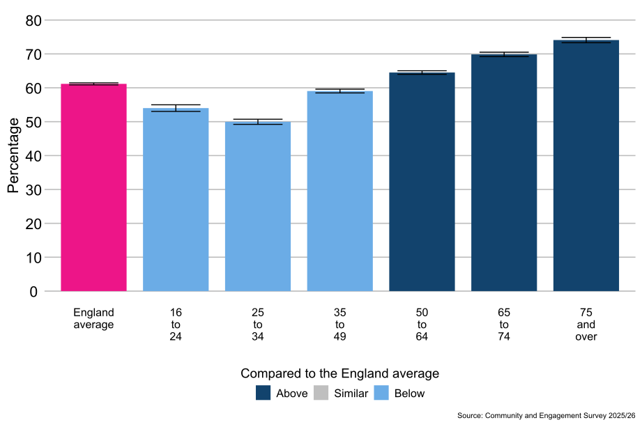
As shown in Figure 1.2, compared with the average for people in England (61%), people aged 50 to 64 (65%), 65 to 74 (70%), and 75 and over (74%) were more likely to feel a strong sense of belonging to their immediate neighbourhood. People aged 16 to 24 (54%), 25 to 34 (50%), and 35 to 49 (59%) were less likely to feel a strong sense of belonging to their immediate neighbourhood compared with the average for people in England (61%).
Figure 1.2: People who feel very or fairly strongly that they belong to their immediate neighbourhood, by age, England: 2025/26 (Base: All people aged 16 and over)
2.4 Disability status
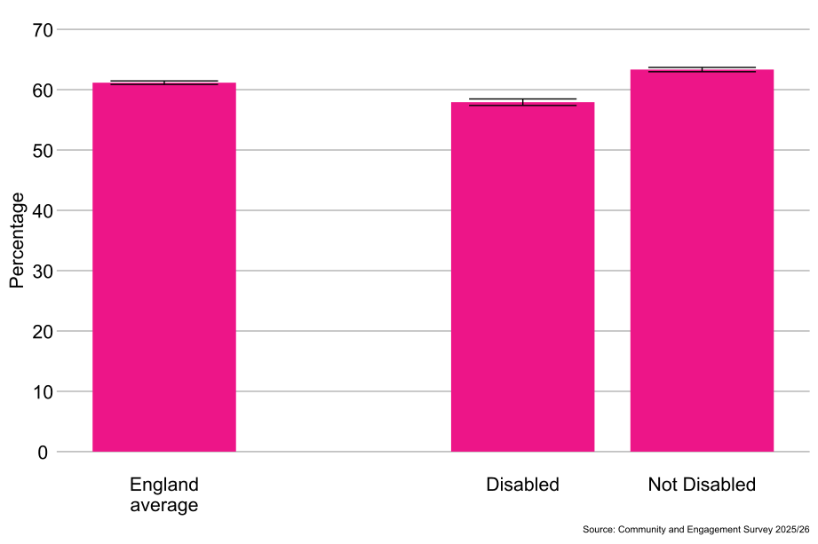
As shown in Figure 1.3, disabled people (58%) were less likely to feel a strong sense of belonging to their immediate neighbourhood compared to non-disabled people (63%).
Figure 1.3: People who feel very or fairly strongly that they belong to their immediate neighbourhood, by disability status, England: 2025/26 (Base: All people aged 16 and over)
2.5 Sex[footnote 3]
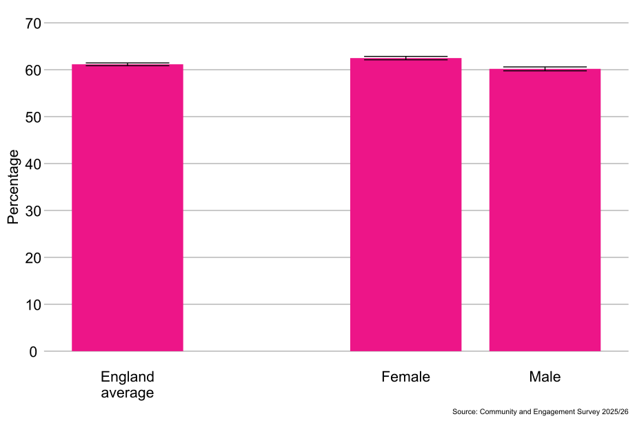
As shown in Figure 1.4, females (62%) were more likely to feel a strong sense of belonging to their immediate neighbourhood compared to males (60%).
Figure 1.4: Percentage of people who feel very or fairly strongly that they belong to their immediate neighbourhood, by sex, England: 2025/26 (Base: All people aged 16 and over)
2.6 Gender identity[footnote 4]
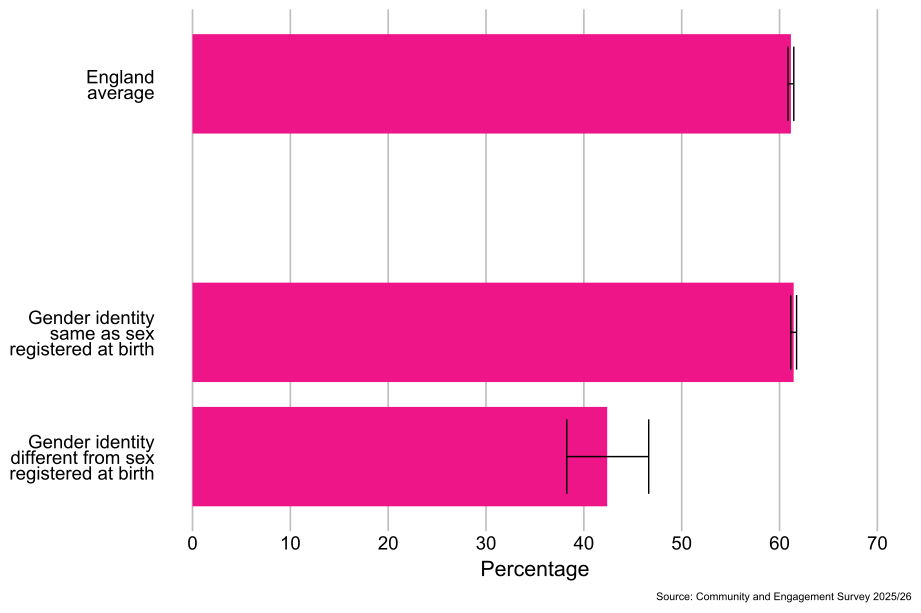
As shown in Figure 1.5, people whose gender identity was the same as their sex registered at birth (61%) were more likely to feel a strong sense of belonging to their immediate neighbourhood than those whose gender identity was different from their sex registered at birth (42%).
Figure 1.5: Percentage of people who feel very or fairly strongly that they belong to their immediate neighbourhood, by gender identity, England: 2025/26 (Base: All people aged 16 and over)
2.7 Sexual orientation[footnote 5]
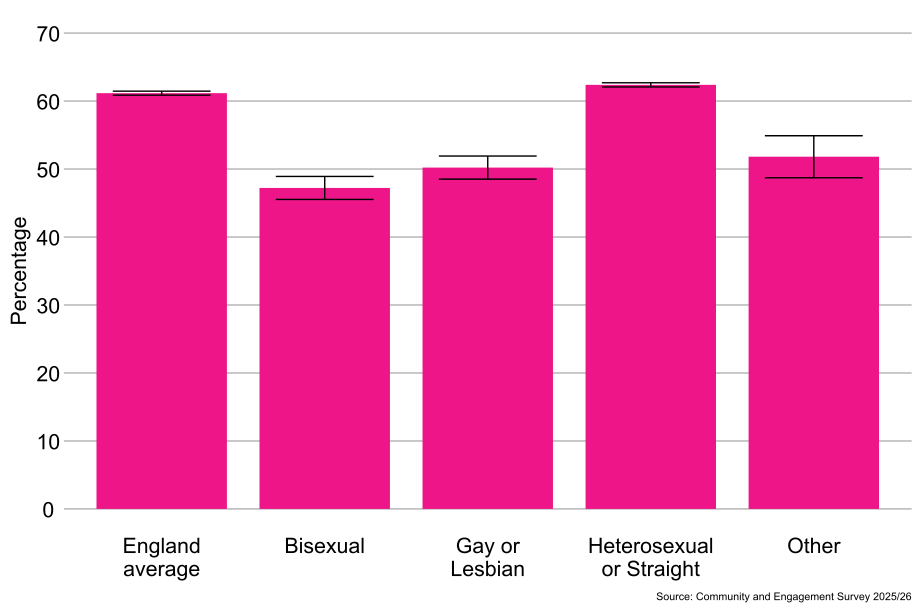
As shown in Figure 1.6, heterosexual or straight people (62%) were more likely to feel a strong sense of belonging to their immediate neighbourhood than people from the “Other sexual orientation” classification (52%), gay or lesbian people (50%), and bisexual people (47%).
Figure 1.6: Percentage of people who feel very or fairly strongly that they belong to their immediate neighbourhood, by sexual orientation, England: 2025/26 (Base: All people aged 16 and over)
2.8 Religion
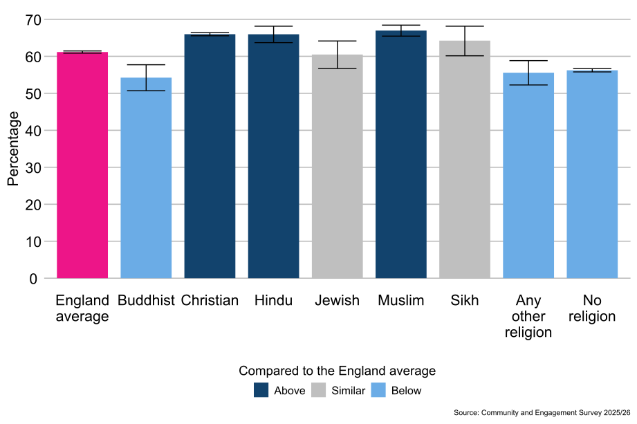
As shown in Figure 1.7, Muslim people (67%), Christian people (66%), and Hindu people (66%) were more likely to feel a strong sense of belonging to their immediate neighbourhood compared with the average for people in England (61%). People who reported having no religion (56%), people from the Any other religion classification (56%), and Buddhist people (54%) were less likely to feel a strong sense of belonging to their immediate neighbourhood compared with the average for people in England (61%).
Figure 1.7: Percentage of people who feel very or fairly strongly that they belong to their immediate neighbourhood, by religion, England: 2025/26 (Base: All people aged 16 and over)
2.9 Ethnicity
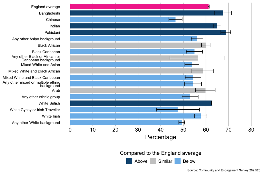
As shown in Figure 1.8, people from the Pakistani (69%), Bangladeshi (68%), Indian (65%) and White British[footnote 6] (63%) ethnic groups were more likely to feel a strong sense of belonging to their immediate neighbourhood compared with the average for people in England (61%). People from the White Irish (58%), Any other Asian background (56%), Black Caribbean (55%), White and Asian (54%), Any other Mixed or multiple ethnic background (54%), White and Black Caribbean (54%), Any other ethnic group (53%), Any other White background (49%), White Gypsy or Irish Traveller (48%), and Chinese (47%) ethnic groups were less likely to feel a strong sense of belonging to their immediate neighbourhood compared with the average for people in England (61%).
Figure 1.8: Percentage of people who feel very or fairly strongly that they belong to their immediate neighbourhood, by ethnicity: England, 2025/26 (Base: All people aged 16 and over)
2.10 Socio-economic classification[footnote 7]
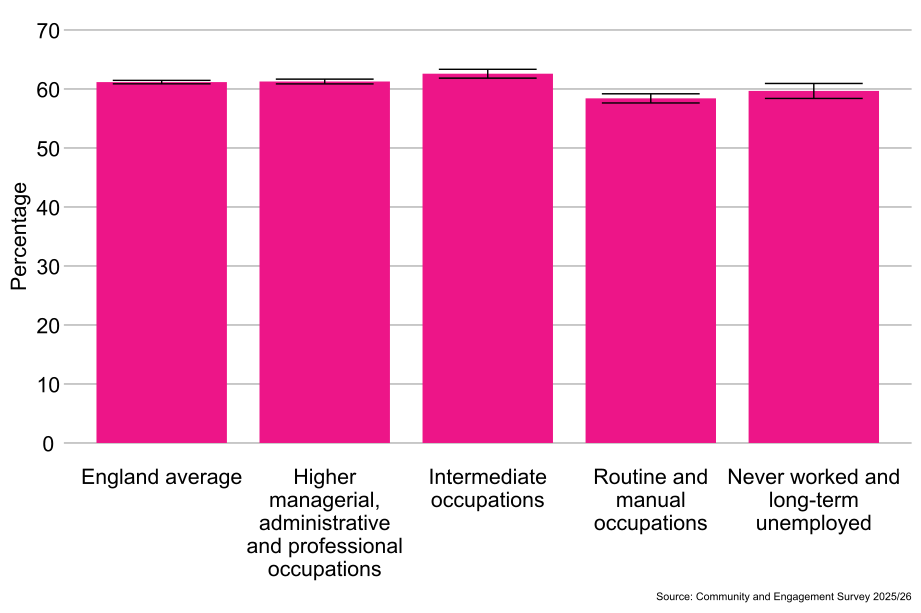
As shown in Figure 1.9, people from the intermediate occupations classification (63%) were more likely to feel a strong sense of belonging to their immediate neighbourhood than people from the higher managerial, administrative and professional occupations classification (61%), the never worked and long-term unemployed classification (60%), and the routine and manual occupations classifications (58%).
Figure 1.9: Percentage of people who feel very or fairly strongly that they belong to their immediate neighbourhood, by socio-economic classification, England: 2025/26 (Base: All people aged 16 and over)
2.11 Index of Multiple Deprivation[footnote 8]
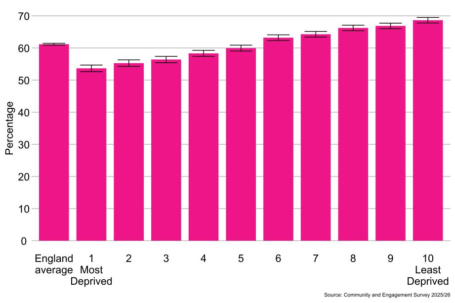
As shown in Figure 1.10, people living in the least deprived areas (10th decile, 69%) were more likely to feel a strong sense of belonging to their immediate neighbourhood than people living in the most deprived areas (1st decile, 54%).
Figure 1.10: Percentage of people who feel very or fairly strongly that they belong to their immediate neighbourhood, by Index of Multiple Deprivation, England: 2025/26 (Base: All people aged 16 and over)
2.12 Sense of belonging by local authority area and ITL1 area
2.13 Regional differences[footnote 9]
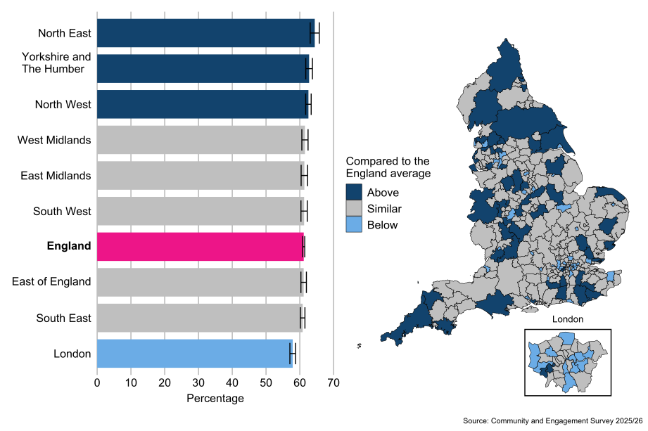
Compared with the average for people in England (61%), people living in the North East (64%), North West (63%), and Yorkshire and The Humber (63%) ITL1 areas were more likely to feel a strong sense of belonging to their immediate neighbourhood. Compared with the average for people in England (61%), people living in the London (58%) ITL1 area were less likely to feel a strong sense of belonging to their immediate neighbourhood.
2.14 Local authority differences[footnote 10]
By local authority, there was a 27 percentage point difference in the proportion of people who reported feeling a strong sense of belonging to their immediate neighbourhood, from 74% in Derbyshire Dale to 47% in Norwich.
The proportion of people who reported feeling a strong sense of belonging to their immediate neighbourhood was in line with the England average in 207 (70%) local authorities. A total of 52 (18%) local authorities were higher than the England average and 36 (12%) reported rates lower than the England average (61%).
Figure 1.11: Percentage of people who feel very or fairly strongly that they belong to their immediate neighbourhood, by ITL1 area and local authority, England: 2025/26 (Base: All people aged 16 and over)
3. Neighbourhood interactions - people who chat to their neighbours at least once a month
3.1 Timeseries
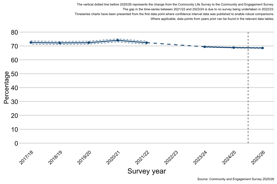
As shown in Figure 2.1, between 2017/18 and 2021/22 the proportion of people who chat to their neighbours at least once a month has remained generally consistent. The proportion of people who chatted with their neighbour at least once a month in 2025/26 (69%) remained similar as those reported in 2024/25 (69%).
Note: There are considerable changes in the confidence intervals between each year due to the sample size of the survey. Where the sample has been boosted, the confidence intervals will narrow to reflect higher confidence in the estimates.
Figure 2.1: Percentage of people who chat to their neighbours at least once a month England: 2017/18 to 2025/26 (Base: All people aged 16 and over)
3.2 Demographics
Demographic questions in the survey are voluntary and self-reported by the respondent.
3.3 Age
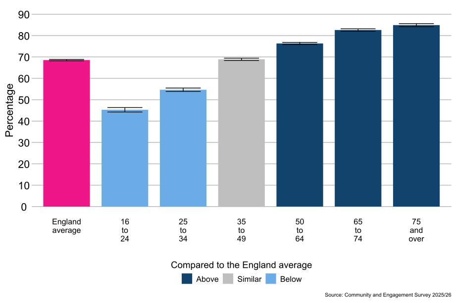
As shown in Figure 2.2, people aged 50 to 64 (76%), 65 to 74 (83%), and 75 and over (85%) were more likely to have chatted to their neighbours at least once a month compared with the average for people in England (69%). People aged 16 to 24 (45%) and 25 to 34 (55%) were less likely to chat to their neighbours at least once a month compared with the average for people in England (69%).
Figure 2.2: Percentage of people who chat to their neighbours at least once a month, by age, England: 2025/26 (Base: All people aged 16 and over)
3.4 Disability status
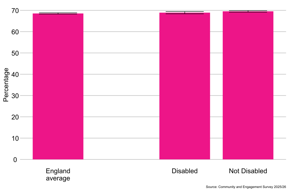
As shown in Figure 2.3, there were no significant differences observed between the proportion of disabled (69%) and non-disabled (70%) people who chat to their neighbours at least once a month.
Figure 2.3: Percentage of people who chat to their neighbours at least once a month, by disability status, England: 2025/26 (Base: All people aged 16 and over)
3.5 Sex[footnote 3]
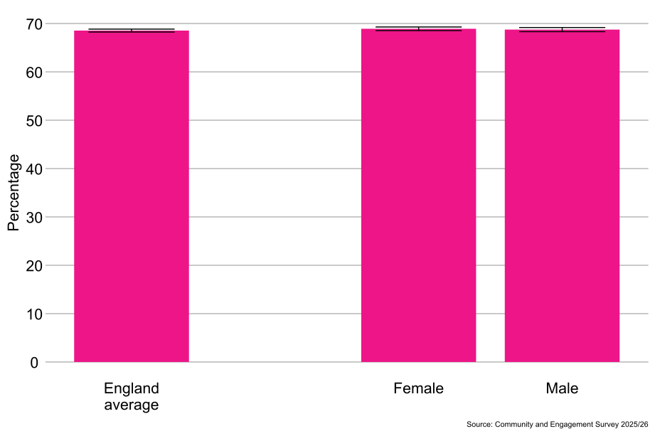
As shown in Figure 2.4, there were no significant differences observed between the proportion of males (69%) and females (69%) who chat to their neighbours at least once a month.
Figure 2.4: Percentage of people who chat to their neighbours at least once a month, by sex, England: 2025/26 (Base: All people aged 16 and over)
3.6 Gender identity[footnote 4]
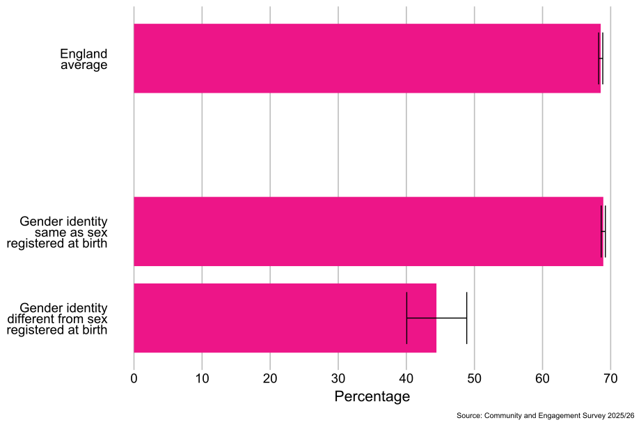
As shown in Figure 2.5, people whose gender identity was the same as their sex registered at birth (69%) were more likely to chat to neighbours at least once a month than people whose gender identity was different from their sex registered at birth (44%).
Figure 2.5: Percentage of people who chat to their neighbours at least once a month, by gender identity, England: 2025/26 (Base: All people aged 16 and over)
3.7 Sexual orientation[footnote 5]
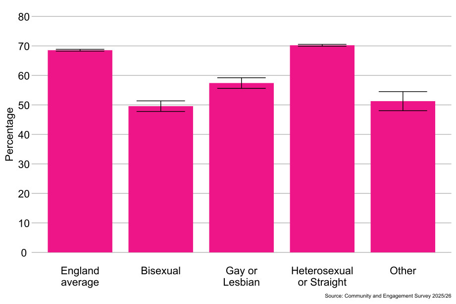
As shown in Figure 2.6, heterosexual or straight people (70%) were more likely to chat to their neighbours at least once a month than gay or lesbian people (57%), people from the “Other sexual orientation” classification (51%) and bisexual people (50%).
Figure 2.6: Percentage of people who chat to their neighbours at least once a month, by sexual orientation, England: 2025/26 (Base: All people aged 16 and over)
3.8 Religion
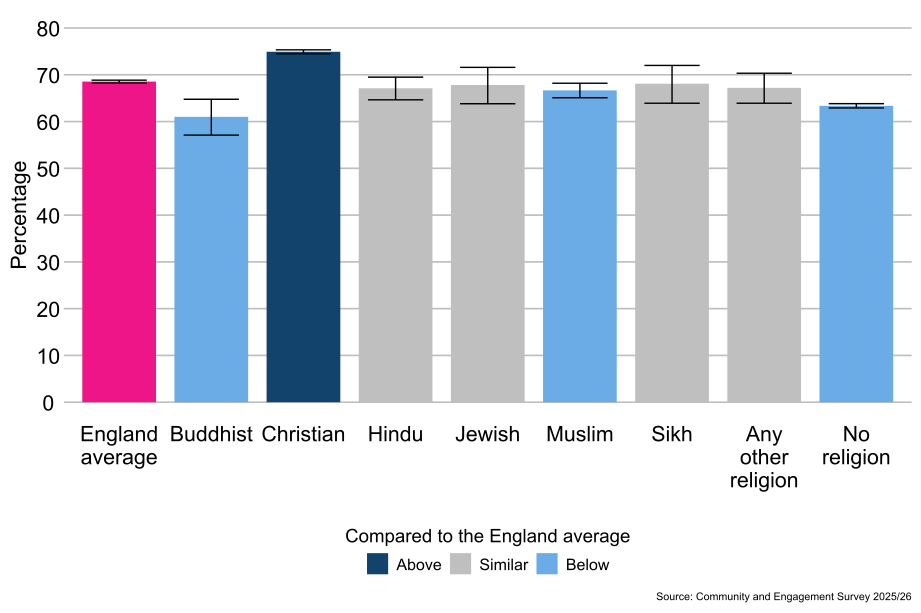
As shown in Figure 2.7, Christian people (75%) were more likely to chat to their neighbour at least once a month compared with the average for people in England (69%). Muslim people (67%), people who reported having no religion (63%) and Buddhist people (61%) were less likely to chat to their neighbour at least once a month compared with the average for people in England (69%).
Figure 2.7: Percentage of people who chat to their neighbours at least once a month, by religion, England: 2025/26 (Base: All people aged 16 and over)
3.9 Ethnicity
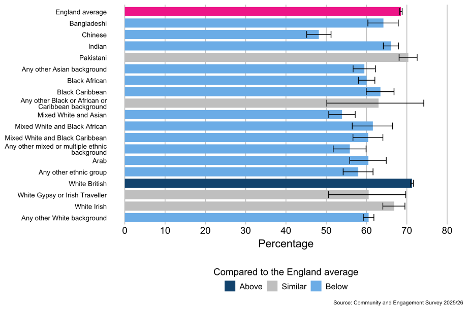
As shown in Figure 2.8, people from the White British[footnote 6] (71%) ethnic group were more likely to chat to their neighbour at least once a month, compared to the average for people in England (69%). People from the Indian (66%), Bangladeshi (64%), Black Caribbean (63%), Mixed White and Black African (62%), Any other White background (61%), Mixed White and Black Caribbean (60%), Black African (60%), Arab (60%), Any other Asian background (59%), Any other ethnic group (58%), Any other mixed or multiple ethnic background (56%), Mixed White and Asian (54%), and Chinese (48%) ethnic groups were less likely to chat to their neighbour at least once a month compared with the average for people in England (69%).
Figure 2.8: Percentage of people who chat to their neighbours at least once a month, by ethnicity, England: 2025/26 (Base: All people aged 16 and over)
3.10 Socio-economic classification
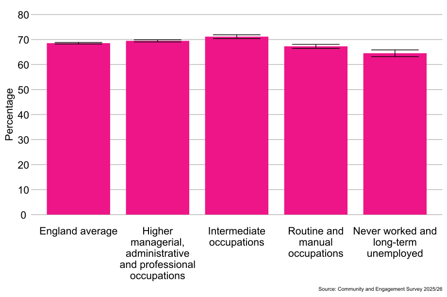
As shown in Figure 2.9, people from the intermediate occupations classification (71%) were more likely to chat to their neighbour at least once a month than people from the higher managerial classification, administrative and professional occupations classification (69%), the routine and manual occupations classification (67%) and the never worked and long-term unemployed classification (65%).
Figure 2.9: Percentage of people who chat to their neighbours at least once a month, by socio-economic classification, England: 2025/26 (Base: All people aged 16 and over)
3.11 Index of Multiple Deprivation
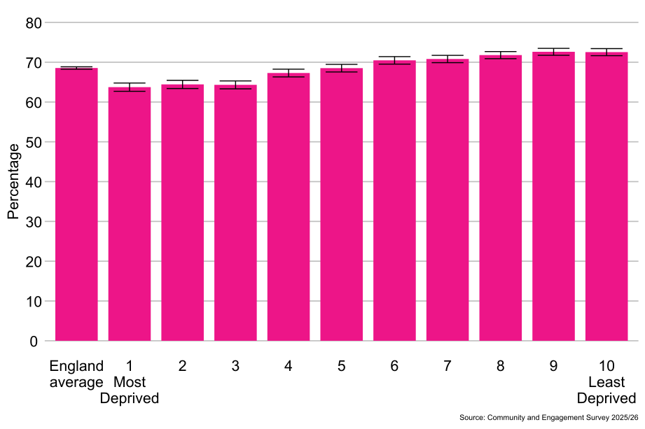
As shown in Figure 2.10, people living in the least deprived areas (10th decile, 73%) were more likely to chat to their neighbour at least once a month than people living in the most deprived areas (1st decile, 64%).
Figure 2.10: Percentage of people who chat to their neighbours at least once a month, by Index of Multiple Deprivation, England: 2025/26 (Base: All people aged 16 and over)
3.12 People who chat to their neighbours at least once a month by local authority area and ITL1 area
3.13 Regional differences[footnote 9]
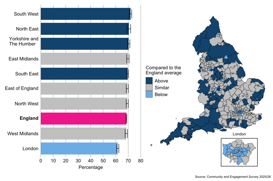
Compared with the average for people in England (69%) people living in the South West (72%), North East (71%), Yorkshire and the Humber (70%) and South East (70%) ITL1 areas were more likely to chat to their neighbours at least once a month. People living in the London (62%) ITL1 area were less likely to chat to their neighbours at least once a month compared with the average for people in England (69%).
3.14 Local authority differences[footnote 10]
By local authority, there was a 48 percentage point difference in the proportion of people who chat to their neighbours at least once a month, from 85% in Derbyshire Dales to 36% in City of London.
If the City of London is removed as an outlier,[footnote 11] there is a 33 percentage point difference between Derbyshire Dales (85%) and Lambeth (52%).
The proportion of people who chat to their neighbours at least once a month was in line with the England average in 194 (66%) local authorities, higher than the England average in 60 (20%) local authorities and below the England average in 41 (14%) local authorities.
Figure 2.11: People who chat to their neighbours at least once a month, by ITL1 area and local authority, England: 2025/26 (Base: All people aged 16 and over)
4. Neighbourhood collaboration - agreement that people in the neighbourhood pull together to improve the neighbourhood
4.1 Timeseries
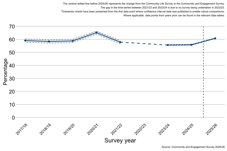
As shown in Figure 3.1, levels of agreement that people in the neighbourhood pull together to improve the neighbourhood in 2025/26 were higher (61%) than those reported in 2024/25 (56%), though lower than levels reported in 2020/21 (65%).
Note: There are considerable changes in the confidence intervals between each year due to the sample size of the survey. Where the sample has been boosted, the confidence intervals will narrow to reflect higher confidence in the estimates.
Figure 3.1: Percentage of people who agreed that people in the neighbourhood pull together to improve the local area, England: 2017/18 to 2025/26 (Base: All people aged 16 and over)
4.2 Demographics
Demographic questions in the survey are voluntary and self-reported by the respondent.
4.3 Age
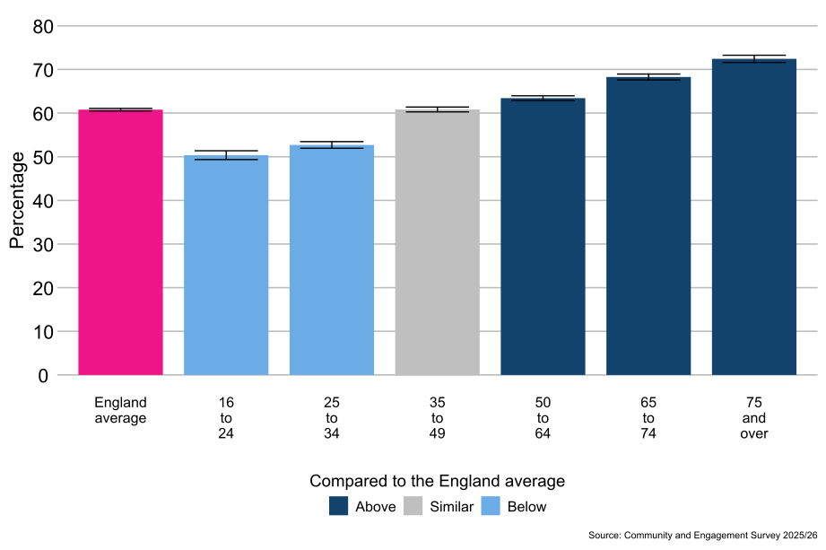
As shown in Figure 3.2, people aged 50 to 64 (63%), 65 to 74 (68%), and 75 and over (72%) were more likely to agree that people in the neighbourhood pull together to improve the neighbourhood compared with the average for people in England (61%). People aged 16 to 24 (50%) and 25 to 34 (53%) were less likely to agree that people in the neighbourhood pull together to improve the neighbourhood compared with the average for people in England (61%).
Figure 3.2: Percentage of people who agreed that people in the neighbourhood pull together to improve the neighbourhood, by age, England: 2025/26 (Base: All people aged 16 and over)
4.4 Disability status
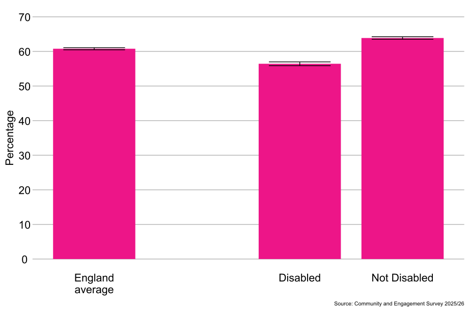
As shown in Figure 3.3, disabled people (56%) were less likely to agree that people in the neighbourhood pull together to improve the neighbourhood than non-disabled people (64%).
Figure 3.3: Percentage of people who agreed that people in the neighbourhood pull together to improve the neighbourhood, by disability, England: 2025/26 (Base: All people aged 16 and over)
4.5 Sex[footnote 3]
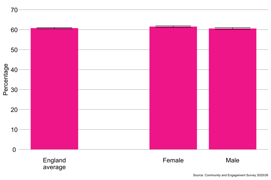
As shown in Figure 3.4, males (61%) were less likely to agree that people in the neighbourhood pull together to improve the neighbourhood than females (62%)
Figure 3.4: Percentage of people who agreed that people in the neighbourhood pull together to improve the neighbourhood, by sex, England: 2025/26 (Base: All people aged 16 and over)
4.6 Gender identity[footnote 4]
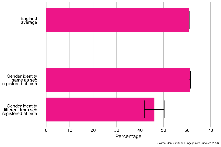
As shown in Figure 3.5, people whose gender identity was the same as their sex registered at birth (61%) were more likely to agree that people in the neighbourhood pull together to improve the neighbourhood than those whose gender identity was different from their sex registered at birth (46%).
Figure 3.5: Percentage of people who agreed that people in the neighbourhood pull together to improve the neighbourhood, by gender identity, England: 2025/26 (Base: All people aged 16 and over)
4.7 Sexual orientation[footnote 5]
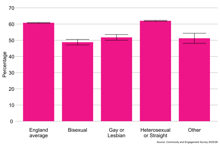
As shown in Figure 3.6, heterosexual or straight people (62%) were more likely to agree that people in the neighbourhood pull together to improve the neighbourhood than gay or lesbian people (52%), people from the “Other sexual orientation” classification (51%), and bisexual people (49%).
Figure 3.6: Percentage of people who agreed that people in the neighbourhood pull together to improve the neighbourhood, by sexual orientation, England: 2025/26 (Base: All people aged 16 and over)
4.8 Religion
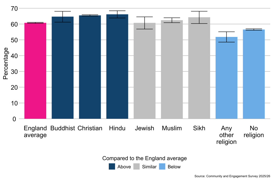
As shown in Figure 3.7, Hindu people (66%), Christian people (65%), and Buddhist people (65%) were more likely to agree that people in the neighbourhood pull together to improve the neighbourhood compared with the average for people in England (61%). People who reported having no religion (57%) and people from the Any other religion classification (52%) were less likely to agree that people in the neighbourhood pull together to improve the neighbourhood compared with the average for people in England (61%).
Figure 3.7: Percentage of people who agreed that people in the neighbourhood pull together to improve the neighbourhood, by religion, England: 2025/26 (Base: All people aged 16 and over)
4.9 Ethnicity
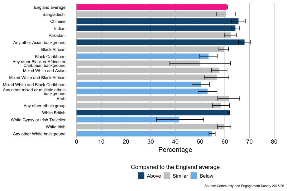
As shown in Figure 3.8, people from the Any other Asian background (68%), Chinese (66%), Indian (64%) and White British[footnote 6] (62%) ethnic groups were more likely to agree that people from their neighbourhood pull together to improve the neighbourhood compared with the average for people in England (61%). People from the Any other White background (55%), Black Caribbean (53%), Any other Mixed or multiple ethnic background (53%), White and Black Caribbean (50%), and White Gypsy or Irish Traveller (42%) ethnic groups were less likely to agree that people from their neighbourhood pull together to improve the neighbourhood compared with the average for people in England (61%).
Figure 3.8: Percentage of people who agreed that people in the neighbourhood pull together to improve the neighbourhood, by ethnicity, England (2025/26) (Base: All people aged 16 and over)
4.10 Socio-economic classification
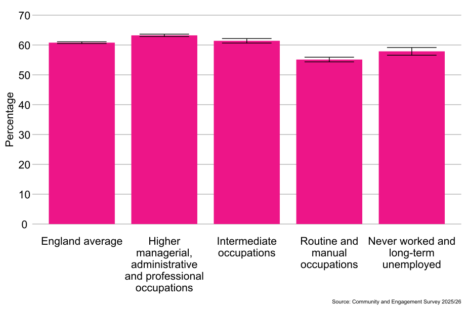
As shown in Figure 3.9, people from the higher managerial, administrative and professional occupations classification (63%) were more likely to agree that people in the neighbourhood pull together to improve the neighbourhood than people from the intermediate occupations classification (61%), the never worked and long-term unemployed classification (58%), and the routine and manual occupations classification (55%).
Figure 3.9: Percentage of people who agreed that people in the neighbourhood pull together to improve the local area, by socio-economic classification, England: 2025/26 (Base: All people aged 16 and over)
4.11 Index of Multiple Deprivation
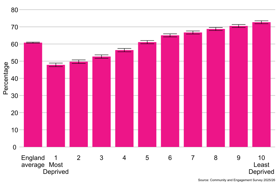
As shown in Figure 3.10, people living in the least deprived areas (10th decile, 73%) were more likely to agree that people in the neighbourhood pull together to improve the neighbourhood than people living in the most deprived areas (1st decile, 48%).
Figure 3.10: Percentage of people who agreed that people in the neighbourhood pull together to improve the neighbourhood, by Index of Multiple Deprivation, England: 2025/26 (Base: All people aged 16 and over)
4.12 People who agreed people in their neighbourhood would pull together to improve the neighbourhood by Local Authority area and ITL1 area
4.13 Regional differences[footnote 9]
As shown in Figure 3.11, compared with the average for people in England (61%), people living in the South West (64%) and South East (63%) ITL1 areas were more likely to agree that people in their neighbourhood would pull together to improve the neighbourhood. People living in the West Midlands (60%) and London (57%) ITL1 areas were less likely to agree that people in their neighbourhood would pull together to improve their neighbourhood compared with the average for people in England (61%).
4.14 Local authority differences[footnote 10]
By local authority, there was a 40 percentage point difference in the proportion of people who agreed that people in their neighbourhood would pull together to improve the neighbourhood from 82% in Derbyshire Dales to 43% in Norwich.
The proportion of people who agreed that people in their neighbourhood would pull together to improve the neighbourhood was in line with the England average in 140 local authorities (47%), higher than the England average in 87 local authorities (29%) and lower in 68 local authorities (23%).
Figure 3.11: People who agreed people in their neighbourhood would pull together to improve the neighbourhood, by ITL1 area and local authority, England: 2025/26 (Base: All people aged 16 and over)
5. Neighbourhood trust - many people in their neighbourhood could be trusted
5.1 Timeseries
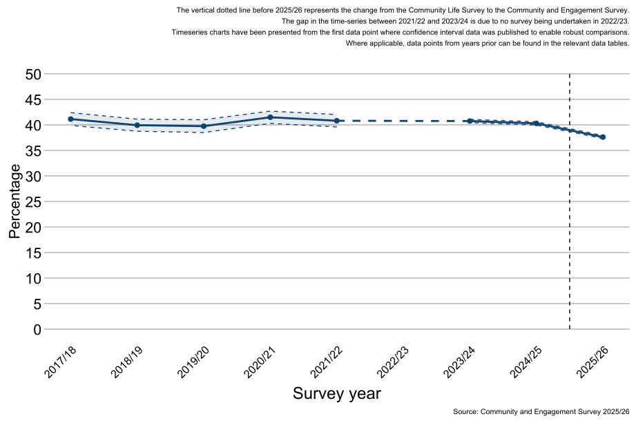
As shown in Figure 4.1, there has been consistent levels of trust between 2017/18 and 2024/2025 (40%-41%). Levels of agreement that many people in their neighbourhood can be trusted decreased by 2 percentage points between 2024/25 (40%) to 38% in 2025/26.
Note: There are considerable changes in the confidence intervals between each year due to the sample size of the survey. Where the sample has been boosted, the confidence intervals will narrow to reflect higher confidence in the estimates.
Figure 4.1: Percentage of people who agree many people can be trusted in this neighbourhood, England: 2017/18 to 2025/26 (Base: All people aged 16 and over)
5.2 Demographics
Demographic questions in the survey are voluntary and self-reported by the respondent.
5.3 Age
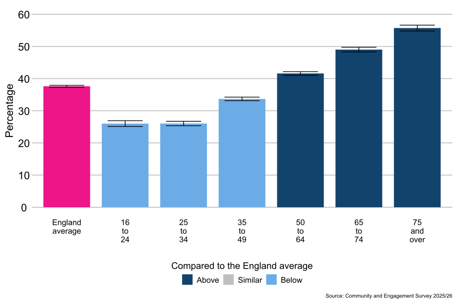
As shown in Figure 4.2, people aged 50 to 64 (42%), 65 to 74 (49%), and 75 and over (56%) were more likely to report that many people in their neighbourhood could be trusted compared with the average for people in England (38%). People aged 16 to 24 (26%), 25 to 34 (26%) and 35 to 49 (34%) were less likely to report that many people in their neighbourhood could be trusted compared with the average for people in England (38%).
Figure 4.2: Percentage of people who agree many of the people can be trusted in this neighbourhood, by age, England: 2025/26 (Base: All people aged 16 and over)
5.4 Disability status
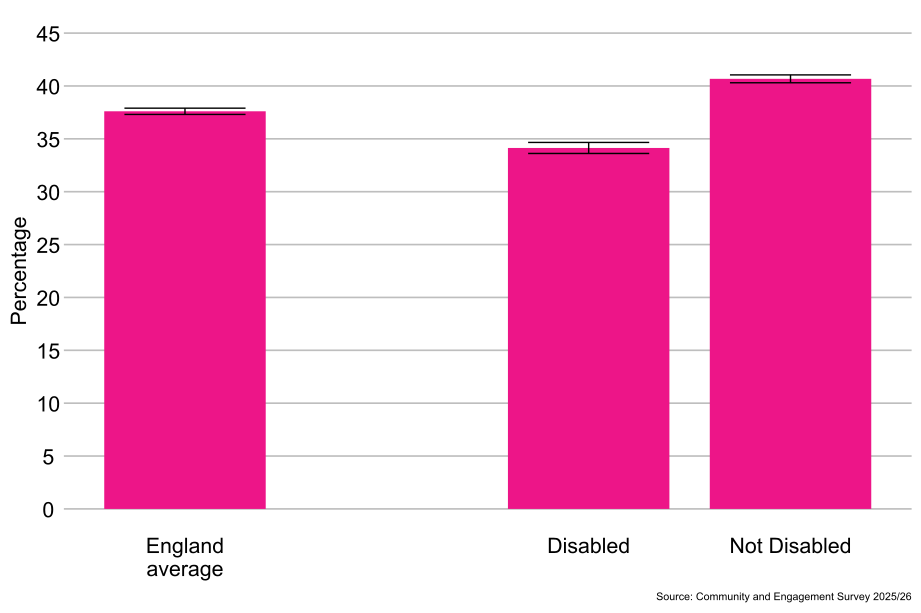
As shown in Figure 4.3, disabled people (34%) were less likely to report that many people in their neighbourhood could be trusted than non-disabled people (41%).
Figure 4.3: Percentage of people who trust people in their neighbourhood, by disability status, England: 2025/26 (Base: All people aged 16 and over)
5.5 Sex[footnote 3]
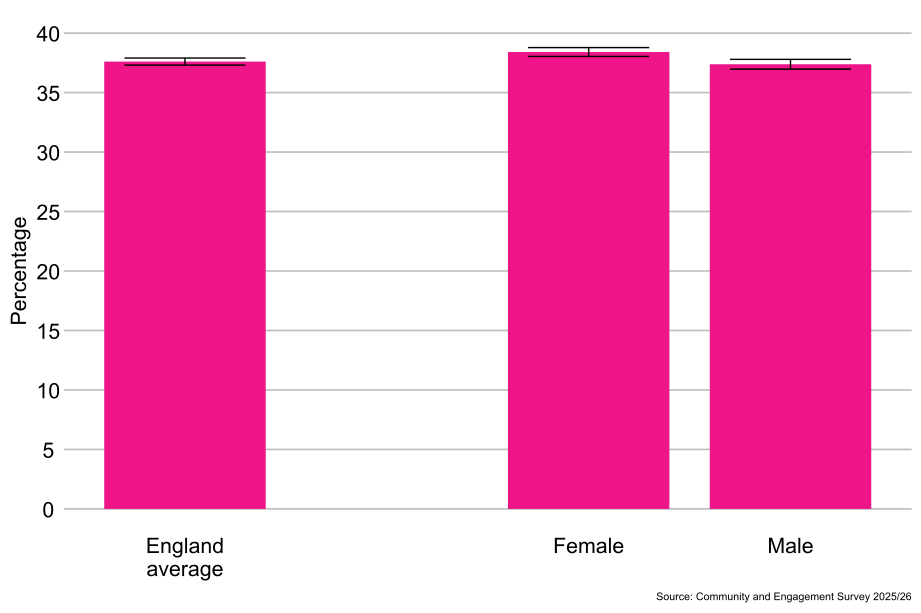
As shown in Figure 4.4, females (38%) were more likely to report that many people in their neighbourhood could be trusted than males (37%).
Figure 4.4: Percentage of people who trust people in their neighbourhood, by sex, England: 2025/26 (Base: All people aged 16 and over)
5.6 Gender identity[footnote 4]
As shown in Figure 4.5, there were no significant differences observed between the proportion of people whose gender identity was the same as their sex registered at birth (38%) and those whose gender identity was different from their sex registered at birth (34%) when reporting whether many people in their neighbourhood could be trusted.
Figure 4.5: Percentage of people who trust people in their neighbourhood, by gender identity, England: 2025/26 (Base: All people aged 16 and over)

5.7 Sexual orientation[footnote 5]
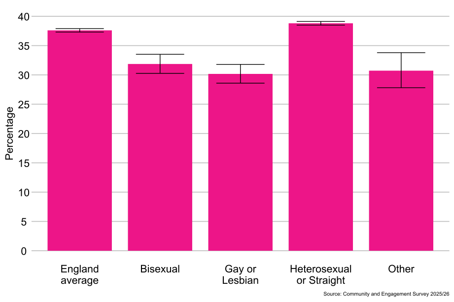
As shown in Figure 4.6, heterosexual or straight people (39%) were more likely to report that many people in their neighbourhood could be trusted than bisexual people (32%), people from the “Other sexual orientation” classification (31%), and gay or lesbian people (30%).
Figure 4.6: Percentage of people who reported many people in their neighbourhood can be trusted, by sexual orientation, England: 2025/26 (Base: All people aged 16 and over)
5.8 Religion
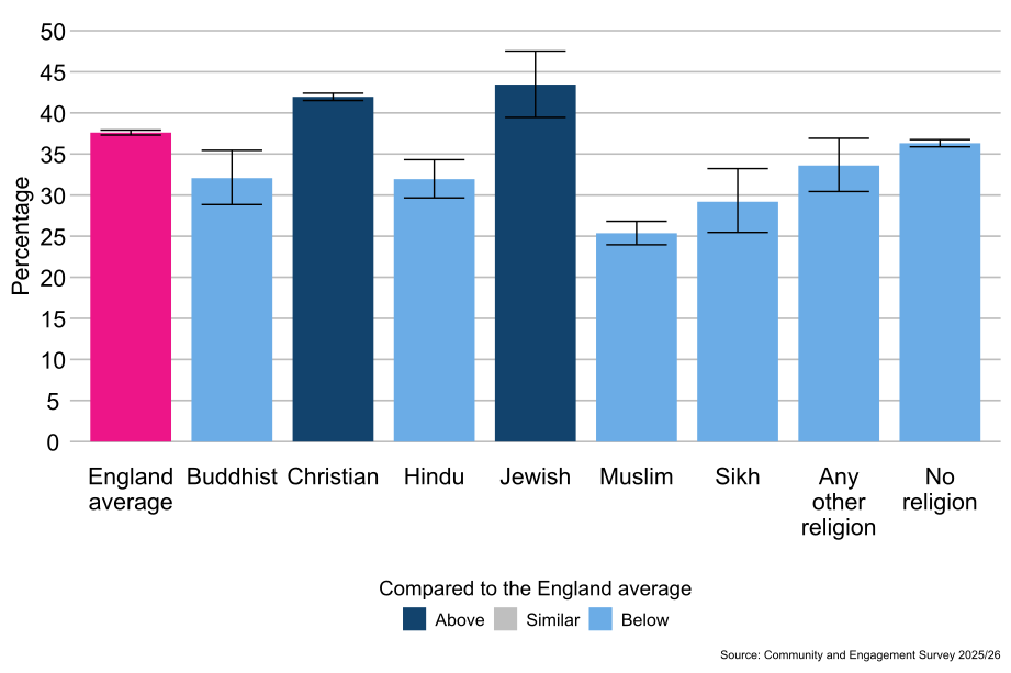
As shown in Figure 4.7, Jewish people (43%) and Christian people (42%) were more likely to report that many people in their neighbourhood could be trusted compared with the average for people in England (38%). People who reported having no religion (36%), people from the Any other religion classification (34%), Buddhist people (32%), Hindu people (32%), Sikh people (29%), and Muslim people (25%) were less likely to report that many people in their neighbourhood could be trusted compared with the average for people in England (38%).
Figure 4.7: Percentage of people who reported many people in their neighbourhood could be trusted, by religion, England: 2025/26 (Base: All people aged 16 and over)
5.9 Ethnicity
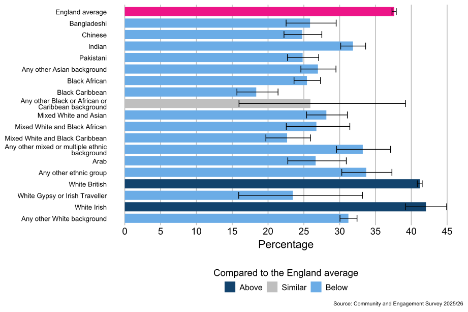
As shown in Figure 4.8, people from the White Irish (42%) and White British[footnote 6] (41%) ethnic groups were more likely to report that many people in their neighbourhood could be trusted, compared with the average for people in England (38%). People from the Any other ethnic background (34%), Any other mixed or multiple ethnic background (33%), Indian (32%), Any other White background (31%), White and Asian (28%), White and Black African (27%), Any other Asian background (27%), Arab (27%), Bangladeshi (26%), Pakistani (25%), Chinese (25%), Black African (25%), Gypsy or Irish Traveller (23%), White and Black Caribbean (23%), and Black Caribbean (18%) ethnic groups were less likely to report that many people in their neighbourhood could be trusted compared with the average for people in England (37%).
Figure 4.8: Percentage of people who reported many people in their neighbourhood can be trusted, by ethnicity, England: 2025/26 (Base: All people aged 16 and over)
5.10 Socio-economic classification
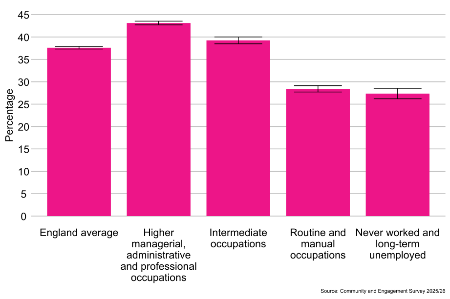
As shown in Figure 4.9, people from the higher managerial, administrative and professional occupations classification (43%) were more likely to report that many people in their neighbourhood could be trusted than people from the intermediate occupations classification (39%), the never worked and long-term unemployed classification (27%), and the routine and manual occupations classification (28%).
Figure 4.9: Percentage of people who reported many people in their neighbourhood could be trusted, by socio-economic classification, England: 2025/26 (Base: All people aged 16 and over)
5.11 Index of Multiple Deprivation
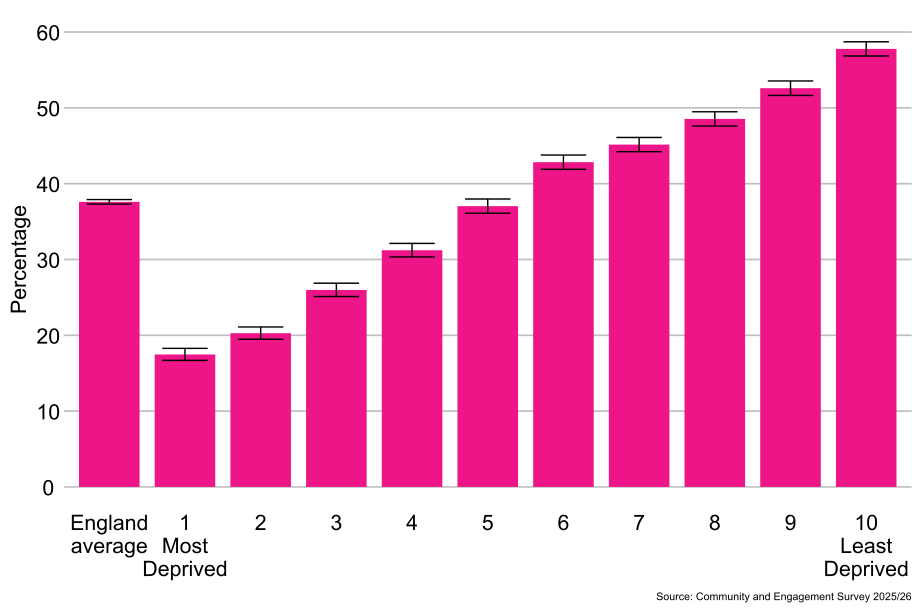
As shown in Figure 4.10, people living in the least deprived areas (10th decile, 58%) were more likely to report that many people in their neighbourhood could be trusted than people living in the most deprived areas (1st decile, 17%).
Figure 4.10: Percentage of people who reported many people in their neighbourhood can be trusted, by Index of Multiple Deprivation, England: 2025/26 (Base: All people aged 16 and over)
5.12 Neighbourhood Trust by local authority area and ITL1 area
5.13 Regional differences[footnote 9]
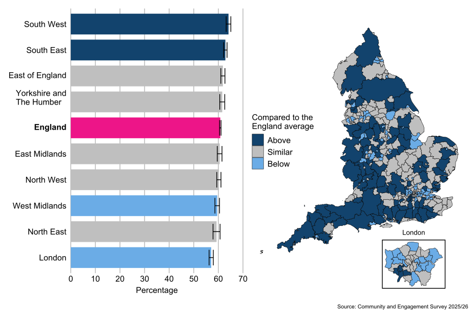
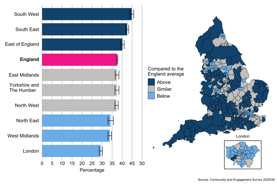
Compared with the average for people in England (38%), people living in the South West (45%), South East (43%) and East of England (40%) ITL1 areas were more likely to report that many people in their neighbourhood could be trusted. People living in the West Midlands (34%), North East (34%) and London (29%) ITL1 areas were less likely to report that many people in their neighbourhood could be trusted compared with the average for people in England (38%).
5.14 Local authority differences[footnote 10]
As shown in Figure 4.11, by local authority, there was a 50 percentage point difference in the proportion of people who reported that many people in their neighbourhood could be trusted from 65% in Derbyshire Dales to 15% in the City of London.
If Derbyshire Dales is excluded[footnote 11], there is a 45 percentage point difference, from 60% in South Hams to 15% in the City of London.
The proportion of people who reported that many people in their neighbourhood could be trusted was lower than the England average of 38% in 84 (28%) local authorities. A total of 103 (35%) local authorities were exactly in line with the England average while 108 (37%) local authorities reported trust rates higher than the England average.
Figure 4.11: People who trust people in their neighbourhood by ITL1 area and local authority, England: 2025/26 (Base: All people aged 16 and over)
6. Agreement that the local area is a place where people from different backgrounds get along well together
6.1 Timeseries
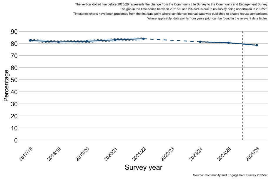
As shown in Figure 5.1, levels of agreement that the local area is a place where people from different backgrounds get along well together have remained consistent over time since 2017/18 (81%-84%) with a slight peak in 2021/22 (84%). Levels of agreement in 2025/26 were lower (79%) than those reported in 2024/25 (81%).
Note: There are considerable changes in the confidence intervals between each year due to the sample size of the survey. Where the sample has been boosted, the confidence intervals will narrow to reflect higher confidence in the estimates.
Figure 5.1: Percentage of people who agree their local area is a place where people from different backgrounds get along well together, England: 2017/18 to 2025/26 (Base: All people aged 16 and over)
6.2 Demographics
Demographic questions in the survey are voluntary and self-reported by the respondent.
6.3 Age
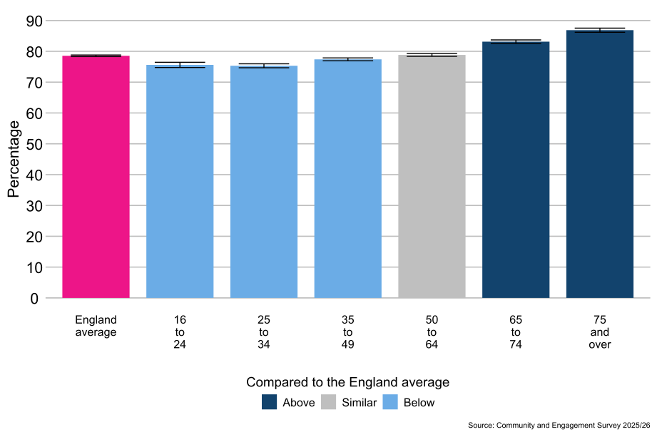
As shown in Figure 5.2, people aged 65 to 74 (83%) and 75 and over (87%) were more likely to agree that their local area is a place where people from different backgrounds get along well together compared with the average for people in England (79%). People aged 16 to 24 (76%), 25 to 34 (75%) and 35 to 49 (77%) were less likely to agree that their local area is a place where people from different backgrounds get along well together compared with the average for people in England (79%).
Figure 5.2: Percentage of people who agree that their local area is a place where people from different backgrounds get along well together, by age, England: 2025/26 (Base: All people aged 16 and over)
6.4 Disability status
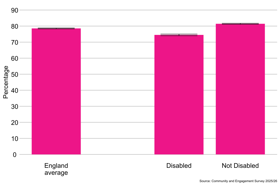
As shown in Figure 5.3, disabled (75%) people were less likely to agree that their local area is a place where people from different backgrounds get along well together than non-disabled people (81%).
Figure 5.3: Percentage of people who agree their local area is a place where people from different backgrounds get along well together, by disability status, England: 2025/26 (Base: All people aged 16 and over)
6.5 Sex[footnote 3]
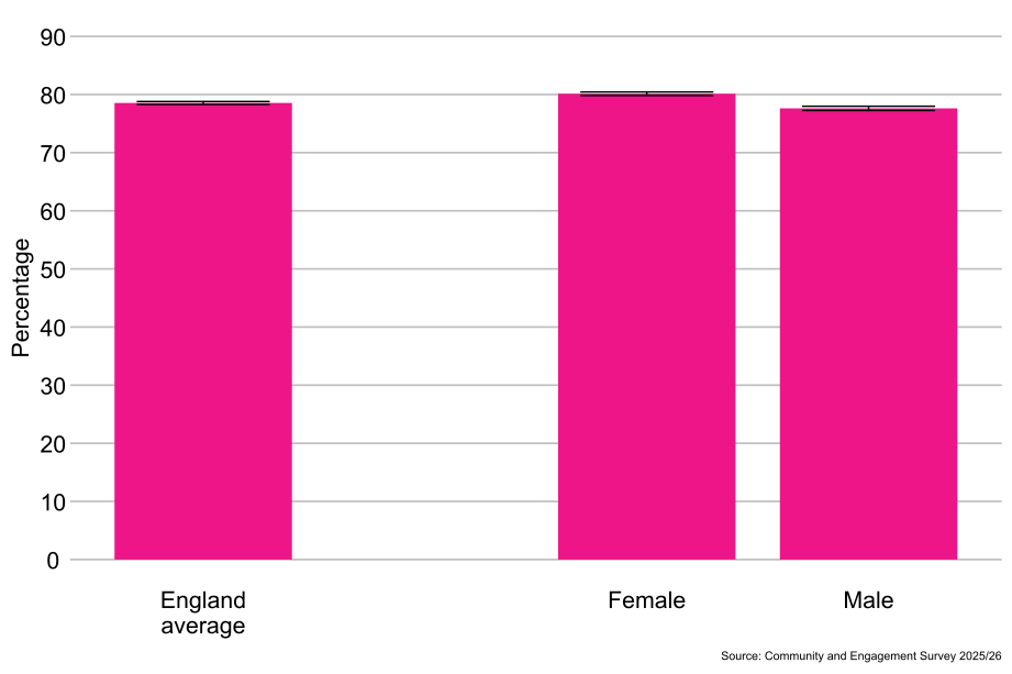
As shown in Figure 5.4, males (78%) were less likely to agree that their local area is a place where people from different backgrounds get along well together than females (80%)
Figure 5.4: Percentage of people who agree their local area is a place where people from different backgrounds get along well together, by sex, England: 2025/26 (Base: All people aged 16 and over)
6.6 Gender identity[footnote 4]
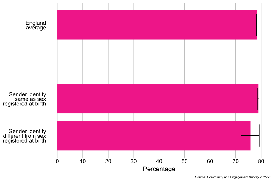
As shown in Figure 5.5, there was no significant difference between people whose gender identity was the same as their sex registered at birth (79%) and those whose gender identity was different from their sex registered at birth (76%) in agreement that their local area is a place where people from different backgrounds get along well together.
Figure 5.5: Percentage of people who agree that their local area is a place where people from different backgrounds get along well together, by gender identity, England: 2025/26 (Base: All people aged 16 and over)
6.7 Sexual orientation[footnote 5]
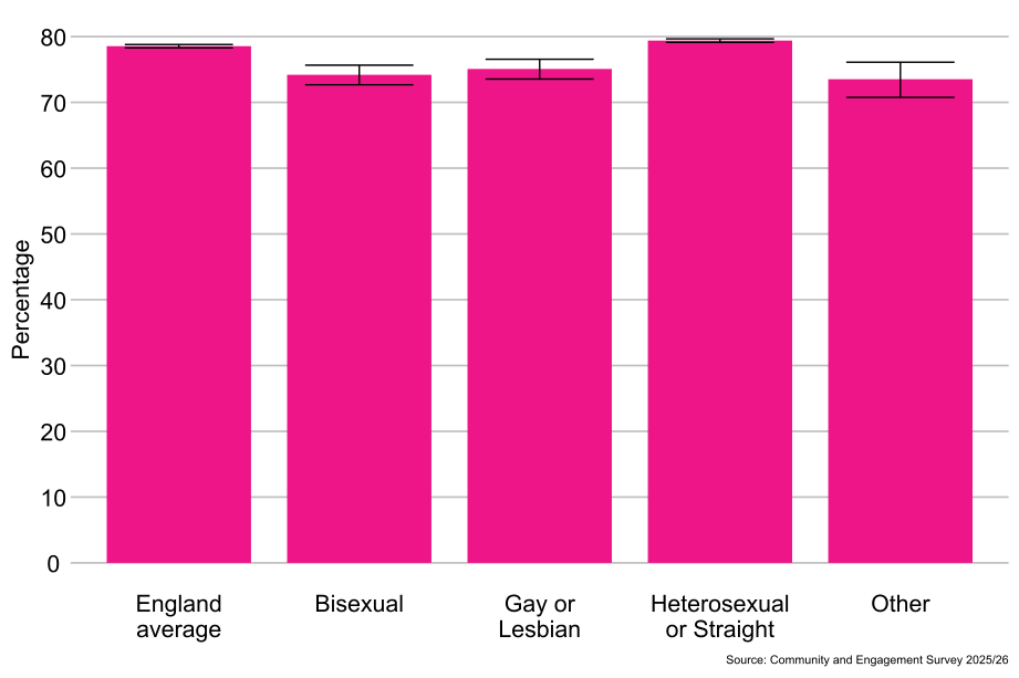
As shown in Figure 5.6, heterosexual or straight people (79%) were more likely to agree that their local area is a place where people from different backgrounds get along well together than gay or lesbian people (75%), bisexual people (74%) and people from the “Other sexual orientation” classification (74%).
Figure 5.6: Percentage of people who agree that their local area is a place where people from different backgrounds get along well together, by sexual orientation, England: 2025/26 (Base: All people aged 16 and over)
6.8 Religion
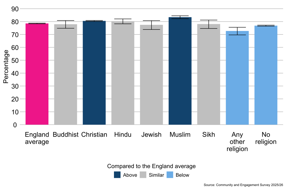
As shown in Figure 5.7, Muslim people (83%) and Christian people (81%) were more likely to agree that their local area is a place where people from different backgrounds get along well together compared with the England average (79%). People who reported having no religion (77%) and people from the Any other religion classification (73%) were less likely to agree that their local area is a place where people from different backgrounds get along well together compared with the England average (79%).
Figure 5.7: Percentage of people who agree that their local area is a place where people from different backgrounds get along well together, by religion, England: 2025/26 (Base: All people aged 16 and over)
6.9 Ethnicity
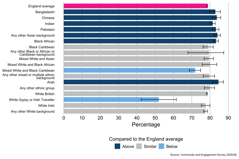
As shown in Figure 5.8, people from the Arab (85%), Any other Asian background (84%), Chinese (84%), Black African (83%), Bangladeshi (83%), Pakistani (83%) and Indian (81%) ethnic groups were more likely to agree that their local area is a place where people from different backgrounds get along well together, compared with the average for people in England (79%). People from the White and Black Caribbean (72%), and White Gypsy or Irish Traveller (52%) ethnic groups were less likely to agree that their local area is a place where people from different backgrounds get along well together compared with the average for people in England (79%).
Figure 5.8: Percentage of people who agree that their local area is a place where people from different backgrounds get along well together, by ethnicity, England: 2025/26 (Base: All people aged 16 and over)
6.10 Socio-economic classification
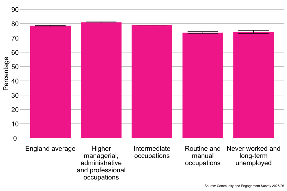
As shown in Figure 5.9, people from the higher managerial, administrative and professional occupations classification (81%) were more likely to agree that their local area is a place where people from different backgrounds get along well together than people from the intermediate occupations classification (79%), the routine and manual occupations classification (74%), and the never worked and long-term unemployed classification (74%).
Figure 5.9: Percentage of people who agree that their local area is a place where people from different backgrounds get along well together, by socio-economic classification, England: 2025/26 (Base: All people aged 16 and over)
6.11 Index of Multiple Deprivation
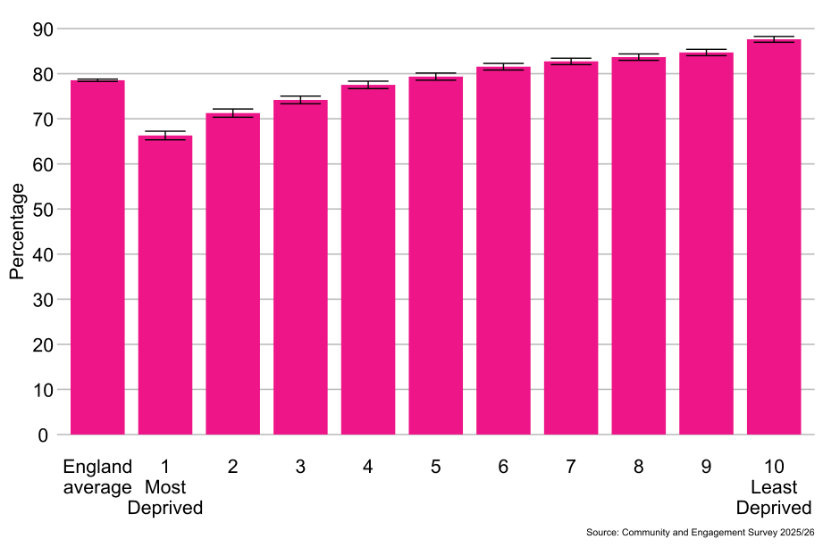
As shown in Figure 5.10, people living in the least deprived areas (10th decile, 88%) were more likely to agree that their local area is a place where people from different backgrounds get along well together than people living in the most deprived areas (1st decile, 66%).
Figure 5.10: Percentage of people who agree that their local area is a place where people from different backgrounds get along well together, by Index of Multiple Deprivation, England: 2025/26 (Base: All people aged 16 and over)
6.12 Agreement people from different backgrounds get along by local authority area and ITL1 area
6.13 Regional differences[footnote 9]
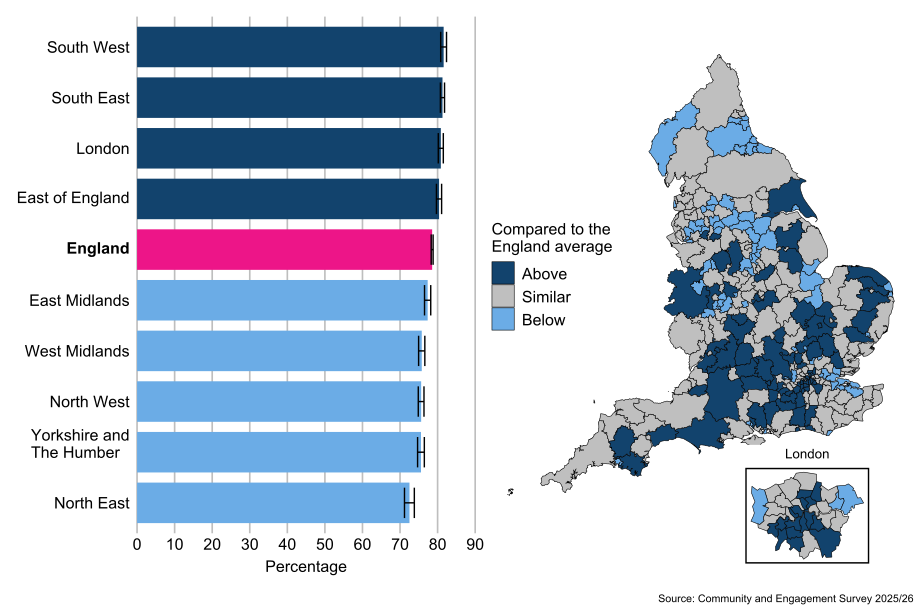
Compared with the average for people in England (79%), people living in the South West (82%), South East (81%), London (81%) and East of England (80%) ITL1 areas were more likely to agree that their local area is a place where people from different backgrounds get along. Compared with the average for people in England (79%), people living in the East Midlands (77%), North West (76%), Yorkshire and The Humber (76%), West Midlands (76%), and North East (73%) ITL1 areas were less likely to agree that their local area is place where people from different backgrounds get along.
6.14 Local authority differences[footnote 10]
By local authority, there was a 34 percentage point difference in the proportion of people who agree that their local area is a place where people from different backgrounds get along, from 92% in the City of London to 59% in Boston.
The proportion of people who agree that their local area is a place where people from different backgrounds get along was lower than the England average of 79% in 67 (23%) local authorities. A total of 146 (49%) local authorities were exactly in line with the England average, while 82 (28%) local authorities reported agreement rates higher than the England average.
Figure 5.11: People who agree that people from different backgrounds get along in their local area, by ITL1 area and local authority, England: 2025/26 (Base: All people aged 16 and over)
7. Change in local area over last two years
7.1 Timeseries
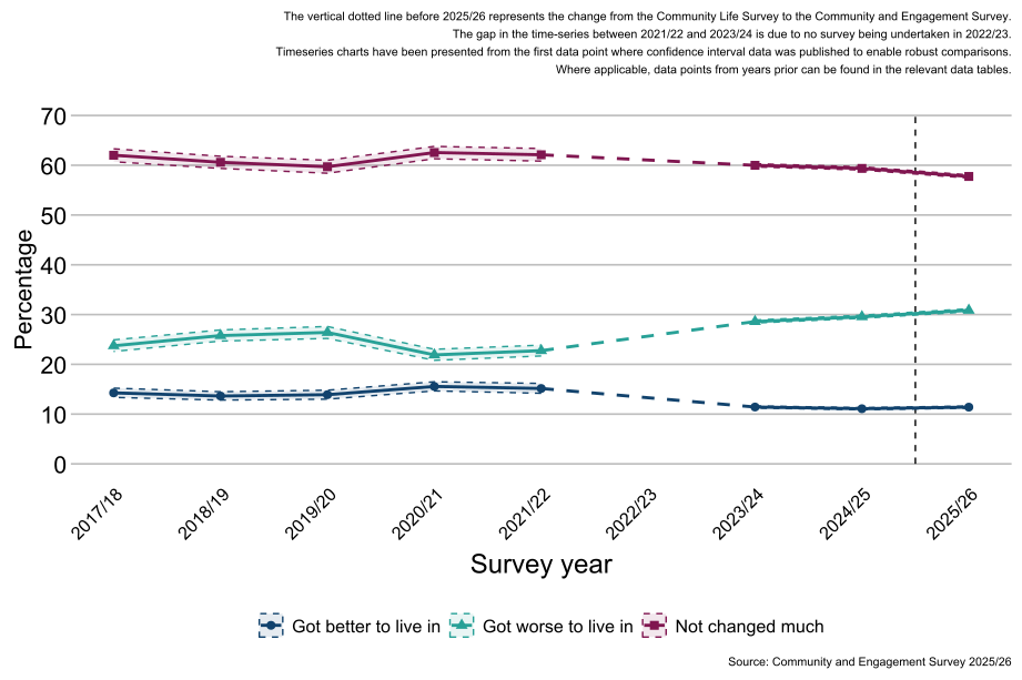
As shown in Figure 6.1, the proportion of respondents in 2025/26 (11%) reporting that over the last two years their area has gotten better to live in has not changed significantly from 2024/25 (11%). These reported levels are less than those reported in previous years; between 2017/18 and 2021/22, 14% to 15% of respondents reported that over the last two years their area has got better to live in.
The proportion of respondents in 2025/26 (31%) reporting that over the last two years their area has got worse to live in increased by one percentage point from the previous year 2024/25 (30%). Between 2017/18 and 2021/22 the reported levels ranged between 21% and 26%.
Note: There are considerable changes in the confidence intervals between each year due to the sample size of the survey. Where the sample has been boosted, the confidence intervals will narrow to reflect higher confidence in the estimates.
Figure 6.1: Percentage of people who feel their area has got better to live in, in the last two years, England: 2017/18 to 2025/26 (Base: All people aged 16 and over)
7.2 Demographics: Who felt their area had got better to live in over the last two years?
Demographic questions in the survey are voluntary and self-reported by the respondent.
7.3 Age
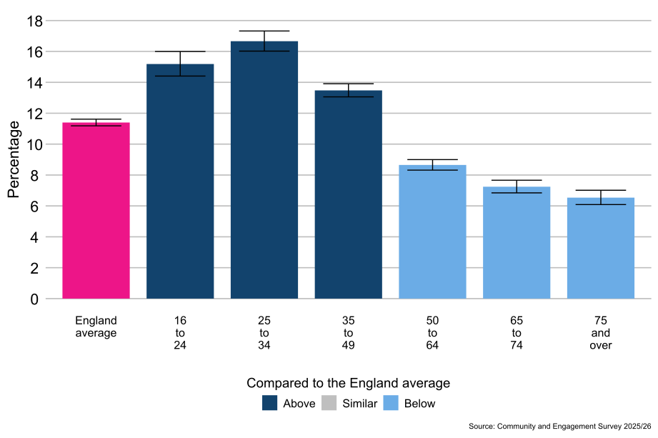
As shown in Figure 6.2, people aged 16 to 24 (15%), 25 to 34 (17%), and 35 to 49 (13%) were more likely to report that their area had got better to live in in the last two years compared with the average for people in England (11%). People aged 50 to 64 (9%), 65 to 74 (7%), and 75 and over (7%) were less likely to report that their area had got better to live in in the last two years compared with the average for people in England (11%).
Figure 6.2: Percentage of people who feel their area has got better to live in, by age, England: 2025/26 (Base: All people aged 16 and over)
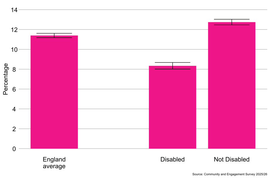
7.4 Disability status
As shown in Figure 6.3, non-disabled people (13%) were more likely to report that their area had got better to live in in the last two years than disabled people (8%).
Figure 6.3: Percentage of people who feel their area has got better to live in, by disability status, England: 2025/26 (Base: All people aged 16 and over)
7.5 Sex[footnote 3]
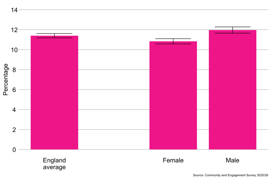
As shown in Figure 6.4, males (12%) were more likely than females (11%) to report that their area had got better to live in in the last two years.
Figure 6.4: Percentage of people who feel their area has got better to live in, by sex, England: 2025/26 (Base: All people aged 16 and over)
7.6 Gender identity[footnote 4]
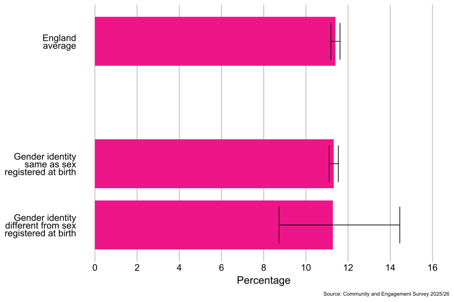
As shown in Figure 6.5, there were no significant differences observed between the proportion of people whose gender identity was the same as their sex registered at birth (11%) and people whose gender identity was different from their sex registered at birth (11%) in reporting that their area had got better to live in in the last two years.
Figure 6.5: Percentage of people who feel their area has got better to live in, by gender identity, England: 2025/26 (Base: All people aged 16 and over)
7.7 Sexual orientation[footnote 5]
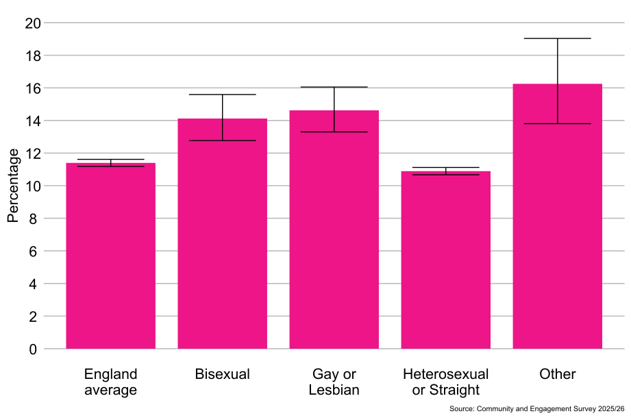
As shown in Figure 6.6, heterosexual or straight people (11%) were less likely to report that their local area had got better to live in over the last two years than people from the “Other sexual orientation” classification (16%), bisexual people (14%), and gay or lesbian people (15%).
Figure 6.6: Percentage of people who feel their area has got better to live in, by sexual orientation, England: 2025/26 (Base: All people aged 16 and over)
7.8 Religion
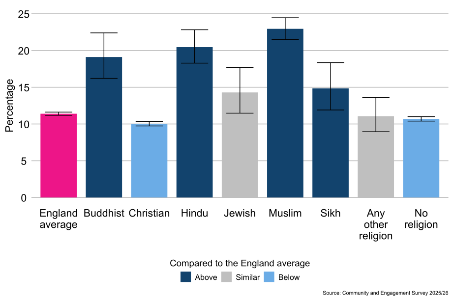
As shown in Figure 6.7, compared with the average for people in England (11%), Muslim people (23%), Hindu people (20%), Buddhist people (19%) and Sikh people (15%) were more likely to report that their local area had got better to live in over the last two years. Christian people (10%) and people who reported having no religion (11%) were less likely to report that their local area had got better to live in over the last two years compared with the average for people in England (11%).
Figure 6.7: Percentage of people who feel their area has got better to live in, by religion, England: 2025/26 (Base: All people aged 16 and over)
7.9 Ethnicity
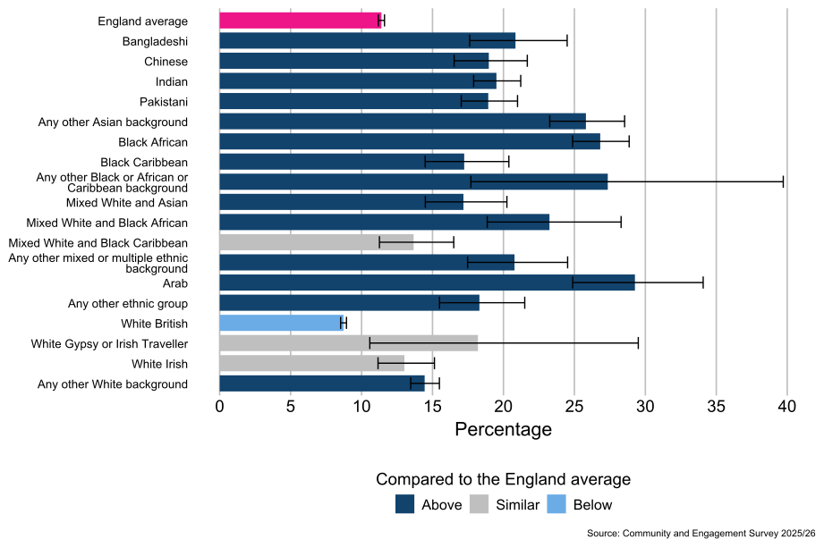
As shown in Figure 6.8, compared with the average for people in England (11%) people from the Arab (29%), Black African (27%), Any other Black or African or Caribbean background (27%), Any other Asian background (26%), White and Black African (23%), Bangladeshi (21%), Any other Mixed or multiple ethnic background (21%), Indian (20%), Pakistani (19%), Chinese (19%), Any other ethnic group (18%), Black Caribbean (17%), White and Asian (17%), and Any other White background (14%) ethnic groups were more likely to report that their area had got better to live in over the last two years. People from the White British[footnote 6] (9%) ethnic group were less likely to report that their area had got better to live in over the last two years compared with the average for people in England (11%).
Figure 6.8: Percentage of people who feel their area has got better to live in, by ethnicity, England: 2025/26 (Base: All people aged 16 and over)
7.10 Socio-economic classification[footnote 7]
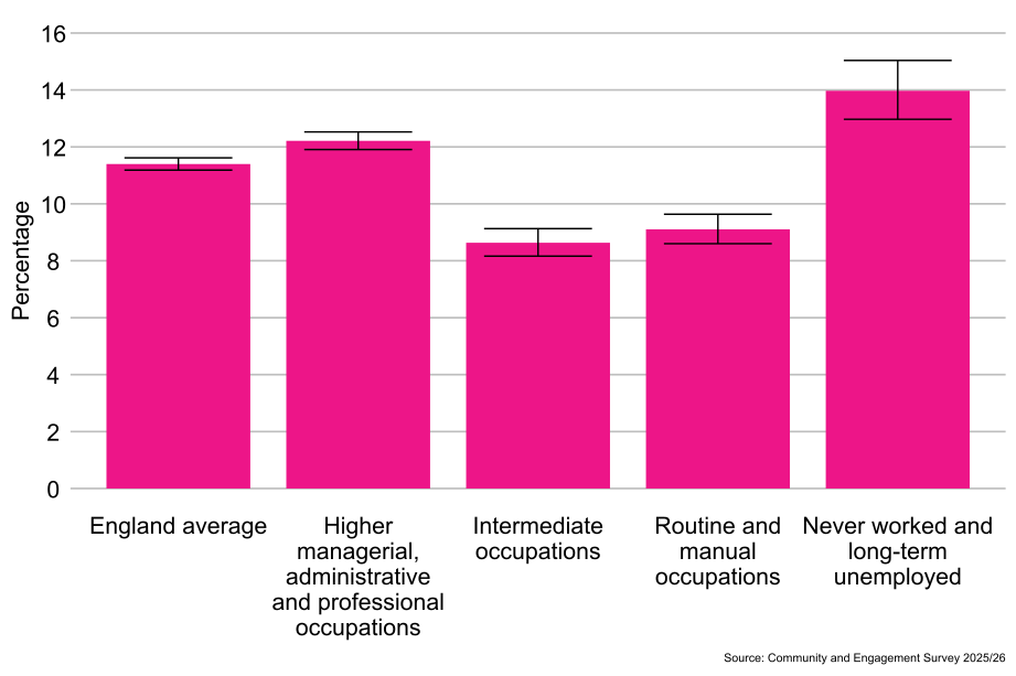
As shown in Figure 6.9, people from the never worked and long-term unemployed classification (14%) were more likely to report that their local area had got better to live in over the last two years than people from the higher managerial, administrative and professional occupations classification (12%), the intermediate occupations classification (9%), and the routine and manual occupations classification (9%).
Figure 6.9: Percentage of people who feel their area has got better to live in, by socio-economic classification, England: 2025/26 (Base: All people aged 16 and over)
7.11 Index of Multiple Deprivation[footnote 8]
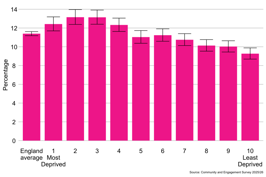
As shown in Figure 6.10, people from the most deprived areas (1st decile, 12%) were more likely to report that their local area had got better to live in over the last two years than people from the least deprived areas (10th decile, 9%).
Figure 6.10: Percentage of people who feel their area has got better to live in, by Index of Multiple Deprivation, England: 2025/26 (Base: All people aged 16 and over)
7.12 Change in local area over last two years by local authority area and ITL1 area
7.13 Regional differences[footnote 9]
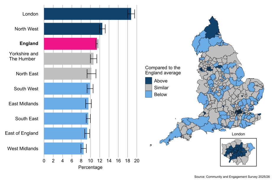
Compared with the average for people in England (11%), people living in the London (19%) and North West (13%) ITL1 areas were more likely to report that their local area had got better to live in over the last two years. Compared with the average for people in England (11%), people living in East Midlands (10%), South East (10%), South West (10%), East of England (9%), and West Midlands (9%) ITL1 areas were less likely to report that their local area had got better to live in over the last two years.
7.14 Local authority differences[footnote 10]
By local authority, there was a 31 percentage point difference in the proportion of people who reported that their local area had got better to live in over the last two years, from 34% in Hackney to 3% in Boston.
The proportion of people who reported that their local area had got better to live in over the last two years was in line with the average for people in England (11%) in 179 (61%) local authorities, lower than the England average of 11% in 80 (27%) local authorities and above in 36 (12%) local authorities.
Figure 6.11: Percentage of people who feel their area has got better to live in by ITL1 area and local authority, England: 2025/26 (Base: All people aged 16 and over)
-
Questions within the Community pathway of the Community and Engagement Survey were asked to respondents from October 2025 to March 2026 only. ↩
-
The majority of estimates in this report are rounded to the nearest whole number. As data are rounded, some changes may appear bigger or smaller than they are. The unrounded numbers are available in the corresponding data tables. ↩
-
This data is based on the respondent’s sex. The Community and Engagement Survey respondents were asked the question “What is your sex?”. The response options were ‘Male’, ‘Female’ and ‘Prefer not to Say’. This closely follows the ONS Census 2021 question for sex, where the target concept was certificated sex meaning a person’s sex at birth or as modified by a Gender Recognition Certificate (GRC), but has been slightly amended to include a ‘Prefer not to Say’ option as we do for all demographic questions in the Community and Engagement Survey. ↩ ↩2 ↩3 ↩4 ↩5 ↩6
-
This data is based on the respondent’s gender identity. The Community and Engagement Survey respondents were asked the question ‘Is the gender you identify with the same as your sex registered at birth?. The response options were ‘Yes’, ‘No, type in gender identity’ or ‘Prefer not to say’. This closely follows the ONS Census 2021 question for England and Wales, but has been slightly amended to include a ‘Prefer not to Say’ option as we do for all demographic questions in the Community and Engagement Survey. It should be noted that in the Census 2021 data for England and Wales, patterns were identified that suggest that some respondents may not have interpreted the question as intended, notably those with lower levels of English language proficiency. Analysis of Scotland’s Census 2022, where the gender identity question was different, has added weight to this observation. More information can be found in the ONS sexual orientation and gender identity quality information report and the additional guidance and quality information for users of gender identity estimates from Census 2021 in England and Wales. Similar respondent error may have occurred during the data collection for these statistics so comparisons between subnational and other smaller group breakdowns should be considered with caution. ↩ ↩2 ↩3 ↩4 ↩5 ↩6
-
Sexual orientation is an umbrella term covering sexual identity, attraction, and behaviour. For an individual respondent, these may not be the same. For example, someone in an opposite-sex relationship may also experience same-sex attraction, and vice versa. This means the statistics should be interpreted purely as showing how people responded to the question, rather than being about whom they are attracted to or their actual relationships. ↩ ↩2 ↩3 ↩4 ↩5 ↩6
-
The White British ethnic group includes adults from an English, Welsh, Scottish, Northern Irish or British ethnic group. ↩ ↩2 ↩3 ↩4 ↩5
-
This is a form of socio-economic classification based on the employment status and occupation of the respondent. ↩ ↩2
-
The Index of Multiple Deprivation is a geographical measure which classifies the relative deprivation of an area. It combines seven indices to produce one overall measure for the area (rather than the individual). It takes into account income, employment, education, skills and training, health and disability, crime, barriers to housing and services, and living environment. For this commentary, the most and least deprived deciles have been compared. There may be some other significant differences between deciles in between which have not been commented on here. The analysis of the Index of Multiple Deprivation was conducted using the 2025 Index of Multiple Deprivation. ↩ ↩2
-
This data is also available by combined authority level and ITL2 area level in the corresponding data tables. ↩ ↩2 ↩3 ↩4 ↩5 ↩6
-
The 2025/26 Community and Engagement Survey includes over 175,000 responses, so confidence intervals are generally very narrow. Whilst this reflects a strength of the data, when highlighting differences, some local authorities may be shown to be above/below the England average, but are only a percentage point more or less than the average. There will be other local authorities who are much higher or lower than the England average, but will both be shown in the same shading within the map. ↩ ↩2 ↩3 ↩4 ↩5 ↩6
-
We have noted these where removing one single local authority makes a substantial difference to the reported range. ↩ ↩2