SPI-M-O: Summary of modelling on scenario for easing restrictions, 7 February 2021
Updated 13 May 2022

© Crown copyright 2022
This publication is licensed under the terms of the Open Government Licence v3.0 except where otherwise stated. To view this licence, visit nationalarchives.gov.uk/doc/open-government-licence/version/3 or write to the Information Policy Team, The National Archives, Kew, London TW9 4DU, or email: psi@nationalarchives.gov.uk.
Where we have identified any third party copyright information you will need to obtain permission from the copyright holders concerned.
This publication is available at https://www.gov.uk/government/publications/spi-m-o-summary-of-modelling-on-scenario-for-easing-restrictions-6-february-2021/spi-m-o-summary-of-modelling-on-scenario-for-easing-restrictions-7-february-2021
1. This document is a summary of modelling by University of Warwick and Imperial College London. It is an update to a paper presented at SAGE on 4 February and has been signed off by SPI-M-O’s chairs on behalf of the committee.
Summary
2. 4 scenarios have been modelled that differ in the speed of easing restrictions from current levels to minimal measures. All 4 scenarios modelled lead to a substantial resurgence in hospital admissions and deaths.
3. The scale and timing of these resurgences are critically dependent on very uncertain modelled assumptions, including real world vaccine effectiveness against severe disease and infection; vaccine coverage and rollout speed; behavioural factors; and the extent to which baseline measures (which could be voluntary) continue to reduce transmission once restrictions are lifted. Given this uncertainty, it would be inadvisable to tie changes in policy to dates instead of data.
4. Unless vaccine efficacy is significantly better than assumed here, it is highly likely that hospital occupancy would be higher than that seen in January 2021, if all restrictions are lifted by the start of May, even under the optimistic vaccine rollout scenario modelled here of 4 million doses per week from the end of March 2021.
5. As restrictions are relaxed virus transmission will increase. The more slowly restrictions are relaxed, the greater the number of hospitalisations and deaths prevented by vaccination and hence it would be less likely that restrictions would need to be reimposed later to avoid hospitals being put under extreme pressure. Rapid relaxation results in a very large wave of hospitalisations and deaths.
6. A resurgence occurs because there are still many people in vulnerable groups who do not have protection; neither directly (either because they have not been vaccinated, or because their vaccination has not prevented them from becoming infected then ill) nor indirectly from wider population immunity (because many younger age groups have not yet been vaccinated or infected).
7. It would take several weeks after lifting one set of restrictions to determine whether it is safe to take the next step.
8. Maintaining baseline measures to reduce transmission once restrictions are lifted is almost certain to save many lives and minimise the threat to hospital capacity. These could include voluntary measures as well as effective Test, Trace and Isolate.
9. Relaxation of current restrictions would be safer the lower the prevalence and hospital occupancy reached before any relaxations commence. This would give a longer time window to respond if it becomes apparent that the relaxation of measures is leading to an unsustainable rise in hospital admissions. Lower prevalence of infection will also reduce the risk of the evolution of new variants. Hospital occupancy is still very high and will remain so for a significant length of time. SPI-M-O’s medium-term projection of hospital occupancy in England on 8 March is between 5,600 and 12,100 [footnote 1].
Key changes since the paper of 4 February
The scenarios being modelled are those commissioned by Cabinet Office and cover England only (see Appendix 1 for details). Both groups assume a significant baseline reduction in transmission due to measures (voluntary or otherwise) after the Tiers system is lifted.
Rollout assumptions are significantly quicker than previously modelled (a large increase from current rates to 4 million doses per week from the final week in March).
Coverage assumptions are significantly more optimistic (including 95% in over 80s).
Key assumptions
Rollout speed: Per current plan until 22 March, then 4 million per week in England.
Compliance: The same in each Tier as in Autumn.
Vaccine reduction in risk of infection:
| Central | Pessimistic | |
|---|---|---|
| First dose | 48% | 24% |
| Second dose | 60% | 30% |
Vaccine reduction in risk of hospital admission or death:
| Central | Pessimistic | |
|---|---|---|
| First dose | 70% | 56% |
| Second dose | 88% | 70% |
Coverage achieved:
| Central (Warwick) | Pessimistic (Warwick), Single scenario (Imperial) | |
|---|---|---|
| Over 80s | 95% | 95% |
| 50 to 80 year old | 85% | 85% |
| Under 50s | 85% | 75% |
10. Models assume a significant increase in vaccine rollout speed, to 4 million per week in England from 22 March. Both groups considered 2 scenarios (named “central” and “pessimistic”) for vaccine efficacy based on data from trials, and 2 or 3 scenarios for transmission under baseline measures once Tiers have been lifted. Warwick considered 2 scenarios for vaccine coverage. Efficacy assumptions given here are those used by Warwick; those used by Imperial were slightly different. A full set of assumptions is given in Appendix 2.
Results
11. The left-hand column of Figure 1 shows the number of hospital admissions, hospital occupancy, and deaths in each of the 4 scenarios from the Imperial model under the most optimistic set of assumptions (namely, this is the best plausible outcome in terms of epidemic progression). Warwick’s model shows qualitatively similar results, and are in remarkable quantitative agreement about hospital admissions, using the central estimates for vaccine efficacy [footnote 2].
12. Even with these optimistic set of assumptions, including 4 million doses per week from 22 March and the long-term retention of measures to reduce transmission, under scenario one (purple lines), there is another wave comparable in size to January 2021, resulting in a further 62,000 to 107,000 deaths in England [footnote 3].
13. Under the more pessimistic efficacy assumptions (right-hand column), this wave is significantly larger still, with 102,000 to 176,000 further deaths in England.
14. Taking a careful approach to relaxing NPIs is likely to save many lives. Under the central assumptions, unlocking between March and 5 July (scenario 3 – red lines) leads to approximately 10,000 fewer deaths than the same measures happening around a month more quickly (scenario 2 – blue lines).
Figure 1: England daily hospital admissions (top row), daily deaths (middle row) and hospital bed occupancy (bottom row) with central assumptions (left column); low baseline of reduction in transmission kept in place (central column); and pessimistic efficacy assumptions (right column). Colours represent the 4 scenarios (purple is 1, blue is 2, red is 3, yellow is 4). Assumed 4 million doses per week from 22 March, coverage of 95% (over 80s), 85% (50 to 80 year olds) and 75% (under 50s). From the Imperial College model.
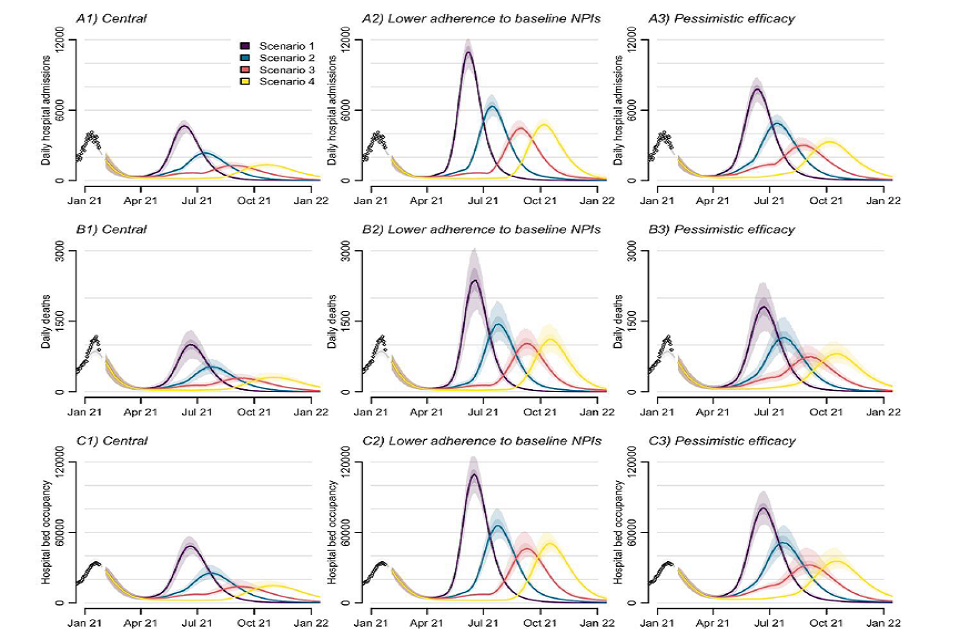
Nine fan charts showing the resurgence in admissions, occupancy and deaths is lower and occurs later in scenarios 2, 3 and 4 compared to 1. It is higher assuming pessimistic vaccine efficacy, and higher still if lower adherence to baseline NPIs is assumed
15. The resurgence is lower in the scenarios where measures are lifted more slowly (blue, red, and yellow lines). In the most optimistic set of scenarios (left-hand column), these peaks are all very high but lower than in January 2021.
16. Under more pessimistic vaccine efficacy assumptions (right-hand column), however, scenario 2 (blue) exceeds the size of the January 2021 peak and scenarios 3 and 4 approach it. Under both sets of assumptions, the height of the peaks in scenarios 3 (red) and 4 (yellow) are similar because the optimistic vaccine rollout assumptions mean a large proportion of vulnerable people in both scenarios have had 2 doses before leaving Tier one [footnote 4]. If the rollout were slower than 4 million per week, scenario 3 would result in a higher number of deaths and admissions than scenario 4.
17. Clinical trials are not sufficiently powered to fully test efficacy of vaccines against severe disease, hospitalisation, or death. To illustrate the effect of higher protection against severe disease, sensitivity analysis has been performed by the University of Warwick to show what effect 99% protection from the vaccine might have on the subsequent waves under each scenario (see Appendix 3). Even when baseline measures of NPIs are retained and assumed to lead to moderate levels of transmission in the final stage of easing, there is the potential for resurgences comparable to those seen in November 2021.
18. In the central column of scenarios in Figure one, the more optimistic vaccine efficacy assumptions are used but, once Tiers are lifted, behaviour is closer to that seen pre-COVID-19 instead of maintaining more significant baseline measures to reduce transmission. In each scenario, the peak is approximately twice as high when there is little transmission reduction on exiting Tiers. Under these conditions, the numbers of further deaths range from 100,000 to 171,000 in scenario one to 82,000 to 134,000 in scenario 4.
19. It is impossible to precisely predict how specific policies (especially any baseline measures retained after Tiers are lifted) will change transmission. As these results show, there is considerable uncertainty whether scenarios 2, 3, and 4 can avoid putting hospitals under similar levels of pressure to those seen in January 2021. For that reason, it would be inadvisable to tie changes in policy to dates instead of data.
20. It is much less likely that restrictions would need to be reimposed if an approach were taken in which each step was followed by a careful evaluation of data before any further unlocking was allowed. Several weeks between steps are required to determine if that change has significantly increased transmission.
21. There is greater uncertainty about vaccine efficacy and coverage during the earlier steps of relaxation; although later steps have the potential for causing larger increases in transmission, there will be more data and understanding on the real-world impact of vaccination.
Why are the resurgences so high in these scenarios, even if 4 million people per week are vaccinated from 22 March?
22. There are still many people in vulnerable groups who do not have protection; neither directly (either because they have not been vaccinated or because their vaccination has not prevented them from becoming infected then ill) nor indirectly from wider population immunity (because many younger age groups have not yet been vaccinated or infected).
23. This is illustrated by Figure 2, where the green area shows the proportion of the population who have been protected against disease through vaccination (dark green) and those who have had the vaccine but who have not received protection (light green). The grey areas are unvaccinated. The coloured lines shows how R (excluding the effects of immunity) changes in each of the 4 scenarios.
Figure 2: Increase in mixing (measured as equivalent R in the absence of immunity, left axis) under different release strategies over time, and proportion of the population in England protected against disease through vaccination over time (dark green shading, right axis) and vaccinated (having received one dose) over time (light green shading, right axis). The grey shaded areas show the proportion of the population ineligible for vaccination (such as those younger than 18 years, light grey, right axis) and those who are vaccine hesitant and not taking the vaccine (dark grey, right axis).
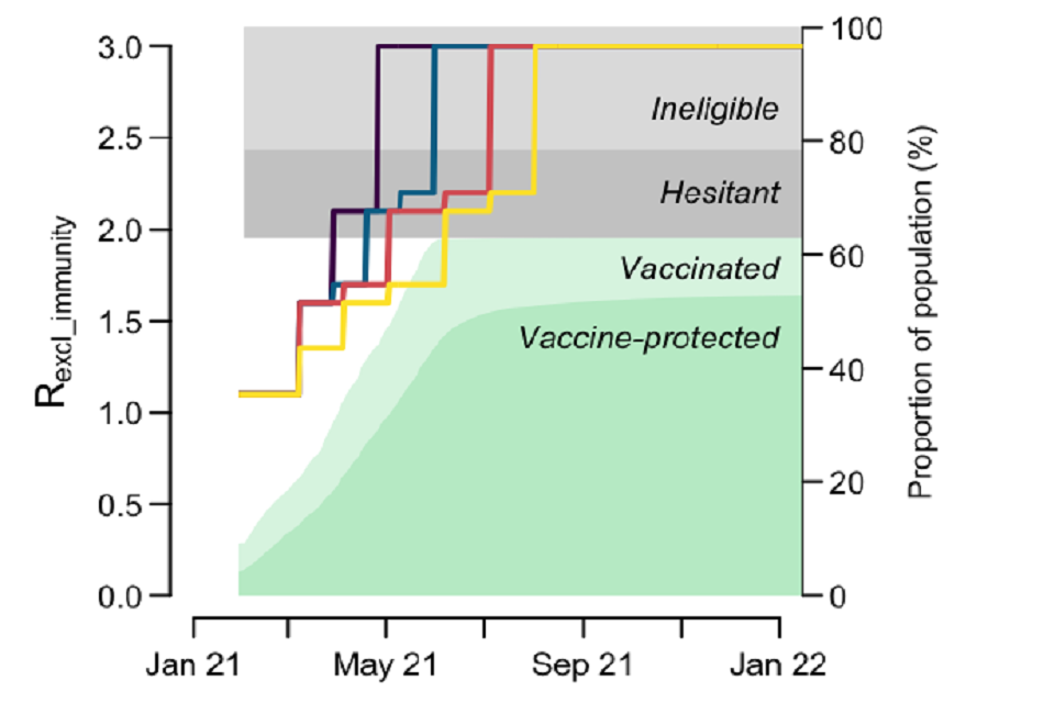
Stacked area chart showing a rising proportion of the population vaccinated in 2021, reaching over 60%, with about 50% protected against disease. Almost 40% are ineligible or hesitant. Line chart showing R excl. immunity over time for the four scenarios.
24. A large proportion of adults remain who are not directly protected by vaccination; in this case: Proportion of adults directly protected against severe disease is equal to 85% vaccine efficacy against severe disease, multiplied by 79% final coverage. This equates to 67%.
25. Only around 79% of the population are adults, which means population level protection is lower, at 53% (dark green in Figure 2). In addition, protection against infection is likely to be lower than that against disease. As a result, herd immunity is not reached without a large resurgence of transmission.
26. Figure 2 also demonstrates that, under the 4 million per week rollout assumption, the levels of protection are very similar in scenarios 3 and 4 at the point of exiting to Tier one. At this point in either scenario 3 or 4, a comparable number of people from JCVI cohorts one to 9 have already been protected through vaccination, thus leading to subsequent resurgences with similar magnitudes.
Efficacy versus effectiveness
27. It is usually observed that the impact of a vaccination when applied in the community is less than that measured under trial conditions. This difference is captured in the 2 words efficacy (measured under trial conditions) and effectiveness (observed in communities) [footnote 5]. The central assumptions used here are from vaccine efficacy trials data and are therefore optimistic estimates for effectiveness in the community.
Implications of uneven vaccine coverage
28. These models do not account for vaccination coverage being different in different communities. Early evidence suggests that coverage has, so far, been lower in some minority ethnic groups. As a result, even if vaccination successfully drives down mortality and morbidity overall, it is highly likely that outbreaks will still happen in some communities.
Seasonality
29. The extent of any seasonal patterns in transmission (either intrinsic to SARS-CoV-2 or as a result of behavioural factors) is not yet clear and so is not included in these models. If transmission is slower in warmer months there would be potential for slightly quicker reopening than these models suggest, but a further resurgence could happen later in the year. This could be particularly acute if waning immunity becomes a factor.
Emergence of vaccine escape mutants
30. These models assume that the field efficacy of vaccines will remain high. Emergence of vaccine escape mutants would lead to decreasing efficacy. Whilst new vaccines can be developed, this will take many months.
Waning immunity
31. These models assume that neither naturally acquired nor vaccine induced immunity wane. Immunity to other coronaviruses is known to wane.
Spatial heterogeneity
32/. These models have focussed on the national average. There is possibility of significant divergence regionally, if the epidemic grows as observed in early autumn 2020. It is possible to have, what appears to be a controlled national scenario alongside a large regional epidemic.
Appendix 1: Scenarios Modelled
| Stage 1 (Schools open) | Stage 2 (Tier 3) | Stage 3 (Tier 2) | Stage 4 (Tier 1) | Baseline measures | |
|---|---|---|---|---|---|
| Scenario 1 | 8 March | 29 March (merged with Stage 3) | 29 March (merged with Stage 2) | n/a | 26 April |
| Scenario 2 | 8 March | 29 March | 19 April | 10 May | 31 May |
| Scenario 3 | 8 March | 5 April | 3 May | 7 June | 5 July |
| Scenario 4 | 8 March (primary), 5 April (all) | 3 May | 7 June | 5 July | 2 August |
Appendix 2: Model assumptions
Vaccine reduction in risk of infection (all ages)
Imperial College
| Central | Pessimistic | |
|---|---|---|
| AZ 1 dose | 48% | 24% |
| AZ 2 dose | 60% | 30% |
| PF 1 dose | 48% | 48% |
| PF 2 dose | 60% | 60% |
Warwick
| Central | Cautious | |
|---|---|---|
| 1 dose | 48% | 24% |
| 2 dose | 60% | 30% |
Based on a weighted average of the 2 vaccines.
Vaccine reduction in risk of hospital admission or death (all ages)
Imperial College
| Central | Pessimistic | |
|---|---|---|
| AZ 1 dose | 70% | 56% |
| AZ 2 dose | 82.4% | 70% |
| PF 1 dose | 88% | 88% |
| PF 2 dose | 94% | 94% |
Warwick
| Central | Cautious | |
|---|---|---|
| First dose | 70% | 56% |
| Second dose | 88% | 70% |
Based on a weighted average of the 2 vaccines.
Time to full vaccine protection
Imperial College
2 weeks (dose 1), 1 week (dose 2).
Warwick
2 weeks.
Rollout speed (England basis)
Imperial College
Per current plan until 22 March, then 4m per week.
Warwick
Per current plan until 22 March, then 4m per week.
Vaccine prioritisation
Imperial College
Per JCVI ordering.
Warwick
Per JCVI ordering.
Coverage achieved (all ages)
Imperial College
| Age | Coverage |
|---|---|
| Over 80s | 95% |
| 50-80 year old | 85% |
| Under 50s | 75% |
| Care home residents | 95% |
| Care home workers | 85% |
Warwick
| Age | Central | Cautious |
|---|---|---|
| Over 80s | 95% | 95% |
| 50-80 year old | 85% | 85% |
| Under 50s | 85% | 75% |
Variants
Imperial College
No impact of novel variants other than B.1.1.7.
Warwick
No impact of novel variants other than B.1.1.7.
R until easing
Imperial College
0.8 (as of start of February 2021).
Warwick
0.79 (as of start of February 2021).
Seasonality
Imperial College
None.
Warwick
None.
Waning immunity
Imperial College
None over the timescale modelled.
Warwick
None over the timescale modelled.
School holidays
Imperial College
Not modelled.
Warwick
Modelled.
Effect of Tiers
Imperial College
Estimated from data. Assumed to be the same as in Autumn with no changes in behaviour.
R_excl_immunity is an estimate of what R would be today in the absence of any immunity
| R_excl_immunity | |
|---|---|
| Stage 1 | 1.6 |
| Tier 3 | 1.7 |
| Tier 2 | 2.1 |
| Tier 1 | 2.2 |
Warwick
Stage 1: As today, but with mixing of school Contacts of pupils increase to 80% of pre-COVID-19 levels.
Stage 2: Similar to Tier 3. Mixing equivalent to 70% of Stage 1 and 30% of Stage 4.
Stage 3: Similar to Tier 2. Mixing equivalent to 30% of Stage 1 and 70% of Stage 4.
Stage 4: Similar to Tier 1. Fitted to mid-September levels of control.
Effect of long-term baseline measures to reduce transmission
Imperial College
- Low transmission scenario: R_excl_immunity = 3.
- High transmission scenario: R_excl_immunity = 4.
Warwick
- Low transmission scenario: R_excl_immunity ~ 3.
- Medium transmission scenario: R_excl_immunity ~ 3.6.
- High transmission: R_excl_immunity ~ 4.
This compares to an unmitigated R0 (equivalent to R_excl_immunity with pre-COVID-19 behaviour) of around 4.5.
Appendix 3: Extremely optimistic vaccine efficacy sensitivity analysis
Figure 3: England hospital admissions (top panel) and occupancy (bottom panel) assuming vaccine prevents 99% of all severe disease. Colours represent the 4 scenarios (purple is one, blue is 2, red is 3, yellow is 4). Assumed 4 million doses per week from 22 March, coverage of 95% (over 80s), 85% (50- to 80-year-olds; and under 50s in the optimistic scenario) and 75% (under 50s in the pessimistic scenario). Levels of transmission for the final phase – low = R_excl_immunity is approximately 3; medium R_excl_immunity is approximately 3.6; and high = R_excl_immunity is approximately 4. From the Warwick model.
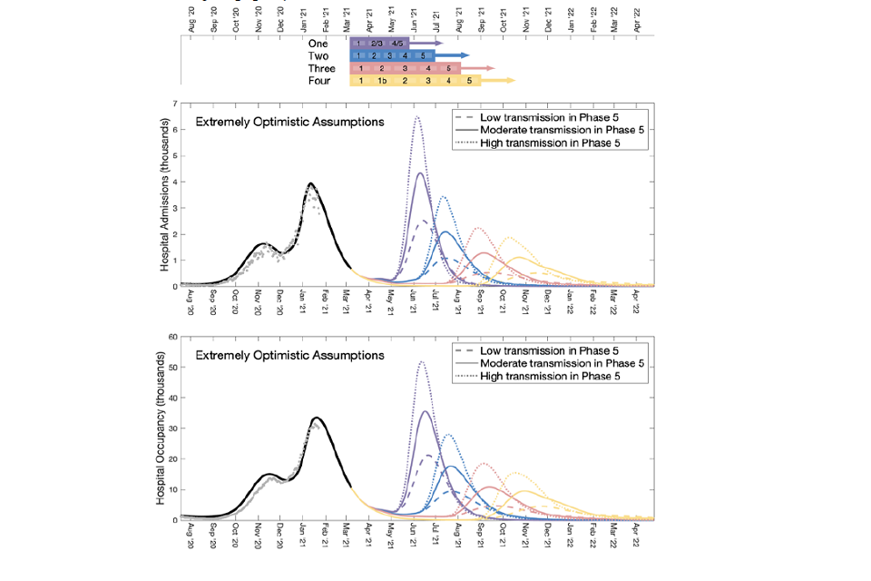
Two line charts showing the resurgence in admissions and occupancy increases with higher baseline transmission in all scenarios. Peaks are lower than under central assumptions, with scenario 1 exceeding the Jan21 peak under high/med baseline transmission.
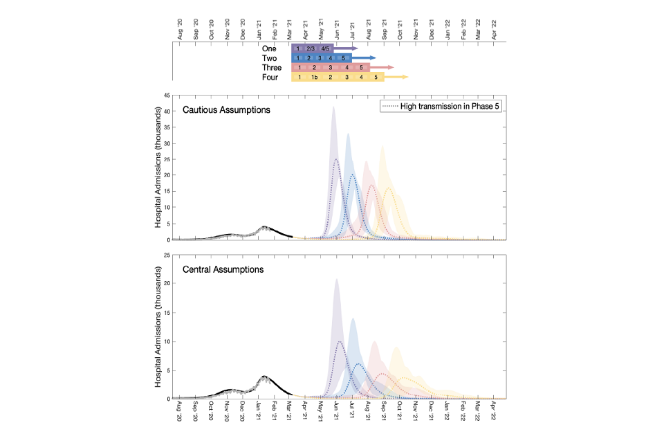
Appendix 4: Comparison of the University of Warwick’s Results.
Figure 4: England hospital occupancy assuming baseline measures reduce transmission remain the equivalent of Tier one, with cautious assumptions (top panel) and optimistic assumptions (bottom panel).Colours represent the 4 scenarios (purple is one, blue is 2, red is 3, yellow is 4) Assumed 4 million doses per week from 22 March, coverage of 95% (over 80s), 85% (50- to 80-year-olds; and under 50s in the optimistic scenario) and 75% (under 50s in the pessimistic scenario). From the Warwick model.
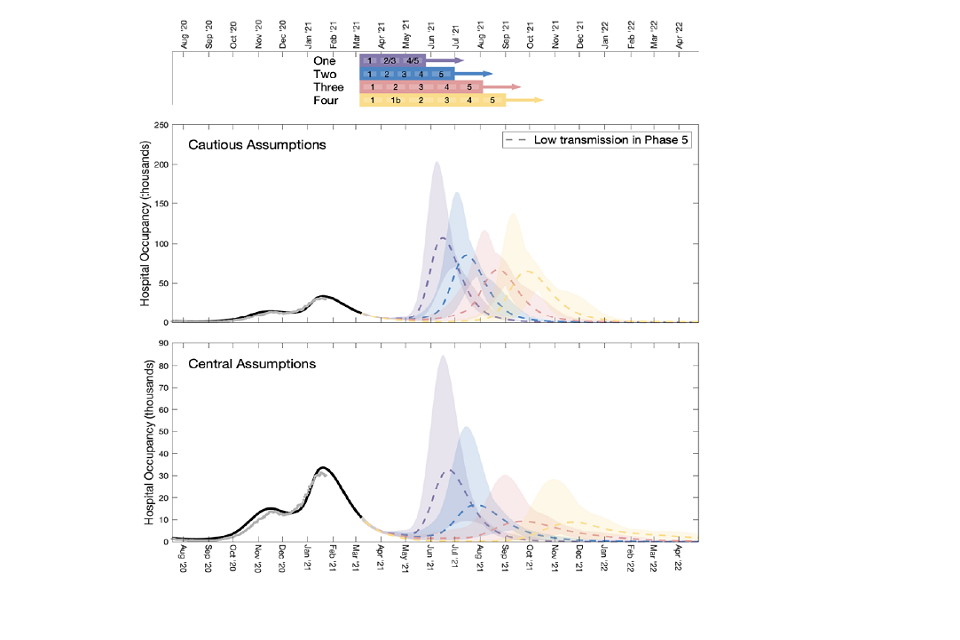
Two fan charts showing the resurgence in occupancy is lowest in scenarios 3 and 4. Under cautious assumptions, waves are much larger than those in January 2021 across all scenarios. Waves are larger and less prolonged than under central assumptions.
Figure 5: England hospital admissions assuming no baseline measures, with cautious assumptions (top panel) and optimistic assumptions (bottom panel).Colours represent the 4 scenarios (purple is one, blue is 2, red is 3, yellow is 4) Assumed 4 million doses per week from 22 March, coverage of 95% (over 80s), 85% (50- to 80-year-olds; and under 50s in the optimistic scenario) and 75% (under 50s in the pessimistic scenario). From the Warwick model.
Two fan charts showing that with high baseline transmission, the resurgence in admissions is similar to or exceeds the January 2021 peak in all scenarios. It is higher still under cautious assumptions, with scenario 1 4-9 fold higher than January.
-
Interquartile range of the distribution given. ↩
-
In some scenarios, there will be some differences, particularly with more pessimistic assumptions around vaccine efficacy. This is for several reasons including: Warwick estimating that a smaller proportion of the population are already immune as a result of being infected; Warwick estimating that infection hospitalisation rates and infection fatality rates are higher; and differences in model structure. Such variation between models is normal. Both sets of assumptions are valid and fall within the range of consensus views considered by SPI-M. ↩
-
These estimates, and others given in this document, cover the period from 1 February 2021 to June 2022. ↩
-
The peak of the resurgence in scenario 4 is slightly higher than in scenario 3 as, in the latter, a larger proportion have been infected before all measures are lifted. ↩
-
What is the difference between efficacy and effectiveness? ↩