SPI-M-O: Consensus statement on COVID-19, 6 January 2022
Published 14 January 2022

© Crown copyright 2022
This publication is licensed under the terms of the Open Government Licence v3.0 except where otherwise stated. To view this licence, visit nationalarchives.gov.uk/doc/open-government-licence/version/3 or write to the Information Policy Team, The National Archives, Kew, London TW9 4DU, or email: psi@nationalarchives.gov.uk.
Where we have identified any third party copyright information you will need to obtain permission from the copyright holders concerned.
This publication is available at https://www.gov.uk/government/publications/spi-m-o-consensus-statement-on-covid-19-6-january-2022/spi-m-o-consensus-statement-on-covid-19-6-january-2022
All probability statements are in line with the framework given in Annex 2.
Generation times, serial intervals, and growth rates
1. The generation time is the average time between someone becoming infected and that person infecting others. [footnote 1] The serial interval is the average time between someone developing symptoms, and those they infect developing symptoms themselves.
2. If the epidemic is growing at a given rate, a shorter generation time would mean the reproduction number is smaller and so less stringent measures or a smaller amount of behavioural change would be needed to curb the spread of the variant. Similarly, if the epidemic is shrinking at a given rate (for example as a result of interventions or behaviour change), a shorter generation time would mean the reproduction number is larger and that there is therefore greater scope for a return to growth as any control measures are relaxed or mixing behaviours increase. In brief, shorter generation times lead to estimated reproduction numbers that are closer to 1.
3. Generation times and serial intervals are context dependent; the same variant can have different serial intervals in different groups of people or if behaviour changes as a result of measures, such as the isolation of infectious people. It is therefore very difficult to measure serial intervals in a robust way as it requires transmission events to be observed in an unbiased way. Generation times are usually inferred from serial intervals as infection events cannot be observed directly. A recent study from South Korea [footnote 2] estimated that the mean serial interval for omicron was 2.2 days (with a standard deviation of 1.62 days), compared to 3.3 days with delta.
4. Early analysis from the UK Health Security Agency (UKHSA) has estimated that the distribution of serial intervals for omicron has a median that is about half a day shorter than for delta (3.1 to 3.2 days versus 3.5 to 3.6 days), but a much heavier tail, so a larger proportion of omicron serial intervals are greater than 8 days. This means that the mean serial intervals are similar, at 3.64 days (95% CI: 3.60, 3.68) for omicron and 3.87 days (95% CI: 3.84, 3.90) for delta. Note that a shorter serial interval does not necessarily mean that people with omicron stop being infectious sooner than those with delta.
5. UKHSA have cautioned that omicron’s average serial interval could be shorter than they have estimated, as a result of the nature of the contact tracing data. This could also mean that the differences between omicron and delta are underestimates. UKHSA suggest this as one reason why their estimates are longer than those from South Korea.
6. A second piece of analysis from UKHSA has shown that there was a clear reduction in the rate at which omicron replaced delta around 14 to 15 December, with omicron’s growth rate advantage approximately halving (Figure 1). There are several plausible explanations for this; one could be that omicron has a shorter generation time and that therefore Plan B measures or spontaneous behaviour change reduced omicron’s growth rate more than delta’s.
Figure 1: Proportion of cases in England with S-Gene Target Failure (cases almost certainly omicron)
Light blue shows the modelled trajectory (and 95% CI) had the rate of replacement not changed and dark blue shows what actually happened. Boxplots show the range across English regions.
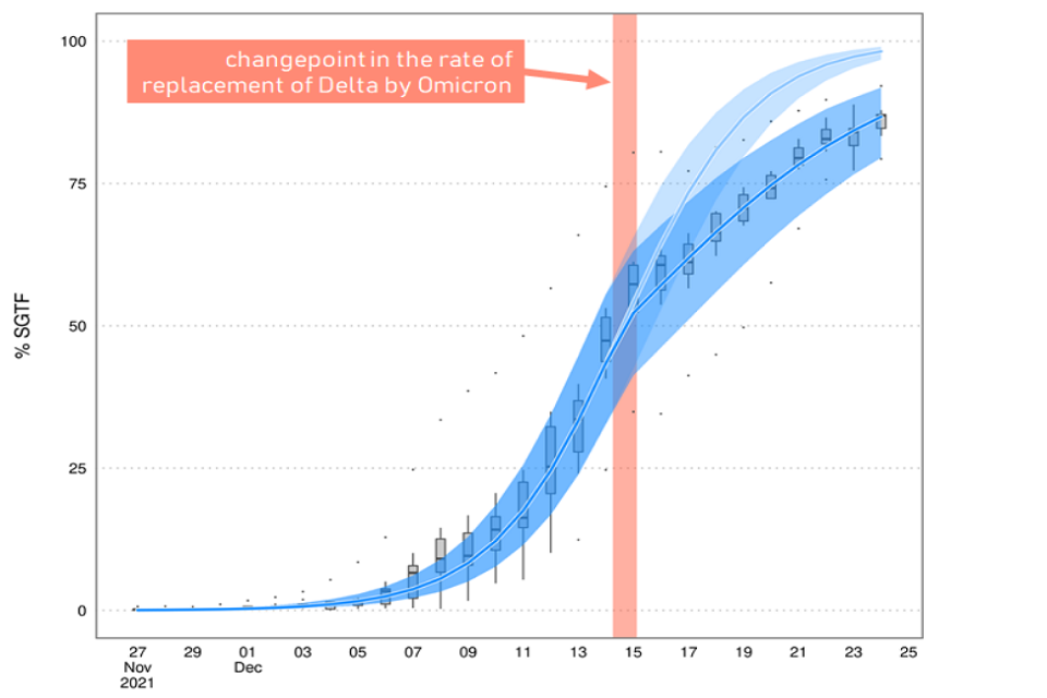
Line chart showing that the modelled percentage of cases with SGTF assuming no change in the rate of replacement of delta by omicron exceeds the trajectory of SGTF in reality. The two diverge from 14-15 Dec. Boxplots show the range across regions.
7. One consequence of this drop in the rate of replacement is that omicron took longer to become dominant in some parts of the country, such as North East England, than it would otherwise have done. The booster vaccine campaign, therefore, will have had a bigger effect in these places. For this reason, amongst others, it is almost certain that the epidemic will peak around the country at different times.
8. It is not possible to determine how much of the drop in the epidemic’s growth in the middle of December was the result of the Plan B measures and how much was a result of other behaviour change. School holidays may also have played a part. Test positivity started to rapidly grow at around the same time that omicron’s growth rate advantage over delta decreased.
9. Overall, evidence on whether the generation time for omicron is different to that of delta remains limited at this point. SPI-M-O considers it likely, with low confidence, that it is slightly shorter for omicron. If everything else is equal, an epidemic with a given growth rate would be expected to peak at a lower level, if it has a shorter generation time.
Modelling update
10. The University of Warwick have updated their previous modelling to account for recent data on both omicron’s intrinsic severity and vaccines’ effectiveness (see Annex 1). For different assumptions around omicron’s relative infection hospitalisation rate compared to delta (columns) and relative generation times (rows), the model is fitted on pre-Christmas data (red dots) and compared to post-Christmas hospitalisation data (dark red dots) [footnote 3]. Scenarios which fit the data poorly are unlikely to occur and are shaded in grey. Different policies are modelled with different coloured lines. These are discussed in the next section.
11. These results show that models where omicron’s generation time is assumed to be the same as delta’s show a poor fit to the post-Christmas data. At present, model runs that assume omicron is 30% to 40% as intrinsically severe as delta are well fitted for a wider range of generation times, compared to those where omicron is 20% or 50% as severe.
12. The emerging consensus that omicron is intrinsically less severe than delta and evidence on vaccines’ effectiveness against hospitalisation, as well as the possibility of omicron’s generation time being shorter than delta’s, mean that the latest modelling has lower levels of peak hospital admissions compared with previous iterations. It remains the case that modelling cannot precisely predict the size of the epidemic’s peak but that current trends are consistent both with admissions peaking a little higher than their current levels, or somewhat higher than in January 2021.
Impact of interventions
13. SAGE have previously advised [footnote 4] that measures to reduce the peak in hospital admissions would be most effective if implemented before the epidemic in older people is well underway.
14. Prevalence in older people is high and rapidly growing, and many more cases (and therefore admissions) will already be ‘in the system’ as a result of recent infections, even if stringent measures were to be introduced immediately. Hospital admissions will peak after cases in older people; it is almost certain that this will happen this month.
15. Warwick model three policy scenarios:
- Plan B measures with some additional reduction in mixing (especially in the older people) until 26 January (black)
- behaviours in line with those seen under Step 2 of the February 2021 Roadmap [footnote 5] from 10 January until 7 February (blue); and
- behaviours in line with those seen under Step 2 of the February 2021 Roadmap from 17 January until 14 February (red)
In each case, behaviour subsequently returns to pre-pandemic norms over 4 months.
16. These policy changes have almost no effect on the number of hospital admissions at the peak. This is because, in Warwick’s modelling, infections have peaked in many age groups once measures are put in place, and the impact of Step 2 is limited as older age groups are estimated to already moderate their behaviour in the Plan B scenario.
17. It is, therefore, unlikely that measures implemented in the near future would significantly reduce the peak in hospital admissions but could reduce the number of severe cases by bringing the epidemic down more quickly. The largest effects of such measures would be in those parts of the country where omicron became dominant later. Rapidly introduced measures could also reduce the number of outbreaks within social care settings (which have not been separately modelled). They could also act to reduce workforce pressures, although these should start to ease sooner than hospital admissions.
Annex 1: University of Warwick modelling
Warwick’s modelling results for hospital admissions in England (means and 95% prediction intervals) for different assumptions of omicron’s relative infection hospitalisation rate compared to delta (columns) and relative generation times (rows). The model is fitted on pre-Christmas data available as of 22 December 2021 (red dots) and compared to subsequent hospitalisation data (dark red dots) [footnote 6]. Scenarios which fit the data poorly are unlikely to occur and are shaded in grey. Different policy scenarios are given different colours: Black is Plan B with additional cautious behaviour, blue is Step 2 of the Roadmap from 10 January until 7 February, and red is Step 2 of the Roadmap from 17 January until 14 February. Vaccine effectiveness assumptions are given in the accompanying paper.
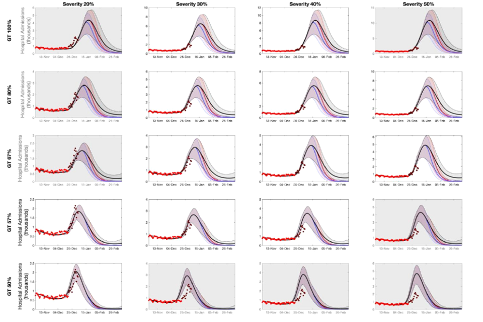
20 fan charts showing higher peak modelled admissions with higher assumed severity and generation time for omicron. Relative to Plan B, Step 2/earlier measures have a modest impact on peak size but generally a faster decline and lower total admissions.
Annex 2: PHIA framework of language for discussing probabilities

0 to 5% remote chance.
10% to 20% highly unlikely.
25% to 35% unlikely.
40% to 50% realistic possibility.
55% to 75% likely or probably.
85% to 90% highly likely.
95% to 100% almost certain.
-
More information on generation times and serial intervals is available from Plus magazine: Why the generation time of COVID-19 is important. ↩
-
Serial interval and basic reproduction number of SARS-CoV-2 Omicron variant in South Korea, Kim et al, 2021. ↩
-
‘Pre-Christmas’ data available as of 22 December 2021, and ‘post-Christmas’ subsequent data points. NHSE’s published estimates of new admissions from the community, with the definition of “the number of patients admitted in previous 24 hours for the first time with COVID-19 plus the number of patients diagnosed in hospital in previous 24 hours where the test was within 7 days of admission”. ↩
-
SAGE 101 minutes: Coronavirus (COVID-19) response, 23 December 2021. ↩
-
NHSE’s published estimates of new admissions from the community, with the definition of “the number of patients admitted in previous 24 hours for the first time with COVID-19 plus the number of patients diagnosed in hospital in previous 24 hours where the test was within 7 days of admission”. ↩