SPI-M-O: Comments on social distancing, 20 May 2020
Updated 20 May 2022

© Crown copyright 2022
This publication is licensed under the terms of the Open Government Licence v3.0 except where otherwise stated. To view this licence, visit nationalarchives.gov.uk/doc/open-government-licence/version/3 or write to the Information Policy Team, The National Archives, Kew, London TW9 4DU, or email: psi@nationalarchives.gov.uk.
Where we have identified any third party copyright information you will need to obtain permission from the copyright holders concerned.
This publication is available at https://www.gov.uk/government/publications/spi-m-o-comments-on-social-distancing-20-may-2020/spi-m-o-comments-on-social-distancing-20-may-2020
Signed off by chairs on behalf of members.
1. The following comments are provided to SAGE to form part of the response to a commission from Cabinet Office on 19 May. They have been reviewed by the SPI-M co-chairs and should be read in conjunction with today’s consensus statement. Paragraphs 2 to 7 provide some input into questions 4 to 7 in the commission. Paragraphs 8 onwards give a view on lead indicators in response to question one.
2. [Questions 4 to 7] The below graphs demonstrate the relationship between the reproduction number R (vertical axis) and the proportion of pre-COVID-19 contacts made outside home and school (horizontal axis) for no contact tracing (left [top]), tracing that isolates 20% of contacts within 48 hours (centre) and tracing that isolates 80% of contacts within 48 hours (right [bottom]). The bands represent different school closure policies. In all these scenarios, it was assumed that children were as susceptible to infection and as infectious as adults. There is currently no scientific consensus on the infectiousness of children, and it is possible that they are less susceptible and or less infectious than adults. If so, the curves would be pushed towards their lower bounds. They are calibrated so that closed schools with no contact tracing and 20% of normal contacts gives R around 0.7, a plausible value for recent weeks before changes were introduced on 1 May. We do not know if R has increased since then. As with all modelling, these graphs should be used to give general principles and is not a precise prediction, particular for the impact of school closures on transmission. This figure is the results of a single model not precise predictions.
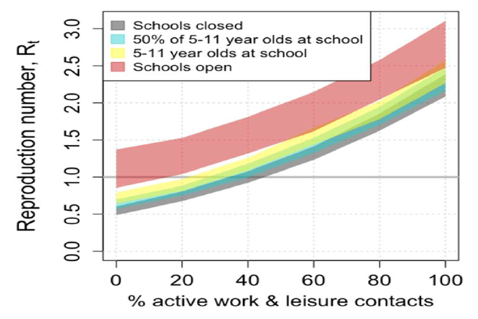
Chart showing the range of potential R values rises with proportion of work/leisure contacts and degree of school opening. With schools open, R ranges across 1 even with minimal “normal” contacts. With schools shut, R is around 1 with 40% of contacts
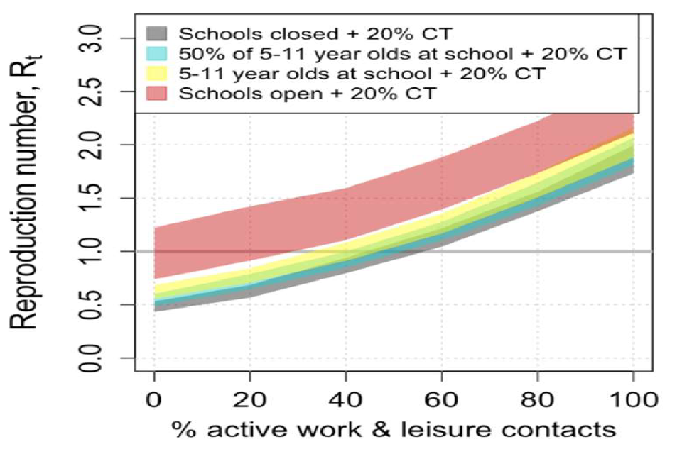
Chart showing the range of potential R values rises with proportion of work/leisure contacts and degree of school opening. With 20% contact tracing, R values are lower than in the left panel and more “normal” contacts are possible without R exceeding 1.
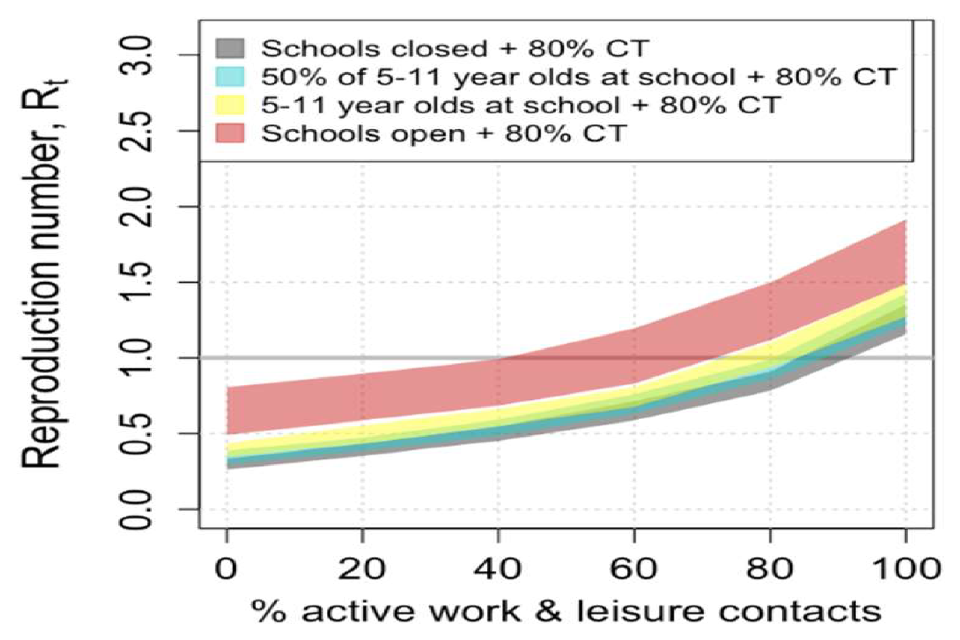
Chart showing the range of potential R values rises with proportion of work/leisure contacts and degree of school opening. With 80% contact tracing, R is below 1 when schools are open and with up to 40% of normal contacts (straddling 1 for 40%-70%).
3. Our current situation, with ‘step 1’ changes in place but without contact tracing places us at around 30% of normal contacts and in the grey ribbon with schools closed in the graph on the left [top]. Even a modest increase in work or leisure contacts would return R back above one. The greater the number of pupils back at school, the smaller the increase in contacts that is possible. The graph in the middle shows that ineffective contact tracing would give us a little more leeway to increase other contacts or increase the proportion of students in school. The graph on the right shows that highly effective contact tracing would give us much more room to manoeuvre, but that even in that scenario, if all schools are reopened, some kind of social distancing would still be required.
4. In all these scenarios, it was assumed that children were as susceptible to infection and as infectious as adults. There is currently no scientific consensus on the infectiousness of children, and it is possible that they are less susceptible and or less infectious than adults. In that case, the increase of the reproduction number from school opening relative to the assumed baseline value of 0.7 would be smaller. The coloured ribbons would be lower down and overlap more with the grey “schools closed ribbon. If school pupils played no role in transmission all ribbons would be in the same place as the grey ribbons.
5. SPI-M-O’s evaluation of the government’s strategy on 4 May (see ‘SPI-M-O: Consensus view on potential relaxing of social distancing measures’) assumed a very efficient system for tracking, tracing and isolating cases. It was modelled by different groups to assume 20 percentage point increase in work contacts in stage 1 compared to levels at that time, with a further 10 percentage point increase in stage 2. They assumed no change in leisure contacts in stage 1 compared to levels at that time and a 10% increase in leisure contacts, in stage 2. These changes were picked based on an early draft of the commission, as it was not finalised in time for the commission to be modelled directly.
6. It is not possible to say how the refined stage 2 measures, particular the opening of non-essential retail, will increase leisure contacts, including whether that would be more or less than previously modelled. The more effectively social distancing guidelines work to reduce potentially infectious contacts, the smaller the increase in transmission that will result, and the greater the leeway that would be available to open up other parts of society.
7. SPI-M have previously looked at the principles of households forming “bubbles”. SAGE have previously advised that further release of distancing measures should not be contemplated until effective outbreak surveillance and test and trace systems are up and running. The impact of bubbling could vary greatly depending on the precise policy adopted and compliance rates. If schools were open, they would act to join up bubbles containing children. This interaction would be complex and would give unpredictable outcomes. Strictly exclusive bubbles of 2 single-occupancy households who work from home would result in a negligible increase in transmission. Bubbles of more than 2 household, of larger households, or of households with more contacts outside the home are more likely to result in complex dynamics and possibly a large increase in R. This could therefore have either a smaller or larger impact on transmission than opening non-essential retail.
8. If transmission increases the number of new infections will start to increase. The first indication of this will come from the ONS’s community swabbing survey and COMIX, the London School of Hygiene and Tropical Medicine’s contact pattern surveys. These should be able to identify such an increase within around 2 weeks. Both have strengths and weaknesses. The COMIX study can give a very early indicator of any change in epidemiologically relevant contacts. It does, however, rely on self-reported contacts, which could be a source of bias. Furthermore, contacts are not necessarily proportional to transmissions, and if social distancing measures work, the correlation between contacts and transmissions will weaken. This would be a sign of success with people able to revive their patterns of social contact whilst avoiding the risk of transmitting infection. The ONS community swabbing survey is our only proper source of information on infection rates. It has already resolved several of our greatest uncertainties about COVID-19 epidemiology. It reaches out to 10,000 households across the country to tell us how many people are infected each week. Despite this reach, it is only able to identify a large increase in incidence with any certainty. Across several sampling weeks a pattern of increasing incidence will emerge and this study will, for some weeks or months into the future, remain our clearest view of COVID-19 transmission in the community. Neither of these studies could identify an increase in transmission in a particular region or subgroup of the population.
9. The first signal in clinical data would be seen in calls to NHS 111, and results from King’s College London’s symptom tracking app. These would be expected 2 weeks after an increase in incidence. Any rise in hospital admissions would be expected 2 to 3 weeks after an increase in transmission. An increase in COVID-19 deaths would be the clearest indicator of an increase in transmission, but would take 3 to 4 weeks to become apparent.
10. While data on transport patterns and other mobility metrics are useful to understand how people are behaving, a successful end to lockdown would increase mobility without increasing transmission. In Wuhan, transport usage was closely connected to transmission before lockdown. Afterwards they became desynchronised – the former increased but the latter didn’t. As a result, great care should be taken when attempting to use indirect measures to estimate changes in transmission.
11. Once a track and trace system is in place, if integrated into surveillance, careful analysis of its results might give an early indicator of increases in transmission.
12. In reality, identifying an increase in transmission will need a balanced view from many different data sources. It will be hard to identify small or gradual changes in transmission, or changes that occur in a particular area or social group.