Community Life Survey 2012 to 2013 findings
Published 19 July 2013

© Crown copyright 2013
This publication is licensed under the terms of the Open Government Licence v3.0 except where otherwise stated. To view this licence, visit nationalarchives.gov.uk/doc/open-government-licence/version/3 or write to the Information Policy Team, The National Archives, Kew, London TW9 4DU, or email: psi@nationalarchives.gov.uk.
Where we have identified any third party copyright information you will need to obtain permission from the copyright holders concerned.
This publication is available at https://www.gov.uk/government/publications/community-life-survey-2012-to-2013-findings/community-life-survey-2012-to-2013-findings
1. Key findings
Community Life Survey 2012 - 2013 findings
The arrows shown in the top right hand corner highlight statistically significant changes between the 2012 to 2013 Community Life Survey data and the 2010 to 2011 Citizenship Survey data along with the direction of movement. The data presented is based on headline findings from 2012 to 2013.
2. Explore the data
- Giving Time and Money: Findings from the 2012 to 2013 Community Life Survey (pdf, 1,654 KB)
- Giving Time and Money: (xlsx, 374 KB)
- Giving Time and Money: logistic regression output (xls, 110 KB)
- 2.1 Trust
- 2.2 Belonging
- 2.3 Neighbourliness
- 2.4 Satisfaction with area
- 2.5 Cohesion
- 2.6 Civic engagement
- 2.7 Influencing decisions
- 2.8 Volunteering
- 2.9 Giving
2.1 Trust
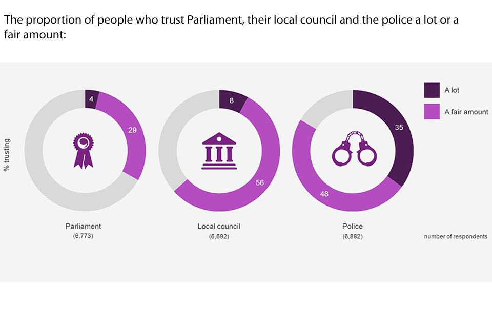
Graphic showing the proportion of people who trust Parliament, their local council and the police a lot or a fair amount

Bar chart showing the changes in proportion of people who trust Parliament a lot or a fair amount over the years
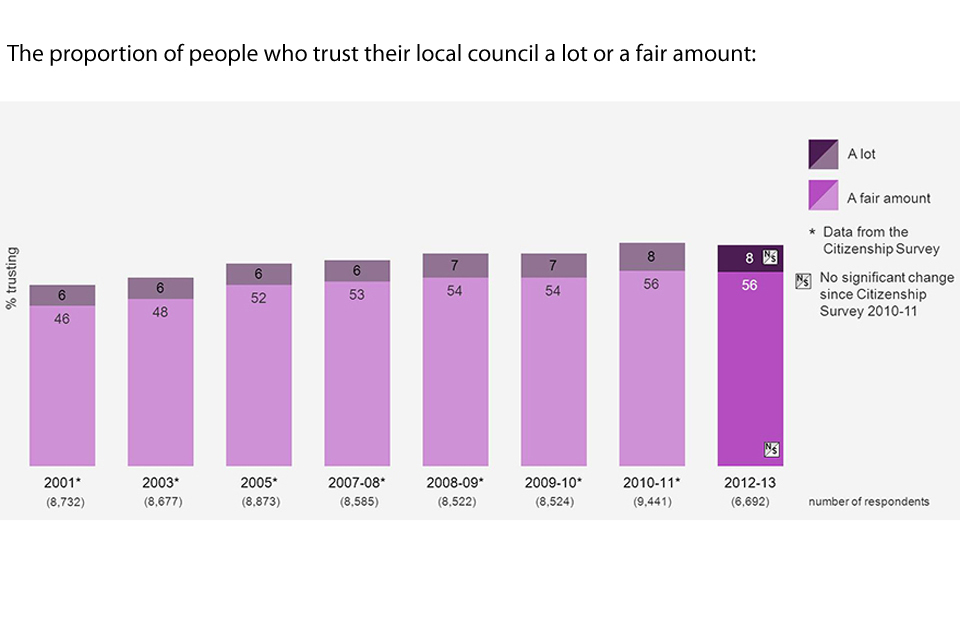
Bar chart showing the changes in proportion of people who trust their local council a lot or a fair amount over the years
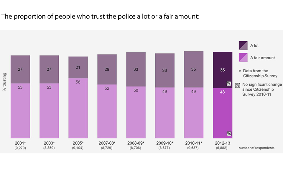
Bar chart showing the changes in proportion of people who trust the police a lot or a fair amount over the years

Bar chart showing changes in response to the question "whether generally speaking most people can be trusted, or that you can't be too careful in dealing with people" over the years
2.2 Belonging
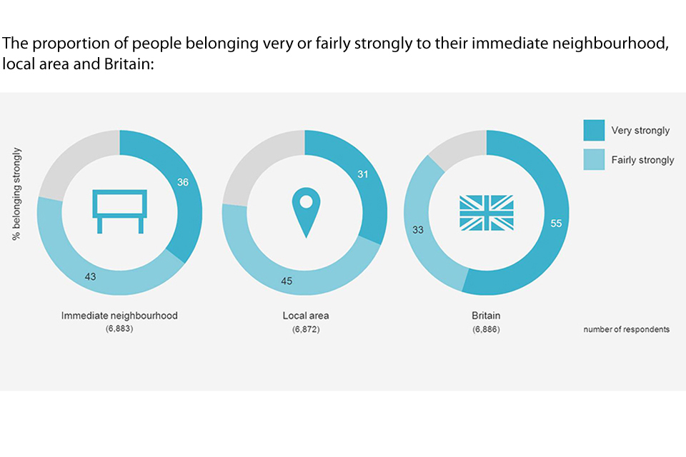
Graphic showing the proportion of people who feel they belong very or fairly strongly to their immediate neighbourhood, local area and Britain

Bar chart showing the changes in proportion of people who feel they belong very or fairly strongly to their immediate neighbourhood over the years
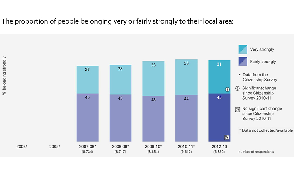
Bar chart showing the changes in proportion of people who feel they belong very or fairly strongly to their local area over the years
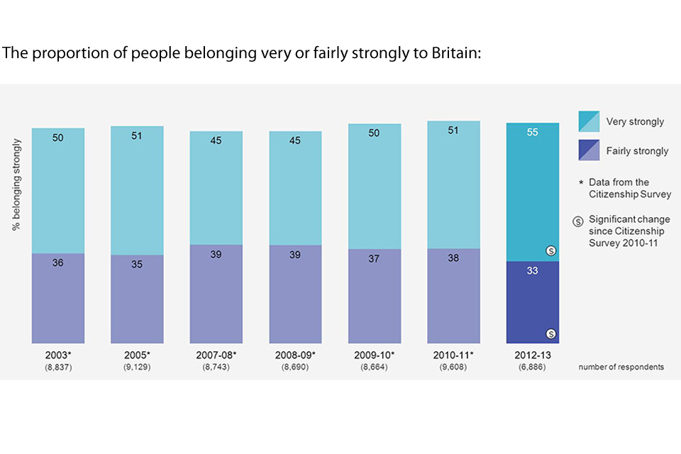
Bar chart showing the changes in proportion of people who feel they belong very or fairly strongly to Britain over the years
2.3 Neighbourliness
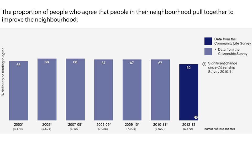
Bar chart showing the changes in proportion of people who agree that people in their neighbourhood pull together to improve the neighbourhood over the years
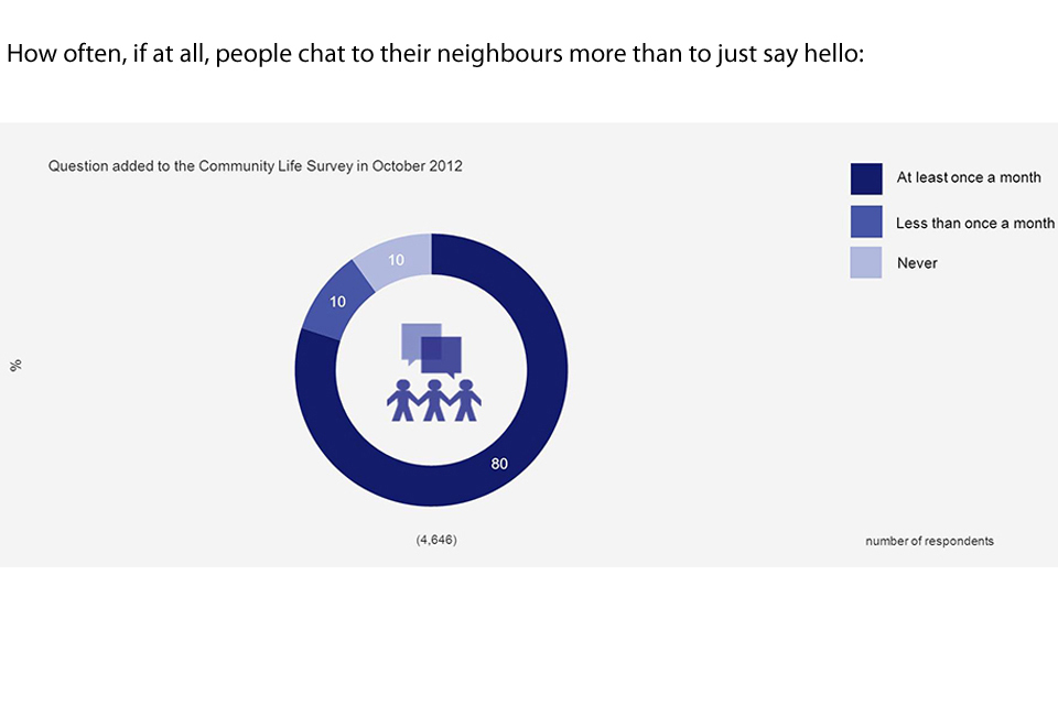
Graphic showing how often, if at all, people chat to their neighbours more than to just say hello
2.4 Satisfaction with area
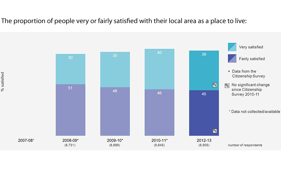
Bar chart showing the proportion of people very or fairly satisfied with their local area as a place to live over the years
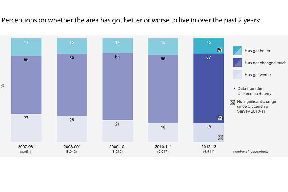
Bar chart showing perceptions on whether the area has got better or worse to live in over the past two years over the years
2.5 Cohesion
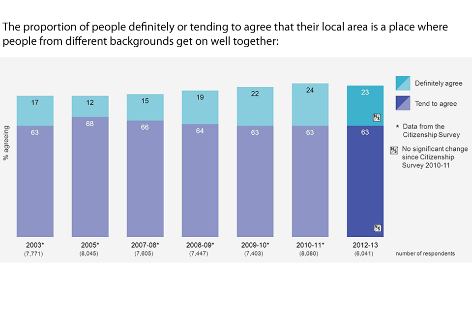
Bar chart showing the proportion of people definitely or tending to agree that their local area is a place where people from different backgrounds get on well together over the years
2.6 Civic engagement
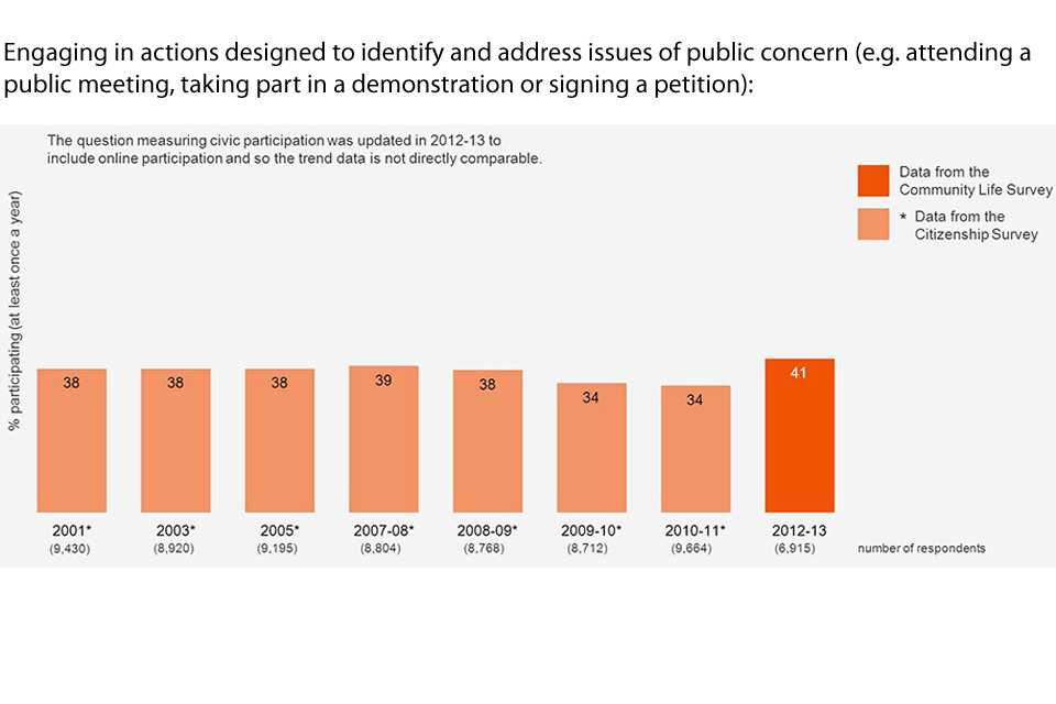
Bar chart showing the percentage of people engaging in actions designed to identify and address issues of public concern (e.g. attending a public meeting, taking part in a demonstration or signing a petition) over the years
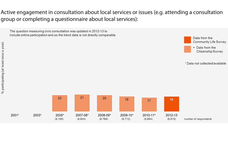
Bar chart showing the percentage of people actively engaging in consultation about local services or issues (e.g. attending a consultation group or completing a questionnaire about local services) over the years
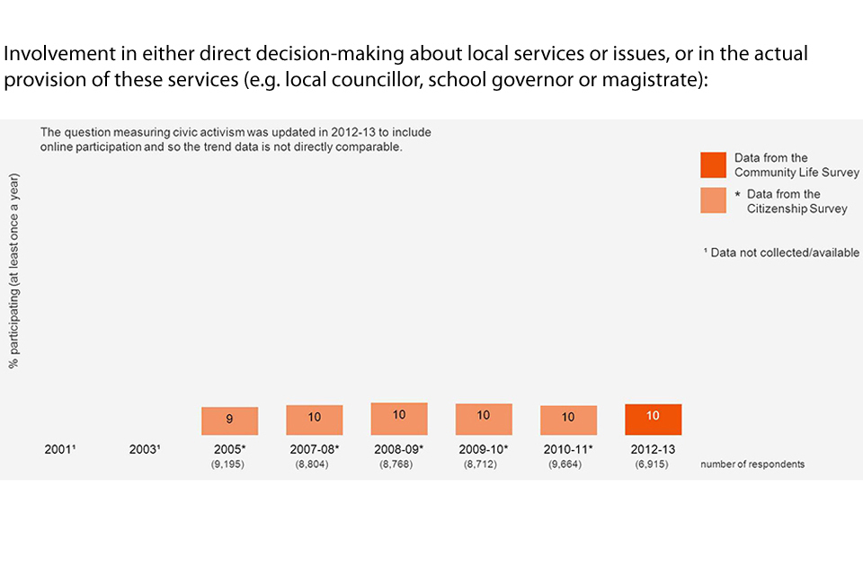
Bar chart showing the percentage of people involvedn either direct decision-making about local services or issues, or in the actual provision of these services (e.g. local councillor, school governor or magistrate) over the years
2.7 Influencing decisions

Bar chart showing the proportion of people agreeing that they can influence decisions affecting their local area and Britain over the years

Bar chart showing the proportion of people who think it is very or quite important to feel that they can influence decisions in their local area over the years

Bar chart showing the proportion of people who would like to be more involved in decisions made by the Council affecting their local area over the years
2.8 Volunteering
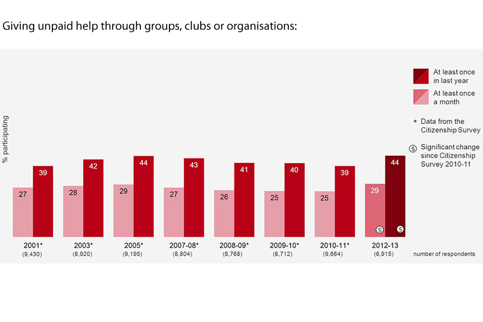
Bar chart showing the percentage of people giving unpaid help through groups, clubs or organisations over the years
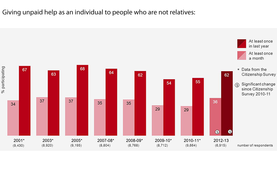
Bar chart showing the percentage of people giving unpaid help as an individual to people who are not relatives over the years
2.9 Giving
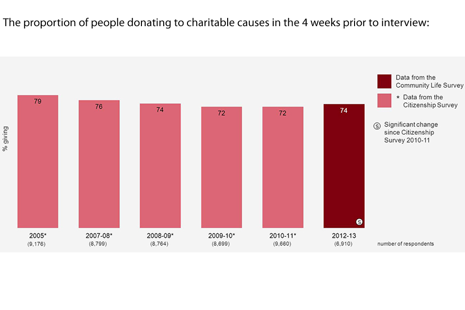
Bar chart showing the proportion of people donating to charitable causes in the 4 weeks prior to interview over the years

Bar chart showing the estimated mean amount of money given to charity in the 4 weeks prior to interview, adjusted for inflation and unadjusted over the years
3. Download the reports/data
3.1 Combined data from quarters 2, 3 and 4 2012 to 2013 (August 2012 to April 2013)
- statistical tables (xlsx, 192 KB)
- statistical tables (csv, 39.4 KB)
- statistical bulletin (pdf, 293 KB)
- pre-release access list (pfd, 92.6 KB)
3.2 Combined data from quarters 2 and 3 2012 to 2013 (August 2012 to January 2013)
- statistical tables (xlsx, 188 KB)
- statistical tables (csv, 37.5 KB)
- statistical bulletin (pdf, 288 KB)
- Community Life Survey overview poster (pdf, 471 KB)
- volunteering and giving poster (pdf, 163 KB)
- pre-release access list (pdf, 92.6 KB)
3.3 Data from quarter 2 2012 to 2013 (August to October 2012)
- statistical tables (xlsx, 186 KB)
- statistical tables (csv, 32.2 KB)
- statistical bulletin (pdf, 282 KB)
- Community Life Survey overview poster (pdf, 506 KB)
- pre-release access list (pdf, 98.2 KB)
4. About this survey - technical information
The below report describes the methodology of the Community Life Survey 2012 to 2013: