Designing good questions
Designing good questions makes it easy for users to provide the right information and understand why they need to provide it.
If they need it, you can add help text and error messages to nudge them in the right direction.
Before you start, make sure you know why you’re asking every question.
You can see how a question page should look in the GOV.UK Design System.
Ask questions that users understand
Closed questions are easier to answer than open questions. Especially in government services, where users are often afraid of being caught out.
An example of a closed question might be ‘Do you live at more than one address?’An open version of this question would be ‘Tell us about your living arrangements’.
A series of simple questions can be easier to answer than one complex question. Especially if parts of it aren’t relevant to all users.
Let users answer with ‘I’m not sure’ or ‘I don’t know’ if these are valid answers.
Change the questions until you find what works
If people are struggling to understand a form, think about re-framing the question or changing the form structure as well as the language.
For example, try reversing the question so the user is invited to say ‘no’ rather than ‘yes’ (or the other way round). Sometimes users make assumptions about what the ‘right’ answer is.
Or try more descriptive labels for radio buttons or checkboxes.
For example, an early version of the register to vote service asked users whether they also lived at a second address. User research showed that some people found it difficult to answer ‘yes’ or ‘no’ to this question because they weren’t sure what ‘counted’ as a second address.
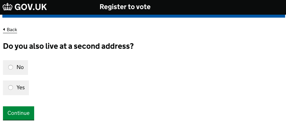
It became much easier to answer when the team replaced the ’Yes’ option with two radio buttons - one labelled ‘Yes, I spend time living at two homes’ and the other ‘Yes, I’m a student with home and term-time addresses’.
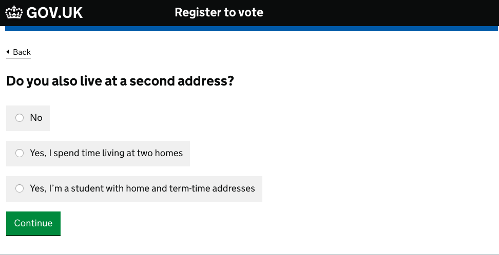
If some radio button or checkbox labels are phrased differently from the others, it may make the page more readable if you separate the options that are different with an ‘or’.
Add help text where necessary
Sometimes it’s useful to provide help text to explain things like:
- legal jargon
- where to find obscure information
- what format the information should be given in
- what you’ll do with a user’s personal information
- the consequences of making one choice over another
Only do this if you see in research that your users need it.
How to add help text
You can do this by:
- adding hint text inline, immediately next to the part of the page it relates to
- using the ‘details’ component to reveal expanding help text - this is useful if the text is only relevant to a subset of users
See examples of hint text and the details component in the GOV.UK Design System.
You might occasionally need to add more detailed text to help users make particularly complex or difficult decisions.
But bear in mind they’re unlikely to read anything longer than 3 lines, so try to keep any text brief and action-focused.
Don’t use help text to explain the interface. If you have to do that, you’ve made your service too complicated.
Help users give you the right information
Do what you can to help users avoid failing validation and getting an error message. Set up your validation so it’s as tolerant as possible of users entering information in different ways.
So, for example, if you’re asking for the user’s National Insurance number the input field should accept either ‘QQ123456C’ or ‘QQ 12 34 56 C’ - stripping out the spaces before it passes the number through to the back end.
You’ll probably need to create multiple error messages per field, so they’re as specific to the problem as possible. Focus on telling the user how to fix the problem rather than describing what’s gone wrong.
The Design System shows how to style and write good error messages.
Related guides
You might find the following guides useful: