Neighbourhood and Community - Community Life Survey 2019/20
Published 14 July 2020

© Crown copyright 2020
This publication is licensed under the terms of the Open Government Licence v3.0 except where otherwise stated. To view this licence, visit nationalarchives.gov.uk/doc/open-government-licence/version/3 or write to the Information Policy Team, The National Archives, Kew, London TW9 4DU, or email: psi@nationalarchives.gov.uk.
Where we have identified any third party copyright information you will need to obtain permission from the copyright holders concerned.
This publication is available at https://www.gov.uk/government/statistics/community-life-survey-201920-neighbourhood-and-community/neighbourhood-and-community-community-life-survey-201920
The Community Life Survey is a household self-completion survey (online or paper) of adults aged 16+ in England. This chapter summarises results related to the respondent’s neighbourhood and community from the 2019/20 survey, which ran from April 2019 to March 2020.
Differences between groups are only reported on in this publication where they are statistically significant i.e. where we can be confident that the differences seen in our sampled respondents reflect the population [footnote 1].
1. Neighbourhood
The proportion of respondents who either said they ‘definitely agree’ or ‘tend to agree’ that they borrow things and exchange favours with their neighbours in 2019/20 was similar to 2018/19, following a gradual decline over the previous five years. In 2019/20, 35% agreed compared with 39% in 2016/17 and 42% in 2013/14.
Figure 3.1 Percentage of adults (16+) who chat to their neighbours at least once a month (more than just to say hello), and the percentage who agree they borrow things and exchange favours with their neighbours, 2013/14 - 2019/20
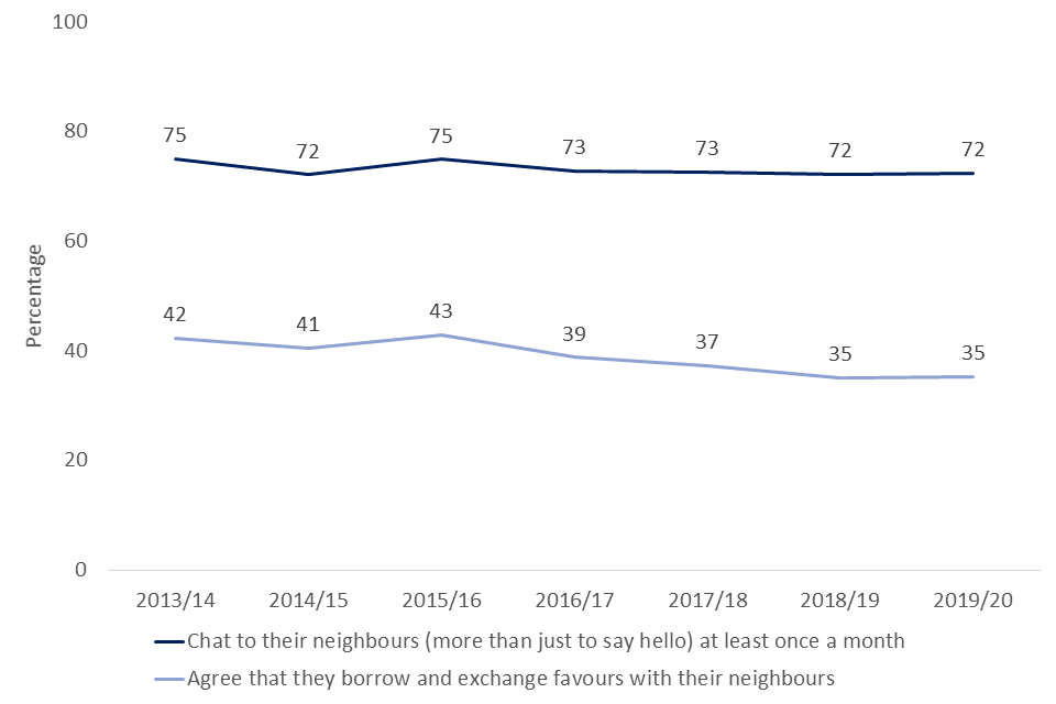
Line chart showing the percentage of respondents who chat to their neighbours once a month, and of respondents who agree that they borrow and exchange favours with their neighbours, from 2013/14 to 2019/20
In 2019/20, 72% of respondents said they chat to their neighbours at least once a month (more than just to say hello), similar to the proportion in 2018/19 but lower than the proportion in 2013/14 (75%).
Demographic trends for the percentage of respondents who chat to their neighbours were broadly consistent with 2018/19.
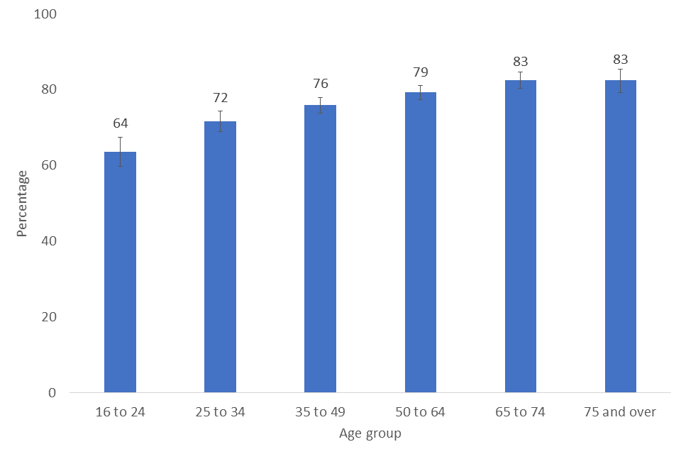
- Respondents aged 16-24 were less likely to chat to their neighbours than older age groups, with 53% doing so once a month or more, compared to 87% of those aged over 65 years old.
- White respondents (74%) were more likely to chat to their neighbours than other ethnicities (ranging from 54% to 67%)
- In London, 65% of respondents reported chatting to neighbours more than once a month, significantly lower than other regions (71-76%)
- Those living in rural areas were more likely to chat to neighbours than those in urban areas (80% compared with 71% respectively)
- Respondents in the least deprived areas were more likely to chat with neighbours than those in the most deprived areas (79% compared with 66% respectively)
- No significant variability was seen between respondents of different genders or between those with a disability or not.
Figure 3.2 Percentage of respondents who chat to neighbours at least once a month by age group, 2019/20
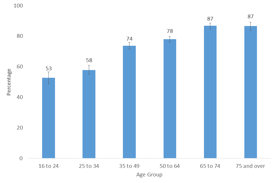
Bar chart showing the percentage of respondents who chat to their neighbours at least once a month by age group, 2019/20
2. Community Cohesion
The percentage of respondents agreeing that their area is a place where people from different backgrounds get along well together has remained fairly consistent over the last seven years, with 82% agreeing in 2019/20, the same proportion as in 2013/14.
In addition, in 2019/20, 59% agreed that people in their neighbourhood pull together to improve the neighbourhood. This is a similar proportion to 2018/19 (58%) and 2013/14 (60%).
Figure 3.3 Percentage of adults (16+) who agree their neighbourhood is a place where people from different backgrounds get on well together, and the percentage who agree people in the neighbourhood pull together to improve the local area, 2013/14-2019/20
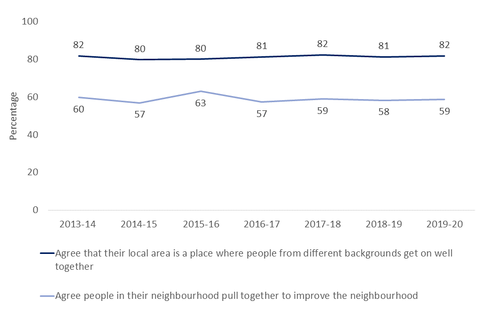
Line chart showing respondents who agree that their local area is a place where people from different backgrounds get on well together, or agree that people in their neighbourhood pull together to improve the neighbourhood, from 2013/14 to 2019/20
There was some variability amongst different demographic groups on the degree to which respondents agreed that their local area is a place where people from different backgrounds get on well together.
- Those aged 75 and over (87%) were more likely to agree that their local area is a place where people from different backgrounds get on well with each other than the younger age groups - 16-24 years olds (80%), 25-34 year olds (77%) and 35-49 year olds (82%).
- Respondents without a limiting long-term disability or illness were more likely to agree than those with (84% compared with 77%).
- Some regional variability was seen by region, with those in London (84%) and the South East (85%) both more likely to agree than those in the North West (79%).
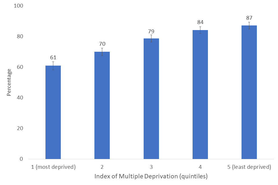
- Respondents living in the least deprived areas were more likely to agree than those living in the most deprived areas (88% compared with 75%).
- No significant variability was seen between respondents of different gender, ethnicity, and urban/rural status
Figure 3.4 Percentage agreeing that their neighbourhood is a place where people from different backgrounds get on well together by Index of Multiple Deprivation quintile, 2019/20
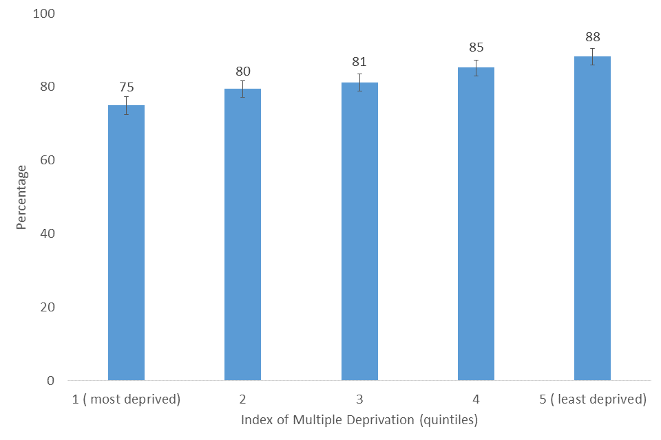
Bar chart showing the percentage of respondents who agree that their neighbourhood is a place where people from different backgrounds get on well together by Index of multiple deprivation quintile, 2019/20
Levels of trust in people in respondents’ neighbourhood have steadily declined from 2013/14 (48%) to 2018/19 (40%), with the value in 2019/20 remaining the same (40%). The percentage of respondents who said ‘none of the people can be trusted’ in their neighbourhood has increased from 3% to 4% from 2013/14 to 2019/20 respectively.
Figure 3.5 Responses to ‘thinking about the people who live in this neighbourhood, to what extent do you believe they can be trusted’, 2019/20
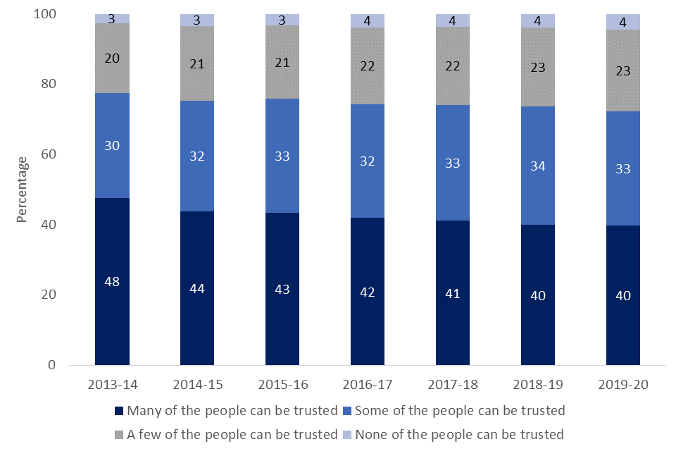
Nested bar chart showing responses to ‘thinking about the people who live in this neighbourhood, to what extent do you believe they can be trusted’ from 2013/14 to 2019/20
3. Neighbourhood satisfaction
Overall, 76% were either very or fairly satisfied with their local area as a place to live, a decrease from 80% in 2013/14. This is made up of 30% of respondents who said they were ‘very satisfied’ with their local area as a place to live, and 46% who were ‘fairly satisfied’. However, the percentage who were ‘very satisfied’ has decreased from 36% in 2013/14.
Figure 3.6 Responses to ‘Overall, how satisfied or dissatisfied are you with your local area as a place to live?’, 2019/20
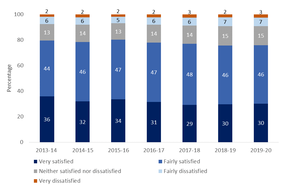
Nested bar chart showing responses to ‘Overall, how satisfied or dissatisfied are you with your local area as a place to live?’ from 2013/14 to 2019/20
Overall there were some differences between demographics groups:
- No significant variability was seen between genders.
- Those aged 65-74 and 75 or over showed higher satisfaction in their local area (83% for both) than younger age groups (64-79%). The lowest satisfaction was seen for 16-24 year olds (64%).
- In 2019/20, Black respondents were less likely to be satisfied with their local area (68%) than White respondents (77%), a difference not observed in 2018/19. No other differences between different ethnicities were seen.
- Lower satisfaction was seen for those with a long term limiting illness or disability (70% agreeing) than for those without (78% agreeing).
- Some regional variability was seen, with those from the East of England (78%), the South West (82%) and the South East (79%) more likely to agree than those in the North West (70%).
- More respondents living in rural areas (85%) agreed that they were satisfied with their local area than those in urban area (74%).
- A higher proportion of those from the least deprived areas (87%) report satisfaction with their local area than those from the most deprived areas (61%).
Figure 3.7: Percentage satisfied with local area by age group, 2019/20
Bar chart showing the percentage of respondents satisfied with their local area by age group, 2019/20
Figure 3.8 Percentage satisfied with local area by IMD [footnote 2] quintile. 2019/20, online and paper estimates
Bar chart showing the percentage of respondents satisfied with their local area by Index of Multiple Deprivation quintile, 2019/20
In 2019/20, the percentage of respondents who said their local area has got better to live in in the last two years remained the same as previous years at 14%. The percentage who felt their area has got worse to live in has continued to increase from 20% in 2013/14 to 26% in 2018/19 and 2019/20. The majority of respondents said that it had not changed much, with 60% of respondents giving this response.
Figure 3.9 Percentage of respondents who felt their area has got either better, worse to live in or has not changed much in the last two years, 2013/14 – 2019/20
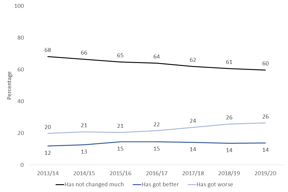
Line chart showing the percentage of respondents who think their area has got better, got worse or stayed the same in the last two years, from 2013/14 to 2019/20
4. Feeling of belonging to neighbourhood
Respondents were asked how strongly they felt they belonged to their immediate neighbourhood.
In 2019/20, the proportion of respondents who feel they ‘very strongly’ or ‘fairly strongly’ belong to their immediate neighbourhood has remained similar to 2018/19, at 63%, however this has increased from 58% in 2013/14.
Figure 3.10 Percentage of adults (16+) who said they feel they very strongly or fairly strongly belong to their immediate neighbourhood, 2013/14 – 2019/20
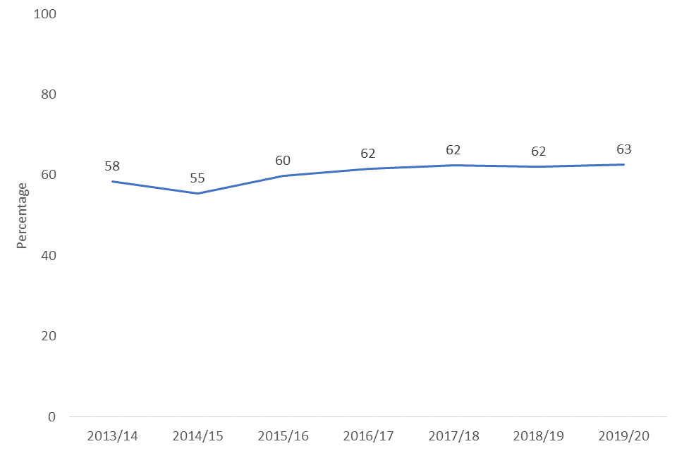
Line chart showing the percentage of adults who said they feel they very strongly or fairly strongly belong to their immediate neighbourhood, 2013/14 – 2019/20
- No significant variability was seen with gender
- Younger age groups (16-24 and 25-34) were less likely to feel strongly (51-55%) that they belong to their immediate neighbourhood than older age groups (63-73%).
- Only 44% of respondents with the ethnicity Other (i.e. not White, Asian, Black or Mixed) agreed that they belonged to their immediate neighbourhood, less than the other ethnicities (62-67%)
- Those without a long term limiting illness or disability were more likely to agree that they belonged to their immediate neighbourhood than those with (64% vs 58%).
- Some regional variability was seen, with those in London (59%) less likely to agree than those in the North East, the West Midlands and the Yorkshire and the Humber (65-69%).
- More of those living in a rural area (72%) felt strongly that they belonged to their immediate neighbourhood than those living in urban areas (61%).
- Variability was seen with deprivation, with more of those from the least deprived areas (70%) agreeing they felt strongly that they belonged to their neighbourhood than those from the most deprived areas (57%).
Figure 3.11 Feeling of belonging to neighbourhood by IMD quintile, 2019/20
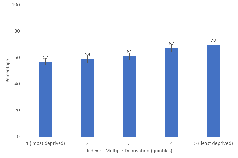
Bar chart showing the percentage of respondents who feel they belong to their immediate neighbourhood by Index of Multiple Deprivation quintile, 2019/20
5. Feeling of belonging to Britain
Respondents were also asked how strongly they felt they belonged to Britain. In 2019/20, 84% answered either ‘very strongly’ or ‘fairly strongly’, a similar level since 2013/14.
Figure 3.12 Percentage of adults (16+) who said they feel they very strongly or fairly strongly belong to Britain 2013/14 – 2019/20
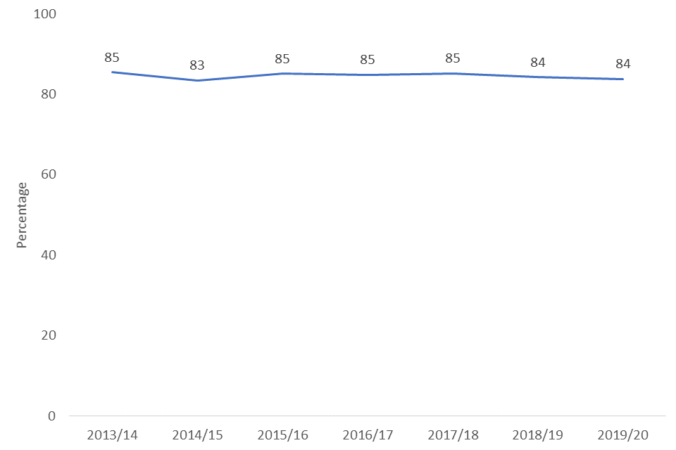
Line chart showing the percentage of adults who said they feel they very strongly or fairly strongly belong to Great Britain, 2013/14 – 2019/20
- Older age groups (50-64, 65-74 and 75 and over) showed higher agreement (87-96%) to this statement than lower age groups (76-80%).
- Those with Mixed ethnicity (77%) were less likely to agree than those with White ethnicity (84%). No other significant differences were observed between ethnicities.
- Those in London reported the lowest levels of agreement (79%), lower than all other regions in England (ranging from 85% to 89%), except the South West (83%) and North West (84%)
- Living in an urban area (83%) was associated with a lower likelihood to respond strongly that they belonged compared to living in a rural area (88%)
- Those who are from the least deprived areas reported a higher agreement (86%) about belonging to Britain than those who are from the most deprived areas (82%)
- No significant variability was seen between the different gender or disability categories.
Figure 3.13 Feeling of belonging to Britain by IMD quintile, 2019/20

Bar chart showing the percentage of respondents who feel they belong to Britain by Index of Multiple Deprivation quintile, 2019/20
-
The 95% confidence intervals are indicated by error bars on the charts. They show the range that we are 95% confident the true value for the population falls between. When there is no overlap between the error bars for two or more groups, we can be more confident that the differences between groups represent true differences between these groups in the population. ↩
-
The Index of Multiple Deprivation, commonly known as the IMD, is the official measure of relative deprivation for small areas in England. It is calculated using several measures such as income deprivation, crime and living environment deprivation. The Index of Multiple Deprivation ranks every small area in England from 1 (most deprived area) to 32,844 (least deprived area). In this publication, we have clustered these areas into ‘IMD Quintiles’ with 1 being the most deprived areas and 5 being the least deprived areas. ↩