Trend Deck 2021: Infrastructure
Published 28 June 2021

© Crown copyright 2021
This publication is licensed under the terms of the Open Government Licence v3.0 except where otherwise stated. To view this licence, visit nationalarchives.gov.uk/doc/open-government-licence/version/3 or write to the Information Policy Team, The National Archives, Kew, London TW9 4DU, or email: psi@nationalarchives.gov.uk.
Where we have identified any third party copyright information you will need to obtain permission from the copyright holders concerned.
This publication is available at https://www.gov.uk/government/publications/trend-deck-2021-infrastructure/trend-deck-2021-infrastructure
1. Small decrease in domestic UK transport emissions
In the UK transport emissions decreased by 2% between 1990 and 2017, and made up 27% of net domestic emissions in 2017. Since 1990, emissions from rail, buses and domestic shipping decreased, whereas van emissions increased by 67% in the UK. Van traffic has doubled since the early 1990s.
International aviation emissions, which are not part of the UK’s domestic emissions, have more than doubled since 1990.
GHG emissions by transport mode
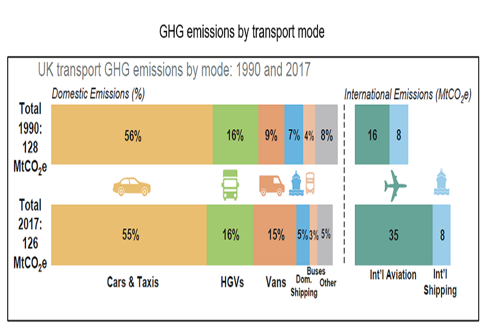
Yellow bars are for cars and taxis, for 1990 they are 56% and 2017 55%. Green bars are heavy goods vehicles, for 1990 they are 16% and 2017 16%. Orange bars are vans, for 1990 they are 9% and 2017 15%. Blue bars are domestic shipping, for 1990 they are 7% and 2017 5%. Peach bars are buses for 1990 4% and 2017 3%. Grey bars are other, for 1990 they are 8% and 2017 5%. International aviation is show as dark green for 1990 they are 16% and 2017 35% and international shipping light blue for 1990 they are 8% and 2017 8%.
Metric tons of carbon dioxide equivalent or MtCO2e is a unit of measurement. The unit “CO2e” represents an amount of a greenhouse gas whose atmospheric impact has been standardized to that of one unit mass of carbon dioxide (CO2), based on the global warming potential of the gas
Source:
- Transport Statistics: Great Britain 2019, Department for Transport.
2. Increase in electric ultra-low emission vehicles to 1% of global stock
Sales of electric cars topped 2.1 million globally in 2019 to boost the stock to 7.2 million electric cars. Electric cars, which accounted for 2.6% of global car sales and about 1% of global car stock in 2019, registered a 40% year-on-year increase.
In 2019, 80,578 ULEVs (ultra-low emission vehicles) were registered for the first time in the UK, an increase of 26% on 2018 and 52% on 2017. ULEVs accounted for 2.7% of all new vehicle registrations, up from 2.1% in 2018.
ULEVs registered for the first time by fuel type, United Kingdom, 2010 to 2019
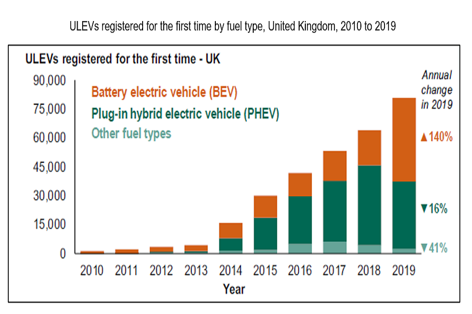
Bar graph of ultra-low emission vehicle registrations in the UK from 0 to 90,000 over the time period 2010 to 2019. Orange bars represent battery electric vehicles, dark green plug-in hybrid vehicles and light green other fuel types.
Sources:
- IEA (2020), Global EV Outlook 2020, IEA, Paris, All Rights Reserved.
- Vehicle Licensing Statistics: Annual 2019, Department for Transport, April 2020.
3. Traffic growth forecast to increase in England and Wales
In England and Wales, the Department for Transport’s National Transport Model forecasts provide a strategic view of future road travel demand under a number of plausible scenarios. From 2015, traffic is forecast to grow across all scenarios by between 17% and 51% by 2050. Car traffic is forecast to grow between 11% and 43%, whilst light goods vehicle traffic is forecast to continue growing significantly in all scenarios (between 23% and 108%).
The proportion of traffic in congested conditions in 2050 is forecast to range from 8% to 16% depending on the scenario, compared to 7% in 2015.
Forecasted road traffic in billion vehicle miles (BVM) in England and Wales, 1995-2050 under different scenarios
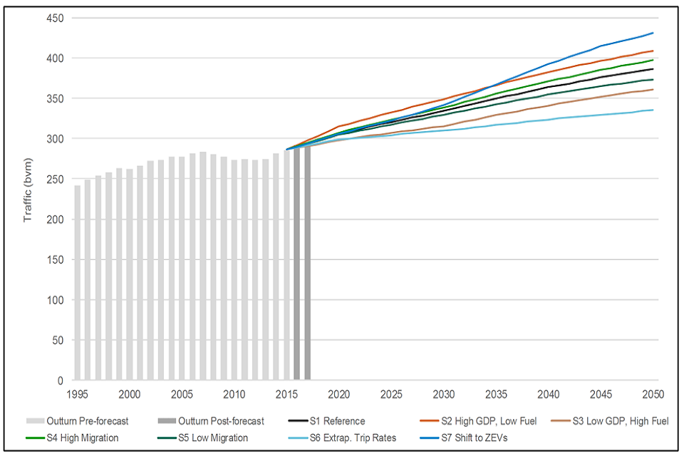
Line graph of traffic in billion vehicle miles over the time period 1995 to 2050. The lines refer to different scenarios based on migration, Gross Domestic Product and fuel.
Source:
4. Rail passenger travel in England is the fastest growing mode of transport
Car was the most common mode of transport in 2019, but travel by rail has increased the fastest since 2002. Of all travel in England in 2019, rail accounted for 2% of trips, 10% of distance and 8% of travel time.
Commuting is the most common journey purpose of rail passengers. Over half of all rail journeys in England in 2019 were for commuting and over a quarter for leisure.
Travel trends 2002 – 2019, England
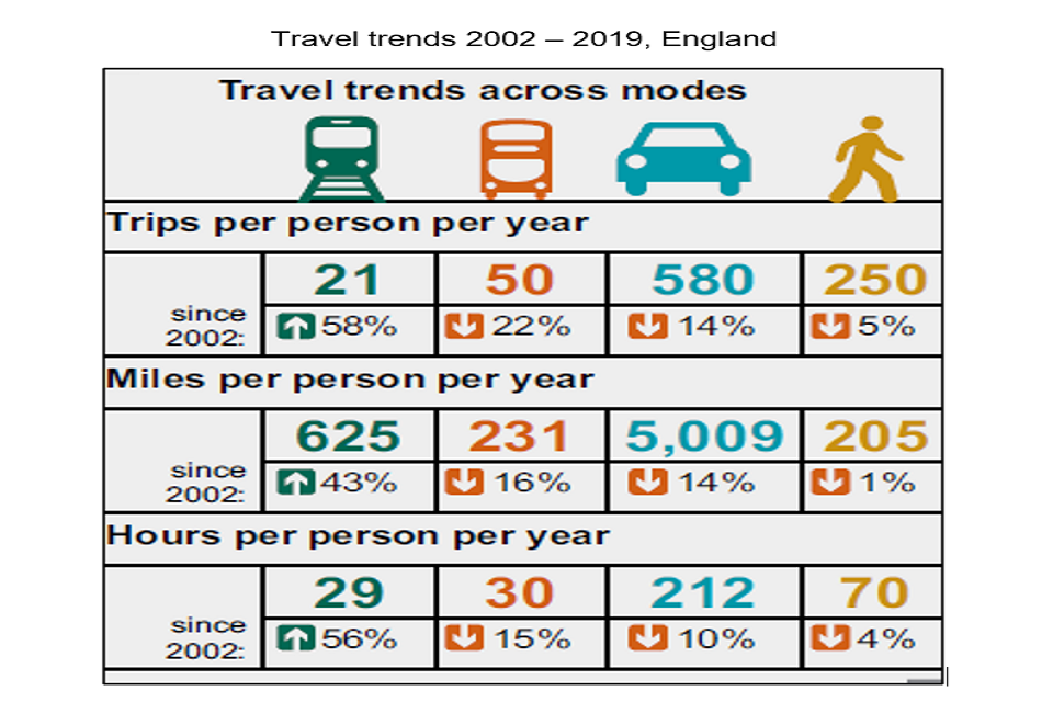
Infographic of travel trends since 2002 for train, bus, car and walking.
Source:
- Department for Transport. Rail Factsheet 2020, Department for Transport and Office of Rail and Road, December 2020.
5. Highest annual growth rate of UK house prices since 2014
UK average house prices increased by 8.6% in the year to February 2021, up from 8% in the year to January 2021. This is the highest annual growth rate the UK has seen since October 2014. The average house price in England was £268,000. The North West saw highest annual growth in average house prices (11.9%), with London at the lowest (4.6%).
It is early days, but the coronavirus (COVID-19) pandemic may have caused some house buyers to reassess their housing preferences. In the Office for National Statistics UK House Price Index data, the average price of detached properties increased by 9.1% in the year to February 2021. By comparison flats and maisonettes increased by 6.7% over the same period.
February 2021 saw UK house price growth at its highest level since October 2014.
Annual house price rates of change for all dwellings, UK: January 2006 to February 2021
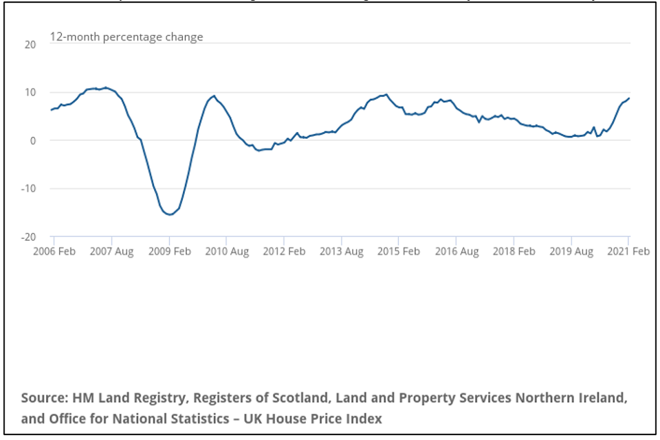
Line graph of percentage change from -20 to 20 over the period February 2006 to February 2021.
Source:
- UK House Price Index: February 2021, Office for National Statistics.
6. Decrease in home ownership for people under 65
Almost three-quarters of people aged 65 years and over in England own their home outright. Younger people are more likely to be renting. Half of people in their mid-30s to mid-40s had a mortgage in 2017, compared with two-thirds 20 years earlier. People in their mid-30s to mid-40s are three times more likely to rent than 20 years ago. A third of this age group were renting from a private landlord in 2017, compared with fewer than 1 in 10 in 1997.
Housing tenure over time, ages 16 to 64 years, England
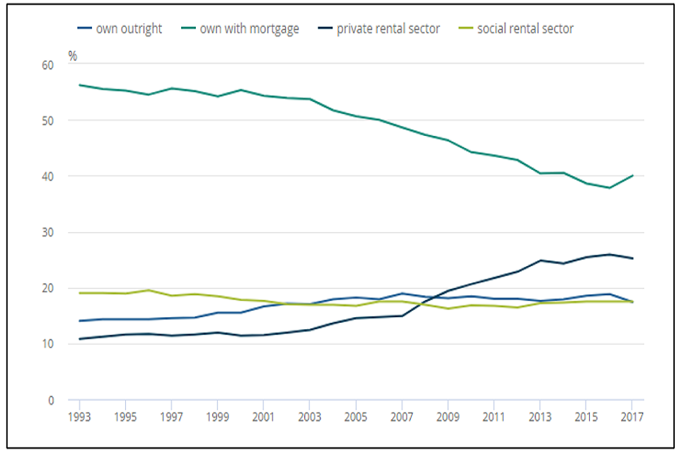
Line graph of percentage from 0 to 60 over the time period 1993 to 2017. The mid blue line refers to own outright, darker green own with mortgage, dark blue private rental sector and lime green social rental sector.
Source: Ministry of Housing, Communities and Local Government - Survey of English Housing (1993 to 2007), English Housing Survey (2008 to 2017).
Source:
- Living longer: changes in housing tenure over time, Office for National Statistics, February 2020.
7. Increase in number of young adults in the UK living with their parents
Over the last two decades there has been a significant increase in the number of young people, aged 20 to 34 years, living with their parents, increasing from 2.4 million in 1999 to 3.6 million in 2020. This is equivalent to more than a quarter of young adults in this age group.
In 2020, 34% of young adult men aged 20 to 34 lived with their parents. The figure for young adult women was 22%. This difference is most likely because women tend to marry at younger ages than men.
Number of young adults aged 20 to 34 living with their parents by sex, UK, 1996 to 2018
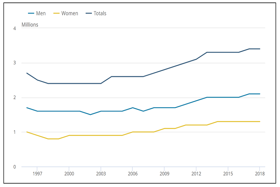
Line graph of millions from 0 to 4 over the time period 1996 to 2018. The lighter blue line refers to men, yellow line women and dark blue line totals.
Source:
- Families and households in the UK: 2020, Office for National Statistics, March 2021.
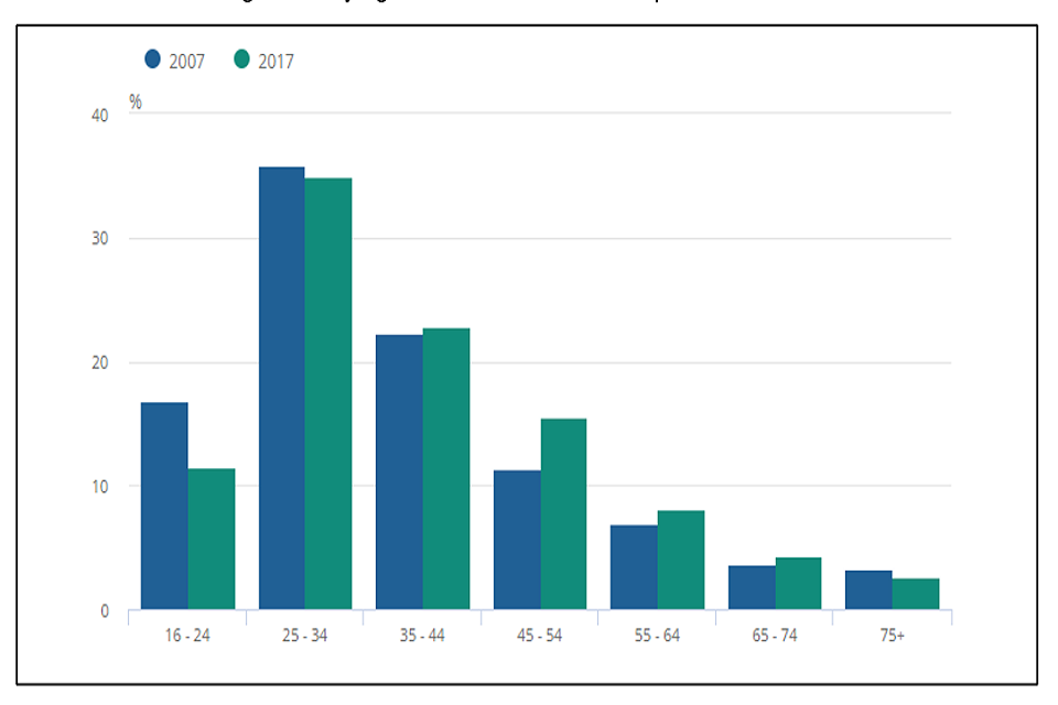
8. Increase in UK households in the private rented sector
The number of households living in the private rented sector in the UK increased from 2.8 million in 2007 to 4.5 million in 2017, an increase of 63%. Younger households are more likely to rent privately, with those in the 25 to 34 years age group representing the largest group.
Households in the 45 to 54 years age group saw the biggest percentage increase from 11% in 2007 to 16% in 2017, an estimated increase of 384,000 households.
In the financial year ending 2017, 35% of one adult households with children were in the private rented sector, compared with 18% in the financial year ending 2007.
Private renting sector by age of household reference person, 2007 and 2017, UK
Bar graph of percentage from 0 to 40 for age groups from 16 to 24 to over 75. Blue bars refer to 2007, green bars to 2017.
Source: Annual Population Survey, requested table, Office for National Statistics.
Source:
- UK private rented sector: 2018, Office for National Statistics, January 2019.
9. Steady increase in start and completion of new build housing since 2008
New build starts were broadly steady from 2003 to 2004, averaging around 44,000 units each quarter until late 2007. Starts were strongly affected by the economic downturn from the start of 2008, when there was a period of rapid decline to a trough in the March quarter of 2009.
Completions increased gradually from 2003 to 2004 reaching a similar level to starts by 2007. From 2009 starts began to recover and during the next two years both series converged and levelled out. From 2013 to 2018, starts and completions grew again gradually. More recently, completions continue to grow, but there has been a decrease in starts.
Seasonally adjusted trends in quarterly new build dwelling starts and completions, England.
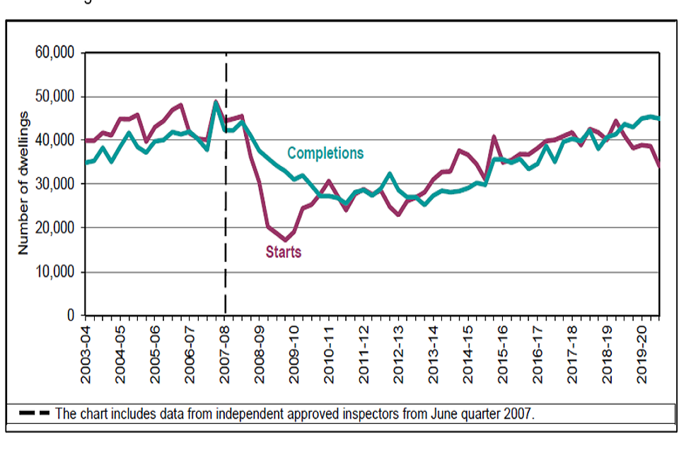
Line graph of number of dwellings from 0 to 60,000 over the time period 2003 to 2004 and 2019 to 2020. The red line show number of new dwelling starts, green line number of completions.
Source:
- House building; new build dwellings, England: December Quarter 2019, Ministry of Housing, Communities and Local Government, March 2020.
10. Affordable rent is the most common type of affordable housing tenure
Affordable rent has become the most common type of affordable housing tenure since its introduction in 2011 to 2012. Under affordable rent housing associations offer tenancies rents of up to 80% of market rent levels within the local area.
Rents let at the ‘affordable rent’ level typically cost between £65 to £80 more per week than traditional social rents for an equivalently sized property in an equivalent area. In England in 2019 and 2020 average rent from housing associations was 26.5% of household income compared to 31.9% from private renting and 17.8% for those with a mortgage.
Trends in the supply of affordable housing completions by tenure, England, 1991 to 1992 and 2019 to 2020
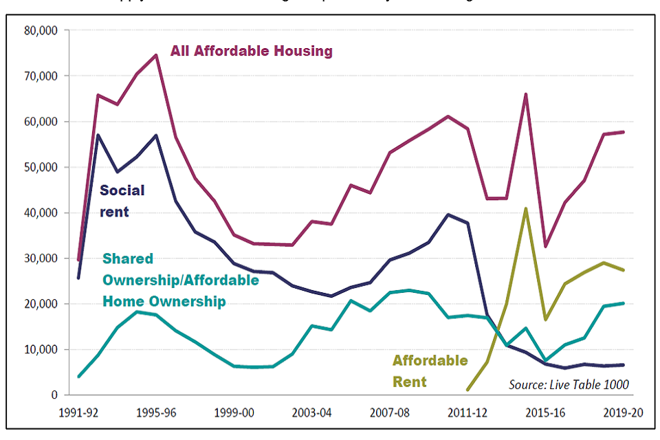
Line graph of housing completions from 0 to 80,000 over the time period 1991 to 1992 to 2019 to 2020. The magenta line refers to all affordable housing, blue line social rent, aqua line shared ownership and lime line affordable rent.
Sources:
- Affordable Housing Supply: April 2019 to March 2020 England, Ministry of Housing, Communities and Local Government, statistical release, December 2020.
- What is affordable housing? House of Commons, Library Briefing Paper, Number 07747, 19 April 2021.
11. Long-term increase in number of rough sleepers in England, but with a recent decline
There were 4,266 people estimated to be sleeping rough on a single night in autumn 2019. This is down 10% from the peak in 2017 but is up by 2,498 people or 141% since 2010. The South West of England was the only region where there was a notable increase in the number of people sleeping rough on a single night in autumn 2019, all other regions were broadly similar or decreased. London and the West Midlands decreased the most.
The majority of people sleeping rough in England are male, aged over 26 years old and from the UK. This is similar to previous years.
Number of people sleeping rough in London and the rest of England since 2010
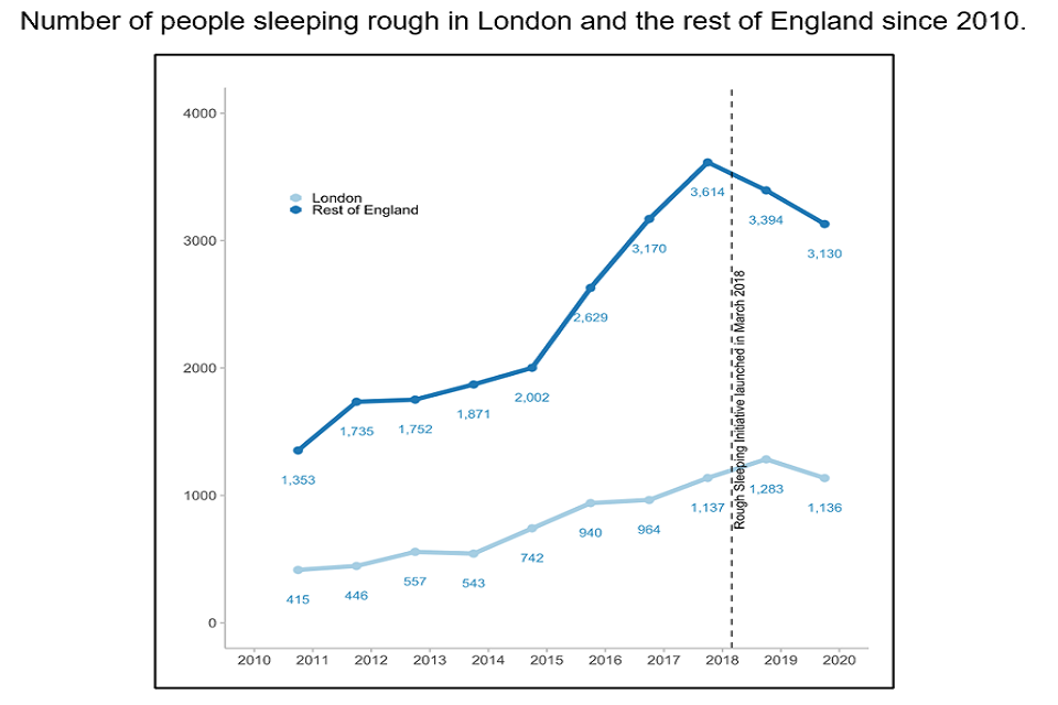
Line graph of number of rough sleepers from 0 to 4000 over the time period 2010 to 2020. The light blue line refers to London and the dark blue line the rest of England.
Sleeping rough includes people sleeping, bedding down or about to bed down in open air locations and other places not designed for habitation including tents, cars, and makeshift shelters.
Source:
- Rough sleeping snapshot in England: autumn 2019, Ministry of Housing, Communities and Local Government, February 2020.