State of the Nation 2022: Chapter 4 – Drivers of social mobility
Updated 21 July 2022

© Crown copyright 2022
This publication is licensed under the terms of the Open Government Licence v3.0 except where otherwise stated. To view this licence, visit nationalarchives.gov.uk/doc/open-government-licence/version/3 or write to the Information Policy Team, The National Archives, Kew, London TW9 4DU, or email: psi@nationalarchives.gov.uk.
Where we have identified any third party copyright information you will need to obtain permission from the copyright holders concerned.
This publication is available at https://www.gov.uk/government/publications/state-of-the-nation-2022-a-fresh-approach-to-social-mobility/state-of-the-nation-2022-chapter-4-drivers-of-social-mobility
Key insights
Trends in the drivers of social mobility over the last 20 years are generally positive.
The conditions of childhood have tended to improve over the past 2 decades, both in terms of finances and parental education levels.
Opportunities for good-quality education and employment have also improved. The UK’s education system has been performing at or above the Organisation for Economic Co-operation and Development (OECD) average since 2006. Maths, in particular, has improved recently.
Job opportunities are currently high, and youth unemployment has trended downwards since the 2008 financial crisis.
Young people’s median real hourly pay has increased steadily and now exceeds its pre-financial crisis high. The balance of professional over working-class jobs taken by young people has also improved.
Levels of social capital (trust and community relationships) in the UK compare well with those in other countries, although civic engagement has declined since the 1990s, and feelings of safety have decreased sharply from 2020 to 2021.
There are different trends in household finances when we consider the longer term, because income inequality and relative child poverty rose significantly in the 1980s, and have never fallen back to the levels seen in the 1960s and 1970s.
The full effects of the COVID-19 pandemic are still unlikely to be shown in the data.
Introduction
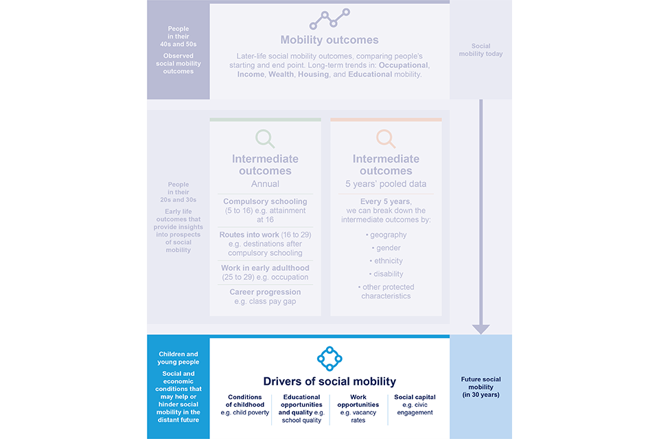
Since the causes of social mobility may lie years or even decades in the past, measuring mobility outcomes can be like “looking in the rear-view mirror”.[footnote 1] But if we measure what is currently happening to the drivers of change, we can look forward and see what mobility trends might look like in the future. Drivers are the background conditions that make social mobility easier. They don’t tell us the UK’s rates of social mobility, and they aren’t broken down by socio-economic background.[footnote 2]
Driving mobility for the whole of the UK
No single driver determines the course of social mobility, and the simple existence of a particular trend or gap does not imply any clear answer or particular policy solution. Nor does any given child on the ‘disadvantaged’ side of a driver necessarily have poor life chances. Factors like individual talent, culture and hard work are almost certainly far more important at the individual level. Yet at the aggregate level, the drivers give a sense of how background conditions for mobility are changing over time, and (where data allows) how the UK compares internationally.
We should distinguish between the question of aggregate mobility rates of change from the distinct (but related) one of an individual’s chances of mobility. If we were considering an individual’s chances of upward mobility, for example, we would want to look at a range of individual characteristics. These include cognitive skills, ambition and aspirations, or conscientiousness and hard work. Such individual characteristics are important, but to fulfil our remit to make recommendations on the promotion of social mobility, we concentrate on the factors with evidence linking them to aggregate rates. These are the background or environmental factors that the UK as a whole should be thinking about to boost social mobility. This also means that drivers are not broken down by socio-economic background.
The unmeasured enablers of mobility
In future, we will look at ways to estimate the impact of important factors like parenting or culture on people’s mobility chances. We will also keep our list of drivers under constant review to examine whether additional ones might be added or whether any should be removed.
In this section, we focus on the following drivers of social mobility:
-
Conditions of childhood.
-
Educational opportunities and quality of schooling
-
Work opportunities for young people
-
Social capital and connections
Figure 4.0: Drivers of social mobility
Driver 1: Conditions of childhood
Children’s social mobility chances partly depend on the resources their parents have to help them get ahead. However, the family resources that aid mobility are not just economic ones. Educational and cultural resources are also important, perhaps just as important for children’s success within the education system, or for obtaining good jobs. Having parents who have been through higher education (HE) themselves is a great help when trying to understand the complex British HE system. The distribution of parenting skills and family environment are likely to be important too, although they are far harder to measure.
We illustrate these conditions with indicators Drivers 1.1 to 1.3 on economic and cultural disparities, using parental education as a rough proxy for the cultural capital that may help children’s mobility. Where trends are based on survey data, they have not been tested for significance unless noted.
With these drivers, we try to show the financial and cultural resources that might be put into place to increase children’s future upward mobility chances. This is an incredibly complex set of circumstances to represent in a small set of measures, and the measures do not in themselves suggest policy solutions. But at the national level, large variations in the financial and cultural resources available to children may act as a barrier to mobility.
Driver 1.1: Distribution of earnings
The 90:10 ratio is the income at the 90th percentile divided by the income at the 10th percentile. The higher the number, the greater the gap between relatively high rates of pay and relatively low rates of pay. When the number is 1, there is no gap (since any number divided by the same number is equal to 1). This can affect social mobility because larger differences in hourly pay will in turn cause larger differences in families’ resources. As a secondary effect, higher hourly pay gives parents more flexibility to work fewer hours, allowing them to spend more time on childcare.
The ratio fell slightly between 2010 and 2020, and more markedly in 2021. The most recent figures indicate that hourly earnings at the 90th percentile were 3.25 times the earnings at the 10th percentile in 2020. Growth in employment and a fall in real earnings have probably contributed to this. As real earnings fall, they may fall more markedly at the higher end. In addition, the furlough scheme kept unemployment from rising sharply during the pandemic.
Historically, income inequality was far lower in the 1960s and 1970s, rose considerably in the 1980s, and has remained at a similar level since the mid-1990s, across a range of measures.[footnote 3] Yet, while general earnings growth in the UK has been poor, there is no sign that disparities in earnings are creating a higher barrier to mobility than in the late 1990s or early 2000s.
Figure 4.1: The gap between high and low hourly earnings has remained relatively stable, with a slight drop recently
The gap in hourly earnings calculated as a ratio between the 90th and 10th percentiles in the UK, from 1997 to 2021. When the ratio equals 1, there is no gap in earnings.

A line chart showing the gap between high and low hourly earnings has remained relatively stable, with a slight drop recently.
Source: ONS, Annual Survey of Hours and Earnings (ASHE).
Note: Values to calculate ratio are taken from earnings and hours worked, place of work by local authority: ASHE table 7.5a. Gross hourly pay from 1997 to 2021.
Driver 1.2: Childhood poverty
We illustrate with indicator Driver 1.2 on childhood poverty. Figure 4.2 shows how the percentage of children living in relative poverty – that is, in households with an income below 60% of the contemporary median, after housing costs – has changed over time. Lines show the UK as a whole, and England, Northern Ireland, Scotland and Wales separately.
Figure 4.2: The percentage of children living in relative poverty after housing costs has slightly declined since the mid-1990s
Percentage of children in relative poverty after housing costs in the UK and in England, Northern Ireland, Wales and Scotland, from financial years starting in 1994 to 2019.

A line chart showing the percentage of children living in relative poverty after housing costs has slightly declined since the mid-1990s.
Source: Department for Work and Pensions, Households Below Average Income, 2021.
Note: Based on a poverty line defined as 60% of the contemporary median equivalised family income after deduction of housing costs. The number for each year is a moving average of the 3 most recent financial years (FY). For example, the figure for 2019 represents the average of the financial years starting in 2017, 2018 and 2019. FY are reported by the year in which they start. For example, 2019 represents the financial year ending in 2020 (FY 2019 to 2020).
A household is said to be in relative poverty if their equivalised income is below 60% of the median income. ‘Equivalised’ means adjusted for the number and ages of the people living in the household. Relative poverty is not a measure of material deprivation, but rather of the number of families and children whose means are significantly less than what might currently be considered ‘normal’. With this definition, there are around 4.3 million children in the UK, or almost 30%, living in poverty.[footnote 4] Figure 4.2 shows that England and Wales have consistently had higher percentages of children living in relative poverty than Northern Ireland and Scotland. Over the last 5 years, levels of poverty have been rising everywhere except in Northern Ireland.
Relative poverty may affect social mobility because children and families living with a relatively low income experience many comparative disadvantages. This can have negative health and social consequences throughout life. In particular, if there is higher income inequality, we might expect an increase in the inequality of investments that richer and poorer parents make in their children.
For example, the most affluent parents can support their children through HE without running into debt, pay for private schooling or private coaching for high-stakes exams or even buy a house within the catchment area of a particular school.[footnote 5] [footnote 6] [footnote 7] [footnote 8] Families of greater financial means might also have more flexibility to reduce working hours and devote more time to quality childcare.
As with the distribution of income, the picture is worse now than in the 1960s and 1970s.[footnote 9] Yet since child poverty rates have remained consistently below their peak in the mid-1990s, there is little sign that they now amount to a significantly worsening barrier to mobility than at that time.
Driver 1.3: Distribution of parental education across families
Analysis of data from Understanding Society (the UK Household Longitudinal Study) shows that the qualifications of young people’s parents have substantially improved since the 2008 recession. As figure 4.3 illustrates, the proportion of young people in dual-parent households whose parents both have a degree increased by approximately 74% between 2009 to 2010 and 2019 to 2020 (from 19% to 33%). Similarly, the proportion in single-parent households where the parent is a graduate increased from 14% to 25%. The proportions of households where the single parent, or either parent (in dual-parent households), has below GCSE-level qualifications has also dropped (from 24% to 11%, and from 14% to 6%, respectively).
Figure 4.3: Parents now have higher levels of qualifications than they did in 2009 to 2010
The percentage of highest parental qualification levels for children in single and dual-parent households in 2009 to 2010 and 2019 to 2020 in the UK

A bar chart showing that single-parent households now have higher levels of qualifications than they did in 2009/10.

A bar chart showing dual-parent households now have higher levels of qualifications than they did in 2009/10.
Source: University of Essex, Institute for Social and Economic Research, Understanding Society: Waves 1 to 11, 2009 to 2020.
Notes: Percentage of single and 2 co-resident parent households who have children aged 5 to 16 years by highest qualification. HE = Higher education.
While these figures tell us little about the relative positioning of parents on the occupational ladder – more people with degrees could simply result in more qualified people competing for the same positions – they indicate that more children are now in a position to benefit from the cultural capital gained by their parents during their parents’ post-school education. ‘Cultural capital’ loosely means the social and cultural knowledge that can help an individual to be socially mobile. Here, we use parental education as a proxy for that cultural capital, but education may also correlate with other family characteristics, such as composition and double incomes. These are relevant to social mobility and we will look further into this in the future.
Parental education only captures a part of cultural capital, and of course, other factors need to be considered. For example, neighbourhoods might be important too. Many young people grow up in neighbourhoods where they only meet others who are similar to them. This may impact their knowledge of opportunities available to them, which in turn can impact their life aspirations.
Driver 2: Educational opportunities and quality of schooling
Educational expansion over time has occurred in all developed countries. Contributing to this is the progressive raising of the school leaving age and the increasing provision of higher and further education after that age.
An expansion of opportunities will increase upward absolute educational mobility, and may also be important in increasing relative educational mobility. For example, while the mandatory school age applies to families of all social backgrounds, raising the age has made more difference to disadvantaged groups. This is because children from advantaged families already stayed on longer at school.
Rigorous studies in the UK and Germany have both shown that raising the school leaving age to 16 reduced class inequalities in educational achievement. In Germany, it also had knock-on effects on relative occupational mobility. UK researchers were unable to find any impact on subsequent occupational mobility, but it had positive impacts on educational mobility.[footnote 10]
The drivers in this section focus on the quality of education provided, and the opportunities for access to different forms of education after the age of 16. Where trends are based on survey data, they have not been tested for significance unless noted.
We focus on data for England primarily, as education is devolved, and there is no harmonised administrative educational data covering all 4 countries of the UK. In some cases, we look at the OECD average to understand how the UK compares with similar countries.
Driver 2.1: Opportunities for education and training post 16
We illustrate this with driver 2.1 in figure 4.4, participation in education and training between age 16 and 18 years. At first glance, the trends seem quite positive: participation in education or apprenticeships is now the highest on record, at 82.3% in 2020. The proportion of young people aged 16 to 18 years who are not in education, employment or training (NEET) has decreased over time, particularly from 2012 to 2013. This rate has remained stable and is still one of the lowest on record at the end of 2020.
Figure 4.4: More young people aged 16 to 18 years are in education and training than ever before, yet many are still NEET despite legal changes
Percentage of young people aged 16 to 18 years participating in education, training and employment in England between 2011 and 2020.

A bar chart showing more young people aged 16 to 18 years are in education and training than ever before, yet many are still not in education, employment or training (NEET) despite legal changes.
Source: DfE, Participation in education, training and employment, 2020.
Note: Work-based learning (WBL); Not in education, employment or training (NEET); NEET includes anybody who is not in any forms of education or training and who is not in employment. This means that a person identified as NEET is either unemployed or economically inactive. Historically, there have been very small overlaps of students studying in further education and higher education and WBL at the same time. The total number of young people in training is calculated by omitting these overlaps. Of note, 16 to 17 year olds are required to remain in education and training in England following raising the participation age legislation in 2013. Participation estimates for the 2020 cohort impacted by COVID-19 may not fully reflect engagement and attendance.
However, this is in the context of a legal requirement, since 2013, for all young people in England to be in education or training. So those who are NEET are in breach of this requirement. Youth employment levels also fell during the pandemic, and apprenticeships were also affected negatively.[footnote 11] [footnote 12] There is evidence from Germany (where apprenticeships are much more prevalent than in the UK) that there were difficulties moving to the digital delivery and interaction that other educational sectors adopted.[footnote 13]
Moving to young people aged 18 years, we see that participation falls considerably. Figure 4.5 shows young people aged 18 years in their first year after compulsory education or training. There were only 64% participating in education or apprenticeships, and 12% NEET, in 2020. While levels of participation in education or apprenticeships show a positive trend, levels of NEET are on the rise. They show an increase compared with last year and are at their highest since 2014. Increases in the levels of NEET are likely due to the effects of the COVID-19 pandemic, which saw decreases in both youth employment and participation in wider training. Even so, the broad stability of the rate despite the effect of the pandemic suggests that some of the underlying phenomena of interest, such as the quality and stability of work, are not being captured.
Figure 4.5: More 18 year olds are in education and employment than 10 years ago, and fewer are NEET
The percentage of young people aged 18 years participating in education, training and employment in England between 2011 and 2020.

A bar chart showing more 18-year olds are in education and employment than 10 years ago, and fewer are not in education, employment or training.
Source: DfE, Participation in education, training and employment, 2020.
Note: Work-based learning (WBL); Not in education, employment or training (NEET). NEET includes anybody who is not in any form of education or training and who is not in employment. This means that a person identified as NEET is either unemployed or economically inactive. Historically there have been very small overlaps of students studying in further education and higher education and WBL at the same time. The total number of young people in training is calculated by omitting these overlaps. Of note, young people aged 16 to 17 years are required to remain in education and training in England following raising the participation age legislation in 2013.
Driver 2.2: Availability of high-quality school education
We illustrate the quality of school education in the UK with the OECD’s Programme for International Student Assessment (PISA) survey, which measures 15-year-old school pupils’ performance in mathematics, science and reading. This survey is designed to evaluate education systems by measuring the performance of pupils at 15 years old, on a comparable basis, across the OECD and certain partner jurisdictions.
PISA allows us to look at the UK as a whole (rather than just England), but also to see how our performance compares with similar countries’. The UK has performed at or above the OECD average since the beginning of the programme in 2000 (although scores in 2000 and 2003 are thought to have low reliability and aren’t plotted below – see figure 4.6). In 2018, students in the UK scored above the OECD averages in reading (504 score points), mathematics (502), and science (505).
Figure 4.6: The UK has performed at or above the OECD average in the Programme for International Student Assessment (PISA) since at least 2006
Average pupil attainment scores (out of 1000) on PISA reading, maths, and science assessments, UK and OECD average, 2006 to 2018.

A bar chart showing the United Kingdom has performed at or above the Organisation for Economic Cooperation and Development average in the Program for International Student Assessment since at least 2006.
Source: OECD, Programme for International Student Assessment (PISA), 2006, 2009, 2012, 2015, and 2018 reading, mathematics and science assessments.
Note: Proxy to measure opportunities for high-quality school education. Average scores for young people aged 15 years on PISA’s overall reading, mathematics and science. The reading, mathematics and science scale ranges from 0 to 1000.
Average performance was not statistically significantly different from that of Australia, Belgium, Germany, New Zealand, Norway, Sweden and the US in at least 2 of the 3 subjects. However, it was lower than the average performance of several regions in China, as well as Canada, Estonia, Korea, and Singapore in all 3 subjects.[footnote 14]
The UK’s reading and science scores have remained stable since 2006, with no significant change. Yet in mathematics, there was a significant 9-point improvement between 2015 and 2018.
Driver 2.3: Opportunities for access to higher education
Proxy measures for participation in HE are plotted for the UK and England in figures 4.7 and 4.8. As we can see, enrolments increased in the UK from 2010 to 2019.[footnote 15] That is, the data reveals a steady increase in participation rates during this period. Over recent years the qualifications landscape within the UK HE sector has continued to expand with more degree-level courses, including degree apprenticeships. These are accessible for learners from more non-traditional academic backgrounds.
This driver seeks to capture the idea of better access to HE – there is no implied recommendation that any particular group should or should not seek HE.
Figure 4.7: More young people aged 19 years are enrolled in education than ever before and the UK has now reached the OECD average
Percentage of pupils enrolled in secondary or tertiary education at age 19, UK and international average, from 2010 to 2019.

A bar chart showing more 19-year olds are enrolled in education than before and the United Kingdom has now reached the Organisation for Economic Cooperation and Development average.
Source: OECD, Online Education Database: Enrolment by age.
Note: Proxy measure of the participation rate relative to the number of young people aged 19 years in the population. Enrolment rates in secondary and tertiary education are expressed as net rates. These are calculated by dividing the number of students aged 19 years enrolled in these levels of education by the size of the population of 19 year olds. Generally, figures are based on headcounts and do not distinguish between full-time and part-time study. In some OECD countries, part-time education is only partially covered in the reported data.
Figure 4.8: Enrolment in higher education is higher than ever before
The percentage of initial entrants to higher education in England aged 17 to 30 years, from 2006 to 2020.

A line chart showing enrolment in higher education is higher than ever before, increasing since 2006.
Source: DfE, Participation measures in higher education, 2019 to 2020.
Note: Figure represents the Higher Education Initial Participation (HEIP) measure. The HEIP has been published by the DfE (and its predecessors) since 2004. The measure is the sum of the age-specific participation rates for the 17 to 30 year old population in England in each academic year. It can be thought of as a projection of the likelihood of a 17 year old today participating in higher education by age 30 if the latest year’s entry rates persisted in the future. An initial entrant is defined as an English-domiciled entrant to higher education who participates for at least 6 months for the first time. Additional providers who returned data to the Higher Education Statistics Agency Student Alternative record have been included from 2014/15. Figures are therefore not directly comparable with earlier years. The HEIP measure includes participation in first degrees, foundation degrees, Higher National Certificates and Higher National Diplomas, postgraduate taught, postgraduate research, and other undergraduate qualifications.
This trend is mirrored by the participation rates for England alone (figure 4.8). The Higher Education Initial Participation (HEIP) measure for those aged 17 to 30 years has seen year-on-year increases in all years apart from in the academic year 2012 to 2013, when there was an increase in tuition fees. The HEIP measure spiked again in the 2019 to 2020 academic year to 53.4%, an increase of 1.5 percentage points from 51.9% in the previous academic year. This increase was largely driven by the contribution to the HEIP measure of those aged 18, which increased by 1.2 percentage points to 30.6% in the academic year 2019 to 2020. This may be because the COVID-19 pandemic limited labour market opportunities for young people, but the UK participation rate is now much closer to the OECD average.
Analysis of the impact of previous crises shows that economic downturns can encourage more young people to stay in education after leaving school. However, as we reported in chapter 3, young people from higher socio-economic backgrounds are still more likely to attend and benefit from university. This is probably due to the increased influence of parental educational background during periods of crisis. For example, secondary analysis of the UK British Household Panel Survey and Understanding Society’s UK Household Longitudinal Survey (HLS) datasets by the University of Essex shows that, during periods of high unemployment, the influence of parents’ educational background on their children’s educational choices increases. The analysis found that immediately after the 2008 recession, young people whose parents had low levels of education were 25 percentage points less likely to want to attend university than young people with highly educated parents.[footnote 16]
In future, it may be possible to look at the value of new level 4 and level 5 qualifications (post-18 but below degree level), and to broaden the scope of this driver to include those. We do not, by the inclusion of this driver, wish to suggest that any particular individuals or groups should increase their participation in HE.
Driver 2.4: Availability of high-quality higher education
We illustrate this driver with retention and completion rates. The proportion of UK students dropping out of university after the first year of their course hit a record low in the 2019 to 2020 academic year (see figure 4.9). Just 5.3% of full-time undergraduate students who started their course in the 2019 to 2020 academic year were no longer in HE at the start of their 2nd year. This represents a fall of 1.4 percentage points on the previous year, and the lowest non-continuation rate observed since the statistics have been collected.[footnote 17]
Figure 4.9: Non-continuation (dropout) rates have fallen sharply
Non-continuation (dropout) rates of full-time entrants during their first year at a higher education provider.

A line chart showing non-continuation (dropout) rates have fallen sharply.
Source: Higher Education Statistics Agency, non-continuation summary: UK performance indicators.
Note: Years represent the academic year of entry. Percentage of UK domiciled full-time entrants who did not leave within 50 days of commencement and did not continue in HE after their first year, academic years of entry 2014 to 2015 to 2019 to 2020.
Despite these increases, many questions remain. Understanding how the rise in participation rates relate to completion rates, and how HE relates to subsequent employment, forms key aspects of future work for the Social Mobility Commission.
A similar pattern is seen for the non-continuation rate for mature full-time, first degree entrants (aged 21 years and older). The number of students dropping out was 11.9% – down 1.6% points from the previous year. Projected outcome statistics show that only 9.4% of full-time first degree entrants in the UK are projected to drop out of HE without a qualification. This is the lowest rate on record.[footnote 18]
The UK’s tertiary graduation rate – the rate at which people graduate with a bachelor’s, master’s or doctoral degree for the first time before a threshold age – is higher than the OECD average. This has been rising (see figure 4.10). However, this OECD average hides a wide variation, which is shown with a few examples below. The equivalent rate in Germany is lower, while that in Spain is considerably higher. The rate in New Zealand was higher in the early 2010s, but has now fallen below the UK’s.
Figure 4.10: The UK’s graduation rate has risen since 2015
The tertiary graduation rate in the UK and internationally, from 2013 to 2019.

A line chart showing the United Kingdom's graduation rate has risen since 2015.
Source: OECD, tertiary graduation rate, 2022.
Note: The tertiary graduation rate represents the expected probability of graduating for the first time from tertiary education before the age threshold if current patterns continue. The threshold is age 30 for completing bachelor’s degrees and first-time tertiary education overall, and age 35 at the master’s and doctoral levels. International students are excluded.
The examples shown here may be more reflective of cultural differences around the age at which study is undertaken, or around things like the vocational training being inside or outside HE institutions, than of the quality of HE. As with the other drivers, we will keep the measure under review.
Driver 3: Work opportunities for young people
Reducing disparities in educational opportunities is important, but not the only consideration for improving mobility chances in the labour market. It is therefore encouraging to see positive recent trends in all measures of work opportunity for young people.
Research has shown that, even among young people with similar educational achievements, those from more advantaged backgrounds do better in the labour market. Even within the same occupations, they earn substantially more than their equally qualified peers from less advantaged backgrounds.[footnote 19]
Work opportunities are important for understanding changing prospects for mobility both over time and across the different areas of the UK. The next set of drivers, 3.1 to 3.4, looks at these aspects in greater detail and includes metrics on job vacancy rates, youth unemployment, type of employment, and earnings. Where trends are based on survey data, they have not been tested for statistical significance unless noted.
Driver 3.1: Vacancy rate at entry level
Figure 4.11 illustrates the trend over time in vacancy rates, showing the number of vacancies per jobseeker. This ratio serves as a proxy for job opportunities. A higher ratio indicates that there are more vacancies, and so greater job opportunities.
Figure 4.11: There are more vacancies available per jobseeker now than at any time in the last 20 years
The number of vacancies per unemployed person in the UK (seasonally adjusted), quarter 4 from 2001 to 2021.

There are more vacancies available per jobseeker now than at any time in the last 20 years.
Source: ONS, Vacancy Survey/LFS.
Note: It is not currently possible to distinguish vacancies in entry-level jobs from other types of jobs. A proxy for job opportunities is calculated by ONS as the ratio of the number of unemployed relative to the number of vacancies and published here as the reciprocal. Ratios were calculated using quarter 4 (October to December) from 2001 to 2021 to use the most recent quarter for 2021. A higher value indicates a more positive trend. It is important to note that this data represents all people aged 16 to 64 years who are unemployed.
Figure 4.11 indicates that the trend in vacancy rates is volatile and impacted by events like the financial crisis of 2008 and the COVID-19 pandemic in 2020. However, there were over 0.9 vacancies for every jobseeker in 2021. This trend is promising and reflective of some of the government’s positive actions during the COVID-19 pandemic, but it is unclear if this trend will continue.
Driver 3.2: Youth unemployment
To illustrate young people’s work opportunities, we show in figure 4.12 youth unemployment rates for the period 2002 to 2021. Unemployment is measured here as the percentage of economically active young people – those who are either in work or available for and seeking work. Those in full-time education, looking after the home, or permanently sick and disabled are excluded from the calculations.
Figure 4.12: Youth unemployment increased sharply in 2020. But it has fallen again, to a similar level as the early 2000s
The percentage of those aged 16 to 24 year who were unemployed in the UK, by gender, from 2002 to 2021.

A line chart showing youth unemployment increased sharply in 2020 but has fallen again, to a similar level as the early 2000s.
Source: ONS, LFS, from 2002 to 2021.
Note: Derived from July to September waves, weighted analysis based on 2020. The LFS follows the internationally agreed definition for unemployment recommended by the International Labour Organisation (ILO) – an agency of the UN. Unemployed people are those without a job, who have actively sought work in the last 4 weeks and are available to start work in the next 2 weeks; or are out of work, have found a job and are waiting to start it in the next 2 weeks. See ONS, ‘A guide to labour market statistics’, 2020. Published on ONS.GOV.UK, and ONS, ‘People in work’, 2022. Published on ONS.GOV.UK.
The most striking aspect of figure 4.12 is the very high unemployment rates for young people after the 2008 financial crisis and again from 2011 to 2013, when youth unemployment rates, particularly those for men, reached 20% or more. While unemployment rates spiked again in 2020 to approximately 16%, the rate in 2021 was considerably lower, at approximately 13% for the UK as a whole (13.5% for men and 12.6% for women). As mentioned earlier, the increase in education participation may have helped to limit a sharp rise in unemployment among young people.[footnote 20]
It is clear that the pandemic has had an impact on young people’s employment prospects. The introduction of restrictions from 2020 to 2021 directly resulted in increased rates of unemployment and impacted working conditions. However, the initial negative impact on employment among this age group in the earlier stages of the pandemic had shown signs of reducing by the end of the third lockdown in March 2021. This positive trend has been experienced by all income groups, except for the lowest earners. They have been, and may still be, suffering financially as a result of the pandemic.[footnote 21] So, there is a potential long-term scarring effect of youth unemployment, particularly for those exposed to poverty or with poor social mobility prospects.
Driver 3.3: Type of employment taken by young people
Vacancies and unemployment do not tell the full story about work opportunities – the type of employment matters too. To look at the level of work available, not just the rate of employment, we include indicators of the percentage of young people taking up professional and managerial, intermediate, and manual work.
Between 2002 and 2019, the number of young men and women in professional jobs has remained roughly the same. As figure 4.13 shows, in 2002, 45.5% of men and 47.5% of women aged 22 to 29 were in professional jobs. This has remained largely unchanged, with estimates of 44.0% of men and 48.7% of women in 2019. The numbers of those in working-class jobs have also remained relatively stable over the same period. 36.1% of men and 26.6% of women were in working-class jobs in 2002, compared with 35.7% and 24.8% in 2019.
But increases in the last 2 years have seen percentages of men in professional jobs reach a high of 51.1% and 48.0% in 2020 and 2021, respectively. Numbers for men in working-class jobs have also reached new lows of 27.1% in 2020 and 28.1% in 2021.
Figure 4.13: The type of employment taken by young men has recently shifted towards professional occupations. In young women this had already been the case for at least 20 years
The percentage of young men (top) and women (bottom) aged 25 to 29 years by type of employment, in the UK, from 2002 to 2021.

A line chart showing the type of employment taken by young men has recently shifted towards professional occupations; in young women this had already been the case for at least 20 years.

A line chart showing the type of employment taken by young men has recently shifted towards professional occupations; in young women this had already been the case for at least 20 years.
Source: ONS, LFS, from 2002 to 2021.
Note: Derived from July to September waves, weighted analysis based on 2020.
This might be thought of as an encouraging trend, but it is explained by high rates of job loss in sectors such as hospitality and retail, that were the hardest hit during periods of the COVID-19 pandemic. While it is reported that, as restrictions eased and some young people got jobs in sales, administration and public service roles, these positives are not likely to have outweighed the damage done in the sectors that traditionally employ young people.[footnote 22] This is supported by an analysis by the Institute for Fiscal Studies, which found that young people aged under 25 years were about 2.5 times more likely than other workers to work in a sector that was closed during the lockdown.[footnote 23]
Analysis of the Understanding Society - the UK Household Longitudinal Survey (UKHLS) data highlights the need for young people to move job sector as a result of loss of employment due to the pandemic. This raises concerns about career disruption and long-term consequences for their earnings and progression, despite the mitigation provided by the Coronavirus Job Retention Scheme.[footnote 24] While it is possible that some people changed from working-class jobs to professional jobs, we cannot confirm that from the available data.
The trend for young women is largely similar to that for young men. However, a comparison of the figures above (figure 4.13) suggests that there was a somewhat greater negative impact of falls in youth employment among men, compared to women. As we can see in the bottom figure, historically there have been fewer women than men in working-class jobs, and the proportion of women in these jobs has remained relatively stable over time. Consistent with our findings, another analysis of Labour Force Survey data suggests that young women have been impacted less by shrinking jobs and have benefited more from employment growth in the past 2 years. Young women have also turned to education in greater numbers than young men.[footnote 25]
Driver 3.4: Earnings of young people
Overall, the hourly earnings of young people have increased over time (see figure 4.14). The long-term trend shows a steady increase in earnings from 1997 to 2009, peaking at £13.31 per hour in 2009. Earnings decreased sharply between 2009 and 2012, likely due to the financial crisis of 2008. Average hourly earnings remained stable until 2015, after which they increased again. In 2021, the average hourly pay reached a peak of £13.33, the highest it has been since 2009.
Figure 4.14: Real hourly pay for young people has recovered to pre-financial crisis levels
The median real hourly pay for people aged 22 to 29 years in the UK, from 1997 to 2021.

A line chart showing real hourly pay for young people has recovered to pre-financial-crisis levels.
Source: ONS, Annual Survey of Hours and Earnings (ASHE) table 6.
Note: Values taken from earnings and hours worked by employees, place of work by local authority: ASHE table 6.5. Hourly pay: gross from 1997 to 2021. Earnings are inflation-adjusted using the Consumer Price Index (CPI, base year = 2021). The Consumer Price Index is a headline measure of inflation - the rate at which prices increase. This is calculated by the Office for National Statistics (ONS) who track the changes in prices for a basket of goods representing the average consumer. For more information see the ONS website. Published on ONS.GOV.UK. ASHE covers employee jobs in the UK. It does not cover the self-employed, nor does it cover employees not paid during the reference period.
It is critical to mention, however, that interpreting average earnings data is difficult at the moment. The data from 2020 and 2021 was affected by both the COVID-19 pandemic, in terms of wages and hours worked in the economy, and also disruption to the collection of data from businesses. This means that comparisons with previous years need to be treated with caution.
Driver 4: Social capital and connections
This is a largely experimental section of the measurement framework. Social capital means the social connections and the trusting relationships that are gained from them. It is a property of society rather than of individuals. Its role in promoting social mobility is less well understood than the role of the labour market, at least in the UK. But research suggests that social capital can enable a more dynamic economy and society. Drivers in this section all broadly relate to social capital, and are not subdivided.
Social capital could also aid entrepreneurship, and has been emphasised in the literature on entrepreneurship within ethnic communities.[footnote 26] The theory behind this idea is that high levels of ‘generalised trust’ within a community reduce transaction costs, making it easier for people to do business with each other.
We show this component of the measurement framework with data on civic engagement, using the UKHLS. In the first instance, we use an exploratory measure of civic engagement, namely volunteering.
We then use a similar measure – participation in voluntary organisations – which American research has found to be causally related to area differences in absolute rates of upward income mobility. Finally, we use a measure from the OECD, which allows for international comparisons.
These trends are based on survey evidence and have not been tested for significance or broken down by socio-economic background. It may be possible to provide such breakdowns in future.
Figure 4.15 suggests that levels of civic engagement, as measured by the percentage of people volunteering, have remained relatively low across time. Analysis of the UKHLS data shows that less than 21% of respondents aged 16 years and over had volunteered within the last 12 months, and that this has remained consistent from 2010 to 2018.
Figure 4.15: There is no clear trend in volunteering over the last 10 years, although there is a noticeable drop after 2014
The percentage of people volunteering in the last 12 months in the UK (men and women aged 16 years and older).

A bar chart showing there is no clear trend in volunteering over the last 10 years, although there is a noticeable drop after 2014.
Source: University of Essex, Institute for Social and Economic Research, Understanding Society: Waves 2 to 10, 2010 to 2018.
Note: Social capital here is measured as volunteering over the past 12 months. Data for this question is collected every 2 years.
Similarly, figure 4.16 suggests that levels of civic engagement, as measured by participation in civic organisations, have been declining, more so in England, Wales and Northern Ireland than in Scotland. This decline is in line with previous research, although it has been suggested that newer forms of online activity may be serving to replace the more traditional forms of civic engagement covered by our measure.[footnote 27] It is perhaps premature to regard this as a warning sign of potential problems, but it could benefit from deeper analysis.
Figure 4.16: Participation in civic organisations has dropped markedly across the UK, except in Scotland
Civic engagement in England, Wales, Scotland and Northern Ireland from 1991 to 2017 (men and women aged 25 to 65 years).

A bar chart showing that participation in civic organisations has dropped markedly across the United Kingdom, except in Scotland.
Source: British Household Panel Survey (BHPS; 1991 and 2001) and University of Essex, Institute for Social and Economic Research, Understanding Society, 2011 and 2017.
Note: Civic engagement is measured as membership of or activity in any of a range of different types of civic organisation. The BHPS initially covered Great Britain but was subsequently extended to include Northern Ireland as well.
As figure 4.17 shows, self-reported satisfaction with personal relationships is relatively high in the UK compared with the other countries surveyed. Since the survey asks about all relationships, this may be a rather weak proxy for social capital, but there is no obvious cause for concern in the results.
Figure 4.17: People in the UK report being more satisfied with personal relationships than in most other countries surveyed
Self-reported satisfaction with personal relationships (score out of 10), 2018, for those aged 16 years and over.

A bar chart showing people in the United Kingdom report being more satisfied with personal relationships than in most other countries surveyed.
Source: OECD, Eurostat’s European Union Statistics on Income and Living Conditions.
Note: Satisfaction with personal relationships refers to the mean score of survey respondents who rate their satisfaction with their personal relationships on an 11-point scale, from 0 (not at all satisfied) to 10 (completely satisfied). The variable refers to the respondent’s opinion/feeling about the degree of satisfaction with their personal relationships. The respondent is expected to make a broad, reflective appraisal of all areas of their personal relationships (for example, relatives, friends, colleagues from work and so on) at a particular point in time (these days). This indicator refers to individuals aged 16 or more.
Fear of crime can be an adverse indicator of generalised social trust. This means that more widespread feelings of safety when walking home at night are likely to indicate higher levels of trust. A time series for the UK is given here, along with an example selection of other wealthy countries. While feelings of safety are not quite as high in the UK as in, for example, Denmark, there is a notable upward trend, but with a very sharp drop in 2021.
Figure 4.18: Feelings of safety when walking home at night have dropped sharply in the last year in the UK
The percentage of respondents who report feeling safe walking home at night, people aged 15 years and over, from 2006 to 2021.

A line chart showing that feelings of safety when walking home at night have dropped sharply in the last year in the United Kingdom.
Source: OECD, Gallup World Poll.
Note: Based on the survey question: “Do you feel safe walking alone at night in the city or area where you live?” Averages reflect the share of all respondents who replied ‘yes’ to this question.
Conclusion
Trends in the drivers of social mobility in the UK look broadly positive, despite more difficult economic conditions following the 2008 financial crisis. In particular, education and young people’s employment have improved over the past decade. The picture on the conditions of childhood has been fairly stable, with a slight recent rise in child poverty, but a slight drop in income inequality. Social capital gives perhaps the greatest cause for concern in recent years, with drops in civic engagement, volunteering and feelings of safety.
A note of caution must underlie all of these conclusions. The UK has just gone through 2 major economic upheavals – the COVID-19 pandemic, and exiting the European Union – and is now entering a cost of living crisis. Future trends in these drivers, and their relationship to social mobility, may be unpredictable.
-
Robert Putnam, ‘Our kids: the American dream in crisis’, 2016. Published on ACADEMIC.OUP.COM. ↩
-
This means that some concepts can be viewed as both driver and outcome. For example, when we look at educational outcomes split by parental class background, it is a mobility measure, since we have a start point (the family background) and an end point (the educational outcome). But when we look at the quality of education across the whole UK, it is a driver. ↩
-
Institute for Fiscal Studies, ‘Living standards, poverty and inequality in the UK’, 2021. Published on IFS.ORG.UK. ↩
-
UK Government, ‘Households below average income: for financial years ending 1995 to 2020’, 2021. Published on GOV.UK. ↩
-
Student Loans Company, ‘Understanding living costs while studying at university or college’, 2021. Published on GOV.UK. ↩
-
The Sutton Trust, ‘Poor grammar: entry into grammar schools disadvantaged pupils in England’, 2013. Published on SUTTONTRUST.COM. ↩
-
Department for Education,‘House prices and schools: do houses close to the best-performing schools cost more?’, 2017. Published on ASSETS.PUBLISHING.SERVICE.GOV.UK. ↩
-
Gary Solon (2004) for a formal exposition of these theories. Gary Solon, ‘A model of intergenerational mobility variation over time and place’, in Miles Corak (editor), ‘Generational income mobility in North America and Europe’, 2009. Published on CAMBRIDGE.ORG. ↩
-
Institute for Fiscal Studies, ‘Living standards, poverty and inequality in the UK’, 2021. Published on IFS.ORG.UK. ↩
-
On Britain, see Franz Buscha and Patrick Sturgis, ‘Increasing inter-generational social mobility: is educational expansion the answer?’, 2015. Published on ONLINELIBRARY.WILEY.COM; On Germany, see Bastian Betthӓuser, ‘Fostering equality of opportunity? Compulsory schooling reform and social mobility in Germany’, 2017. Published on ACADEMIC.OUP.COM. ↩
-
UK Parliament, ‘Youth unemployment statistics’, 2022. Published on HOUSE OF COMMONS LIBRARY. ↩
-
London School of Economics Business Review, ‘UK apprenticeships: impacts of the levy and COVID-19’, 2021. Published on BLOGS.LSE.AC.UK. ↩
-
Multidisciplinary Digital Publishing Institute, ‘Challenges in the digitization of apprenticeships during the coronavirus pandemic: who needs special assistance?’, 2021. Published on MDPI.COM. ↩
-
Organisation for Economic Cooperation and Development, ‘PISA 2018 results’, 2018. Published on OECD.ORG. ↩
-
We note that international comparisons are not straightforward. In this case, it is much more common for young people aged 19 years to be in secondary education in many countries than in the UK, which can skew the comparison and interpretation. These trends should therefore be treated with caution. ↩
-
Institute for Social and Economic Research, ‘Recession: the impact on young people and social mobility’. Published on UNDERSTANDING SOCIETY.AC.UK. ↩
-
Higher Education Statistics Agency, ‘Non-continuation summary: UK performance indicators’, 2022. Published on HESA.AC.UK. ↩
-
Higher Education Statistics Agency, ‘Non-continuation summary: UK performance indicators’, 2022. Published on HESA.AC.UK. ↩
-
Social Mobility Commission, ‘Social mobility, the class pay gap and intergenerational worklessness’, 2017. Published on GOV.UK; Sam Friedman and Daniel Laurison, ‘The class ceiling: why it pays to be privileged’, 2019. Published on BRISTOL UNIVERSITY PRESS.CO.UK. ↩
-
Resolution Foundation, ‘Uneven steps, 2021. Published on RESOLUTION FOUNDATION.ORG. ↩
-
Thomas Crossley and others, ‘A year of COVID: The evolution of labour market and financial inequalities through the crisis’, 2021. Published on UNDERSTANDINGSOCIETY.AC.UK. ↩
-
Institute for Employment Studies, ‘An unequal crisis: the impact of the pandemic on the youth labour market’, 2021. Published on EMPLOYMENT-STUDIES.CO.UK. ↩
-
Institute for Fiscal Studies, ‘Sector shutdowns during the coronavirus crisis: which workers are most exposed?’, 2020. Published on IFS.ORG.UK. ↩
-
Thomas Crossley, Paul Fisher, Peter Levell and Hamish Low, ‘A year of COVID: The evolution of labour market and financial inequalities through the crisis’, 2021. Published on UNDERSTANDINGSOCIETY.AC.UK. ↩
-
Institute for Employment Studies, ‘An unequal crisis: the impact of the pandemic on the youth labour market’, 2021. Published on EMPLOYMENT STUDIES.CO.UK. ↩
-
Monder Ram, ‘Enterprise support and minority ethnic firms’, 1988. Published on TAYLOR AND FRANCIS.ONLINE; Monder Ram and Trevor Jones, ‘Ethnic minority business in the UK: a review of research and policy developments’, 2008. Published on JOURNALS SAGEPUB.COM ↩
-
The classic study of the decline of social capital is Robert Putnam’s, ‘Bowling alone: the collapse and revival of American community’, 2000. Published on BOWLING ALONE.COM. For investigation of trends in Britain, see Peter Hall, ‘Social capital in Britain’, 1999. Published on CAMBRIDGE.ORG; Yaojun Li and others, ‘Social capital and social exclusion in England and Wales (1972-1999)’, 2004. Published on ONLINELIBRARY. WILEY.COM; Yaojun Li and others, ‘Social capital and social trust in Britain’. 2005. Published on ACADEMIC.OUP.COM. ↩