State of the Nation 2022: Chapter 3 – Intermediate outcomes
Updated 21 July 2022

© Crown copyright 2022
This publication is licensed under the terms of the Open Government Licence v3.0 except where otherwise stated. To view this licence, visit nationalarchives.gov.uk/doc/open-government-licence/version/3 or write to the Information Policy Team, The National Archives, Kew, London TW9 4DU, or email: psi@nationalarchives.gov.uk.
Where we have identified any third party copyright information you will need to obtain permission from the copyright holders concerned.
This publication is available at https://www.gov.uk/government/publications/state-of-the-nation-2022-a-fresh-approach-to-social-mobility/state-of-the-nation-2022-chapter-3-intermediate-outcomes
Key insights
The popular narrative of worsening mobility prospects for young people in the UK is not supported when we take a careful look at a range of outcomes across education and employment.
Almost every gap in our intermediate outcomes between young people from higher and lower socio-economic backgrounds has narrowed in the past decade.[footnote 1] There are still disparities, but there has been progress across all measures.
Intermediate outcomes in education and work have been trending in a positive direction. Educational attainment gaps between pupils from higher and lower socio-economic backgrounds have narrowed, especially at key stages 2 and 4.
The gaps between professional and working-class backgrounds for both university participation and degree attainment have also narrowed.
In terms of early career, the gap between people from professional and working-class backgrounds has decreased for most of our occupational and economic outcomes since 2014.
In some cases, there are different trends for men and women. For example, the gap in earnings between women of professional and working-class backgrounds has widened since 2014.
The full effects of the COVID-19 pandemic are still unlikely to be shown in the data.
Introduction
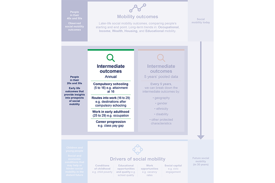
In chapter 2 we looked at social mobility outcomes. This means looking backwards, from people’s current social positions (like their occupation or income at age 50), to their starting social positions (like their parents’ occupation or income). We then compared where they started – their social background – with where they ended up.
The mobility experiences of adults in their 40s or 50s will have been shaped by factors that are now decades in the past. While this will give very valuable insight, we also want to know about the effects of more recent events. We need an early indication of where young people may end up, allowing us to get a sense of the current state of social mobility. Intermediate outcomes, which we describe and illustrate in this chapter, give us that more up-to-date insight.
Intermediate outcomes focus on the experiences of young people as they move through education and into the labour market. We are interested in how young people from different social backgrounds acquire the educational skills and qualifications, and the experience of work, that will enhance their future mobility. We call these ‘intermediate outcomes’, since they are measured earlier in life than the mobility outcomes in chapter 2. We plan to report on them annually, since the experiences of each cohort of people leaving school and entering the labour market may change from year to year – think for example of the effects of the pandemic.
Why do we break measures down by background?
For any analysis of social mobility, we need to know where a person starts – their background – and where they end up – their outcome. For example, to measure Alice’s occupational-class mobility, we need to know both her parents’ occupational class (Alice’s background), and her own occupational class (Alice’s outcome). This way, we can see whether Alice has moved up or down.
If we want measures at the population level, we need to be able to summarise everyone’s backgrounds, and outcomes, in a small set of numbers. And to isolate the effect of social background on outcomes – the essence of social mobility analysis – we need to look at the outcomes of everyone sharing a certain background.
Better data, better decisions
Data limitations
We can easily find summary statistics for outcomes, such as the percentage of people achieving good grades at school. But we also need background measures, and, unfortunately, data on starting points is much more limited. For example, we have very little information available about family circumstances and early life. For children in school, the only administrative data available on socio-economic background is eligibility for free school meals (FSM), which broadly correlates with lower income and lower occupational class. The Office for National Statistics’s (ONS) Labour Force Survey (LFS) asks respondents about their parents’ jobs when the respondent was a teenager, but not about their income (see technical annexe for more information).
This leaves much that is unmeasured. We do not know from the data available, for instance, about family-related factors, such as the time parents spend reading to their children, or individual factors, like determination or the propensity to work hard. We also cannot take into account, at least using public data, things like school quality.
Causal explanations
These data limitations create the risk that we mistakenly explain whatever disparity in outcomes we see by the background factors that happen to be observable, rather than by the hidden factors that may be a more immediate cause. For example, special educational needs and disabilities (SEND) may correlate with eligibility for FSM, and also correlate with worse educational outcomes. If we observe that children eligible for FSM achieve worse outcomes on average, it is tempting to conclude that FSM status is solely responsible for the worse outcomes. But this would ignore (among other things) the role of SEND, and any policy based on this conclusion would be misdirected.
All of this means that we cannot call for policy solutions targeted at reducing disparities based on mobility analysis alone. Not every difference is caused by unfairness. But mobility analysis can suggest further research to identify the root causes of the disparity. We need to ensure that policy solutions target all people who miss out on having a fair and equal opportunity.
Improving data
Our selection of intermediate outcomes has been limited by the availability of reliable data. As we note in this document, there are many surprising gaps in the current availability of data, which limits the Commission’s ability to report and advise the government accurately.
For example, to the best of our knowledge, there is no UK-wide, regularly-updated database relating young people’s educational achievements to their social backgrounds. The closest we can get is FSM eligibility, which captures roughly the poorest 15% of students in England. This divides pupils into 2 groups that broadly correlate with higher and lower income and occupational-class background.
However, subtle differences are lost in these groupings. Within-group variation is likely to be significant, and, even more seriously, the amount of within-group variation may itself vary across the UK. This makes FSM eligibility problematic for geographical analysis. It also does not capture family income over time. This means we cannot, for example, distinguish between children from families with permanently low incomes from ones with short periods of low income. Moreover, the criteria for FSM eligibility have expanded recently, making comparison over time more difficult.
We will look carefully at what can be done to improve this. We also summarise some top priorities for new data. We are committed to pursuing independent research looking at how the government can improve data on social mobility that will enhance not only this index but many other areas. Therefore, we expect the index to evolve over time, both as our understanding of social mobility gets better and as new data becomes available. We also acknowledge that the methodologies used for each indicator are not always ideal and highlight these limitations throughout the report.
Indicators for this year
We start by looking at the years of compulsory schooling, as educational achievement strongly predicts later outcomes.[footnote 2] There is good evidence that socio-economic disparities in children’s skills emerge early on, well before they start school. They then tend to increase in the school journey, and have major effects on their careers.[footnote 3] A consensus seems to be emerging that there is no one ‘critical age’, and that all stages of childhood are important.[footnote 4]
The years that follow compulsory schooling are just as important, so we next turn to the routes into work. This covers the period when some young people leave education and move into training, apprenticeships, work or, into unemployment or economic inactivity.[footnote 5] These years are critical for young people’s future progress in the labour market, and for their chances of social mobility. Finally, we look at work in early adulthood and early career progression.
For 2022, we use very broad socio-economic categories (‘professional’, ‘intermediate’, and ‘working class’) and simple metrics, such as median pay. In the future, we want to provide more granularity. For example, this year, we measure the proportion of people who go to any university. Next year, we may consider subgroups of universities, like the Russell Group of 24 leading UK universities. We will also consider apprenticeships and other routes into highly skilled work. This year, we divide socio-economic background into 3 parts, while next year, we may use a finer division.
As a start, we examine the following measures:
| Intermediate outcome | Age |
|---|---|
| 1 – The years of compulsory schooling | 5 to 16 |
| 2 – Routes into work – the transition years | 16 to 29 |
| 3 – Work in early adulthood | 25 to 29 |
| 4 – Career progression | 35 to 44 |
Figure 3.0: Intermediate outcomes
A note on our data
This report uses data from:
- ONS
- Department for Education (DfE)
- Department for Work and Pensions (DWP)
- Organisation for Economic Co-operation and Development (OECD)
We have also used other publicly available data from panel survey studies, such as Understanding Society – the UK Household Longitudinal Survey (UKHLS). The majority of our indicators are derived from 2 UK household surveys: the ONS’s Labour Force Survey (LFS) and UKHLS. For more information, see the technical annex.
Significance of trends
Some of our intermediate-outcome measures are proportions or means derived from survey data, for which we have no level of uncertainty around the estimates (such as confidence intervals). Therefore, all trends should be treated with caution – we have not tested for statistical significance unless stated otherwise. For more information, see the technical annex.
Intermediate outcome 1: The years of compulsory schooling (aged 5 to 16)
How children develop during their years of compulsory education can play a crucial role in determining the outcomes they go on to achieve. We monitor trends of various measures focused on education and skills development between the ages of 5 and 16 years to examine social background differences at this stage of life.
If the differences that emerge early in life were widening, this would suggest more difficult prospects for social mobility in the future. Yet all of our measures are improving. In all 3 cases, the gap between those from different backgrounds has narrowed.
England, Northern Ireland, Scotland, and Wales all have different accountability systems and different social background measures. So, for 2022, we present only English measures, while we look into the possibility of UK-wide measures for 2023.[footnote 6]
1.1 Level of development at age 5
Starting with the youngest pupils, we look at ‘good level of development’, as defined in the early years foundation stage profile (EYFSP). This measure shows the percentage of children who achieve a ‘good’ level of development at the age of 5 – children achieving the expected level in the 3 main areas of learning, and in literacy and numeracy.
Due to the devolved nature of the education system, we can only monitor this measure for children in England this year. The only socio-economic background measure available is eligibility for FSM. FSM captures roughly the poorest 15% of students; while not ideal, it is the only socio-economic background measure available in schools data.[footnote 7] In particular, due to the transitional protections covering FSM eligibility as we move from old-style multiple benefits to Universal Credit, there is a greatly increased number of children eligible for FSM. This also means that the average child on FSM today is probably not as disadvantaged as the average child on FSM 10 years ago. So this may contribute to closing the measured gap, even with no underlying change in the pattern of achievement.
In figure 3.1 we note 3 features. Firstly, the proportion of children achieving a ‘good’ level of development at the age of 5 has increased over time. In the 2012 to 2013 academic year, 36% of pupils eligible for FSM achieved a good level of development, compared with 55% of all other pupils. In the 2018 to 2019 academic year, these proportions were 57% and 74% respectively. So more children, both disadvantaged and non-disadvantaged, are starting school with a ‘good’ level of development.
Figure 3.1: Children eligible for FSM are catching up with other children at age 5 years; the gap has closed from 19 to 17 percentage points
The percentage of students achieving a ‘good level of development’ at age 5 years by eligibility for FSM in England, from 2012 to 2019.

A bar chart showing children eligible for free school meals (FSM) are catching up with other children at age 5 and the gap has closed from 19 to 17 percentage points.
Source: Department for Education (DfE). Early years foundation stage profile results from the 2018 to 2019 academic year, 2019.
Note: The percent ‘good level of development’ tracks development at age 5 years in England only. A child achieving at least the expected level in the Early Learning Goals within the 3 prime areas of learning and within literacy and numeracy is classed as having a ‘good level of development’.
Secondly, the size of the gap between children who qualify for FSM and those who do not has narrowed over time. The gap has decreased from 19 percentage points in the 2012 to 2013 academic year (36% versus 55%) to 17 percentage points in the 2018 to 2019 academic year (57% versus 74%). But closing this gap is simply not enough.
Thirdly, in the 2018 to 2019 academic year, 43% of pupils eligible for FSM and 26% of all other pupils failed to achieve a ‘good level of development’. This is an area of concern, given the importance of developing reading and numeracy skills at an early age. All children, regardless of social background, deserve the best possible start. And there may be significant implications for social mobility if, for example, the 43% of FSM pupils and 26% of non-FSM pupils share some social disadvantage that is not well captured by the available data.
More detailed analysis, comparing children both within and across groups, is essential. It is only then that we can start to understand the shared and distinct reasons for poorer levels of development across social backgrounds. There are certainly some children who might be vulnerable in ways that are not reflected by this data alone. For example, some might have SEND that can create or compound other difficulties. As noted earlier, there are significant limitations to how useful FSM is as a proxy for socio-economic background. New and innovative metrics are needed to understand and tackle this problem.
1.2 Attainment at age 11
Understanding attainment at age 11 can be done in 2 ways. First, we can look at overall levels of achievement for disadvantaged children and all other pupils, and second, at the gaps between them.[footnote 8]
In 2019, we see that 51% of disadvantaged pupils reached the expected standard in reading, writing, and maths compared with 71% of all other pupils, a difference of 19 percentage points (see figure 3.2).[footnote 9] [footnote 10] But, taking a closer look, this means that half (49%) of disadvantaged pupils and 29% of all other pupils are still not achieving the expected standards in all 3 subjects. Again, some of these children might be disadvantaged or vulnerable in ways that are not captured here. For example, they could come from financially advantaged homes, but do not have the necessary support needed to thrive at school.
If children do not meet the expected standard, they might be limited in how they access the secondary curriculum. Failure to achieve core competencies in literacy and numeracy, for any child, poses serious risk to their future prospects.
Figure 3.2: Disadvantaged pupils are less likely to reach the expected standard at key stage 2, but many non-disadvantaged pupils also do not reach this standard
The percentage of pupils reaching the expected standard in reading, writing and maths at key stage 2 in 2019.

A bar chart showing that disadvantaged pupils are less likely to reach the expected standard at key stage 2, but many non-disadvantaged pupils also do not reach this standard.
Source: DfE, National curriculum assessments at key stage 2 in England, 2019.
Note: Bold colours indicate the disadvantaged (blue) and all other pupils (orange) who are achieving a Grade 5 or above in both English and Maths. Light colours indicate the disadvantaged (blue) and all other pupils (orange) not reaching these standards. Disadvantaged pupils are defined as: those who were registered as eligible for free school meals at any point in the last 6 years, children looked after by a local authority or have left local authority care in England and Wales through adoption, a special guardianship order, a residence order or a child arrangements order.
Moving away from overall levels of achievement, we rely on a newer metric – the disadvantage gap. This compares the key stage 2 performance of pupils in England who are eligible for FSM (and certain other pupils) with that of pupils who are not.[footnote 11] [footnote 12]
It differs from previous measures used by the Department for Education (DfE) as it is a positional measure based on rank rather than overall levels. This measures how pupils from ‘disadvantaged and non-disadvantaged backgrounds’ differ with respect to their positions in rankings of performance. This makes the measure more robust to changes in assessments over time.
A disadvantage gap score of zero would indicate that pupils from disadvantaged backgrounds perform equally well as pupils from non-disadvantaged backgrounds. A disadvantage gap score of +10 would mean that every non-disadvantaged pupil did better than every disadvantaged pupil.
Figure 3.3 shows a 12.8% decrease in the gap between children from disadvantaged and non-disadvantaged backgrounds between 2011 and 2019. However, between 2018 and 2019 there was a slight increase of 0.5% (from 2.90 to 2.91). This was the last year with available data.
Figure 3.3: The gap between disadvantaged pupils and all other pupils at key stage 2 decreased gradually from 2011 to 2019
The disadvantage attainment gap index for England at key stage 2, from 2011 to 2019.

A line chart showing the gap between disadvantaged pupils and all other pupils at key stage 2 decreased gradually from 2011 to 2019.
Source: DfE, National curriculum assessments at key stage 2 in England, 2019.
Note: Comparisons are made by ordering pupil scores in reading and maths assessments at the end of key stage 2 and assessing the difference in the average position of disadvantaged pupils and others. The mean rank of pupils in the disadvantaged and other pupil groups are subtracted from one another and multiplied up by a factor of 20 to give a value between -10 and +10 (where 0 indicates an equal distribution of scores). Disadvantaged pupils are defined as: those who were registered as eligible for free school meals at any point in the last 6 years, children looked after by a local authority or have left local authority care in England and Wales through adoption, a special guardianship order, a residence order or a child arrangements order.
Changes to data collection and scoring methodologies have limited comparisons of attainment scores over time, and we should be cautious in drawing any conclusions. We need to compare results from different datasets and distinguish the overall patterns of attainment for pupils from a variety of different backgrounds, not just those eligible for FSM .
1.3 Attainment at age 16
The end of compulsory education is just as important as its beginning. A young person’s educational outcomes at age 16 years can shape how they progress through to further and higher education (HE), training, and employment. To look at how differences in socio-economic background influence this progression, we look at overall levels of attainment for disadvantaged pupils and all other pupils. We then examine the key stage 4 disadvantage gap index for English schools. The disadvantage gap index summarises the relative attainment in English and Maths at GCSE between disadvantaged pupils and all other pupils.[footnote 13]
In the 2020 to 2021 academic year, attainment in English and Maths was lower for disadvantaged pupils compared to all other pupils. 31.7% of disadvantaged pupils achieved a grade 5 (equivalent to a good pass) or above, in English and Maths, compared with 59.2% for all other pupils (see figure 3.4).[footnote 14] However, this also means around two-thirds of disadvantaged pupils (68.3%) and more than one-third of all other pupils (40.8%) fail to achieve a good pass in both English and Maths at GCSE. This is concerning. In the absence of any effort to reverse this pattern, large numbers of students will leave school without essential qualifications. This urgently needs to change.
Figure 3.4: Fewer disadvantaged than non-disadvantaged pupils get a good pass on both English and Maths GCSEs. Many non-disadvantaged pupils also do not meet this standard
Percentage of pupils who achieved a grade 5 or above in both GCSE English and Maths in the 2020 to 2021 academic year.

A bar chart showing fewer disadvantaged than non-disadvantaged pupils get a good pass on both English and Maths GCSEs but many non-disadvantaged pupils also do not meet this standard.
Source: DfE, key stage 4 attainment data for state-funded schools, 2021.
Note: Bold colours indicate the disadvantaged (blue) and all other pupils (orange) who are achieving a Grade 5 or above in both English and Maths. Light colours indicate the disadvantaged (blue) and all other pupils (orange) not reaching these standards. Disadvantaged pupils are defined as: those who were registered as eligible for free school meals at any point in the last 6 years, children looked after by a local authority or have left local authority care in England and Wales through adoption, a special guardianship order, a residence order or a child arrangements order.
Despite the trends mentioned above, there has been some encouraging progress in closing the gaps between poorer students and their more advantaged peers. The attainment gap, for the differences between disadvantaged pupils and their peers, has narrowed by 7% between 2010 and 2021 (see figure 3.5). This progress must continue.
Figure 3.5: The gap between disadvantaged pupils and all other pupils decreased gradually from 2010 to 2020 but increased in the 2020 to 2021 academic year
The disadvantage attainment gap index for England at key stage 4, from 2010 to 2021.

A line chart showing the gap between disadvantaged pupils and all other pupils decreased gradually from 2010 to 2020 but increased in 2020/21.
Source: DfE, key stage 4 attainment data for state-funded schools, 2021.
Note: Covers performance in Maths and English GCSEs of students at state-funded schools using a positional measure of attainment.
Intermediate outcome 2: Routes into work – the transition years (aged 16 to 29)
The paths that young people take after the end of compulsory schooling have major implications for their future careers. The end of compulsory schooling is a critical point for many young people, although with the gradual increase in numbers staying on in education after the age of 16, the key transition will tend to move upwards to age 18. This has already happened in many other developed countries.[footnote 15] After the raising of the participation age, and the COVID-19 pandemic limiting opportunities for young people in the labour market, this move seems likely to accelerate.
The next set of intermediate outcomes represents this transition from school to work between the ages of 16 to 29. Our focus here is the progression of school leavers into further education and HE, training or employment. Just as socio-economic differences tend to grow over the educational career, so there is evidence that they grow over the course of a person’s career in the labour market. The following measures of rates of young people who are not in education, employment or training (NEET), who are enrolled in HE, and of their highest qualifications obtained, give some insight into these differences.
Across most of the measures of intermediate outcome 2, we see background-based gaps narrowing and overall outcomes improving. This is again promising for the future of social mobility in the UK. In one of the measures, employment between the ages of 16 and 24, there is limited evidence of any gap at all. Access to post-school education and educational achievement have also been trending upwards.
2.1 Destinations after age 16
In figure 3.6, we present the percentage of 16 to 24 year olds who are NEET.
The most striking feature is that NEET rates have decreased for young people from working-class backgrounds and were the lowest reported on record in 2021 at 12.4%. We also see a narrowing of the gap between those from professional and working-class backgrounds. In 2014, 9.5% of those from professional backgrounds and 18.6% of those from working-class backgrounds were NEET. By 2021, this was 10.6% and 12.4% respectively. So someone from a working-class background was around twice as likely to be NEET as someone from a professional background in 2014. But in 2021, they were only 1.2 times more likely.[footnote 16]
Despite the narrowing in the gap, over 10% of young people from both working-class and professional backgrounds remain NEET. This is cause for concern, particularly in terms of mobility prospects. It is crucial for young people to continue to develop their skills through work, education or training. Those who do not might fail to get on and potentially fall behind.
Figure 3.6: Rates of NEET have decreased for young people from working-class backgrounds, and the gap between class backgrounds has narrowed
Social class differences in the percentage of young people (age 16 to 24 years) who are NEET in the UK, from 2014 to 2021.

A line chart showing rates of not in education, employment, or training have decreased for young people from working-class backgrounds, and the gap between class backgrounds has narrowed.
Source: ONS, LFS, from 2014 to 2021.
Note: Data collected from July to September; analysis based on LFS population weights 2020. NEET is defined as ‘not in employment, education or training’ in the week before the survey. The age group 16 to 24 years is chosen in order to obtain more precise estimates, and ‘background’ refers to the main wage earner’s occupation (father, mother, other family member, joint earner, no one was earning) when the respondent was 14 years old.
In figure 3.7, we compare the percentages of young people of different backgrounds who were employed. In 2021, we see that 55.5% of those from a professional background were in employment, relative to 58.7% of those from a working-class background. Between 2014 and 2021, the proportions have remained fairly stable for people from all class backgrounds.[footnote 17]
Figure 3.7: No clear class-based trend in rates of employment
Social class differences in the percentage of young people (age 16 to 24 years) who are in employment in the UK, from 2014 to 2021.

A line chart showing no clear class-based trends in rates of employment for young people (16 to 24).
Source: ONS, LFS, from 2014 to 2021.
Note: Data collected from July to September; analysis based on LFS population weights 2020. Employment is defined as those aged 16 and over, who are in employment if they did at least one hour of work in the reference week (as an employee, as self-employed, as unpaid workers in a family business, or as participants in government-supported training schemes) and those who had a job that they were temporarily away from (for example, if they are on holiday). The age group 16 to 24 years is chosen in order to obtain more precise estimates, and ‘background’ refers to the main wage earner’s occupation (father, mother, other family member, joint earner, no one was earning). when the respondent was 14 years old.
Turning to figure 3.8, we see a somewhat different pattern when we examine the proportion of young people who were in full-time education, training or an apprenticeship.[footnote 18]
Figure 3.8: Young people from professional backgrounds have higher rates of full-time education, training or apprenticeships than others, but all rates have trended upwards
Social class differences in the percentage of young people (age 16 to 24 years) in full-time education, training or apprenticeship in the UK, from 2014 to 2021.

A line chart showing young people from professional backgrounds have higher rates of full-time education, training or apprenticeships than others, but all rates have trended upwards.
Source: ONS, LFS, from 2014 to 2021.
Note: Data collected from July to September; analysis based on LFS population weights 2020. A full-time student is defined as people aged 16 to 24 years who are in full-time education or training of any type. The age group 16 to 24 years is chosen in order to obtain more precise estimates, and ‘background’ refers to the main wage earner’s occupation (father, mother, other family member, joint earner, no one was earning) when the respondent was 14 years old.
Overall trends for participation are promising, particularly over the past 2 years. Participation in full-time education, training and apprenticeships increased or remained stable for all class backgrounds, with a particularly large spike in 2020.
However, there are still some important differences to note. There continue to be more young people from professional class backgrounds in full-time education, training or apprenticeships than those from other socio-economic backgrounds. And, in 2021, young people from a professional background were still 1.2 times more likely than those from working-class backgrounds to be in education or training.[footnote 19]
Despite these differences, we see some encouraging signs – the gap between those from different socio-economic backgrounds is narrowing. Since 2014, participation rates for people from intermediate and working-class backgrounds have risen. For example, the percentage of young people from working-class backgrounds in education, training or apprenticeships rose from 25% in 2014 to 28.9% in 2021. Over the same time, the percentage of those from professional class backgrounds remained relatively stable (from 34.1% to 33.9%).
While on this measure, we can see that the largest gap is between those of professional background and others. On the NEET measure, the gap is between the working-class – who are more likely to be NEET – and others. In other words, educational opportunities may be higher for those of professional background, while the risk of being NEET is higher for those of working-class background.
2.2 Entry to higher education
We now look at class and gender differences in entry to HE. This measure is split by both socio-economic background and gender, because in recent years, there has been a larger proportion of women than men enrolled in HE.[footnote 20] Of course, we acknowledge that there are many different routes to take following compulsory education, and HE represents just one of them.
Figure 3.9 shows the proportion of men and women aged 19 years who are undertaking a full-time first degree in the UK between 2014 and 2021. Overall in 2021, women (36%) are more likely to be studying for a degree full time than men (28%). We also see higher rates of participation among young men and women from professional backgrounds than among those from working-class backgrounds. This may explain low rates of those who are NEET. These men and women may have chosen or had the opportunity to stay in education rather than to risk unemployment or inactivity.
However, we also see that the gaps between those from professional and working-class backgrounds have narrowed for both men and women.[footnote 21] The rates of young people from professional class backgrounds undertaking full-time first degrees has remained relatively stable, especially for women (men 44.6% in 2014 and 37.2% in 2021 versus women 45.8% in 2014 and 43.7% in 2021). But, the respective rates of men and women from working-class backgrounds have risen from 9.8% to 21.7% and 16.4% to 32% over time.
While encouraging, there are several important factors that might influence participation in HE that we have not captured this year. For example, we consider entry into all HE, irrespective of institution or programme. This includes a wide range of universities and offers only a basic overview of participation rates. Focusing on specific universities, like those from the Russell Group, may yield a very different picture in terms of access to HE. Future research is needed to understand more about what is driving these rates. This will require an overall look at the availability of choices and access to opportunities for young people from a variety of different backgrounds.
Figure 3.9: More men from professional backgrounds have undertaken full-time first degrees than men from other backgrounds; the gap is less clear for women. Both gaps have narrowed over time
Social class differences in the percentage of 19 year old men (top) and women (bottom) undertaking full-time first degree in the UK, from 2014 to 2021.

A line chart showing more men from professional backgrounds have undertaken full-time first degrees than men from other backgrounds; the gap is less clear for women and both gaps have narrowed over time.

A line chart showing more men from professional backgrounds have undertaken full-time first degrees than men from other backgrounds; the gap is less clear for women and both gaps have narrowed over time.
Source: ONS, LFS, from 2014 to 2021.
Note: Data collected from July to September; analysis based on LFS population weights 2020.
2.3 Highest qualification by age 25 to 29
We now turn to the highest qualifications young people achieve. As before, this measure is split by socio-economic background and gender. Figure 3.10 provides respective breakdowns of the highest qualifications achieved by young men from professional and working-class backgrounds between 2014 and 2021. Figure 3.11 provides the equivalent breakdowns for women.
Figure 3.10: Professional men are more likely to have a degree than working-class men, but this gap has slightly narrowed since 2014. Of those with no higher qualification than a GCSE, the gap between working class and professional men has narrowed
Men aged 25 to 29 years split by highest qualification and social class, professional and/or managerial (top) and working class (bottom) in the UK, from 2014 to 2021.

A stacked bar chart showing professional men are more likely to have a degree than working class men, but this gap has narrowed since 2014.

A stacked bar chart showing professional men are more likely to have a degree than working class men, but this gap has narrowed since 2014.
Source: ONS, LFS, from 2014 to 2021.
Note: Data collected from July to September, analysis based on LFS population weights 2020.
Figure 3.11: Professional women are more likely to have a degree than working-class women, but this gap has narrowed since 2014. Working-class women are more likely than professional women to have no qualification higher than a GCSE, but this gap has also narrowed
Women aged 25 to 29 years split by highest qualification and social class, professional and/or managerial (top) and working-class (bottom) in the UK, from 2014 to 2021.

A stacked bar chart showing professional women are more likely to have a degree than working class women and less likely to have no qualification, but these gaps have narrowed since 2014.

A stacked bar chart showing professional women are more likely to have a degree than working class women and less likely to have no qualification, but these gaps have narrowed since 2014.
Source: ONS, LFS, from 2014 to 2021.
Note: Data collected from July to September; analysis based on LFS population weights 2020.
Figures 3.10 and 3.11 show some promising trends. Since 2014, the proportion of men and women from professional and working-class backgrounds achieving a degree by the age of 25 has increased. Professional men and women are still more likely to have a degree than their working-class peers. But the gaps between these groups have also narrowed. In 2014, for example, men from professional backgrounds were 2.4 times more likely to have obtained a degree than men from working-class backgrounds. However, by 2021, they were only 1.4 times more likely.
These figures also show that the number of men and women with lower levels of qualifications is decreasing. Men and women from working-class backgrounds are more likely to have no qualifications higher than GCSEs compared with those from professional class backgrounds. But the gaps between these groups are narrowing over time. In 2014, 10.3% of men and 10.3% of women from a professional background had no qualification higher than a GCSE, compared with 31.1% of men and 34.9% of women from a working-class background. However, by 2021, these numbers were lower for people across both backgrounds: 9.4% of professional men and 8.5% of women, compared with 26.7% of working-class men and 18% of women.
Intermediate outcome 3: Work in early adulthood (aged 25 to 29)
Initial steps up the occupational ladder have major implications for a person’s subsequent career. The labour market has been polarising in recent years. There are ‘good’ jobs with formal contracts, higher earnings, formal training, low risks of unemployment and regular career ladders. This is opposed to ‘precarious’ jobs with short-term contracts, agency working, wages often at or below the minimum wage, little professional development, high risks of unemployment and little in the way of potential advancement. Sorting into these different types of jobs is largely based on qualifications, but social origins also make a difference even after taking account of qualification levels. In addition migrants, especially those with little English, are particularly likely to find themselves in the precarious labour market.
To cover early labour market experiences we include measures of unemployment, occupational level, and earnings among young people. We select those in the age range 25 to 29 in order to cover young people who have gone through HE and include the 4 classic labour market outcomes of economic activity, unemployment, occupational level, and earnings.
Again, the indicators for this outcome are almost all positive. With the exception of women’s median hourly pay, gaps have closed or do not have trends, with encouraging numbers of young people economically active.
These indicators are based on sample data and not all trends have been tested for significance. This means we cannot confidently conclude that the gaps and trends observed are representative of those in the wider population.
3.1 Economic activity, from age 25 to 29
We now focus on young people in employment or seeking employment. Our focus here is not on the type of employment, but instead on whether or not young people are actively engaged in the labour market.
Figure 3.12 shows the proportions of men and women aged 25 to 29 years who were economically active between 2014 and 2021. Overall, men are more likely than women to be active participants in the labour market and this seems to be consistent across all social class backgrounds.
We also see that there are no clear class-based trends in economic activity for men. Around 90% of young men from all class backgrounds are economically active. Further, men from working-class backgrounds are just as likely to be active in the labour market as those from professional backgrounds, and this has remained stable from 2014 to 2021.[footnote 22]
Still, around 10% of men from any socio-economic background are not actively looking for a job or currently in one. Some of this group may still be in education but others will certainly not. The latter is of particular concern. Delay or failure to enter the labour market – or even dropping out of it – could harm a young adult’s future social mobility chances.
In the bottom figure, we see that trends for women are somewhat different to those for men. First, we note that fewer women than men are active participants in the labour market between the ages of 25 to 29. This could be due to many reasons and further analysis is required. One possibility is that more women than men are likely to progress to HE (see intermediate outcome 2.2). This may result in a greater proportion of women waiting to join the labour market beyond the age 29.
Second, we see clearer differences between women from different socio-economic backgrounds. Over time, however, we have seen these differences decrease. In 2014, 83.8% of professional women were economically active, compared with 71.9% of working-class women. But, by 2021, 90.3% of professional women and 82% of working-class women were economically active.[footnote 23]
Figure 3.12: For men there is no overall trend in economic activity, but for women the gap has narrowed
Social class differences in percentage of men (top) and women (bottom) aged 25 to 29 years who are economically active in the UK, from 2014 to 2021.

A line chart showing for men there is no overall trend in economic activity but for women the gap has narrowed.

A line chart showing for men there is no overall trend in economic activity but for women the gap has narrowed.
Source: ONS, LFS, from 2014 to 2021.
Note: Data collected from July to September; analysis based on LFS population weights 2020. Economic activity is reflected as the percentage of young people who are in work or available for and looking for work.
3.2 Unemployment from age 25 to 29
Next we turn to trends in unemployment for young people. The term unemployment here refers to people without a job who have actively looked for work in the last 4 weeks, and are available to start work in the next 2 weeks.[footnote 24] As before, this measure is split by both socio-economic background and gender.
From the data provided, we cannot see any class-based trends for unemployment rates (see figure 3.13). Overall rates are fairly low by historical standards, and around their lowest level since their dramatic rise in the late 1970s and early to mid-1980s. For both men and women, we see fluctuating trends with multiple crossing points and no clear direction.[footnote 25] We see some recovery from the spike in unemployment in 2020, particularly for women. However, we must continue to monitor these trends, particularly for those exposed to poverty or with poor social mobility prospects.
Figure 3.13: There is no clear class-based trend in unemployment rates for men and women aged 25 to 29 years
Social class differences in percentage of men (top) and women (bottom) aged 25 to 29 years who are unemployed in the UK, from 2014 to 2021.

A line chart showing no clear class-based trend in unemployment rates for men and women at age 25 to 29.

A line chart showing no clear class-based trend in unemployment rates for men and women at age 25 to 29.
Source: ONS, LFS, from 2014 to 2021.
Note: Data collected from July to September; analysis based on LFS population weights 2020. The series for women is particularly volatile, potentially due to small sample sizes, so changes across years should be treated with caution.
3.3 Occupational level
We now compare the occupational class composition of young people aged 25 to 29 from professional and working-class backgrounds over time. To account for differences in the composition of occupational class by gender, we provide separate charts for men and women.
In 2021, both men and women from a professional background were more likely to be in a professional occupation than their working-class counterparts (see figures 3.14 and 3.15). However, this gap appears to have narrowed for both men and women since 2014.[footnote 26]
In 2014, men aged 25 to 29 from a professional background were on average 1.9 times more likely to be in a professional job than men from a working-class background (50.7% versus 26.4%). By 2021, this dropped to 1.6 times more likely (56.6% versus 33.9%). For women, the drop was from 2.3 times more likely (52.5% versus 22.9%) to 1.6 times more likely (55.7% versus 35.9%). However, the data suggests progress may have stalled during the pandemic. Further analysis is needed to confirm this trend.
Figure 3.14: Men from professional backgrounds are more likely to be in professional jobs than those from working-class backgrounds, but this gap has narrowed
Social class differences in access to occupations for men (age 25 to 29 years) from professional (top) and working-class (bottom) backgrounds in the UK from 2014 to 2021.

A stacked bar chart showing that men from professional backgrounds are more likely to be in professional jobs than those from working-class backgrounds, but this gap has narrowed.

A stacked bar chart showing that men from professional backgrounds are more likely to be in professional jobs than those from working-class backgrounds, but this gap has narrowed.
Source: ONS, LFS, from 2014 to 2021.
Note: Data collected from July to September, analysis based on LFS population weights 2020.
Figure 3.15: Women from professional backgrounds are more likely to be in professional jobs than those from working-class backgrounds, but this gap has narrowed
Social class differences in access to occupations for women (age 25 to 29 years) from professional (top) and working-class (bottom) backgrounds in the UK from 2014 to 2021.

A stacked bar chart showing women from professional backgrounds are more likely to be in professional jobs than those from working-class backgrounds, but this gap has narrowed.

A stacked bar chart showing women from professional backgrounds are more likely to be in professional jobs than those from working-class backgrounds, but this gap has narrowed.
Source: ONS, LFS, from 2014 to 2021.
Note: Data collected from July to September; analysis based on LFS population weights 2020.
3.4 Earnings of young people
Looking beyond participation in the labour market and types of occupations, we now turn to earnings. As with our other intermediate outcomes, we split this indicator by socio-economic background and gender to provide a comprehensive overview.
Figure 3.16 shows that men and women from a professional background tend to earn more than those from a working-class background.
For men, the gap has slightly narrowed. In 2021, men from a professional background earned an average of £15.18 per hour, while men from a working-class background earned about 76% of this (£11.55). This compares favourably to 2014, when the ratio was only 70%.
For women, however, the gap has slightly widened. Women from a professional background earned on average £14.23 per hour in 2021, compared with £10.05 per hour for women from working-class backgrounds, or 71%. Yet the ratio in 2014 was better, at 79%. Most of this gap opened up in 2021, suggesting this may be related to the pandemic.
It is worth noting the differences in earnings between classes observed here may be explained by the findings we have seen in our other intermediate outcome measures. For example, with intermediate outcome 3.3, we found that people from professional backgrounds are more likely to be in professional occupations themselves, and professional occupations often have higher earnings. Differences in educational attainment might also explain some of the differences seen here.
Figure 3.16: Median earnings of young adults in work have trended upwards, with the gap slightly narrowing for men from different class backgrounds, and slightly widening for women
Social class differences in nominal median hourly pay for men (top) and women (bottom) in employment, aged 25 to 29 years in the UK.

A line chart showing median earnings of young adults in work have trended upwards, with the gap slightly narrowing for men from different class background, and slightly widening for women.

A line chart showing median earnings of young adults in work have trended upwards, with the gap slightly narrowing for men from different class background, and slightly widening for women.
Source: ONS, LFS, from 2014 to 2021.
Note: Data collected from July to September, analysis based on LFS population weights 2020. Earnings are in nominal terms and therefore not adjusted for inflation.
Intermediate outcome 4: Career progression
We now look at the progress people make in their careers in their 20s to 30s. We do this by monitoring 2 dimensions: occupational class and income. By focusing on people in their early to mid-career, we are in essence comparing origins and destinations. This gives us a first glimpse at what mobility outcomes might look like in the future.
We present the next set of measures as experimental, since progression measures require a more complicated methodology and rely on large sample sizes to derive meaningful trends. While we encourage a cautious interpretation of this year’s results, we note that these are important measures to include in future years. They do, however, need to be refined with further scrutiny and consideration. For these reasons, we do not include a summary of our findings.
4.1 Acquisition of further training and qualifications
This progression measure looks at young people who have gained training and qualifications, including vocational and professional qualifications, after the age of compulsory education. This can be an important indicator of job prospects, and particularly of likely progression in professional careers.
Unfortunately, we have not managed to identify data of good enough quality to publish this measure in 2022. We will continue to study the issue, with a view to adding the measure to our annual report in 2023.
4.2 Occupational progression
This measure considers the progress people in their 30s have made in achieving a higher occupational class relative to the job they were in during their 20s. Tracking the progress people make in rising up the occupational class ladder over 10 years can help inform how social background and occupational mobility interact now and may evolve in the future.
We provide early illustrations as a concept measure this year.[footnote 27] For clarity and concision we focus primarily on progression into professional class occupations. However, we must stress that this is only one type of intermediate outcome. Mobility can happen in both small and big steps. In the future we will consider progression at all levels to ensure we capture a more complete picture.
In figures 3.17, 3.18 and 3.19 we present 3 charts – one for each socio-economic background. Each chart shows what percentage of people have ended up in a professional job in their 30s, split by the type of job they were doing in their 20s. As we might expect, no matter what the socio-economic background, people are far more likely to be doing a professional job in their 30s, if they were already in a professional job in their 20s.
Among people of a professional background (figure 3.17), 82% of those that had a professional job at age 25 to 29 years still had a professional job 10 years later at age 35 to 39 years. 51% of those in an intermediate job at age 25 to 29 years progressed upwards to a professional job 10 years later. And only 38% of those in a working-class job progressed upwards to a professional job.
People of an intermediate background (figure 3.18) had better chances of remaining professional (91%) if they were already in a professional job at age 25 to 29 years. But their chances of progressing up from an intermediate job or a working-class job were much worse than for those from a professional background – just 43% (versus 51%) and 22% (versus 38%).
The equivalent figures for people from a working-class background (figure 3.19) are similar: 81% managed to remain as professionals, while 35% and 23% progressed upwards from intermediate and working-class jobs respectively, at age 25 to 29 years.
So, we see that people from professional backgrounds seem to be much more likely to ‘bounce back’ from having a lower occupational class at age 25 to 29 years, to a professional position at age 35 to 39 years, than people from other backgrounds.
Figure 3.17: The percentage of people from a professional background doing a professional job now, at age 35 to 39 years, split by the type of job they had at age 25 to 29 years

A bar chart showing the percentage of people from a professional background doing a professional job now, at age 35 to 39, split by the type of job they had at age 25 to 29.
Source: University of Essex, Institute for Social and Economic Research, Understanding Society: Waves 1 to 11, 2009 to 2020; British Household Panel Survey, from 1999 to 2009.
Note: The vertical axis reflects the occupational origins of respondents at 25 to 29 years. The horizontal axis shows the proportion of the same respondents at age 35 to 39 years who are in a professional/managerial occupation. For example, the top bar gives the percentage of those who were from professional and/or managerial backgrounds and in professional jobs aged 25 to 29 years, who remained in professional jobs 10 years later (when aged 35 to 39 years). Due to small sample sizes, we draw on data pooled over 5 years. The sample consists of everyone aged 25 to 29 in the years of 2005 to 2009 and then compares this to their occupational class 10 years later (aged 35 to 39 in 2015 to 2019).
Figure 3.18: The percentage of people from an intermediate background doing a professional job now, at age 35 to 39 years, split by the type of job they had at age 25 to 29 years

A bar chart showing the percentage of people from an intermediate background doing a professional job now, at age 35 to 39, split by the type of job they had at age 25 to 29.
Source: University of Essex, Institute for Social and Economic Research, Understanding Society: Waves 1 to 11, 2009 to 2020; British Household Panel Survey, from 1999 to 2009.
Note: The vertical axis reflects the occupational origins of respondents at 25 to 29 years. The horizontal axis shows the proportion of the same respondents at age 35 to 39 years who are in a professional and/or managerial occupation. For example, the top bar gives the percentage of those who were from intermediate backgrounds and in professional jobs aged 25 to 29 years, who remained in professional jobs 10 years later (when aged 35 to 39 years). Due to small sample sizes, we draw on data pooled over 5 years. The sample consists of everyone aged 25 to 29 in the years of 2005 to 2009 and then compares this to their occupational class 10 years later (aged 35 to 39 in 2015 to 2019).
Figure 3.19: The percentage of people from a working-class background doing a professional job now, at age 35 to 39 years, split by the type of job they had at age 25 to 29 years

A bar chart showing the percentage of people from a working class background doing a professional job now, at age 35 to 39, split by the type of job they had at age 25 to 29.
Source: University of Essex, Institute for Social and Economic Research, Understanding Society: Waves 1 to 11, 2009 to 2020; British Household Panel Survey, 1999 to 2009.
Note: The vertical axis reflects the occupational origins of respondents at 25 to 29 years. The horizontal axis shows the proportion of the same respondents at age 35 to 39 years who are in a professional and/or managerial occupation. For example, the top bar gives the percentage of those who were from working-class backgrounds and in professional jobs aged 25 to 29 years, who remained in professional jobs 10 years later (when aged 35 to 39 years). Due to small sample sizes, we draw on data pooled over 5 years. The sample consists of everyone aged 25 to 29 in the years of 2005 to 2009 and then compares this to their occupational class 10 years later (aged 35 to 39 in 2015 to 2019).
4.3 Income progression
Jobs tell only one side of the story – the other side is pay. This measure captures how people’s pay progresses as they go through their careers. It compares the change in income level (measured in quintiles) of people in their 30s relative to their 20s.[footnote 28]
As with our occupational progress measure (4.2), this measure is still in development. We focus primarily on movement to the top quintile but acknowledge that this provides only one snapshot of a much more complex mobility picture.
Due to small sample sizes, the most recent year we could use for those aged 35 to 39 years is 2012, and therefore for those aged 25 to 29 years is 10 years previously, 2002. As with the occupational progression measure, we have pooled data over 5 years to boost sample sizes.
Among people of a professional background (figure 3.20), 77% who earned in the top quintile at age 25 to 29 years, continued to earn in the top quintile 10 years later, at age 35 to 39 years. As the starting income at age 25 to 29 years falls – in other words, as people had further to progress up the income ladder – a lower percentage made it to the top quintile. The higher a person’s income at age 25 to 29 years, the more likely they are to be in the top income quintile by the age of 35 to 39 years. For those starting in the bottom quintile at age 25 to 29 years, only 13% were in the top quintile 10 years later.
Figures 3.21 and 3.22 show the equivalent for people from intermediate class and working-class backgrounds. The picture is similar, with those from a higher income quintile at age 25 to 29 years being more likely to be in the top income quintile 10 years later.
However, comparing all 3 figures suggests that, on average, people from a professional background find it easier to reach the top income level than those from intermediate or working-class backgrounds. This is true for any given income quintile at the age of 25 to 29 years – being from a professional background corresponds to a greater percentage making it to the top income quintile 10 years later.
Figure 3.20: The percentage of people from a professional background who earn in the top quintile now, at age 35 to 39 years, split by the quintile they earned in at age 25 to 29 years

A bar chart showing the percentage of people from a professional background who earn in the top quintile now, at age 35 to 39 years, split by the quintile they earned in at age 25 to 29 years.
Source: University of Essex, Institute for Social and Economic Research, Understanding Society: Waves 1 to 11, 2009 to 2020; British Household Panel Survey, from 2002 to 2009.
Note: The vertical axis gives the income of respondents (men and women) by quintile at age 25 to 29 years. The horizontal axis gives the proportion of the same respondents at age 35 to 39 years who are in the top income quintile (5th quintile). Respondents can be both part-time or full-time earners and income is derived from total gross personal monthly income. For example, the top bar gives the percentage of those from professional/managerial backgrounds in the top income quintile aged 25 to 29 years, who were then in the top quintile 10 years later at age 35 to 39 years. Due to small sample sizes, we draw on data pooled over 5 years (in other words, age 25 to 29 years from 1998 to 2002, and 35 to 39 years from 2008 to 2012). Quin = quintile.
Figure 3.21: The percentage of people from an intermediate background who earn in the top quintile now, at age 35 to 39 years, split by the quintile they earned in at age 25 to 29 years

A bar chart showing the percentage of people from an intermediate background who earn in the top quintile now, at age 35 to 39 years, split by the quintile they earned in at age 25 to 29 years.
Source: University of Essex, Institute for Social and Economic Research, Understanding Society: Waves 1 to 11, 2009 to 2020; British Household Panel Survey, 2002 to 2009.
Note: The vertical axis gives the income of respondents (men and women) by quintile at age 25 to 29 years. The horizontal axis gives the proportion of the same respondents at age 35 to 39 years who are in the top income quintile (5th quintile). Respondents can be both part-time or full-time earners and income is derived from total gross personal monthly income. For example, the top bar gives the percentage of those from intermediate backgrounds in the top income quintile aged 25 to 29 years, who were then in the top quintile 10 years later at age 35 to 39 years. Due to small sample sizes, we draw on data pooled over 5 years (in other words, age 25 to 29 years from 1998 to 2002, and 35 to 39 years from 2008 to 2012). Quin = quintile.
Figure 3.22: The percentage of people from a working-class background who are in the top quintile now, at age 35 to 39 years, split by the income quintile they were in at age 25 to 29 years

A bar chart showing the percentage of people from a working-class background who are in the top quintile now, at age 35 to 39 years, split by the income quintile they were in at age 25 to 29 years.
Source: University of Essex, Institute for Social and Economic Research, Understanding Society: Waves 1 to 11, 2009 to 2020; British Household Panel Survey, 2002 to 2009.
Note: The vertical axis gives the income of respondents (men and women) by quintile at age 25 to 29 years. The horizontal axis gives the proportion of the same respondents at age 35 to 39 years who are in the top income quintile (5th quintile). Respondents can be both part-time or full-time earners and income is derived from total gross personal monthly income. For example, the top bar gives the percentage of those from working-class backgrounds in the top income quintile aged 25 to 29 years, who were then in the top quintile 10 years later at age 35 to 39 years. Due to small sample sizes, we draw on data pooled over 5 years (in other words, age 25 to 29 years from 1998 to 2002, and 35 to 39 years from 2008 to 2012). Quin = quintile.
4.4 Class pay gap
Recently there has been a great deal of interest in the gender pay gap. But there are also class pay gaps – essentially, the differences in average pay between people in the same occupational class but from different social class backgrounds. The class pay gap is calculated by comparing the average pay of people from different class backgrounds who are currently in the same occupational class. Comparisons of this kind require careful interpretation. The differences in average pay could be due to many factors, including differences in educational attainment or job choices within the same occupational class. However, we can start to unpick the trends by looking at the earnings of thousands of survey respondents.
Figure 3.23 (top) shows the class pay gap (in percentage terms) for men aged 35 to 44 years from professional and working-class backgrounds. A positive difference implies a higher income for people from professional backgrounds relative to people from working-class backgrounds in the same occupational class. The findings indicate that, for professional occupations, men from a professional background earn 18% more than men from a working-class background. For intermediate occupations, men from a professional background earn 4% more than those from a working-class background. For working-class occupations the class pay gap is 6% in favour of men from a professional background.
Figure 3.23 (bottom) illustrates the class pay gap for women aged 35 to 44 years of professional and working-class backgrounds. As with men, women from professional backgrounds earn more on average than women from working-class backgrounds in the same occupational class. Women from a professional background have 23% higher pay in professional jobs than women from working-class backgrounds. In intermediate and working-class jobs, those from a professional background earn 8% and 7% more respectively than women from a working-class background.
Figure 3.23: The class (background) pay gap is the largest in professional jobs
Class pay gap between men (top) and women (bottom) from professional and working-class backgrounds within each occupational group in the UK, from 2014 to 2021 (aged 35 to 44 years).

A bar chart showing the class pay gap is largest in professional jobs for men and women.

A bar chart showing the class pay gap is largest in professional jobs for men and women.
Source: ONS, LFS, from 2014 to 2021.
Note: Data collected from July to September; weighted analysis. The figures are based on median hourly earnings (£). Due to challenges with small sample sizes and a volatile time series we have calculated a weighted average of the median pay between 2014 and 2021. (Weighted according to sample size.). Due to likely differences in income levels between men and women we split this measure by gender.
Conclusion
Our analysis reveals that the gaps associated with social background – parental occupation or income – have generally narrowed for young people in recent years. This is good news for social mobility in the UK.
But this is only a first step. The real work has only just started, and improving social mobility requires a much deeper dive into the data. We can only use the data we have, and more work needs to be done to get the best possible metrics.
Data limitations are severe and pressing. We have very limited insight into the multitude of factors that might influence a young person’s social mobility chances. Many of these factors, like upbringing, SEND, or parental education, might be only loosely correlated with the one social background indicator we have – FSM eligibility. The data picture improves slightly with the use of the LFS, as we then get access to more detailed information about parental occupation, but even then, far more information is missing than present.
It is also notable that earnings for women (Intermediate outcome 3.4), whose indicator did not show a significant improvement, is not a categorical outcome measure. This means that differences between classes are not obscured by the imposition of categories. For example, earnings vary greatly across professional occupations, but our analyses of occupational mobility treat all professional occupations as the same. So it may be that subdividing our categorical outcome measures, such as educational outcomes, would reveal further class differences.
Further research is needed now to understand detail and reasons behind these trends. Innovative analysis, going above and beyond disparities between groups, is essential. And this is exactly what we will do, starting with the geographical analysis that we aim to carry out next year. It is only then that we can identify exactly how and where to try and close these gaps even further.
As we will discuss further in chapter 4, the overall conditions in the UK – without taking background into account – also seem to have improved. Educational outcomes, employment prospects and earnings are almost all better than they were 10 years ago.
Case studies
Case study: Sharon Birch, 56, from Hartlepool in County Durham

Photograph of Sharon Birch
Some of our children come from families that have been written off for years so hope and aspiration are sort of lost. That means the nursery is an opportunity to enjoy different experiences. We go on train trips, we go to the beach, we go to parks, we go to museums. We’ve got an Alexa and we play jazz and piano music. None of our children will go home and listen to opera but they will listen to it in nursery. This is where cultural capital comes in. It’s about making a child believe they can be anyone they want to be.
The environment is important too. We eat with tablecloths and napkins. We don’t use plastic plates and there are flowers in a vase on the table. The children may not have these things at home. They might just eat off their knees. We try and do things that give them a different perspective. It’s really important for the children to see that there’s more to life than just Hartlepool. If we give them access to these things, it gives them the opportunity to broaden their view and realise that anything’s possible.
I was a police officer for 20 years and my specialism was in child protection. Coming from a safeguarding background, I have an understanding of the issues that affect some of these children at home. We try to build relationships with parents so that if they’re facing difficulties, we can get help earlier so it’s better for them and better for the children. By the time that child leaves nursery they’ve had some good strong adults in their lives who they know they can rely on.
Every child has a key worker, which is very important. They build up a rapport with the children and the families. It means they might then share something that they wouldn’t if they didn’t have that rapport, like a bereavement in the family that could cause a big impact on the child, the break-up of a relationship, or any financial struggles. Without that consistency, things could be missed.
Working in partnership with the parents is key. We give them storybooks and activity packs to help with speech and language skills, which some children in this area may be lacking. We give jigsaws out to children who may not have the resources at home and colouring books to help with mark-making. If necessary, we’ll refer children to speech and language therapists very early on. We’ll always work with the parents and share the resources we’ve got. If we can do something to make a family’s life a bit easier, we will.
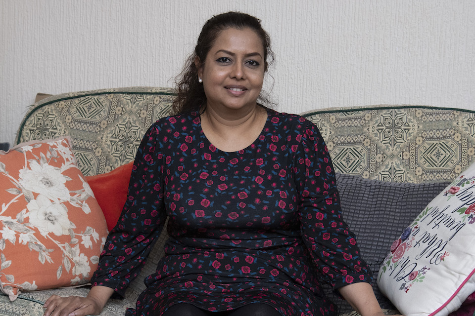
Case study: Saraswati Balgobin, 47, from Ilford in East London
Photograph of Saraswati Balgobin
My husband became violent and I had to leave and take the kids. I ended up in a women’s refuge. Finances were a challenge. I was on my own. I didn’t feel confident to trust people. We were living in one bedroom and sharing a kitchen and bathroom with others.
Tushar has always been very bright in his studies.
When he was young his favourite word was ‘persevere’ and he has stuck to that! I used to buy loads of books for him and his sister and do a lot of reading with them. We started the ABC at a very young age.
We would go to Sainsbury’s or Tesco and buy books about English and mathematics. We did not go out much to museums or galleries as finances were an issue. But when I used to do my shopping list, I would ask him to work out the total and in the supermarket I would say, “this is £1.50 for 200g and this is £4 for 300g. Which is cheaper?” He would work it out in the shop and say, “that one’s cheaper mum, take that one”.
Space has always been an issue. But I bought a dining table, not to eat dinner but for Tushar to do his homework. When he has exams, I will take time off from work to make sure he has eaten his breakfast and is sleeping well. I feel his education is important.
I’ve worked my way up from being a carer to a manager of a care home. But because of finances, I never got where I wanted to in my studies.
I always say to him, “One day you will get somewhere I never did in life! Make me proud!” Before I felt my family used to look at me thinking, “She’s a single parent, how will she manage the kids’ education?” But I’ve proved everyone wrong. I’ve done it. I’m proud of myself.
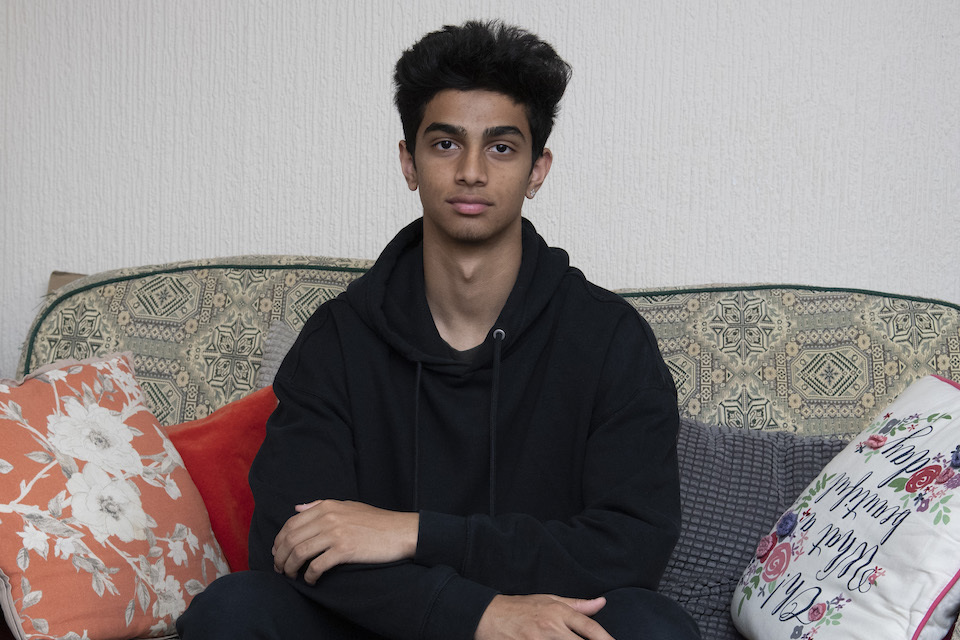
Tushar Muralidharan, 16, from Ilford in East London
Photograph of Tushar Muralidharan
As a kid, my mum was always asking me maths questions. She still does it to this day! Whenever she gets the chance she will be like, “I’m not sure I have enough money to spend on this. Which one is cheaper?” I enjoy it because I never like shopping so it gives me something to do.
I think maths came naturally to me because I did a lot when I was young and so by the time I started school I understood the basic principles. It meant I didn’t have to put as much effort in as others.
As a child I really liked books too, especially non-fiction. My mum used to sit down and read with me a lot. I think that’s why I do well in English, even though it’s not my favourite subject.
Because I have read so many books, I have a wide vocabulary.
I go to Seven Kings School in Ilford. My favourite subjects are maths, sciences and design technology. For my recent design technology GCSE coursework I made a prototype for a theme park. My mum borrowed a knife from work so I could cut the cardboard. I have always really liked Lego and I think that it perfected my fine motor skills. I’m very precise and accurate.
When it’s exam time my mum makes sure everything is flowing in the house and that I have a comfortable environment to work in when I come home. I work at the dining table. It’s full of my revision cards and notes.
After my A-levels I want to take a chemical engineering course, either at university or an apprenticeship, because it’s good money and interesting. My mum has been a good loving mother. She makes me feel supported and like I always have someone to ask for help.
-
Data for some of our measures only goes as far back as 2014. ↩
-
To understand educational achievement, we follow the official government approach, dividing education into early years (aged 2 to 5 years), primary school, with assessments taken at around age 11 years (key stage 2), and compulsory secondary schooling with formal GCSE assessment at around age 16 years in England, Wales and Northern Ireland (key stage 4). ↩
-
Alice Sullivan and others, ‘Pathways from origins to destinations: stability and change in the roles of cognition, private schools and educational attainment’, 2020. Published on ONLINELIBRARY.WILEY.COM; Matt Dickson and others,‘Early, late or never? When does parental education impact child outcomes?’, 2016. Published on ACADEMIC.OUP.COM. ↩
-
Raj Chetty and Nathaniel Hendren, ‘The impacts of neighbourhoods on intergenerational mobility II: county-level estimates’, 2018. Published on NATIONAL BUREAU OF ECONOMIC RESEARCH. ↩
-
In England continuing participation in education, at least on a part-time basis, is now legally required until age 18. ↩
-
The lack of harmonised education statistics across England, Wales, Scotland and Northern Ireland means that the only option at present is to have separate (non-comparable) measures for each of the 4 nations.If harmonised measures are not possible, we hope to present data for the separate nations in future years. However, the devolved nations do have similar examinations. Wales does GCSEs. Northern Ireland has the Nationals 4 and 5 and Scotland does National 3, 4 and 5, and also has Highers. ↩
-
Free school meals (FSM) is the only available measure of social background in England, Wales and Northern Ireland. In Scotland, a completely different area-based measure of social background is used, the Scottish Index of Multiple Deprivation. To the best of our knowledge, there is no UK-wide and regularly-updated database showing how young people’s educational achievements are related to their social backgrounds. We are therefore limited in what we can use. FSM is not an ideal measure and presents serious limitations. First, eligibility for FSMs is a devolved matter, so the requirements are slightly different in each nation. Second, there is a great deal of heterogeneity within the non-FSM population, which reduces the nuance in how we can compare outcomes; it creates a binary result, where we are forced to report on those poorest of students compared to all others. In addition, this makes FSM and its derivatives a poor measure for making comparisons between areas, because the extent of heterogeneity will vary between areas. ↩
-
Disadvantaged pupils are defined as: those who were registered as eligible for FSM at any point in the last 6 years and, children looked after by a local authority or have left local authority care in England and Wales through adoption, a special guardianship order, a residence order or a child arrangements order. ↩
-
The Department for Education notes the gap is 19 percentage points rather than 20 due to rounding. ↩
-
Department for Education, ‘National curriculum assessments: key stage 2, 2019 (revised))’, 2019. Published on GOV.UK. ↩
-
In the disadvantage gap index, the Department for Education classes pupils who have been eligible for free school meals (FSM) at some point in the past 6 years as disadvantaged. ↩
-
Devolved nations have worked to develop their own comparable statistics. Scotland introduced the Scottish National Standardised Assessments in 2017 to 2018, Wales has national tests for children each year for the ages of 7 to 14 years and Northern Ireland has standard assessment tests which are completed at the age of 7 and 11 years. However, further analysis is required before we can assess whether to include these in a future release of our index. ↩
-
Pupils are defined as disadvantaged if they are known to have been eligible for FSM at any point in the past 6 years (from year 6 to year 11), if they are recorded as having been looked after for at least one day or if they are recorded as having been adopted from care. ↩
-
UK Government, ‘Key stage 4 performance’, 2021. Published on GOV.UK. ↩
-
For a detailed discussion of the impact of the COVID-19 pandemic, see: Social Mobility Commission, ‘[State of the nation 2021: social mobility and the pandemic](https://www.gov.uk/government/publications/state-of-the-nation-2021-social-mobility-and-the-pandemic?ct=t(Sonreport21)’, 2021. Published on GOV.UK. ↩
-
We conducted additional analysis to check whether the trends reported were due to sampling variation. For the likelihood of being not in education, employment or training, the odds ratios reflecting the gap between those from professional and working-class backgrounds are statistically significant (at the 95% level) for each year, except in 2021. To see if the gap changed over time, we compared the 2021 odds ratio with the 2014 odds ratio. The difference between these ratios is significant (at the 95% level). ↩
-
We conducted additional analysis to check whether the trends reported were due to sampling variation. For the likelihood of being employed, the odds ratios reflecting the gap between those from professional and working-class backgrounds is not statistically significant (at the 95% level) for all years apart from 2020. As the majority of odds ratios are not significantly different, we do not report a test for whether the change in odds ratios between 2014 and 2021 is significant. ↩
-
Due to small sample sizes, training and apprenticeships were included with education. ↩
-
We conducted additional analysis to check whether the trends reported were due to sampling variation. For the likelihood of being in education or training, the odds ratios reflecting the gap between those from professional and working-class backgrounds are statistically significant (at the 95% level) for each year, except in 2016. To see if the gap changed over time, we compared the 2021 odds ratio with the 2014 odds ratio. The difference between these ratios is significant (at the 95% level). ↩
-
Higher Education Statistics Agency, ‘Who’s studying in HE?’, 2022. Published on HESA.AC.UK. ↩
-
We conducted additional analysis to check whether the trends reported were due to sampling variation. For men, the odds ratios reflecting the gap between those from professional and working-class backgrounds are statistically significant (at the 95% level) for each year, except in 2020. To see if the gap changed over time, we compared the 2021 odds ratio with the 2014 odds ratio. The difference between these ratios is significant (at the 95% level). For women the odds ratios reflecting the gap between those from professional and working-class backgrounds are statistically significant (at the 95% level) for most years, except for 2016, 2020 and 2021. To see if the gap changed over time, we compared the 2021 odds ratio with the 2014 odds ratio. The difference between these ratios is significant (at the 95% level). ↩
-
We conducted additional analysis to check whether the trends reported were due to sampling variation. For men, the odds ratios reflecting the gap between those from professional and working-class backgrounds are not statistically significant (at the 95% level) for all years. Therefore, we do not test whether the 2021 odds ratio is statistically significantly different from the 2014 odds ratio. ↩
-
We conducted additional analysis to check whether the trends reported were due to sampling variation. For women, the odds ratios reflecting the gap between those from professional and working-class backgrounds were statistically significant (at the 95% level) for all years. To see if the gap changed over time, we compared the 2021 odds ratio with the 2014 odds ratio. The difference between these ratios is significant (at the 95% level). ↩
-
This definition is consistent with that of the Office for National Statistics, and with the internationally agreed definition recommended by the International Labour Organisation. ↩
-
We conducted additional analysis to check whether movements in the data captured were due to sampling variation. For men, the odds ratios reflecting the gap between those from professional and working-class backgrounds was not statistically significant (at the 95% level) for any year. For women the odds ratios reflecting the gap between those from professional and working-class backgrounds was not statistically significant (at the 95% level) for most years, except for 2014, 2015 and 2018. As the majority of odds ratios are not statistically significant for both men and women, we do not conduct any significance testing on the difference between the 2014 and 2021 odds ratios. ↩
-
We conducted additional analysis to check whether the trends reported were due to sampling variation. For men and women, the odds ratios reflecting the gap between those from professional and working-class backgrounds are statistically significant (at the 95% level) for all years. To see if the gap changed over time, we compared the 2021 odds ratio with the 2014 odds ratio. The difference between these ratios is significant (at the 95% level) for both men and women. ↩
-
These measures are considered experimental and should be interpreted with caution this year. ↩
-
Quintiles are fifths of the population, ordered from lowest to highest in terms of (in this case) income. ↩