Trend Deck 2021: Economics
Published 28 June 2021

© Crown copyright 2021
This publication is licensed under the terms of the Open Government Licence v3.0 except where otherwise stated. To view this licence, visit nationalarchives.gov.uk/doc/open-government-licence/version/3 or write to the Information Policy Team, The National Archives, Kew, London TW9 4DU, or email: psi@nationalarchives.gov.uk.
Where we have identified any third party copyright information you will need to obtain permission from the copyright holders concerned.
This publication is available at https://www.gov.uk/government/publications/trend-deck-2021-economics/trend-deck-2021-economics
1. Declining international trade but China is still experiencing high growth rates
The effect of coronavirus (COVID-19) on international trade reinforces the volatile pattern observed during the last decade. The last 10 years have seen the global economy becoming less dependent on trade as measured by the value of world trade in goods and services over world output. This ratio reached its peak at more than 30% in 2008. Despite ups and downs, the ratio of international trade to global output has been in decline and was expected to settle at about 25% for 2020. For 2021 and beyond, it is possible this may rebound but there is uncertainty given the disruption of COVID-19 and unresolved trade issues among some major economies.
China’s trade patterns have been notably different relative to other economies with year-over-year growth rates of almost 10%.
Trends across the world for January to September 2020
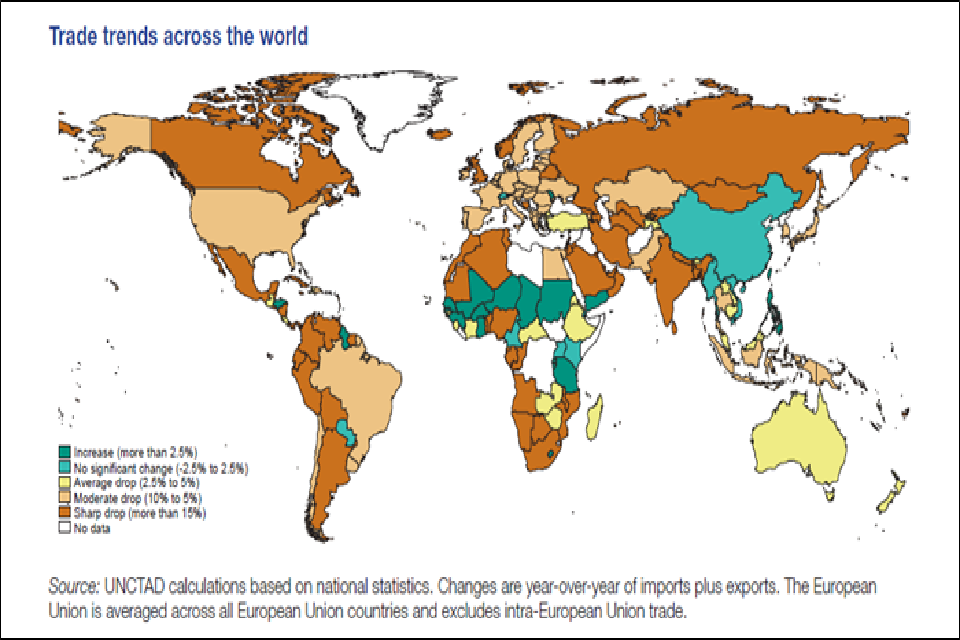
Map of the world showing trade trends based on year over year imports and exports. Dark green areas have seen the biggest increase, followed by light green. Yellow, light brown and tan areas have seen drops from 2.5 to 15 percent.
Source:
- From Key Statistics and Trends in International Trade 2020 – Trade trends under the Covid-19 pandemic, NCTAD – Division on International Trade and Commodities. ©2021 United Nations. Reprinted with the permission of the United Nations.
2. Growth projections in emerging economies have been over optimistic
A decade of over-optimism toward Emerging Markets (EMs) by forecasters suggests growth prospects may be exaggerated. In 2019, the Gross Domestic Product (GDP) of the average major EM was 24% lower than the International Monetary Fund projected in 2008. China’s slowdown, elevated debt levels, weak trade prospects, and global ‘Japanification’ (a period of stagnation, defined by weak growth and low rates of inflation) mean further disappointments are possible. The global economy will lose, given EMs are likely to account for 70% of global growth between 2020 to 2040.
Global Growth
The global economy is estimated to have contracted 4.3% in 2020. China’s increase in output was an exception and disruptions from the coronavirus (COVID-19) pandemic in the majority of other Emerging Markets and Developing Economies (EMDEs) were more severe than previously envisioned, resulting in deeper recessions and slower recoveries
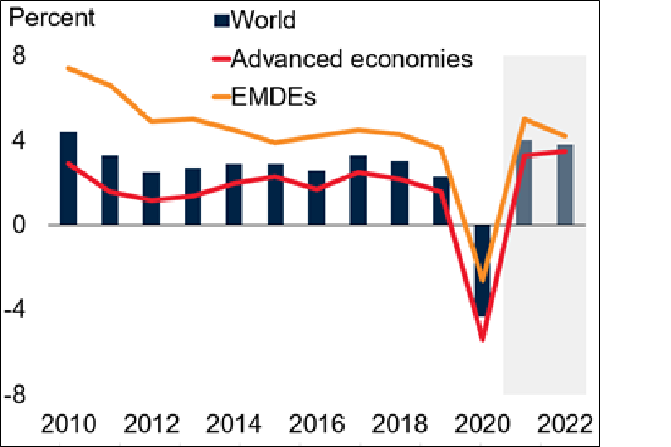
Bar chart and line graph of percentage change in global growth from minus 8 to 8 over the time period 2010 to 2022. The blue bars represent the world, red line advanced economies and yellow line emerging markets and developing economies.
Source: World Bank
- World Bank. 2021. Global Economic Prospects, January 2021. Washington, DC: World Bank. doi: 10.1596/978-1-4648-1612-3. License: Creative Commons Attribution CC BY 3.0 IGO
- Ten long-term themes for the global economy and markets, Oxford Economics, Research Briefing Global, 18 March 2021
3. Economic global growth is expected to continue but with high uncertainty over projections
Global Gross Domestic Product (GDP) fell by 3.5% in 2020 as governments imposed public health restrictions in an attempt to control the coronavirus (COVID-19) pandemic.
UK GDP fell 9.9% in 2020, the largest decline in the G7. The 2021 lockdown at the start of the year and temporary disruption to EU-UK trade is expected to result in output falling again in the first quarter of 2021.
In the UK in the medium term, the rapid rollout of vaccines and easing of public health restrictions is expected to fuel a more rapid recovery in output to its pre-pandemic levels by the middle of 2022. Beyond March 2022, the effect of the virus lingers through its ‘scarring’ impact on the supply capacity of the economy. This impact is uncertain, and the Office for Budget Responsibility continues to assume that the pandemic lowers output in the medium term by 3% relative to its pre-pandemic path.
Real GDP: central forecast and scenarios
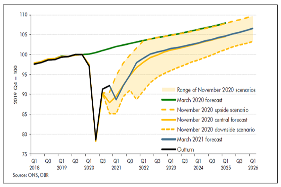
Line graph of change in Gross Domestic Product from 75 to 110 where 2019 Q4 = 100 over the time period Q1 2018 to Q1 2026.
Source:
- Economic and fiscal outlook – March 2021, Office for Budget Responsibility
4. Global investment in infrastructure is projected to fall short under current trends
A well-functioning, modern infrastructure (electricity, roads, water, telecoms, and transport) is central to economic development and to quality of life. The Global Infrastructure Outlook estimates investment needs to be $94 trillion between 2016 and 2040. This is 19% higher than would be delivered under current trends and is an average of $3.7 trillion per year. To meet this investment need, the world will need to increase the proportion of Gross Domestic Product it dedicates to infrastructure to 3.5%, compared to the 3.0% expected under current trends.
Electricity and roads are the two most important sectors - together they account for more than two-thirds of global investment needs.
Regional share of global investment infrastructure 2007 to 2040
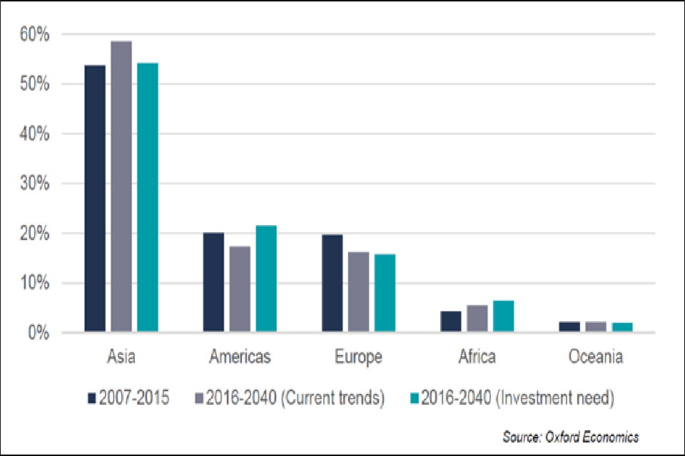
Bar graph of percentage regional share of global infrastructure from 0 to 60 over three time periods, 2007 to 2015 (dark grey bars), 2016 to 2040 under current trends (light grey bars) and 2016 to 2040 where investment is needed (green bars)
Source:
- Global Infrastructure Outlook, Infrastructure investment needs 50 countries, 7 sectors to 2040. Oxford Economics and Global Infrastructure Hub, July 2017
5. Small increase in UK income inequality over the last 10 years
Following a steady rise from the mid-1970s to early 1990s the Gini coefficient for disposable income (the amount of money that households have available for spending and saving after direct taxes) has remained broadly stable, with the exception of the highest reported level during the economic downturn of the financial year ending 2008 (38.6%).
During the 10-year period leading up to financial year ending 2020, income inequality increased by an average of 0.2% points per year to 36.3%, as measured by the Gini coefficient for disposable income. This is still lower than after the 2008 downturn.
Income inequality has increased by 2.2 percentage points in the 10-year period leading up to financial year ending 2020
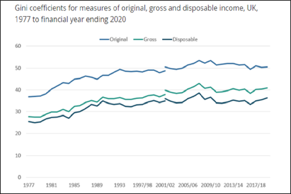
Line graph showing Gini coefficient between 0 and 60 per cent over the time period 1977 to financial year ending 2020. The dark blue line shows disposable income, green line gross income and lighter blue line original income
Inequality measures how evenly household income is shared among the population. One of the most widely used measures of income inequality is the Gini coefficient. Gini coefficients can vary between 0% and 100% and the lower the value, the more equally household income is distributed. Original income includes all sources of income from employment, private pensions, investments, and other non-government sources. The receipt of cash benefits is then added to original income to estimate gross income. Finally, direct taxes are subtracted from gross income to estimate disposable income.
Source:
- Household income inequality, UK: financial year ending 2020, Office for National Statistics, January 2021
6. Global food prices are declining but climate change is likely to mean price volatility
In the Intergovernmental Panel on Climate Change Special Report on Climate Change and Land, for shared Socio-economic Pathways (SSPs) 1 2, and 3, global crop and economic models project a 1 to 29% cereal price increase by 2050 which would impact consumers globally through higher food prices. Low-income consumers are particularly at risk, with models projecting increases of 1 to 183 million additional people at risk of hunger across the SSPs compared to a no climate change scenario. The pathways are scenarios of projected socio-economic global change to 2100.
Interlinkages between the climate system, food system, ecosystems (land, water and oceans) and socio-economic system. These systems operate at multiple scales, both global and regional. Food security is an outcome of the food system leading to human well-being, which is also indirectly linked with climate and ecosystems through the socio-economic system
Long-term evolution of commodity prices, in real terms, 1960-2028
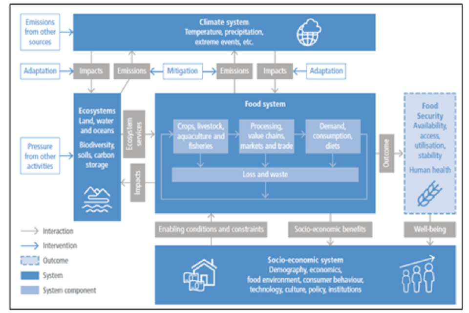
Infographic of how the climate system impacts on ecosystems and the food system, with outcomes on food security.
Projections in the Agricultural Outlook typically assume average agroclimatic conditions during the growing season. Crop yields generally follow their historical trends and therefore do not capture the potential effect of rare and high biophysical stress.
Sources:
- Mbow, C., C. Rosenzweig, L.G. Barioni, T.G. Benton, M. Herrero, M. Krishnapillai, E. Liwenga, P. Pradhan, M.G. Rivera-Ferre, T. Sapkota, F.N. Tubiello, Y. Xu, 2019: Climate Change and Land: an IPCC special report on climate change, desertification, land degradation, sustainable land management, food security, and greenhouse gas fluxes in terrestrial ecosystems [P.R. Shukla, J. Skea, E. Calvo Buendia, V. Masson-Delmotte, H.-O. Pörtner, D.C. Roberts, P. Zhai, R. Slade, S. Connors, R. van Diemen, M. Ferrat, E. Haughey, S. Luz, S. Neogi, M. Pathak, J. Petzold, J. Portugal Pereira, P. Vyas, E. Huntley, K. Kissick, M. Belkacemi, J. Malley, (eds.)]. In press
7. UK labour productivity has slowed since the 2008 recession
Labour productivity in the UK, measured by output per hour, grew by an average annual growth rate of 2.2% in the 10-year period prior to the 2008 economic downturn (1997 to 2007). During the downturn (2008 to 2009), it fell by an average of 1.2%. In the subsequent nine years (2010 to 2019), output per hour growth was positive but lower than previously, instead growing by 0.4%. This phenomenon is widely known as the productivity puzzle.
In 2020, output per hour has continued to grow at 0.4%, leaving it seemingly unaffected by the coronavirus (COVID-19) pandemic. A change in the distribution of economic activity between industries is the primary reason we have not seen a similar drop to the 2008 to 2009 downturn.
The trends of the UK’s main productivity measures vary dramatically across different time periods
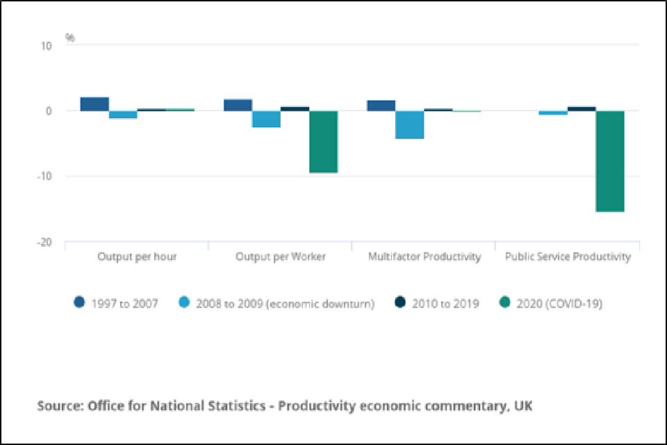
Bar graph of productivity from -20 to 10 in percentage over four time periods, 1997 to 2007 (mid blue), 2008 to 2009 (light blue), 2010 to 2019 (dark blue) and 2020 (green).
Output per hour and output per worker, multi-factor productivity (measures the amount that cannot be accounted for by changes in inputs of quality-adjusted labour and capital), public sector productivity (estimates of total public service output, inputs, and productivity), 1997 to 2020, cumulative annual growth rates, UK.
Source:
- Productivity economic commentary, UK: October to December 2020, Office for National Statistics, April 2021
8. Long-term trend of increasing UK employment rates
The estimated employment rate for people aged between 16 and 64 years has generally been increasing since early 2012, largely driven by an increase in the employment rate for women and higher State Pension age. However, there has been a decrease since December 2019 to February 2020, coinciding with the start of the coronavirus (COVID-19) pandemic.
For people aged between 16 and 64 years, over the period December 2020 to February 2021, the estimated employment rate for all people was 75.1%; this is 1.4 percentage points down on the same period the previous year.
UK employment rates (aged 16 and 64 years, seasonally adjusted, between January and March 1971 and December 2020 to February 2021
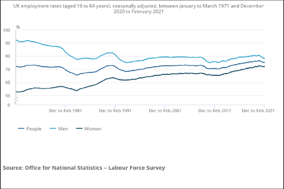
Line graph of percentage change from 0 to 100 from January to March 1971 to December 2020 to February 2021. The mid blue line represents people, light blue line men and dark blue line women.
Source:
- Employment in the UK: April 2021, Office for National Statistics, April 2021
9. Non-employing businesses account for most of private business population growth
Between the years 2000 and 2020, the number of private sector businesses increased by 2.5 million (72%). The average annual rate of growth was at 3%.
This growth in the UK private sector business population has mainly been due to increasing numbers of non-employing businesses (businesses with a single employee director are treated as having no employees). Since 2000, the number of non-employing businesses accounted for 88% of total growth over this period.
Growth in the number of UK private sector businesses by size band, 2000 to 2020
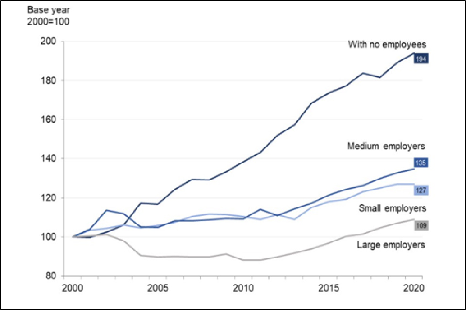
Line graph of growth in UK private sector businesses from 80 to 200 over the time period 2000 to 2020. The growth is from the base year of 2000 which equals 100
Source:
- Business population estimates for the UK and regions 2020, Department for Business, Energy and Industrial Strategy, October 2020
10. Increase share of young people in low paid job occupations and on zero-hours contracts
The share of 18 to 29 year olds working in relatively lower-paying occupations has risen from below 30% to almost 40% since the early 1990s, while staying flat across the workforce as a whole. The share of 18 to 29 year olds working part-time or in a temporary job involuntarily has not fallen since 2017, whereas the proportion continues to fall for older age groups.
People on a zero-hours contract are more likely to be younger. In 2017, 36.0% of people on zero-hours contracts were aged 16 to 24 years, compared with 11.4% for all people in employment.
Comparison of percentages (%) of people who are in employment on a zero-hours contract and who are not on a zero-hours contract by age, October to December 2017
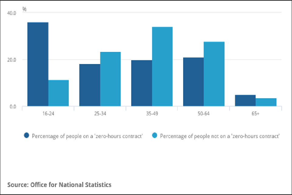
Bar graph of percentage 0 to 40 over five age groupings from 16 to over 65. Dark blue bars are percentage of people on zero hours contracts; light blue percentage of people not on a zero-hours contract.
Sources:
- G. Bangham et al, 2019 Intergenerational Audit 2019, Resolution Foundation, June 2019
- Contracts that do not guarantee a minimum number of hours: April 2018, Office for National Statistics, April 2018
11. Increasing number of disabled people in employment
Between October to December 2013 and October to December 2020, the number of disabled people in employment increased by 1.41 million, an increase of 47%. In this period, the number of people in employment who are not disabled increased by 457,000, an increase of 2%.
For context, it is worth noting that the number of disabled people aged 16 to 64 has increased by 1.65 million, or 24%, during this period.
Over the same period the proportion of disabled people who have been in employment also increased, from 44.2% in October to December 2013 to 52.3% in October to December 2020.
Disabled people in employment, 2013 to 2020, Age 16 to 64, millions
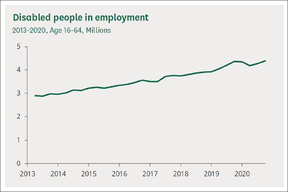
Line graph from 0 to 5 million over the time period 2013 to 2020.
Source:
- Disabled people in employment House of Commons Library Briefing, 13 August 2020
12. The UK gender pay gap is decreasing fastest for the under 40s
The gender pay gap in the UK over the last decade has fallen by approximately a quarter among full-time employees and by just over one-fifth among all employees. In 2020, the gap among full-time employees fell to 7.4%, from 9.0% in 2019. Among all employees it fell to 15.5%, from 17.4%. The gap is higher for all employees because women fill more part-time jobs which have lower hourly median pay.
Since 2018, for age groups under 40 years, the gender pay gap for full-time employees is now close to zero. However, from age group 40 to 49 years and older the gender pay gap for full-time employees is still over 10%
Gender pay gap for full-time median gross hourly earnings (excluding overtime), UK, April 1997 to 2020
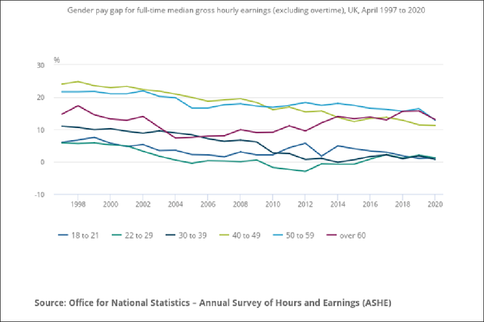
Line graph of gender pay gap as a percentage from -10 to 30, between 1998 to 2020. The mid blue line is ages 18 to 21; green line ages 22 to 29; dark blue line ages 30 to 39; lime green line ages 40 to 49; light blue line ages 50 to 59; red line over 60.
Source:
- Gender pay gap in the UK:2020, Office for National Statistics, November 2020