Examples of tables and charts to use on GOV.UK
Published 29 October 2020

© Crown copyright 2020
This publication is licensed under the terms of the Open Government Licence v3.0 except where otherwise stated. To view this licence, visit nationalarchives.gov.uk/doc/open-government-licence/version/3 or write to the Information Policy Team, The National Archives, Kew, London TW9 4DU, or email: psi@nationalarchives.gov.uk.
Where we have identified any third party copyright information you will need to obtain permission from the copyright holders concerned.
This publication is available at https://www.gov.uk/government/publications/examples-of-visual-content-to-use-on-govuk/examples-of-visual-content-to-use-on-govuk
The content on this page is created using Markdown. Find out more about using Markdown to format content in Whitehall publisher.
1. Tables
1.1 Table with just columns
Colours of fruits
| Fruit | Colour |
|---|---|
| apple | green |
| banana | yellow |
1.2 Table with rows and columns
Remember data should always be right aligned for ease of comparison. Right alignment ensures units sit above units, tens above tens, hundreds above hundreds and so on.
Price of fruit and vegetables
| Unit of measure | Fruit | Vegetables |
|---|---|---|
| per gram | 5p | 8p |
| per kilo | 7p | 6p |
| per tonne | 173p | 165p |
1.3 Table with footnotes
It is possible to embed linked footnotes into a table. However, jumping from one section of text to another can be disruptive. It is better to put the information at the point of need whenever possible.
If you do have to use footnotes, in general it is best practice to place them in the table title, column headings or row labels. Avoid placing them in cells with data as it affects the alignment of the figures.
Note: the HTML tables you can build on GOV.UK do not allow you to put footnotes in column headings.
Score (out of 100) on tests, by day test was taken
| Subject | Weekday | Weekend |
|---|---|---|
| Mental maths test [footnote 1] | 31 | 31 |
| Spelling test [footnote 1] | 24 | 24 |
| General knowledge test [footnote 2] | 62 | 75 |
2. Bar charts
2.1 Simple bar chart
Number of fruit in different shops
| Shop | Apples |
|---|---|
| Shop 1 | 6 |
| Shop 2 | 6 |
| Shop 3 | 18 |
2.2 Stacked bar chart
Percentage of shop staff by age group
| Shop | 20 to 30 | 31 to 40 | 41 to 50 | 51 and over | Total |
|---|---|---|---|---|---|
| Shop 1 | 20 | 35 | 30 | 15 | 100 |
| Shop 2 | 6 | 54 | 25 | 15 | 100 |
| Shop 3 | 60 | 22 | 10 | 8 | 100 |
2.3 Clustered bar chart
Number of fruit in different shops
| Shop | Apples | Bananas |
|---|---|---|
| Shop 1 | 6 | 6 |
| Shop 2 | 6 | 8 |
| Shop 3 | 18 | 2 |
| Shop 4 | 5 | 4 |
| Shop 5 | 7 | 7 |
| Shop 6 | 11 | 1 |
2.4 Bar chart with negative values
Change in the number of buildings owned by each shop in the last year
| Shop | Change in number of buildings |
|---|---|
| Shop 1 | -12 |
| Shop 2 | 3 |
| Shop 3 | -4 |
| Shop 4 | 2 |
3. Image formats for charts
When charts are uploaded as images the recommended format is SVG. This is because SVG images retain the same quality no matter what screen resolution or size they are viewed at. This means a user can zoom in and out and the image retains its quality. This adaptability makes it a more accessible format.
On this page we show an example of the same chart uploaded in different formats. If you zoom in you should be able to tell that the SVG format is more accessible.
Further detail can be found in this GOV.UK guidance on formatting content.
3.1 Chart saved as an SVG
Satisfaction levels for six organisations (fictional data)
The legend is presented in the same order as the categories within the bars.

Chart 3.1 is a stacked bar chart. It presents fictional data about the satisfaction levels for six organisations. The chart shows that Organisation A recorded the highest satisfaction levels, followed by Organisation B and then Organisation C. Organisation F recorded the lowest satisfaction levels.
Chart 3.1 is presented in SVG format to demonstrate that the quality of the image remains the same when a user zooms in. This can be compared with Chart 3.2 and Chart 3.3, which present the same image in PNG and JPEG formats to demonstrate how the quality of the image is compromised when a user zooms in. By comparison, the SVG chart offers a more accessible format for the presented data.
3.2 Chart saved as PNG
Satisfaction levels for six organisations (fictional data)
The legend is presented in the same order as the categories within the bars.
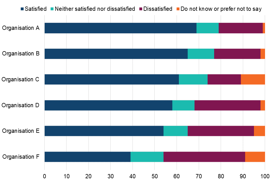
Chart 3.2 is a stacked bar chart. It presents fictional data about the satisfaction levels for six organisations. The chart shows that Organisation A recorded the highest satisfaction levels, followed by Organisation B and then Organisation C. Organisation F recorded the lowest satisfaction levels.
Chart 3.2 is presented in PNG format to demonstrate that the quality of the image reduces when a user zooms in. This can be compared with Chart 3.1, which provides a more accessible format for the data presented.
3.3 Chart saved as JPEG
Satisfaction levels for six organisations (fictional data)
The legend is presented in the same order as the categories within the bars.
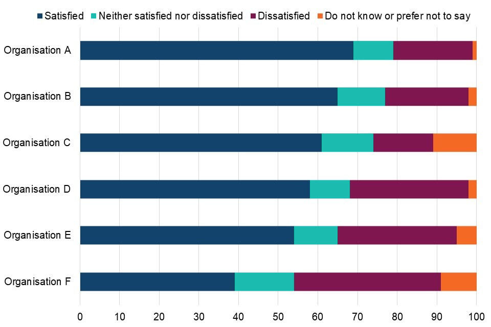
Chart 3.3 is a stacked bar chart. It presents fictional data about the satisfaction levels for six organisations. The chart shows that Organisation A recorded the highest satisfaction levels, followed by Organisation B and then Organisation C. Organisation F recorded the lowest satisfaction levels.
Chart 3.3 is presented in JPEG format to demonstrate that the quality of the image reduces when a user zooms in. This can be compared with Chart 3.1, which provides a more accessible format for the data presented.