Annex A: how to use and interpret charts in this report
Updated 4 November 2022
Applies to England

© Crown copyright 2022
This publication is licensed under the terms of the Open Government Licence v3.0 except where otherwise stated. To view this licence, visit nationalarchives.gov.uk/doc/open-government-licence/version/3 or write to the Information Policy Team, The National Archives, Kew, London TW9 4DU, or email: psi@nationalarchives.gov.uk.
Where we have identified any third party copyright information you will need to obtain permission from the copyright holders concerned.
This publication is available at https://www.gov.uk/government/statistics/changes-in-the-weight-status-of-children-between-the-first-and-final-years-of-primary-school/annex-a-how-to-use-and-interpret-charts-in-this-report
1. Charts in the longitudinal cohort analysis report
The longitudinal cohort analysis report has 2 types of chart presented with the text. A Sankey diagram that shows the flow of movement between weight groups of children in reception in 2013 to 2014 to year 6 in 2019 to 2020, and a bar graph that shows for each weight group in reception, the proportion of that group that moved to the different year 6 weight categories.
This document summarises how to use and interpret the report charts.
2. Sankey diagram
Image 1 shows an example Sankey diagram. For the Sankey diagrams in the report:
- on the left is the weight category the children were in when they were in reception in 2013 to 2014, and on the right is the weight category the children were in when they were in year 6 in 2019 to 2020
- the thickness of the line linking one weight category in reception to another in year 6 represents the number of children moving between the weight categories; the thickness of the line represents the number of children moving between those groups
- the lines linking weight categories are the colour of the weight category in reception they are moving from
- hover over the linking lines; they pale in colour and show an information box that will summarise the weight category movement and the proportion of children of the weight category selected on the left (in reception in 2013 to 2014) that moved to the weight category on the right (in year 6 in 2019 to 2020)
- all data that drives the Sankey diagram is available to download as an accessible spreadsheet from the webpage housing the report
2.1 Image 1: An example of a Sankey diagram, with the hover-over information box shown

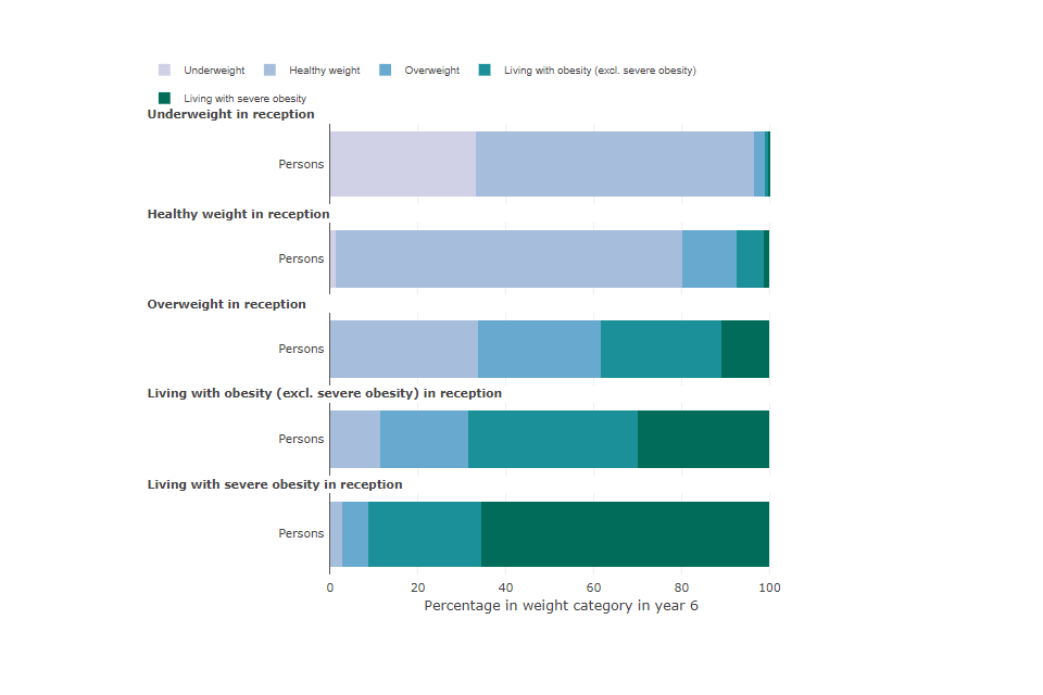
3. Bar graphs
Image 2 shows an example bar graph from the report. For the bar graphs in this report:
- each weight category in reception in 2013 to 2014 has a bar graph with each group analysed listed on the left side e.g. sex, ethnicity, deprivation, region
- the colours in the bar graph represent the weight categories in year 6 in 2019 to 2020
- the larger the colour bar in the chart the larger the proportion of children that moved to that year 6 weight category in 2019 to 2020
- hover over the bar graph to show an information box that will summarise the weight category movement and the proportion of the reception weight category that moved to the selected year 6 weight category in 2019 to 2020
- to see a single year 6 weight category on a chart, double click on the weight category name in the legend; to return all weight categories double click the legend item again
- to deselect a year 6 weight category, single click on the legend item and it will be removed from the chart, click the weight category in the legend again to put it back into the chart
- all data that drives the bar graphs is available to download as an accessible spreadsheet from the webpage housing the report
3.1 Image 2: An example of a bar graph, with the hover-over information box shown