Using relative likelihoods to compare ethnic disparities
Published 18 August 2020

© Crown copyright 2020
This publication is licensed under the terms of the Open Government Licence v3.0 except where otherwise stated. To view this licence, visit nationalarchives.gov.uk/doc/open-government-licence/version/3 or write to the Information Policy Team, The National Archives, Kew, London TW9 4DU, or email: psi@nationalarchives.gov.uk.
Where we have identified any third party copyright information you will need to obtain permission from the copyright holders concerned.
This publication is available at https://www.gov.uk/government/publications/using-relative-likelihoods-to-compare-ethnic-disparities/using-relative-likelihoods-to-compare-ethnic-disparities
1. Introduction
The Race Disparity Unit’s Ethnicity facts and figures presents data about the experiences and outcomes for different ethnic groups in areas including education, work, housing and health.
It can be difficult to work out what the biggest disparities are. This report explains why it is difficult, and how we’re using relative likelihoods to make it easier.
We explain what relative likelihoods are and the benefits of using them. We then look in detail at the issues we need to consider when using relative likelihoods.
2. Summary
Relative likelihoods are a statistical technique that give us a way to compare ethnic disparities:
- in different topics, like crime and education
- for different population sub-groups, like men and women
- at different stages of a process, such as progression through the criminal justice system
Example
25.2% of women with Mixed ethnicity and 17.4% of Black women said they were victims of crime in the 3 years to March 2017. To work out the relative likelihood, we divide 25.2% by 17.4%, which equals 1.45. We can therefore say that women with Mixed ethnicity are about 1.5 times as likely to be victims of crime as Black women.
Working out relative likelihoods is simple. But there are a number of features of the way in which they are calculated that bear upon their interpretation:
- Not all estimates of disparities are reliable. But we can use significance testing to work out which disparities represent real effects.
- Not all relative likelihoods that are greater (or less than) 1 might be a cause for concern. We can use the ‘four-fifths rule’ to identify notable disparities, for example those that are greater than 1.25 or less than 0.80. Disparities which are both notable and statistically significant might need further analysis and possible intervention.
- The fear of crime example uses the White group as the comparator. In fact any ethnic group can be used as the comparator, but a larger comparator group makes the relative likelihoods more reliable. In practice, the availability of data is often a key consideration.
- When comparing disparities for different topics, it’s important to bear in mind the ‘polarity’ of the data. For example, a high percentage of people who have confidence in the local police is ‘good’. A high percentage of people who fear crime is not ‘good’.
- It’s important to look at absolute as well as relative differences. If a particular group is doing consistently worse than the White group, and especially if the data relates to a topic which might indicate the beginning of cumulative disadvantage over the life-course (such as education), then there’s value in looking at the absolute levels.
- Absolute differences are also important where less than half of an ethnic group experiences an outcome and more than half of the group experience the opposite outcome. For example, we look at the example of entering higher education and not entering higher education. The relative likelihood between ethnic groups will differ depending on which outcome you look at.
- Some disparities may be ‘hidden’. For example, the relative likelihoods for the total population in each ethnic group may be driven by a particular sub-group (like people from a particular age group or gender). This report discusses this using data about common mental disorders.
- Most people find visualisations easier to understand than tables of data. This report looks at the pros and cons of two types of visualisation – bar charts and heat maps – using the same data to illustrate each approach.
This report looks at these issues in more detail.
3. What are relative likelihoods?
The data on Ethnicity facts and figures uses different metrics to show the outcomes for different ethnic groups. Metrics include:
- percentages
- rates
- pounds
- time
A lot of our analyses compare the differences in percentages between ethnic groups, often using the White or White British ethnic group as the ‘comparator’ group. We discuss this in more detail later in the section Choosing which ethnic group to compare with.
Table 1. Confidence in the local police (England and Wales, 2018/19) and Students aged 16 to 18 achieving at least 3 A grades at A level (England, 2018/19) - Percentages and absolute differences
| Confidence in the local police | Students achieving at least 3 A grades at A level | |
|---|---|---|
| Ethnic group | ||
| All | 75.3% | 13.0% |
| Indian | 79.2% | 15.5% |
| White British | 74.8% | 11.0% |
| Absolute difference | 4.4 percentage points | 4.5 percentage points |
Table 1 shows us that:
- confidence in the local police was higher for Indian people (79.2%) than White British people (74.8%), an absolute difference of 4.4 percentage points
- Indian pupils (15.5%) were more likely than White British pupils (11.0%) to get 3 A grades or higher at A level, an absolute difference of 4.5 percentage points
In both outcomes, the absolute difference between the Indian and White British ethnic group is very similar (4.4 to 4.5 percentage points). But achieving at least 3 A grades at A level is a much less ‘frequent’ outcome than having confidence in the local police; 13.0% of all students got at least 3 A grades at A level, while 75.3% of all adults had confidence in their local police. In relative terms, how do these disparities compare?
And how can we compare these disparities with differences expressed as rates? For example, figures on arrests are presented as rates. In 2018/19, there were 32 arrests for every 1,000 Black people, and 10 arrests for every 1,000 White people.
This difference in metrics means that it’s not possible to compare these measures directly for differences between ethnic groups.
But it is possible to make these sorts of comparisons by using relative likelihoods. The relative likelihood becomes the common metric, regardless of whether we’re comparing rates or percentages, whether one has a high value or a low value, and whether it is for the whole population or a subgroup.
A relative likelihood is a number that indicates the extent to which two groups differ in their likelihood of experiencing an outcome.
To calculate a relative likelihood, we use the following formula:
Relative likelihood = percentage (or proportion) of one group experiencing an outcome, divided by percentage (or proportion) of another group experiencing an outcome
We let the numerator be ethnic group ‘X’ and the denominator be the ‘comparator ethnic group’.
The closer a relative likelihood is to 1, the greater equality there is between the two ethnic groups.
A relative likelihood greater than 1 suggests the outcome is more likely in ethnic group ‘X’ than in the comparator ethnic group.
A relative likelihood less than 1 suggests the outcome is less likely in ethnic group ‘X’ than in the comparator group.
For example, Figure 1 shows how confident people are in their local police. It shows:
- the percentage of people who have confidence in their local police for the Asian and White aggregated and detailed ethnic groups
- the relative likelihood for each aggregated ethnic group (Asian and White), compared with the White ethnic group
- the relative likelihood for each detailed ethnic group (Bangladeshi, Indian, Pakistani, Chinese, Asian Other and White British), compared with the White British ethnic group
Figure 1. Confidence in the local police - Percentages and relative likelihoods, by ethnicity (England and Wales, 2018/19)

Source: Crime Survey for England and Wales, year ending March 2019
From this data, we can say that:
- comparing the Indian and White British ethnic groups again, Indian people are 1.06 times as likely as White British people to have confidence in their local police
- this relative likelihood represents equality between the Indian and White British ethnic groups
- the Asian ethnic group are 1.04 times as likely (or equally likely) as the White ethnic group to have confidence in their local police, however there is variation between the detailed ethnic groups that comprise the aggregated Asian group
- for example, Pakistani people are 0.97 as likely to have confidence in the police as White British people, whilst Chinese people are 1.16 times as likely to have confidence in the police as their White British counterparts
The same calculations can be applied to our data on students achieving at least 3 A grades at A level, shown in Figure 2.
Figure 2. Students aged 16 to 18 achieving at least 3 A grades at A level - Percentages and relative likelihoods, by ethnicity (England, 2018 to 2019 academic year)

Source: Department for Education, A level and other 16 to 18 results: 2018 to 2019 (revised). Note: Chinese students are included in a separate Chinese aggregated group rather than the Asian aggregated group, and are therefore not shown.
By using relative likelihoods, we can show that:
- Indian students are 1.41 times as likely to get at least 3 As at A level as White British students
- a relative likelihood of 1 indicates that Asian and White students are equally likely to achieve at least 3 As at A level but again, there is variation within the the Asian aggregated group
- Pakistani and Bangladeshi students are 0.66 and 0.71 times as likely as White students to achieve at least 3 As at A level
For this reason, RDU presents detailed ethnicity classifications where possible. More information on this can be found in Using harmonised ethnicity classifications.
By looking at relative likelihoods, we can see that the disparity between Indian and White British pupils in achieving at least 3 A grades at A level (1.41) is larger than for having confidence in the local police (1.06), despite the absolute differences being the same.
Applying the same approach to numbers expressed as rates, we find the disparity in arrest rates is higher still. The arrest rate of Black people is 3.36 times higher than that for White people.
Another way to use relative likelihoods is to compare people at different stages of a pathway. For example, we can identify that disparities between ethnic groups are higher among pupils at key stage 4 of their education (for example, GCSEs) than in earlier key stages.
Relative likelihoods have also been used to study disproportionality between ethnic groups in the criminal justice system. A strength of this work is it compares disparities in the outcomes experienced by people at each stage of the system - using rates that reflect the group entering each stage (rather than the general population). This approach helped the Ministry of Justice pinpoint those parts of the pathway where disparities were greater, and to compare with disparities at earlier stages, notably in arrests.
Relative likelihoods are therefore an effective statistical technique for drawing comparisons, but there are a number of issues to consider when working them out and interpreting them.
4. Calculating and interpreting relative likelihoods
4.1 Statistical significance
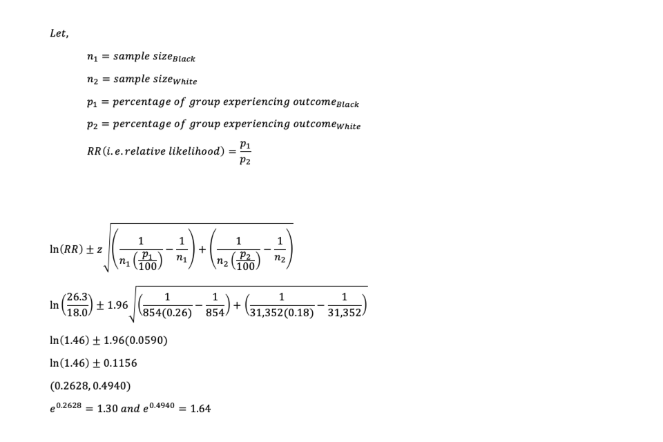
Our data on people’s fear of crime indicates that 26.3% of Black people and 18.0% of White people believe they are going to be a victim of crime in the next year. Expressed as a relative likelihood, Black people are 1.46 times as likely to fear crime as White people. But how reliable is this estimate?
We can use significance testing, in the form of confidence intervals, to test whether a relative likelihood is statistically significantly different from parity (that is, from 1).
By calculating confidence intervals around the estimate (see Annex 6.1 for detailed calculations), we can be 95% certain that the relative likelihood of fearing crime for Black people compared with White people is between 1.30 and 1.64. Since this confidence interval does not include 1, we can say that the relative likelihood is statistically significant.
Similarly we can assess the significance of the finding that students from the Chinese ethnic group are twice (2.05) as likely as White students to obtain at least 3 A grades at A level. This relative likelihood has a 95% confidence interval of 1.86 to 2.25, so again we can say that the estimate is reliable.
Testing for significant differences can help us to sift through large amounts of data to distinguish between disparities that represent a real effect from those that are solely due to chance.
4.2 Size of disparities and the ‘four-fifths rule’
While the significance of the disparity is important, we also need to explore whether the relative likelihood is notable in size. This helps us to focus on the areas which might be prioritised for further work, and to understand possible reasons for the disparity and ways to reduce it.
The fear of crime and confidence in the local police examples show disparities between 0.9 times and 1.5 times the figure for the White group. The further away from 1, the greater the size of the disparity. But is any number other than 1 a cause for concern? Or might it just reflect natural variation in the data?
We can apply a pragmatic approach, referred to as the ‘four-fifths rule’. The four-fifths rule classifies any relative likelihood of less than four-fifths (0.80) or more than the reciprocal of four-fifths (1.25) as ‘notable’.
The four-fifths rule is used in the US by the Equal Employment Opportunity Commission, to review decisions such as those about hiring, promotion or other employment decisions. The Commission has taken the position that evidence of adverse impact exists when the selection rate for any race, sex, or ethnic group is less than four-fifths (80 percent) of the rate for the group with the highest rate.
The four-fifths rule has been used by the Ministry of Justice to identify disproportionality in the criminal justice system, to focus on those outcomes which are further from equality.
Not all statistically significant disparities will be notable in size. Conversely, some disparities might not be statistically significant but be relatively large in size.
The framework in Table 2 shows how the RDU might interpret the significance and size of a relative likelihood, to decide whether or not to investigate a disparity further.
Table 2. Significance and size interpretation
| Relative rate is not statistically significant | Relative rate is statistically significant | |
|---|---|---|
| Relative rate is between 0.80 and 1.25 | Not significant or notable | Low priority for policy action |
| Relative rate is less than 0.80 or more than 1.25 | Merits ongoing monitoring from analyst | High priority for policy action |
While the significance and size of the relative likelihood are important pieces of information, analysts and policy makers might still want to consider a subset of these disparities. There may also be life stage or cumulative impacts of disparities in outcomes, and some population groups may be persistently or multiply disadvantaged, making an outcome an ideal candidate for immediate policy action.
Additionally, where significant disparities may not be notable in size, they may still warrant attention if they persist over time. For example, the fact that confidence in the police among people with Mixed ethnicity was 7 percentage points lower than among White people in 2018/19, and that it has been persistently lagging over 5 years, is of interest in its own right. By this reasoning, a significant difference may be ‘notable’ even if the relative likelihood does not meet the four-fifths rule.
4.3 Choosing which ethnic group to compare with
In the examples above, we used the White or White British ethnic group as the comparator group. Making comparisons with the White British group is preferable because it might expose any disparities associated with White minority groups, such as Gypsy, Roma and Travellers.
However, comparing with the White British group requires data that disaggregates the overall White group, which we cannot do systematically on Ethnicity facts and figures because of the need for greater consistency between ethnic categories in different datasets.
Comparison with the total population is the most ‘neutral’ approach, as it avoids the perception that the White or White British groups are some sort of ‘ideal’. But it includes an element of comparing an ethnic group against itself, and we don’t currently have a ‘total’ figure for all of the data on the website.
We also have to consider what the best comparator is for the intended purpose of calculating reliable relative likelihoods. Estimates from surveys and some administrative datasets have a wider margin of error when they’re based on small numbers of cases.
For example, education data shows us that the least desirable outcomes tend to be among White Gypsy and Roma and White Irish Traveller pupils. These are also among the smallest ethnic groups, leading to less reliable estimates of their outcomes. Because of this, it is more appropriate to make comparisons with the White or White British groups as they have the largest numbers, which means that the relative likelihoods estimates are the most robust.
Again, we are working to fill data gaps as we update our website. Doing so will allow us to have a fuller range of possible comparators.
4.4 Polarity of outcomes
For some outcomes, the higher the value, the better the outcome. For example, having confidence in your local police is ‘positive’.
On the other hand, a higher percentage can represent a poor outcome in some cases. For example, having a fear of crime is ‘negative’.
In other words, these outcomes differ in what can be termed as their ‘polarity’.
Not all outcomes have an obvious polarity, like self-employment. We know that, in 2017, 15% of White people were self-employed compared with 24% of people from the combined Pakistani and Bangladeshi ethnic group. There is no objective answer as to whether being self-employed is ‘positive’ or ‘negative’. Whilst a high value might reflect barriers to employment (negative), it could indicate entrepreneurship (positive).
Critically, when comparing two outcomes where polarity does exist, the size of the relative likelihood, and thus potentially whether we consider the relative likelihood to be notable or not, is influenced by the polarity of the outcomes.
The next section explains why it is important to look at absolute differences in the context of data where polarity is clear.
4.5 Absolute differences
Absolute differences are especially important to consider if there are 2 possible outcomes and the percentages experiencing each outcome are very different. Where this is the case, the choice of which outcome to focus on is crucial.
For example, Figure 3 shows:
- the percentage of Black and White 18 year olds who went into higher education
- the percentage of Black and White 18 year olds who did not go into higher education
- the relative likelihood for the Black ethnic group, compared with the White ethnic group
From an educational perspective, ‘entering higher education’ is positive in polarity, while ‘not entering education’ is negative.
Together, these 2 groups represent all 18 year-old students. Any disparities affecting the group going into higher education will therefore be mirrored in the group not going into higher education. As we will see, this is not the case with relative likelihoods.
Figure 3. Percentage and relative rates of young Black and White pupils who entered higher education and did not enter higher education (England, 2019)

As you would expect, whether looking at data for students who entered higher education or those who did not enter higher education, the absolute difference between Black and White pupils is the same, at 14.2 percentage points.
However, the relative likelihoods differ. Black 18 year olds are 1.47 times as likely as White 18 year olds to go into higher education. This figure meets the four-fifths rule and we would consider it to be a notable disparity. In comparison, the relative disparity between those who did not enter higher education between the 2 ethnic groups is smaller (0.80) and not notable, though sits on the threshold.
The conclusion we draw from a relative likelihood about how notable a disparity is depends on whether the less ‘frequent’ outcome (entering higher education) or the more ‘frequent’ outcome (not entering higher education) is presented. It reflects the simple arithmetic point that a difference of 14.2 percentage points is bigger relative to a rare outcome than to a more common outcome.
This highlights that the use of relative likelihoods is not completely objective. Some caution may be needed in choosing how to present an outcome to avoid criticism of cherry picking or hiding disparities. In this case, we would recommend using the data in its most widely recognised form, as a measure of pupils who entered higher education (also referred to as the ‘entry rate’).
4.6 Odds ratios
Odds ratios provide an alternative technique of comparing two groups’ experiences of an outcome. Unlike relative likelihoods, odd ratios are not dependent upon which version of the outcome is chosen.
While relative likelihoods are the ratio of two proportions, odds ratios measure the ratio of two odds. ‘Odds’ are defined as the number (or proportion) of individuals experiencing an outcome to the number (or proportion) of individuals not experiencing the outcome. Odds ratios are calculated as the ratio of the odds of a group experiencing an outcome to the odds of a comparator group experiencing an outcome. Like relative likelihoods, an odds ratio equal to 1 indicates that the two groups are equally likely to experience an outcome.
Critically, the odds ratio of entering higher education for the Black group against the White group (1.84) is the reciprocal of the odds ratio of not entering higher education for the Black group against the White group (0.54). In this instance, the odds ratio of entering higher education and the odds ratio of not entering higher education are equally likely to fulfil the four-fifths rule.
As such, an odds ratio has the same qualitative meaning, regardless of whether the less ‘frequent’ outcome or more ‘frequent’ outcome is presented.
Although the odds ratio has this attractive technical property, we favour the relative likelihood because it is more intuitive, being more simply related to the probabilities/proportions reported.
5. Challenges in interpreting relative likelihoods
5.1 Hidden disparities
For some topics, disparities might not be visible when just looking at the data by ethnic group alone. They may only appear (or become more stark) when looking at the data in more detail, such as by ethnicity and gender or area.
An example of this can be found in the data for adults experiencing common mental disorders from the Adult Psychiatric Morbidity Survey.
Table 3. Likelihoods of adults in each ethnic group experiencing common mental disorders relative to White British adults (England, 2014)
| Ethnic group | All adults | Men | Women |
|---|---|---|---|
| Prevalence of common mental disorders in past week | |||
| White British | 17.3% | 13.5% | 20.9% |
| Relative likelihood of common mental disorders (relative to White British adults) | |||
| Asian | 1.03 | 0.96 | 1.13 |
| Black | 1.30 | 1.00 | 1.40 |
| Mixed | 1.09 | 0.78 | 1.37 |
| White Other | 0.83 | 0.97 | 0.75 |
Data has been standardised for different age profiles of men and women in each ethnic group
When looking at the overall figures, we can see that the Black ethnic group had the largest relative likelihood of having a common mental disorder compared with the White British group (being 1.30 times as likely).
However, when broken down by gender, it is clear that this disparity was driven by the experience of Black women, who were 1.40 times as likely as White British women to have had a common mental disorder.
In fact the difference in prevalence of common mental disorders between Black women and White British women was the only statistically significant difference.
5.2 Geographical clustering of ethnic groups
We need to interpret particularly large relative likelihoods with caution, and consider possible explanatory factors. For example, large relative likelihoods may be apparent where there are overlaps in the geographical clustering of particular ethnic groups and the geographical clustering of the outcomes in question.
Household overcrowding is a case in point. 30.5% of Bangladeshi households lived in an overcrowded home compared with 1.6% of White British households, a relative likelihood of 19.06.
The issue may be associated with the clustering of some ethnic groups in geographic areas where overcrowding is more prevalent. 65% of people from the Bangladeshi ethnic group live in 21 local authority areas, and 41% live in 10 London boroughs, where there are high levels of overcrowding for all ethnic groups.
5.3 Using harmonised ethnicity classifications
We can only use relative likelihoods to compare the disparities across different measures reliably if we have consistent ethnic group classifications across our datasets.
As previously noted, the data on Ethnicity facts and figures is gathered from different sources, many of which use different ethnicity classifications.
The five ethnic group classification (Asian, Black, Mixed, White and Other) is based on the 2011 Census, and is the single most commonly-used classification on our website.
For many datasets, we have more detailed data. This is usually either:
- the 16 ethnic groups used in the 2001 Census
- the 18 ethnic groups used in the 2011 Census
We can use both classifications to generate data for 5 aggregated ethnic groups (albeit with small differences between the 2001 and 2011 versions).
In general we try to present data in as detailed a format as possible, to avoid hiding disparities that may exist within an aggregated group such as Asian (which included Indian, Pakistani, Bangladeshi, Chinese, and Other Asian in the 2011 Census). But we can only use relative likelihoods to compare disparities where datasets use the same ethnicity classifications.
Likewise, for some datasets on our website, we have data for detailed ethnic classifications but not for the relevant aggregated groups. For example, we have estimates of household income for the Indian, Pakistani, Bangladeshi, Chinese and Other Asian groups, but not for the Asian group as a whole.
We are trying to make as much data as possible available using the five ethnic group classification, as an imperfect but practical common standard across the website. We’re also working with departments to move towards using a consistent and detailed ethnicity classification across government.
6. Using visualisations to demonstrate relative likelihoods
There are a number of different visualisation techniques that can be used to present relative likelihoods. In this section, we explore the use of bar charts and heat maps.
6.1 Bar charts
Bar charts, shown in Figure 4, illustrate the size of a likelihood by the length of the bars. For each ethnic group, the longer the bar, the larger the disparity between the group and the White or White British group.
Figure 4. Relative likelihoods among aggregated ethnic groups (relative to White) and detailed ethnic groups (relative to White British) for four criminal justice measures

Note: Broad ethnic groups are in bold. For Arrests, people from the Chinese ethnic group are included in the Other broad group rather than the Asian broad group, and the Any Other includes people with Arab ethnicity. Differences shown have not been tested for statistical significance.
However, there are some issues with using bar charts to visualise relative likelihoods, especially when a relative likelihood is less than 1. Given that a relative likelihood of 0.2 between Group A and Group B is the equivalent of a likelihood of 5 between Group B and Group A, we are faced with the challenge of drawing a chart which does not give undue prominence to the larger number – inevitably the eye is drawn more to a bar that is 5 units long than one that is 0.2 units long.
The same underlying issue arises when writing about relative likelihoods. It can be easier to say (and understand) ‘group B is 5 times as likely as group A to have a particular outcome’, rather than ‘group A is 0.2 times as likely to have the outcome as group B’.
6.2 Heat maps
Heat maps can provide a helpful tool for presenting relative likelihoods and visualising the scale of disparities. Although there are still a number of considerations to take into account, heat maps can help to overcome the instinct to think of small numbers (e.g. those below 1) as less important indicators of disparity.
Figure 5 presents the same data as shown in Figure 4, but this time in heat map format.
Figure 5. Relative likelihoods for four criminal justice measures, by ethnicity

Note: Broad ethnic groups are in bold. For Arrests, people from the Chinese ethnic group are included in the Other broad group rather than the Asian broad group, and the Any Other includes people with Arab ethnicity. Differences shown have not been tested for statistical significance.
Heat maps generally use colour overlays in two ways.
First, they use colour to indicate the direction of a disparity between ethnic groups. We use shades of blue where a good outcome is more likely for the ethnic minority group than for the White or White British comparator. We use shades of red where a good outcome is less likely for the ethnic minority group than for the White or White British reference group.
Second, to demonstrate the size of a relative likelihood, heat maps use colour intensity. In our example, a less intense or lighter shade of blue or red depicts a smaller relative likelihood (between 1.25 and 2 or between 0.5 and 0.8). A darker shade of blue or red shows a larger relative likelihood (2 and above or 0.5 and below). This helps show where the most extreme disparities are without giving prominence to large numbers – a disparity that is dark blue, for instance, can be just as large as a disparity that is dark red.
Importantly, regardless of the polarity of the data, the colour scheme must prevail. It is always the case that blue means more likely, and a darker shade shows a larger disparity.
To achieve this, we must reverse the colour scheme for outcomes with a negative polarity. Hence, relative likelihoods equal in size will have different colours if they differ in polarity. The size of the disparity between the Black Caribbean and White British group in the confidence in their local police (0.75) is about the same as the disparity between the White British and the Bangladeshi group in their experience of being a victim of crime (0.74).
The relative likelihood of 0.75 for the Black Caribbean group indicates that a good outcome for the Black Caribbean group is less likely than for the White British group. The disparity is detrimental to the Black Caribbean group.
The relative likelihood of being a victim of 0.74 for the Bangladeshi group indicates that a good outcome is more likely for the Bangladeshi group than for the White British group. The disparity is detrimental to the White British group.
However, some concerns still arise when using heat maps to demonstrate relative rates.
As discussed earlier, not all outcomes have an obvious polarity. Where this is the case, a heat map with a colour scheme may not be the best option for the visualisation of relative likelihoods.
We should be cautious when deciding what colour scheme to adopt. A red and green colour scheme may initially appear appropriate when considering outcomes from the perspective of ethnic minority groups. However, whilst red is synonymous with ‘bad’, green is often used to indicate that something is ‘good’. All disparities are inherently a ‘bad thing’, whether they are in favour or detriment of the White reference group.
Additionally, we need to consider accessibility, for example regarding people with red-green colour blindness. Therefore, in this report we have adopted a red and blue colour scheme.
7. Next steps
Relative likelihoods can be a valuable tool to highlight the largest disparities between ethnic groups (or indeed where there is relative equality).
But there can be problems in their calculation, interpretation and visualisation. So we advise that they be used carefully, taking into consideration the issues raised in this report.
As we continue to collect and publish ethnicity data, we will seek to use relative likelihoods to better illustrate the ethnic disparities faced by people in the UK.
The RDU plans to continue work to address many of the issues raised in this report including:
- harmonising ethnic categories, and being more consistent in the data presented on our website
- publishing more guidance about the implications of geographical clustering of certain outcomes for the calculation and interpretation of relative likelihoods
- drawing attention to apparent disparities that may be based on poor quality data
- conducting user research about different ways of visualising relative likelihoods
- developing the evidence base required to explore which disparities cumulatively lead to further poor outcomes at subsequent life-stages
- exploring the potential for using this technique to set ethnic disparities in the context of disparities in outcomes for other protected characteristics
- evaluating the use of alternative techniques for comparing disparities, such as odds ratios
If you would like to be part of this work, please contact Nadyne Dunkley at: nadyne.dunkley@cabinetoffice.gov.uk or Richard Laux at: richard.laux@cabinetoffice.gov.uk
8. Acknowledgements
The RDU is grateful for advice provided by Baljit Gill (Ministry for Housing, Communities and Local Government), Charles Lound (Office for National Statistics), Sandy Rass (Department for Work and Pensions), and Sylvia Bolton (Department for Health and Social Care).
9. Annex: Calculating confidence intervals around a relative likelihood
The following worked example derives confidence intervals around the relative likelihood of fearing crime between Black and White people, by means of (i) calculating the standard error of the natural logarithm of the relative likelihood (‘ln(RR)’), (ii) multiplying by the standard error by 1.96 (for alpha = .05), (iii) adding/subtracting it from ln(RR) and (iv) exponentiating to transform the limits back. Binomial distributions from independent observations are assumed.