Local Health commentary: June 2021
Published 2 June 2021
Applies to England

© Crown copyright 2021
This publication is licensed under the terms of the Open Government Licence v3.0 except where otherwise stated. To view this licence, visit nationalarchives.gov.uk/doc/open-government-licence/version/3 or write to the Information Policy Team, The National Archives, Kew, London TW9 4DU, or email: psi@nationalarchives.gov.uk.
Where we have identified any third party copyright information you will need to obtain permission from the copyright holders concerned.
This publication is available at https://www.gov.uk/government/statistics/local-health-june-2021-update/local-health-commentary-june-2021
New in this update
This update includes data for 61 indicators, of which 5 are new:
-
population of the total resident population who are 0 to 4 years of age
-
population of the total resident population who are 5 to 15 years of age
-
population of the total resident population who are 50 to 64 years of age
-
population density
-
estimated (modelled) prevalence of adults, aged 16 years and over, classified as overweight (including obese)
This summary provides the main messages from selected indicators. None of these indicators cover the period since 31 March 2020 and therefore will not show the impact of the pandemic. For a complete list of indicators that have been updated please see Local Health: indicator updates
Public Health England’s (PHE) Local Health mapping tool presents data at small geographic area level. It helps provide an understanding of the scale of, often hidden, inequalities within local areas. The data can then be used to support targeted interventions to reduce health inequalities with the aim for everyone to have the same opportunities to lead a healthy life, no matter where they live or who they are.
Summary of selected indicators
Populations
The provision of separate indicators for populations aged 0 to 4 years and 5 to 15 year, allows school age children to be distinguished from the under 5s, as these groups are likely to require different services.
Another new indicator is the population aged between 50 and 64 years, sometimes referred to as the older working age population. The proportion of this age group is predicted to increase to 34% in 2050, from a base of 26% in 2012. This is due to demographic and societal changes such as improvements in life expectancy. The new indicator showing the proportion of the population who are 50 to 64 years old can therefore be used when considering this groups’ health and need for services.
The new population density indicator provides important socio-demographic information on the proximity of populations at a local level. Population density is defined as the total population per square kilometre. In 2019, across small areas in England this ranged from fewer than 10 people per square kilometre to over 20,000 people per square kilometre. The population density indicator, along with other local health indicators, can help planning for the health and social care needs of populations at a small area level.
Estimated (modelled) prevalence of overweight (including obesity) in adults, aged 16 years and over
The recent ‘Patterns and trends in excess weight among adults in England’ Public Health matters blog discusses the affect that obesity has on the morbidity and mortality of the population and explains that the prevalence of obesity amongst adults is increasing.
The 1993 Health Survey for England reported that the prevalence of obesity among men and women aged 16 and over was 13% and 16% respectively which has increased to 27% of men and 29% of women in 2019.
Obesity is a global and complex public health concern. It is associated with reduced life expectancy and is a risk factor for a range of chronic diseases, including cardiovascular disease, type 2 diabetes, at least 12 kinds of cancer, liver and respiratory disease, and can also impact on mental health.
The modelled estimates in the Local Health mapping tool show the percentage of the population who are overweight or living with obesity, defined as having a body mass index (BMI) greater than or equal to 25kg/m2.
The data is displayed in quintiles. The 20% of areas with the highest proportion of the population overweight or living with obesity are in quintile 1 which are the darkest shades on the map.
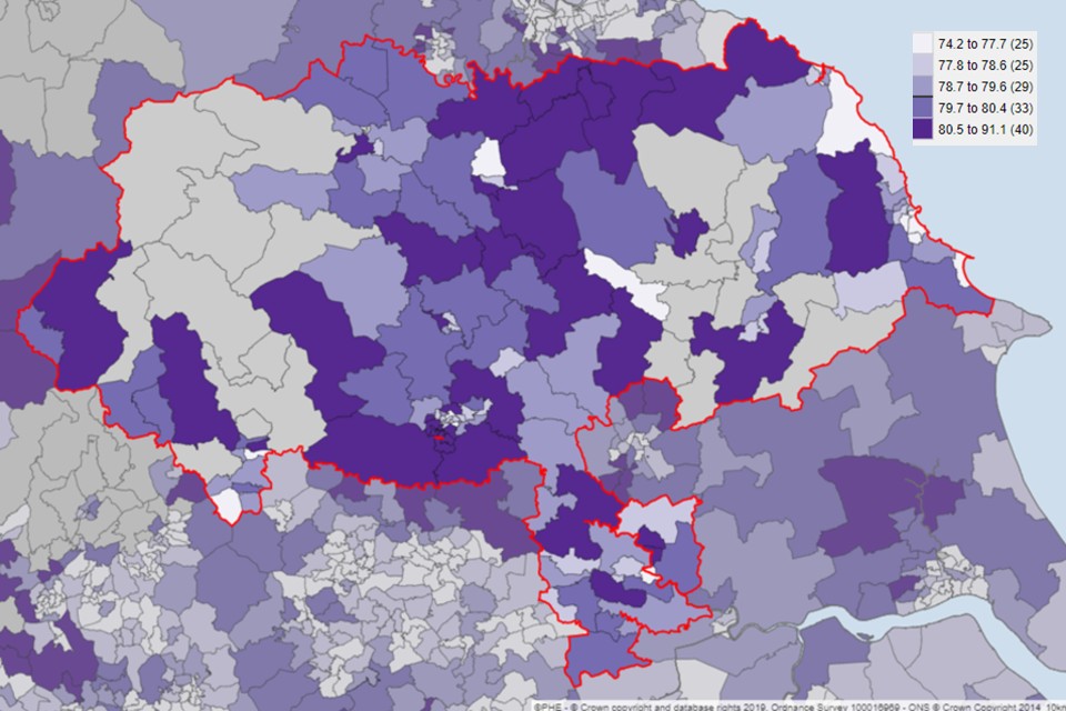
The image below shows the wards within the upper tier local authority (UTLA) of East Sussex. The UTLA area falls within quintile 3 for all UTLAs in England. However, when you drill down into the 108 electoral wards which form the UTLA you can see that the UTLA contains areas that fall within a range of quintiles.
-
four wards are in quintile 2 (areas with the second lowest percentage of obese adults)
-
thirty-four wards are in quintile 3
-
sixty-three wards are in quintile 4
-
seven wards are in quintile 5 (areas with the highest percentage of obese adults)
Using Local Health to highlight within area inequalities (Figure 1) allows for targeted action in the areas that have most need. Local authorities and health commissioners will be able to use this data to assess and evidence which neighbourhoods need targeted support and resources to help combat the causes of obesity.
Figure 1: Modelled adult prevalence of overweight (including obesity) in adults 16 years and over, 2014, wards in East Sussex
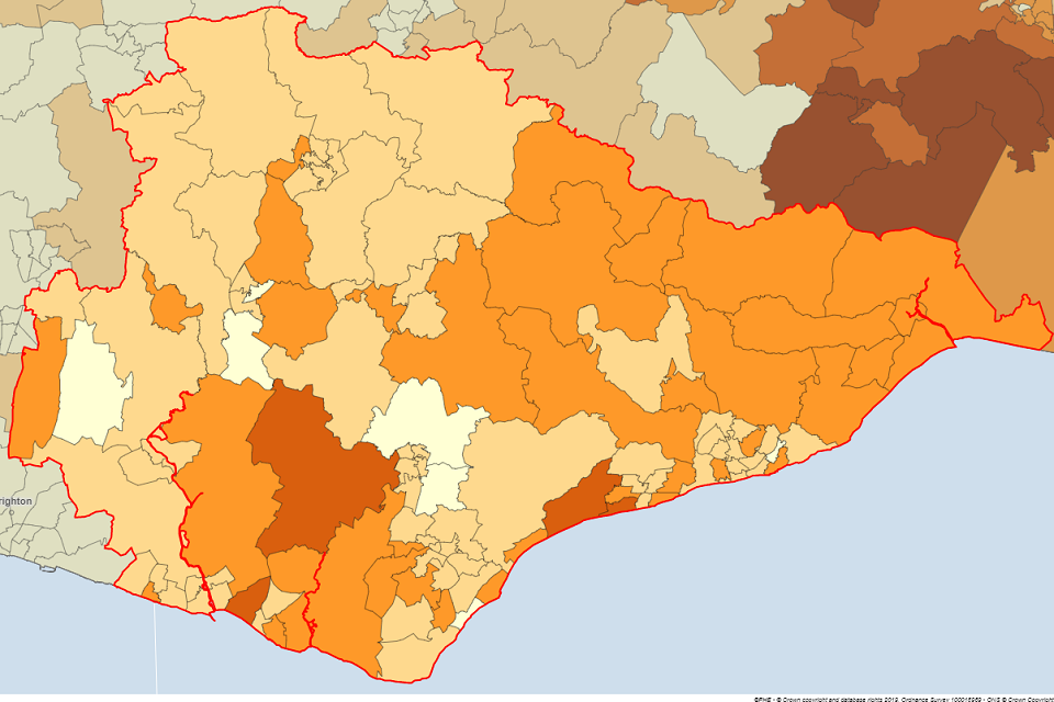
Source: Department of Geography and Environment, University of Southampton and Department of Geography, University of Portsmouth.
Life Expectancy
Period life expectancy is the average number of years a person would expect to live based on contemporary mortality rates. For a particular area and time period, it is an estimate of the average number of years a new-born baby would survive if he or she experienced the age-specific mortality rates for that area and time period throughout his or her life.
Figures reflect mortality among those living in an area in each time period, rather than mortality among those born in the area. The figures are not therefore the number of years a baby born in the area could actually expect to live, both because the mortality rates of the area are likely to change in the future and because many of those born in the area will live elsewhere for at least some part of their lives.
Life expectancy at birth is a useful summary measure of all-cause mortality as it quantifies the differences between areas in units (years of life) that are more readily understood and meaningful to the audience than those of other measures.
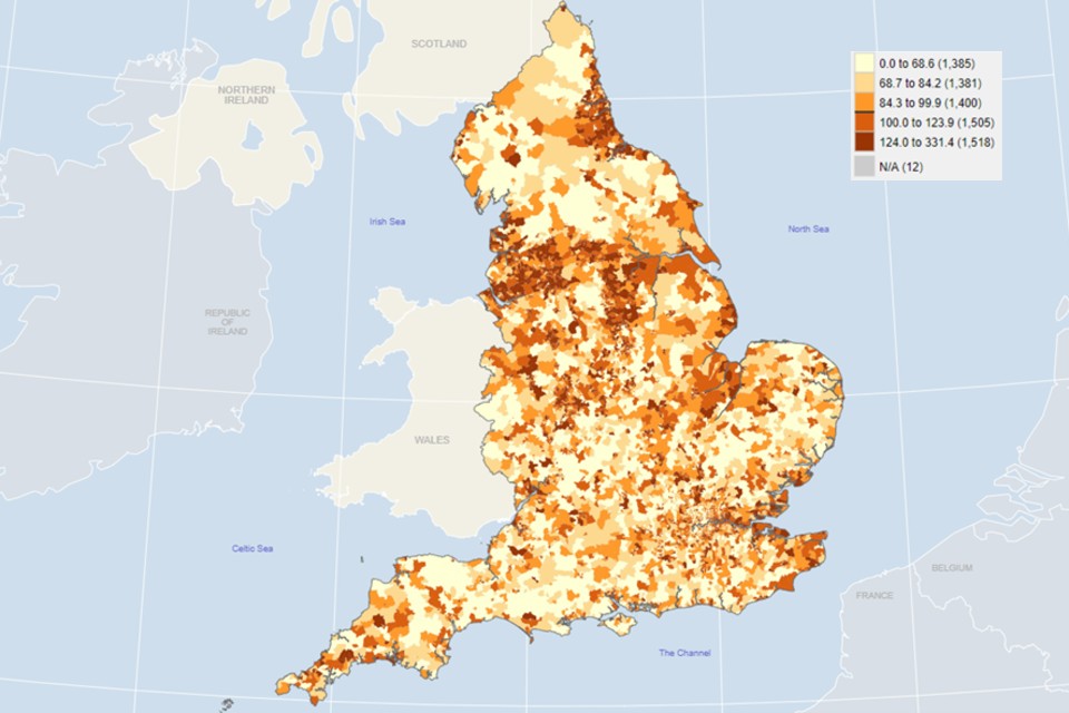
At the UTLA level, the difference in life expectancy at birth for males between areas in the north and south of England is clear. However, at a small area level the picture is much more complex (Figure 2).
Figure 2: Life expectancy at birth 2015 to 2019, Males for upper tier local authorities (top) and wards (bottom)
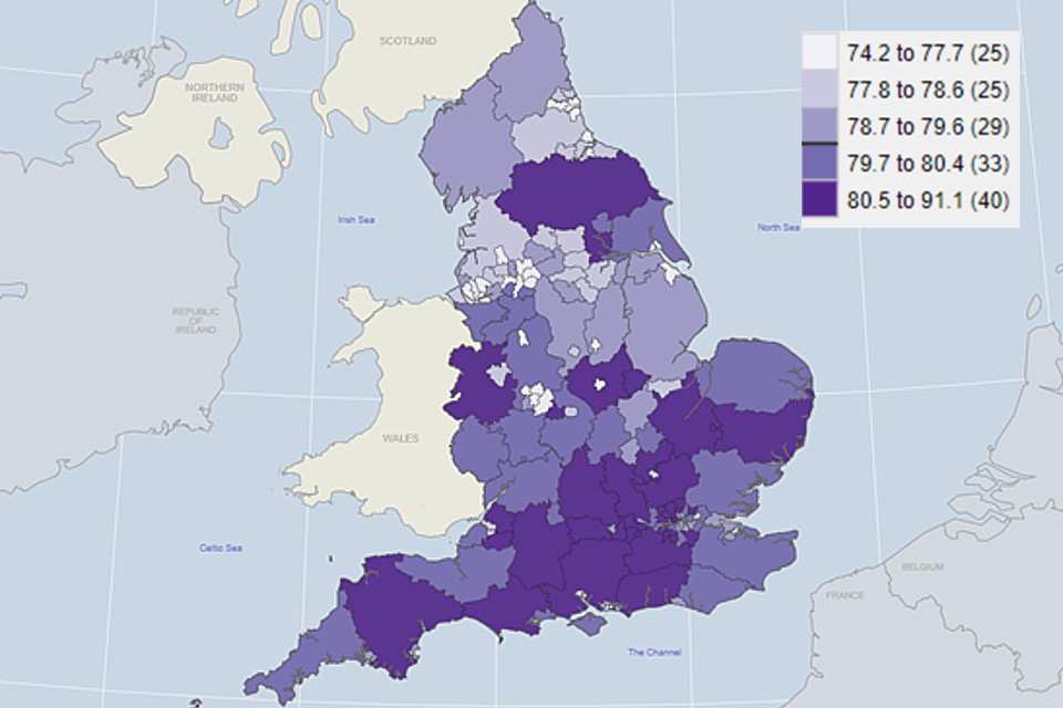
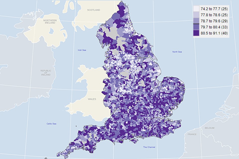
Source: Public Health England analysis of ONS death registration data and mid-year population estimates.
Looking at a small area level gives a more detailed picture of how life expectancy fluctuates across neighbouring areas. For example, the overall life expectancy at birth for males in North Yorkshire was 80.6 years, however in the wards within this area it ranged from 74.0 to 86.8 years (Figure 3).
Figure 3: Life expectancy at birth for males 2015 to 2019 for UTLA of North Yorkshire (top) and wards within North Yorkshire (bottom)
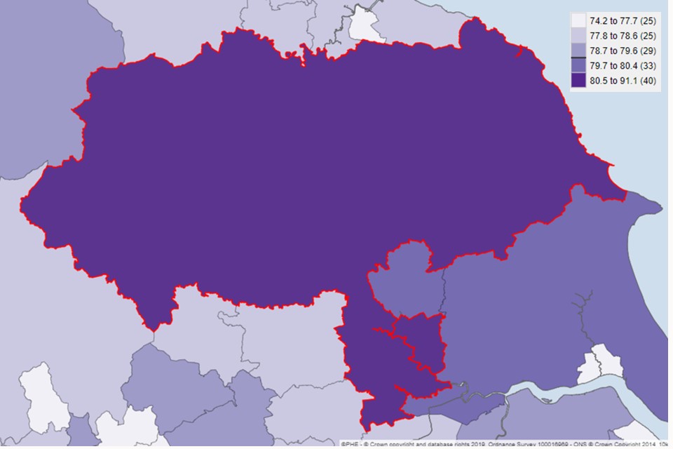
Source: Public Health England analysis of ONS death registration data and mid-year population estimates.
Income Deprivation
The deprivation indicators have been updated with data for 2019. These indicators can be compared to other local health indicators to see what impact deprivation may have on health. For example, the deaths from respiratory diseases indicator shows that there is considerable inequality between small areas of England.
By comparing this to income deprivation it can be seen that areas with a high proportion of income deprivation tended to have a higher mortality rate from respiratory diseases (Figure 4).
Additional comparisons with other local health indicators reveal, for example, that areas with a high proportion of income deprivation were also more likely to have a greater incidence of lung cancer and a higher percentage of emergency hospital admissions for Chronic Obstructive Pulmonary Disease (COPD).
Figure 4: Comparison of mortality rates due to respiratory disease, 2015 to 2019 (top) and income deprivation by wards, 2019 (bottom).
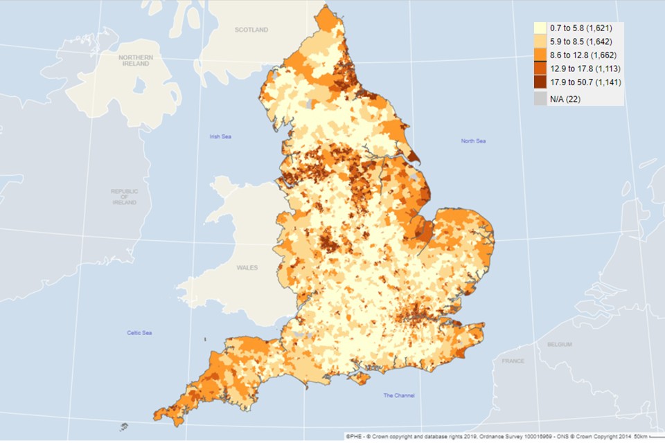
Source: Public Health England analysis of ONS death registration data (left), Ministry of Housing, Communities & Local Government, Index of Deprivation 2019 (right)
Background and further information
Local Health is a collection of quality assured health information presented for small geographical areas. By presenting data for small areas, Local Health provides evidence of inequalities within local areas. It supports targeted interventions to reduce inequalities.
View the Local Health small area mapping tool and the local health Fingertips profile
Responsible statistician, product lead: Sonia Gill For queries relating to this publication contact localhealth@phe.gov.uk