Trend Deck 2021: Natural Resources
Published 28 June 2021

© Crown copyright 2021
This publication is licensed under the terms of the Open Government Licence v3.0 except where otherwise stated. To view this licence, visit nationalarchives.gov.uk/doc/open-government-licence/version/3 or write to the Information Policy Team, The National Archives, Kew, London TW9 4DU, or email: psi@nationalarchives.gov.uk.
Where we have identified any third party copyright information you will need to obtain permission from the copyright holders concerned.
This publication is available at https://www.gov.uk/government/publications/trend-deck-2021-natural-resources/trend-deck-2021-natural-resources
1. Global energy demand is projected to increase but at a slower rate
The 2020 assessment by the International Energy Agency (IEA) was for a drop in global energy demand by 5% in 2020, in response to the coronavirus (COVID-19) pandemic.
Longer term, in the IEA scenarios out to 2030, global demand continues to increase but not as rapidly. Pre-pandemic levels of energy demand were projected to grow by 12% between 2019 and 2030. Growth over this period is now 9% in the Stated Policies Scenario (where COVID-19 is gradually brought under control in 2021), and only 4% in the Delayed Recovery Scenario where the global economy recovers by 2023.
With demand in advanced economies on a declining trend, most of the increase comes from emerging markets and developing economies, led by India.
Global primary energy demand growth by scenario, 2019 to 2030
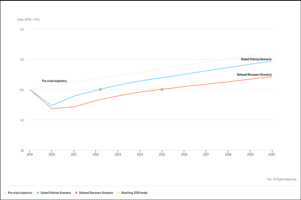
Notes: The pre-crisis trajectory is represented by the World Energy Outlook 2019 Stated Policies Scenario projection.
Sources:
- IEA (2020), World Energy Outlook 2020, IEA, Paris.
- IEA, Global primary energy demand growth by scenario, 2019 to 2030, IEA, Paris. All Rights Reserved.
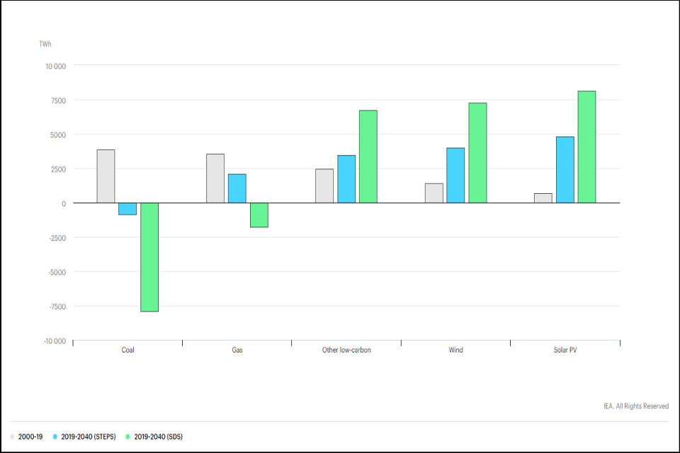
2. Renewables projected to meet most of the growth in global electricity demand
Renewables grow rapidly in all the International Energy Agency (IEA) scenarios out to 2030. Solar photovoltaic (PV) is consistently cheaper than new coal or gas fired power plants in most countries. In the IEA Stated Policies Scenario (STEPS), where coronavirus (COVID-19) is gradually brought under control in 2021, renewables meet 80% of the growth in global electricity demand to 2030. Hydropower remains the largest renewable source of electricity, but solar is the main driver of growth as it sets new records for deployment each year after 2022, followed by onshore and offshore wind.
Change in global electricity generation by source and IEA scenario, 2000 to 2040
STEPS refers to the Stated Policies Scenario; SDS the Sustainable Development Scenario meeting sustainable energy objectives and commitments in the climate change Paris Agreement.
Sources:
- IEA (2020), World Energy Outlook 2020, IEA, Paris.
- IEA Change in global electricity generation by source and scenario, 2000 to 2040, IEA, Paris. All Rights Reserved.
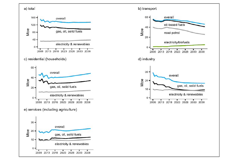
3. Projected decrease in UK total final energy demand
Energy and emissions projections suggest that total final energy demand in the UK in 2040 will be around 135 million tonnes of oil equivalent (Mtoe). This is about 4% lower than the demand in 2018.
The proportion of all final energy demand met from electricity or renewables is projected to rise from 23% in 2018 to 27% in 2035 and to 28% in 2040.
Patterns of demand vary across the four major energy consuming sectors. Between 2018 and 2040 the projections show transport final energy demand falling by 16% and industry by 24%. Residential increases to 36% of the total final energy demand. Services are projected to increase by 7%, reaching 17% of the total energy demand.
Energy and Emissions Projections 2019
Source:
- Energy and Emissions Projections 2019, Department for Business, Energy, and Industrial Strategy, October 2020.
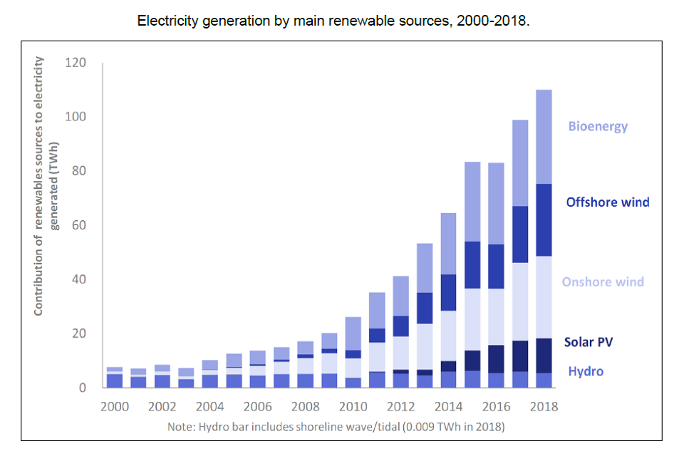
4. Britain’s electricity system continues to decorbonise
2020 was the greenest year on record for Britain’s electricity system. This follows a trend that has seen the electricity system decarbonise by 66% in the last seven years and progress by National Grid (who deliver gas and electricity to millions of people in the UK) to deliver a carbon free system by 2025.
Coal generated only 1.6% of the electricity mix in 2020, compared with almost 25% five years ago. Wind generation reached its highest daily peak with an electricity share of 59.9% and solar power is also setting new records with an electricity share at 34%.
Electricity generation by main renewable sources, 2000 to 2018
Source:
- National Grid 2020 greenest year on record, National Grid, January 2021.
- Chapter 6. Renewable sources of energy, Department of Business, Energy, and Industrial Strategy, 2019.
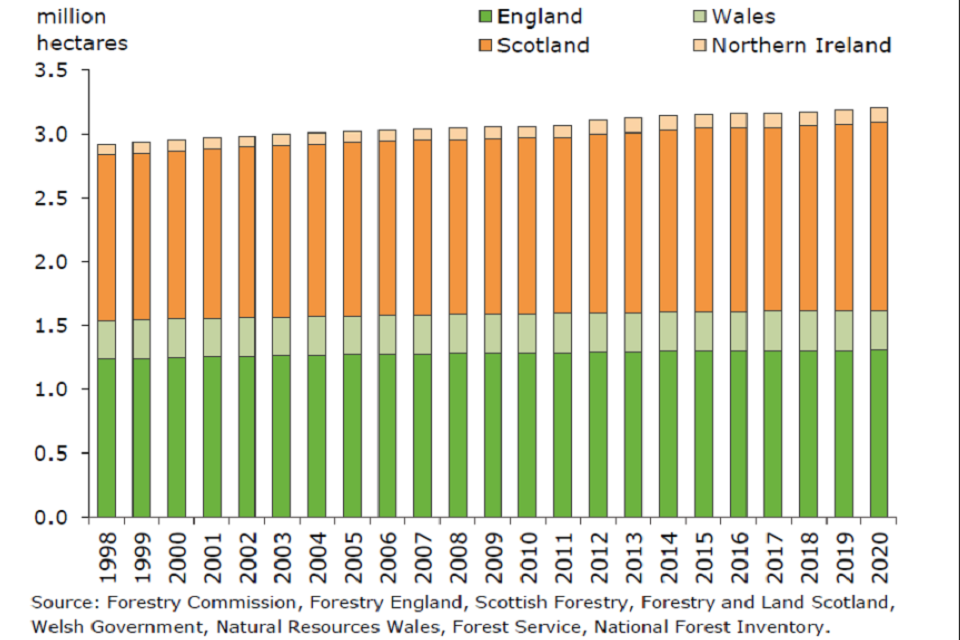
5. Increase in UK woodland area
The area of woodland in the UK on 31 March 2020 was estimated to be 3.2 million hectares. This represents 13% of the total land area in the UK; 10% in England, 15% in Wales, 19% in Scotland and 9% in Northern Ireland. Woodland is defined in UK forestry statistics as land under stands of trees with a canopy cover of at least 20% or having the potential to achieve this.
Woodland area in the UK has risen by around 290 thousand hectares since 1998, an increase of 10% over the period to 2020.
Area of woodland, 1998 to 2020
Source:
- Forestry statistics 2020, Forestry Commission, September 2020.
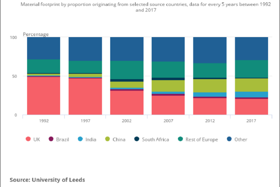
6. UK is increasingly a net importer of materials
The UK’s material footprint captures the amount of domestic and foreign extraction of materials needed to produce the goods and services used by households, governments, and charities in the UK. In 2017, the UK’s material footprint was estimated as 1.2 billion tonnes, equivalent to 18.5 tonnes per person.
The UK is increasingly a net importer of materials. Domestic extraction accounted for 47% of material footprint in 1990; by 2017 this had fallen to 21%. Material footprint fell during the economic downturn of 2008 and 2009 but rose again from 2012. The proportion of material footprint sourced from China and India rose between 1990 and 2017 from 2% to 17% and 1% to 7% respectively.
Domestic extraction accounted for just over a fifth of material footprint in 2017.
Material footprint by proportion originating from selected source countries, data for every 5 years between 1992 and 2017
Source:
- Material Footprint in the UK: 2017, Office for National Statistics, April 2020.
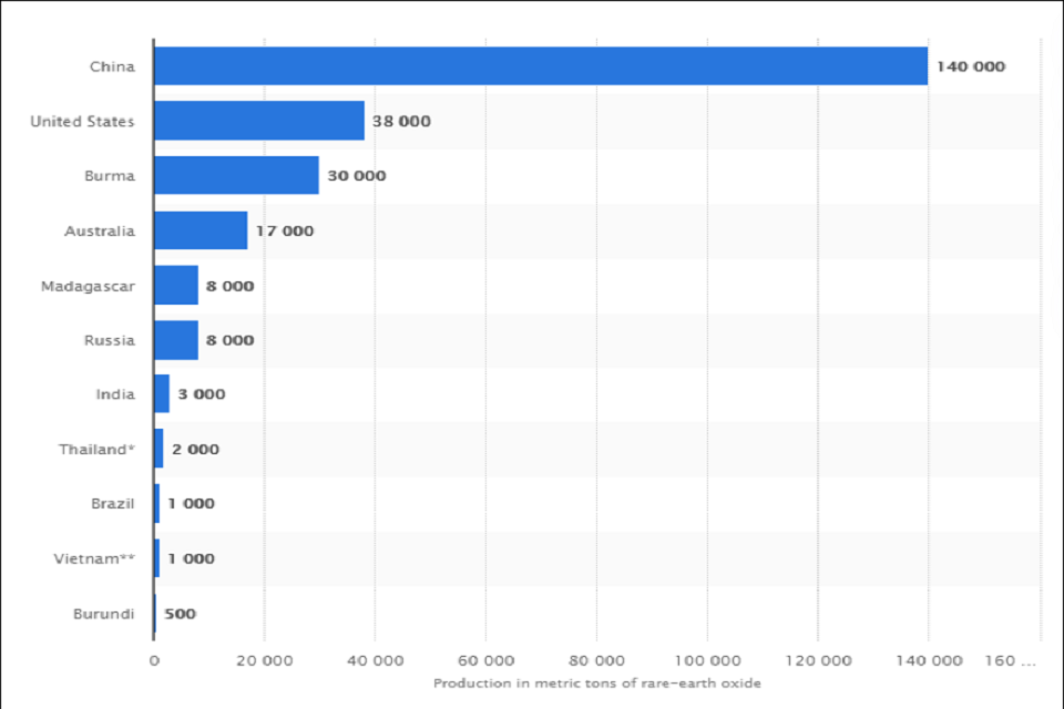
7. China produces most of world’s rare earth elements
Rare earth elements (REEs) are widely used in modern technologies. China, which accounts for an estimated 71% of global mine production of REEs, introduced export restrictions in 2010 that led to prices of some REEs rising by between 10 and 40-fold.
The global demand for lithium is forecast to grow by over 20% a year in the next decade due to its use in electric vehicle batteries. Demand for indium in the European Union is predicted to grow from approximately 200 tonnes in 2015 to 270 tonnes in 2030, driven by its use in touch screens.
Major countries in rare earth mine production worldwide 2020 (in metric tons of rare-earth oxide).
Sources:
- Access to critical material, Parliamentary Office of Science and Technology POSTNOTE, Number 609, September 2019.
- Major countries in rare earth mine production worldwide 2020, Statista 2021.
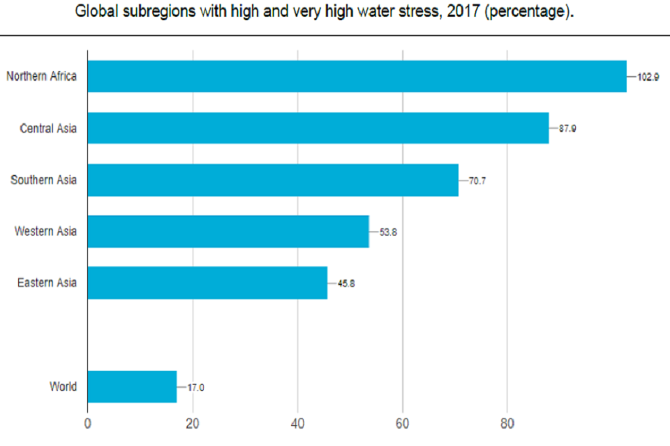
8. Huge regional variations in global water stress
High water stress is the withdrawal of too much fresh water from natural sources compared with the fresh water available. If unmitigated, water stress can lead to water scarcity, which could displace an estimated 700 million people by 2030.
Globally, water stress was at 17% in 2017. However, this value masks huge regional variations. Northern Africa and Central and Southern Asia register water stress levels above 70%. Western Asia and Eastern Asia follow, with water stress levels between 45% and 55% respectively.
Global subregions with high and very high water stress, 2017 (percentage)
Source:
- Sustainable Development Goals Report 2020, clean water and sanitation, United Nations.
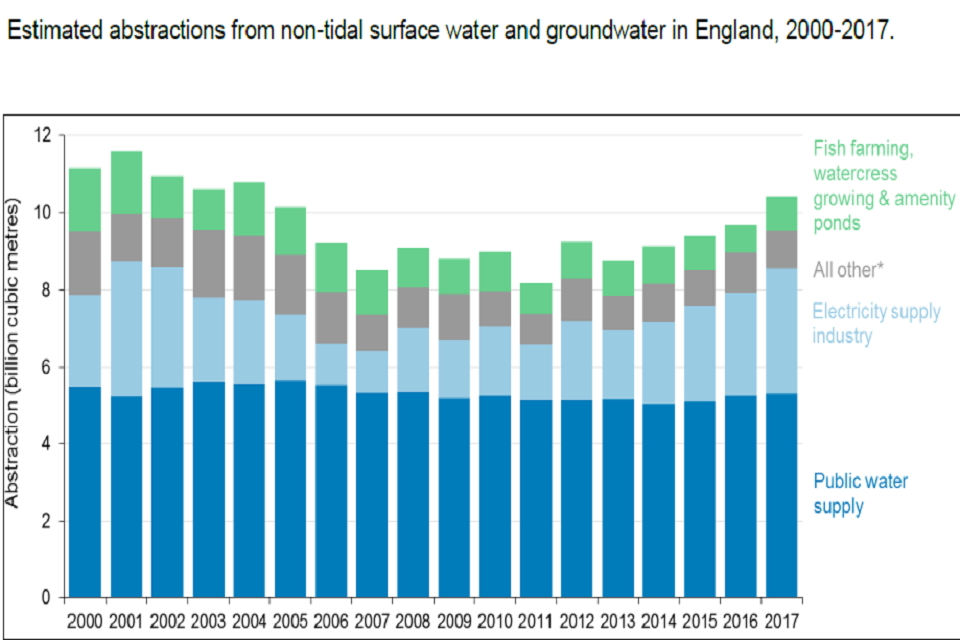
9. Increase in water abstraction rates in England
Abstraction is the removal of water resources from rivers, lakes, canals, reservoirs or from underground strata. Since 2011, total abstraction in England has increased by 26.9% to an estimated 10.4 billion cubic metres in 2017. This increase is mostly accounted for by the electricity supply industry.
Abstraction for public water supply, which makes up 51.2% of total abstraction, has been relatively stable, increasing by 3.1%.
Estimated abstractions from non-tidal surface water and groundwater in England, 2000 to 2017
Source:
- Water abstraction statistics: England, 2000 to 2017, Department for Environment, Food and Rural Affairs, March 2019.
10. Little change in the ecological status of UK surface water bodies
There has been little change in the overall number of surface water bodies in the UK awarded high or good ecological status since 2009, and little change in the short term, between 2014 and 2019. The ecological status of UK surface water bodies is a measure that looks at both the biological and habitat condition status of a water body.
In 2019, 36% of surface water bodies were assessed under the Water Framework Directive as being in high or good status, the same as in 2009 and one percentage point higher than the figure of 35% reported in 2014.
Status classification of UK surface water bodies under the Water Framework Directive, 2009 to 2019
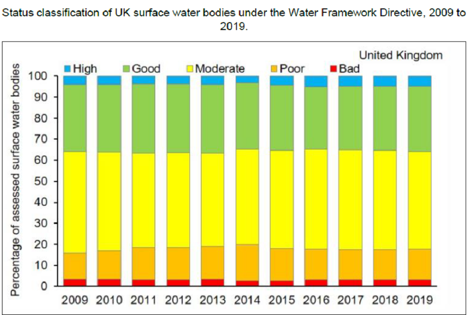
Based on numbers of surface water bodies classified under the Water Framework Directive in England, Wales, Scotland and Northern Ireland. Includes rivers, canals (Northern Ireland does not report on canals), lakes, estuaries and coastal water bodies.
Source:
- Surface water status, Joint Nature Conservation Committee, October 2020.
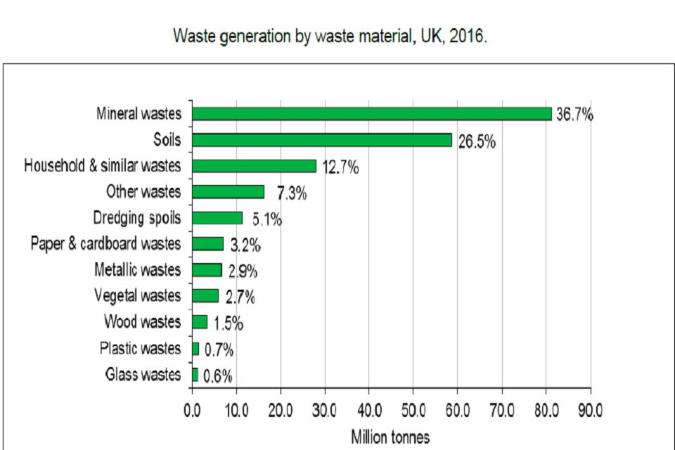
11. Increase in total waste generated in the UK
The UK generated 221 million tonnes of total waste in 2016, an increase of 3.3% from 2014. England generated 187 million tonnes of total waste, an increase of 2.8% from 2014, and 85% of the UK total.
The largest waste material categories in the UK in 2016 were mineral waste (from construction, demolition and excavation) at 81.1 million tonnes and soils at 58.7 million tonnes. Together, these make up 63% of total UK waste.
In 2016, recycling and other recovery was the most common final waste treatment type in the UK, accounting for 104 million tonnes (48.5%). 24.4% (52.3 million tonnes) of waste was disposed in landfill.
Waste generation by waste material, UK, 2016
Source: Defra Statistics
Includes waste that may go on to be exported, but excludes waste imported from outside the UK. Any type of waste can be generated by any economic activity. For example ‘household & similar wastes’ are not solely generated by ‘households’. Percentages may not sum to exactly 100% due to rounding.
Source:
- UK statistics on waste, Department for Environment, Food and Rural Affairs, March 2020.
12. Continuing decline in biodiversity
Overall, biodiversity loss is continuing, despite substantial ongoing efforts for biodiversity conservation and sustainable use. While there has been significant progress towards most of the Aichi Biodiversity Targets, none has been fully achieved. While current conservation and management actions are having positive impacts, their effects are overwhelmed by the growing pressures on biodiversity, which, in turn, are related to increased levels of consumption of food, energy and materials and to the development of infrastructure. Consequently, the world is not on track to achieve most of the current globally agreed targets for biodiversity.
A portfolio of actions to reduce loss and restore biodiversity
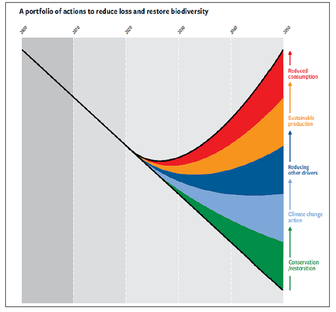
Trends in biodiversity (various metrics, left axis) have been declining and are projected to continue to do so under business as usual scenarios (trend line). Various areas of action could reduce the rate of biodiversity decline, and the full portfolio of actions, in combination, could halt and reverse the decline (bend the curve), potentially leading to net biodiversity gains after 2030. These are, from bottom to top:
(1) Enhanced conservation and restoration of ecosystems;
(2) Climate change mitigation;
(3) Action on pollution, invasive alien species and overexploitation;
(4) More sustainable production of goods and services, especially food;
(5) Reduced consumption and waste. However, none of the areas of action alone, nor in partial combinations, can bend the curve of biodiversity loss.
Source:
- Secretariat of the Convention on Biological Diversity (2020) Global Biodiversity Outlook 5. Montreal.
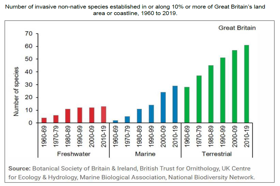
13. The number of invasive non-native species is increasing in Great Britain
Over the period 1960 to 2019 invasive non-native species have become more prevalent in the countryside. Since 1960, the number of these species established in or along 10% or more of Great Britain’s land area or coastline has increased in the freshwater, marine (coastal) and terrestrial environments, increasing the likely pressure on native biodiversity.
Number of invasive non-native species established in or along 10% or more of Great Britain’s land area or coastline, 1960 to 2019
Source:
- Pressure from invasive species, Joint Nature Conservation Committee, October 2020.
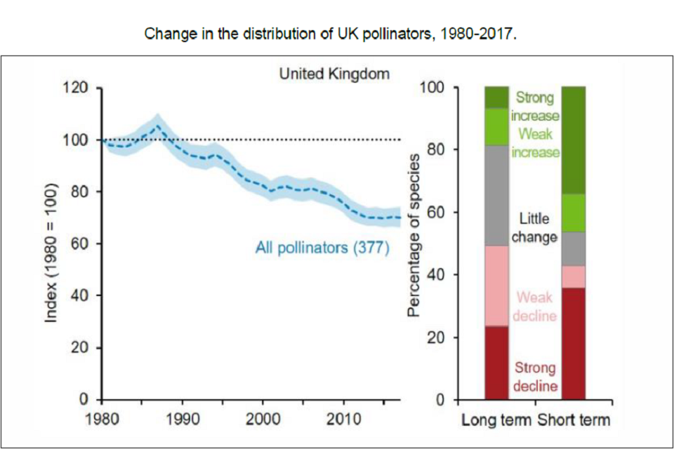
14. Long-term decline in UK pollinators
There has been an overall decrease in the UK biodiversity pollinator indicator from 1987 onwards. In 2017, the indicator had declined by 30% compared to its value in 1980.
Over the long term, 19% of pollinator species became more widespread (7% showed a strong increase) and 49% became less widespread (24% showed a strong decrease).
By contrast, over the short term, a greater proportion of species were increasing (46% with 34% exhibiting a strong increase) than decreasing (43% with 36% exhibiting a strong decrease).
Change in the distribution of UK pollinators, 1980 to 2017
Source:
- Status of Pollinating Insects, Joint Nature Conservation Committee, October 2020.